kottke.org posts about art
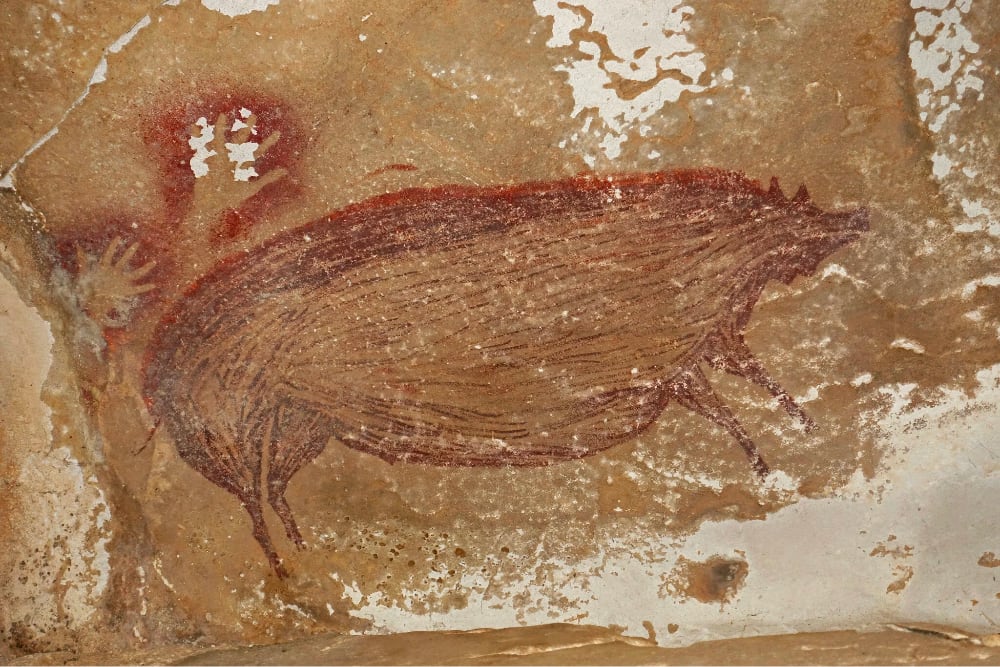
According to a study published this week, archaeologists have determined that a recently discovered cave painting of a warty pig is at least 45,500 years old. From the NY Times:
In a hidden valley on an Indonesian island, there is a cave decorated with what may be the oldest figurative art ever glimpsed by modern eyes.
The vivid depiction of a wild pig, outlined and filled in with mulberry-hued pigment, dates back at least 45,500 years, according to a study published on Wednesday in Science Advances. It was discovered deep inside a cave called Leang Tedongnge in December 2017, during an archaeological survey led by Basran Burhan, a graduate student at Griffith University and co-author of the new research. The animal in the painting resembles the warty pig, a species still living today on the island of Sulawesi where the cave is.
Still up for debate: who painted it? Not the individual who painted it — we’ll never know that — but what species painted it.
Human skeletal remains as old as 45,500 years have never been found in Sulawesi, so it is not clear that the artists were anatomically modern humans. The islands that are now called Indonesia were inhabited by different hominins — the broader family to which humans belong — over long periods of time. Some of these hominin remains date “to over a million years old,” said Rasmi Shoocongdej, an archaeologist at Silpakorn University in Thailand who was not involved in the study.
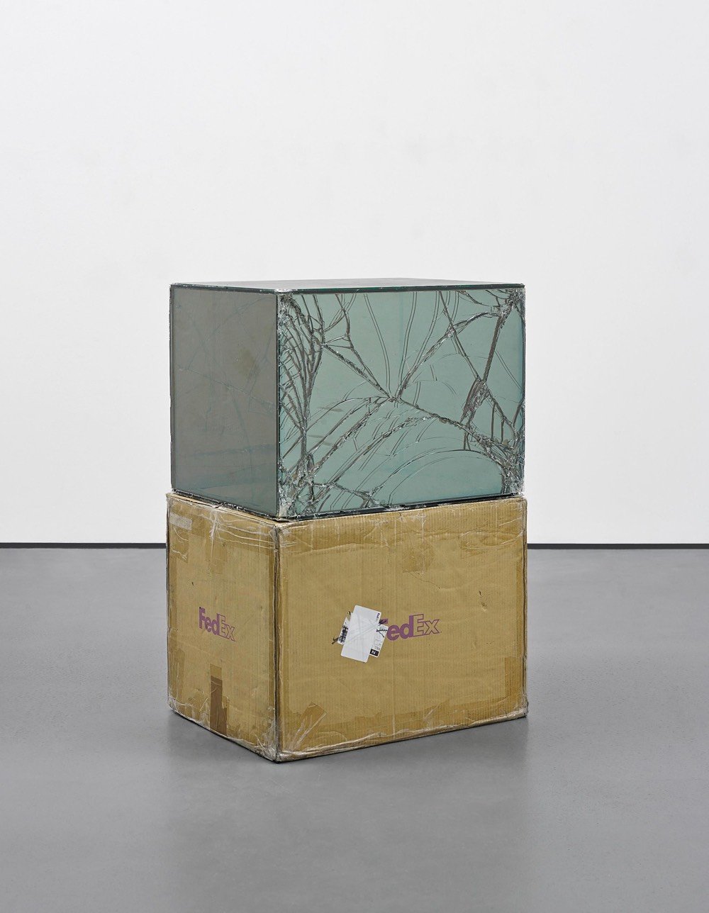
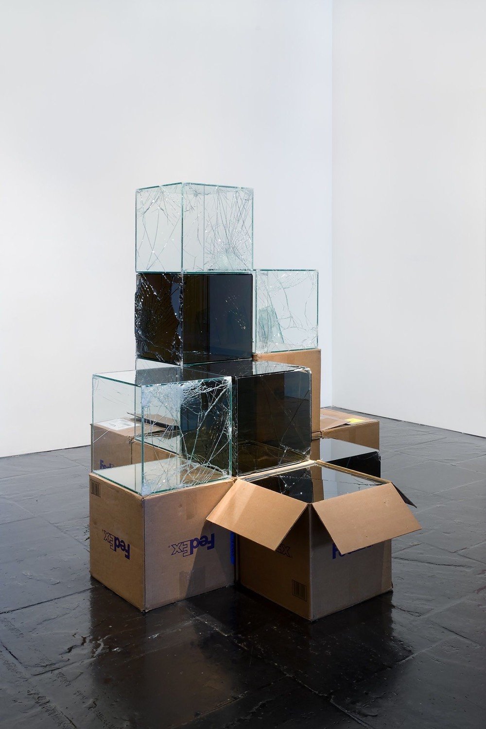


Since 2007, artist Walead Beshty has been cleverly using FedEx’s shipping infrastructure to create a series of artworks. He constructs glass objects that fit exactly into FedEx’s shipping boxes and then ships them to galleries and museums without any protection against damage. Any cracks or breaks in the glass became part of the work upon display at its destination. According this interview, part of what interested Beshty about doing this project related to the proprietary sizes of FedEx’s boxes:
As for the corporate dimension, I was aware that standard FedEx boxes are SSCC coded (serial shipping container code), a code that is held by FedEx and excludes other shippers from registering a box with the same dimensions. In other words, the size of an official FedEx box, not just its design, is proprietary; it is a volume of space which is a property exclusive to FedEx. When thinking about the work, its scale and so on, it made sense to adhere to that proprietary volume, because, as a modular, it had a real and preexisting significance in daily life, it was common, specific, and immediately familiar. That is, it had an iconic resonance that a more arbitrary form or shape wouldn’t have.
And each time the work is shipped — say from one gallery to another — it’s unwittingly altered further by a system created by a massive multinational corporation:
Rather than thinking in terms of the Duchampian readymade, which is most often understood as operating iconically — as in the appropriation and repositioning of a static thing — I was thinking of readymade systems of production, of using pre-existing active systems to produce a work. No object is truly static anyway, so this opened up broader questions I had about the tradition of appropriation, the way it froze cultural signifiers and reapplied them to other contexts, treated images as dead, static things… The object isn’t treated differently than other FedEx packages, I simply used FedEx to transport an object that registers how the system treated it in aesthetic terms. The result is that the object is constantly changing. Every time the work is shipped it goes through a material transformation.
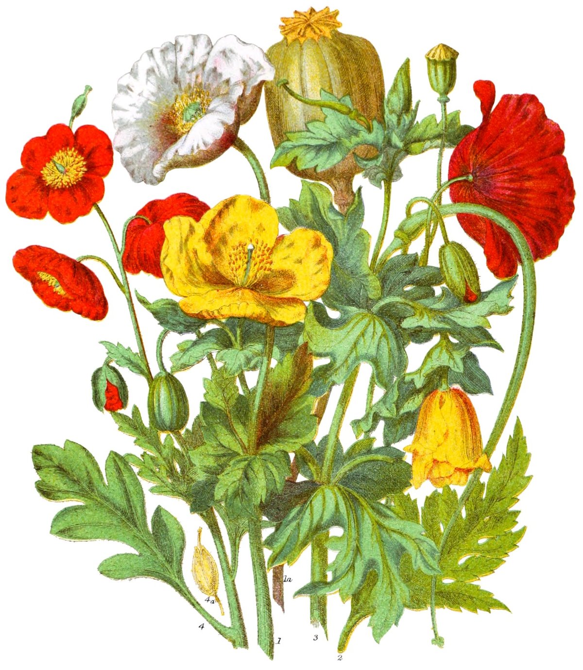
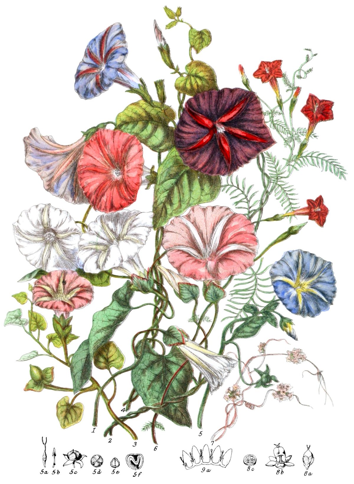
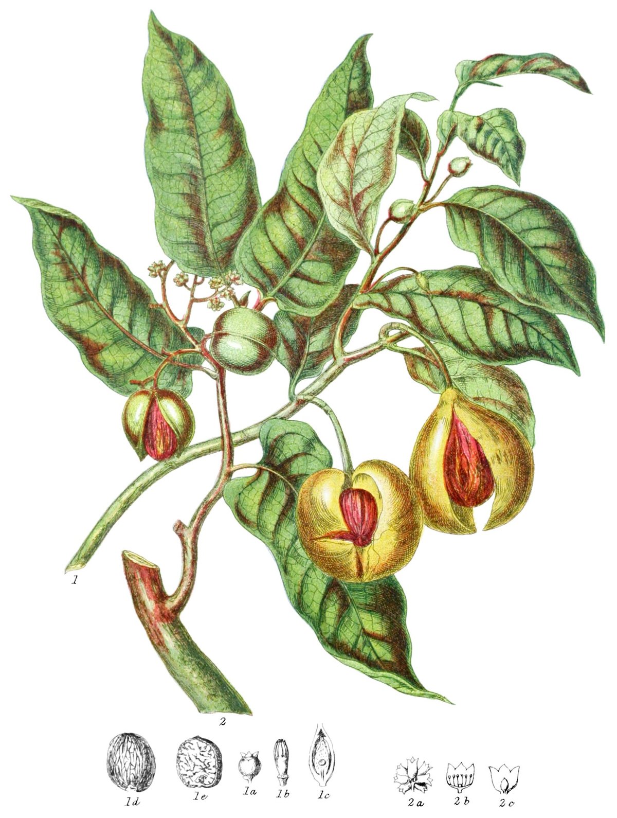
Nicholas Rougeux has beautifully reproduced & remastered botanical illustrator Elizabeth Twining’s catalog of plants and flowers from 1868, Illustrations of the Natural Orders of Plants. Each of the 160 illustrations is accompanied by explanatory text from the original book and an interactive version of the image (click on the highlighted plant for more info).
Posters based on the illustrations are available and, get this, so are puzzles!
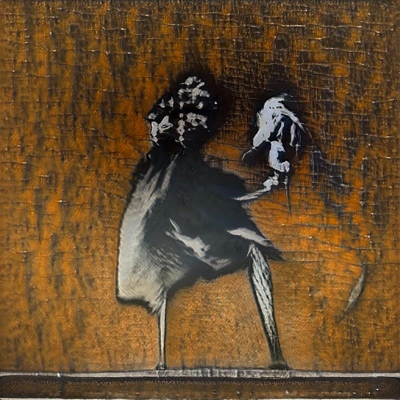
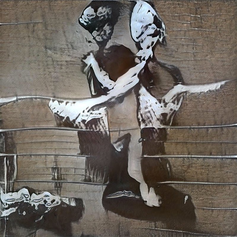
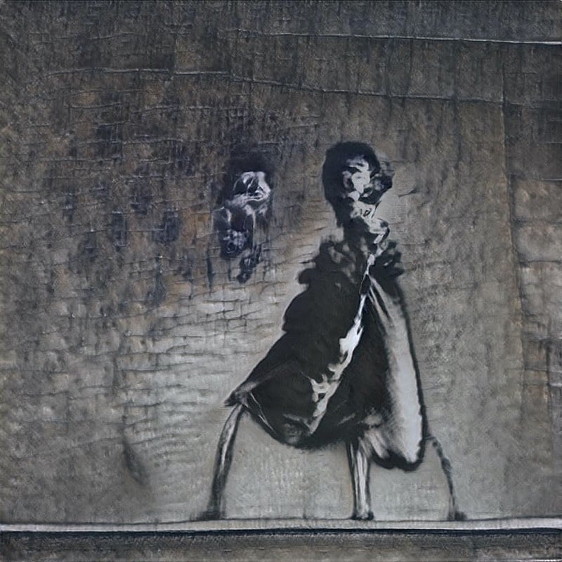
GANksy is an AI program trained on Banksy’s street art.
GANksy was born into the cloud in September 2020, then underwent a strenuous A.I. training regime using hundreds of street art photos for thousands of iterations to become the fully-formed artist we see today. All of GANksy’s works are original creations derived from its understanding of shape, form and texture. GANksy wants to be put into a robot body so it can spraypaint the entire planet.
The results are cool but not super coherent — these look more like abstract NIN and Radiohead album covers than the sly & whimsical works Banksy stencils up around the world. With GANksy, you get the feel of Banksy’s art and the surfaces he chooses to put it on but little of the meaning, which is about what you would expect from training using a neural network based on style.
In 1980, Sol LeWitt created a piece of art called The Area of Manhattan Between the Places I Have Lived Is Removed where he cut out the area between all the places he’d lived in NYC on a satellite image. Matt Miller whipped up an app on Glitch that allows you to make your own map according to those rules. Here’s my Between the Places map:

Here is LeWitt’s original map:
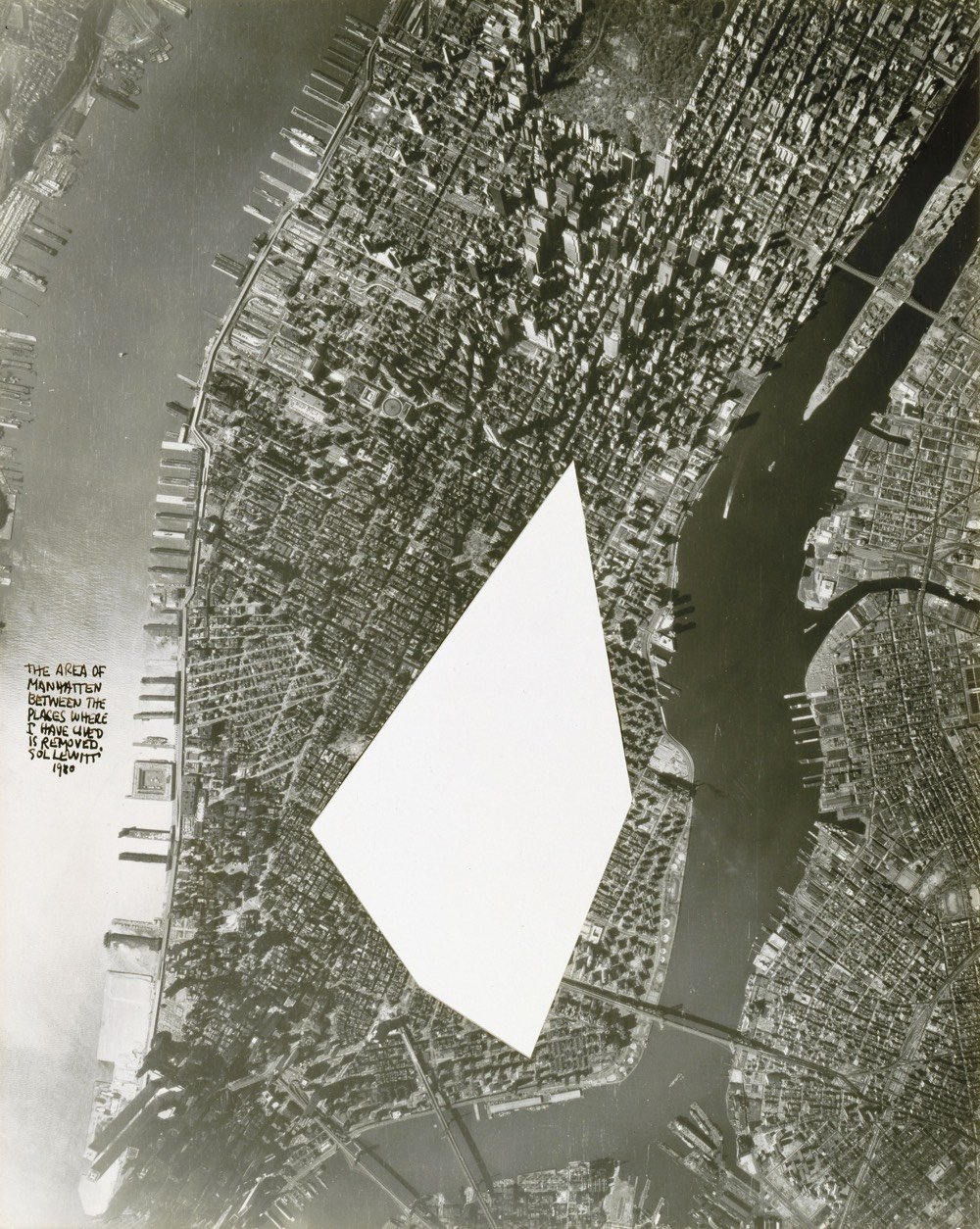
Looks like Miller’s app doesn’t optimize for solid, filled polygons — I suspect if I’d been a little more careful about entering my addresses in the correct order, mine would look more like LeWitt’s. But still a fun exercise!
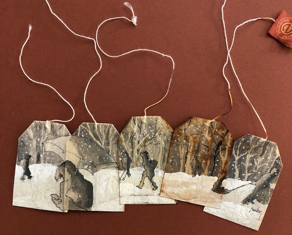
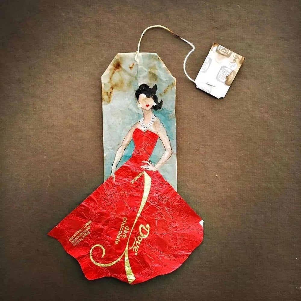
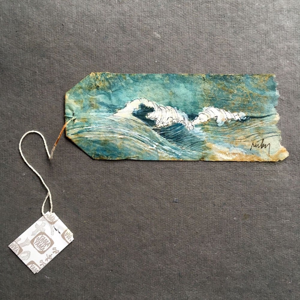
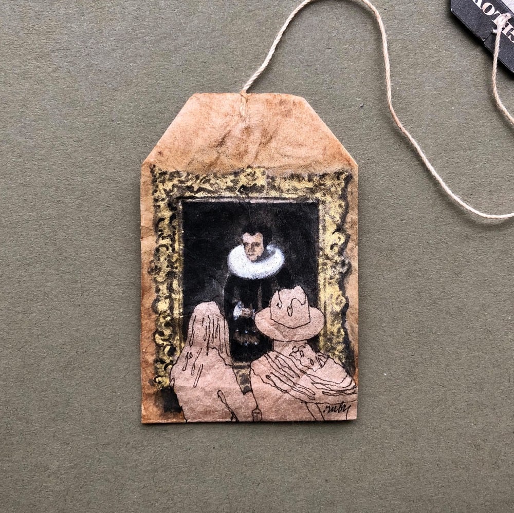
Ruby Silvious paints watercolors on used tea bags. Art is everywhere and anything is a canvas. Check out her Instagram for regular updates. Prints and original art are available. (via colossal)
The book Art & Fear by David Bayles and Ted Orland contains a passage about whether artists should focus of quantity or quality in their work.
The ceramics teacher announced on opening day that he was dividing the class into two groups. All those on the left side of the studio, he said, would be graded solely on the quantity of work they produced, all those on the right solely on its quality. His procedure was simple: on the final day of class he would bring in his bathroom scales and weigh the work of the “quantity” group: fifty pound of pots rated an “A”, forty pounds a “B”, and so on. Those being graded on “quality”, however, needed to produce only one pot — albeit a perfect one — to get an “A”. Well, came grading time and a curious fact emerged: the works of highest quality were all produced by the group being graded for quantity. It seems that while the “quantity” group was busily churning out piles of work — and learning from their mistakes — the “quality” group had sat theorizing about perfection, and in the end had little more to show for their efforts than grandiose theories and a pile of dead clay.
It’s a great anecdote but with the absence of specific details (like the teacher’s name), it’s always struck me as apocryphal — a parable of unknown origin used to illustrate a counterpoint to conventional wisdom. Austin Kleon recently noticed another version of this story, featuring photographer Jerry Uelsmann, from James Clear’s Atomic Habits. It starts:
On the first day of class, Jerry Uelsmann, a professor at the University of Florida, divided his film photography students into two groups.
Everyone on the left side of the classroom, he explained, would be in the “quantity” group.
Then it continues exactly as the ceramics story goes. Turns out, Orland says that he and Bayles changed the photography story into one about ceramics for their book, per Clear’s footnote:
“Yes, the ‘ceramics story’ in ‘Art & Fear’ is indeed true, allowing for some literary license in the retelling. Its real-world origin was as a gambit employed by photographer Jerry Uelsmann to motivate his Beginning Photography students at the University of Florida. As retold in ‘Art & Fear’ it faithfully captures the scene as Jerry told it to me — except I replaced photography with ceramics as the medium being explored. Admittedly, it would’ve been easier to retain photography as the art medium being discussed, but David Bayles (co-author) & I are both photographers ourselves, and at the time we were consciously trying to broaden the range of media being referenced in the text. The intriguing thing to me is that it hardly matters what art form was invoked — the moral of the story appears to hold equally true straight across the whole art spectrum (and even outside the arts, for that matter).”
Same anecdote, same takeaway, just different details right? I’m not so sure. The specific details lend credibility to the actual story and to the lesson we’re supposed to learn from it. There’s a meaningful difference in believability and authority between the two versions — one is a tale to shore up an argument but the other is an experiment, an actual thing that happened in the world with actual results. Even though I’ve known it in my bones for years because of my own work, I’m happy now to fully believe the connection between quantity and quality demonstrated in this story.
Update: Tangentially related from Emre Soyer and Robin Hogarth in Havard Business Review: Don’t Let a Good Story Sell You on a Bad Idea. (thx, rob)


Posing as young apartment-hunting Hungarian billionaire, artist Andi Schmied was able to gain access to more than two dozen luxury apartments in Manhattan and photograph the views from them. The resulting project is called Private Views and you can see some of her photos in this portfolio. Christopher Bonanos interviewed Schmied about the project for Curbed. Regarding the banal sameness of rich people things:
Did you discover anything interesting about the apartments themselves?
They are all the same! I mean, really! For example, the layout of the apartments are essentially identical. You enter, and there’s a main view, always from the living room — in the case of Billionaires’ Row, everything’s facing the park. The second-best view is from the master bedroom, which is usually the corner. Then there’s the countertop, which usually a kitchen island in the middle, and there’s different types of marble but there’s always marble — Calacatta Tucci, or Noir St. Laurent, or Chinchilla Mink, and they always tell you, “It’s the best of the best,” from a hidden corner of the planet where they hand-selected the most incredible pieces. After five of these, it’s incredibly similar, all of them. Also they put a lot of emphasis on naming the designer.
The branding.
Yes. And there’s a big competition for amenities, who has the craziest amenities. Of course there’s the pool and all of that, but one of the newest things in the past two years in every single development is the golf-simulator room - it’s just the standard now.
Private Views is performance art as much as it is about photography and architecture. I love the details about how she conned her way into these buildings by using the eagerness of real estate brokers against them.
But after a while I realized that it absolutely doesn’t matter what I wear: From their point of view, you’ve passed the access, and you can do anything — anything is believable. For example, all the pictures were taken with a film camera, which is [gestures broadly] this big. I’d just ask, “Can I take some pictures for my husband?” which is a very obvious and normal thing to do. There were a few agents who noticed that it was a film camera, not a digital camera, and those who noticed asked, “Oh, wow, is it film?” And I’d always say something like, “Oh, my grandfather gave it to me — to record all the special moments in my life.” And they’d just put me in this box of “artsy billionaire,” and would start to talk to me about MoMA’s latest collection. So anything goes.
For a taste of the real estate banter, you can watch videos that Schmied recorded of her visits in a talk she gave early last year. Schmied is crowdfunding a book based on the project — you can back it here.
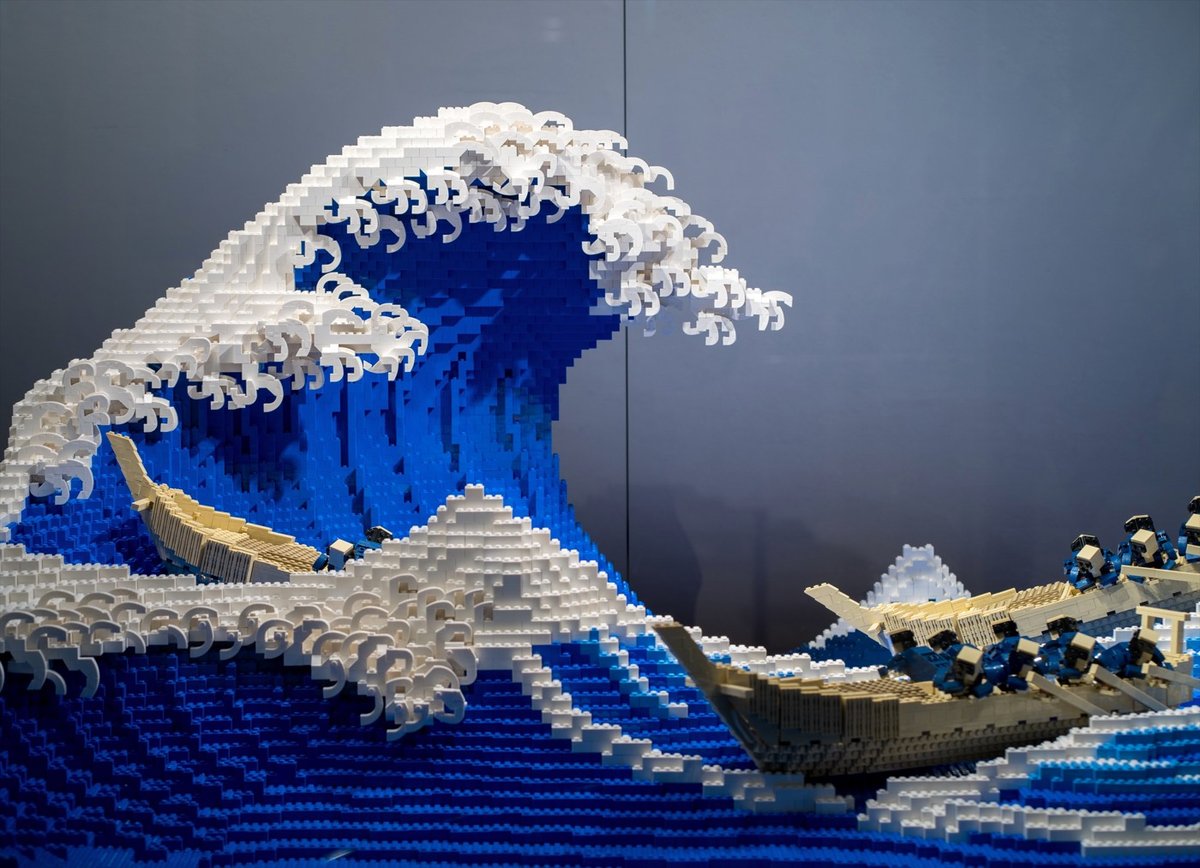
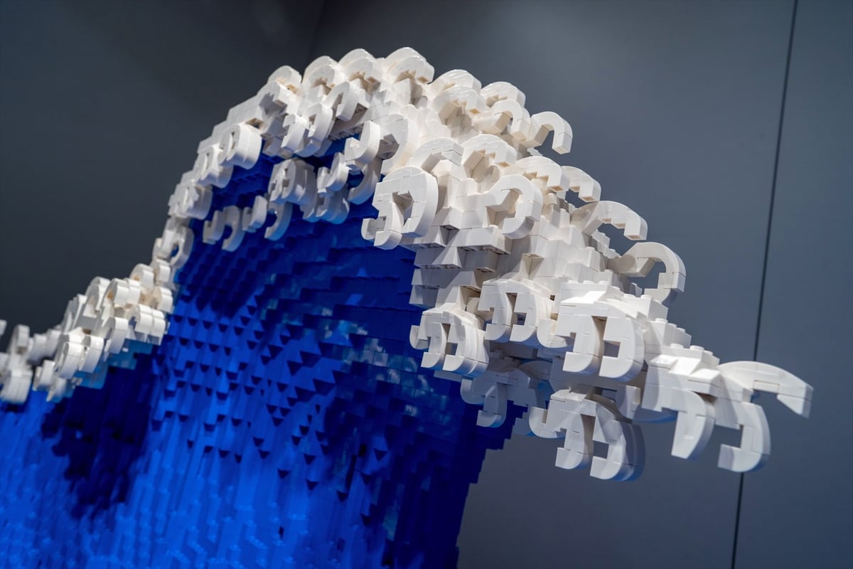
Jumpei Mitsui, the youngest-ever Lego Certified Professional, has created a Lego version of Hokusai’s iconic woodblock print, The Great Wave off Kanagawa. The Great Wave is perhaps the most recognizable (and most covered) Japanese artwork in the world. Mitsui’s Lego rendering is composed of 50,000 pieces and took 400 hours to build. From Spoon & Tamago:
In ensuring that his 3D lego replica not only payed homage to the original but also captured the dynamics of crashing waves, Mitsui says he read several academic papers on giant wave formations, as well as spent hours on YouTube watching video of waves.
You can check out the Lego Great Wave in person at the Hankyu Brick Museum in Osaka.
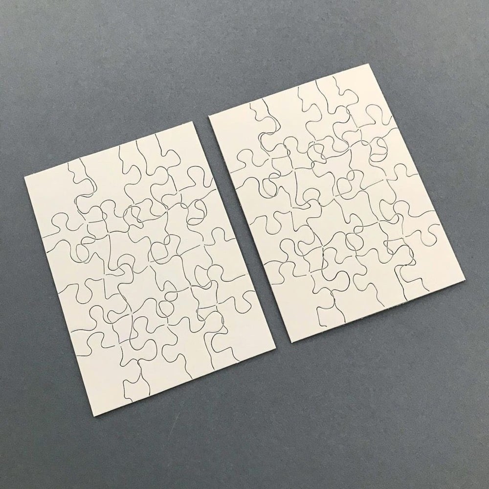
Two Puzzles by Micah Lexier consists of a pair of jigsaw puzzles, each with the die-cut pattern of the other puzzle printed on it. From Lexier’s Instagram:
They look like two of the exact same puzzles, but are in fact different. One is the image of the nine-piece puzzle foil-stamped on to the 16-piece die-cut puzzle and the other is the image of the 16-piece puzzle foil-stamped on to the nine piece die-cut puzzle.
The puzzles are for sale in a limited edition of 100 at Paul + Wendy Projects. (via @kellianderson)
Update: See also Jigsaw Jigsaw, the puzzle for fans of the Droste effect. (via @christopherjobs)
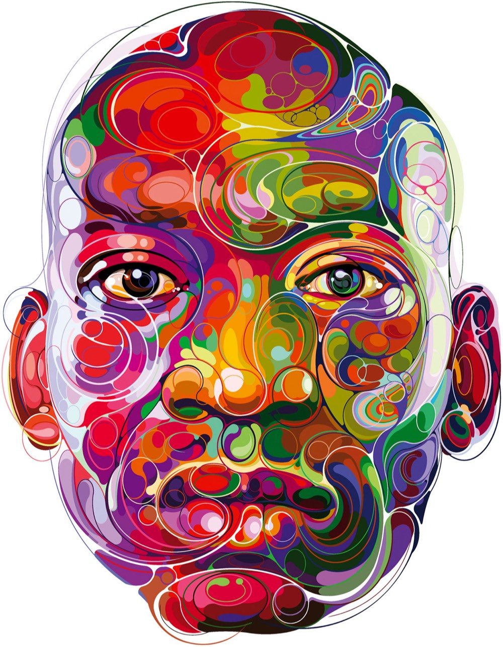

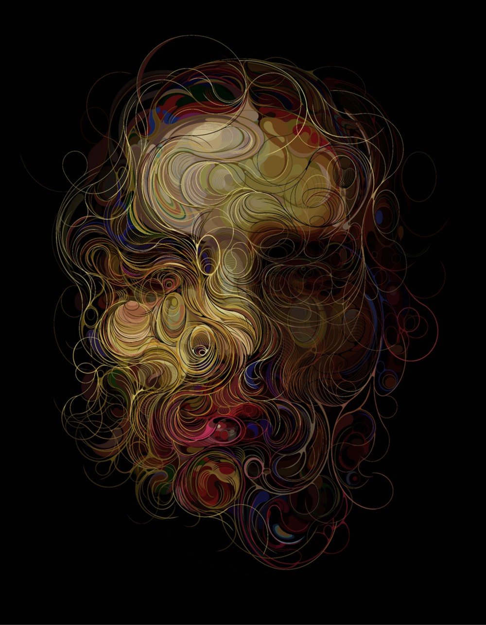
The vibrance and swirl of Martin Satí’s artwork reminds me, variously, of Milton Glaser’s portrait of Bob Dylan, the intricate calligraphy of Arabic art, and marbled paper. The artist shared a bit about his process with Colossal.
Satí shares that his practice, while digital, similarly molds facial features as a sculptor would. Despite using impalpable tools, he says that his “material is like semi-liquid and is difficult to model but at the same time is very rich in movement and liveliness… I work with this material, which I usually call ‘Silicone Pie,’ as an artisan works with ceramics. I am modeling the colors with lines of movement until I achieve an optimal level of detail.”
Mmmm, Silicone Pie. (via colossal)
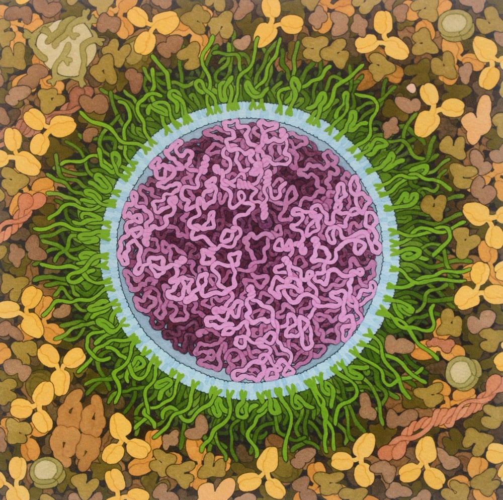
Artist and biologist David Goodsell has done a painting of the Covid-19 mRNA vaccine.
The vaccine structure is highly idealized, with spike mRNA in magenta, lipids in blue, and PEG-lipid in green. The background is blood serum or lymph.
Both the Pfizer/BioNTech and the Moderna Covid-19 vaccines are based on mRNA — you can brush up on how they work at Stat or the CDC.
mRNA vaccines are a new type of vaccine to protect against infectious diseases. To trigger an immune response, many vaccines put a weakened or inactivated germ into our bodies. Not mRNA vaccines. Instead, they teach our cells how to make a protein — or even just a piece of a protein — that triggers an immune response inside our bodies. That immune response, which produces antibodies, is what protects us from getting infected if the real virus enters our bodies.
See also Goodsell’s painting of a SARS coronavirus from back in February.
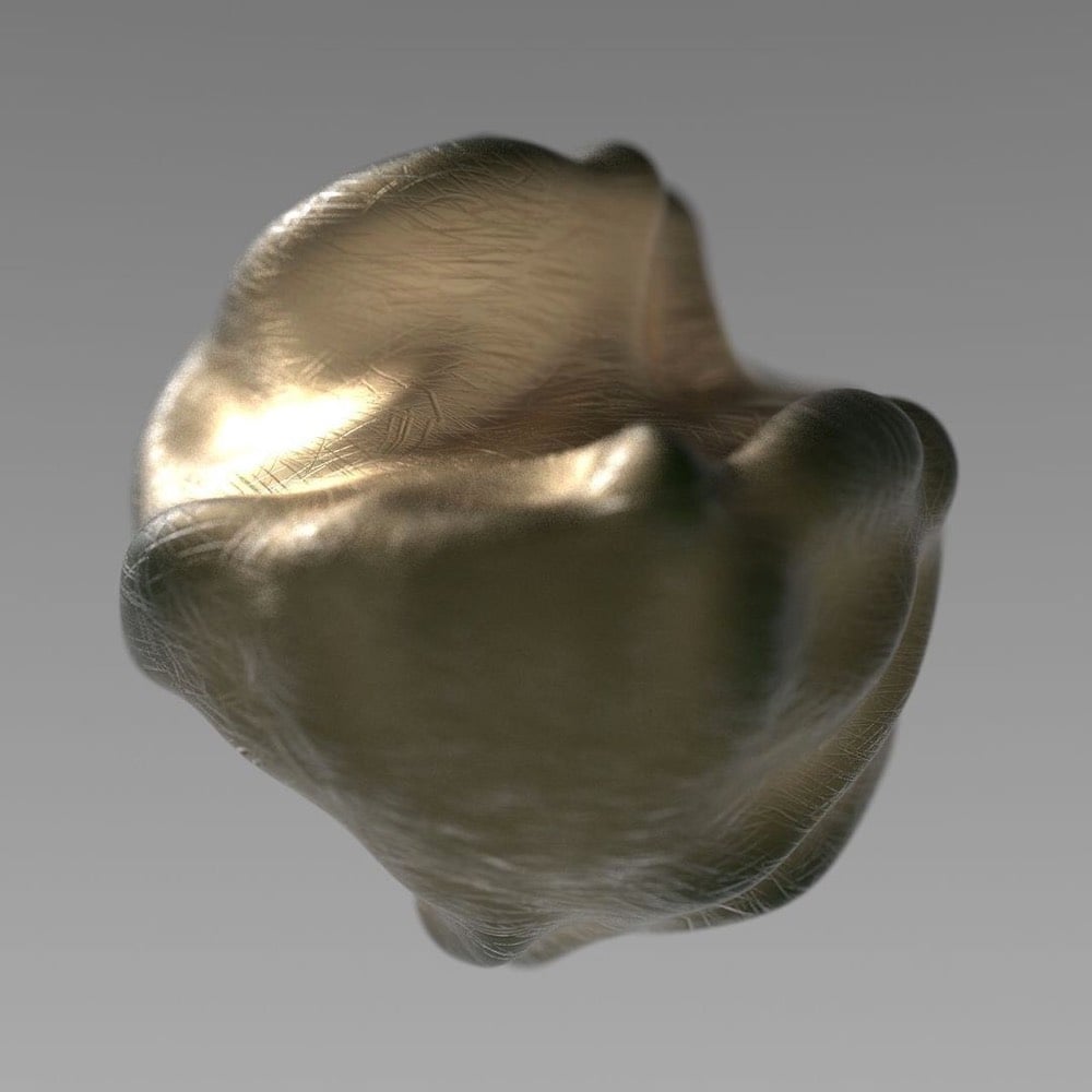
Even though we’re still in the midst of it, The Atlantic commissioned three designers/artists to design hypothetical Covid-19 memorials. Ian Bogost writes:
So this might seem like a strange time to imagine memorializing the pandemic in a formal way. A premature time. Maya Lin’s Vietnam Veterans Memorial was conceived in 1981, six years after the United States had withdrawn from the conflict. Michael Arad and Peter Walker’s 9/11 memorial broke ground at the site of the World Trade Center in 2006, almost five years after the attacks.
But there are downsides to waiting. A traumatic event is an author of its own memorial; as a famous anecdote attests, when a Nazi soldier asked Pablo Picasso if he had made Guernica, the famous painting the artist created during the month following the Luftwaffe’s bombing of its Basque namesake in 1937, Picasso replied, “No, you did.” The feelings, facts, and ideas available during a calamity dissipate as it ebbs. The temptation arises to contain tragedy in a tidy box, closing the book on its history.
Each of the three ideas is intriguing in its own way. I liked how Ronald Rael and Virginia San Fratello (who made those border wall teeter-totters last year) explained their thought process (which Rael elaborated on here).
Quarantine has limited our ability to use smell and touch for communion, so she and Rael became interested in finding a way to replicate the experience. That’s where pennies come in: Copper is an antiviral — a quality with obvious symbolism in the moment — and one that evolves over time, developing a patina as it interacts with water and air. So the pair latched on to it as a material.
Rael San Fratello’s first idea was a pragmatic one: a traditional memorial made of copper molded into a bulbous, organic wall. The copper material would invite the touch lost to quarantine. Outdoors, it could develop a green or purple patina. “If touched constantly,” San Fratello said, “the patina might never occur, and the memorial will remain shiny.”
See also the design for a pandemic memorial already in the planning stages in Uruguay.
In the Scottish village of Newburgh, the Christmas lights hung up around town were designed from drawings done by local schoolchildren. Poppy McKenzie Smith shared some of the displays on Twitter.

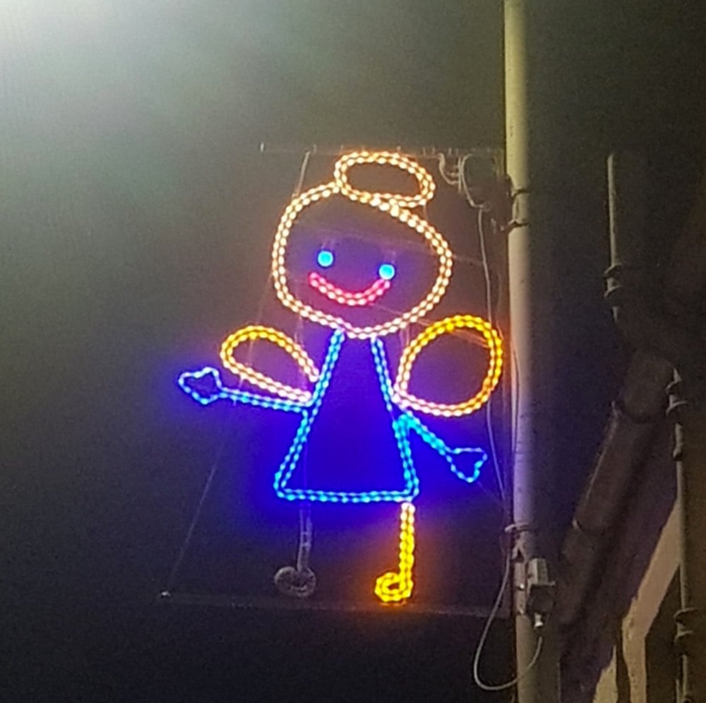
This is the best, way better than any professional display. The kids must feel so great seeing their handiwork lit up around town like this.
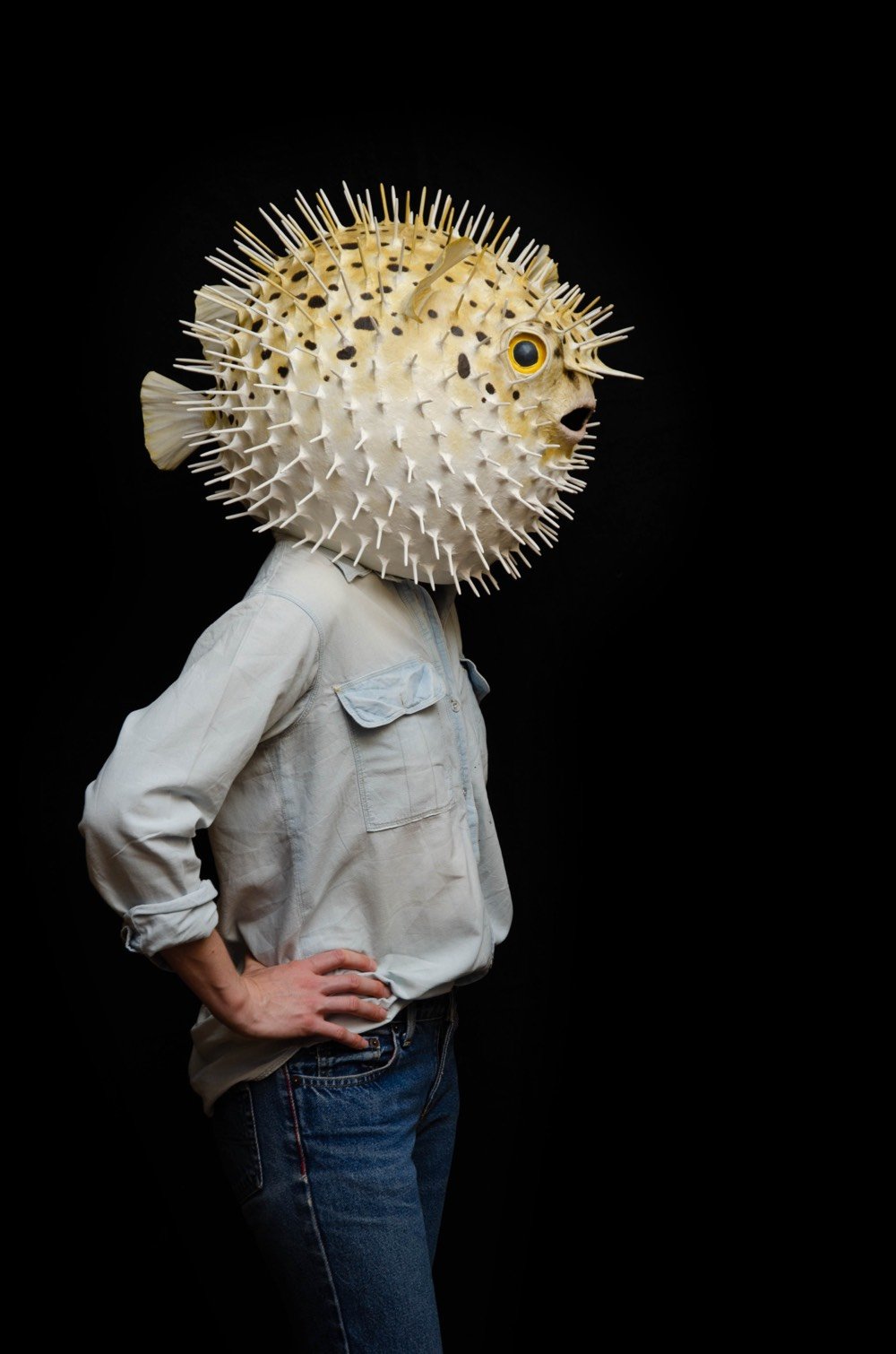
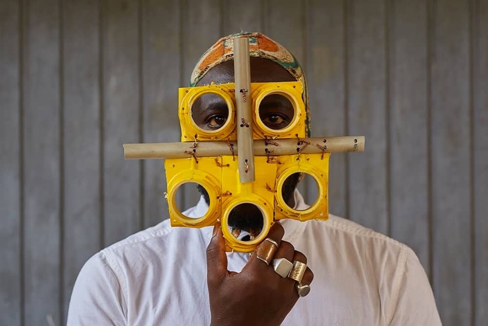
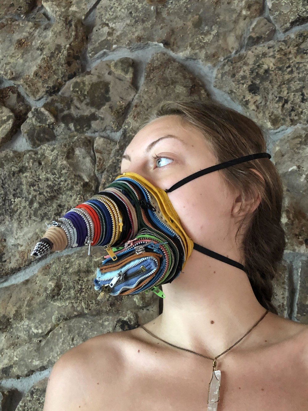
Denver’s Vicki Myhren Gallery is hosting a virtual exhibition called MASK that showcases participating artists’ takes on the now-ubiquitous Covid-19 face masks.
Through this project, we hope to call attention to the significance and signification of masking as an issue of public health and a demonstration of civic responsibility. Equally, MASK calls attention to this newly important medium’s function as an outward mode of self-expression and opportunity for creativity.
(via colossal)
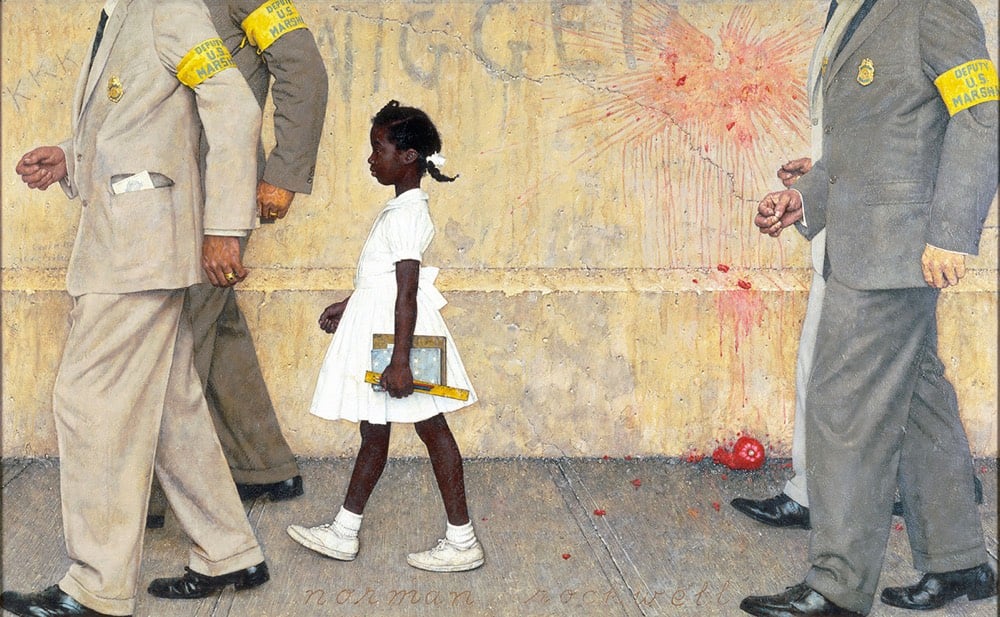
In 1960, six-year-old Ruby Bridges became the first Black student at the newly desegregated William Frantz Elementary School in New Orleans. Escorted to her first day of school by federal marshals, she was immortalized by Normal Rockwell in a 1964 painting called The Problem We All Live With. Bridges has a new book out today called This Is Your Time.
Written as a letter from civil rights activist and icon Ruby Bridges to the reader, This Is Your Time is both a recounting of Ruby’s experience as a child who had no choice but to be escorted to class by federal marshals when she was chosen as one of the first black students to integrate New Orleans’ all-white public school system and an appeal to generations to come to effect change.
In a segment on NPR’s Weekend Edition, Bridges shared some of her story from the book.
The first day that I arrived with federal marshals, they rushed me inside of the building. And 500 kids walked out of school that first day and they never returned.
[Making friends] did not come easy because I heard kids, there were days when I would go into this coat closet to hang up my coat and I could hear kids laughing and talking, but I never saw them. Later on, I came to realize that they were being hidden from me in another classroom.
And that was because there were some white parents who actually crossed that picket line and brought their kids to school. But the principal who was part of the opposition, she would hide them. And even though I was complaining — or at least mentioning it to Mrs. Henry, she would never say anything to me, but she was actually going to the principal and saying, if you don’t allow those kids to come together, because the law has now changed, then I’m going to report you to the superintendent. And so I think after months of that, we were allowed to come together.
Bridges is only 66 years old today — this was all not so long ago.
Update: Sad news: Ruby’s mother, Lucille Bridges, died yesterday at the age of 86.
Her daughter went on to become an icon of the Civil Rights Movement, memorialized in Norman Rockwell’s famous painting “The Problem We All Live With” which depicts a tiny Ruby in a white dress carrying her notebooks and a ruler surrounded by much taller U.S. Marshals. But Ruby Bridges once credited her parents as the forces behind her history-making achievement.
“My parents are the real heroes,” the U.S. Marshals Service once quoted her as saying during a ceremony at an art gallery showing the painting. “They (sent me to that public school) because they felt it was the right thing to do.”
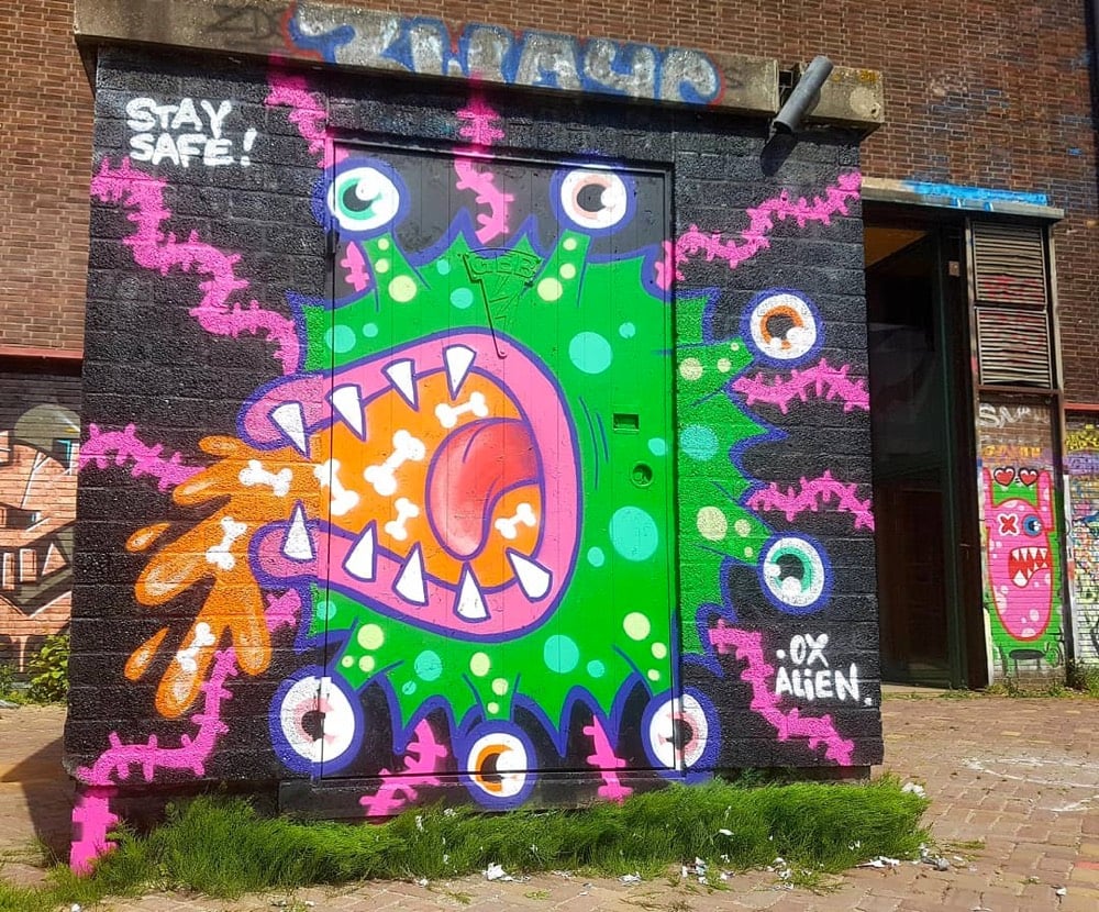
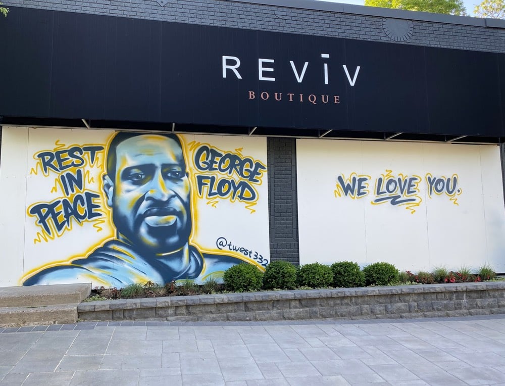
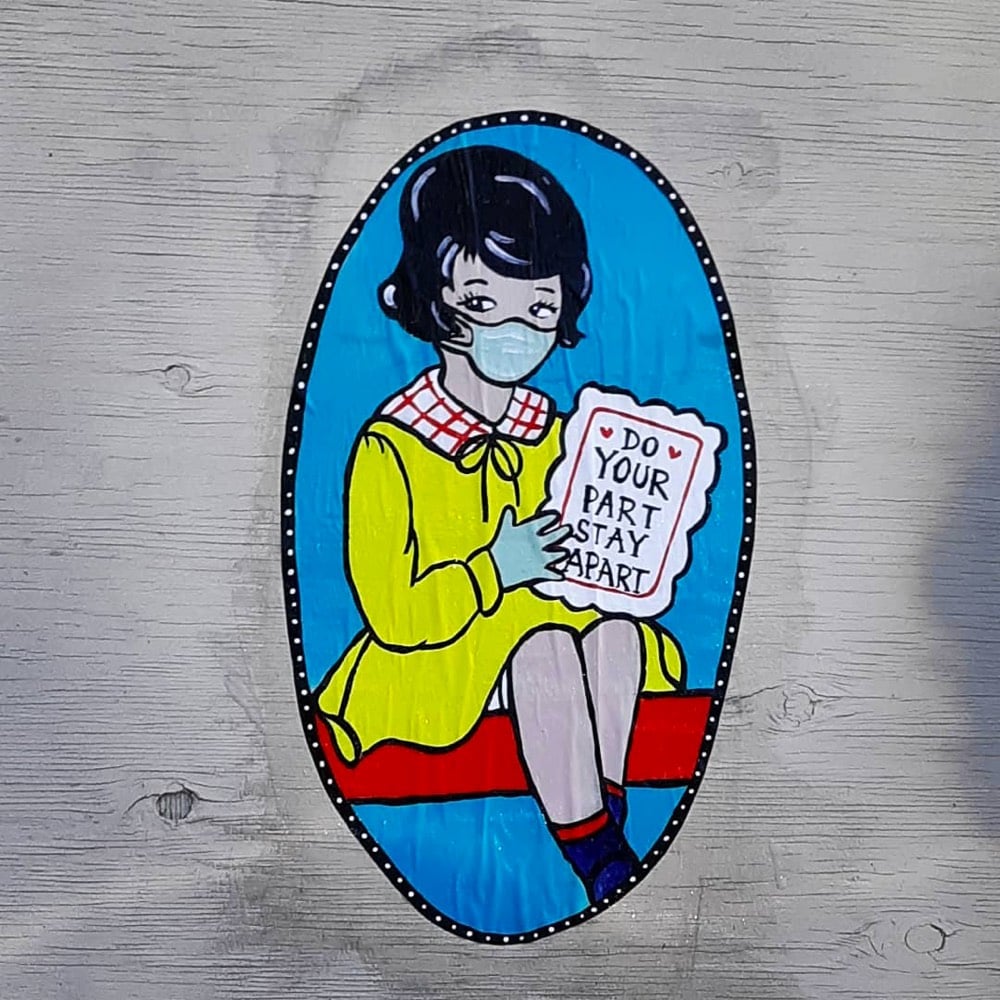
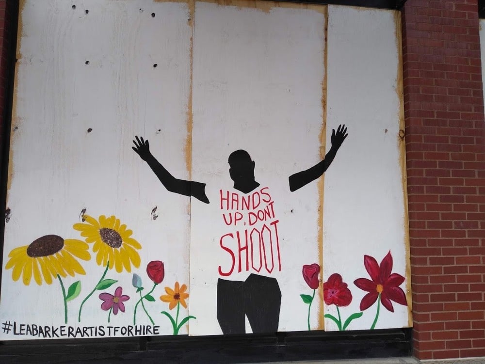
The Urban Art Mapping Research Project has been collecting photos of street art created over the past several months related to the Covid-19 pandemic and the anti-racist protests.
Artists and writers producing work in the streets — including tags, graffiti, murals, stickers, and other installations on walls, pavement, and signs — are in a unique position to respond quickly and effectively in a moment of crisis. Street art’s ephemeral nature serves to reveal very immediate and sometimes fleeting responses, often in a manner that can be raw and direct. At the same time, in the context of a crisis, street art also has the potential to transform urban space and foster a sustained political dialogue, reaching a wide audience, particularly when museums and galleries are shuttered.
(via open culture)
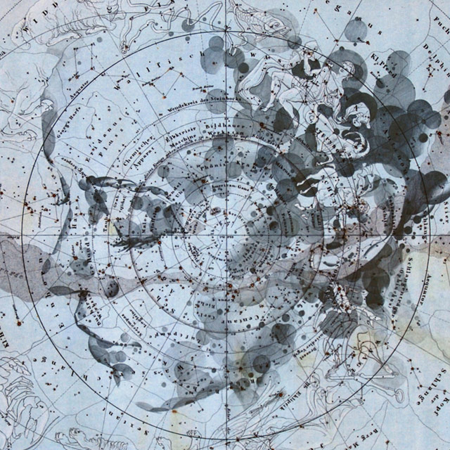
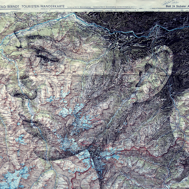
Artist Ed Fairburn draws portraits of people and objects on top of maps and, well, it is just my exact cup of tea. His newest stuff is available on Instagram. I’ve featured his work twice before and it won’t be the last. (via colossal)
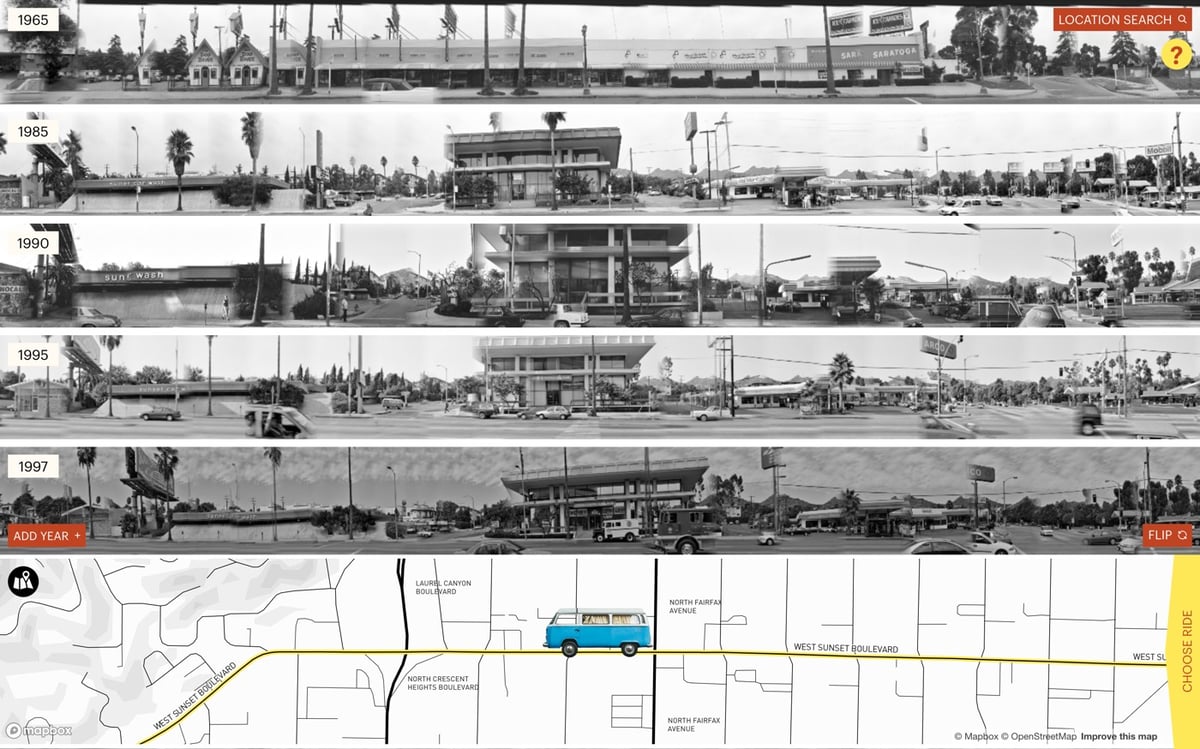
Since 1965, American artist Ed Ruscha has been taking photos all along the length of Sunset Boulevard in LA. The Getty has made those photos available on the Getty Research Institute website and Stamen Design built this fantastic interface called 12 Sunsets for virtually cruising up and down the street.
This is so much fun to play with! You can use the mouse or arrow keys to drive, the spacebar to flip to the other side of the street, and you can change or add years to the display. It’s really interesting to add a bunch of different years to the display and then motor up and down the street to see what’s changed over the decades. It’s the perfect interface for this art.
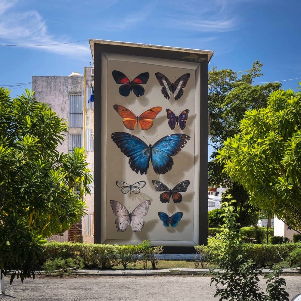
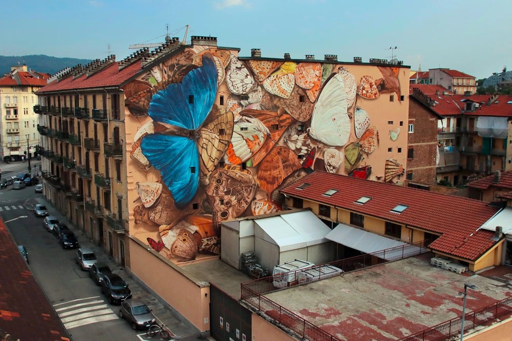
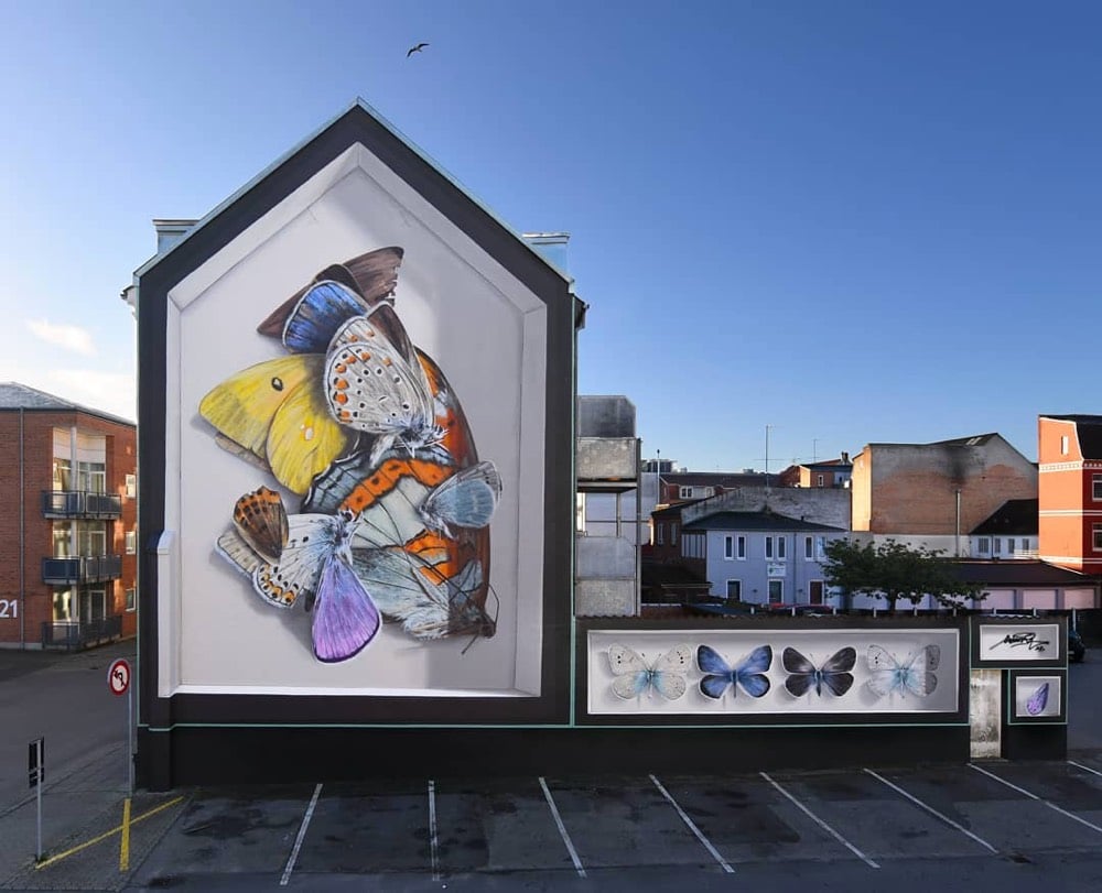
I love these building-sized murals featuring butterflies by French street artist Mantra (Instagram). From a Colossal post about the artist:
In a conversation with Colossal, Mantra said he’s harbored a lifelong fascination with entomology that stems from spending hours in French gardens and bucolic areas as a kid. “As a child, I was interested, curious, and focused on the small life forms in those places,” he says. His current practice hearkens back to those carefree hours and connects with an adolescent desire to become a naturalist. “My approach is as a scientist,” the artist says, noting that education about environmental care and issues is part of the goal.
Although Mantra considers all insects and natural life beautiful and crucial to maintaining biodiversity, the focus on butterflies revolves around his artistic ambitions because the vivid creatures allow him to experiment with color, shape, and texture. Each specimen is rendered freehand before the artist adds detail and the illusory shadows that make them appear three-dimensional. By painting various Lepidoptera species again and again, the artist is “repeating a mantra,” a detail of his practice that informs the moniker he works under.

Some combination of vintage tech, nature, the ambiguous scale, fog, and color palette in this digital image by Eric Mack is really tickling my brain in all the right ways today. (via @FedeItaliano76)
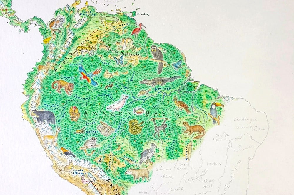
You may remember Anton Thomas from the huge hand-drawn map of North America that took him about 5 years to finish. His next effort, already well underway, is Wild World, a geographic map of the Earth.
Commenced in mid-2020, this is a brand new map of the world. Rather than the endless skylines and cultural features of North America: Portrait of a Continent, I wanted the wild character of Earth to shine.
While you won’t find cities or borders on this map, you will find geographic labels. This is important. From mountain ranges to deserts, rivers to rainforests, the labels here offer a detailed, accurate outline of Earth’s natural geography.
He’s aiming to complete the map by mid-2021.
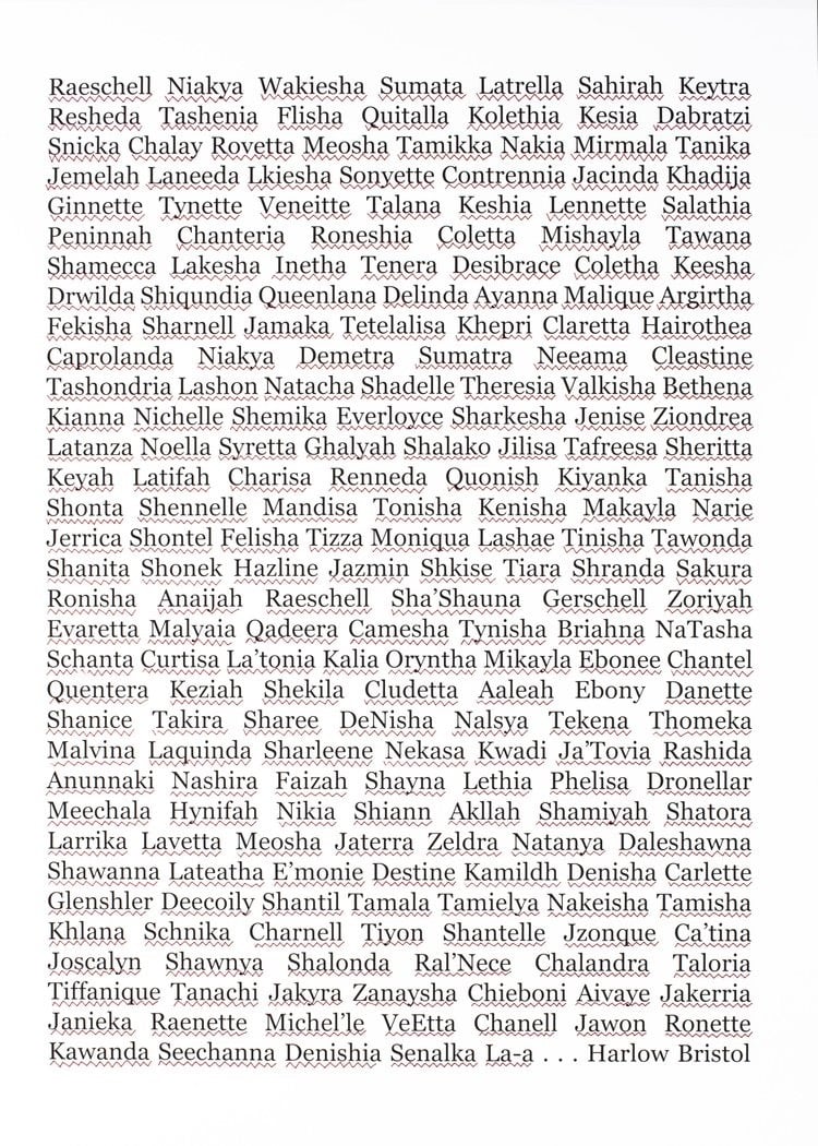
The piece above is part of a series called Pluralism by artist Deborah Roberts — it’s a collage of dozens of Black names marked as misspelled by Microsoft Word’s built-in spell checker. I don’t know about you, but this makes me think about the neutrality of technology, how software is built, who builds it, and for whom it is designed.
I found this via Seeing Black Futures by Jenna Wortham and Kimberly Drew, which is adapted from their forthcoming book, Black Futures. You can check out more of Roberts’ work on her website or on Instagram.
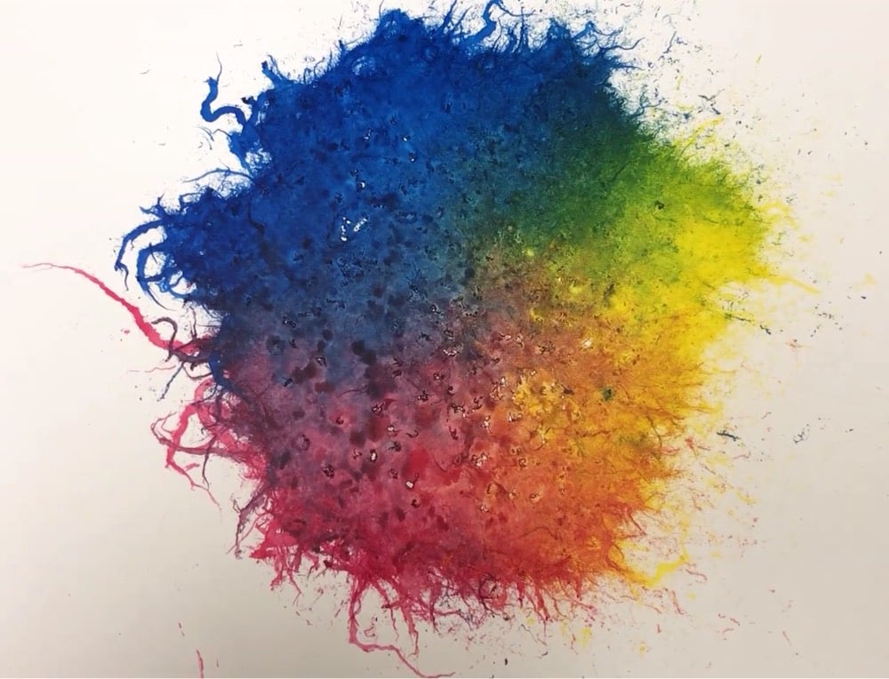
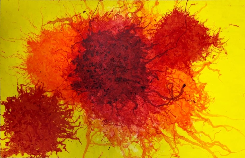
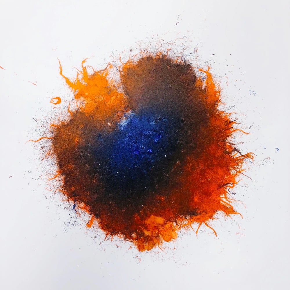
Ants use pheromone trails to signal to other ants to follow them to food or other desirable destinations. Inspired by this, entomology graduate student Horace Zeng dropped some of the fire ants he uses in his research into some paint pooled on canvases and watched them disperse, leaving behind these colorful patterns. Here’s a video of the ants doing their thing:
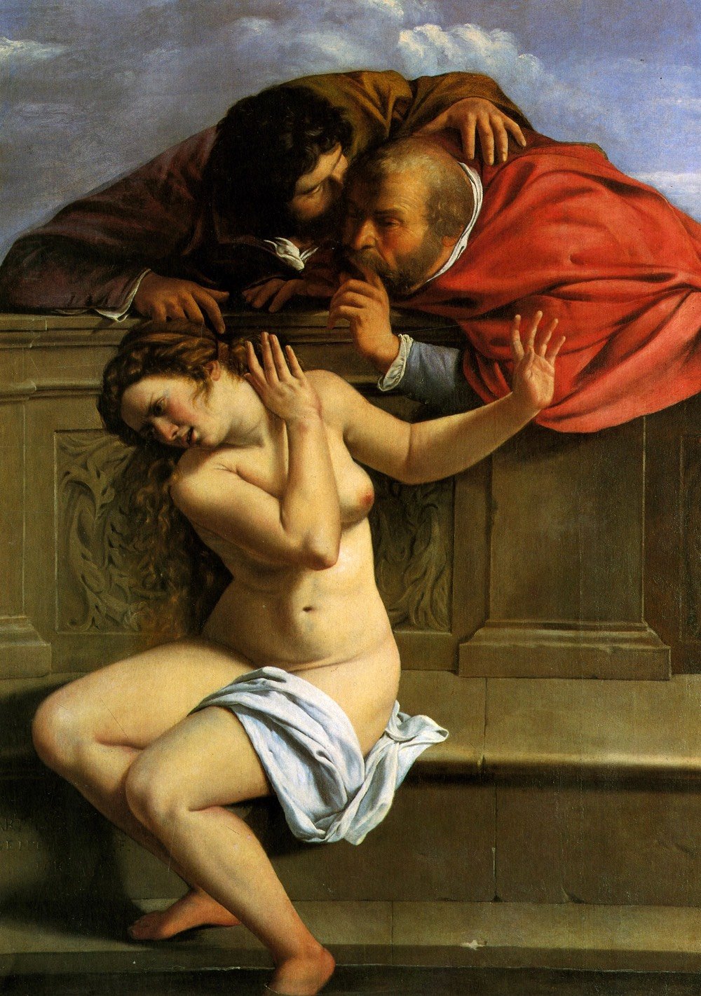
For the New Yorker, Rebecca Mead writes about the 17th-century Italian painter Artemisia Gentileschi, whose work has been growing in stature and popularity in recent years.
Increasingly, Artemisia is celebrated less for her handling of private trauma than for her adept management of her public persona. Throughout her career, she demonstrated a sophisticated comprehension of the way her unusual status as a woman added to the value of her paintings. On a formal level, her representation of herself in the guise of different characters and genders prefigures such postmodern artists as Cindy Sherman. Unlike Sherman, however, Artemisia had few female peers. She was not the only woman working as an artist during the early seventeenth century: a slightly older contemporary was the northern-Italian portraitist Fede Galizia, born in 1578, whose father, like Artemisia’s, was also a painter. But Artemisia must often have felt singular. In a series of letters written to one of her most important patrons, the collector Antonio Ruffo, she wittily referred to her gender: “A woman’s name raises doubts until her work is seen,” and, regarding a work in progress, “I will show Your Illustrious Lordship what a woman can do.” In 2001, the scholar Elizabeth Cropper wrote, “We will never understand Artemisia Gentileschi as a painter if we cannot accept that she was not supposed to be a painter at all, and that her own sense of herself — not to mention others’ views of her — as an independent woman, as a marvel, a stupor mundi, as worthy of immortal fame and historical celebration, was entirely justified.” On art-adjacent blogs, Artemisia’s strength and occasionally obnoxious self-assurance are held forth as her most essential qualities. She has become, as the Internet term of approval has it, a badass bitch.
An exhibition of Gentileschi’s work is set to open early next month at the National Gallery in London and is getting rave reviews. Man, I’d love to go see this in person!
BTW, when reading Mead’s piece, I kept stopping to search for the art she referenced and I recommend you do the same. It’s a) frustrating that the New Yorker doesn’t use hyperlinks for this purpose in the online version and b) still wondrous after all these years that this fantastic art is available to view online with a few quick clicks and keystrokes. Imagine reading a piece like this in 1989 and wanting to look at the art - it would take a trip to the library and then probably hours of searching.
Oh hell, I’ll just do this quick…here’s every painting referenced in Mead’s piece:
- “Susanna and the Elders”, Tintoretto: “…he portrayed Susanna as serene and abstracted, towelling a raised foot and regarding herself in a mirror, unaware of a bald man who is concealed behind a rose trellis and peering between her parted thighs.”
- “Susanna and the Elders”, Peter Paul Rubens: “…Susanna is shown reaching for a shawl, realizing with horror that she has been exposed to two leering men.”
- “Susannah and the Elders”, Ludovico Carracci: “Sometimes the violence threatened against Susanna is indicated in the tableau…”
- “Susanna and the Elders” (1610), Artemisia Gentileschi (pictured above): “Her head and her body torque away from the onlookers as she raises a hand toward them, in what looks like ineffectual self-defense.”
- “Self-Portrait as St. Catherine of Alexandria”, Artemisia Gentileschi: “…the subject gazes at the viewer, her brow dimpled in concentration, while wearing a gauzy turban and other finery.”
- “Judith and Her Maidservant with the Head of Holofernes”, Artemisia Gentileschi: “…offers a masterly execution of the technique, with its subjects illuminated, mid-action, by raking lamplight.”
- “Judith Beheading Holofernes”, Artemisia Gentileschi: “It shows the Biblical heroine with her sleeves rolled up over muscular arms, her mouth set, deftly butchering the Assyrian general.”
- “Crucifixion of Saint Peter”, Caravaggio: “…the elderly martyr is being raised, upside down, on a cross…”
- “The Conversion on the Way to Damascus”, Caravaggio: “…a young, muscled St. Paul is sprawled on the ground after receiving a heavenly vision.”
- “Young Woman with a Violin (Saint Cecilia)”, Orazio Gentileschi: “…shows a musician with a cleft chin, a rounded cheek, and an alert expression.”
- “David and Goliath”, Artemisia Gentileschi: “…a painting that shows David sitting triumphantly next to Goliath’s severed head…”
- “Cleopatra”, Artemisia Gentileschi: “…the ‘uncompromising sensuality’ of the recumbent nude…”
- “Danaë”, Artemisia Gentileschi: “Creases around the figure’s armpits and swells in the stomach reveal an awareness of the way a woman’s flesh settles and subsides.”
- “Danaë and the Shower of Gold”, Orazio Gentileschi: “…features bed linens so realistic that the viewer feels she could climb between them, but the princess’s breasts defy gravity with an almost comical perkiness.”
- “Self-Portrait as a Lute Player”, Artemisia Gentileschi: “…the delicacy and articulation of the hands, shown mid-strum on the instrument.”
- “Allegory of Inclination”, Artemisia Gentileschi: “…a female nude sitting on a tuft of cloud.”
- “Judith Slaying Holofernes”, Artemisia Gentileschi: “…a maidservant, Abra, forcefully holds Holofernes down while Judith confidently hacks away at his neck.”
- “Judith Beheading Holofernes”, Caravaggio: “She hardly seems to have the oomph required for decapitation.”
- “The Birth of Saint John the Baptist”, Artemisia Gentileschi: “…Artemisia’s version underlines her intimacy with the dynamics of the birthing room.”
- “Madonna and Child”, Artemisia Gentileschi: “Mary swoons, eyes closed, as the infant Jesus reaches for her cheek, his eyes locked on her face with palpably needy attachment.”
- “Susanna and the Elders” (1652), Artemisia Gentileschi: “…this Susanna draws the elders’ attention away from her body not by blocking their gaze but by meeting it with her own — staring at them just as they stare at her, and obliging them to acknowledge her as a human being.”
- “Mary Magdalene in Ecstasy”, Artemisia Gentileschi: “…her slight smile seems labile, indicating that Artemisia understood a woman’s sensuality from the inside out.”
- “Self-Portrait as the Allegory of Painting”, Artemisia Gentileschi: “Rather than looking out of the frame, as is typical with self-portraits, the figure is looking at a prepared canvas, with a raised brush in one hand and a palette in the other.”
Viewing, comparing, and contrasting these paintings is a great little tour through one brief moment in the long history of art. Have fun!
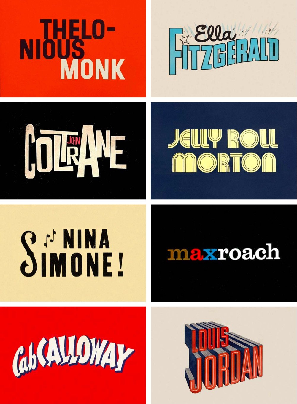
Reagan Ray (previously) surveyed 100s of iconic covers of jazz albums (Blue Note, anyone?) and isolated the lettering of the artists’ names. I love these sorts of compilations — this is like a mini-tour through the history of graphic design in the 20th century.
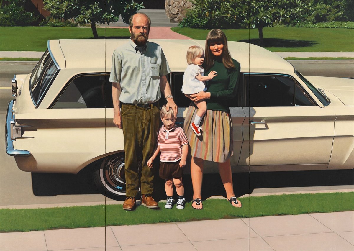
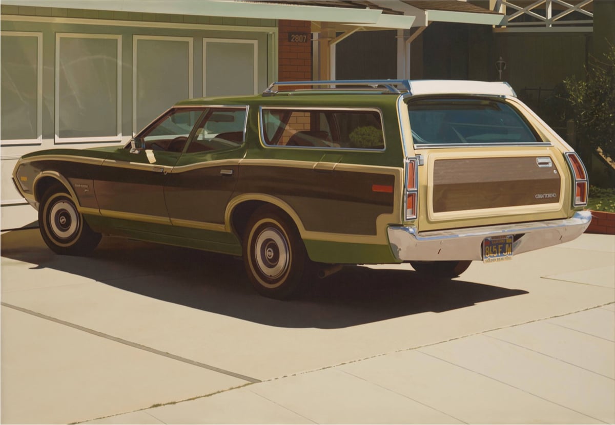
Speaking of realism, while researching this post on Arinze Stanley, I noticed that American realist painter Robert Bechtle died yesterday. I can’t exactly remember which of the paintings shown above (‘61 Pontiac at the Whitney, Alameda Gran Torino, 1974 at SFMoMA) I saw in person first, but I do remember being instantly drawn to his work. The level of detail combined with objects of such mundanity sent my mind spinning off into all kinds of interesting realms.
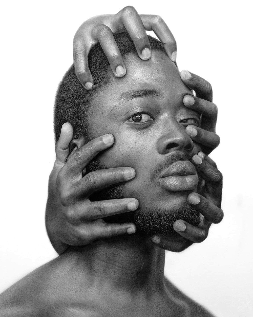
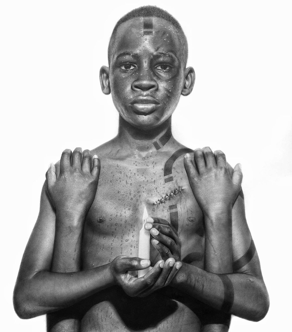
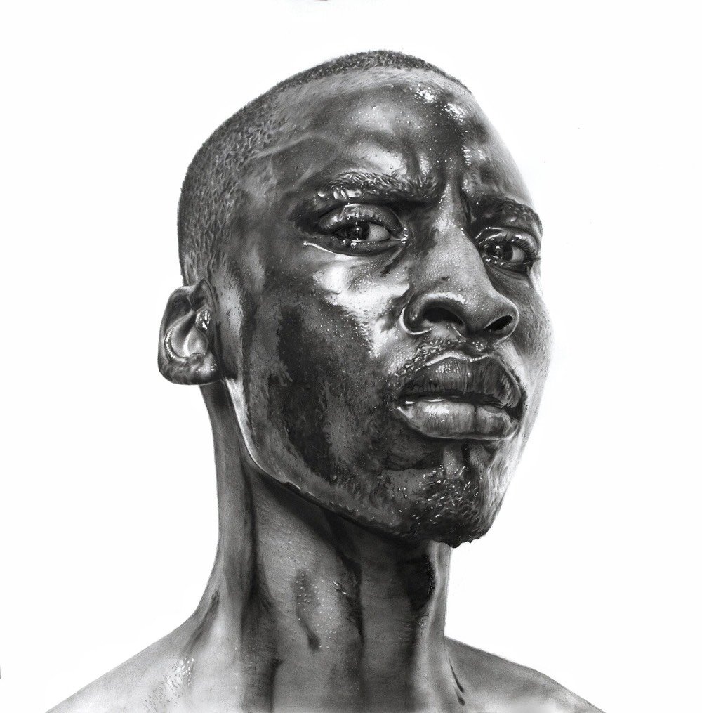
Nigerian artist Arinze Stanley uses hyperrealistic techniques to draw surreal portraits in stunning detail. From his artist statement:
I draw inspiration from life experiences and basically everything that sparks a feeling of necessity, I find myself spending countless hours working on an artwork to stimulate deep and strong emotions in order to connect more intimately with my viewers
Most times it’s almost like I lose control of my pencils and the art flows through me to the paper.
I work with my Principle of the Three P’s namely Patience, Practice and Persistence. These have guided me over the years towards perfecting my craft.”
Great Big Story did a feature on Stanley and his work last year that’s worth watching:
(via colossal)
Mary Magdalene in Ecstasy is a painting made in the 1620s by Artemisia Gentileschi. The painting was presumed lost until it was rediscovered in a private collection in France and sold at auction for more than $1 million in 2014.
As part of season 2 of Google Arts & Culture’s Art Zoom project (previously), British singer/songwriter FKA twigs gives her personal interpretation of the painting in the video above.
Scholars assumed it was painted in the 1620s, when Artemisia Gentileschi left Florence and moved back to Rome. She had separated from her husband and become an independent woman, the head of her own household, a rarity at that time.
When making my own album, entitled “Magdalene,” it was a time of great healing for me. When I was researching about Mary Magdalene and I was looking at a lot of paintings of her, she seemed so poised and so together. But the irony is in finishing my music, I found a deep wildness, a looseness, an acceptance, a release. And that’s exactly what I’m experiencing in this painting.
I found this incredibly soothing to watch and listen to…almost ASMR-like. And as usual, you can zoom around the painting yourself; this is not even halfway zoomed in…at full zoom you can see individual brushstrokes and cracks in the painting.
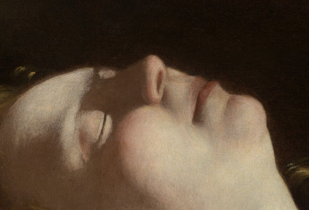
Update: FKA twigs gives tours of two additional Gentileschi paintings: Self-Portrait as Saint Catherine of Alexandria and Judith Beheading Holofernes.
(via @norabz)
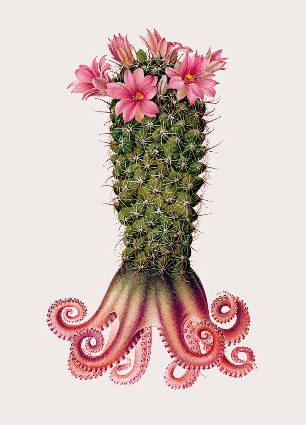

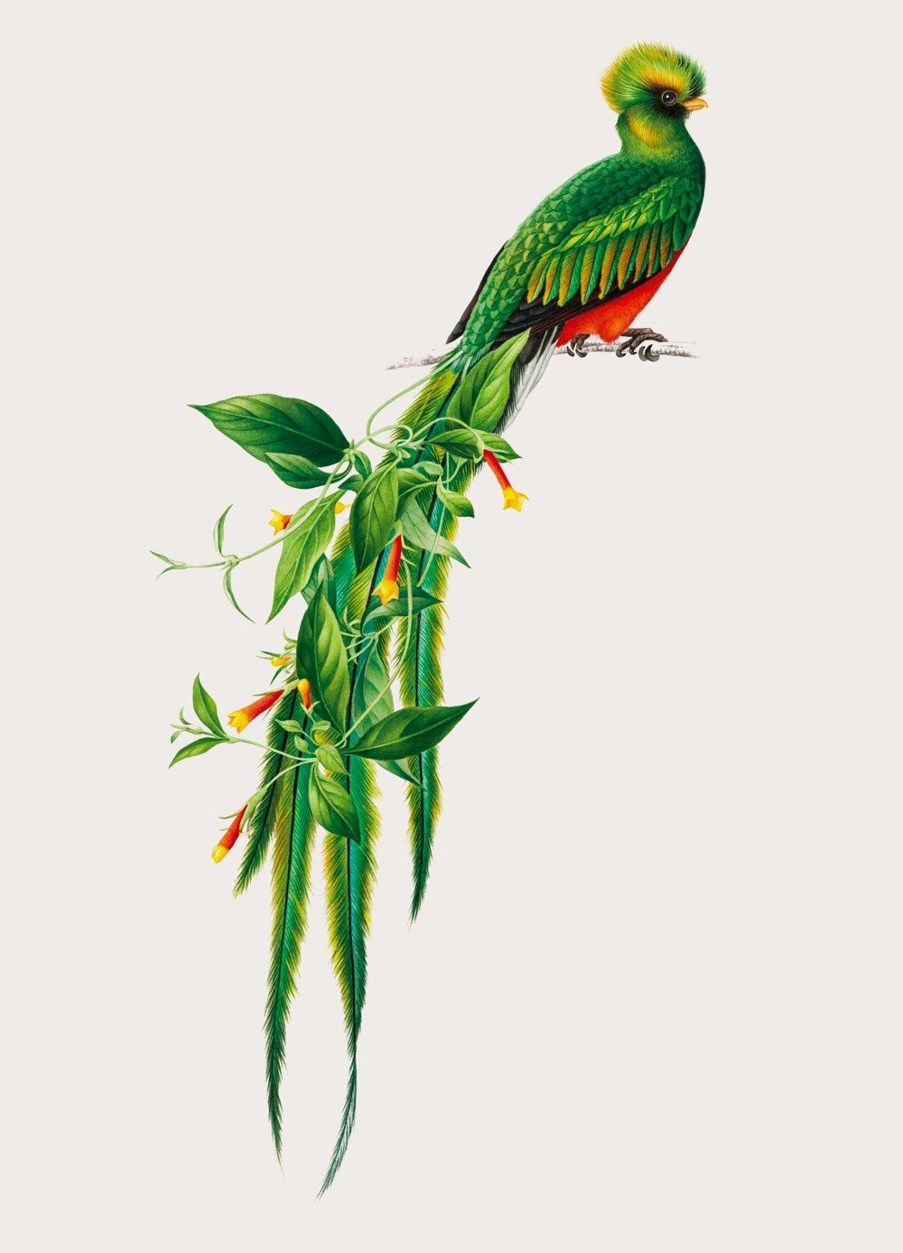
Study of the Creative Specimens is a collection of fantastical hybrid creatures created for Adobe’s 99U conference by Mark Brooks and illustration studio alademosca. Prints are available from Paper Chase Press. (via colossal)
Newer posts
Older posts




Socials & More