kottke.org posts about science
Thousands of scientific research papers on Covid-19 and SARS-CoV-2 are being published each week and with them comes a clearer picture of the virus and the disease it causes. There’s still a lot we don’t know, but this piece from Science magazine is the best synthesis of the emerging science that I have read. It details a virus that “acts like no microbe humanity has ever seen” and affects not only the lungs but also the kidneys, heart, brain, and the intestines.
As the number of confirmed cases of COVID-19 surges past 2.2 million globally and deaths surpass 150,000, clinicians and pathologists are struggling to understand the damage wrought by the coronavirus as it tears through the body. They are realizing that although the lungs are ground zero, its reach can extend to many organs including the heart and blood vessels, kidneys, gut, and brain.
“[The disease] can attack almost anything in the body with devastating consequences,” says cardiologist Harlan Krumholz of Yale University and Yale-New Haven Hospital, who is leading multiple efforts to gather clinical data on COVID-19. “Its ferocity is breathtaking and humbling.”
Understanding the rampage could help the doctors on the front lines treat the fraction of infected people who become desperately and sometimes mysteriously ill. Does a dangerous, newly observed tendency to blood clotting transform some mild cases into life-threatening emergencies? Is an overzealous immune response behind the worst cases, suggesting treatment with immune-suppressing drugs could help? What explains the startlingly low blood oxygen that some physicians are reporting in patients who nonetheless are not gasping for breath? “Taking a systems approach may be beneficial as we start thinking about therapies,” says Nilam Mangalmurti, a pulmonary intensivist at the Hospital of the University of Pennsylvania (HUP).
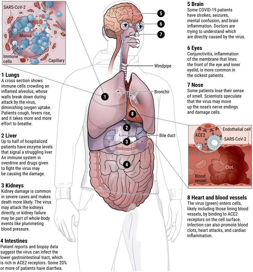
I’ve been hearing that although Covid-19’s attack begins in the lungs, it is as much a vascular disease as it is a respiratory disease — and there is some evidence emerging to support this view:
If COVID-19 targets blood vessels, that could also help explain why patients with pre-existing damage to those vessels, for example from diabetes and high blood pressure, face higher risk of serious disease. Recent Centers for Disease Control and Prevention (CDC) data on hospitalized patients in 14 U.S. states found that about one-third had chronic lung disease-but nearly as many had diabetes, and fully half had pre-existing high blood pressure.
Mangalmurti says she has been “shocked by the fact that we don’t have a huge number of asthmatics” or patients with other respiratory diseases in HUP’s ICU. “It’s very striking to us that risk factors seem to be vascular: diabetes, obesity, age, hypertension.”
What struck me most about this piece is the sheer energy of the vast network of minds bent towards understanding this thing with the hope of beating it as soon as possible. This is the scientific method at work right here, in all its urgent & messy glory.
The Atlantic’s Ed Yong has written his second long article about the Covid-19 pandemic about what happens next and what a roadmap to dealing with the next phase of the crisis might look like.
As I wrote last month, the only viable endgame is to play whack-a-mole with the coronavirus, suppressing it until a vaccine can be produced. With luck, that will take 18 to 24 months. During that time, new outbreaks will probably arise. Much about that period is unclear, but the dozens of experts whom I have interviewed agree that life as most people knew it cannot fully return. “I think people haven’t understood that this isn’t about the next couple of weeks,” said Michael Osterholm, an infectious-disease epidemiologist at the University of Minnesota. “This is about the next two years.”
The pandemic is not a hurricane or a wildfire. It is not comparable to Pearl Harbor or 9/11. Such disasters are confined in time and space. The SARS-CoV-2 virus will linger through the year and across the world. “Everyone wants to know when this will end,” said Devi Sridhar, a public-health expert at the University of Edinburgh. “That’s not the right question. The right question is: How do we continue?”
Nicky Case, working with security & privacy researcher Carmela Troncoso and epidemiologist Marcel Salathé, came up with this fantastic explanation of how we can use apps to automatically do contact tracing for Covid-19 infections while protecting people’s privacy. The second panel succinctly explains why contact tracing (in conjunction with quick, ubiquitous testing) can have such a huge benefit in a case like this:
A problem with COVID-19: You’re contagious ~2 days before you know you’re infected. But it takes ~3 days to become contagious, so if we quarantine folks exposed to you the day you know you were infected… We stop the spread, by staying one step ahead!

It’s based on a proposal called Decentralized Privacy-Preserving Proximity Tracing developed by Troncoso, Salathé, and a host of others. Thanks to Case for putting this comic in the public domain so that anyone can publish it.
Update: About two hours after posting this, Apple and Google announced they are jointly working on contact tracing technology that uses Bluetooth and makes “user privacy and security central to the design”.
A number of leading public health authorities, universities, and NGOs around the world have been doing important work to develop opt-in contact tracing technology. To further this cause, Apple and Google will be launching a comprehensive solution that includes application programming interfaces (APIs) and operating system-level technology to assist in enabling contact tracing. Given the urgent need, the plan is to implement this solution in two steps while maintaining strong protections around user privacy.
Update: Based on information published by Google and Apple on their contact tracing protocols, it appears as though their system works pretty much like the one outlined about in the comic and this proposal.
Also, here is an important reminder that the problem of what to do about Covid-19 is not primarily a technological one and that turning it into one is troublesome.
We think it is necessary and overdue to rethink the way technology gets designed and implemented, because contact tracing apps, if implemented, will be scripting the way we will live our lives and not just for a short period. They will be laying out normative conditions for reality, and will contribute to the decisions of who gets to have freedom of choice and freedom to decide … or not. Contact tracing apps will co-define who gets to live and have a life, and the possibilities for perceiving the world itself.
Update: Security expert Bruce Schneier has some brief thoughts on “anonymous” contact tracing as well as some links to other critiques, including Ross Anderson’s:
But contact tracing in the real world is not quite as many of the academic and industry proposals assume.
First, it isn’t anonymous. Covid-19 is a notifiable disease so a doctor who diagnoses you must inform the public health authorities, and if they have the bandwidth they call you and ask who you’ve been in contact with. They then call your contacts in turn. It’s not about consent or anonymity, so much as being persuasive and having a good bedside manner.
I’m relaxed about doing all this under emergency public-health powers, since this will make it harder for intrusive systems to persist after the pandemic than if they have some privacy theater that can be used to argue that the whizzy new medi-panopticon is legal enough to be kept running.
And I had thoughts similar to Anderson’s about the potential for abuse:
Fifth, although the cryptographers — and now Google and Apple — are discussing more anonymous variants of the Singapore app, that’s not the problem. Anyone who’s worked on abuse will instantly realise that a voluntary app operated by anonymous actors is wide open to trolling. The performance art people will tie a phone to a dog and let it run around the park; the Russians will use the app to run service-denial attacks and spread panic; and little Johnny will self-report symptoms to get the whole school sent home.
The tie-a-phone-to-a-dog thing reminds me a lot of the wagon full of smartphones creating traffic jams. (via @circa1977)
This week, Covid-19 passed heart disease and cancer as the leading cause of death per day in the United States. In this graph made by Dr. Maria Danilychev using data from Worldometer and the CDC, you can see that Covid-19 overtook heart disease sometime on Monday or Tuesday.
If the data in NYC is any indication, the number of nationwide Covid-19 deaths may be undercounted, so this transition probably happened sooner.1 Hopefully through the social distancing and other measures put in place to flatten the curve, the number of daily Covid-19 deaths won’t start beating out all other causes combined before it starts declining.
I do not know if hearing about other people’s quarantine experiences makes going through one yourself any easier, but the story of how NASA sequestered the returning Apollo 11 astronauts away from the rest of the world for 21 days is interesting for other reasons as well. The worry was that some sort of “moon bug” or “lunar plague” was going to make its way from the Moon to the Earth in the spacecraft or the astronauts’ bodies.
From the moment the Apollo 11 astronauts arrive back on earth from their epochal visit to the moon, they will be treated not as heroes but as bearers of the most virulent, devastating plague the world has ever known.
So NASA quarantined Armstrong, Aldrin, and Collins in a series of specially designed suits and environments until August 10, 1969. At one point, the three of them lived in a modified Airstream trailer in which the air pressure was lower on the inside than outside so if there was a leak, air would rush into the trailer, not out. Armstrong even celebrated a birthday in quarantine.
After Apollo 11, NASA did similar quarantines for 12 and 14 but abandoned them after that because they figured it was safe.
Oh, and if you were curious about the Soyuz launch yesterday that sent three astronauts to the ISS and how they were going to mitigate the chances of sending any SARS-CoV-2 up there, crews on all missions are subject to a mandatory 2 week quarantine before they leave (according to this press release).
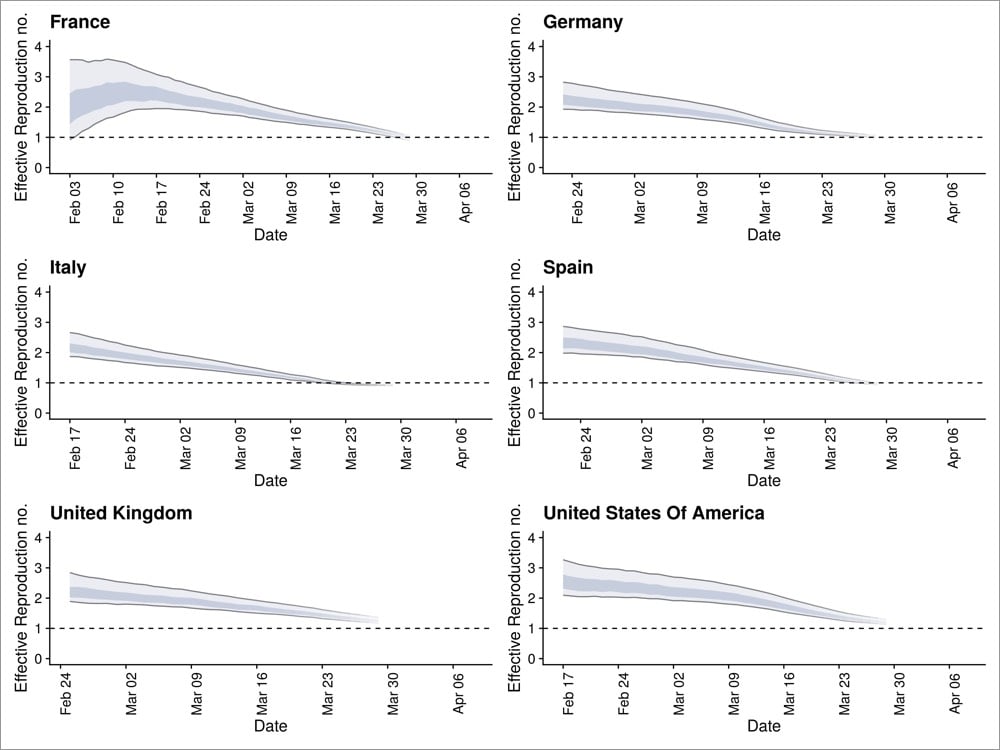
Trevor Bedford, who does research on epidemics and infectious diseases, has compiled a number of papers and data sets with “strong evidence” that social distancing measures have slowed Covid-19 transmission rates around the world.
This report (from the Imperial College team who produced the sobering report that has been the blueprint for pandemic responses around the world) estimates that measures taken in several European countries have lowered their effective reproduction numbers (the R value) to close to 1.
Overall, we estimate that countries have managed to reduce their reproduction number. Our estimates have wide credible intervals and contain 1 for countries that have implemented all interventions considered in our analysis. This means that the reproduction number may be above or below this value. With current interventions remaining in place to at least the end of March, we estimate that interventions across all 11 countries will have averted 59,000 deaths up to 31 March [95% credible interval 21,000-120,000]. Many more deaths will be averted through ensuring that interventions remain in place until transmission drops to low levels. We estimate that, across all 11 countries between 7 and 43 million individuals have been infected with SARS-CoV-2 up to 28th March, representing between 1.88% and 11.43% of the population. The proportion of the population infected to date — the attack rate — is estimated to be highest in Spain followed by Italy and lowest in Germany and Norway, reflecting the relative stages of the epidemics.
And this was published on March 30 — here’s the latest data. The paper goes on to say (italics mine):
We cannot say for certain that the current measures have controlled the epidemic in Europe; however, if current trends continue, there is reason for optimism.
An Institute for Disease Modeling report from March 29 shows a similar reduction in their effective reproduction number in King County, Washington (the 12th most populous county in the US).
The graphs at the top of the post are from the latest data compiled by the Centre for the Mathematical Modelling of Infectious Diseases. Lots of countries looking like they are headed for an effect R value of 1, which would indicate a slowing (rather than growing) epidemic.
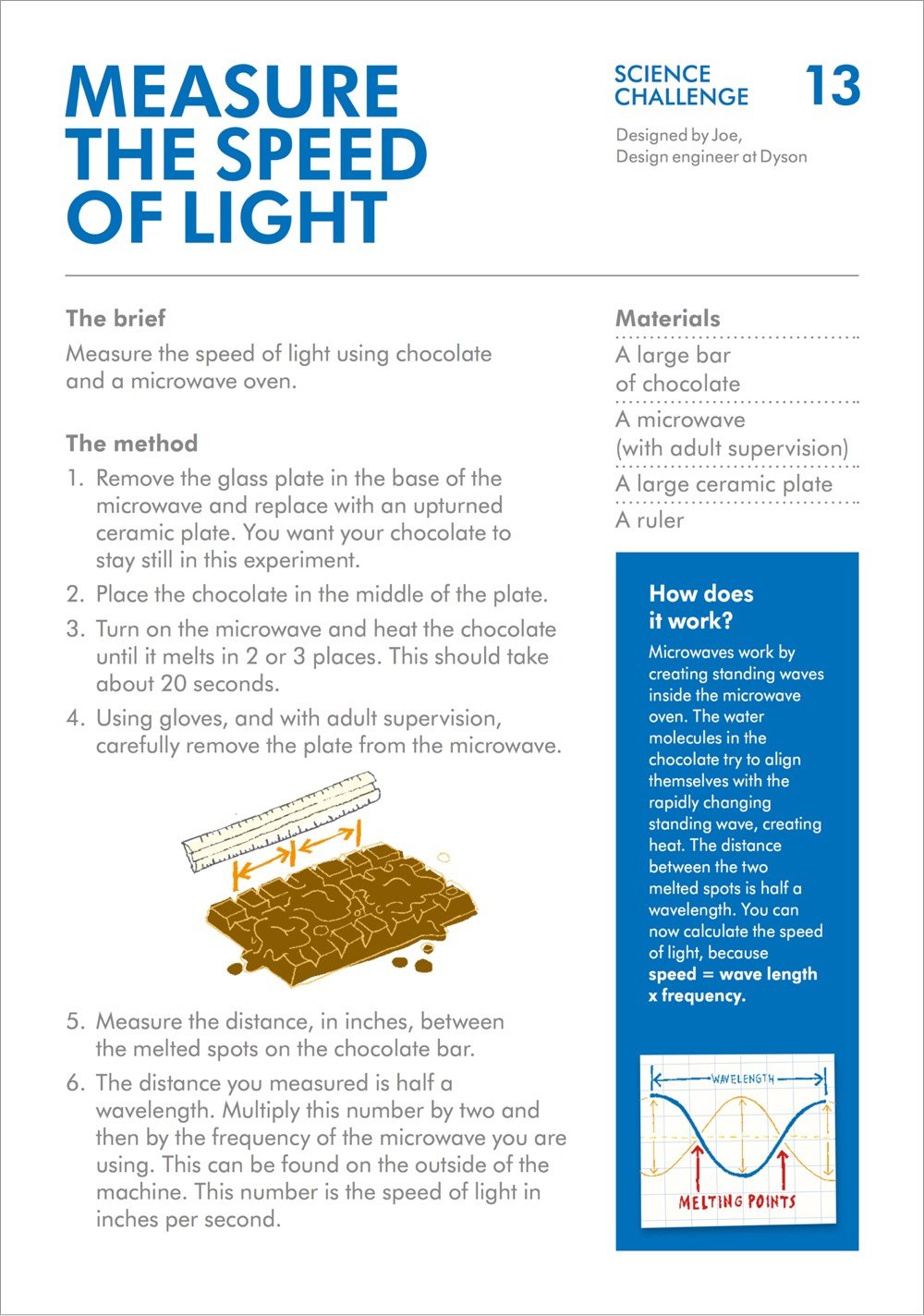
The James Dyson Foundation has designed a set of 44 challenges related to science & engineering specifically for kids (ages 7 & older), which are perfect for these at-home learning times. The challenges include making an air-powered car out of a balloon, strong bridges out of spaghetti, and a cardboard chair strong enough to hold a person:
Here’s the PDF with all 44 challenges. What I like about these projects is that they’re hands-on, you can do them with stuff you already have around the house, and they’re educational in the best way: there’s no “teaching” really…the challenges are designed to appeal to the natural curiosity of kids.
Reading through these, the one that blew my mind was that you can determine the speed of light by melting a chocolate bar in the microwave.
That’s so cool! (via open culture)

Since the early 90s, biologist David Goodsell (previously) has been creating scientifically accurate paintings of the structures of cells, molecules, and, yes, viruses. In early February, Goodsell completed a painting of a SARS coronavirus (above).
This painting depicts a coronavirus just entering the lungs, surrounded by mucus secreted by respiratory cells, secreted antibodies, and several small immune systems proteins. The virus is enclosed by a membrane that includes the S (spike) protein, which will mediate attachment and entry into cells, M (membrane) protein, which is involved in organization of the nucleoprotein inside, and E (envelope) protein, which is a membrane channel involved in budding of the virus and may be incorporated into the virion during that process. The nucleoprotein inside includes many copies of the N (nucleocapsid) protein bound to the genomic RNA.
In a brief interview with the NY Times, Goodsell explained why he made the image:
“You have to admit, these viruses are so symmetrical that they’re beautiful,” said Mr. Goodsell, an associate professor at Scripps Research Institute in La Jolla. “Are bright colors and pretty stuff the right approach? The jury’s still out. I’m not trying to make these things look dangerous, I want people to understand how they’re built.”
Seeing the infection count rise, Mr. Goodsell said he worried about the health of his aging parents in Los Angeles. But he hopes his painting can quell fears about the novel coronavirus by educating people on the virus’s workings: “I want people to think of viruses as being an entity that we can learn about and fight. They’re not nebulous nothings.”
Goodsell is currently working on a painting featuring the life cycle of a coronavirus and sharing his progress on Twitter. (via @christopherjobs)
From Ken Burns and Dr. Siddhartha Mukherjee, The Gene: An Intimate History, a series about the history of genetics based on Mukherjee’s book of the same name. Here’s a trailer:
The series tells the story of the rapid evolution of genetic science from Gregor Mendel’s groundbreaking experiment in the 19th century to CRISPR, and the hope that newfound powers to alter DNA with pinpoint precision will transform the treatment of some of the world’s most complex and challenging diseases. The series also tackles the daunting ethical challenges that these technologies pose for humankind.
This looks great, especially if this clip about Nancy Wexler’s crusade to find a cure for Huntington’s disease is representative of the whole:
In 1968, Nancy Wexler’s mother was diagnosed with a rare genetic disease - Huntington’s. Facing a 50-50 chance of contracting Huntington’s herself, Wexler — a non-scientist — began an odyssey to find the gene that causes the disease. For three decades, Wexler searched for treatments but chose not to get tested. As time passed, she noticed changes in the way she moved. Finally, in early 2020, Wexler decided to face her fears.
Part 1 of the series is now streaming on PBS with part 2 set to premiere next week.
As I’m writing this, according to Johns Hopkins’ Covid-19 tracker, Germany has recorded 100,186 confirmed cases of Covid-19 (fourth most in the world) and 1590 deaths — that’s a death rate of about 1.6%. Compare that to Italy (12.3%), China (4%), the US (2.9%), and even South Korea (1.8%) and you start to wonder how they’re doing it. This article from the NY Times details why the death rate is so low in Germany.
Another explanation for the low fatality rate is that Germany has been testing far more people than most nations. That means it catches more people with few or no symptoms, increasing the number of known cases, but not the number of fatalities.
“That automatically lowers the death rate on paper,” said Professor Kräusslich.
But there are also significant medical factors that have kept the number of deaths in Germany relatively low, epidemiologists and virologists say, chief among them early and widespread testing and treatment, plenty of intensive care beds and a trusted government whose social distancing guidelines are widely observed.
This article is a real punch in the gut if you’re an American. Obviously there are bureaucracies and inefficiencies in Germany like anywhere else, but it really seems like they listened to the experts and did what a government is supposed to do for its people before a disaster struck.
“Maybe our biggest strength in Germany,” said Professor Kräusslich, “is the rational decision-making at the highest level of government combined with the trust the government enjoys in the population.”
This whole crisis is really laying bare many of the worst aspects of American society — it’s increasingly obvious that the United States resembles a failed state in many ways. I can’t be the only American whose response to the pandemic is to think seriously about moving to a country with a functioning government, good healthcare for everyone, and a real social safety net.
Soon after the CDC started to mobilize to address Covid-19, medical illustrators Alissa Eckert & Dan Higgins were asked to create this illustration of a coronavirus that could be used as the “face” of the epidemic.
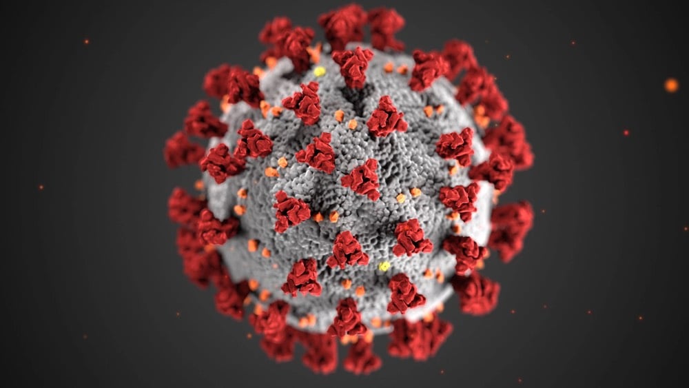
The novel coronavirus, like all viruses, is covered with proteins that give it its character and traits. There are the spike proteins, or S-proteins — the red clusters in the image — which allow the virus to attach to human cells. Envelope or E-proteins, represented by yellow crumbs, help it get into those cells. And membrane proteins, or M-proteins, shown in orange, give the virus its form.
In a video released last February, Eckert explained a little about what she does at CDC.

Have you been wearing a face mask when going out in public recently? There’s been a lot of debate recently about whether they are effective in keeping people safe from COVID-19 infection, and it’s been really challenging to find good information. After reading several things over the past few days, I have concluded that wearing a mask in public is a helpful step I can take to help keep myself and others safe, with the important caveat that healthcare workers need access to masks before the rest of us (see below). In particular, I found this extensive review of the medical and scientific literature on mask & respirator use helpful, including why research on mask efficacy is so hard to do and speculation on why the CDC and WHO generally don’t recommend wearing them.
I was able to find one study like this outside of the health care setting. Some people with swine flu travelled on a plane from New York to China, and many fellow passengers got infected. Some researchers looked at whether passengers who wore masks throughout the flight stayed healthier. The answer was very much yes. They were able to track down 9 people who got sick on the flight and 32 who didn’t. 0% of the sick passengers wore masks, compared to 47% of the healthy passengers. Another way to look at that is that 0% of mask-wearers got sick, but 35% of non-wearers did. This was a significant difference, and of obvious applicability to the current question.
See also this review of relevant scientific literature, this NY Times piece, this Washington Post opinion piece by Jeremy Howard (who is on a Twitter mission to get everyone to wear masks):
When historians tally up the many missteps policymakers have made in response to the coronavirus pandemic, the senseless and unscientific push for the general public to avoid wearing masks should be near the top.
The evidence not only fails to support the push, it also contradicts it. It can take a while for official recommendations to catch up with scientific thinking. In this case, such delays might be deadly and economically disastrous. It’s time to make masks a key part of our fight to contain, then defeat, this pandemic. Masks effective at “flattening the curve” can be made at home with nothing more than a T-shirt and a pair of scissors. We should all wear masks — store-bought or homemade — whenever we’re out in public.
At the height of the HIV crisis, authorities did not tell people to put away condoms. As fatalities from car crashes mounted, no one recommended avoiding seat belts. Yet in a global respiratory pandemic, people who should know better are discouraging Americans from using respiratory protection.
I have to admit that I have not been wearing a mask out in public — I’ve been to the grocery store only three times in the past two weeks, I go at off-hours, and it’s rural Vermont, so there’s not actually that many people about (e.g. compared to Manhattan). But I’m going to start wearing one in crowded places (like the grocery store) because doing so could a) safeguard others against my possible infection (because asymptomatic people can still be contagious), b) make it less likely for me to get infected, and c) provide a visible signal to others in my community to normalize mask wearing. As we’ve seen in epidemic simulations, relatively small measures can have outsize effects in limiting later infections & deaths, and face masks, even if a tiny bit effective, can have a real impact.
Crucially, the available research and mask advocates stress the importance of wearing masks properly and responsibly. Here are some guidelines I compiled about responsible mask usage:
Don’t buy masks (or use new masks you might have at home) while there is a shortage for healthcare workers, especially not N95 respirators (which are difficult to use properly anyway). Make a mask at home. Skiers & snowboarders, wear your buffs or ski masks. Donate any unused masks or respirators you may have to healthcare workers.
Make sure your mask fits properly — limit any gaps between the mask and your face as much as you can. (Facial hair can limit mask effectiveness.)
While wearing your mask in public, don’t fuss with it — touching your face is bad, remember? Wear it at home for a few hours to get used to the sensation. Then when you’re ready to go out, put it on properly and don’t touch it again until you’re back home (or in the car or whatever). Part of the point of the mask is for you to touch your face less.
Limit reuse of potentially contaminated masks. Discard or, if possible, wash or disinfect masks after public usage or at the end of the day.
Wearing a mask doesn’t mean you can safely go do a bunch of things without fear of getting infected. The idea here is to protect yourself while engaging in necessary activities in public. Wearing a mask doesn’t mean you can visit grandma safely or discard the six-feet-away rule.
Don’t do anything stupid like spraying your mask with a household cleaner that contains bleach and put it on. Come on.
So that’s what I’ve personally concluded from all my reading. I hope wearing masks can help keep us a little safer during all of this.
Update: From Ferris Jabr at Wired, It’s Time to Face Facts, America: Masks Work.
It is unequivocally true that masks must be prioritized for health care workers in any country suffering from a shortage of personal protective equipment. But the conflicting claims and guidelines regarding their use raise three questions of the utmost urgency: Do masks work? Should everyone wear them? And if there aren’t enough medical-grade masks for the general public, is it possible to make a viable substitute at home? Decades of scientific research, lessons from past pandemics, and common sense suggest the answer to all of these questions is yes.
Update: The Atlantic’s Ed Yong weighs in on masks:
In Asia, masks aren’t just shields. They’re also symbols. They’re an affirmation of civic-mindedness and conscientiousness, and such symbols might be important in other parts of the world too. If widely used, masks could signal that society is taking the pandemic threat seriously. They might reduce the stigma foisted on sick people, who would no longer feel ashamed or singled out for wearing one. They could offer reassurance to people who don’t have the privilege of isolating themselves at home, and must continue to work in public spaces. “My staff have also mentioned that having a mask reminds them not to touch their face or put a pen in their mouth,” Bourouiba noted.
He also writes about something I’ve been wondering about: is the virus airborne, what does that even mean, when will we know for sure, and how should that affect our behavior in the meantime?
These particles might not even have been infectious. “I think we’ll find that like many other viruses, [SARS-CoV-2] isn’t especially stable under outdoor conditions like sunlight or warm temperatures,” Santarpia said. “Don’t congregate in groups outside, but going for a walk, or sitting on your porch on a sunny day, are still great ideas.”
You could tie yourself in knots gaming out the various scenarios that might pose a risk outdoors, but Marr recommends a simple technique. “When I go out now, I imagine that everyone is smoking, and I pick my path to get the least exposure to that smoke,” she told me. If that’s the case, I asked her, is it irrational to hold your breath when another person walks past you and you don’t have enough space to move away? “It’s not irrational; I do that myself,” she said. “I don’t know if it makes a difference, but in theory it could. It’s like when you walk through a cigarette plume.”
And from the WHO, here’s a video on how to wear a mask properly.
Update: One of the reasons I started to wear a mask when I go out in public was to “provide a visible signal to others in my community to normalize mask wearing”. Maciej Cegłowski’s post touches on this and other reasons to wear a mask that don’t directly have to do with avoiding infection.
A mask is a visible public signal to strangers that you are trying to protect their health. No other intervention does this. It would be great if we had a soap that turned our hands gold for an hour, so everyone could admire our superb hand-washing technique. But all of the behaviors that benefit public health are invisible, with the exception of mask wearing.
If I see you with a mask on, it shows me you care about my health, and vice versa. This dramatically changes what it feels like to be in a public space. Other people no longer feel like an anonymous threat; they are now your teammates in a common struggle.
Back when the COVID-19 pandemic was beginning to be taken seriously by the American public, 3blue1brown’s Grant Sanderson released a video about epidemics and exponential growth. (It’s excellent — I recommend watching it if you’re still a little unclear on how things are got so out of hand so quickly in Italy and, very soon, in NYC.) In his latest video, Sanderson digs a bit deeper into simulating epidemics using a variety of scenarios.
Like, if people stay away from each other I get how that will slow the spread, but what if despite mostly staying away from each other people still occasionally go to a central location like a grocery store or a school?
Also, what if you are able to identify and isolate the cases? And if you can, what if a few slip through, say because they show no symptoms and aren’t tested?
How does travel between separate communities affect things? And what if people avoid contact with others for a while, but then they kind of get tired of it and stop?
These simulations are fascinating to watch. Many of the takeaways boil down to: early & aggressive actions have a huge effect in the number of people infected, how long an epidemic lasts, and (in the case of a disease like COVID-19 that causes fatalities) the number of deaths. This is what all the epidemiologists have been telling us — because the math, while complex when you’re dealing with many factors (as in a real-world scenario), is actually pretty straightforward and unambiguous.
The biggest takeaway? That the effective identification and isolation of cases has the largest effect on cutting down the infection rate. Testing and isolation, done as quickly and efficiently as possible.
See also these other epidemic simulations: Washington Post and Kevin Simler.
Note: Please keep in mind that these are simulations to help us better understand how epidemics work in general — it’s not about how the COVID-19 pandemic is proceeding or will proceed in the future.
Note: Please check the updates below for some important corrections to some of the information in this video.
From Dr. Jeffrey VanWingen MD, a video on how to ensure that your grocery shopping experience is as safe as possible and to avoid potential COVID-19 infection from plastic and metal surfaces. I’m going to be honest with you: a lot of this seems like overkill (as it should — see the Paradox of Preparation). However, this is also pretty much what I’ve been doing after grocery shopping for the past 2 weeks because I am a fastidious motherfucker1 with plenty of time to wipe down groceries. If it comes down to a choice between watching 7 more minutes of The Mandalorian or wiping down my groceries before putting them in the fridge, I’m gonna wipe them groceries. Baby Yoda can wait.
See also this PDF from Crumpton Group about how to keep your household free of the outside effects of the COVID-19 pandemic.
Household members should understand that their principal effort should be directed towards isolating the inside of the home from the pandemic effects outside. All physical thresholds of the home will serve as a cordon sanitaire. Strive to decontaminate everyone and everything to the best practical degree before entering.
Many of Dr. VanWingen’s recommendations mirror those in the PDF. See also expert guidance on COVID-19 and food safety. (thx, meg)
Update: I have not had a chance to read it yet (was attending to some other things this evening — family, trying to have some normalcy), but I’ve been told that this thread is a good response to the video above. I’ll have a closer look at it tomorrow.
Update: Ok, I’ve read Don Schaffner’s thread criticizing this video. At least I think this is the video he’s referring to because he never says it outright — which I’ll get to in a minute. (Schaffner is a professor in the food science department at Rutgers who I linked to the other day in my post on COVID-19 and food safety.) As he notes, there are a couple of factual errors and VanWingen does offer some dubious advice, particularly about washing food with soap (which I didn’t take seriously). I do not believe, however, that VanWingen was suggesting that people leave frozen items and perishables in a warm garage for 3 days and that the normal rules of food safety are somehow countermanded by potential coronavirus contamination. If you want to leave that box of Cheerios that you don’t need in the car for 3 days, go right ahead. He definitely should have been clearer on that point though.
But the bulk of VanWingen’s video was about how to handle your groceries and takeout food coming into your house to minimize the chance of infection. (And as I mentioned, much of it mirrors the advice in this document and in Dr. Michael Lin’s document from a couple of weeks ago — this isn’t just his opinon or my opinion.) If we are to take seriously a) the assumption that anyone could have COVID-19 (including yourself & grocery workers) that we are operating under w/r/t to handwashing & keeping a 6-foot distance, b) the preliminary results that suggest that SARS-CoV-2 can last on some surfaces for days, and c) that person-to-surface-to-person transfer of SARS-CoV-2 might result in infection (i.e. the reason we are doing all this handwashing and face not-touching), then we should be disinfecting surfaces that other people have been touching recently. Right? We should assume that all surfaces are contaminated. This doesn’t seem outlandish, especially when grocery stores are restocking shelves continuously — that bag of chips that you put into your cart may have been placed on the shelf only 30 minutes before. How is disinfecting your Oreos package when you get home from the store a bad idea? Sure, wash your hands before you eat, but if you have kids, you know how futile that can be sometimes, especially when Oreos are involved. So why not just clean the package? Ditto with transferring takeout food to new containers and giving it a blast in the microwave to warm it up.
Schaffner’s stance is that most surfaces aren’t contaminated to a high degree, which is undoubtably true. Having watched the video & read Schaffner’s advice (and other advice by other experts), where your personal comfort level with making sure the surfaces you and your family come into contact to are disinfected is up to you. Ultimately, advice from experts is still advice and you have to figure out whether it works for you. It’s easy to believe you should wash your hands frequently because that’s universal advice. But “you should disinfect surfaces you touch” and “you don’t have to worry too much about disinfecting your grocery packages” are genuinely conflicting bits of advice from well-meaning experts! You’ve gotta use your noggin and make up your own mind, based on your personal idea of risk and safety. It’s gonna land differently with different people.
Finally, I’m going to get a little cranky here, but I found Schaffner’s overall tone in the first few tweets of that thread mocking, ungenerous, and unhelpful. Instead of gently offering alternative authoritative advice, he subtweeted (by refusing to link to the video and calling Dr. VanWingen not by his name but referring to him as “the video MD”) and made fun of VanWingen’s outfit. I know it must be frustrating to see what you perceive as misinformation out there, but we do not need Doctor vs Doctor battles here. Everyone’s just going to get defensive and dig their heels in.
Update: From Joseph Allen of Harvard’s School of Public Health, Don’t panic about shopping, getting delivery or accepting packages.
Yes, the virus can be detected on some surfaces for up to a day, but the reality is that the levels drop off quickly. For example, the article shows that the virus’s half-life on stainless steel and plastic was 5.6 hours and 6.8 hours, respectively. (Half-life is how long it takes the viral concentration to decrease by half, then half of that half, and so on until it’s gone.)
And here’s how to take reasonable precautions when getting a package delivery or going to the grocery store:
You can leave that cardboard package at your door for a few hours - or bring it inside and leave it right inside your door, then wash your hands again. If you’re still concerned there was any virus on the package, you could wipe down the exterior with a disinfectant, or open it outdoors and put the packaging in the recycling can. (Then wash your hands again.)
What about going to the grocery store? The same approach applies.
Shop when you need to (keeping six feet from other customers) and load items into your cart or basket. Keep your hands away from your face while shopping, and wash them as soon as you’re home. Put away your groceries, and then wash your hands again. If you wait even a few hours before using anything you just purchased, most of the virus that was on any package will be significantly reduced. If you need to use something immediately, and want to take extra precautions, wipe the package down with a disinfectant. Last, wash all fruits and vegetables as you normally would.
Important caveat: the coronavirus half-life times are for room temperature. For colder temperatures (like in the fridge or especially the freezer), the virus will last longer. So maybe wipe down that bag of frozen peas even if you’re not going to use them for a couple of days.
From Ed Yong at the Atlantic, a great article on the current state of the pandemic in the United States, what will happen over the next few months, how it will end, and what the aftermath will be.
With little room to surge during a crisis, America’s health-care system operates on the assumption that unaffected states can help beleaguered ones in an emergency. That ethic works for localized disasters such as hurricanes or wildfires, but not for a pandemic that is now in all 50 states. Cooperation has given way to competition; some worried hospitals have bought out large quantities of supplies, in the way that panicked consumers have bought out toilet paper.
Partly, that’s because the White House is a ghost town of scientific expertise. A pandemic-preparedness office that was part of the National Security Council was dissolved in 2018. On January 28, Luciana Borio, who was part of that team, urged the government to “act now to prevent an American epidemic,” and specifically to work with the private sector to develop fast, easy diagnostic tests. But with the office shuttered, those warnings were published in The Wall Street Journal, rather than spoken into the president’s ear. Instead of springing into action, America sat idle.
Rudderless, blindsided, lethargic, and uncoordinated, America has mishandled the COVID-19 crisis to a substantially worse degree than what every health expert I’ve spoken with had feared. “Much worse,” said Ron Klain, who coordinated the U.S. response to the West African Ebola outbreak in 2014. “Beyond any expectations we had,” said Lauren Sauer, who works on disaster preparedness at Johns Hopkins Medicine. “As an American, I’m horrified,” said Seth Berkley, who heads Gavi, the Vaccine Alliance. “The U.S. may end up with the worst outbreak in the industrialized world.”
If you’ve been reading obsessively about the pandemic, there’s not a lot new in here, but Yong lays the whole situation out very clearly and succinctly (he easily could have gone twice as long). The section on potential after effects was especially interesting:
Pandemics can also catalyze social change. People, businesses, and institutions have been remarkably quick to adopt or call for practices that they might once have dragged their heels on, including working from home, conference-calling to accommodate people with disabilities, proper sick leave, and flexible child-care arrangements. “This is the first time in my lifetime that I’ve heard someone say, ‘Oh, if you’re sick, stay home,’” says Adia Benton, an anthropologist at Northwestern University. Perhaps the nation will learn that preparedness isn’t just about masks, vaccines, and tests, but also about fair labor policies and a stable and equal health-care system. Perhaps it will appreciate that health-care workers and public-health specialists compose America’s social immune system, and that this system has been suppressed.
Aspects of America’s identity may need rethinking after COVID-19. Many of the country’s values have seemed to work against it during the pandemic. Its individualism, exceptionalism, and tendency to equate doing whatever you want with an act of resistance meant that when it came time to save lives and stay indoors, some people flocked to bars and clubs. Having internalized years of anti-terrorism messaging following 9/11, Americans resolved to not live in fear. But SARS-CoV-2 has no interest in their terror, only their cells.
I really hope that Betteridge’s law is wrong about that headline I wrote.
Back in late December, a new comet called Comet ATLAS (or C/2019 Y4) was discovered by a robotic astronomical survey on the lookout for objects that may strike the Earth. Don’t worry, Comet ATLAS isn’t going to hit us, but it has a chance to put on quite a show.1 It didn’t seem like much at first, but since its discovery Comet ATLAS has gotten brighter much faster than scientists have expected.
When astronomers first spotted Comet ATLAS in December, it was in Ursa Major and was an exceedingly faint object, close to 20th magnitude. That’s about 398,000 times dimmer than stars that are on the threshold of naked-eye visibility. At the time, it was 273 million miles (439 million kilometers) from the sun.
But comets typically brighten as they approach the sun, and at its closest, on May 31, Comet ATLAS will be just 23.5 million miles (37.8 million km) from the sun. Such a prodigious change in solar distance would typically cause a comet to increase in luminosity by almost 11 magnitudes, enough to make ATLAS easily visible in a small telescope or a pair of good binoculars, although quite frankly nothing really to write home about.
Except, since its discovery, the comet has been brightening at an almost unprecedented speed. As of March 17, ATLAS was already magnitude +8.5, over 600 times brighter than forecast. As a result, great expectations are buzzing for this icy lump of cosmic detritus, with hopes it could become a stupendously bright object by the end of May.
But the brightening could also be a sign that the comet is ejecting a lot of material because it’s burning itself out, so grain of salt. But if keeps brightening at a good pace, it could be visible during the day in the northern hemisphere.
If Atlas manages to remain intact, some in the field have suggested it could grow from magnitude +1 to possibly -5. At the brightest extreme, it could be visible even during the day.
The location of the comet is also notable-unlike more recent comets, it will be best viewed in the Northern Hemisphere.
Chuck Ayoub recently captured the comet arcing across the night sky with his backyard astrophotography rig:
Oh I hope Comet ATLAS can keep it together. I vividly remember going outside in rural Wisconsin darkness to see the tail of Comet Hyakutake stretch halfway across the sky. One of the most amazing things I’ve ever seen.
Update: It looks as though Comet ATLAS will not be dazzling naked-eye observers later this spring — the comet seems to have broken into 3 or 4 pieces as it nears the Sun.

Like many of you, I’ve been wondering about COVID-19 & food safety. Is it safe to eat takeout prepared by your local restaurant? To answer that and many other questions, Kenji Lopez-Alt has compiled a comprehensive guide to food safety and coronavirus for Serious Eats. Kenji is the most fastidious and exacting food person I know — how could you think otherwise after having read The Food Lab? — so I take his thoughts and research on this very seriously.
Even so, plenty of folks — myself included — have been confused or curious about the safety of allowing restaurants to continue preparing and serving food. Is it actually safe? Should I reheat the food when I get it home? Is it better to support local businesses by ordering food, or am I only putting workers and delivery people at risk? And if I’m cooking my own food, what guidelines should I follow?
To answer these questions, I referenced dozens of articles and scientific reports and enlisted the help of Ben Chapman, a food safety specialist from the North Carolina State University and cohost of Risky or Not and Food Safety Talk.
Let’s get right to the nitty gritty:
Q: Can I get COVID-19 from touching or eating contaminated food?
According to multiple health and safety organizations worldwide, including the CDC, the USDA, and the European Food Safety Authority, there is currently no evidence that COVID-19 has spread through food or food packaging. Previous coronavirus epidemics likewise showed no evidence of having been spread through food or packaging.
Be sure to read on for answers to questions like “Are we going to run out of food?” and “Am I more likely to get COVID-19 from take-out, delivery, or cooking at home?”
The FDA has a coronavirus safety page on their website as well.
Unlike foodborne gastrointestinal (GI) viruses like norovirus and hepatitis A that often make people ill through contaminated food, SARS-CoV-2, which causes COVID-19, is a virus that causes respiratory illness. Foodborne exposure to this virus is not known to be a route of transmission.
In a piece from March 14, Amanda Mull talked with epidemiologist Stephen Morse from Columbia University about food safety:
Even if the person preparing it is sick, he told me via email, “cooked foods are unlikely to be a concern unless they get contaminated after cooking.” He granted that “a salad, if someone sneezes on it, might possibly be some risk,” but as long as the food is handled properly, he said, “there should be very little risk.”
And Don Schaffner, a professor in the food science department at Rutgers, has been posting information on food safety & COVID-19 on Twitter.
Even if a sick worker sneezed on my food (I know that’s gross), my risk of contracting COVID-19 from it are very low.
First it’s important to realize that this is a respiratory illness as far as we know. The biggest risk is being around sick people who are shedding the virus when they sneeze or cough.
Even if the virus did get onto food, we’re going to put that food in our mouth and swallow it so the virus will end up in our stomach. Our stomachs have a low pH which would likely in activate the virus.
Space Shuttle thermal tiles conduct heat so poorly that after being in a 2200 °F oven for hours, you can pick them up with your bare hands only seconds after they come out, still glowing hot.
On March 10, Tomas Pueyo published a widely read and praised article called Coronavirus: Why You Must Act Now. Yesterday, in the wake of the Imperial College paper and the criticism of it, Pueyo has published a second article: Coronavirus: The Hammer and the Dance. I urge you to read it — it’s sobering yet hopeful. A summary:
Strong coronavirus measures today should only last a few weeks, there shouldn’t be a big peak of infections afterwards, and it can all be done for a reasonable cost to society, saving millions of lives along the way. If we don’t take these measures, tens of millions will be infected, many will die, along with anybody else that requires intensive care, because the healthcare system will have collapsed.
As the title indicates, Pueyo and his collaborators are suggesting an approach that combines initial aggressive action followed by a longer period of efficient vigilance. First comes the Hammer — we use aggressive measures for weeks, giving our healthcare system time to ramp up & scientists time to research the hell out of this thing and for the world’s testing capability to get up to speed.
And then we Dance.
If you hammer the coronavirus, within a few weeks you’ve controlled it and you’re in much better shape to address it. Now comes the longer-term effort to keep this virus contained until there’s a vaccine.
This is probably the single biggest, most important mistake people make when thinking about this stage: they think it will keep them home for months. This is not the case at all. In fact, it is likely that our lives will go back to close to normal.
But, here’s how the Dance works:
How come South Korea, Singapore, Taiwan and Japan have had cases for a long time, in the case of South Korea thousands of them, and yet they’re not locked down home?
In this video, the South Korea Foreign Minister explains how her country did it. It was pretty simple: efficient testing, efficient tracing, travel bans, efficient isolating and efficient quarantining.
That way, most people aren’t locked down, just those who need to be — the sick, the people who have been with those who have gotten sick, etc. Most people can go back to work, back to fairly normal routines.
I call the months-long period between the Hammer and a vaccine the Dance because it won’t be a period during which measures are always the same harsh ones. Some regions will see outbreaks again, others won’t for long periods of time. Depending on how cases evolve, we will need to tighten up social distancing measures or we will be able to release them. That is the dance of R: a dance of measures between getting our lives back on track and spreading the disease, one of economy vs. healthcare.
This piece in the Atlantic, This Is How We Can Beat the Coronavirus by Aaron E. Carroll & Ashish Jha, advocates for essentially the same approach.
We can create a third path. We can decide to meet this challenge head on. It is absolutely within our capacity to do so. We could develop tests that are fast, reliable, and ubiquitous. If we screen everyone, and do so regularly, we can let most people return to a more normal life. We can reopen schools and places where people gather. If we can be assured that the people who congregate aren’t infectious, they can socialize.
We can build health-care facilities that do rapid screening and care for people who are infected, apart from those who are not. This will prevent transmission from one sick person to another in hospitals and other healthcare facilities. We can even commit to housing infected people apart from their healthy family members, to prevent transmission in households.
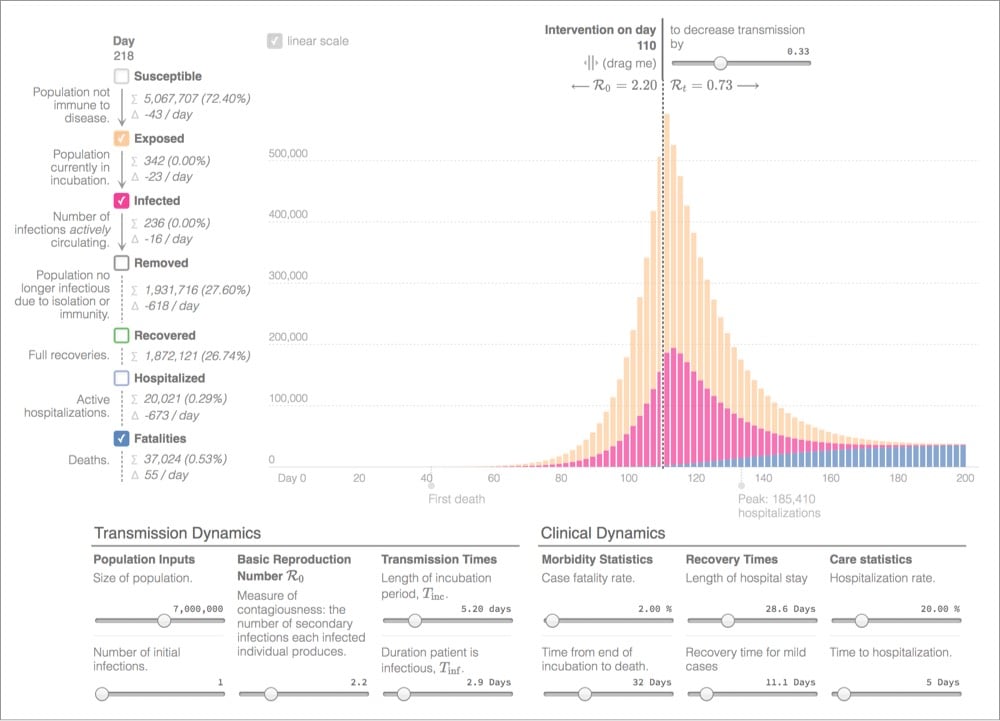
By manipulating values like R0, incubation time, and hospitalization rate with this this epidemic graphing calculator, you really get a sense of how effective early intervention and aggressive measures can be in curbing infection & saving lives in an exponential crisis like the COVID-19 pandemic.
This morning Kurzgesagt released their video about COVID-19 that they’ve been working on for a week, and it is excellent, particularly the first part where they explain exactly what the SARS-CoV-2 virus does to a human body and why it can be so dangerous. I hadn’t heard that described before, especially in such relatively simple terms.
The virus has not caused too much damage yet, but corona is now going to release a real beast on you: your own immune system. The immune system, while there to protect you, can actually be pretty dangerous to yourself and needs tight regulation. And as immune cells pour into the lungs to fight the virus, corona infects some of them and creates confusion. Cells have neither ears nor eyes — they communicate mostly via tiny information proteins called cytokines — nearly every important immune reaction is controlled by them. Corona causes infected immune cells to overreact and yell bloody murder. In a sense, it puts the immune system into a fighting frenzy and sends way more soldiers than it should, wasting its resources and causing damage.
Kurzgesagt always provides a list of scientific sources used to produce their videos, and the one for this video is particularly extensive and they are going to keep it updated.
Update: For more information on the coronavirus itself, SARS-CoV-2, see Ed Yong’s piece in the Atlantic and How the Coronavirus Could Take Over Your Body (Before You Ever Feel It) from New York magazine.
One of the key shortages in areas overwhelmed by COVID-19 patients (like Italy) is ventilators in hospitals. COVID-19 is a respiratory illness and respirators are essential in treating patients with acute symptoms. In the US and other countries, experts are warning of ventilator shortages and manufacturers say it will be difficult to ramp up production quickly enough to meet demand. So healthcare providers are looking for other solutions.
One potential solution is modifying ventilators to work for more than one person at a time. Based on feasibility research published in 2006, the simple technique uses inexpensive parts that hospitals already have on hand to modify machines to work with 4 patients at a time (with important caveats). One of the authors of that research paper, Dr. Charlene Babcock, explains how to hack the ventilators in this video:
Some notes from the video:
- The initial study used test lungs (not actual humans)
- You need to make sure the lung size and resistance of all four patients hooked up to a single ventilator are the same. No mixing adults and kids, for instance.
- Make sure the ventilator tubes leading to and from the patients are all the same length.
- This technique has been used successfully in the field, during the aftermath of the 2017 Las Vegas shooting.
- They did not investigate cross-contamination effects, so you have to make sure all the patients connected to one machine are COVID-19 patients in order to mitigate the risk.
In closing, Babcock says:
Now here’s my disclaimer. This is off-label use of the ventilator. The ventilator is made for one person and I’m using it here in a simulation of four patients. I always hope that you would never need to use it in this way, but you can never predict what’s going to happen in a disaster. And if it was me and I had four patients and they all needed intubation and I only had one ventilator, I would simply have a shared discussion meeting with all four families and say “I could pick one to live or we could try to have all four live”. But this is clearly off-label and likely would only be used in dire circumstance, which we may see with COVID-19.
Other people are working on designing and deploying open source ventilators and ventilators made from parts of other machines. All this reminds me of that scene in Apollo 13 where NASA engineers design a modified CO2 scrubber using only parts available on the spacecraft. A similar “failure is not an option” spirit might be called for in this case as well.
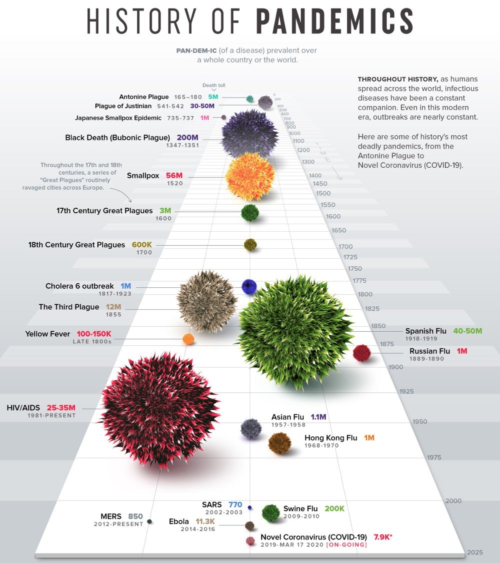
From Nicholas LePan, Visualizing the History of Pandemics.
The practice of quarantine began during the 14th century, in an effort to protect coastal cities from plague epidemics. Cautious port authorities required ships arriving in Venice from infected ports to sit at anchor for 40 days before landing — the origin of the word quarantine from the Italian “quaranta giorni”, or 40 days.
One of the first instances of relying on geography and statistical analysis was in mid-19th century London, during a cholera outbreak. In 1854, Dr. John Snow came to the conclusion that cholera was spreading via tainted water and decided to display neighborhood mortality data directly on a map. This method revealed a cluster of cases around a specific pump from which people were drawing their water from.
While the interactions created through trade and urban life play a pivotal role, it is also the virulent nature of particular diseases that indicate the trajectory of a pandemic.
One of my big takeaways from the Tracking Infectiousness section of the piece is: holy shit, look at how contagious measles is! An R0 of 16! (The common flu is about 1.5 and ebola is 2.0.) And people want to keep their children from getting vaccinated for this?!
Note: I feel the need to add a disclaimer to this post. This was a really hard thing to read for me and it might be for you too. It is a single paper from a scientific team dedicated to the study of infectious diseases — it has not been peer reviewed, the available data is changing every day (for things like death rates, transmission rates, and potential immunity), and there might be differing opinions & assumptions by other infectious disease experts that would result in a different analysis. Even so, this seems like a possibility to take seriously and I hope I’m being responsible in sharing it.
This is an excellent but extremely sobering read: Impact of non-pharmaceutical interventions (NPIs) to reduce COVID19 mortality and healthcare demand, a 20-page paper by the Imperial College COVID-19 Response Team (and a few other organizations, including the WHO Collaborating Centre for Infectious Disease Modelling).
The paper is technical in nature but mostly written in plain English so it’s pretty readable, but here is an article that summarizes the paper. It discusses the two main strategies for dealing with this epidemic (mitigation & suppression), the strengths and weaknesses of each one, and how they both may be necessary in some measure to best address the crisis. For instance, here’s a graph showing the effects of three different suppression scenarios for the US compared to critical care bed capacity:
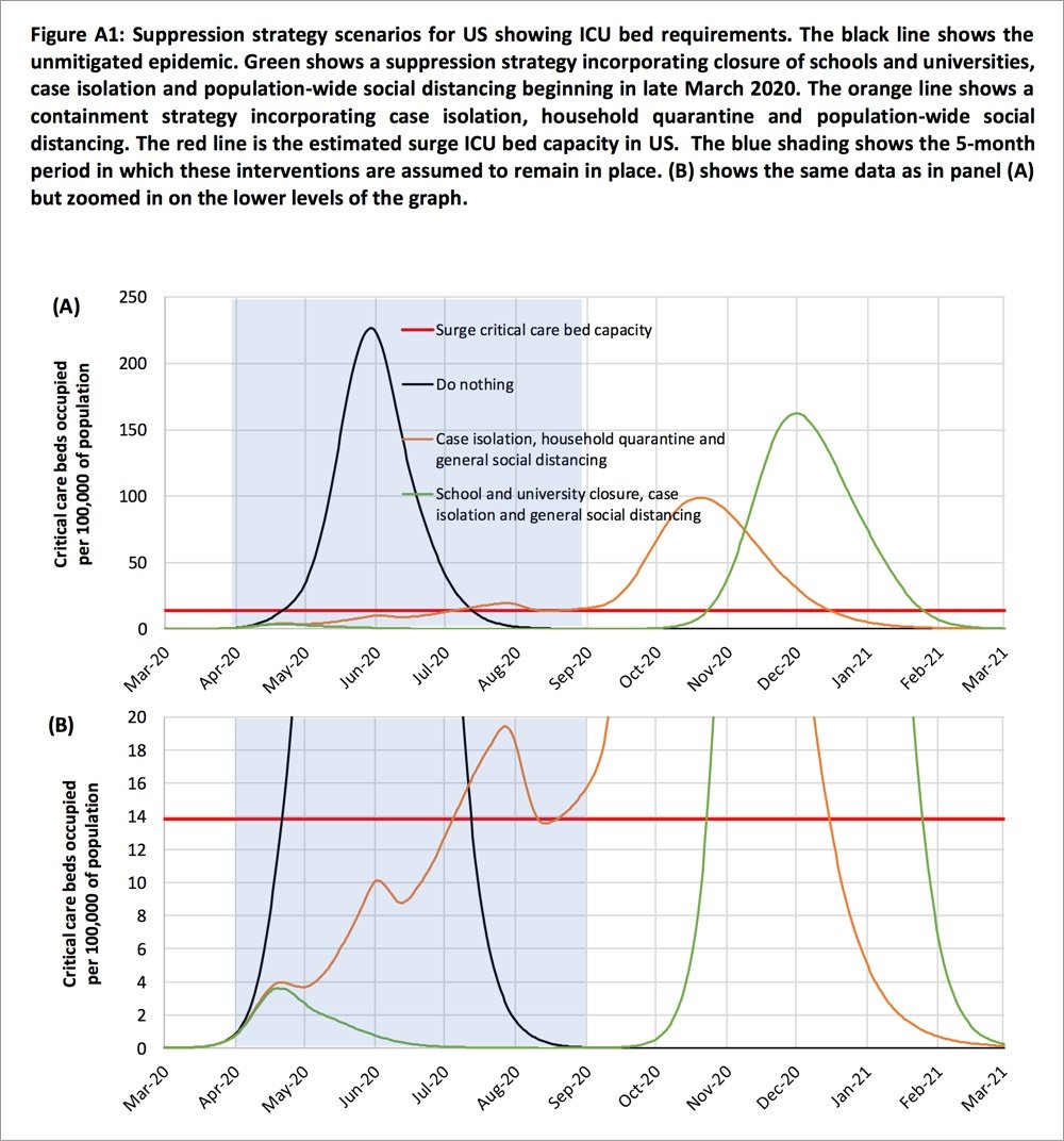
Two fundamental strategies are possible: (a) mitigation, which focuses on slowing but not necessarily stopping epidemic spread — reducing peak healthcare demand while protecting those most at risk of severe disease from infection, and (b) suppression, which aims to reverse epidemic growth, reducing case numbers to low levels and maintaining that situation indefinitely. Each policy has major challenges. We find that that optimal mitigation policies (combining home isolation of suspect cases, home quarantine of those living in the same household as suspect cases, and social distancing of the elderly and others at most risk of severe disease) might reduce peak healthcare demand by 2/3 and deaths by half. However, the resulting mitigated epidemic would still likely result in hundreds of thousands of deaths and health systems (most notably intensive care units) being overwhelmed many times over. For countries able to achieve it, this leaves suppression as the preferred policy option.
We show that in the UK and US context, suppression will minimally require a combination of social distancing of the entire population, home isolation of cases and household quarantine of their family members. This may need to be supplemented by school and university closures, though it should be recognised that such closures may have negative impacts on health systems due to increased absenteeism. The major challenge of suppression is that this type of intensive intervention package — or something equivalently effective at reducing transmission — will need to be maintained until a vaccine becomes available (potentially 18 months or more) — given that we predict that transmission will quickly rebound if interventions are relaxed. We show that intermittent social distancing — triggered by trends in disease surveillance — may allow interventions to be relaxed temporarily in relative short time windows, but measures will need to be reintroduced if or when case numbers rebound. Last, while experience in China and now South Korea show that suppression is possible in the short term, it remains to be seen whether it is possible long-term, and whether the social and economic costs of the interventions adopted thus far can be reduced.
If you missed the scale on the graph (it extends until March 2021) and the bit in there about closures, quarantine, and self-distancing measures needing to remain in place for months and months, the authors repeat that assertion throughout the paper. From the discussion section of the paper:
Overall, our results suggest that population-wide social distancing applied to the population as a whole would have the largest impact; and in combination with other interventions — notably home isolation of cases and school and university closure — has the potential to suppress transmission below the threshold of R=1 required to rapidly reduce case incidence. A minimum policy for effective suppression is therefore population-wide social distancing combined with home isolation of cases and school and university closure.
To avoid a rebound in transmission, these policies will need to be maintained until large stocks of vaccine are available to immunise the population — which could be 18 months or more. Adaptive hospital surveillance-based triggers for switching on and off population-wide social distancing and school closure offer greater robustness to uncertainty than fixed duration interventions and can be adapted for regional use (e.g. at the state level in the US). Given local epidemics are not perfectly synchronised, local policies are also more efficient and can achieve comparable levels of suppression to national policies while being in force for a slightly smaller proportion of the time. However, we estimate that for a national GB policy, social distancing would need to be in force for at least 2/3 of the time (for R0=2.4, see Table 4) until a vaccine was available.
I absolutely do not want to seem alarmist here, but if this analysis is anywhere close to being in the ballpark, it seems at least feasible that this whole thing is going to last far longer than the few weeks that people are thinking about. The concluding sentence:
However, we emphasise that is not at all certain that suppression will succeed long term; no public health intervention with such disruptive effects on society has been previously attempted for such a long duration of time. How populations and societies will respond remains unclear.
The paper is available in several languages here.
Update: Here is a short review of the Imperial College paper by Chen Shen, Nassim Nicholas Taleb, and Yaneer Bar-Yam. The important bit:
However, they make structural mistakes in analyzing outbreak response. They ignore standard Contact Tracing [2] allowing isolation of infected prior to symptoms. They also ignore door-to-door monitoring to identify cases with symptoms [3]. Their conclusions that there will be resurgent outbreaks are wrong. After a few weeks of lockdown almost all infectious people are identified and their contacts are isolated prior to symptoms and cannot infect others [4]. The outbreak can be stopped completely with no resurgence as in China, where new cases were down to one yesterday, after excluding imported international travelers that are quarantined.
If I understand this correctly, Shen et al. are saying that some tactics not taken into account by the Imperial College analysis could be hyper-effective in containing the spread of COVID-19. The big if, particularly in countries like the US and Britain that are acting like failing states is if those measures can be implemented on the scale required. (thx, ryan)
Update: The lead author of the Imperial College paper, Neil Ferguson, has likely contracted COVID-19. From his Twitter acct:
Sigh. Developed a slight dry but persistent cough yesterday and self isolated even though I felt fine. Then developed high fever at 4am today.
Ferguson says he’s still at his desk, working away.
Update: The pair of articles I linked to in this post are excellent and you should read them after reading the Imperial College paper.
Strong coronavirus measures today should only last a few weeks, there shouldn’t be a big peak of infections afterwards, and it can all be done for a reasonable cost to society, saving millions of lives along the way. If we don’t take these measures, tens of millions will be infected, many will die, along with anybody else that requires intensive care, because the healthcare system will have collapsed.
This is from a few days ago, but because the United States is a couple of weeks behind Italy in addressing the COVID-19 pandemic, what was happening there then might still be in our future if we don’t take (seemingly unreasonable but actually entirely reasonable) precautions. From Yascha Mounk’s The Extraordinary Decisions Facing Italian Doctors:
The authors, who are medical doctors, then deduce a set of concrete recommendations for how to manage these impossible choices, including this: “It may become necessary to establish an age limit for access to intensive care.”
Those who are too old to have a high likelihood of recovery, or who have too low a number of “life-years” left even if they should survive, would be left to die. This sounds cruel, but the alternative, the document argues, is no better. “In case of a total saturation of resources, maintaining the criterion of ‘first come, first served’ would amount to a decision to exclude late-arriving patients from access to intensive care.”
In addition to age, doctors and nurses are also advised to take a patient’s overall state of health into account: “The presence of comorbidities needs to be carefully evaluated.” This is in part because early studies of the virus seem to suggest that patients with serious preexisting health conditions are significantly more likely to die. But it is also because patients in a worse state of overall health could require a greater share of scarce resources to survive: “What might be a relatively short treatment course in healthier people could be longer and more resource-consuming in the case of older or more fragile patients.”
Mounk continues:
My academic training is in political and moral philosophy. I have spent countless hours in fancy seminar rooms discussing abstract moral dilemmas like the so-called trolley problem. If a train is barreling toward five innocent people who are tied to the tracks, and I could divert it by pulling the lever, but at the cost of killing an innocent bystander, should I do it?
Part of the point of all those discussions was, supposedly, to help professionals make difficult moral choices in real-world circumstances. If you are an overworked nurse battling a novel disease under the most desperate circumstances, and you simply cannot treat everyone, however hard you try, whose life should you save?
Despite those years of theory, I must admit that I have no moral judgment to make about the extraordinary document published by those brave Italian doctors. I have not the first clue whether they are recommending the right or the wrong thing.
I have been rewatching The Good Place with my kids (they love it), and all of the moral philosophy stuff underpinning the show has taken on a greater meaning over the last week or two.
Over the past week or so, echoing public health officials & epidemiologists, I’ve been trying to illustrate the often counterintuitive concept of exponential growth that you see in an epidemic and how flattening the curve can help keep people healthy and alive. But I think people have a hard time grasping what that means, personally, to them. Like, what’s one person in the face of a pandemic?
Well, epidemiologist Britta Jewell had a similar thought and came up with this brilliantly simple graph, one of the best I’ve seen in illustrating the power of exponential growth and how we as individuals can affect change:
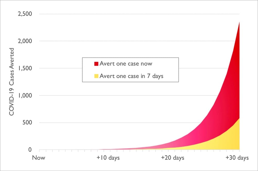
Jewell explains a bit more about what we’re looking at:
The graph illustrates the results of a thought experiment. It assumes constant 30 percent growth throughout the next month in an epidemic like the one in the U.S. right now, and compares the results of stopping one infection today — by actions such as shifting to online classes, canceling of large events and imposing travel restrictions — versus taking the same action one week from today.
The difference is stark. If you act today, you will have averted four times as many infections in the next month: roughly 2,400 averted infections, versus just 600 if you wait one week. That’s the power of averting just one infection, and obviously we would like to avert more than one.
So that’s 1800 infections averted from the actions of just one person. Assuming a somewhat conservative death rate of 1% for COVID-19, that’s 18 deaths averted. Think about that before you head out to the bar tonight or convene your book group as usual. Your actions have a lot of power in this moment; take care in how you wield it.
Coronavirus, social distancing, exponential growth, flatten the curve, pandemic, immunocompromised — those are just some of the concepts related to COVID-19 we have had to come up to speed on over the last few weeks. We should add the “paradox of preparation” to that list.
The paradox of preparation refers to how preventative measures can intuitively seem like a waste of time both before and after the fact. Most of us don’t stop brushing our teeth because the dentist didn’t find any cavities at our most recent checkup, but with larger events that have effects more difficult to gauge (like COVID-19, climate change, and Y2K), it can be hard to spur people to action. From Chris Hayes:
A doctor I spoke to today called this the “paradox of preparation” and it’s the key dynamic in all this. The only way to get ahead of the curve is to take actions that *at the time* seem like overreactions, eg: Japan closing all schools for a month with very few confirmed cases.
That was in response to Dr. James Hamblin:
The thing is if shutdowns and social distancing work perfectly and are extremely effective it will seem in retrospect like they were totally unnecessary overreactions.
Epidemiologist Mari Armstrong-Hough made a similar point earlier on Twitter:
You won’t ever know if what you did personally helped. That’s the nature of public health. When the best way to save lives is to prevent a disease rather than treat it, success often looks like an overreaction.
Preparation, prevention, regulations, and safeguards prevent catastrophes all the time, but we seldom think or hear about it because “world continues to function” is not interesting news. We have to rely on statistical analysis and the expert opinions of planners and officials in order to evaluate both crucial next steps and the effectiveness of preparatory measures after the fact, and that can be challenging for us to pay attention to. So we tend to forget that preparation & prevention is necessary and discount it the next time around.
The good news is that while unchecked epidemics grow exponentially, another thing that can also spreads exponentially is behavioral norms. The basic expert advice on how we can slow the spread of COVID-19 in our communities is pretty unambiguous — wash your hands, don’t touch your face, maintain social distance, self-quarantine, etc. — and so is the huge potential impact of those precautions on the number of people who will get infected and die. To help overcome the paradox of preparation, let’s continue to spread the word about what the experts are urging us to do. Because if we don’t, there might be a lot fewer of us around in a month or two.
Update: In the same vein, Vaughn Tan writes:
This means that any effective actions taken against coronavirus in the few days before the epidemic curve shoots upward in any country will always look unreasonable and disproportionate.
By the time those actions look reasonable and appropriate, they will be too late.
And Now Is the Time to Overreact Ian Bogost in the Atlantic:
The idea that an extreme reaction, such as closing schools and canceling events, might prove to be an overreaction that would look silly or wasteful later outweighs any other concern. It can also feel imprudent; just staying home isn’t so easy for workers who depend on weekly paychecks, and closing is a hard decision for local companies running on thin margins. But experts are saying that Americans can’t really over-prepare right now. Overreaction is good!
It’s hard to square that directive with the associations we’ve built up around overreactions. Ultimately, overreaction is a matter of knowledge-an epistemological problem. Unlike viruses or even zombies, the concept lives inside your skull rather than out in the world. The sooner we can understand how that knowledge works, and retool our action in relation to its limits, the better we’ll be able to handle the unfolding crisis.
Michael Specter writing about America’s weakened public-health system for the New Yorker:
Few people have trouble understanding the purpose of public education or public housing: they are tangible programs that, at least in theory, are designed to improve our lives. Public-health accomplishments, however, are measured in an entirely different way: success is defined by what is prevented, not by what is produced. This creates an odd psychological dynamic.
When public-health programs are successful, they are invisible, and what is invisible is almost always taken for granted. Nobody cheers when they remain untouched by a disease that they hardly knew existed. That makes it easy for shortsighted politicians to deny long-term realities. And that is what they almost always do.
From Stanford professor of neurobiology and bioengineering Michael Lin, this is an excellent 31-page PDF presentation (Slideshare) on what we know about COVID-19 so far and how to deal with it, with extensive references to the latest research (as of 3/15). I’m going to include a few of the most interesting and important slides right here, but do read the whole thing — it is very informative.
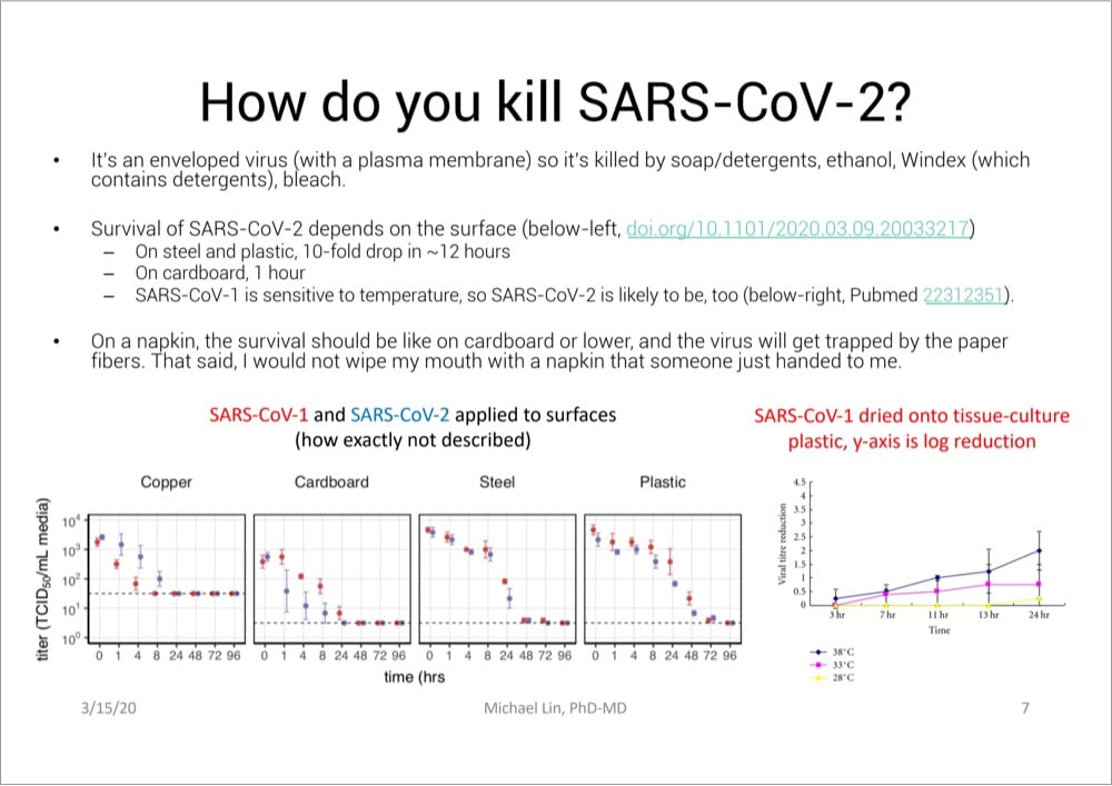
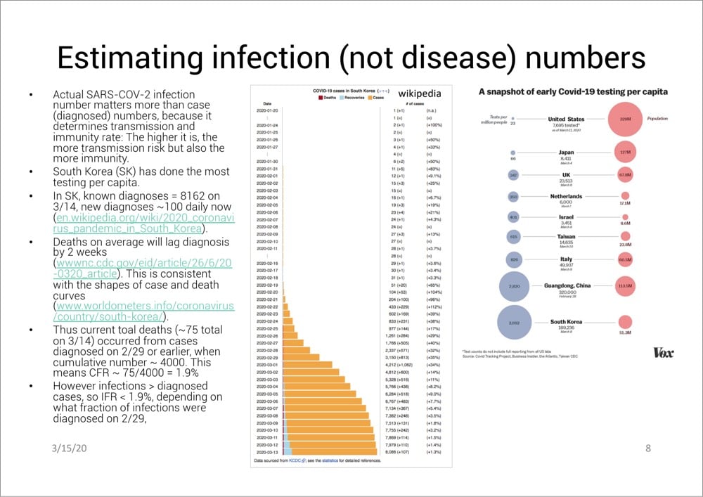
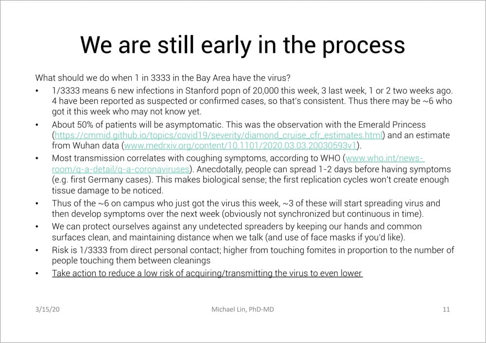
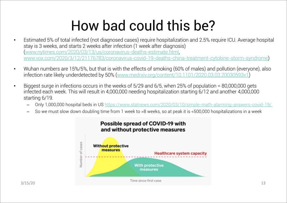
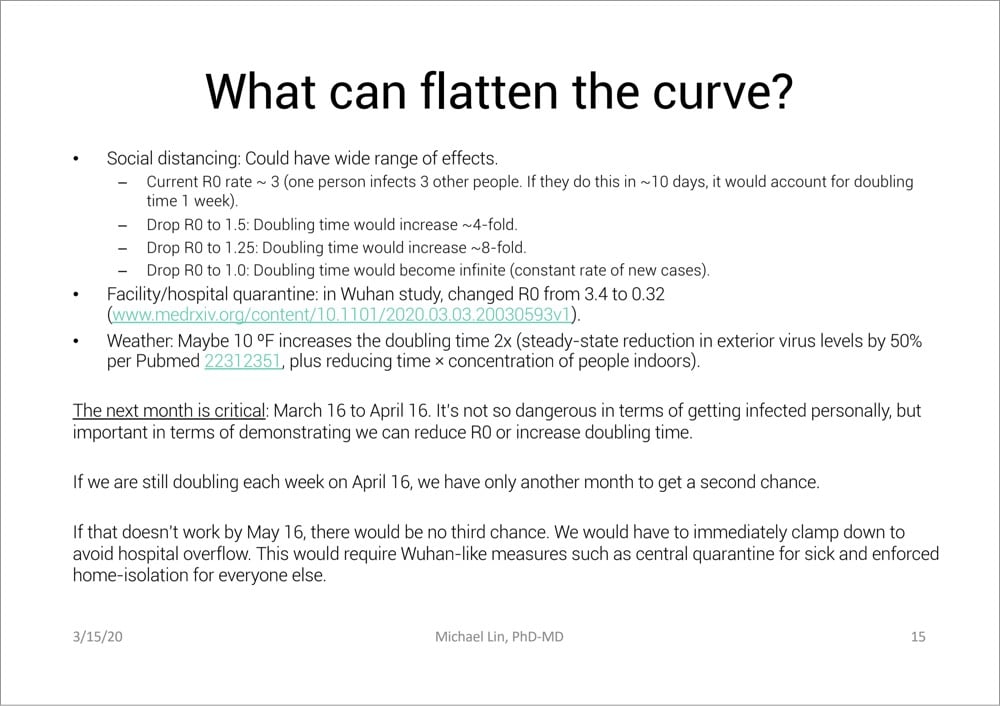
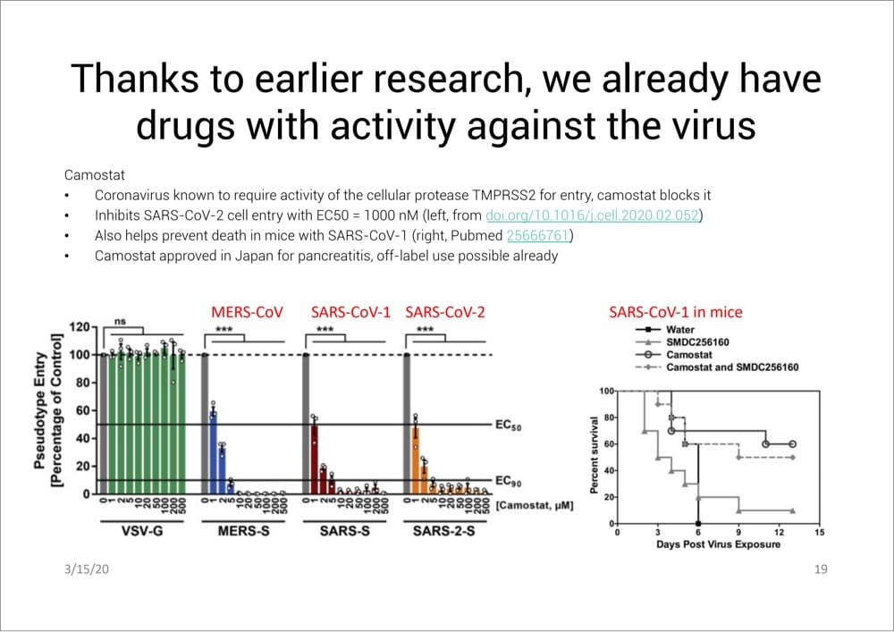

And here are a few other quotes I pulled out:
Compare to Spanish flu of 1917-1918: Cumulative infection rate 27%, IFR 2%. Spanish flu might have higher IFR than COVID-19, but medical care was much worse then (no ventilators, no drugs). In reality COVID-19 is likely the more severe disease. In any case, Spanish flu was devastating.
Large meetings that bring people from around the country are obviously a big risk. Large numbers of people who might breath the same air and touch the same things (e.g. at Biogen meeting, attendants used the same serving utensils at a buffet, and 70 got infected)
If you are young, the worry is more about transmitting virus to older people than about yourself.
Death rates will lag infection rates by 3-4 weeks (2 weeks from diagnosis but that’s 1 week from infection time on average with current testing practices)
Read Lin’s entire presentation here.
Social distancing has been recommended by epidemiologists and public health officials as a way to slow the spread of COVID-19, flatten the curve, and save lives. Avoiding rock concerts and sporting events is easy, but what about going to the grocery store or visiting with a friend? The Atlantic’s Kaitlyn Tiffany talked to a number of public health experts about The Dos and Don’ts of ‘Social Distancing’.
Q: Should I be avoiding bars and restaurants?
Cannuscio: People should avoid gathering in public places. People should be at home as much as possible. The measures that have worked to get transmission under control or at least to bend the curve, in China and South Korea, have been extreme measures to increase social distancing.
Q: Should I stop visiting elderly relatives?
Cannuscio: I think if we are fortunate enough to live near our elders and we get into the mode of seriously isolating our own families, then one person should be designated to go and visit. If we’re not in a situation where we can truly limit our own social contact, then we will be putting that elder at risk by going to visit.
In my estimation, the answers that Carolyn Cannuscio, of Penn’s Center for Public Health Initiatives, gives are the ones to follow. Dr. Asaf Bitton’s advice is even stricter:
2. No kid playdates, parties, sleepovers, or families/friends visiting each other’s houses and apartments.
This sounds extreme because it is. We are trying to create distance between family units and between individuals. It may be particularly uncomfortable for families with small children, kids with differential abilities or challenges, and for kids who simply love to play with their friends. But even if you choose only one friend to have over, you are creating new links and possibilities for the type of transmission that all of our school/work/public event closures are trying to prevent. The symptoms of coronavirus take four to five days to manifest themselves. Someone who comes over looking well can transmit the virus. Sharing food is particularly risky — I definitely do not recommend that people do so outside of their family.
They both rightly talk about how the early actions we take will end up having a big impact in limiting the damage. (Check out this video about epidemics & exponential growth if you haven’t already.) Singapore, Hong Kong, Taiwan, and other places were able to nip the epidemic in the bud in part because of aggressive social distancing practices.
According to an ongoing investigation at The Atlantic, the US has tested only about 14,000 people for COVID-19 so far (a stat CDC data seems to confirm). 14,000 out of 330 million people. Olga Khazan writes about the four main reasons why the US is so behind in testing for the virus.
Interviews with laboratory directors and public-health experts reveal a Fyre-Festival-like cascade of problems that have led to a dearth of tests at a time when America desperately needs them. The issues began with onerous requirements for the labs that make the tests, continued because of arcane hurdles that prevented researchers from getting the right supplies, and extended to a White House that seemed to lack cohesion in the pandemic’s early days. Getting out lots of tests for a new disease is a major logistical and scientific challenge, but it can be pulled off with the help of highly efficient, effective government leadership. In this case, such leadership didn’t appear to exist.
Here’s another take on the problem from a few days ago in the NY Times.
The US has bungled the situation so badly that a pair of Chinese foundations announced this morning that they were donating 500,000 testing kits and 1 million masks to the US. Last month in my Asian travelogue, I wrote that my main observation after spending three weeks in Asia was: “America is a rich country that feels like a poor country”. That we have to rely on foreign aid in situations like this is a good example of what I was referring to.
Newer posts
Older posts





Socials & More