Painting or reality?
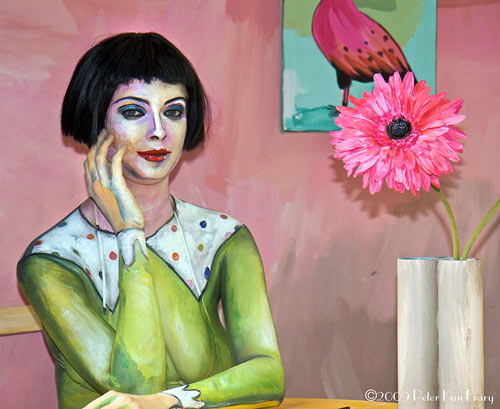
Answer here. (via rocketboom)


This site is made possible by member support. 💞
Big thanks to Arcustech for hosting the site and offering amazing tech support.
When you buy through links on kottke.org, I may earn an affiliate commission. Thanks for supporting the site!
kottke.org. home of fine hypertext products since 1998.
Beloved by 86.47% of the web.
Shaquille O’Neal curated an art exhibition that opened this weekend at Flag Art Foundation in Chelsea.
Do you ever get time to visit museums?
I used to go a lot with my kids. Donald Trump is a great friend, and he has four or five Picassos on his plane. And that’s where I would look at them. One time, I was at a museum and tried touching a Picasso. You break it, you buy it, they said. I was told it would cost $2 million.
A number of designers, artists, and photographers share how they combat creative block. One solution begins:
Slice and chop 2 medium onions into small pieces.
Put a medium sized pan on a medium heat with a few glugs of olive oil.
Add the onions to the pan, and a pinch of salt and pepper.
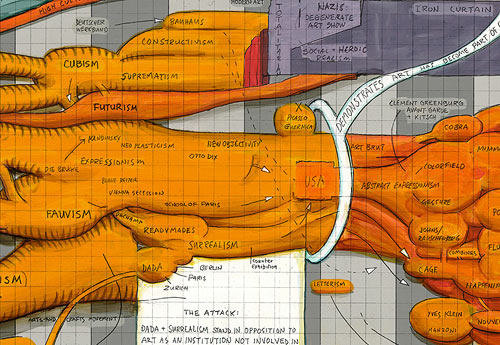
Ward Shelley paints these wonderfully intricate timelines of different things…his life, Frank Zappa’s career, and the history of the avant garde.
The Indianapolis Museum of Art and the New Orleans Museum of Art have a Super Bowl bet…the loser loans a significant piece of art to the winner for three months. The directors of the two museums trash talked back and forth via email and Twitter before agreeing on the paintings to be loaned.
“Max Anderson must not really believe the Colts can beat the Saints in the Super Bowl. Otherwise why would he bet such an insignificant work as the Ingrid Calame painting? Let’s up the ante. The New Orleans Museum of Art will bet the three-month loan of its Renoir painting, Seamstress at Window, circa 1908, which is currently in the big Renoir exhibition in Paris. What will Max wager of equal importance? Go Saints!”
(thx, stuart)
Upcoming at MoMA: a retrospective of the work of Henri Cartier-Bresson.
For more than twenty-five years, he was the keenest observer of the global theater of human affairs — and one of the great portraitists of the twentieth century. MoMA’s retrospective, the first in the United States in three decades, surveys Cartier-Bresson’s entire career, with a presentation of about three hundred photographs, mostly arranged thematically and supplemented with periodicals and books.
After MoMA, the exhibition will visit Chicago, SF, and Atlanta. Quite excited for this one.
Artist Motoi Yamamoto creates intricate large scale mazes using salt. I love this one, an installation at the Sumter County Gallery of Art in South Carolina:
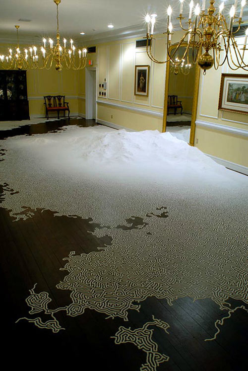
His Utsusemi installations are worth checking out as well.
![]()
American Pixels is a project by Joerg Colberg that uses jpeg compression algorithms to create compelling images. From the technical notes:
ajpeg is a new image compression algorithm where the focus is not on making its compression efficient but, rather, on making its result interesting. As computer technology has evolved to make artificial images look ever more real - so that the latest generation of shooter and war games will look as realistic as possible - ajpeg is intended to go the opposite way: Instead of creating an image artificially with the intent of making it look as photo-realistic as possible, it takes an image captured from life and transforms it into something that looks real and not real at the same time.
Artist Christopher Locke makes fossil sculptures of extinct technology, including cassette tapes, rotary telephones, and boom boxes.

Roman Cortes took Diego Velázquez’s Las Meninas and applied a pseudo 3-D parallax effect to it using only CSS. Awesome. Now redo The Kid Stays in the Picture entirely in CSS.
I love this project: a couple of NYC artists do paintings of items that they want and sell the art to buy the items.
Each painting shows one thing we want, and sells for the price of the real item. So you can buy A Slice of Pepperoni for $3.00 or Dinner at Nobu for $152.00. When the painting sells we use the money to go out and buy that thing.

The other half of the project is the documentation of the purchase/enjoyment of the item; here’s the outcome of “Custom Adidas”. (via clusterflock)
Update: C.J. Cubitt reminded me of J.S.G. Boggs, an artist who draws realistic-looking money and trades it for goods and services…the goods, receipt, and any change become the artwork. Here’s one of his hand-drawn bills:

Update: Dorothy Gambrell of Cat and Girl solicits donations and then draws the stuff she buys. (thx, sean & seth)
Update: The same artists also do Needs for Sale…the sales benefit charities.
An oldie but goodie from Cory Arcangel: an mp3 of Iron Maiden’s The Number of the Beast compressed 666 times. (via lined and unlined)
Jeanne-Claude, one-half of the art duo Christo and Jeanne-Claude, has died at the age of 74. The front page of the couple’s web site has a short tribute. I loved The Gates.
For his piece Steak Filter, Noah Feehan ran a video signal of a steak cooking through the actual steak. The deterioration of the video signal becomes a sign of how done the steak is.
Quite literally, I am plugging composite video into a big steak, which is then cooked. The video signal going through the steak is the image of the steak cooking. Gradually, the steak loses moisture and signal can no longer pass.
The videos don’t really show too much, but I love the idea. (via eat me daily)
Fabio Viale makes unusual marble sculptures, like this skull that looks like it’s made out of styrofoam.
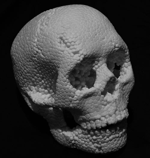
(via this is that)
Berliners! Artist Martin Butler is trying to find 33,000 people to recreate the Berlin Wall for the 20th anniversary of the Wall’s fall.
The idea is to form on the 9th of november 2009 — the night the Wall fell 20 years ago — a line of people that will recreate the Berlin Wall with their physical presence, marking the path where the wall once stood. Thousands of people will form a human chain that will make its way on the 9th of november around 8.15pm. This action will last for approximately 15 minutes.
If you want to be a part of the piece, sign up on the web site. (thx, søren)
Update: A U2 concert at the Brandenburg Gate has run into some trouble after — and I swear I am not making this up — a huge wall has been constructed to keep non-ticket holders out of the concert. (thx, john)
Michael Paulus is offering new versions of his cartoon skeleton sketches at his Etsy store.
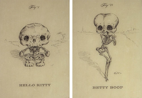
I’ve got a previous version of his Hello Kitty…love it.
In addition to being a painter of some repute, Peter Paul Rubens was also a diplomat:
In Master of Shadows, Mark Lamster tells the story of Rubens’s life and brilliantly re-creates the culture, religious conflicts, and political intrigues of his time. Commissions to paint military and political leaders drew Rubens from his Antwerp home to London, Madrid, Paris, and Rome. The Spanish crown, recognizing the value of his easy access to figures of power, enlisted him into diplomatic service. His uncommon intelligence, preternatural charm, and ability to navigate through ever-shifting political winds allowed him to negotiate a long-sought peace treaty between England and Spain even as Europe’s shrewdest statesmen plotted against him.
and a graphic designer.
Moretus was Rubens’s most frequent design client. To save his friend money, Rubens generally did his work for Plantin on holidays, so he would not have to charge Moretus his rather exorbitant day rate (Rubens was notorious for his high prices), and even then he agreed to be paid in books.
Congrats to Jen Bekman on getting funding for 20x2001.
“I love the idea of taking the friction out of the art world,” said Mr. Conrad. “A lot of people want to buy nice things, but don’t know how. Jen has built a business from that, which is growing very nicely and has a lot of repeat customers.”
[1] In light of the new FTC guidelines for disclosure by bloggers2, a few somewhat relevent statements. 1. 20x200 has in the past paid $1200 to sponsor the kottke.org RSS feed. 2. I have linked to 20x200 and Jen Bekman’s gallery several times on kottke.org, for which Jen Bekman has thanked me, which is a good feeling, to be thanked, and perhaps that subconsciously predisposes me towards future linking because who doesn’t like to be thanked? 3. Jen Bekman is a friend. 4. I also know Caterina Fake, Zach Klein, and Scott Heiferman socially; they are a few of 20x200’s angel investors. 5. I am a resident of New York City, in which 20x200 is headquartered. 6. I have purchased art from 20x200 in the past. 7. I may have received a 20x200 print from Jen Bekman herself, either as a straight-up gift or as a promotional item. Honestly, I can’t remember if she gave me anything, what it was, or the circumstances of the giving. 8. I have received 20x200 prints as gifts from others. They are thanked. 9. I know my wife and my wife knows Jen Bekman. 10. I may have unwittingly posed for photos next to 20x200 artwork hanging in my residence or in the residences of others, giving the impression that I am endorsing said artwork. Apologies. 11. I have agreed to, at some point in the future, curating a selection of artworks for 20x200 and then chatting casually with Jen Bekman about my choices, an edited transcript of which will appear on the 20x200 web site. As far as I know, no payment for this service is forthcoming and if it was, I would refuse it politely. 12. Jen Bekman’s dog’s name is Ollie. So is my son’s. ↩
[2] Why just for bloggers? Do New York Times book, music, and movie reviewers disclose that they received review copies for free? ↩
Stolen art in the Los Angeles area results in some unorthodox art posters. Here’s a missing Warhol print of Mick Jagger:

Looks like something Warhol himself might have come up with.
That’s the name of Ohio-based artist Richard Whitehurst’s latest work.
The artist plans to place himself in a room, the only entrance or exit being a 22 ft long plywood tunnel constructed by Whitehurst himself. Then he says that for the duration of the gallery’s opening (from 7:00 p.m. to midnight) he will rape anyone who travels through the tunnel into that room.
Whitehurst prototyped the idea with a previous project called The Punch-You-In-The-Face Tunnel.
As it turns out, I ended up breaking the nose of the third person to crawl through the tunnel, an aspiring model. She went to the hospital and eventually sued me. Her modeling career was put on hold. The civil case was long and drawn out and the matter still hasn’t been resolved. To this day she still has unpaid medical bills. The point of this long aside is that all this took place two years ago, and I’m still having an impact on this young lady’s life, something not many other artists could claim about their work.
Rape seemed like the next logical step.
Me? I would have built The Tickle Tunnel. I guess that’s why I’m not an artist. (via mxml)
Update: Oh, hell, it’s fake. (thx, dozens of people who aren’t saps like I am)
In 2001, Tim Hawkinson created Uberorgan for the gallery at MassMOCA.
Several bus-size biomorphic balloons, each with its horn tuned to a different note in the octave, make up a walk-in self-playing organ. A 200 foot-long scroll of dots and dashes encodes a musical score of old hymns, pop classics, and improvisational ditties. This score is deciphered by the organ’s brain - a bank of light sensitive switches - and then reinterpreted by a series of switches and relays that translate the original patterns into non-repeating variations of the score.
Part sculpture, part giant musical instrument, Hawkinson’s installation was a loose interpretation of the human body’s organ systems. Uberorgan conducted itself for five minutes every hour, on the hour. The exhibition traveled from MassMOCA to the Getty Center in Los Angeles, where it graced the museum’s entrance hall during the exhibit of Hawkinson’s work called Zoopsia, a name that means “visual hallucinations of animals.”
You can hear a minute long sample of the Uberorgan on the Getty Center website. To me it sounds like a duet between a three-year-old jamming out on a bass saxophone and an elephant in a good mood.
Update: Tim Hawkinson and the Uberorgan are featured the Art:21 episode,”Time.” Seeing and hearing the piece, even on the small screen, is impressive, and Hawkinson explains how he came about creating such a voluminous, volume-driven work of art. (thx, cliff)
The art of Sandhi Schimmel Gold is junk. The artist uses junk mail to create semi-mosaic’ed handmade portraits. Using advertising ephemera and all kinds of textures and colors, she’s constructed representations of Frank Sinatra, Kurt Vonnegut, Jackie O, and Audrey Hepburn, among others. She combines painting with collage to render faces that are unbelievably detailed and realistic. If you want to see what Schimmel would do with your visage you can commission a piece. I’d like to see my neighbor’s mug constructed from of all of his Cabela’s catalogs that find themselves in my mailbox.
An interesting article in The Brooklyn Rail debates the value of commercialism versus criticism in the art world. Riffing off of an essay called “Frivolity and Unction” from Dave Hickey’s book, Air Guitar, writer Shane McAdams opines that art doesn’t have to be “important” to be good:
“Art” can be unimportant and still allow for the experience of a work of art to be life-changing. I value the memories I have of listening to baseball games on my grandparents’ porch, but Baseball, as a concept, remains entirely unimportant. Such concepts as baseball, art, and Hickey’s example of rock and roll, are wholly unimportant except for the experiences they foster and the history to which they contribute.
Kasey McMahon decided to combine an interest in taxidermy with her PC. Fearing that the natural world is being replaced by technology, the artist installed a working computer inside of an idle beaver. First, she crafted a computer from the motherboard up, tested it, then hollowed out a stuffed beaver and molded the two together using spandex spray, resin, and fiberglass. After three months of work, the result was Compubeaver, followed up by its accessory, Text-o-Possum, a stuffed possum that’s equipped with a laser in its back leg that projects a virtual keyboard. McMahon was generous enough to provide a 29-step guide for the rest of us, in the hope that we’ll each case mod a beaver and create our own animal-based data processor. Just imagine using a raccoon laptop at Starbucks. Perhaps that would inspire them to provide free WiFi.
Update: See also installing Linux on a dead badger. (thx, michael)
Brian Dettmer began crafting skeletons from cassette tapes after being inspired by the relatively rapid death of analog media. The artist, whose previous work includes meticulous autopsies of books, enjoys deconstructing found objects and transforming them into complex, chimerical sculptures. His plastic bones have resulted in a series of skulls, both human and animal, crafted from tapes consistent with a musical genre, such as rock and metal. Each piece is devoid of any adhesive, and although Dettmer keeps his process a secret, it’s rumored that the cassettes are welded together using heat, moulds, and his damp hands. No word yet on how they sound.
Did Jackson Pollock hide his name in one of his most well-known paintings?
Pollock’s possibly writing his name in Mural testifies to an overlooked feature of his works: they have a structure, contrary to the popular notion that they could be done by any 5-year-old with a knack for splatters. In my view, Pollock organized the painting around his name according to a compositional system-vertical markings that serve as the loci of rhythmic spirals-borrowed directly from his mentor, Benton.
Try and find it for yourself.
Dazzling work by Hiroshi Sugimoto.
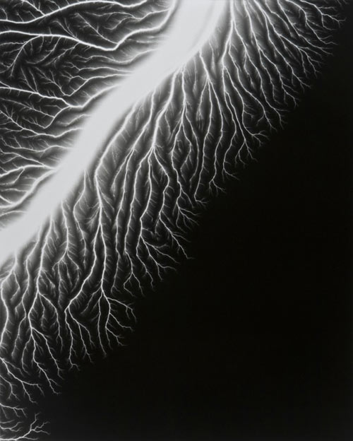
Hiroshi Sugimoto uses a 400,000-volt Van De Graaff generator to apply an electrical charge directly onto his film.
See also Peter Miller’s Polariod experiments.
Update: Robert Buelteman uses electricity to take photos of flowers.
Socials & More