kottke.org posts about art
This fantastic short video from Anthony Cerniello shows a person imperceptibly aging from youth to old age.
The idea was that something is happening but you can’t see it but you can feel it, like aging itself.
I would love to know how this was done. Benjamin Button-esque FX, I would imagine.
Update: Oh hey, luckily for me, this blogger named Jason Kottke posted this video more than two years ago and noted how the video was made.
Anthony Cerniello took photos of similar-looking family members at a reunion, from the youngest to the oldest, and edited them together in a video to create a nearly seamless portrait of a person aging in only a few minutes.
I think I’ll have to subscribe to this fella’s site. (via @jniemasik)
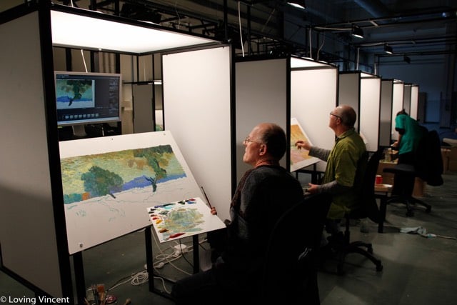
Loving Vincent is an upcoming feature-length film about Vincent van Gogh that is animated in an unusual way: using 12 oil paintings per second. They’ve trained dozens of painters — and are looking for more if you’re interested — in the style of van Gogh to illustrate every instant of the film. Here are some of the painters working on the movie:
Update: A full trailer is out:
(via colossal)
Henry Darger is perhaps the most famous outsider artist in the world. This is a short documentary about his life (not much is known) and art (which now fetches tens of thousands of dollars).

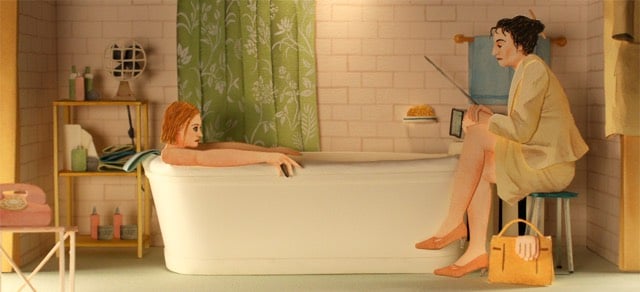
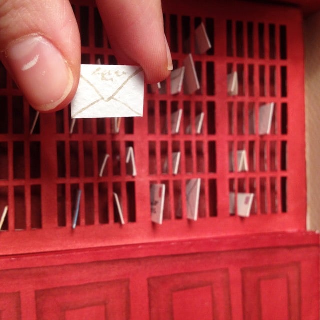
Spanish artist Mar Cerdà uses watercolor and paper to create amazingly detailed dioramas, including those made from scenes in Wes Anderson movies. So far, he’s done scenes from The Grand Budapest Hotel, The Darjeeling Limited, and The Royal Tenenbaums. (via designboom)
The Neues Museum in Berlin is the current home of the bust of Queen Nefertiti, a singular piece of ancient Egyptian sculpture. A pair of artists went to the museum, did a 360° scan of the bust without the museum’s permission, and have made the resulting high-resolution 3D model available to all.
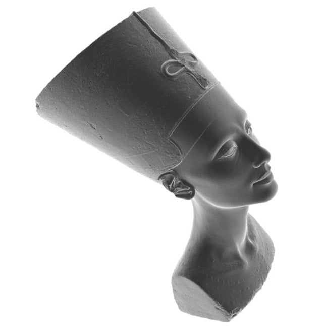
In lieu of the contested original, a 3D-printed copy of the bust made from the model is now on display in Egypt at the American University of Cairo. (via hyperallergic)
Update: There’s cause to be skeptical about how the 3D scan of Nefertiti was accomplished and the artists are being a little vague as to how they did it. The video shows the artists using a Kinect Xbox controller but a Kinect scan can’t deliver the resolution level of the 3D model. Perhaps it was stitched together using a bunch of photos? Or maybe they hacked into the museum’s files and took their model?
The last possibility and reigning theory is that Ms. Badri and Mr. Nelles elusive hacker partners are literally real hackers who stole a copy of the high resolution scan from the Museum’s servers. A high resolution scan must exist as a high res 3D printed replica is already available for sale online.
Adam Westbrook talks about Vincent van Gogh and the benefit of doing creative work without the audience in mind. Having never read Csikszentmihalyi’s Flow (I know, I know), I was unfamiliar with the word “autotelic”. From Wikipedia:
Mihaly Csikszentmihalyi describes people who are internally driven, and as such may exhibit a sense of purpose and curiosity, as autotelic. This determination is an exclusive difference from being externally driven, where things such as comfort, money, power, or fame are the motivating force.
Doug Belshaw has a bit more on autotelism and how it relates to education.
Artist Jill Pelto turns climate change graphs into art. So, for instance, a chart of rising global temperatures turns into a forest fire, which are becoming more common as temps rise:
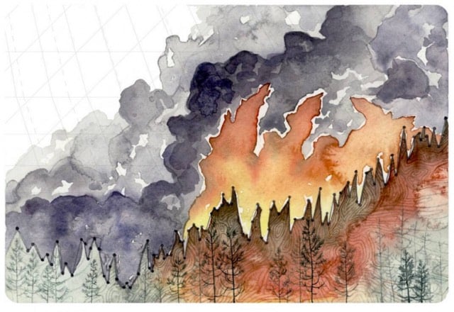
And a graph of the retreat of glaciers over the years becomes a retreating glacier:
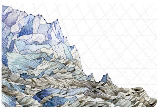
(via @EricHolthaus & climate central)
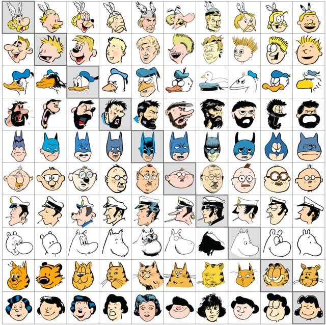
Artist Jaakko Seppälä drew 10 of his favorite comic characters in each other’s distinctive styles, e.g. Lucy van Pelt in the style of Calvin and Hobbes or Garfield in the style of Donald Duck.
Update: See also the Great Comic Switcheroo of 1997, where a bunch of comic authors drew each others’ comics for a day. (via @craigpatik)
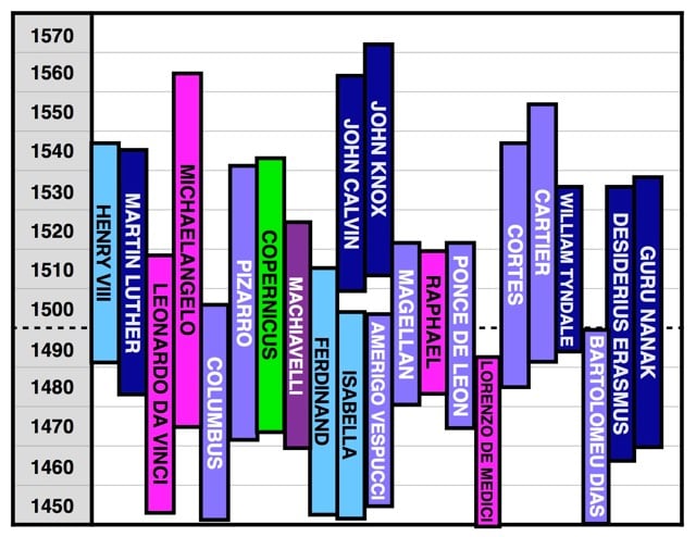
At Wait But Why, Tim Urban turns history on its side by thinking about time-synchronized events around the world, as opposed to events through the progression of time in each part of the world.
Likewise, I might know that Copernicus began writing his seminal work On the Revolutions of the Celestial Spheres in Poland in the early 1510s, but by learning that right around that same time in Italy, Michelangelo painted the ceiling of the Sistine Chapel, I get a better picture of the times. By learning that it was right while both of these things were happening that Henry VIII married Catherine of Aragon in England, the 1510s suddenly begins to take on a distinct personality. These three facts, when put together, allow me to see a more three-dimensional picture of the 1510s — it allows me to see the 1510s horizontally, like cutting out a complete segment of the vine tangle and examining it all together.
He does this mainly by charting and graphing the lifetimes of famous people, revealing hidden contemporaries.
I’ve been slowly making my way through Ken Burns’ remastered The Civil War.1 At a few points in the program, narrator David McCullough reminds the viewer of what was going on around the world at the same time as the war. In the US, 1863 brought the Battle of Gettysburg and The Emancipation Proclamation. But also:
In Paris that year, new paintings by Cezanne, Whistler, and Manet were shown at a special exhibit for outcasts. In Russia, Dostoevsky finished Notes from the Underground. And in London, Karl Marx labored to complete his masterpiece, Das Kapital.
And a year later, while the advantage in the war was turning towards the US:1
In 1864, a rebellion in China that cost 20 million lives finally came to an end. In 1864, the Tsar’s armies conquered Turkistan and Tolstoy finished War and Peace. In 1864, Louis Pasteur pasteurized wine, the Geneva Convention established the neutrality of battlefield hospitals, and Karl Marx founded the International Workingmen’s Association in London and in New York.
Urban explicitly references the war in his post:
People in the US associate the 1860s with Lincoln and the Civil War. But what we overlook is that the 1860s was one of history’s greatest literary decades. In the ten years between 1859 and 1869, Darwin published his world-changing On the Origin of Species (1859), Dickens published A Tale of Two Cities (1859) and Great Expectations (1861), Lewis Carroll published Alice in Wonderland (1865), Dostoyevsky published Crime and Punishment (1866), and Tolstoy capped things off with War and Peace (1869).
The Civil War. The Origin of Species. Alice in Wonderland. The infancy of Impressionism. Pasteurization. Das Kapital. Gregor Mendel’s laws of inheritance. All in an eight-year span. Dang.
Before the holiday break, I took in the Picasso Sculpture show at MoMA. Sculpture typically isn’t my cup of tea art-wise (or Picasso-wise) and much of the exhibition was lost on me, but Bull’s Head stopped me in my tracks.
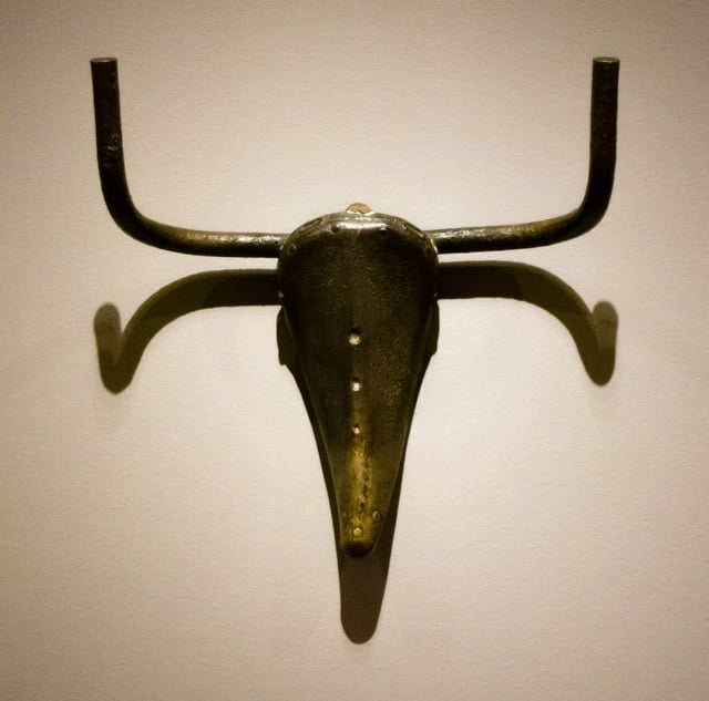
Picasso once said of the piece:
Guess how I made the bull’s head? One day, in a pile of objects all jumbled up together, I found an old bicycle seat right next to a rusty set of handlebars. In a flash, they joined together in my head. The idea of the Bull’s Head came to me before I had a chance to think. All I did was weld them together… [but] if you were only to see the bull’s head and not the bicycle seat and handlebars that form it, the sculpture would lose some of its impact.
The piece is, at once, just barely over the line of what can be considered art and also so wonderfully artistic. Love it.
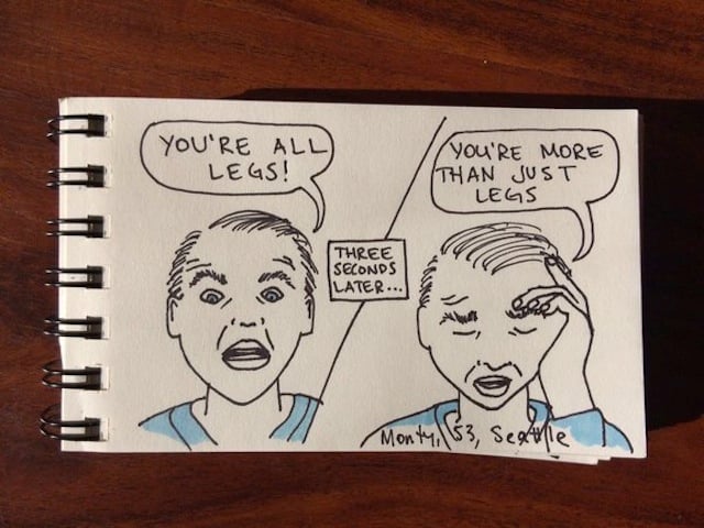
According to Jacq the Stripper’s Twitter bio, “I dance. Naked. For large (and occasionally insultingly modest) sums of money. I wrote a book about it.” Her book is The Beaver Show, and you can buy it in paperback or Kindle.
It’s a memoir of her life on the gentlemen’s club stage.
On Twitter, she also posts her art, featuring absurd things male customers say.



Using a tilt-shift effect, St. Tesla created miniature versions of galaxies, nebula, and supernovas. So cute!
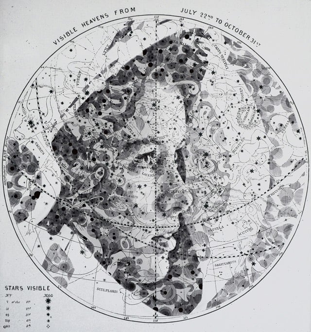
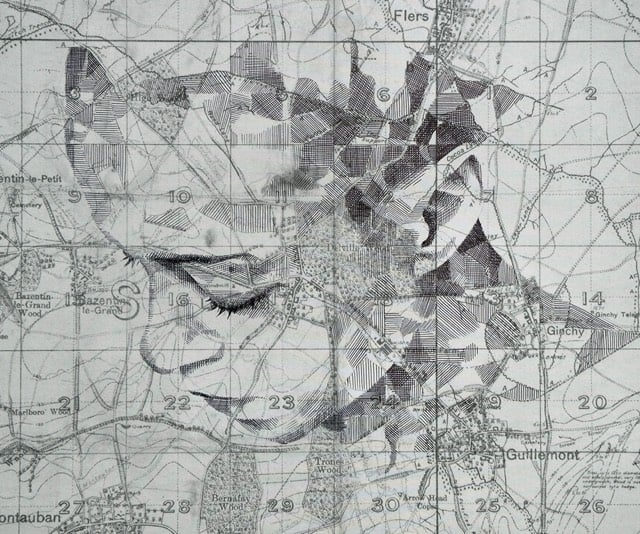
Colossal notes that artist Ed Fairburn has produced a bunch of new work (previously). Love these.
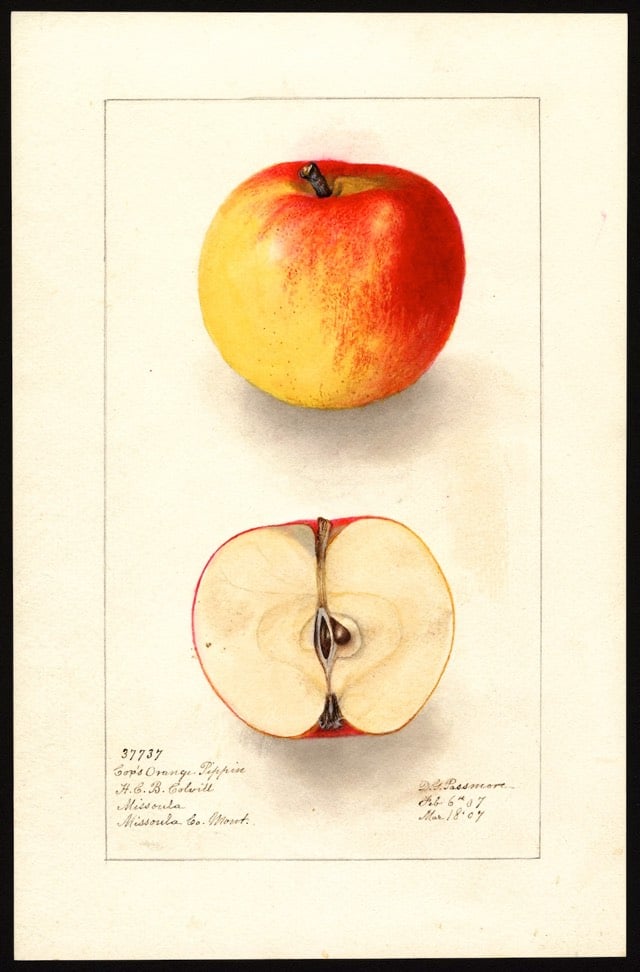
The U.S. Department of Agriculture’s National Agricultural Library contains around 3800 watercolor paintings, lithographs, and drawings of different apple varieties, most of which you will not find at the typical American grocery store. They also have another 3500 images of other fruits and nuts. (via slate)
Update: Until recently, the high-resolution images from this collection were not freely available to the public. After some agitation by Parker Higgins of the EFF, the Department of Agriculture decided to post high-res JPGs of each painting for free download. Higgins recently gave a talk about how it went down. This is a good example of the value of the public domain (and activists like Higgins)…without those images being available, neither Slate or I would have written about the collection, and who knows what someone who read them will do with that information. Maybe nothing! But maybe something cool! It’s worth putting it out there to find out…governments should be in the business of increasing the possibility space of their citizens. (via @stvnrlly)

Operating under the name of Zolloc, Hayden Zezula makes all sorts of cool, creepy, lovely, trippy animated GIFs. This one is my favorite. (via ignant)
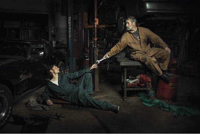
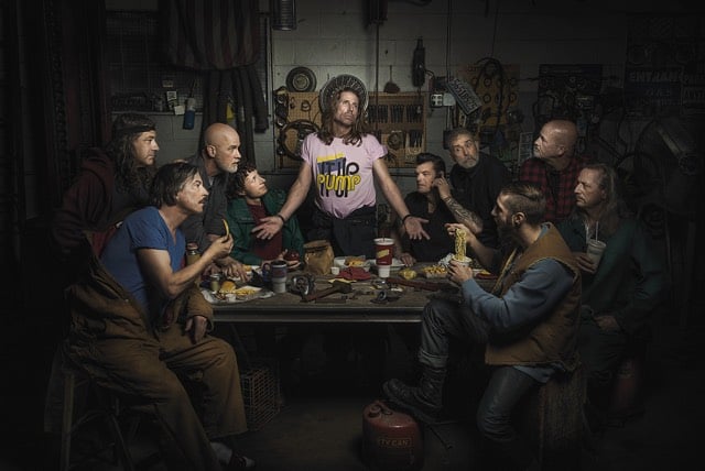
From photographer Freddy Fabris, The Renaissance Series, photographs of auto mechanics posed in the style of Renaissance paintings. (via colossal)
The Joy of Painting, hosted by Bob Ross, ran for 11 years on public television for a total of more than 400 episodes. The very first episode ever broadcast was just uploaded to Ross’ YouTube channel.
Gene Kogan used some neural network software written by Justin Johnson to transfer the style of paintings by 17 artists to a scene from Disney’s 1951 animated version of Alice in Wonderland. The artists include Sol Lewitt, Picasso, Munch, Georgia O’Keeffe, and van Gogh.
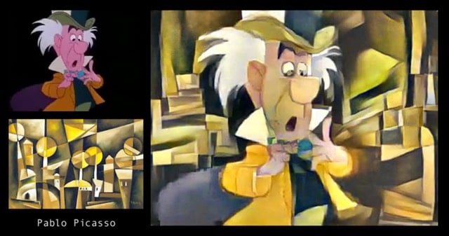
The effect works amazingly well, like if you took Alice in Wonderland and a MoMA catalog and put them in a blender. (via prosthetic knowledge)
From 1915, a short film of Claude Monet painting one of his series of Water Lilies paintings. Monet created about 250 oil paintings depicting the lilies and other flowers in his flower garden at Giverny.
Open Culture has posted a few other videos of old masters at work and at leisure, including Edgar Degas, Auguste Renoir, and Auguste Rodin.
The Nerdwriter takes on Children of Men, specifically what’s going in the background of Alfonso Cuarón’s film, both in terms of references to other works of art & culture and to things that push the plot along and contribute to the tone and message of the film.
[This is NSFW.] Artist Hilde Krohn Huse needed a minute or two of film of herself hanging naked upside down from a tree branch for a project she was working on. But when the rope tightened around her ankle too much, things went a little wrong.
My first thought was, “OK, you’ve fucked up, Hilde, but let’s try to get you out of this so nobody needs to know.” I hauled myself up, hand over hand, until I was swinging horizontally, just below the branch, and tried to yank my foot free.
It was hopeless. Righting myself, I put my free foot back on the ground to rest for a moment, then tried again, pulling myself up and fighting, puppet-like, against my bonds. My left foot, taking my weight in the lowest noose, started to spasm and I knew my strength wouldn’t hold out. But my pride was still uppermost — the idea of having to draw the attention of others to my humiliating plight still seemed unthinkable. I was losing strength, but full of adrenaline, my face dragging along the woodland floor, leaving me spitting twigs.
As any good artist would, Huse turned her ordeal into an art piece in the form of the 11 minutes of video shot before her camera shut off:
The eruption of Mount Tambora in Indonesia in 1815 was the most powerful volcanic eruption in recorded history. According to Tambora: The Eruption That Changed the World by Gillen D’Arcy Wood, the eruption affected the world’s weather for at least three years, inspired artists & writers, triggered famine, contributed to the world’s cholera epidemic, and altered economic systems all over the world.
Here, Gillen D’Arcy Wood traces Tambora’s global and historical reach: how the volcano’s three-year climate change regime initiated the first worldwide cholera pandemic, expanded opium markets in China, and plunged the United States into its first economic depression. Bringing the history of this planetary emergency to life, Tambora sheds light on the fragile interdependence of climate and human societies to offer a cautionary tale about the potential tragic impacts of drastic climate change in our own century.
William Broad reviewed the book recently for the NY Times.
The particles high in the atmosphere also produced spectacular sunsets, as detailed in the famous paintings of J.M.W. Turner, the English landscape pioneer. His vivid red skies, Dr. Wood remarked, “seem like an advertisement for the future of art.”
The story also comes alive in local dramas, none more important for literary history than the birth of Frankenstein’s monster and the human vampire. That happened on Lake Geneva in Switzerland, where some of the most famous names of English poetry had gone on a summer holiday.
The Tambora eruption must have also unleashed quite a racket, perhaps louder than Krakatoa’s loudest sound in the world.
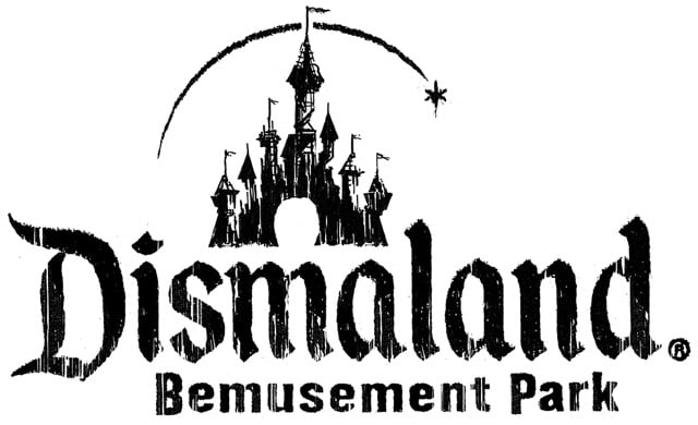
Banksy has opened an apocalyptic theme park called Dismaland in an abandoned resort in an English coastal town, Weston-super-Mare.
Are you looking for an alternative to the sugar-coated tedium of the average family day out? Or just somewhere a lot cheaper? Then this is the place for you. Bring the whole family to come and enjoy the latest addition to our chronic leisure surplus…
The entrance fee is £3 and the park will be open for five weeks. Colossal has the scoop, including a list of artists who contributed art to the park, er, show.
A demented assortment of bizarre and macabre artworks from no less than 50 artists from around the world including Damien Hirst, Bill Barminski, Caitlin Cherry, Polly Morgan, Josh Keyes, Mike Ross, David Shrigley, Bäst, and Espo. In addition, Banksy is showing 10 artworks of his own.
Colossal’s own Christopher Jobson curated the park’s short film program. Congrats! (Also, super jealous!)
Update: For a closer look at the park, check out the trailer:
Photographer Clayton Cubitt started a project in 2012 called Hysterical Literature. In each of the project’s resulting videos, a female participant is filmed from the waist up reading a story of her choosing while she is stimulated to orgasm with a vibrator by Cubitt’s partner, Katie James. His first subject was adult film star Stoya; her thoughts on the experience are here.
Vanity Fair recently sent writer Tony Bentley to participate in an HL session. Her reading choice? The Portrait of a Lady by Henry James.
With Katie now in position under the table, takeoff is imminent and the stakes are high: the sessions are a one-shot deal, no retakes, and no editing of the footage after the fact. It was not lost on me that a perfect triangulation between Clayton (auteur, cameraman), Katie (Hitachi artist), and me (the canvas) was in play, and it mirrored my internal mixture of curiosity, exhilaration, and stage fright. I couldn’t help wondering if this adventure qualified as having a threesome with two strangers. But soon enough such intellectualizing sexualizing was rendered naught.
“Rolling,” says Clayton, and everything instantly disappeared except the book in my hands and the words on the page. The world was out and I was on.
By the time I’d read two pages, I was struggling mightily to keep my countenance. “She spent half her time in thinking of beauty, bravery and mag-nan-nnn-im-im-ity…”
There’s no nudity in the videos, but you might still find them NSFW.
A painting of fruit done by Giovanni Stanchi sometime in the mid 1600s shows that the watermelon has changed somewhat in the intervening 350 years.
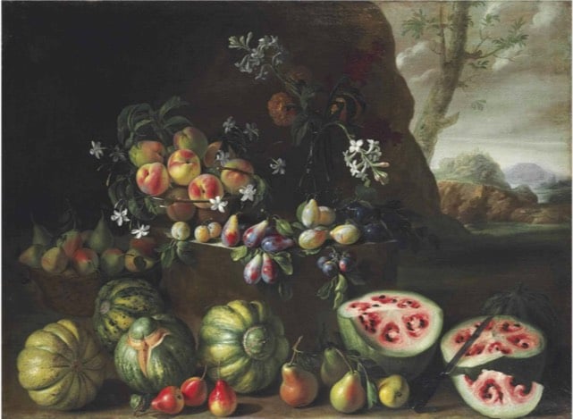
That’s because over time, we’ve bred watermelons to have the bright red color we recognize today. That fleshy interior is actually the watermelon’s placenta, which holds the seeds. Before it was fully domesticated, that placenta lacked the high amounts of lycopene that give it the red color. Through hundreds of years of domestication, we’ve modified smaller watermelons with a white interior into the larger, lycopene-loaded versions we know today.
(via @robinsloan)
I had no idea Ol’ Dirty Bastard and medieval paintings had something in common. One of ODB’s AKAs was also the reason why babies in medieval paintings looked like ugly middle-aged men: Big Baby Jesus.
I mean, this baby looks like he wants to tell you that a boat is just a money pit.
Artist Sam Van Aken is using grafting to create trees that bear 40 different kinds of fruit. National Geographic recently featured Van Aken’s Tree of 40 Fruit project:
The grafting process involves slicing a bit of a branch with a bud from a tree of one of the varieties and inserting it into a slit in a branch on the “working tree,” then wrapping the wound with tape until it heals and the bud starts to grow into a new branch. Over several years he adds slices of branches from other varieties to the working tree. In the spring the “Tree of 40 Fruit” has blossoms in many hues of pink and purple, and in the summer it begins to bear the fruits in sequence — Van Aken says it’s both a work of art and a time line of the varieties’ blossoming and fruiting. He’s created more than a dozen of the trees that have been planted at sites such as museums around the U.S., which he sees as a way to spread diversity on a small scale.
(via colossal)
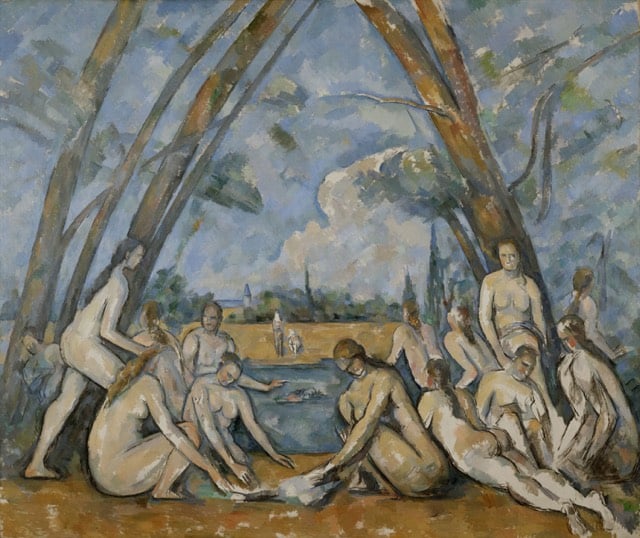
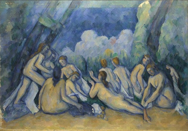
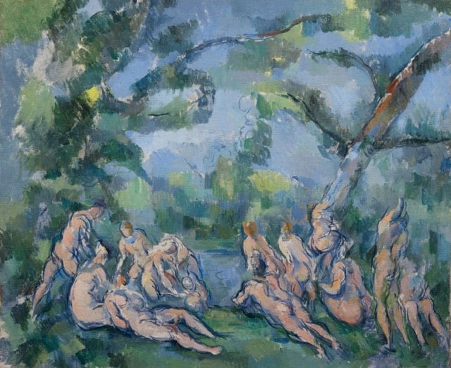
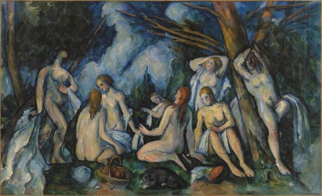
Paul Cezanne’s The Large Bathers is the subject of the second video in The Nerdwriter’s series, Understanding Art. (The first was on Jacques-Louis David’s The Death of Socrates.)
The Large Bathers is part of a series of similar paintings by Cezanne. The one used in the video is housed at the Philadelphia Museum of Art:
Other pieces include those from (top to bottom) The National Gallery, The Art Institute of Chicago, and The Barnes Foundation:
The Met recently cleaned and repaired a 1660 painting by Charles Le Brun called Everhard Jabach and His Family. It took ten months of painstaking work, as this video shows:
Colossal has some before-and-after shots of the painting.
Newer posts
Older posts






Socials & More