kottke.org posts about art
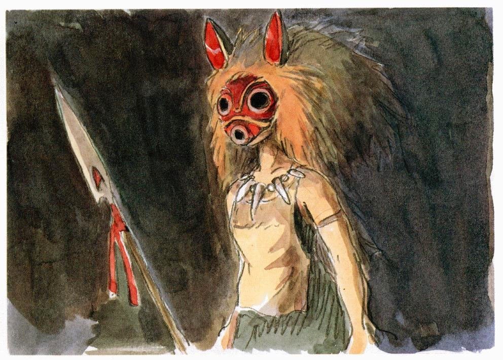
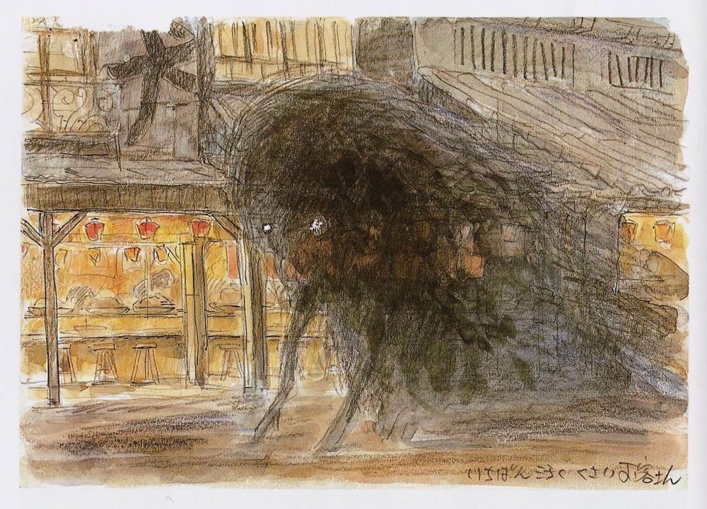
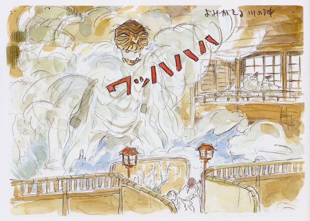
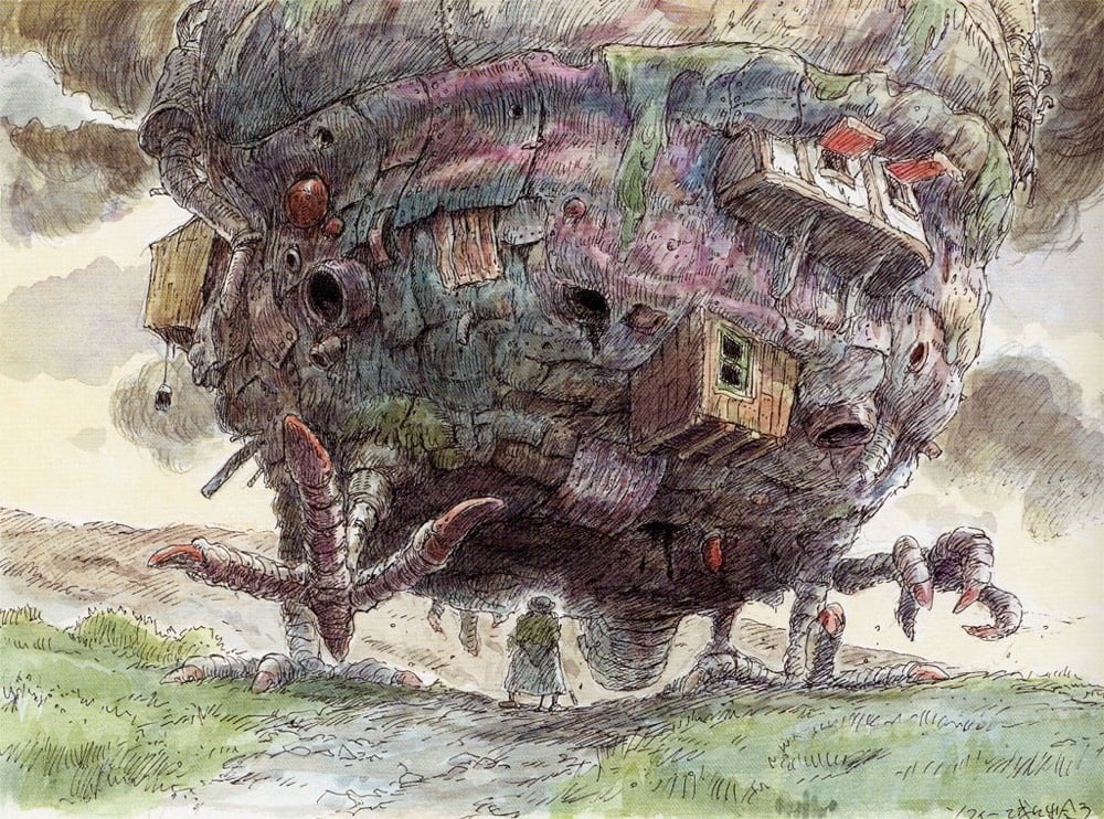
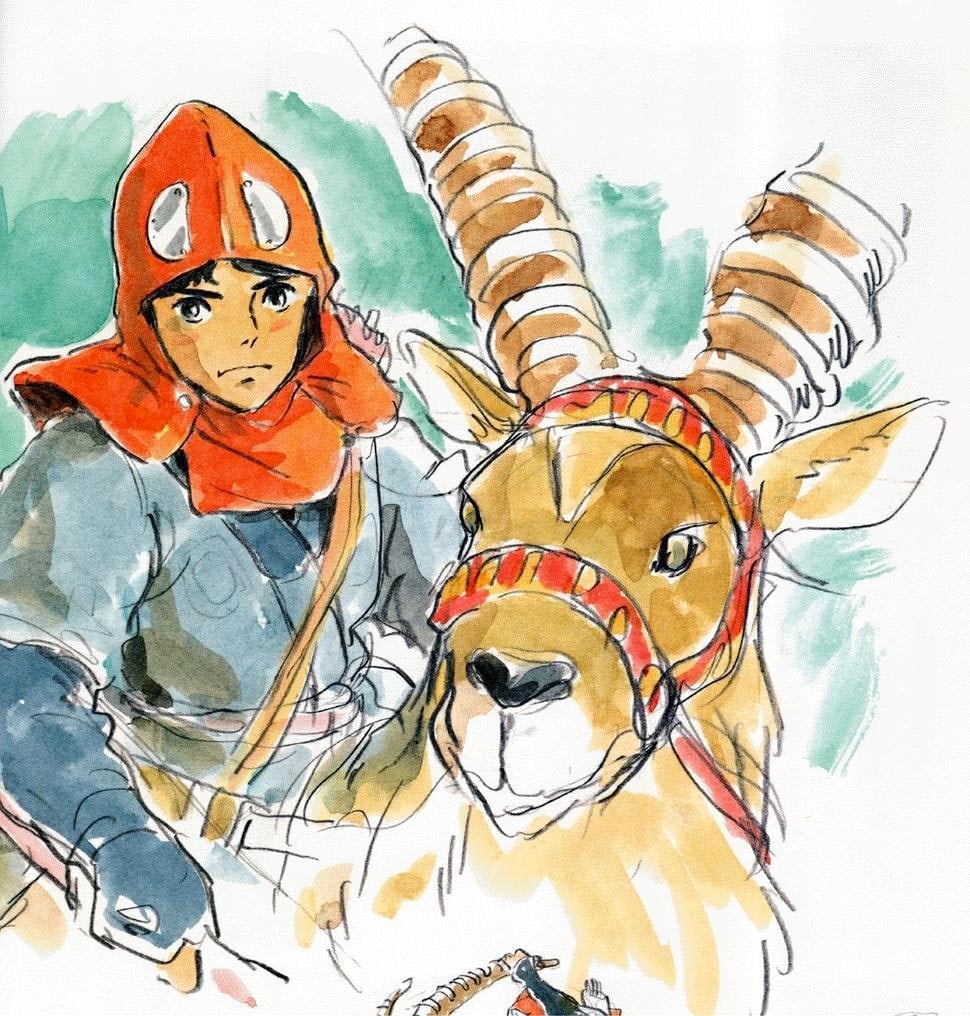

Tales From Weirdland has a collection of posts that feature concept drawings from several Studio Ghibli movies like Spirited Away, Howl’s Moving Castle, and Castle in the Sky. I poked around a little and found artwork & concept drawings from Princess Mononoke, The Wind Rises, and Porco Rosso. Hand dawn and it all just pops off the screen. Wonderful.
Looks like a lot of this is available in book form as well: The Art of Spirited Away, The Art of Princess Mononoke, The Art of Howl’s Moving Castle, etc.
Artist and former advertising art director Alvaro Naddeo does these wonderful paintings of old iconic junk from our branded past repurposed into absurdist structures and vehicles, like Junkyard Wars through the lens of Warhol. It’s tough to explain, so just feast thine eyes on a couple of examples:
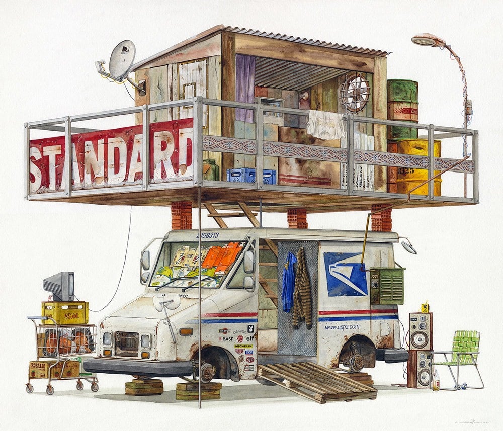
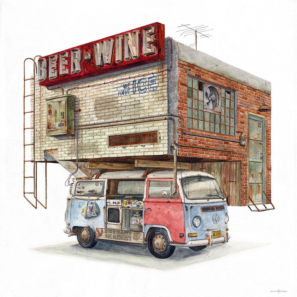
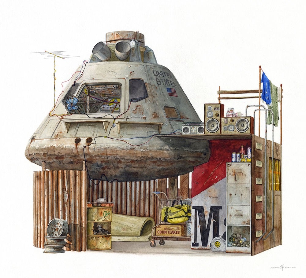
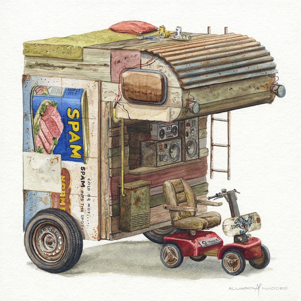
Ok, that was more than a couple. But there are so many more on his website and Instagram (including work-in-progress stuff)…check them out!
Naddeo recently shared his process for making these paintings with Colossal:
Naddeo tells Colossal that he starts with a loose sketch by hand. He then uses 3D software to help define a plausible shape for his imagined constructions, and creates a reference composition in Photoshop. After years of practice, Naddeo shares that he is able to recreate the texture, color, and shadows of various building materials like brick and concrete from memory. He uses reference photos to help flesh out small detail items, which are similarly rendered in watercolor.
A prime example of Robin Sloan’s concept of the flip-flop.

Liberty Crumbling is sand sculptor Damon Langlois’ version of the statue of Abraham Lincoln at the Lincoln Memorial, which won first prize at 2019 Texas SandFest. (via colossal)
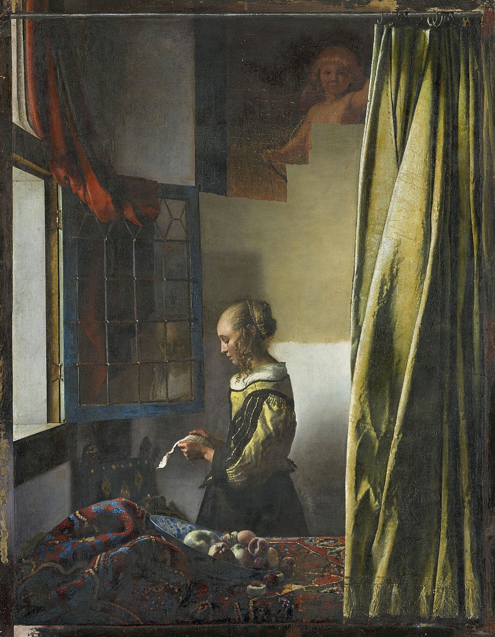
The Staatliche Kunstsammlungen Dresden is restoring a painting by Johannes Vermeer after it was “conclusively determined” that part of it was painted over after Vermeer died.
For more than 250 years now, the famous painting by Johannes Vermeer featuring a profile depiction of a girl intently reading a letter in front of a light-coloured empty wall has held a firm place among the masterpieces in the Dresden Gemäldegalerie. This picture, which dates to around 1657/59, is regarded as one of the earliest interior paintings by Vermeer with a solitary figure. Previous x-ray examinations indicated that a picture of a naked Cupid in the painting had been overpainted. Today, new laboratory tests have conclusively determined that the overpainting was not by Vermeer’s hand. On this basis, the Gemäldegalerie Alte Meister decided in the course of the current restoration of the work to remove the overpaint.
The restoration of Girl Reading a Letter at an Open Window is not totally complete, here’s what it looks like now:
And what it looked like before the restoration started:
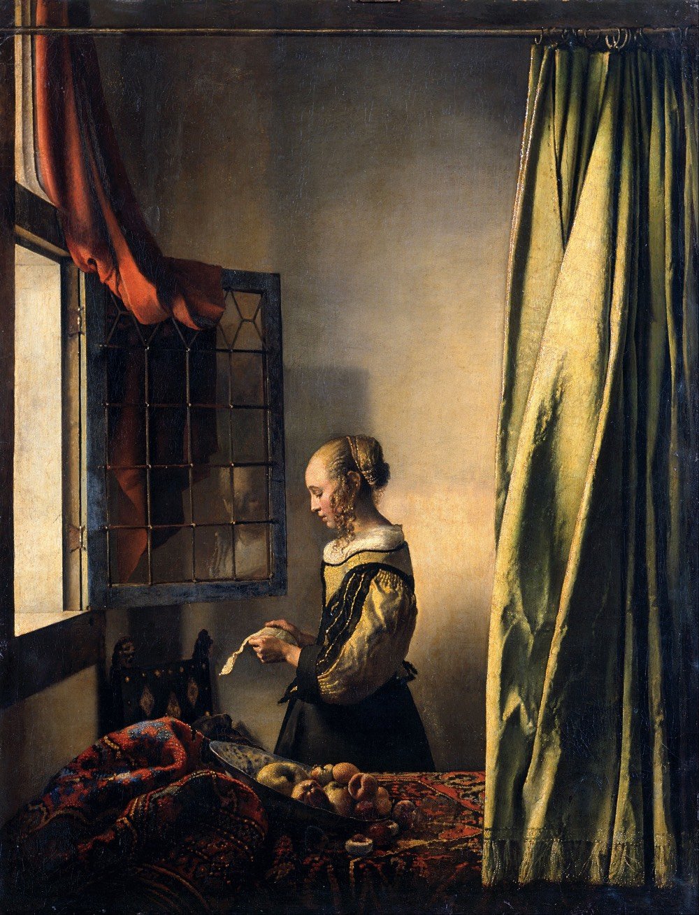
The partially restored painting will be on display at the Gemäldegalerie Alte Meister in Dresden until June 16, after which they will take another year to complete the painstaking restoration.
This past weekend I was in Boston for some cultcha and went to The Museum of Fine Arts. Among several paintings, pastels, and drawings of dancers by Edgar Degas, a bronze casting of his sculpture La Petite Danseuse de Quatorze Ans caught my eye:
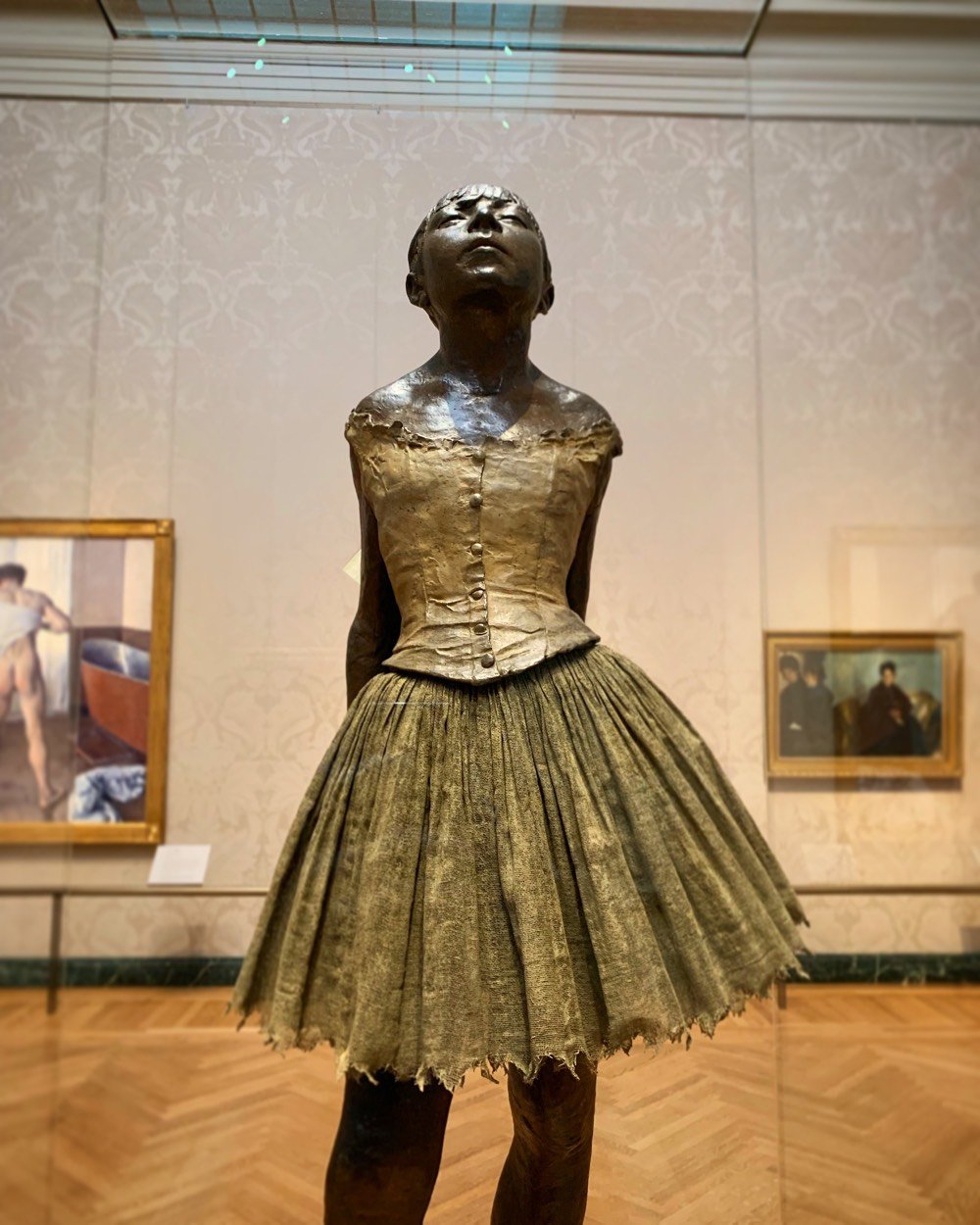
This is Degas’s largest surviving sculpture and the only one he titled and exhibited. The original wax version, a portrait of a young Belgian dancer named Marie van Goethem, was shown at the 1881 Impressionist exhibition in Paris. The wax was tinted to resemble flesh, she wore a wig of real hair, and was dressed in pink slippers and bodice in addition to a skirt and ribbon similar to those on this cast. The excessive naturalism of the work offended many viewers, but the critic J.K. Huysmans called it “the only really modern attempt that I know in sculpture.”
I’ve seen many representations of ballet dancers in Degas’ work over the years, but this time around was different because I had read Julia Wolkoff’s The Sordid Truth behind Degas’s Ballet Dancers last year.
The formerly upright ballet had taken on the role of unseemly cabaret; in Paris, its success was almost entirely predicated on lecherous social contracts. Sex work was a part of a ballerina’s reality, and the city’s grand opera house, the Palais Garnier, was designed with this in mind. A luxuriously appointed room located behind the stage, called the foyer de la danse, was a place where the dancers would warm up before performances. But it also served as a kind of men’s club, where abonnés — wealthy male subscribers to the opera — could conduct business, socialize, and proposition the ballerinas.
Young members-in-training of the ballet companies were called “petits rats” in reference to their often impoverished backgrounds. As Wolkoff observes of the subject of the sculpture:
Marie van Goethem was the “petit rat” who posed for the sculpture, and she likely engaged in the sexually predatory economy of the ballet world to survive. Van Goethem disappeared from the public eye shortly after the sculpture was completed; after being late to a rehearsal, the Paris Opera Ballet dismissed her. The teenager probably returned home to follow in the footsteps of her mother — a laundress and likely prostitute — and older sister, who was also a sex worker.
Here’s a Degas painting of an on-stage practice from the collection at the Met:
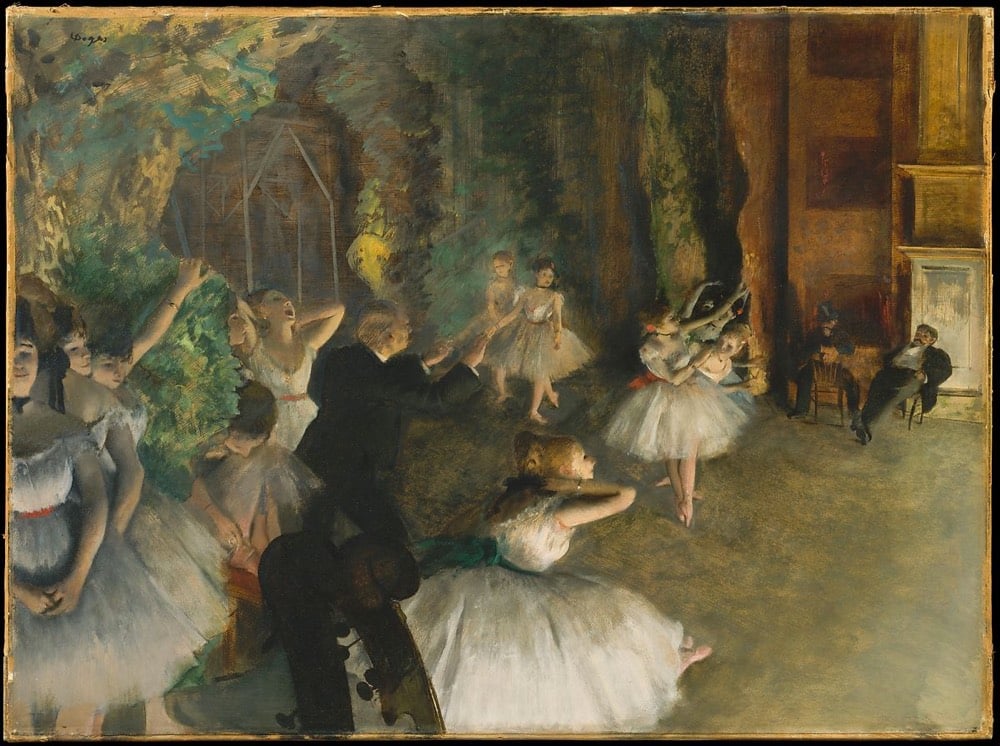
What might look at first glance like a depiction of the beauty of dance takes on a more sinister nature when you notice the men on the right side of the painting, perhaps a pair of wealthy subscribers getting a special preview of that night’s ballet and their choice of ballerinas. You might never look at another of Degas’ ballet paintings the same way again.
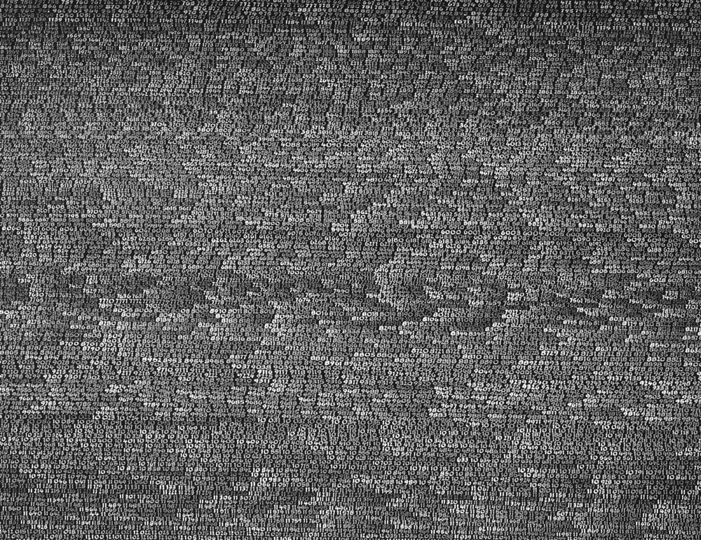
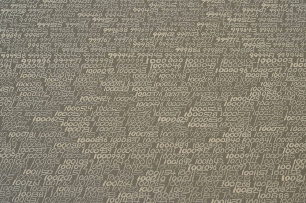
In 1965, French-born Polish painter Roman Opalka began work on his series of paintings OPALKA 1965/1 - ∞. Starting in the top-left corner of a canvas, he painted the number “1”, then “2”, then “3”, and so on, continuing until the canvas was full of consecutive whole numbers. At the top of the next canvas, he picked up where he’d left off, and then just kept going from canvas to canvas. By 1970, Opalka abandoned working on anything else and devoted himself solely to filling canvases with numbers.
From Hyperallergic:
He pursued this culmination on a daily basis, eight hours a day, until the process of painting led him to “white/white” — that is, white numbers on a canvas with a background painted white, the same as the numbers. After three years (1968, possibly 1969), Opalka began to add 1% white pigment to the black background. Gradually, over time, as more paintings were painted, the black surface would become gray. As he continued to count and to paint five, six, and seven digit numbers, he discreetly added 1% white to each canvas, thus making the surfaces appear increasingly lighter. In the late 1970s he declared that the background of his canvases would eventually appear white, the same white used to paint the numerals that would finally dissolve into the surface, embody the surface. Ultimately, there would be no distinction between the white numerals and the white surface; they would culminate as a form of blankness, possibly transcendent, as the numerals grew invisible within the prospect of infinity, the Samadhi or highest level of meditation.
According to Opalka’s website, the last number he painted was 5607249, in white paint, invisible on a white canvas. (via moss & fog)
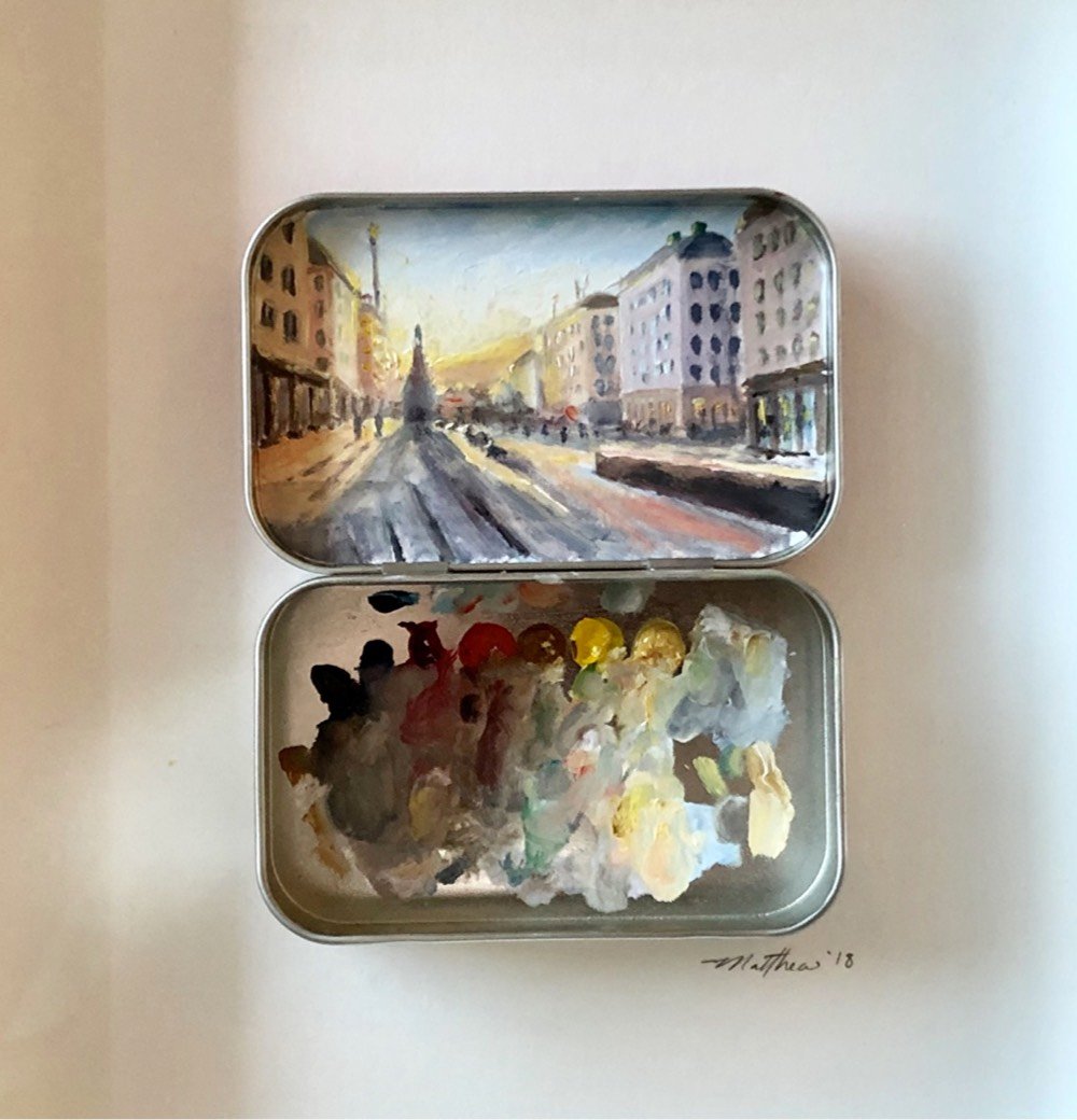
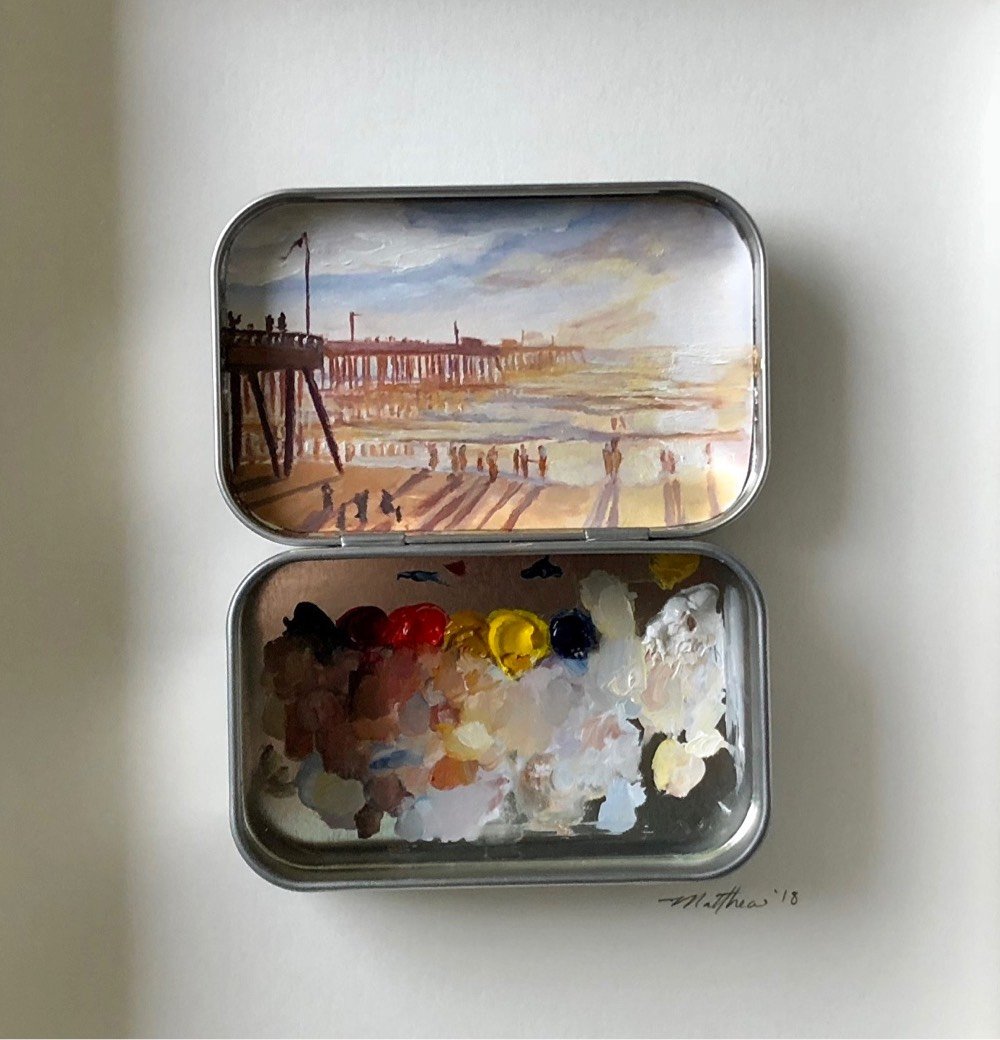
Painter Matthew Betancourt paints these miniature works of art inside the covers of Altoids tins. Aside from the playfulness and cuteness factor, I love that he uses the bottom half of the tin as a palette and it’s displayed along with the finished painting. You get to see the process along with the work. It’s something that Betancourt plays with even more on his Instagram account, where he displays subject, palette, and finished product all in one go:
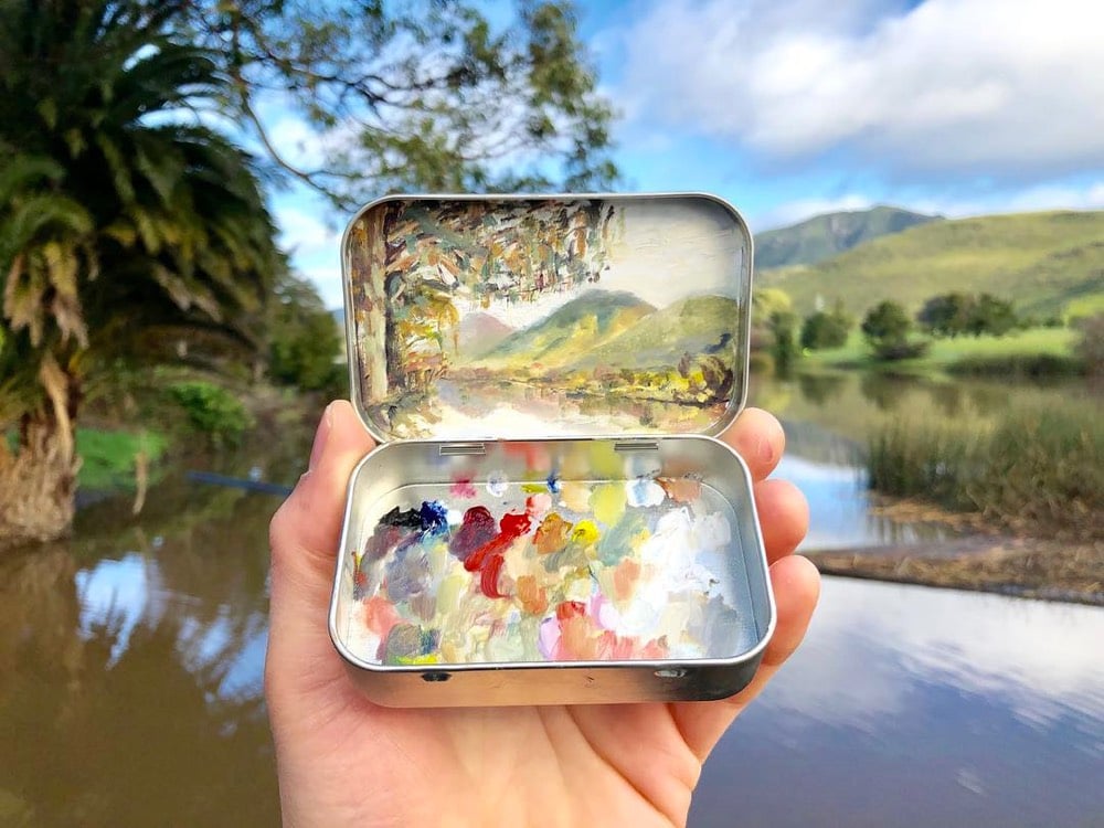
(thx, brandon)
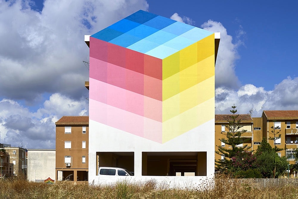
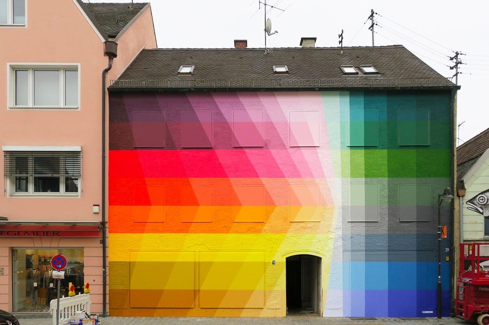
I love these colorful pixelated exteriors by Italian artist Alberonero. These are going on the mood board for my theoretical future house. You can find more of their work on Facebook, Instagram, and Tumblr. (via colossal)
I really like these portraits by artist, illustrator and conceptual designer Linsey Levendall.
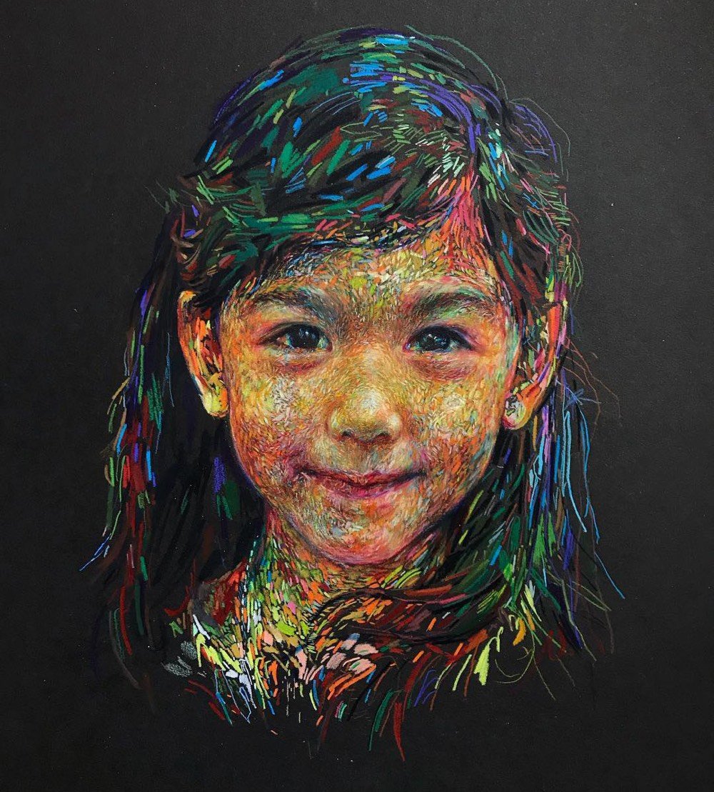
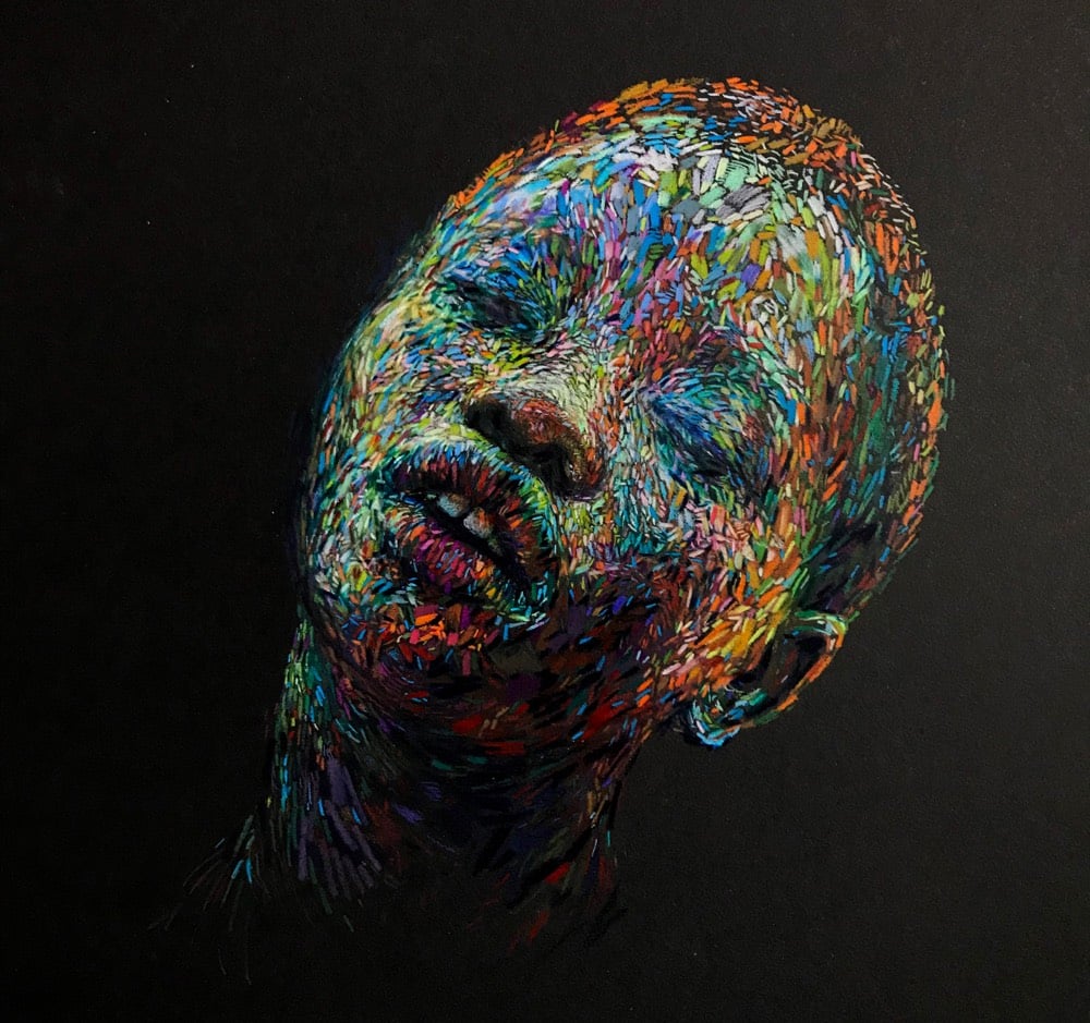
Like I said last week, I am a sucker for any sort of contemporary impressionism that reminds me of the likes of van Gogh, Seurat, or Monet. Maybe I’m just a rube who didn’t see enough art as a kid, but I will never not be impressed by how a thousand tiny strokes of a pen or brush magically come together to make not only a recognizable human face but can also spark a feeling in my brain. (also via colossal)
Using found images as his starting point, Kai Samuels-Davis paints portraits & objects in an impressionistic way.
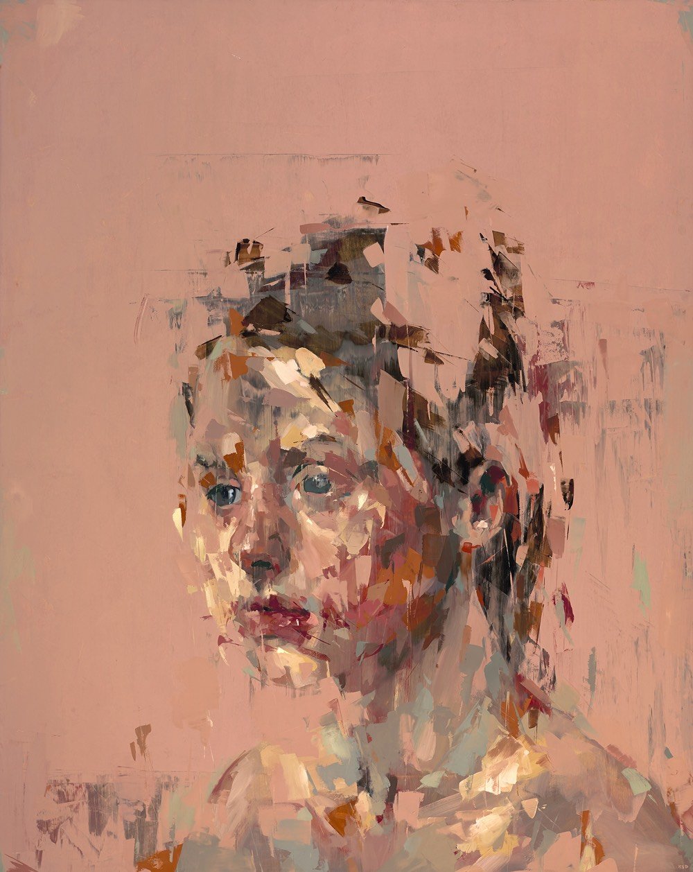
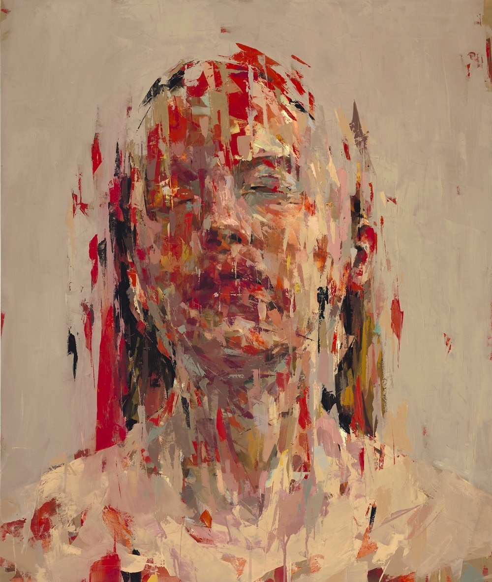
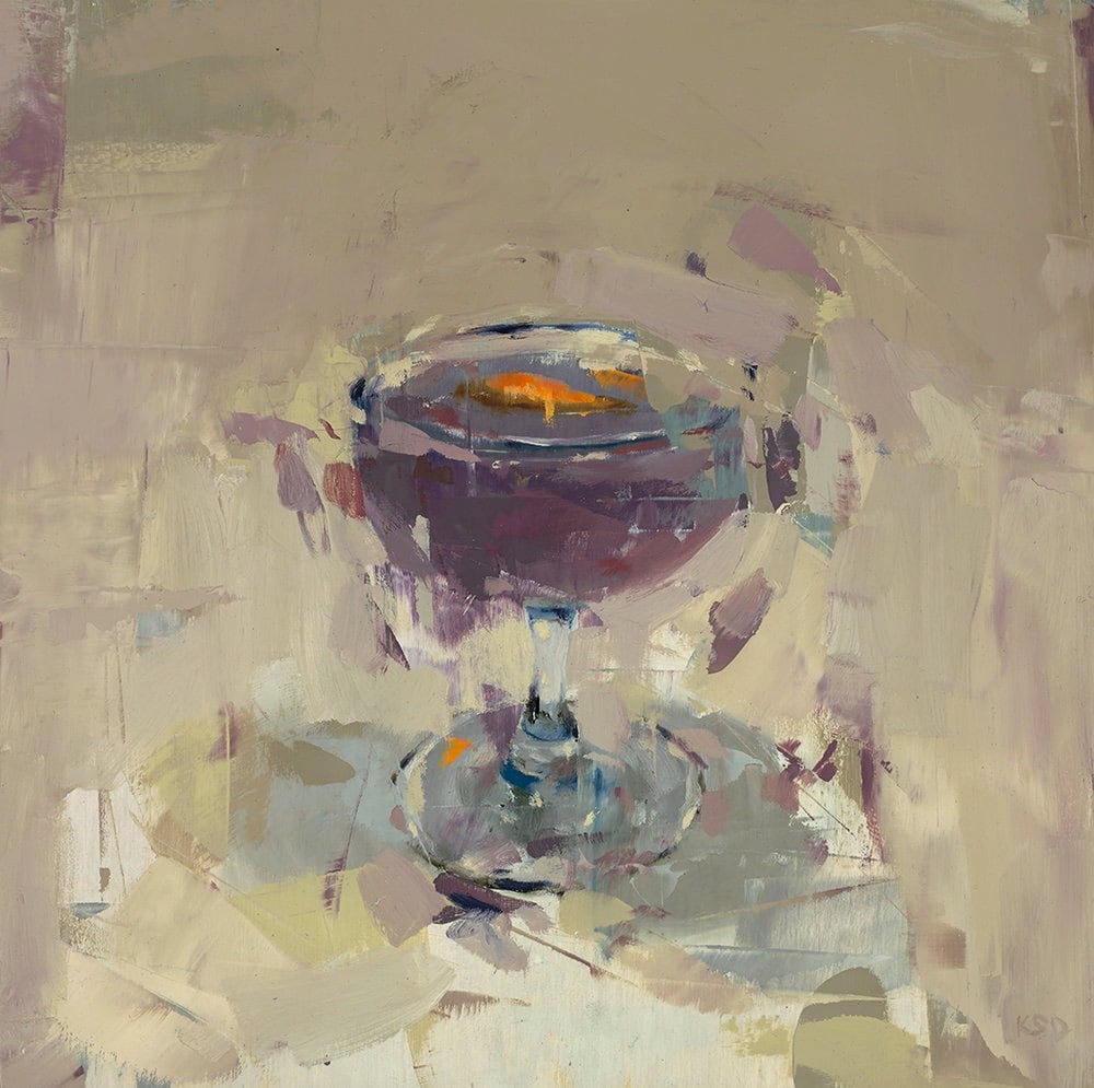
I am a sucker for any sort of contemporary impressionism that reminds me of the likes of van Gogh, Seurat, or Monet. I am also a sucker for observing how artists progress as they mature. Take a look at Samuels-Davis’s older work, from 2015 and before. The older stuff is good but his recent work is stronger and cleaner and more abstract without sacrificing any of the “legibility” of the figures & objects he’s representing. It does more with less. (via colossal)
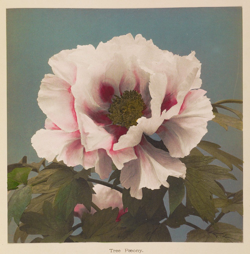

From The Public Domain Review, Ogawa Kazumasa’s Hand-Coloured Photographs of Flowers.
The stunning floral images featured here are the work of Ogawa Kazumasa, a Japanese photographer, printer, and publisher known for his pioneering work in photomechanical printing and photography in the Meiji era.
A reprinted book containing these images by Kazumasa is available as are prints. (via @john_overholt)
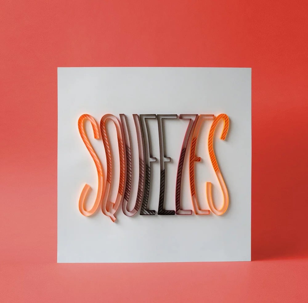
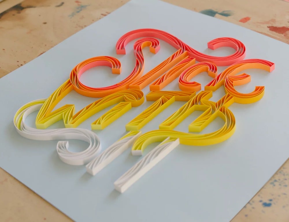
Paper artist Alia Bright combines papercraft and typography to make these colorful, um, sculptures? Texts? They’re super-cool, whatever you call them. Here’s a close-up of one of the pieces, all made by hand of course:
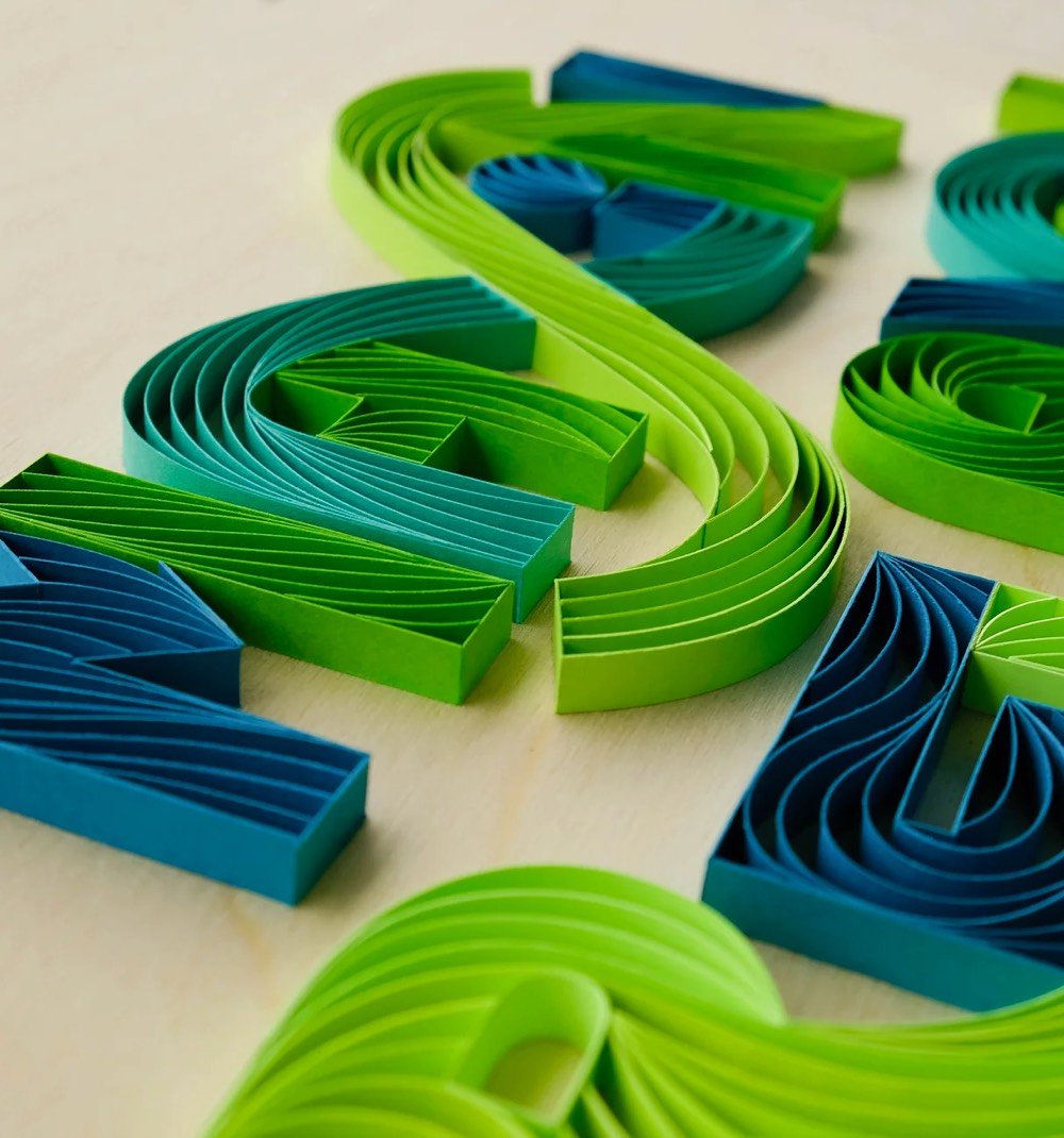
You can keep up with Bright’s newest work on Instagram. (via swissmiss)
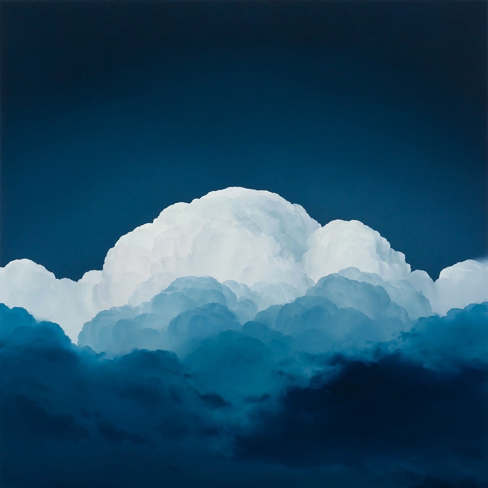
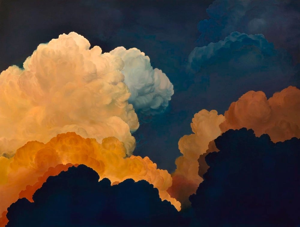
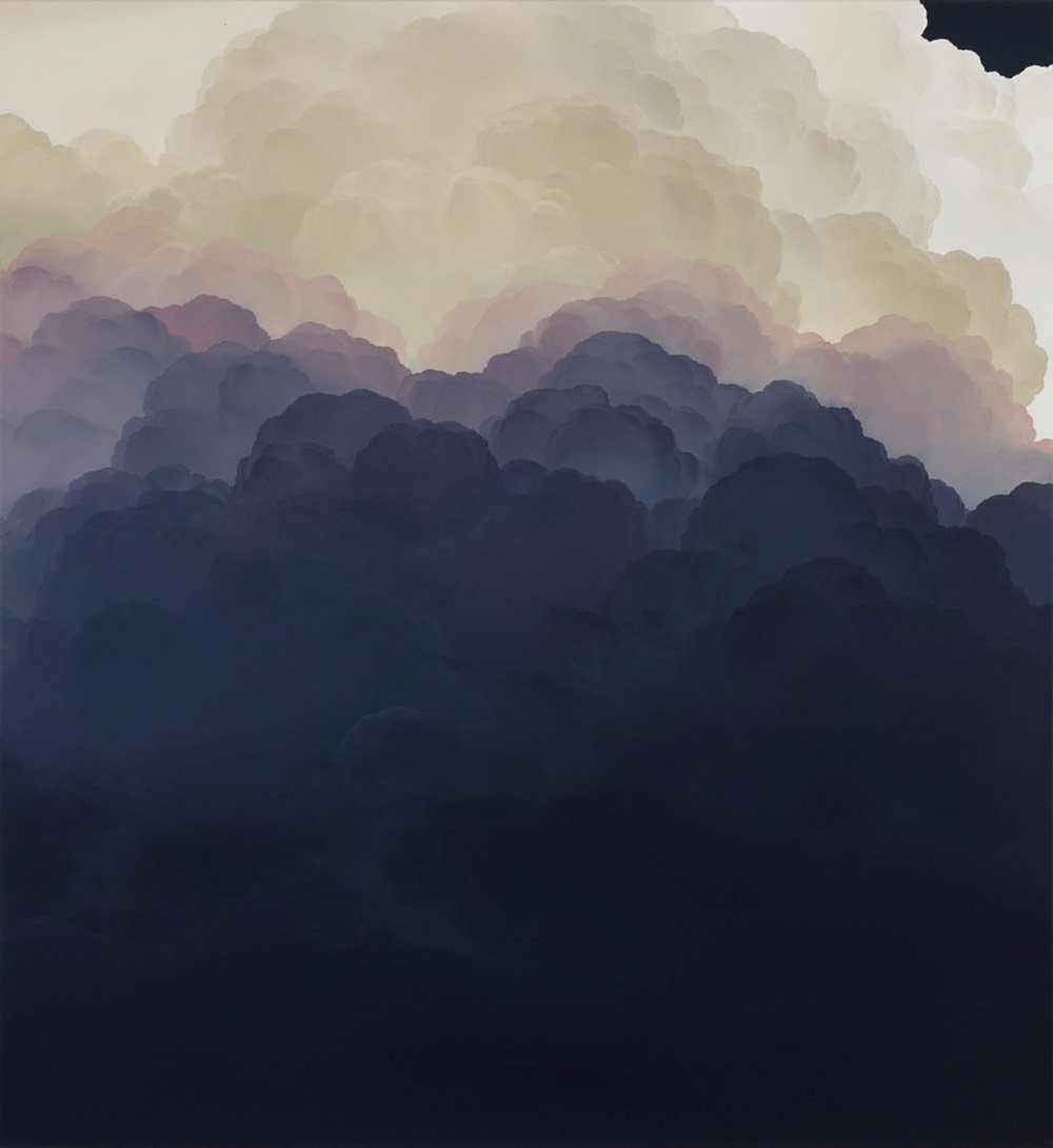
Ian Fisher’s paintings of clouds are surprisingly lifelike. If you scroll through the paintings on his site, you can see his representation of them improve…his most recent ones are difficult to distinguish from photographs of actual clouds.
This is a photo taken in Germany in 1914 by August Sander:
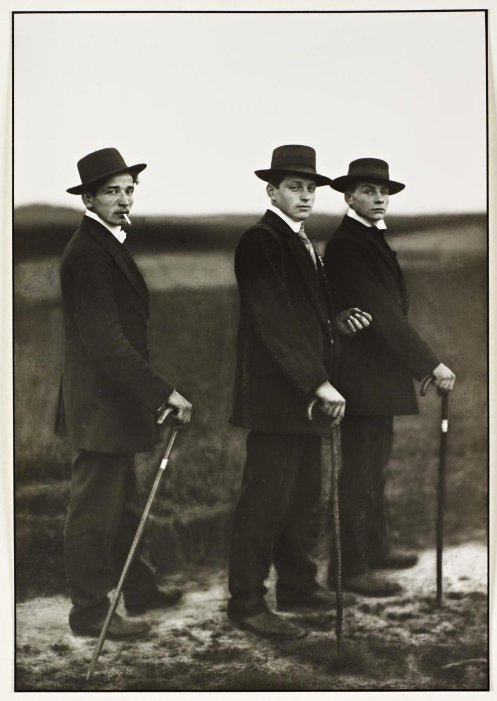
It’s called Young Farmers and it depicts three young men on their way to a dance in rural Germany. But as John Green explains in this video, there is so much more going on with this photo.
From The Tate, which has a print of Young Farmers in its collection:
The Marxist art critic John Berger famously analysed the photograph in his influential essay ‘The Suit and the Photograph’ (1980) writing: ‘The date is 1914. The three young men belong, at the very most, to the second generation who ever wore such suits in the European countryside. Twenty or 30 years earlier, such clothes did not exist at a price which peasants could afford.’ (Berger 1980, p.30.) Berger suggests that these mass market suits, emulating the higher quality attire of the bourgeois urban class, draws attention to, rather than disguises, their ‘social caste’, and not in a particularly flattering sense. In his essay, Berger considers that the three young men are of a social group not beyond the reach of aspirational advertising campaigns and travelling salesmen, and in a state of awkward transition, succumbing to a new ‘cultural hegemony’. The posturing of these three rural ‘lads’, perhaps on their way to a dance, confounds and subverts expectations of the peasant ‘type’, especially in that they smoke cigarettes. Peasants were traditionally depicted smoking a pipe handcrafted from wood, and which like the wooden canes that appear frequently in Sander’s volume of photographs devoted to peasants and farmers, including this one, connoted an organic connection to the native soil as well as a certain time-honoured wisdom. By contrast, the mass-manufactured cigarette was often seen at the time as an urban symbol of social dissolution.
However, Green also cautions that there’s only so much you can infer about people from a photograph (given, for example, that the three men weren’t actually farmers).
This video is from a new-to-me channel called The Art Assignment, which is about art and art history. Subscribed!
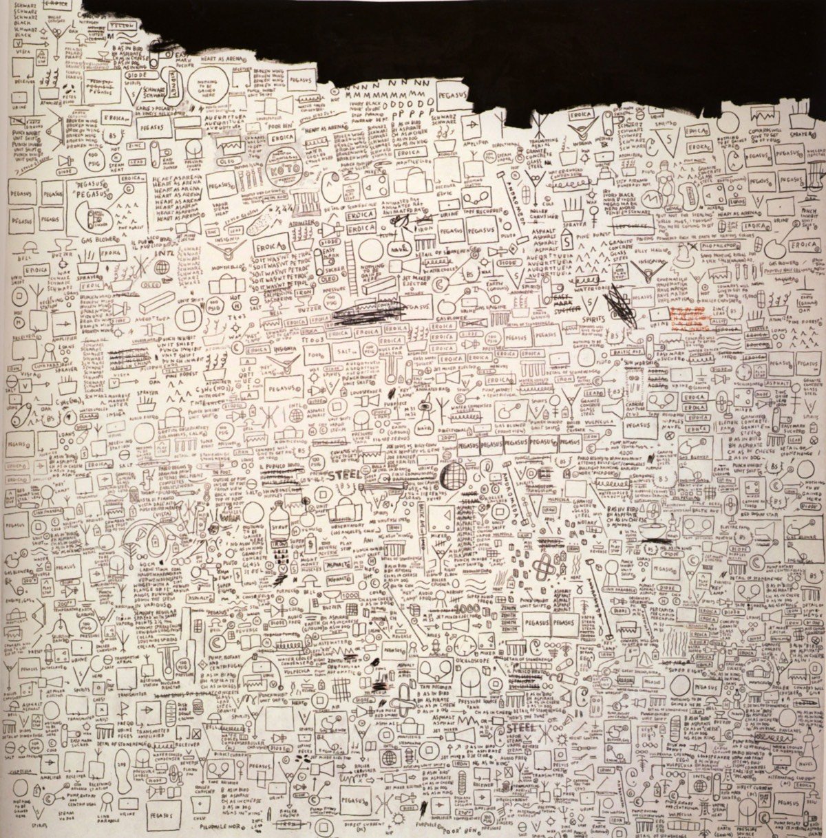
The drawing above is Pegasus by Jean-Michel Basquiat. His first art dealer, Annina Nosei, once called it “the most beautiful drawing ever”. I am not going to disagree with her. I’ve only seen Basquiat’s work sporadically, mostly single paintings included in larger exhibitions with Warhols and Harings, but when I saw Pegasus in this short video about the artist’s life & work, it grabbed me, an instant favorite.
The drawing is held in a private collection, but I hope I get to see it in person someday. For more on Basquiat, check out the 2009 documentary Jean-Michel Basquiat: The Radiant Child.
In a letter to his brother Theo, Vincent van Gogh called his 1888 oil painting The Night Café “one of the ugliest pictures I have done”.
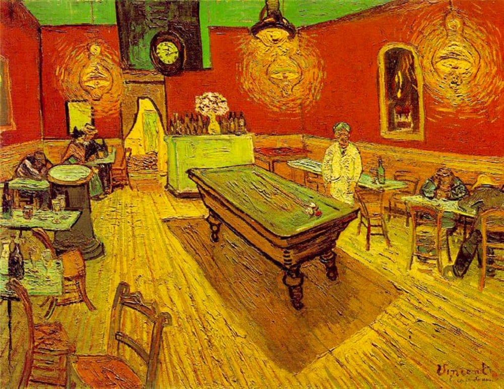
In this video, Evan Puschak looks at what van Gogh meant by that and how he used discordant colors together to suggest a mood.
van Gogh wrote of his intentions for the painting to his brother:
I have tried to express the terrible passions of humanity by means of red and green. The room is blood red and dark yellow with a green billiard table in the middle; there are four lemon-yellow lamps with a glow of orange and green. Everywhere there is a clash and contrast of the most alien reds and greens, in the figures of little sleeping hooligans, in the empty dreary room, in violet and blue. The blood-red and the yellow-green of the billiard table, for instance, contrast with the soft tender Louis XV green of the counter, on which there is a rose nosegay. The white clothes of the landlord, watchful in a corner of that furnace, turn lemon-yellow, or pale luminous green.
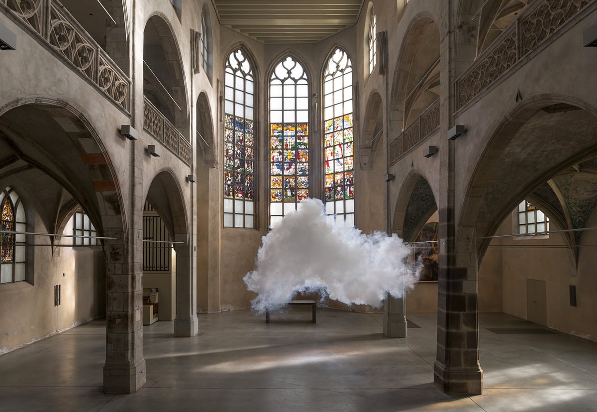
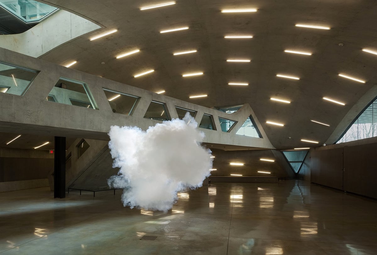
Dutch artist Berndnaut Smilde creates ephemeral water vapor sculptures (you know, clouds!) in places you normally wouldn’t find them, like inside churches & museums. He shared some of his process with National Geographic:
The ingredients for Smilde’s clouds: just smoke and water vapor. He requires a cold and damp space with no air circulation, lest the clouds never form or fall straight to the ground. He mists an area with a spray bottle to put water vapor into the air. Then he turns on fog machines that spout tiny particles, and the vapor condenses around them.
Smilde runs around the forming cloud, coaxing it into a shape about 10 feet across and six feet tall. Then he steps back long enough for a photographer to snap several images. Once the air clears, he’ll start over, repeating the process dozens of times until he’s happy with the results. Later, he’ll retouch the photos to remove his tools.
(via moss & fog)


Lines (57° 59´N, 7° 16´W) is a light installation in Lochmaddy, Scotland that visualizes how much the sea level will rise if our climate keeps changing at its current pace. Co-collaborators Timo Aho and Pekka Niittyvirta installed sensors to detect high tide, which then illuminates lights showing what the high tide will look like in the future.
The installation explores the catastrophic impact of our relationship with nature and its long-term effects. The work provokes a dialogue on how the rising sea levels will affect coastal areas, its inhabitants and land usage in the future.
This is specifically relevant in the low lying island archipelago of Uist in the Outer Hebrides off the west coast of Scotland, and in particular to Taigh Chearsabhagh Museum & Arts Centre in Lochmaddy where the installation is situated. The Centre cannot develop on its existing site due to predicted storm surge sea levels.
(via colossal)
Russell Shorto has a piece in this weekend’s NY Times Magazine about two previously undiscovered Rembrandt paintings, the man who found them both, and the art-world controversy that followed. Here’s one of the newly claimed Rembrandts, bought for $173,000 at auction:
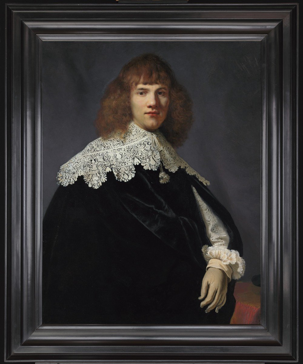
The article is interesting throughout — it’s a neat little bow of a story by the author of the fantastic Island at the Center of the World — but I wanted to highlight this bit on “Rembrandtness” (what a term!) and the fuzziness of authenticating a painting like this:
Six next lined up prominent scholars to support his attribution of the painting to Rembrandt. It’s worth noting that some were unwilling to do so — not because they definitively believed otherwise, but as part of a shift toward acknowledging the gray areas in art history. For such a painting, which seemingly came out of nowhere, there is no way to achieve absolute certainty about its provenance. “When Jan came to me with his painting, I had to admit I couldn’t contest his arguments,” said Gary Schwartz, an American Rembrandt biographer and an authority on 17th-century Dutch art. “And I told him I wouldn’t express doubts about Rembrandt’s authorship. But it doesn’t make me happy” to be so definitive. He went on to elaborate the particular difficulties that Rembrandt poses for authenticators: the variety of styles he painted in, his many pupils, the likelihood that in his studio more than one person worked on a given painting. A painting that is determined to be, say, by “the studio of Rembrandt,” rather than by Rembrandt himself, would be of lesser value. Schwartz is one of a number of art historians who, when it comes to questions of the authenticity of works by famous painters, would like people to focus less on the artist and the monetary worth of the painting than on the work itself. He uses the term “Rembrandtness” and argues for assigning shades of likelihood that a painting is by the artist himself. Regarding the Rembrandtness of this particular portrait, he said, “The attribution to Rembrandt is the hypothesis to beat, but it may not be unbeatable.”
Museums try to respect “Rembrandtness.” The National Gallery of Art in London, for instance, labels “An Old Man in an Armchair” as “probably by Rembrandt,” and the Mauritshuis museum recently announced that it is mounting an exhaustive study of two of its supposed Rembrandts to try to determine the likelihood of their being by the master. “I think ‘Rembrandtness’ is a smart idea,” said Ronni Baer, senior curator of European paintings at the Museum of Fine Arts in Boston. “But people aren’t going to be content with it because there’s so much money involved in attribution.”
I wonder what the true Rembrandtness is of all the paintings in museums or expensive collections that are currently attributed to only his hand? Or the da Vinciness of Salvator Mundi?
Speaking of Rembrandt, the Rijksmuseum in Amsterdam is currently displaying all of their extensive collection of works by the artist in an exhibition called All the Rembrandts.1
In addition, the most important painting in the collection, Night Watch, will be restored in place over the next several years so that museum visitors can observe the process.

Tomorrow, February 23, is William Edward Burghardt Du Bois’s birthday. Du Bois was born in 1868 and died in 1963. In fact, Du Bois died, in Ghana, the day before the March on Washington for Jobs and Freedom. Roy Wilkins and hundreds of thousands of marchers observed Du Bois’s death with a moment of silence.
Du Bois is one of the most influential and important thinkers in American history. He wrote many, many speeches, essays, and books that are essential to understanding American culture, society, labor, and politics, particularly as they affected and were affected in turn by black people.
My favorite Du Bois essay, and one of the first I ever read, was and probably still is “Criteria of Negro Art.” It was written and published in 1926, and first presented as a speech in honor of Carter Woodson. I have in the last few years met otherwise extremely well-read people who knew nothing of this essay and have since sworn an oath to remedy that wherever possible. So you get to read some excerpts from it now.
The Big Idea of the essay is really formulated in the fourth paragraph:
What do we want? What is the thing we are after? As it was phrased last night it had a certain truth: We want to be Americans, full-fledged Americans, with all the rights of other American citizens. But is that all? Do we want simply to be Americans? Once in a while through all of us there flashes some clairvoyance, some clear idea, of what America really is. We who are dark can see America in a way that white Americans cannot. And seeing our country thus, are we satisfied with its present goals and ideals?
The answer to this first question “What do we want?” is Art, the proper appreciation of Beauty and Freedom; and the answer to the last question, “are we satisfied with [America’s] present goals and ideals?” is, of course, No.
In the twelfth paragraph, Du Bois argues that the lives of black Americans, not just the emerging intellectual bourgeoisie of the 1920s, but the lives of all black Americans, for their entire history, are the proper subject of this new kind of Art:
This is brought to us peculiarly when as artists we face our own past as a people. There has come to us — and it has come especially through the man we are going to honor tonight — a realization of that past, of which for long years we have been ashamed, for which we have apologized. We thought nothing could come out of that past which we wanted to remember; which we wanted to hand down to our children. Suddenly, this same past is taking on form, color, and reality, and in a half shamefaced way we are beginning to be proud of it. We are remembering that the romance of the world did not die and lie forgotten in the Middle Age [sic]; that if you want romance to deal with you must have it here and now and in your own hands.
Du Bois, after all, was a sociologist, and knew how to mobilize facts and figures; he does so in this anecdote, about black soldiers who fought in the Great War:
Have you heard the story of the conquest of German East Africa? Listen to the untold tale: There were 40,000 black men and 4,000 white men who talked German. There were 20,000 black men and 12,000 white men who talked English. There were 10,000 black men and 400 white men who talked French. In Africa then where the Mountains of the Moon raised their white and snow-capped heads into the mouth of the tropic sun, where Nile and Congo rise and the Great Lakes swim, these men fought; they struggled on mountain, hill and valley, in river, lake and swamp, until in masses they sickened, crawled and died; until the 4,000 white Germans had become mostly bleached bones; until nearly all the 12,000 white Englishmen had returned to South Africa, and the 400 Frenchmen to Belgium and Heaven; all except a mere handful of the white men died; but thousands of black men from East, West and South Africa, from Nigeria and the Valley of the Nile, and from the West Indies still struggled, fought and died. For four years they fought and won and lost German East Africa; and all you hear about it is that England and Belgium conquered German Africa for the allies!
In the 18th paragraph, he demolishes the premise that the success of black artists in and of itself is evidence of racial progress as such:
With the growing recognition of Negro artists in spite of the severe handicaps, one comforting thing is occurring to both white and black. They are whispering, “Here is a way out. Here is the real solution of the color problem. The recognition accorded Cullen, Hughes, Fauset, White and others shows there is no real color line. Keep quiet! Don’t complain! Work! All will be well!”
And beginning in the 21st paragraph, he quickly, and with startling beauty, poses the real problem for black artists working in America:
There is in New York tonight a black woman molding clay by herself in a little bare room, because there is not a single school of sculpture in New York where she is welcome. Surely there are doors she might burst through, but when God makes a sculptor He does not always make the pushing sort of person who beats his way through doors thrust in his face. This girl is working her hands off to get out of this country so that she can get some sort of training.
There was Richard Brown. If he had been white he would have been alive today instead of dead of neglect. Many helped him when he asked but he was not the kind of boy that always asks. He was simply one who made colors sing.
There is a colored woman in Chicago who is a great musician. She thought she would like to study at Fontainebleau this summer where Walter Damrosch and a score of leaders of Art have an American school of music. But the application blank of this school says: “I am a white American and I apply for admission to the school.”
We can go on the stage; we can be just as funny as white Americans wish us to be; we can play all the sordid parts that America likes to assign to Negroes; but for any thing else there is still small place for us.
I first read this essay at least twenty years ago, but I swear I’ve thought about “when God makes a sculptor He does not always make the pushing sort of person who beats his way through doors thrust in his face” every day since. Every day. I think about it for black artists, for gay, lesbian, transgender, and queer artists, for women who put up with harassment and abuse from the very people who’ve promised to help them pursue their art. And I think about it even more when I think about the thousands if not millions of people who were turned away from ever becoming artists, writers, musicians, actors, sculptors, dancers, engineers, designers, programmers, or any other critical or creative field where doors are so often thrust in your face.
Yes, push through those doors. But hold them open after you. Because the next person, God may not have made to be one whose first inclination is to push.
All art, Du Bois argues, and in particular the art of black people, relies on not just Beauty, but Truth and Goodness, “goodness in all its aspects of justice, honor and right — not for sake of an ethical sanction but as the one true method of gaining sympathy and human interest.” Art that seeks to restore the balance of truth and goodness, on a subject like the lives of black people, which is prone to so much distortion and misunderstanding, necessarily relies on an ideal of Justice. This leads to maybe the most famous quote of the essay:
Thus all Art is propaganda and ever must be, despite the wailing of the purists. I stand in utter shamelessness and say that whatever art I have for writing has been used always for propaganda for gaining the right of black folk to love and enjoy. I do not care a damn for any art that is not used for propaganda. But I do care when propaganda is confined to one side while the other is stripped and silent.
What America is getting from its white artists, is propaganda that shames and distorts the lives of black people, in order to show them to be sinister and/or servile.
In other words, the white public today demands from its artists, literary and pictorial, racial pre-judgment which deliberately distorts Truth and Justice, as far as colored races are concerned, and it will pay for no other.
But respectability politics is almost as dangerous, when it comes to art.
On the other hand, the young and slowly growing black public still wants its prophets almost equally unfree. We are bound by all sorts of customs that have come down as second-hand soul clothes of white patrons. We are ashamed of sex and we lower our eyes when people will talk of it. Our religion holds us in superstition. Our worst side has been so shamelessly emphasized that we are denying we have or ever had a worst side. In all sorts of ways we are hemmed in and our new young artists have got to fight their way to freedom.
And here is the bind, the contradiction which even Du Bois cannot completely unravel. Until black artists produce great art, black people will not be registered by white people as fully human. And once those great artists appear, their blackness will be erased away, in favor of a false universality and sham humanism.
And then do you know what will be said? It is already saying. Just as soon as true Art emerges; just as soon as the black artist appears, someone touches the race on the shoulder and says, “He did that because he was an American, not because he was a Negro; he was born here; he was trained here; he is not a Negro — what is a Negro anyhow? He is just human; it is the kind of thing you ought to expect.”
I do not doubt that the ultimate art coming from black folk is going to be just as beautiful, and beautiful largely in the same ways, as the art that comes from white folk, or yellow, or red; but the point today is that until the art of the black folk compells [sic] recognition they will not be rated as human. And when through art they compell [sic] recognition then let the world discover if it will that their art is as new as it is old and as old as new.
Du Bois closes the essay with one of the most beautiful passages I’ve ever read. It’s also the most personal. It’s about his friend and classmate William Vaughan Moody.
I had a classmate once who did three beautiful things and died. One of them was a story of a folk who found fire and then went wandering in the gloom of night seeking again the stars they had once known and lost; suddenly out of blackness they looked up and there loomed the heavens; and what was it that they said? They raised a mighty cry: “It is the stars, it is the ancient stars, it is the young and everlasting stars!”
There are other great essays about the relationship between politics and art. Some of them are subtler than Du Bois’s. Some take on more directly the nature of politics or art itself. Some have a more politically radical intent. Some name more names, and pick more fights. But nobody but Du Bois, working with the economy he’s working with, states as directly the political problems facing art, artists, art critics, and the art-loving public. Nobody gets to the root of things as squarely as he does.
It’s the best essay on art and politics ever written. And if you don’t agree, I want to see your candidate. That’s all.

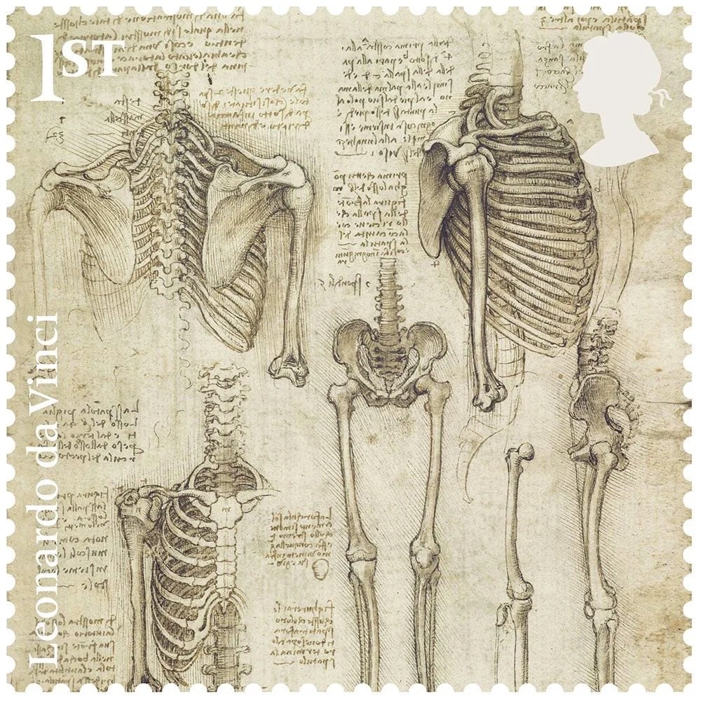

The Royal Mail in the UK have released a set of stamps that feature drawings done by Leonardo da Vinci.
The Royal Collection holds the greatest collection of Leonardo’s drawings in existence, housed in the Print Room at Windsor Castle. Because they have been protected from light, fire and flood, they are in almost pristine condition and allow us to see exactly what Leonardo intended — and to observe his hand and mind at work, after a span of five centuries. These drawings are among the greatest artistic treasures of the United Kingdom.
The drawings are all taken from a collection owned by the royal family and will be featured in a distributed exhibition of Leonardo’s drawings happening around the UK this year. (via colossal)
In her series “opsec and beauty”, artist Addie Wagenknecht efficiently combines two YouTube genres into one, giving tips on cybersecurity while reviewing beauty products. In this video, Wagenknecht recommends using pass phrases instead of passwords while reviewing a Korean facial sheet mask:
I also like this one, titled “Dry shampoo review Herbal Essence and blocking Chad from calling”:
It makes your hair smell really good. It kinda makes you look like you’ve washed it. I’m going on like day 10 right now of not washing my hair but you can tell it’s transformed. I also want to talk about having secondary phone numbers because that way you can block the guy once he realizes you actually have to do things to yourself to be perfect.
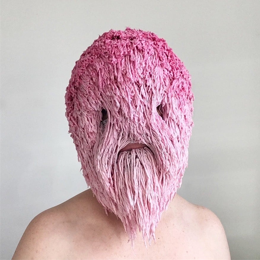
For the past few years, visual artist Threadstories has been making these amazing masks and posting selfies of her wearing them on Instagram. She starts each mask with a crocheted balaclava:
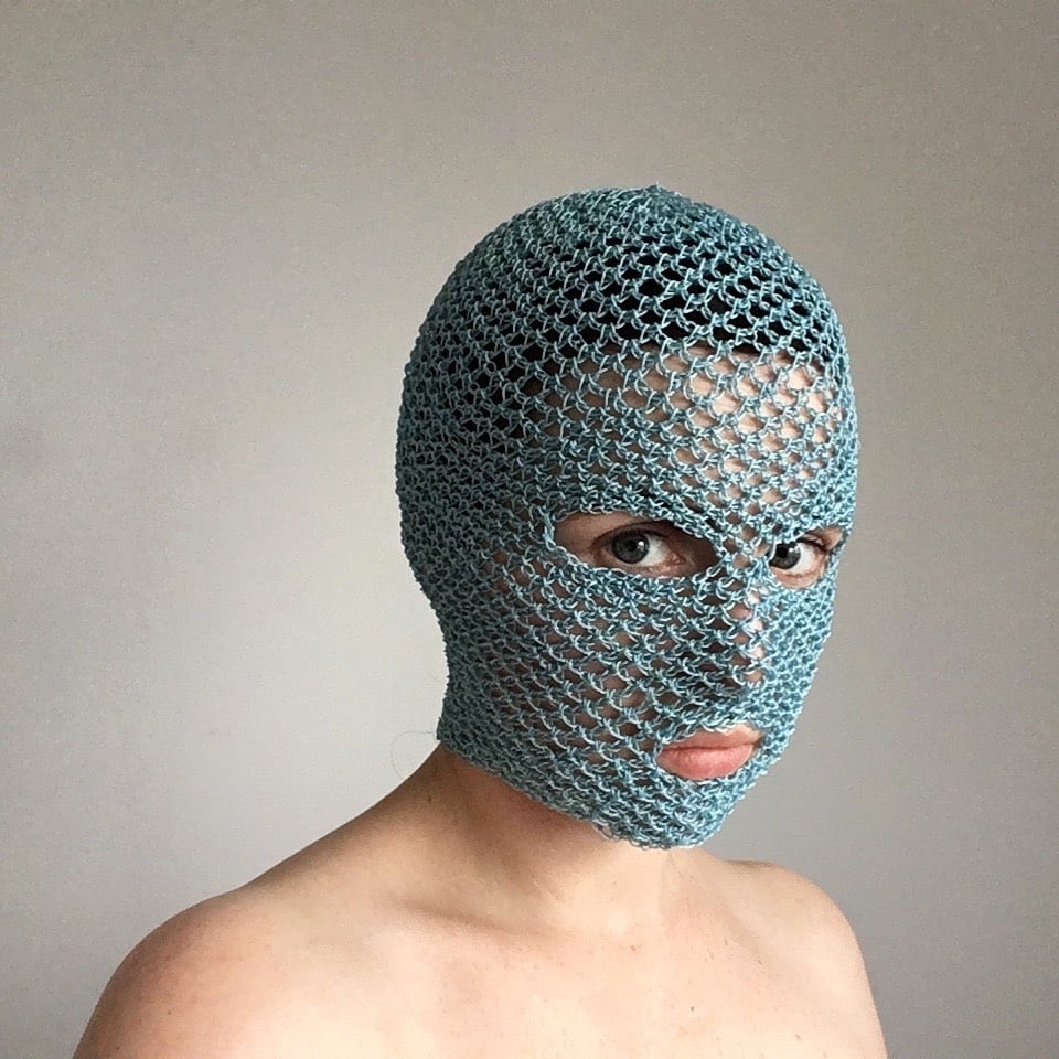
And ends up at many different endpoints:
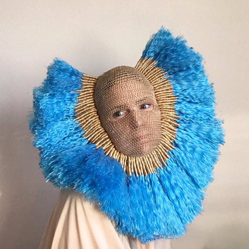
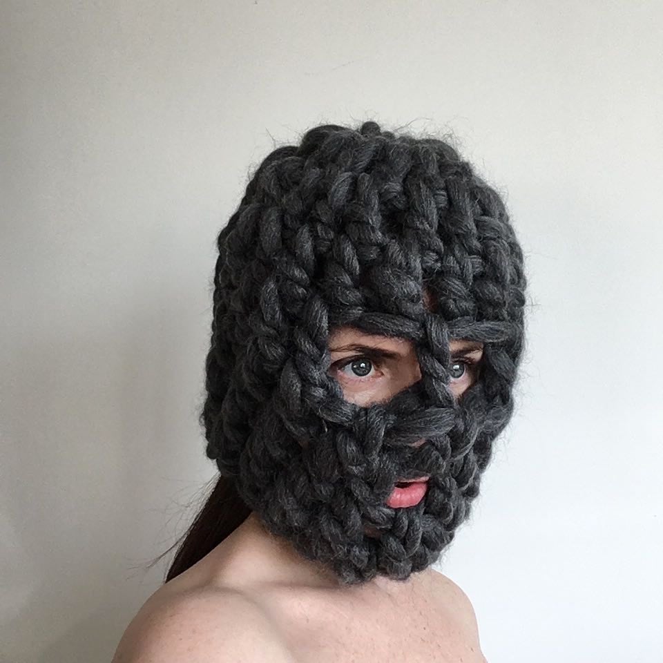
You can see the masks in motion in this video and read more about the project in this RedMilk interview.
I don’t have any one line of enquiry or source of inspiration. Everything from traditional basket making to Francis Bacons portraits to the sight of someone with really crooked teeth or an episode of Blue Planet might inspire a mask. Thematically I am questioning how the erosion of personal privacy online effects how we view and portray ourselves. I am constructing facades — masks in response to these questions. We are all so over exposed and to what end? Privacy is precious.
(via swissmiss)
The USPS will release a set of stamps in 2019 honoring the artist Ellsworth Kelly. Some art works better on stamps than others…Kelly’s stripped down abstracts look like they were specifically designed for postage:
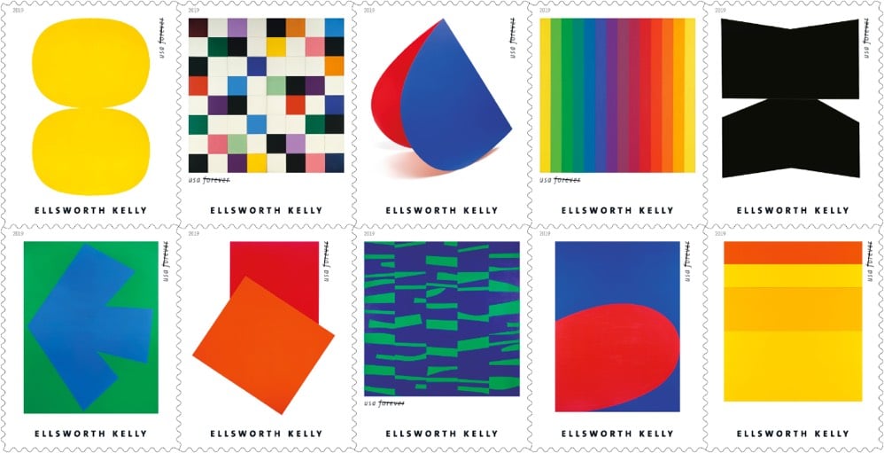
You can check out more of Kelly’s art at MoMA and The Whitney.
Moon Rivas, a cyborg artist, has sensors implanted in her feet that vibrate whenever an earthquake is detected anywhere in the world. A dancer and choreographer, Rivas uses the randomly occurring vibrations to perform dance pieces like “Waiting for Earthquakes”. This video from Quartz gives a good overview of Rivas’ art and process (back when an implant was located in her arm instead of her feet).
CNN and Bloomberg both have recently updated reports on Rivas’ work.
Ribas then transforms that data into dance or music, often incorporating elements of spontaneity and uncertainty. For example, the movements in the dance “Waiting for Earthquakes,” in which the artist stands perfectly still until seismic activity occurs, can take many shapes.
“I’m a dancer and a choreographer, so I wanted to experience movement in a deeper way,” she explains. “Whenever there is an earthquake, I move according to the intensity of the earthquake. It’s a bit like a duet between the earth and myself. Earth is actually the choreographer of the piece and I’m just imitating the data that she gives.”
Her partner Neil Harbisson is also a cyborg. He was born colorblind but is outfitted with an antenna implanted in his head that vibrates when it detects colors. (via @boletrone)
Check out these elaborate and colorfully decorated origami creations by paper artist Cristian Marianciuc.
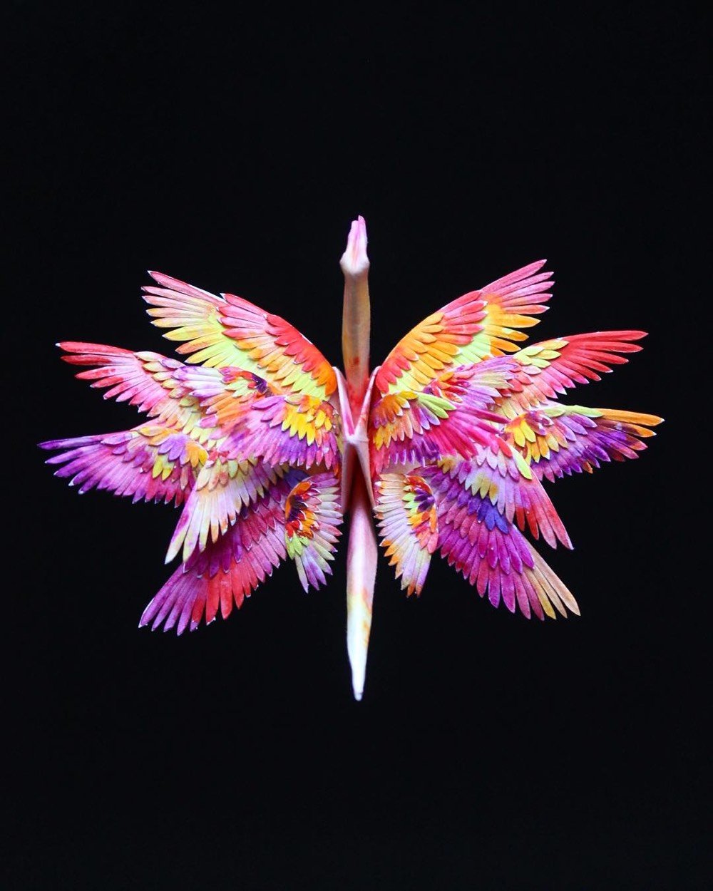


To create these intricate artworks, Marianciuc folds traditional origami cranes and then adorns them with hand-cut paper and other materials. Some of his creations are available in his Etsy shop. (via @imperica)
Artists Irene Posch & Ebru Kurbak have built The Embroidered Computer, a programmable 8-bit computer made using traditional embroidery techniques and materials.
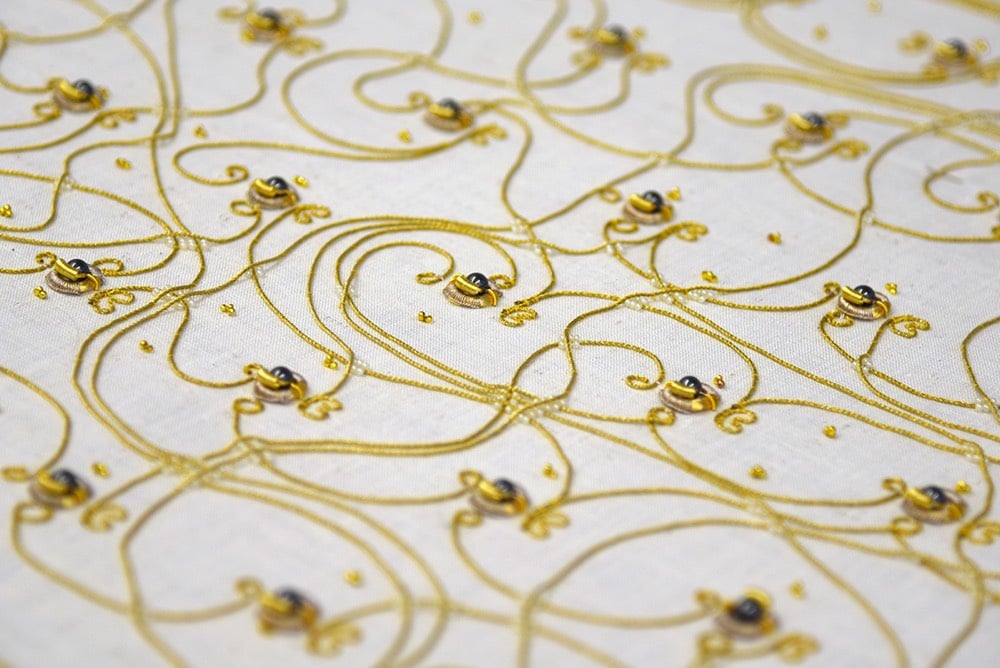
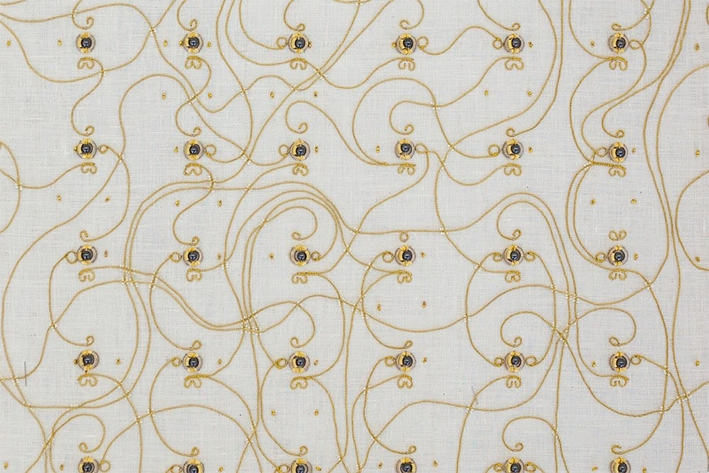
Solely built from a variety of metal threads, magnetic, glas and metal beads, and being inspired by traditional crafting routines and patterns, the piece questions the appearance of current digital and electronic technologies surrounding us, as well as our interaction with them.
Technically, the piece consists of (textile) relays, similar to early computers before the invention of semiconductors. Visually, the gold materials, here used for their conductive properties, arranged into specific patterns to fulfill electronic functions, dominate the work. Traditionally purely decorative, their pattern here defines they function. They lay bare core digital routines usually hidden in black boxes. Users are invited to interact with the piece in programming the textile to compute for them.
The piece also slyly references the connection between the early history of computing and the textile industry.
When British mathematician Charles Babbage released his plans for the Analytical Engine, widely considered the first modern computer design, fellow mathematician Ada Lovelace is famously quoted as saying that ‘the Analytical Engine weaves algebraic patterns, just as the Jacquard loom weaves flowers and leaves.’
The Jacquard loom is often considered a predecessor to the modern computer because it uses a binary system to store information that can be read by the loom and reproduced many times over.
See also Posch’s & Kurbak’s The Knitted Radio, a sweater that functions as an FM radio transmitter.

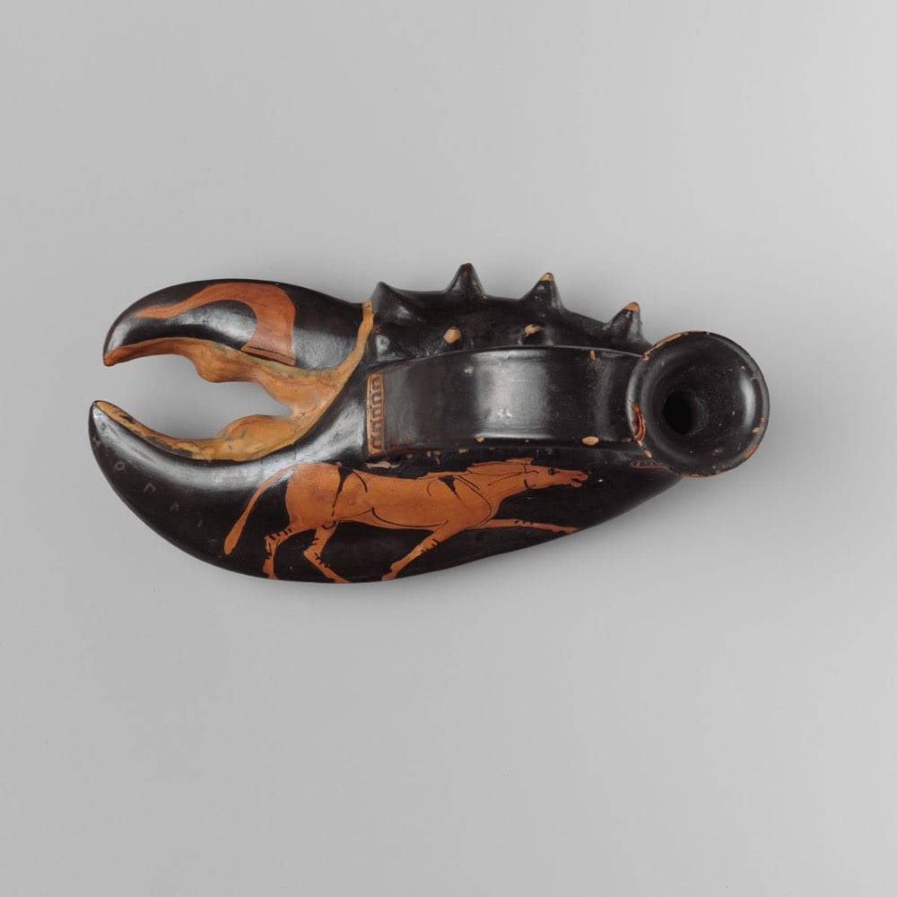
Terracotta vase in the form of a lobster claw from the collection at the Met. Circa 460 BC.
Because so many aspects of Greek life depended on the sea, a vase in the shape of a lobster claw is not surprising. It is, however, exceptional and may be a variant of the askos — a bag-shaped oil container provided with a vertical mouth and strap handle. The Dionysiac iconography of the lobster claw suggests that it was a novelty item used at symposia (drinking parties).
The vase bears an inscription that reads “the boy is fair”.
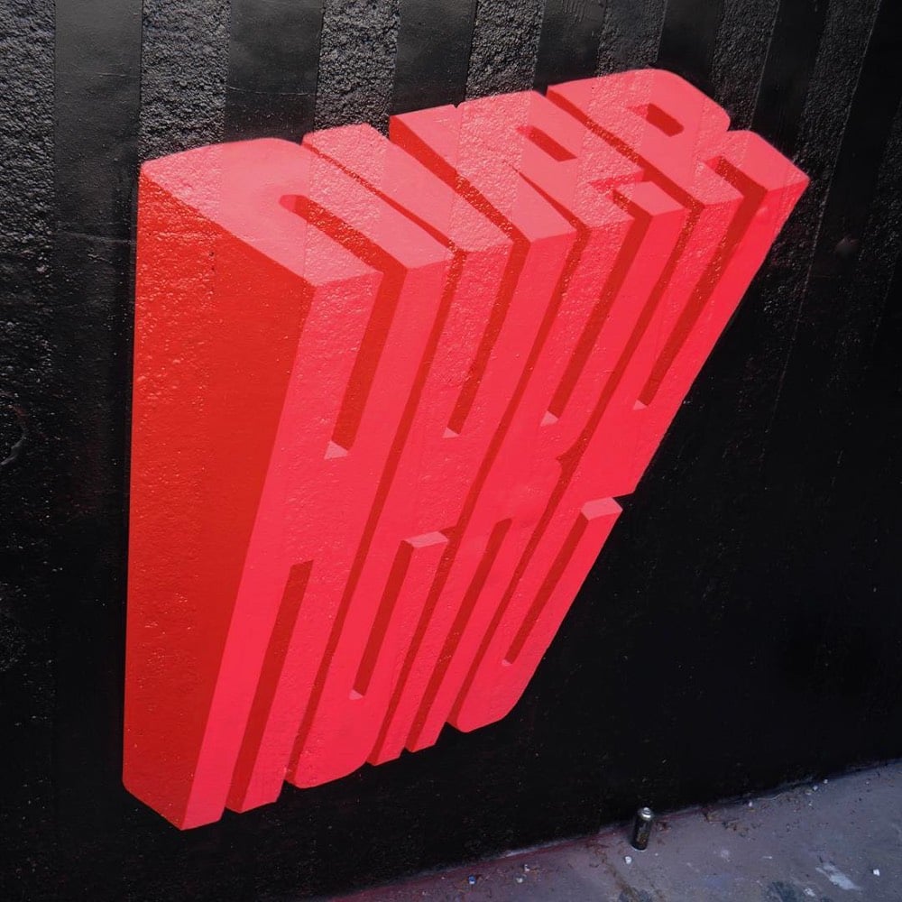
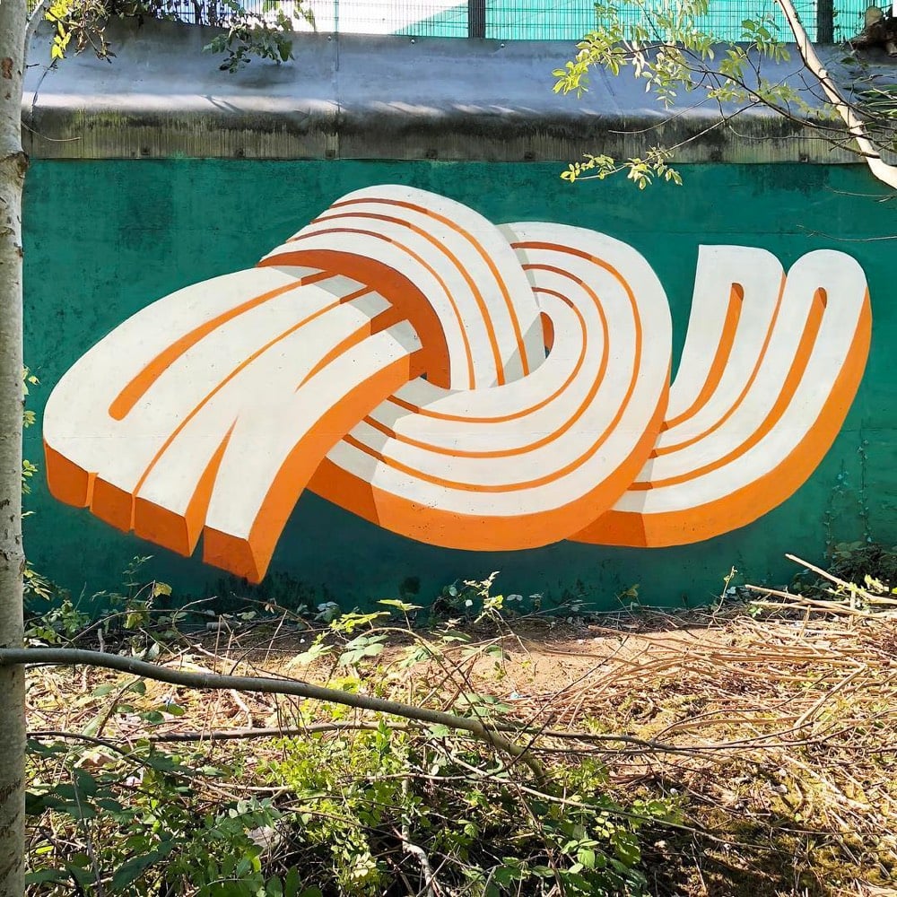
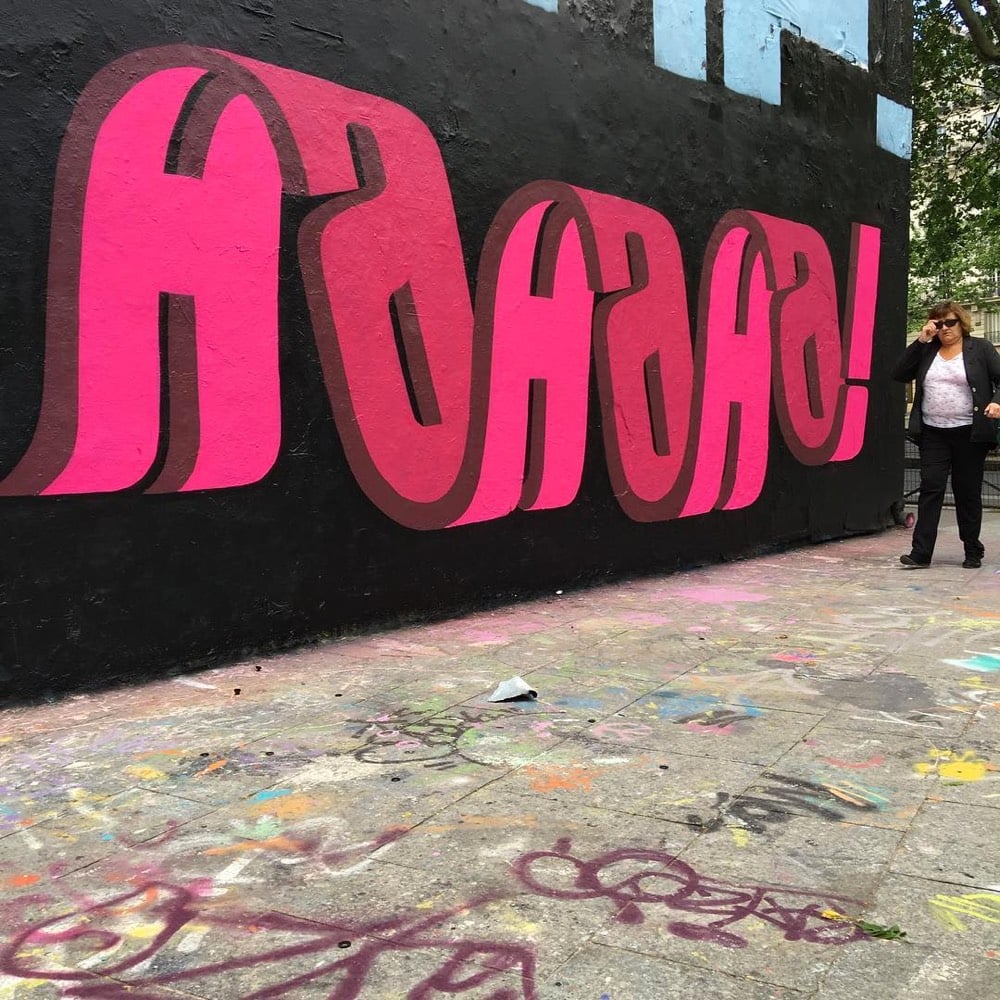
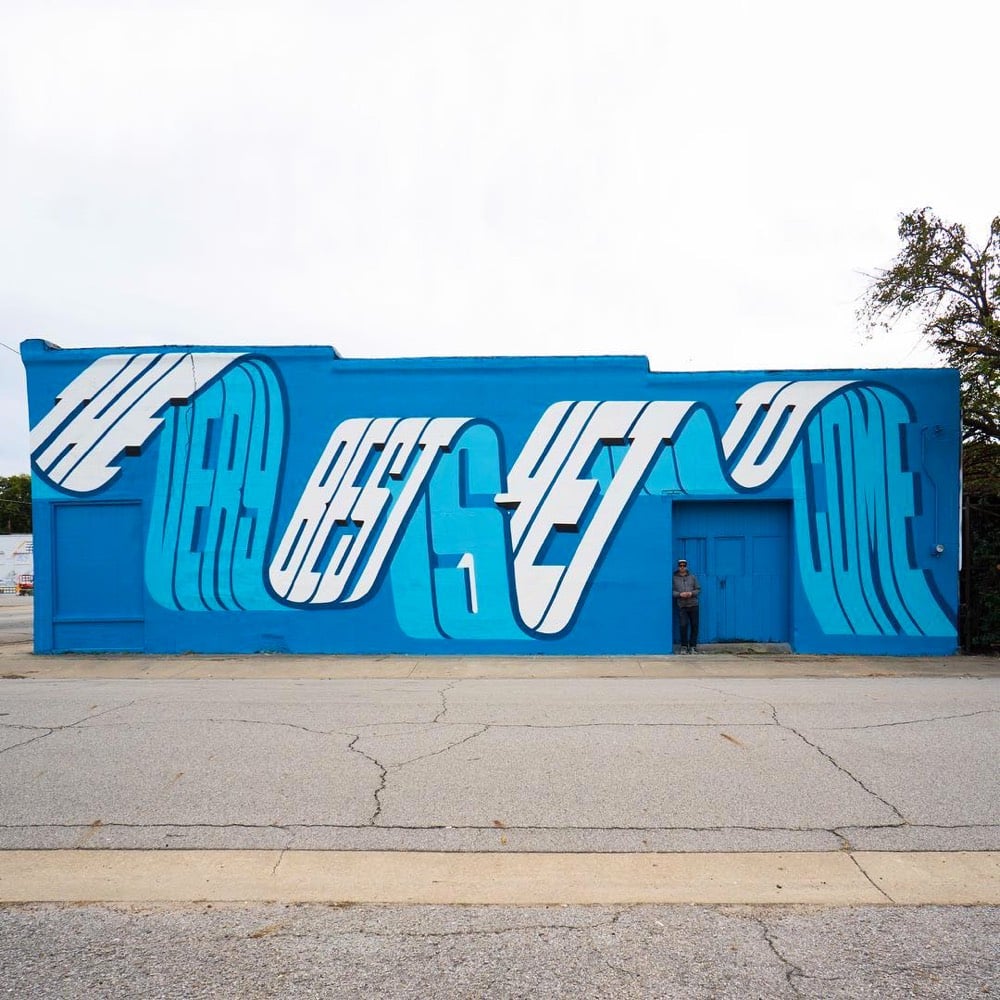
I love this chunky/wavy typographic street art by Pref. He spoke with Colossal back in May about his art.
“Since then I have pushed and experimented with this idea of overlapping words, seeing how many I can fit into the space of one word, and then slowly boiling it down and simplifying this idea to become more legible,” he tells Colossal. “This in turn lead more to the use of ‘typography’ throughout my style as you see today. I have always been interested in the idea of graffiti speaking to the general public, rather than just other graffiti writers, and readable letters or a more ‘typographic’ approach has been a good route to that.”
Newer posts
Older posts






Socials & More