kottke.org posts about art
Guernica is one of Pablo Picasso’s greatest masterpieces, and, like a lot of his other work, can be difficult to decipher. The painting is obviously anti-war, anti-fascist, and pro-Spain, but beyond that, art scholars have been puzzling over details for decades. In this TED-Ed video, Iseult Gillespie offers a short tour of the painting and its history. You might find this piece (and the list of works cited at the bottom) useful as well.
However, Picasso declared the inspiration for the painting was the aftermath of the 1937 attack of the Spanish town Guernica. On market day April 26, 1937, the citizens of Guernica gathered for their customary shopping and socializing; unfortunately, German war planes descended upon the town. The Nazis bombed Guernica and killed 1600 people; fires burned for three days and destroyed the town. Picasso captured the “la douleur et la mort” or “pain and death” of the aftermath. Yet, Picasso maintained his place that he did not assign meaning to the individual images. Nonetheless, this large-scale monochromatic painting encourages the inner critic to react, deconstruct, and create their own dialogue.
This account of the bombing shows how bloodthirsty and ruthless the Nazis were in 1937.
Besides celebrating the Führer’s birthday, the attack on Guernica served as a tactical military and aeronautical experiment to test the Luftwaffe’s ability to annihilate an entire city and crush the morale of its people. The Condor Legion’s chief of staff, Colonel Wolfram von Richthofen, painstakingly devised the operation to maximize human casualties, and above all deaths. A brief initial bombing at 4:30 PM drove much of the population into air-raid shelters. When Guernica’s citizens emerged from these shelters to rescue the wounded, a second, longer wave of bombing began, trapping them in the town center from which there was no escape. Low-flying planes strafed the streets with machine-gun fire. Those who had managed to survive were incinerated by the flames or asphyxiated by the lack of oxygen. Three hours of coordinated air strikes leveled the city and killed over 1,500 civilians. In his war diary, Richthofen described the operation as “absolutely fabulous!…a complete technical success.” The Führer was so thrilled that, two years later, he ordered Richthofen to employ the same bombing techniques, on an infinitely greater scale, to lay waste to Warsaw, thereby setting off World War II.
With that sort of casual brutality, it’s no wonder Picasso was still livid about it years later:
In occupied Paris, a Gestapo officer who had barged his way into Picasso’s apartment pointed at a photo of the mural, Guernica, asking: “Did you do that?” “No,” Picasso replied, “you did”, his wit fizzing with the anger that animates the piece.
(via open culture)
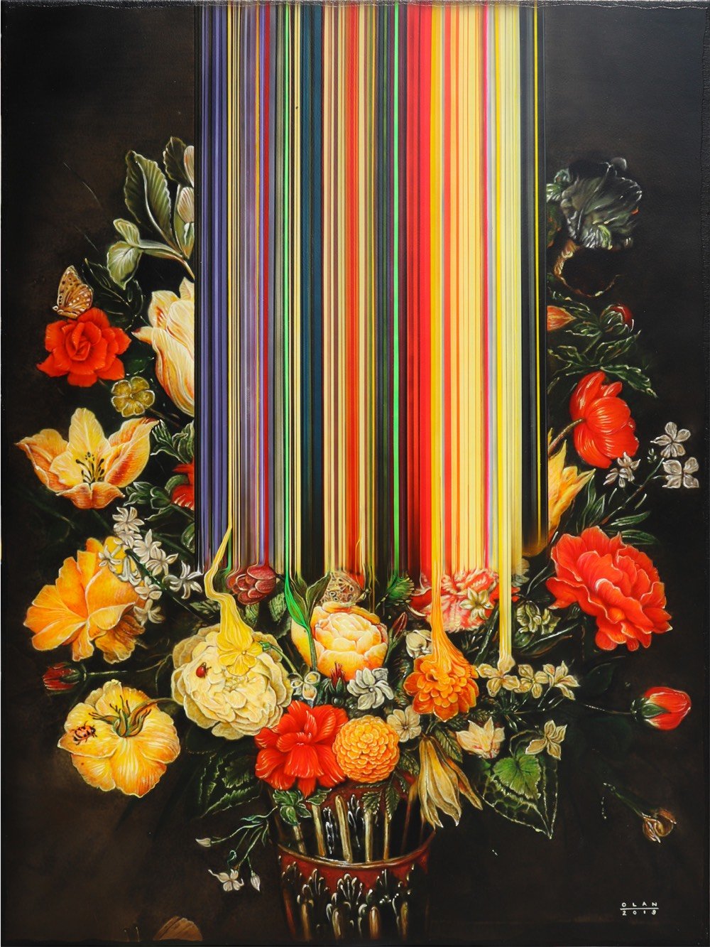
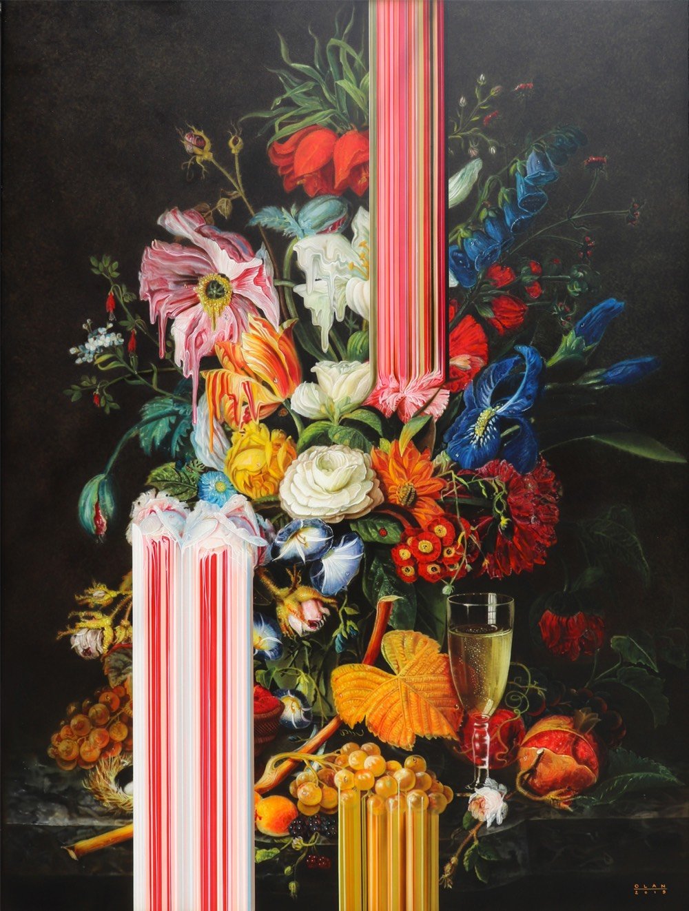
Holy moly I love these glitched still lifes by Olan Ventura. (via colossal)
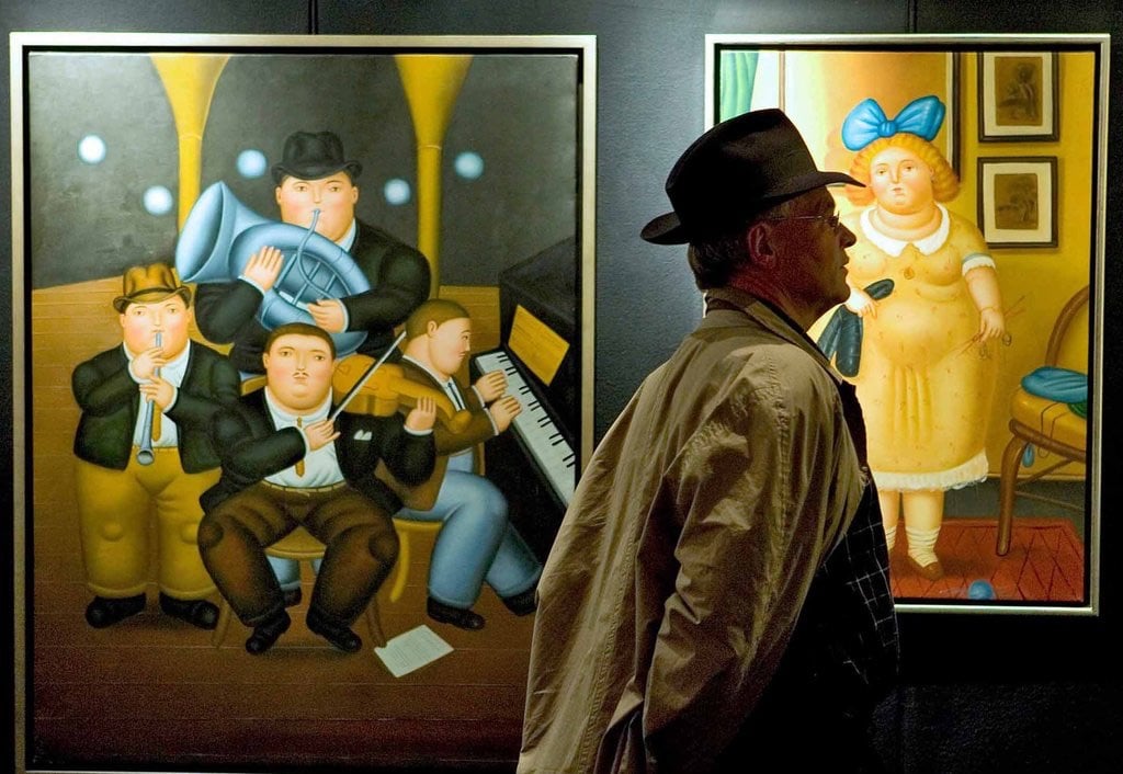
The Atavist’s “Masterpiece Theater,” by Anna Altman, traces the works of an art forger, Geert Jan Jansen (aka, among others, Jan Van den Bergen). Among other notorious works, Jansen forged a Picasso drawing which was thought to have been destroyed in a robbery, then directed a writer to it so the painting could be rediscovered.
Altman spends a fair amount of time chipping away at Jansen’s motives, and those of art forgers in general:
It takes a certain psychology to exploit art’s loopholes: a tendency toward self-aggrandizement, a loose relationship with the truth, and a sense of superiority, particularly vis-à-vis art royalty. Many forgers take a perverse pleasure in thumbing their noses at gatekeeping elites. And forgers can be something of a Rorschach test for the public. The art world, with its exclusivity, money, and pretension, elicits strong, sometimes negative reactions. The idea of someone skilled enough with a paintbrush or pen to fool the rich and powerful can be tantalizing. “To art critics, the forger is a mediocre artist seeking revenge; to the media, a conman interested only in money; to the apologist, he is the equal of the masters he forged; to the public he is often a folk hero,” Wynne writes.
There’s an element of Catch Me If You Can here:
Inside the château, Schoeller found hundreds of artworks that he and the French police suspected were fraudulent. They were attributed to masters like Picasso, Matisse, and Joan Miró. They were arranged in neat stacks, apparently ready for sale. Fake Chagall paintings hung above the stove, drying. Several rooms were designated for a particular artist whose style was being faked. Authorities also found half-finished works, sketches for new ones, contracts with auction houses in Belgium, Switzerland, and New York, and false authentication certificates. Moreover, Van den Bergen had all the tools required to produce fake certificates of authenticity, including a bag full of stamps and 30 vintage typewriters used to approximate typefaces from various time periods. In a dustbin were strips of paper cut from forged certificates to eliminate watermarks, which might have given away the documentation’s true age.
But the tools of the craft, the seams in the story, might always be more interesting than penetrating whatever depths are in the characters at work:
Strategy, or deciding what kind of art to fake, is also key. Potentially blockbuster works—oil paintings by Michelangelo, say, that might be worth tens of millions of dollars—are likely to be put through the authentication wringer. Less prized items are not. Prints, works on paper, and gouaches (opaque watercolors) usually sell for less than $10,000 and pass through small auction houses and dealers. It’s much easier to elude detection when the stakes, relatively speaking, are low.
That may have been one reason Van den Bergen forged the types of works he did—smaller-scale compositions on paper rather than oil paintings. But he may have had other, more personal motives. Among the paintings recovered from the château were large-format abstract canvases, filled with geometric shapes in shades of lime green and orange. They were originals of the artist, and Schoeller wasn’t impressed. “He’s a perfect craftsman but not an artist,” the investigator told the Stuttgarter Nachrichten. “He has no style of his own.” Perhaps that’s why he’d become a forger in the first place—an abundance of artistic ambition without the vision to realize it.
Working from remains discovered during archaeological excavations, sculptor and archaeologist Oscar Nilsson combines his two disciplines to reconstruct the faces of people who lived hundreds, thousands, and even tens of thousands of years ago.
This Neanderthal woman lived 45-50,000 years ago:

This young woman lived in what is now Britain about 5500 years ago. DNA evidence shows that the skin color of the region’s inhabitants at the time was quite dark, akin to that of modern North Africans.

This man was around 20 when he died in northern Switzerland 1300 years ago. His skull was unusual in that it contained a full set of perfect teeth.

You can read more about Nilsson’s restorations at Facebook and National Geographic.
Nilsson’s forensic technique starts with an exact 3D replica of the original skull, scanned, printed, and then modeled by hand to reflect bone structure and tissue thickness based on the individual’s origin, sex, and estimated age at death.
Recent genome studies of ancient European populations enable Nilsson to outfit his reconstructions with reasonably accurate estimates of skin, hair, and eye color. The Neolithic population that the 5,600-year-old Whitehawk woman belonged to, for instance, generally had lighter skin and darker eyes than earlier occupants of Britain such as Cheddar Man, but were darker than the exhibit’s Ditchling Road man, who arrived on the island in the first wave of light-skinned, light-eyed Beaker people from continental Europe around 4,400 years ago.
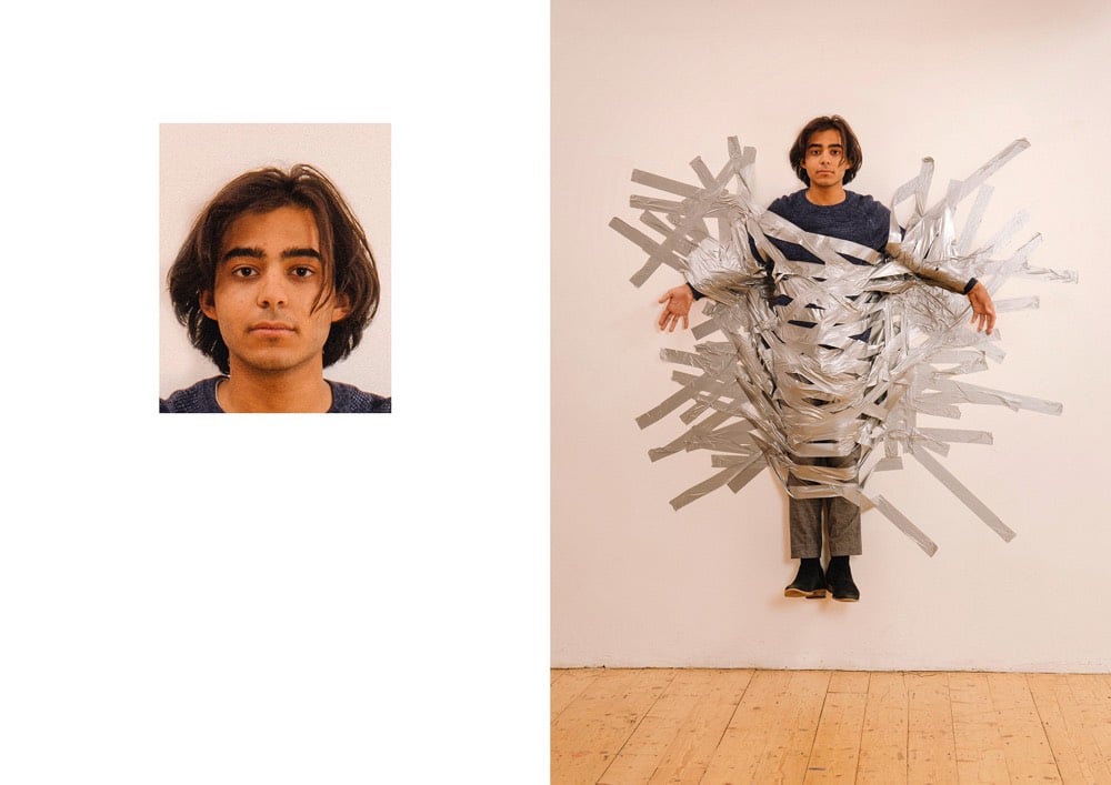
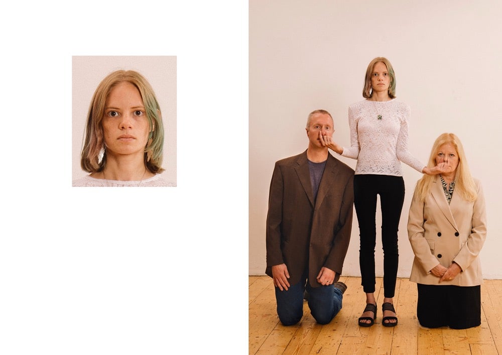

Passport photos are subject to an extensive list of guidelines and restrictions — for instance, the background has to be “plain white or off-white” with no pattern, you can’t wear glasses or hats, and the photo must be tightly cropped on your face. Max Siedentopf’s Passport Photos project imagines what might have been going on outside of that carefully controlled frame when the photos were taken. (via colossal)
Le Corbuffet was a series of performances by artist Esther Choi that sought to bring together food with notable artists and designers, along with a healthy dose of puns. A cookbook based on the project will be out in October: Le Corbuffet: Edible Art and Design Classics. Here’s the page for Quiche Haring:

Other dishes include Rhubarbara Kruger Compote, Shigeru Banchan Two Ways, Yokonomiyaki, Rem Brûlée, and the Robert Rauschenburger. Here’s the full menu/table of contents:

Says Choi about where the idea for the project came from:
In 2014, I stumbled across an elaborate menu crafted by László Moholy-Nagy. The multi-panelled bill of fare was for a dinner held in tribute to the Bauhaus founder and architect, Walter Gropius, in 1937. Inspired by the menu for Gropius’s dinner, and the questions that it raised about the elitism of cultural production, I decided to conduct a social experiment a year later.
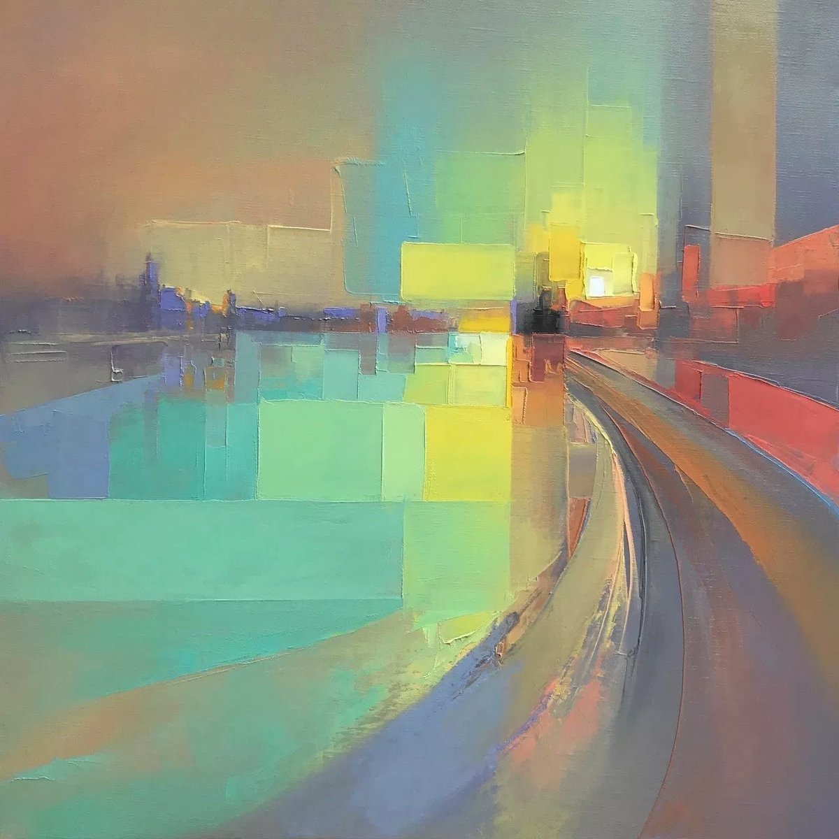
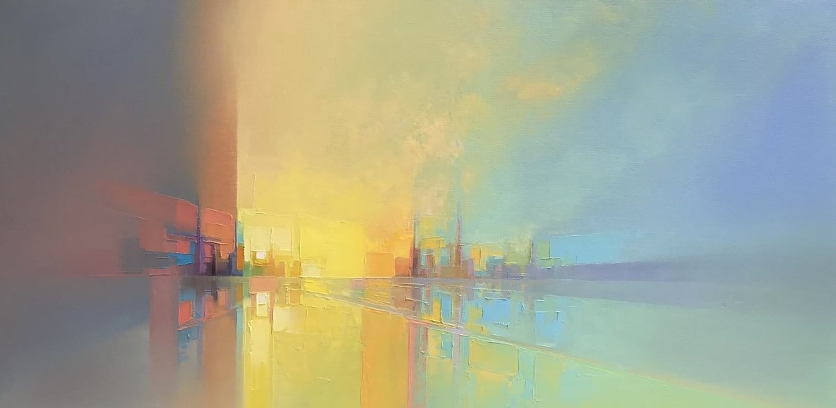

Oh, I love these abstract oil paintings by Jason Anderson. They are analog and organic but also more than a little pixel-y. Every time I see something like this, I want to get out my paints, stretch a canvas, and try it out. Note: I do not own any paints nor have I ever built any canvases. These “chunky” abstracts (see also Joseph Lee’s work) always make me curious about how much abstraction you can get away with and still have it look like something the viewer can recognize. Abstraction also always makes me think about Scott McCloud. (via colossal)
I realize that many of you have probably seen it already, but I ran across this while away on vacation and thought it was one of the most clever, moving, and powerful creative projects I’ve seen recently. Working off of a concept from 2009, activist architects Ronald Rael and Virginia San Fratello installed three seesaws through the US/Mexico border wall near El Paso which allowed children on both sides of the border to enjoy playing together.

Here’s video of the seesaws in action (from Rael’s Instagram post):
Brilliant. Damon Stapleton says that the seesaw has a “gentle anarchy” to it.
Their beautiful intention was to bring people together through design. As you may have guessed, I really like this idea. It has power, playfulness, humanity, humour and simplicity in equal measure. But most importantly, it has a gentle anarchy at its core. Great ideas like these have this essential creative point of view. There are no rules. Reject the world as it is or how others tell you to see it. Realise you have the ability to make the world the way you want it to be. And, it will be fun or at the very least, unboring. Gentle anarchy. This point of view can be scary for many. But without it, almost nothing will change or move forward.
The plans for the seesaw are on the cover of Rael’s 2017 book, Borderwall as Architecture: A Manifesto for the U.S.-Mexico Boundary, in which he documents similar projects like Burrito Wall, where the border wall is converted into a small restaurant.

If you are old enough, you probably have fond memories of the kids’ drawing toy, Spirograph. Actually, they still exist but I’m pretty sure they are less of a thing than a few decades back.
James Nolan Gandy builds gorgeous articulated machines that produce beautiful—almost digital looking in their precision—drawings very reminiscent of what kids did with spirograph.
To create multi-color works Gandy must pause the machine to switch out each color, furthering the collaboration between the built artistic object and his own aesthetic desires.
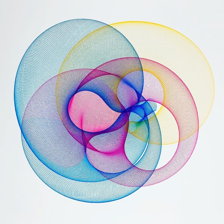
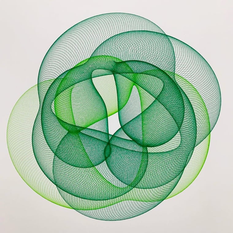
You can see more on James Nolan Gandy’s site.
Music pioneer Fab 5 Freddy is most well-known for hosting the seminal Yo! MTV Raps, but his earliest public attention came because of his art.
In the late 1970s, Freddy became a member of the Brooklyn-based graffiti group the Fabulous 5, known for painting the entire side of New York City Subway cars. Along with other Fabulous 5 member Lee Quiñones, under his direction they began to shift from street graffiti to transition into the art world and in 1979 they both exhibited in a prestigious gallery in Rome Italy, Galleria LaMedusa. In 1980, he painted a subway train with cartoon style depictions of giant Campbell’s Soup cans, after Andy Warhol.
Freddy is back on the art scene as the host of a BBC2 documentary, A Fresh Guide To Florence With Fab 5 Freddy.
Hip hop pioneer Fred Brathwaite — aka Fab 5 Freddy — goes on a quest to uncover the hidden black figures of Italian Renaissance art. “Not only were Renaissance artists making art that defined high aesthetic ideals, but they were also groundbreaking in showing an ethnically diverse, racially mixed Italy in the 15th and 16th century. You just have to look at the art.”
Pairing a hip hop legend with Renaissance art might seem like a bit of a stretch, but NYC in the 70s and 80s was a place that a curious kid could get into all sorts of things: hip hop, graffiti, and Caravaggio.
“When I was a kid,” he says, “I would cut school to travel around Manhattan museums.” The Metropolitan was his favourite because of its lax entry policy. “I would show up and toss a nickel in the admissions box then spend a day in fantasy land, going from English armour to Renaissance paintings, pop art to expressionism.”
It was an unusual interest, not one he could share with “the kids on the corner from the hood”. But it sparked his own artistic career as a subway graffiti artist and led to a lasting bond with Basquiat, who he met as a teenager. “He would spend a lot of his childhood at the Brooklyn Museum just as I did at the Met,” he says. “Finally, there was someone I could talk to about Caravaggio and Rothko. We were both so impressed with the radical nature of modernist manifestos like futurism. They gave us — two young, black kids — the capacity to articulate what we wanted to say.”
There doesn’t seem to be a trailer or any clips available online and I don’t know if this will be released in the US at all, but I would love to see this show up on Netflix or Amazon at some point.
See also Susan Orlean’s 1991 profile of Fab 5 Freddy for the New Yorker.


Heinrich C. Berann’s panoramic paintings of US National Parks aren’t just art and aren’t just maps but sit somewhere delightfully in the middle. The US National Park Park Service recently released ultra high-res scans of Berann’s parks panoramas for free download. You can read about the paintings at National Geographic.
Part of the appeal of Berann’s depictions of the national parks is that they look fairly realistic while at the same time greatly enhancing the landscapes in a number of ways. The end result is similar to what you might see from the window of a plane, and yet better than any possible real-world view, Patterson says.
Berann made sure all the important features of each park were visible in the scene. Sometimes this required some creative distortion. On the Yosemite National Park panorama below, for instance, Yosemite Valley is widened to allow all the rock formations, waterfalls, and man-made structures to be clearly seen. All of the valley’s iconic natural features are exaggerated, with Half Dome and El Capitan much taller than in real life, and the waterfalls significantly longer.
The NPS has many other high-resolution maps available for download here. Another good resource for downloadable maps is National Park Maps.
(As an aside, I got this link from Open Culture, who said they found it via Boing Boing. I clicked through to Boing Boing to see that they’d discovered the link from, uh, kottke.org? Perhaps from this link last year?)
The Andrews brothers travel the world taking overhead drone photos that they offer as prints on their site Abstract Aerial Art. I was especially struck by this photo of a container ship, whose shadow doubles as a graph of how tall each row’s containers are.

Here are a couple of other favorites:


You can catch more of their work on Instagram. (via colossal)
From the Book of Judith comes the tale of Judith beheading Holofernes.
In the story, Judith, a beautiful widow, is able to enter the tent of Holofernes because of his desire for her. Holofernes was an Assyrian general who was about to destroy Judith’s home, the city of Bethulia. Overcome with drink, he passes out and is decapitated by Judith; his head is taken away in a basket.
The story has been a rich vein for artists to explore throughout the centuries. Michelangelo worked it into the Sistine chapel, Botticelli & Rubens painted it, and Italian painter Caravaggio’s rendition is probably the most well-known:
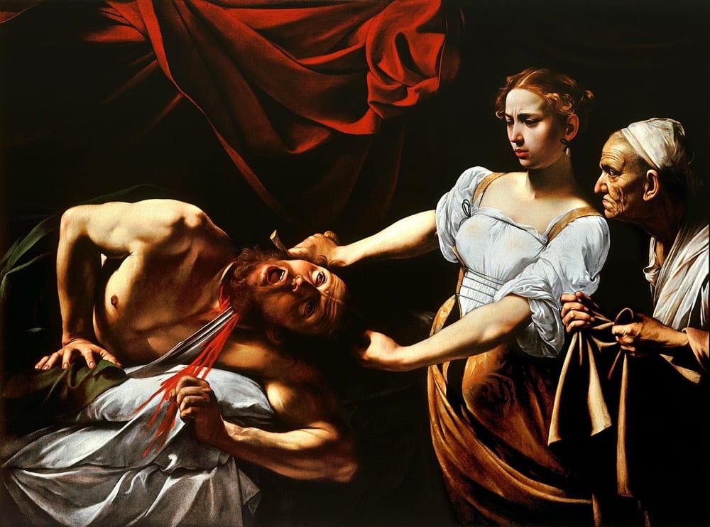
In Lyta Gold and Brianna Rennix’s entertaining ranking of 10 paintings of Judith beheading Holofernes, they put the Caravaggio at #2, with the top slot going to a painter who worked a generation later, Artemisia Gentileschi:

As it was from a young age in her father’s studio, her mastery is readily apparent but some context is helpful to appreciate the painting more fully. Throughout her career, Gentileschi featured women, often from mythology or the Bible, as primary subjects with real agency in her paintings. But the story of Judith and Holofernes likely appealed to her for another reason as well. When she was 17 or 18, Gentileschi was raped by her painting instructor, Agostino Tassi. He was convicted at trial, with Gentileschi having to testify in detail about the assault and submitting to torture to ensure she was telling the truth:
During the trial, she was subjected to sibille, a process in which ropes were tied to her fingers and tightened progressively. The practice was meant to divine whether or not she was telling the truth. After seven months in court, the judged finally ruled in Gentileschi’s favor. Tassi was sentenced to five years in prison, but never actually served time.
There appears to be some scholarly disagreement about this, but many believe that Judith Slaying Holofernes, first painted around the time of the trial, was a self portrait, with Gentileschi painting herself as Judith and Tassi as Holofernes. More recently, some critics & historians have tried to draw emphasis away from her assault in the interpretation of this and other paintings, focusing on her growing proficiency and not her victimhood. Whatever her intent at the time, the painting stands as a powerful statement and the young artist was able to continue painting, eventually becoming one of the most famous and sought-after artists in Europe.
By the time Gentileschi made Self-Portrait as the Allegory of Painting, she’d received perhaps the greatest honor bestowed upon the era’s painters: induction into the Accademia del Disegno. She was the first woman to receive the distinction and, according to the 2007 catalogue for the exhibition “Italian Women Artists: From Renaissance to Baroque,” it changed the course of her life.
With this badge of honor, Gentileschi could buy paints and supplies without a man’s permission, travel by herself, and even sign contracts. In other words, through painting, she had gained freedom. Gentileschi would go on to separate from her husband and live and work independently, primarily in Naples and London, for the rest of her life. All the while, she supported her two daughters, who also went on to become painters.
After her death, Gentileschi’s influence waned and her contributions were nearly forgotten. It was only in the 20th century that her work started to be recognized again. If you’d like to see Judith Slaying Holofernes in person, there are two copies of the painting. The earlier one, painted around the time of the trial, is housed at the Museo di Capodimonte in Naples:

A copy painted a decade later (the one shown above, with Judith in yellow) is on display at the Gallerie degli Uffizi in Florence.
The NY Times convened a group of curators and artists to decide on a list of the 25 artworks made since 1970 “that define the contemporary age”. At various times, the panelists objected to the futility of such an exercise, but eventually ended up with a list that’s highly subjective, grossly incomplete, and full of great work.
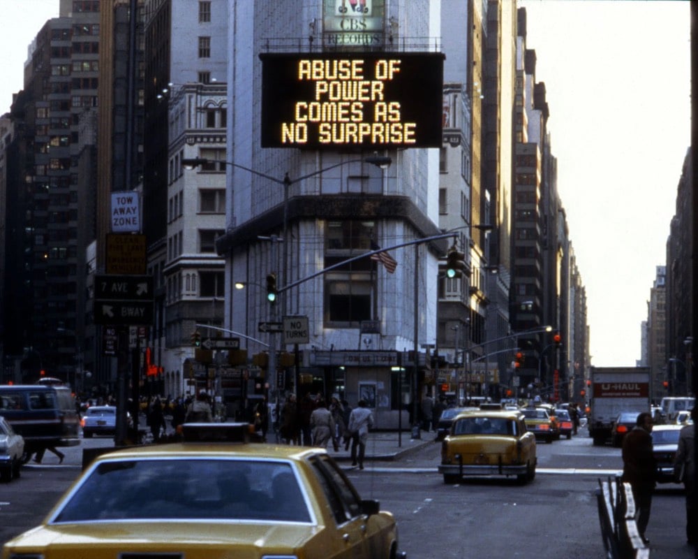
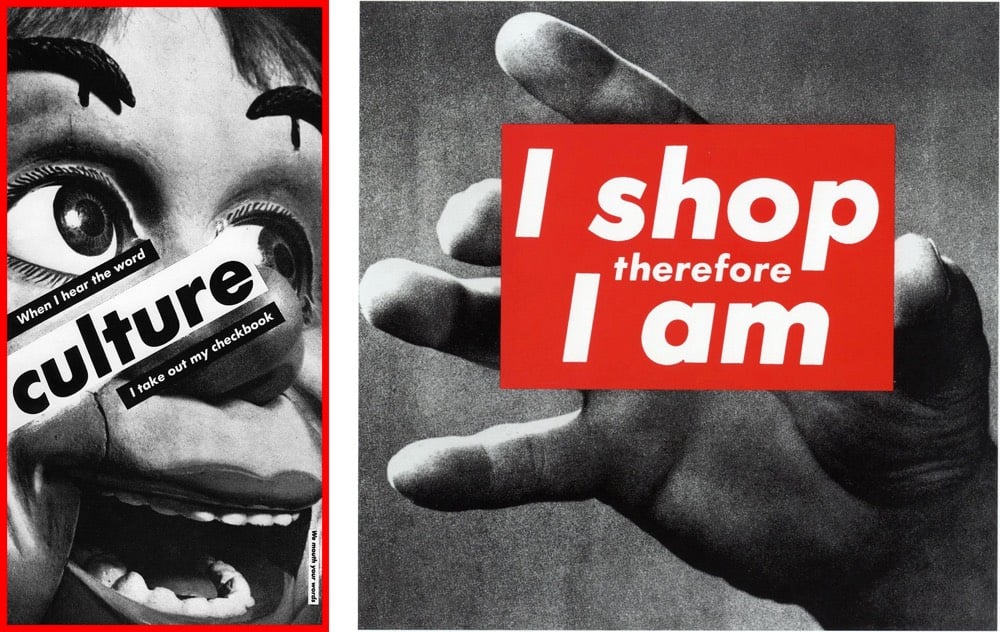
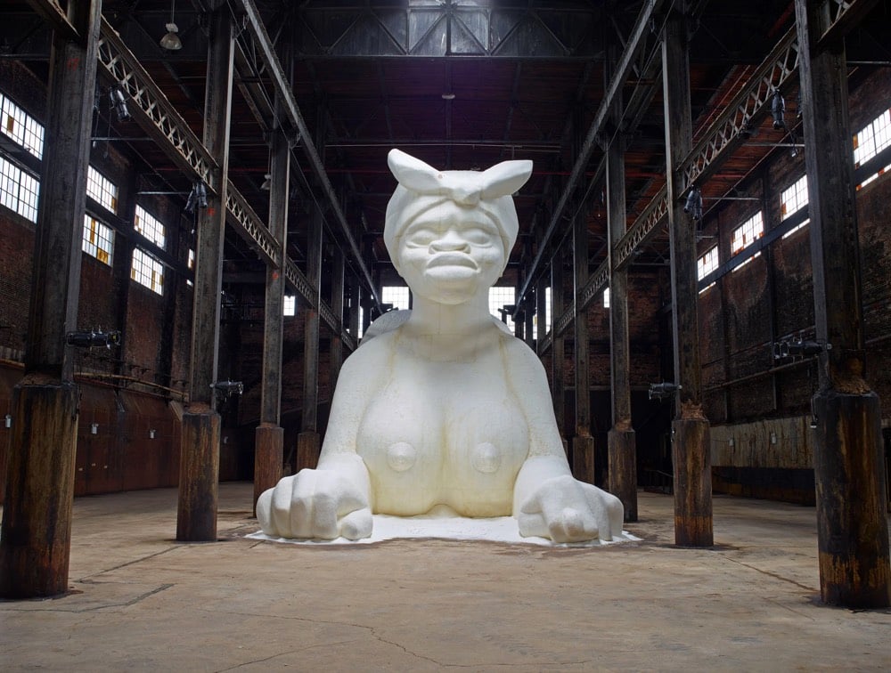
Nan Goldin, Barbara Kruger, Jenny Holzer, and Kara Walker all made the list. Jeff Koons is listed, somewhat reluctantly both by the panel and himself: “The artist did not grant permission for the named work to be published.”
Perhaps just as interesting as the artworks is the panelists’ discussion, a mini-tour of recent art history. Artist Martha Rosler said of Walker’s “A Subtlety, or the Marvelous Sugar Baby”:
“A Subtlety” made lots of people furious because it was about the history of labor and sugar in a place that was already about to be gentrified. It was this gigantic, mammy-like, sphinxlike, female object, and then it had all these little melting children. “A Subtlety” is part of a very longstanding tradition that began in the Arab world that had to do with creating objects out of clay but also out of sugar. So it’s the impacted value of extractive mining, but it’s also the impacted value of the labor of slaves. And it’s also on the site where wage slavery had occurred — sugar work was the worst. The Domino Sugar factory was once owned by the Havemeyers, and Henry Havemeyer was one of the main donors to the Metropolitan Museum of Art. The sugar king was the art king. So it had all of these things — and then there’s the idea of all these people taking selfies in front of it. It was extremely brilliant without having to say a thing.
(via @sippey)
During the course of his television career, Bob Ross painted more than 1000 paintings. But you never see them for sale. You can buy Bob Ross paint sets and even a waffle maker that makes waffles that look like Bob Ross — “Pour in the batter, lower the lid, and before you know it, there’s Bob Ross ready for butter and syrup.” — but good luck buying one of his actual paintings. In this charming little video from the NY Times, we learn where all of Bob Ross’s paintings are, meet the paintings’ custodians, and discover why the art isn’t for sale.
In 1994, the talk show host Phil Donahue asked Mr. Ross to “say out loud your work will never hang in a museum.”
“Well, maybe it will,” Mr. Ross replied. “But probably not the Smithsonian.”
Some of Ross’s paintings can be viewed at The Bob Ross Art Workshop & Gallery in New Smyrna Beach, Florida. Every episode of The Joy of Painting can be viewed on YouTube or sometimes streaming on Twitch. I watched on Twitch for a couple minutes just now and was tickled to catch him saying one of his signature phrases: “happy little trees”.

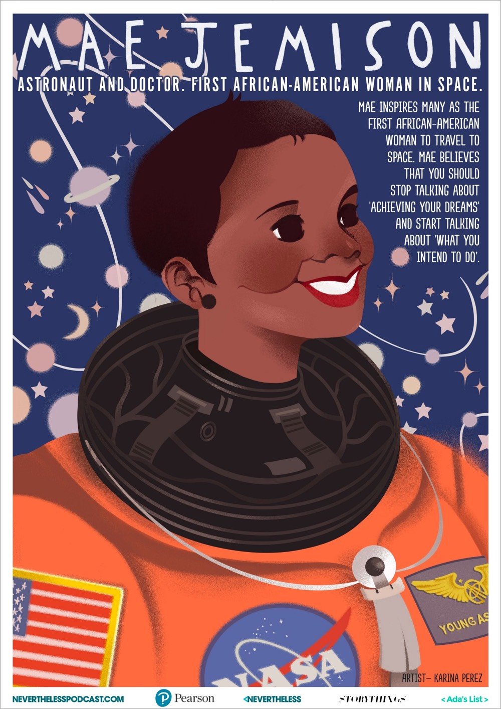
The folks behind the Nevertheless podcast commissioned a set of seven posters of STEM role models, people who have made significant contributions to science, technology, engineering, and mathematics. The posters are free to download and print out in eight different languages (including English, Spanish, and Simplified Chinese).
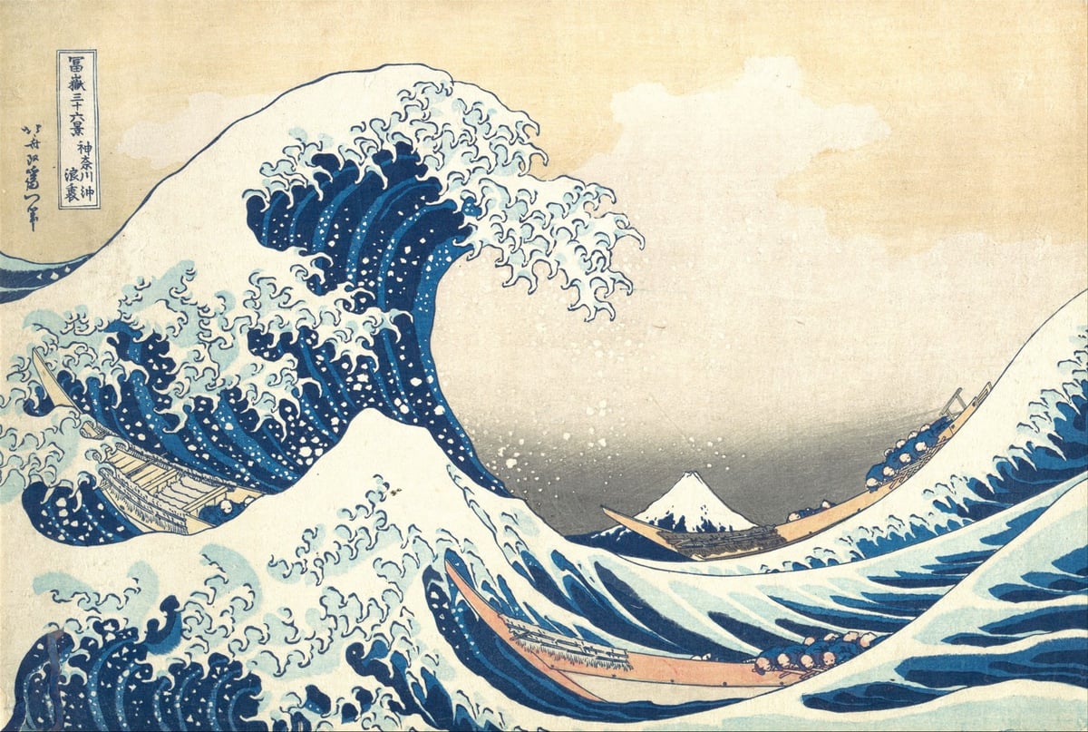
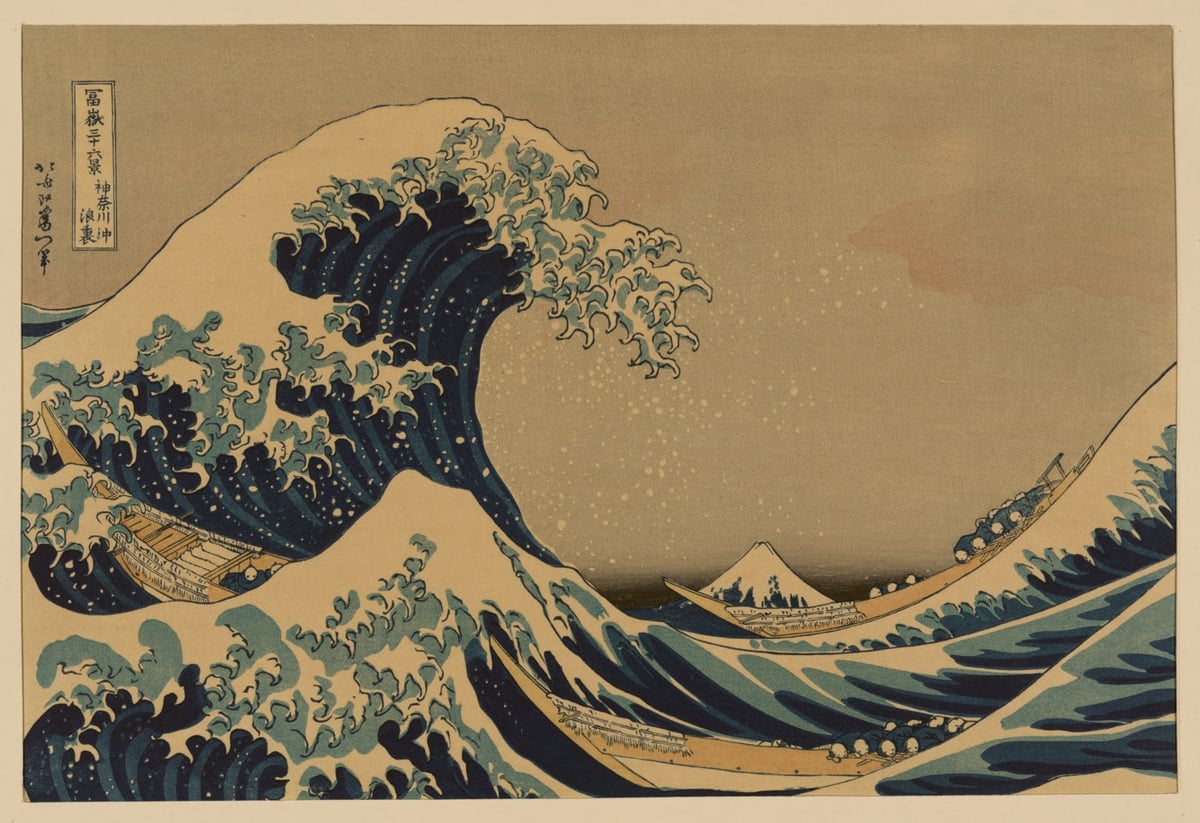
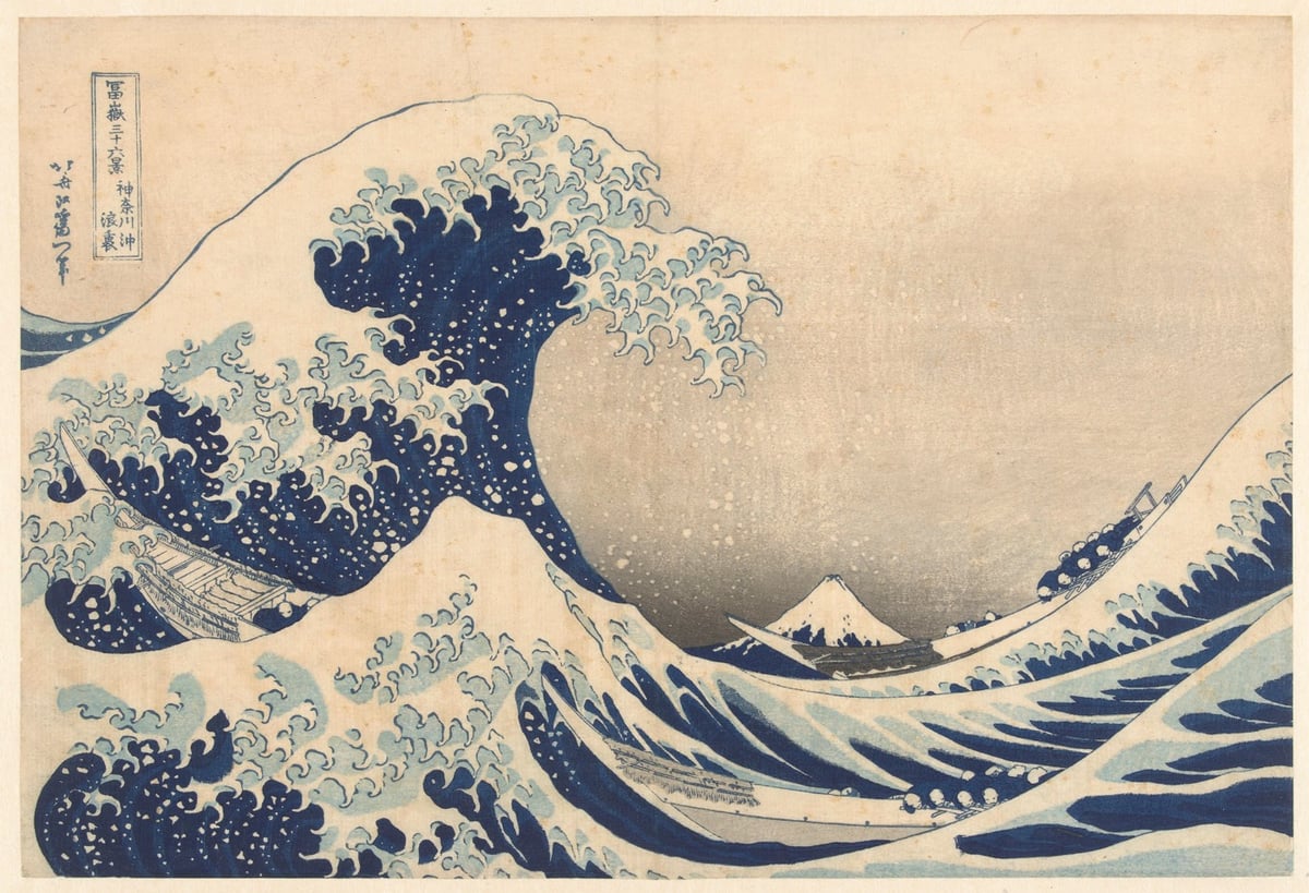
One of the world’s great art masterpieces is Katsushika Hokusai’s woodblock print Kanagawa oki nami ura, popularly known as The Great Wave. Thousands of prints were made and some of the surviving copies made their way into museums & private collections. I’ve selected three of the highest resolution prints available for free download (from top to bottom):
Metropolitan Museum of Art (10 megapixels)
Library of Congress (51 megapixels)
Rijksmuseum (22 megapixels)
You can find many other versions using the Ukiyo-e Search site.
Douglas McCarthy recently wrote about The Great Wave and the various ways that museums choose to offer digital copies on their websites.
If we consider the customer journey of acquiring a digital image of ‘The Great Wave’ from our fourteen museums, a definite trend emerges — the more open the policy of a museum is, the easier it is to obtain its pictures.
Like the other open access institutions in our sample group, The Art Institute of Chicago’s collections website makes the process incredibly simple: clicking once on the download icon triggers the download of a high-resolution image.
In contrast, undertaking the same process on the British Museum’s website entails mandatory user registration and the submission of personal data.
(via @john_overholt)
Update: A few years ago, woodblock printmaker David Bull documented the process of making prints of The Great Wave in this great series of videos. Part of his process included a fascinating investigation of previous prints and trying to determine which of the many prints might be printed by the original printer. He shares bits and pieces of that investigation in the first three videos and also the eighth & tenth videos, in which he zeroes in on two candidates for original prints (the one at the Met shown above and the British Museum print) and concludes, controversially I would think, that one (and possibly both) of these prints was made as a knock-off, a forgery. After watching Bull’s explanation, it’s not at all difficult to think that perhaps very few prints made from the original blocks by the original printer exist today. (via @gregalor)
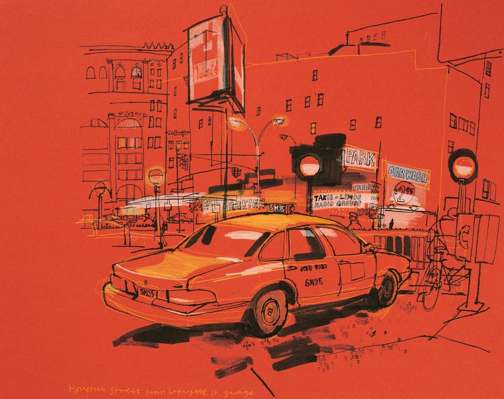
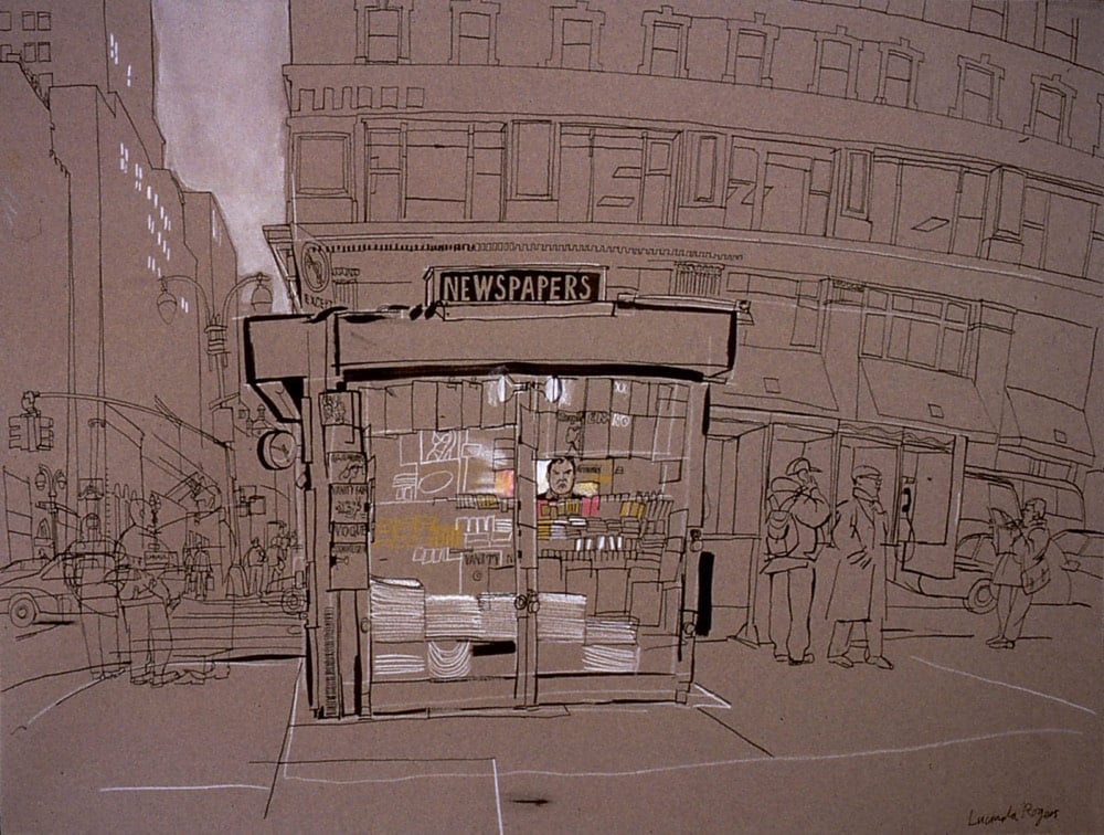
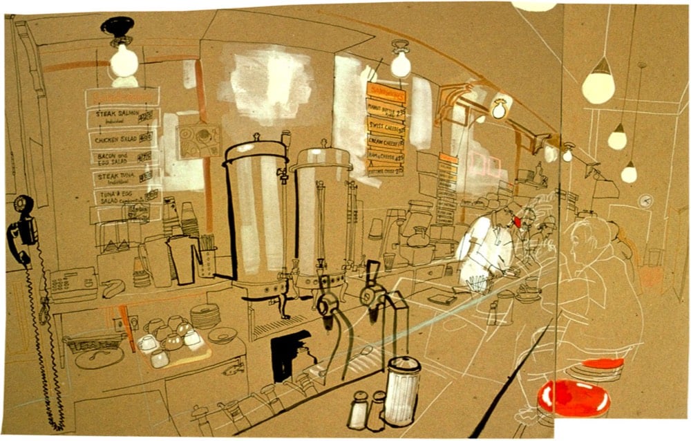
Since her first trip in 1988, UK artist Lucinda Rogers has been traveling to NYC to draw the city and its inhabitants. Rogers is working on a book of her illustrations, which she hopes to publish independently with the help of Kickstarter.
With your support this book will for the first time reveal and re-assemble around ninety drawings made between 1988 and 2018.
Working with the designer Simon Esterson we are producing the book independently and by using Kickstarter we have total control of the design and quality of production, resulting in a beautiful edition — if we reach the target!
I am delighted that the introduction will be by Luc Sante, the brilliant writer and chronicler of cities, known best for Low Life : Lures and Snares of Old New York.
The project is most of the way towards the goal with a little over a week left. Let’s help push it over the finish line. (thx, david)
Google Arts & Culture, with expertise from music video geniuses La Blogothèque, have produced a series of videos they’re calling Art Zoom. Inspired a bit by ASMR, the videos feature musicians talking about famous artworks while they zoom in & out of high-res images taken with Google’s Art Camera. Here, start with Maggie Rogers talking about Vincent van Gogh’s Starry Night:
You can zoom into Starry Night yourself and get even closer than this:
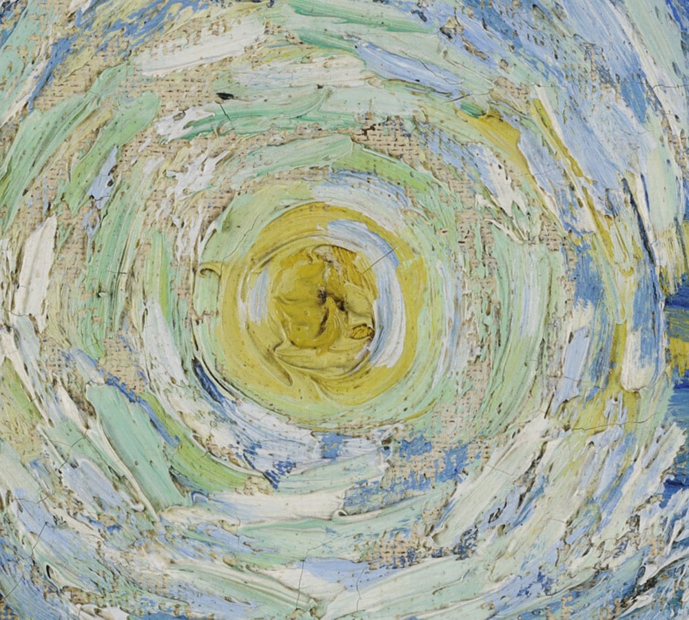
The other two videos in the series feature Jarvis Coker talking about Monet’s La Gare Saint Lazare and Feist talking about The Tower of Babel by Pieter Bruegel the Elder.
From Evan Puschak, this explanation of how art went from almost fully representational painting to abstract impressionism in about 100 years is a 6-minute whirlwind tour of modern art, from Édouard Manet to Jackson Pollock’s drip paintings. I always love when Puschak dips back into art…the first video of ever posted of his was about Jacques-Louis David’s The Death of Socrates.
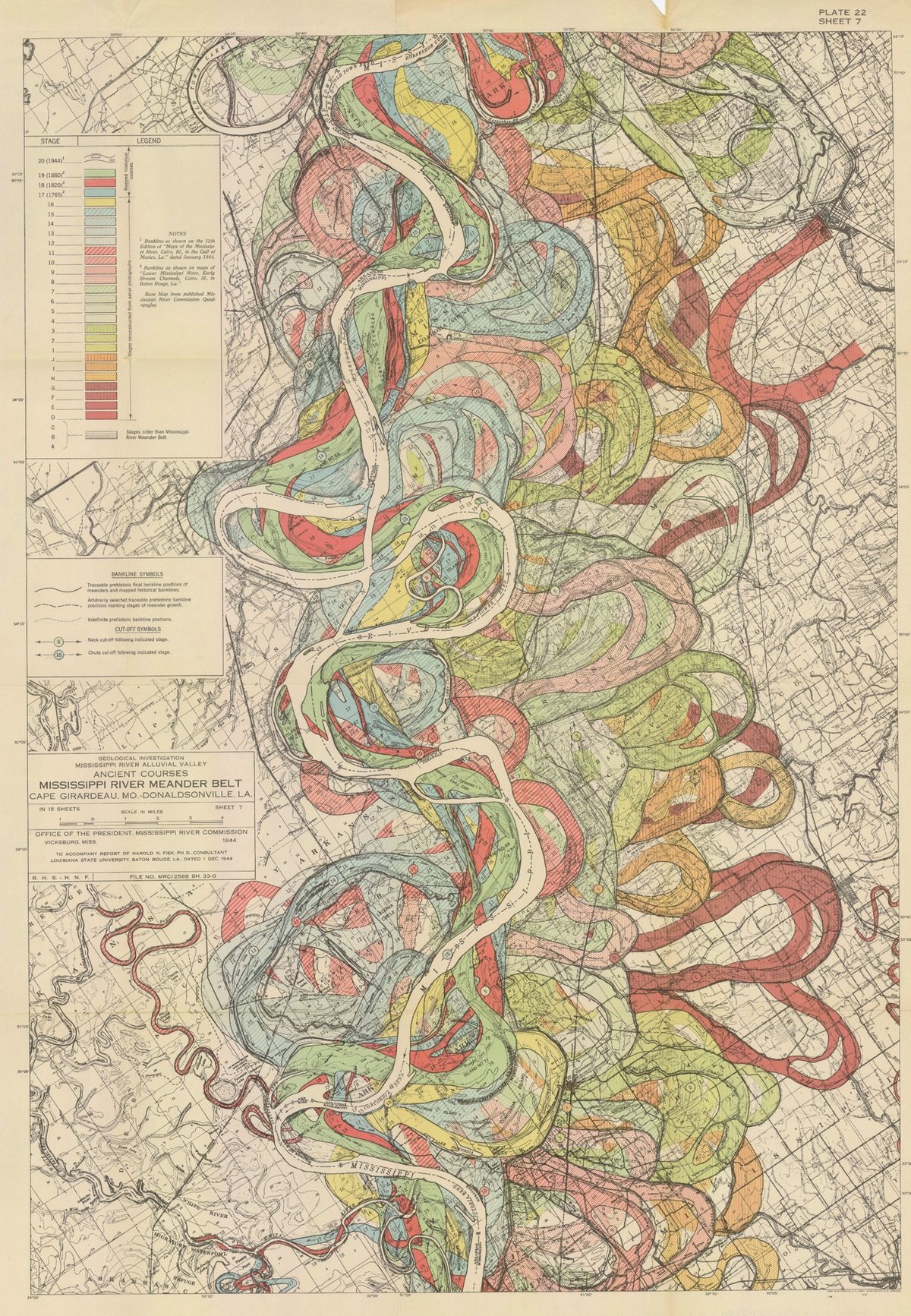

I have long admired the Mississippi River meander maps designed by Army Corps of Engineers cartographer Harold Fisk but have somehow never written a whole post about them. So when my pals at 20x200 reached out wanting me to write a blog post for them about their Fisk prints, I jumped at the chance. It gave me an excuse to write about art as time travel and, in particular, how Fisk’s clever map compresses thousands of years of a river’s activity into a single image.
It takes some imagination, but standing before a painting by Hilma af Klint, a sculpture by Bernini, or a cave painting in Chauvet, France draws you back in time in a powerful way: you know you’re standing precisely where those artists stood hundreds or even thousands of years ago, laying paint to surface or chisel to stone. Even experiencing art through prints or photographs leads the mind to consider all the cultural, political, technological, and economic things that were happening when the work was produced. Art is a doorway to past worlds.
Fisk’s maps represent the memory of a mighty river, with thousands of years of course changes compressed into a single image by a clever mapmaker with an artistic eye. Looking at them, you’re invited to imagine the Mississippi as it was during the European exploration of the Americas in the 1500s, during the Cahokia civilization in the 1200s (when this city’s population matched London’s), when the first humans came upon the river more than 12,000 years ago, and even back to before humans, when mammoths, camels, dire wolves, and giant beavers roamed the land and gazed upon the river.
You can buy prints of Fisk’s maps at 20x200…they have several available at all kinds of different sizes, framed and unframed.
Update: With LIDAR, the past meanderings of rivers can be seen more clearly (and no less artistically) than in Fisk’s maps. Here’s a LIDAR image of the Mississippi River along the border of Arkansas and Mississippi:
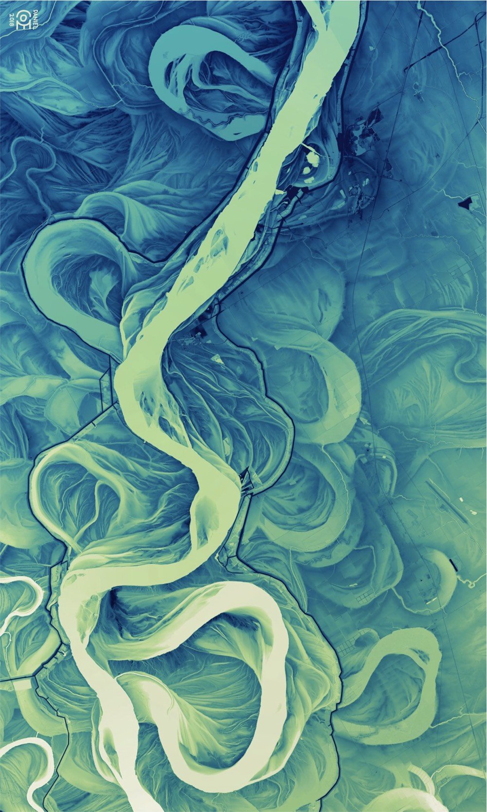
And don’t miss Daniel Coe’s morphing GIF of Fisk’s map to the LIDAR image. (via @macgbrown)
Update: Ahhh, look at this meander quilt from Timna Tarr:
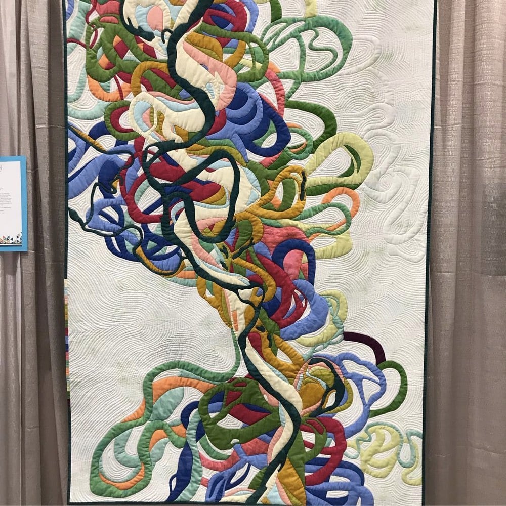
And check out some of the other quilts in her gallery…very cool. (thx, rachel)
Update: Cathy Fussell has also created quilts based on Fisk’s maps.
I don’t know if this needs a disclaimer or not, but 20x200 paid me a modest amount to write this blog post for their site but not the post you’re reading now. 20x200 didn’t pay me to write this here post; they didn’t even ask me if I would link to their post from my site. I once wrote a slightly longer (and progressively unhinged) disclaimer for a previous post about 20x200.
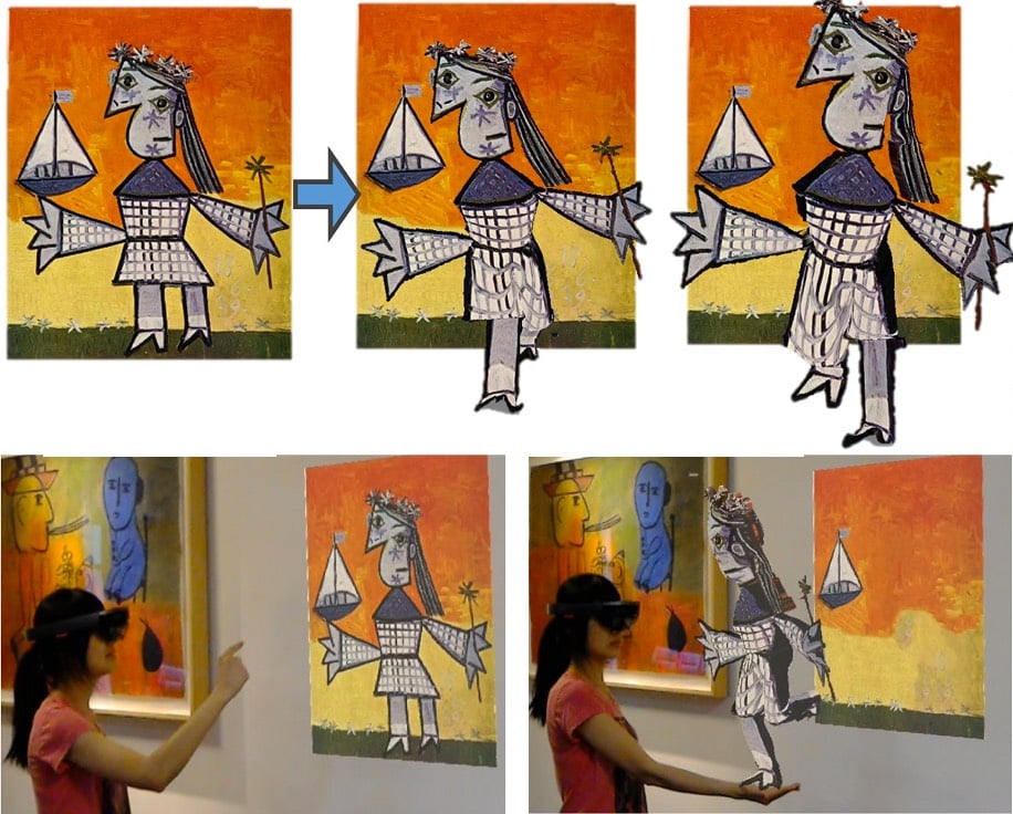
Researchers at the University of Washington and Facebook have developed an algorithm that can “wake up” people depicted in still images (photos, drawings, paintings) and create 3D characters than can “walk out” of their images. Check out some examples and their methods here (full paper):
The AR implementation of their technique is especially impressive…a figure in a Picasso painting just comes alive and starts running around the room. (thx nick, who accurately notes the Young Sherlock Holmes vibe)
The National Sound Library of Mexico says they have found the only known audio recording of Frida Kahlo’s voice. Take a listen:
The library have unearthed what they believe could be the first known voice recording of Kahlo, taken from a pilot episode of 1955 radio show El Bachiller, which aired after her death in 1954.
The episode featured a profile of Kahlo’s artist husband Diego Rivera. In it, she reads from her essay Portrait of Diego, which was taken from the catalogue of a 1949 exhibition at the Palace of Fine Arts, celebrating 50 years of Rivera’s work.
“He is a gigantic, immense child, with a friendly face and a sad gaze,” she says, as translated by Agence France-Presse. (A different English translation of the text can be found on Google Arts & Culture.)
Film footage of Kahlo is difficult to come by as well; I could only find these two clips:
The first video is in color and shows Kahlo and husband Diego Rivera in her house in Mexico City. The second shows Kahlo painting, drawing, and socializing with the likes of Leon Trotsky. At ~0:56, she walks quickly and confidently down the stairs of a ship, which is a bit surprising given what I’ve read about her health problems.
Update: According to this article (and its translation by Google), the voice on the recording isn’t Kahlo but belongs instead to actress Amparo Garrido:
Yes, I recognize myself. For me it was a big surprise because so many years had passed that I really did not even remember. […] When listening to this audio I remembered some things and I got excited because I did recognize myself.
(via @p_tricio)
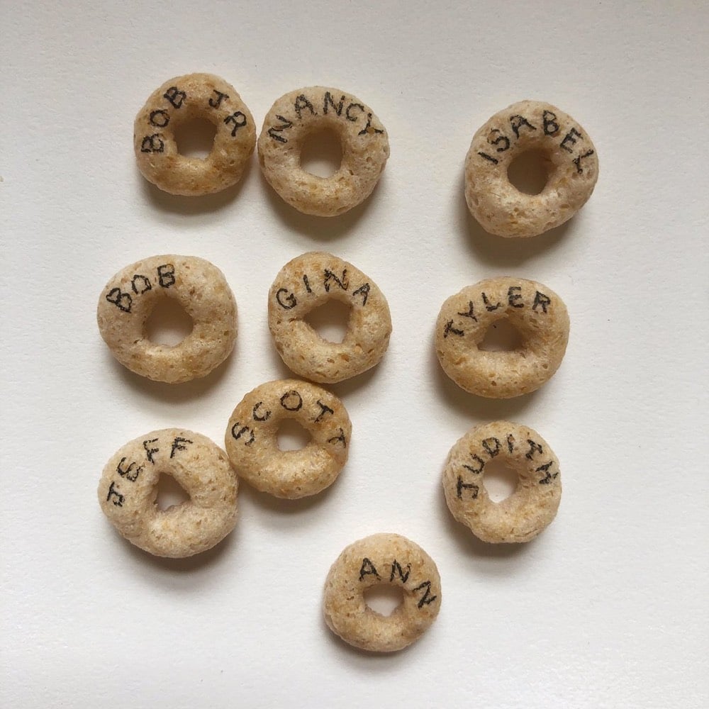
Brian McMullen is giving names to all of the 3,501 Cheerios in his cereal box and is taking name suggestions on Twitter. (via sam potts)
French artist and designer Paul Chadeisson has created a series of images of the megacities from Blade Runner, abandoned in some far future.
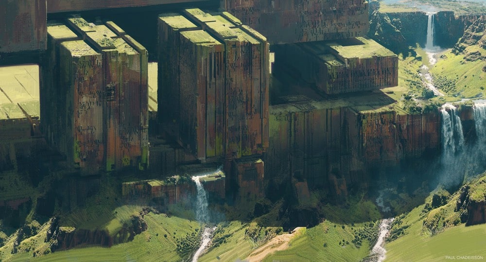

You can see more of Chadeisson’s work on Behance and Instagram.
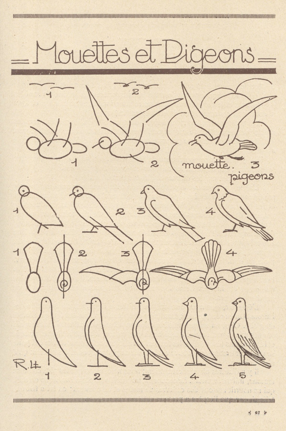
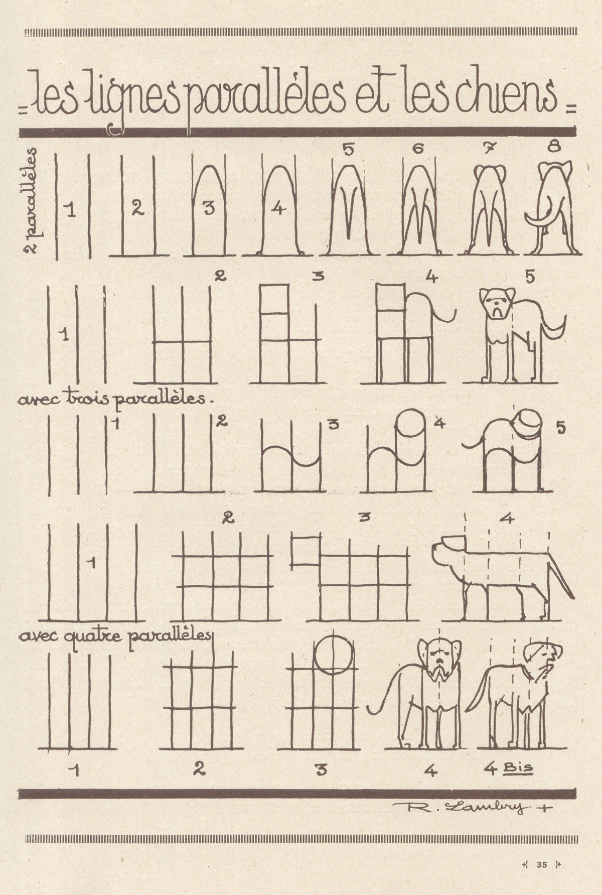
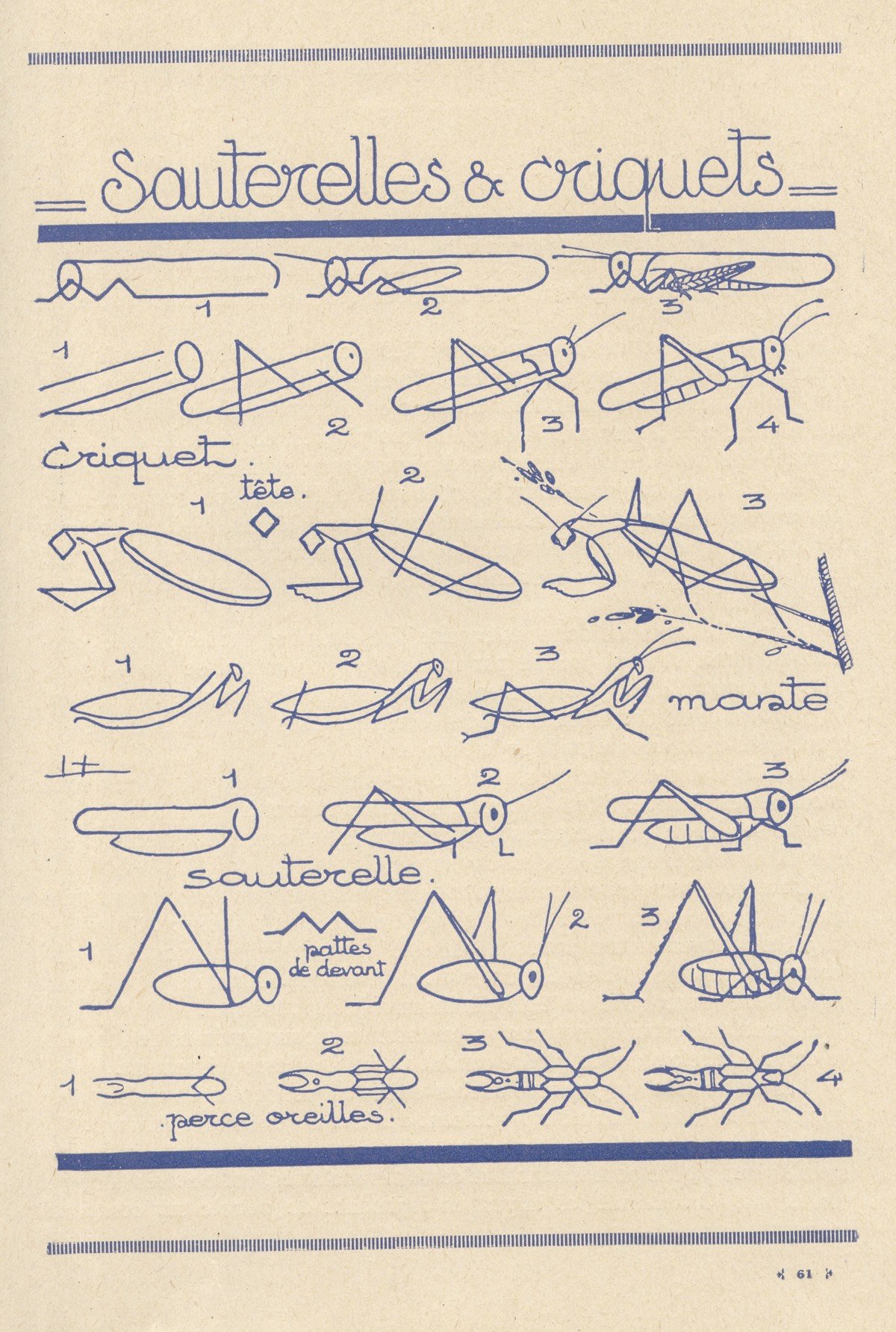
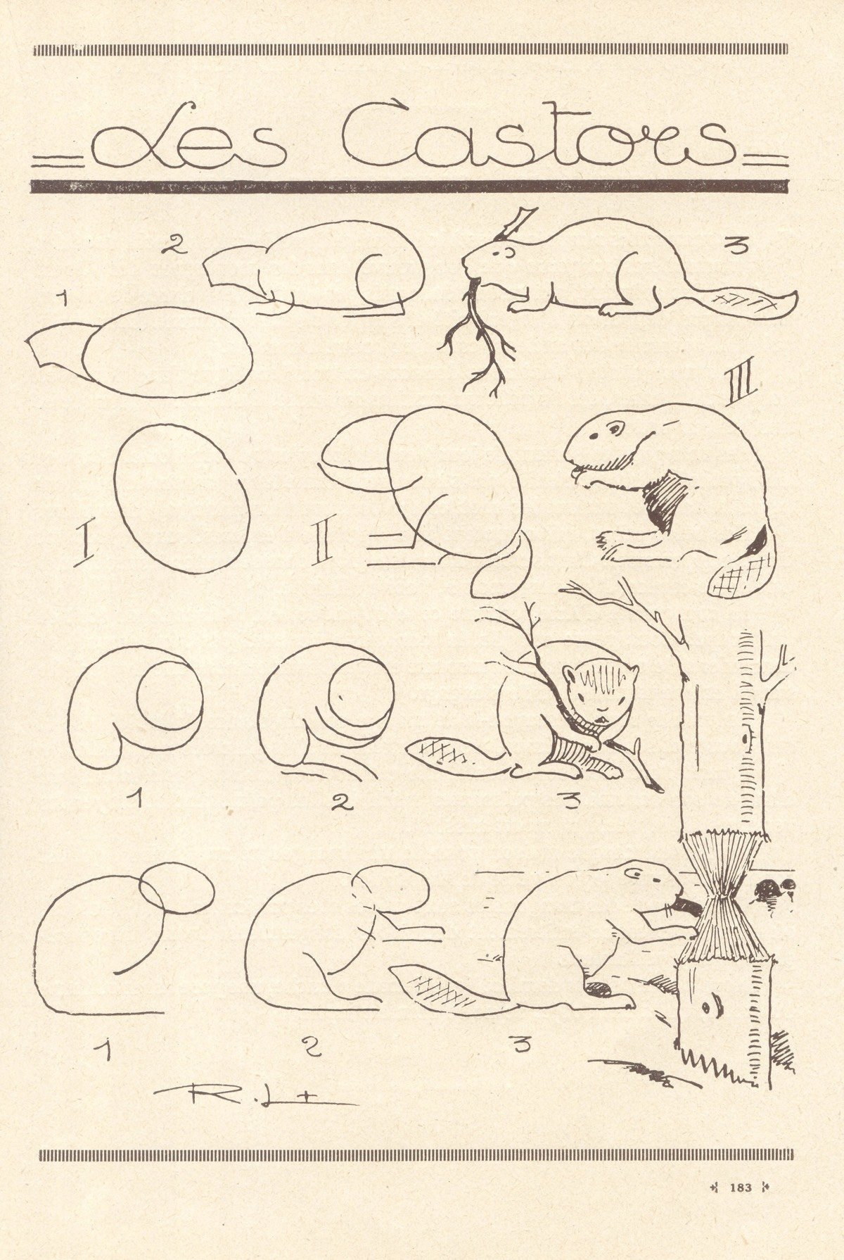
Les Animaux Tels Qu’ils Sont is a 1930s book by Robert Lambry that contain instructions for drawing all kinds of animals, from elephants and snakes to birds and horses. Each drawing starts with basic forms — circles, rectangles, etc. — which Lambry builds into simple line drawings of each animal. I love the dogs drawn with parallel lines.
Update: A new English edition of Lambry’s book is being released this fall as The Draw Any Animal Book. (thx, matt)
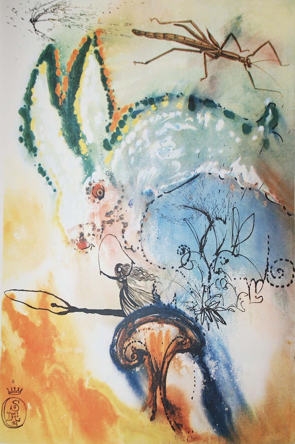
In 1969, surrealist Salvador Dali provided a set of 12 illustrations for an edition of Alice in Wonderland, a seemingly perfect match of artist to subject matter. It was released in a limited edition and copies are now a coveted collector’s item — here’s a signed copy on eBay for $10,000. Luckily, Princeton Architectural Press put out a 150th anniversary edition a few years ago that’s more manageable (Amazon).
See also a couple of Dali’s other books: a wine guide and a cookbook.
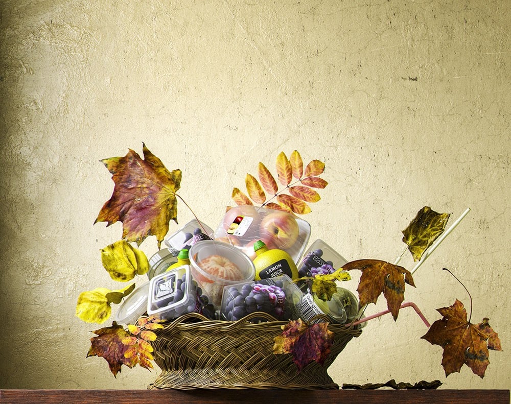
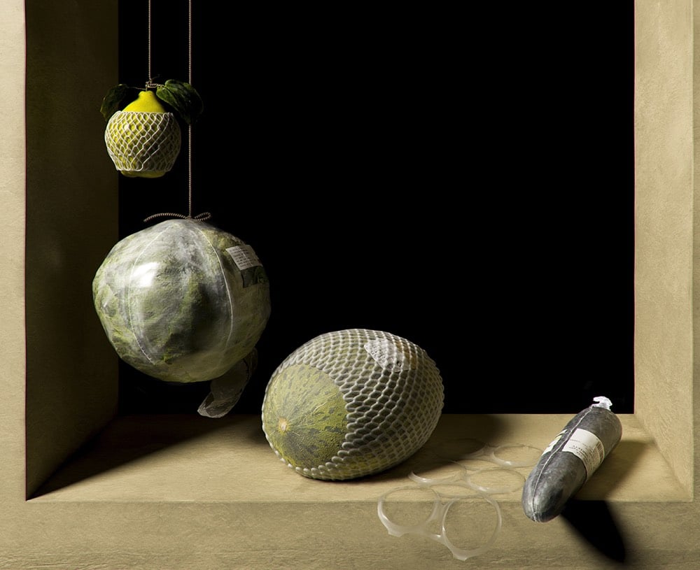
Still lifes of fruits and vegetables arranged on tables and in baskets & bowls have been a staple of Western art for centuries. Spanish creative studio Quatre Caps has brought the still life into the supermarket age with their project Not Longer Life. The project was conceived to call attention to wasteful plastic packaging of fruits and vegetables, but as this post points out, packaged and pre-cut foods can be easier to eat for disabled people.
As a person with limited hand dexterity, I look at this and see an easier way to eat healthy food. I actively avoid eating oranges, not because I dislike them (they are definitely tasty) but because I have so much difficulty peeling them. Any attempt to peel an orange is likely to result in an unappetizing mess because I’ve squeezed the orange to hard while trying to maneuver it for peel removal.
I don’t have access to peeled oranges from my grocery store though I’d probably take advantage of them if I did. I do buy precut vegetables all the time because it is more convenient and safer for me to do so.
(via colossal)
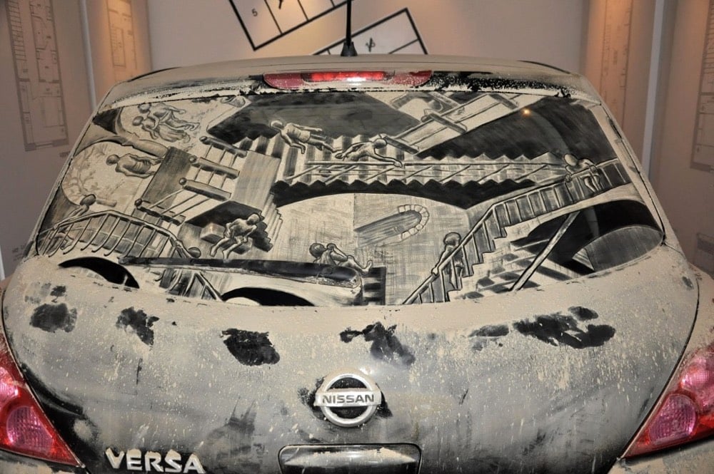
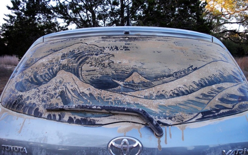
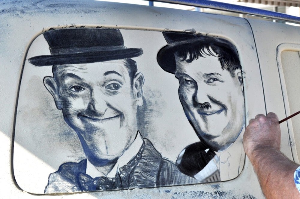
Scott Wade turns the dirty windows of cars into mobile art. Here’s a look at Wade in action:
Artist Shawn Feeney worked as a forensic artist for a few years and was inspired by that experience to produce BFF, a project where he combined the faces of pairs of friends into composite portraits, and then pairs of those composites into composite drawings, and so on until a single composite remained from 128 initial faces. Here are two of the quarterfinalist brackets:


And in this video, you get a closer look at the complete bracket and how the lineage of each starting drawing develops through the generations:
This reminds me of the software-averaged faces of people from different countries around the world and also Jason Salavon’s work like the combination of all the couch gags from The Simpsons and Every Playboy Centerfold (SFW).
Newer posts
Older posts




Socials & More