Long piece about the changes being made
Long piece about the changes being made to the typography of the US highway signs, switching from Highway Gothic (on which Interstate is based) to Clearview.


This site is made possible by member support. 💞
Big thanks to Arcustech for hosting the site and offering amazing tech support.
When you buy through links on kottke.org, I may earn an affiliate commission. Thanks for supporting the site!
kottke.org. home of fine hypertext products since 1998.
Beloved by 86.47% of the web.
Long piece about the changes being made to the typography of the US highway signs, switching from Highway Gothic (on which Interstate is based) to Clearview.
The newly designed US$5 bill is the worst one yet…the phrase “typographic train wreck” comes to mind. The purple 5 in the lower right, while useful, is one of the most amateur design choices I’ve seen on something that’s destined for such a wide market. (thx, tom)
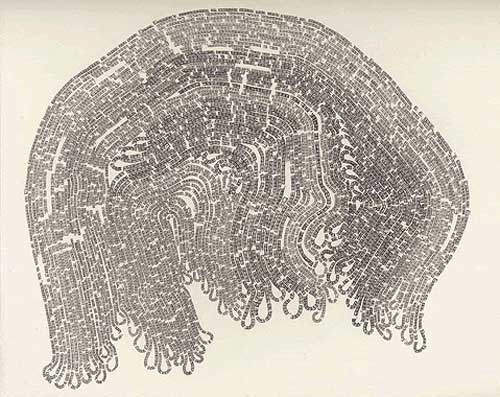
Justin Quinn’s wonderful typographic art (more here).

The Morning News has a gallery of pages from Hand Job (@ Amazon), a collection of hand drawn type, and a short interview with its author, Michael Perry. It looks like a gorgeous book; you can find more images from it on Perry’s web site, which is sure to get an unusual influx of visitors searching for non-typography-oriented happy endings..
Tickets for Helvetica’s multi-week run at the IFC Center in NYC are on sale now.
Tauba Auerbach: startling starting staring string sting sing sin in i. More of her typographic work here.
New web site for Hoefler & Frere-Jones, the noted and celebrated typeface designers, including a weblog. Subscribed. Oh, and the browser fonts of choice for the meticulous duo? “Lucida Grande, Lucida Sans, Verdana, Georgia, Helvetica, Arial” (thx, jonathan)
Cartype: “A comprehensive collection of reviews and study of typographical applications of emblems, car company logos and car logos with images, comments, links, car company information and general interest.”
NYC font fans rejoice…Helvetica (the movie) will be starting a run at the IFC Center on September 12. My short review of the film is here.
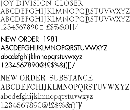
Peter Saville, the British designer closely associated with Factory Records, is offering free downloads of some of the fonts he used in designing record sleeves and other work for New Order, Joy Division, and other Factory Records artists (see update below).

(thx, mark)
Update: Several Peter Saville fans from around the world have written in to say that the above site is not Peter Saville’s official site (this is). It’s also unclear whether those fonts were indeed made by Saville (probably not) or ever offered for download free of charge (probably definitely not). But they’re still neat fonts, so download at your own risk.
Update: Kai has identified some of the fonts offered as shoddy versions of the following:
Joy Division Closer - Trajan (Adobe)
Blue Monday - Engravers Gothic (Bitstream)
New Order 1981 - Futura (Bauer)
New Order 1993 - Handel Gothic (Linotype)
New Order Ceremony - Albertus (Mecanorma)
New Order 316 - BT Incised 901 (Bitstream) = Antique Olive (Linotype)
New Order Regret - Rotis Serif (Agfa)
In this case, you get what you pay for, I guess.
A list of companies and the fonts they use for their logos and corporate identities.
Michael Bierut’s 13 reasons to choose a particular typeface for a project. “Once I saw a project in a student portfolio that undertook the dubious challenge of redesigning the Tiffany’s identity. I particularly disliked the font that was used, and I politely asked what it was. ‘Oh,’ came the enthusiastic response, ‘that’s the best part! It’s called Tiffany!’”
Typographic map of London. That is, a map made of type (like Paula Scher’s paintings) not a map of typography in London. (via moon river)
Photos of a 1923 American Type Foundry specimen book. (via quipsologies)
On the occasion of Helvetica’s NYC premiere tonight, Michael Bierut remembers a time when no one knew anything about type or fonts except for designers and typesetters. “[Today] we live in a world where any person in any cubicle in the world can pick between Arial and Trebuchet and Chalkboard whenever they want, risk free, copyfitting tables be damned, and where a film about a typeface actually stands a chance of enjoying some small measure of popular success.”
Exhibit on Helvetica (the font, not the film) opens tomorow at the MoMA and will be available for a good long time (until March 31, 2008). “Widely considered the official typeface of the twentieth century, Helvetica communicates with simple, well-proportioned letterforms that convey an aesthetic clarity that is at once universal, neutral, and undeniably modern.”
Winners of the Helvetica haiku contest I pointed to a couple of weeks ago. My favorite of all the ones listed: “i shot the serif / left him there full of leading / yearning for kerning”. Close second: “She misunderstood / When I said she was ‘Grotesque’ / Akzidenz happen”. I am a sucker for puns.
Results of the Type Directors Club type design competition for 2007. I really like Subtil. (via quipsologies)
Quick quiz: Is this text set in Arial or Helvetica? If you’re struggling with that, check out How to Spot Arial. (thx, hubs)
Back when type was set with individual metal letters, those letters were called “sorts”. Popular letters like a, e, t, i, etc. would occasionally run out and the printer would then be “out of sorts”.
Update: Scratch that. Individual letters are called “sorts”, but “out of sorts” came from somewhere else. (thx grant and hal)
Perhaps the highest praise I can offer for Helvetica comes courtesy of Meg, who was snickering on the way into the theater about going to see a movie about a font and exited saying, “that was great, now I want to be a designer!” The rest of the audience, mostly designers and type folks, loved it as well. But for the non-design folks, what’s compelling about the movie is getting a glimpse of how designers think and work; that it’s not just about making things look pretty. The modern world is awash in signage and symbols and words and for a lot of them, especially the corporate messages, there’s a reason why they look the way they do. The story of Helvetica offers a partial key to decoding these messages.
Check out some clips from the film and the screenings schedule to find out when Helvetica will be showing in your area. Thanks to the fine folks at Veer for inviting me to the screening.
Enter this font haiku contest to win a limited-edition poster from the Helvetica documentary.
A nice presentation on web typography from SXSW 2007.
A wonderful collection of 19th century shipping posters on Flickr. (via quipsologies)
Update: That Flickr user also has several other interesting sets of images to look at, including book covers, typography of The Electric Company, Soviet children’s books, and Civil War posters.
A friend of mine who works at the University of Nebraska-Lincoln emailed to let me know that they’ve posted both audio and video of a talk that Chris Ware gave at the school last week. If you’re short on time, the real meat of the video starts around 18:30 when Ware starts a slideshow that delves into his process. In addition to his series of Thanksgiving-themed New Yorker covers from last year, he also talks about some of his other work, including Rusty Brown and the strip he did for the NY Times Magazine.
80 wonderful handdrawn typographic posters by Job Wouters. (via type for you)
The top 100 fonts as determined by a panel of designers and type experts. Top 10: Helvetica, Garamond, Frutiger, Bodoni, Futura, Times, Akzidenz Grotesk, Officina, Gill Sans, and Univers. A PDF of the results (with photos, in German) is also available. (via type for you)
Over at Typophile, they’re debating the 20 most important type designers of all time.
Socials & More