kottke.org posts about infoviz
If you live and work in Los Angeles and have an average commute, you spend 72 hours a year in traffic. That’s enough time to read War and Peace once, get through Wagner’s The Ring Cycle almost five times, or watch the entire Lord of the Rings trilogy almost eight times. The page includes stats for other cities too.
Update: A closer read, a bit of arithmetic, and several emails have convinced me that the 72 hours is not the overall commute time but the time spent sitting motionless in traffic. (thx, everyone)
A chart from Wired in 2005 shows how Star Wars influenced the later development of movies, games, TV programs, and the like.
The Star Wars empire has grown into one of the most fertile incubators of talent in the worlds of movies (Lucasfilm), visual effects (Industrial Light & Magic), sound (Skywalker Sound), and video games (LucasArts). Along the way, some of the original Lucas crew has gone on to become his biggest competitors.
The Flash interface is really annoying and not useful…the whole image is a better way to look at it. Very Mark Lombardi. (via vc)
An analysis of the three major types of gravestone motifs used in eastern Massachusetts during the seventeenth and eighteenth centuries.
The earliest of the three is a winged death’s head, with blank eyes and a grinning visage. Earlier versions are quite ornate, but as time passes, they become less elaborate. Sometime during the eighteenth century — the time varies according to location — the grim death’s head designs are replaced, more or less quickly, by winged cherubs. This design also goes through a gradual simplification of form with time. By the late 1700’s or early 1800’s, again depending on where you are observing, the cherubs are replaced by stones decorated with a willow tree overhanging a pedestaled urn.
Pay special attention to the graph of the popularity of each motif and the slideshow of example gravestones. (thx, peterme)
Update: A reader writes in:
In regards to your post on Gravestone Motif Analysis, I think that the most important text on the subject is still Graven Images: New England Stonecarving and its Symbols, 1650-1815 by Allen Ludwig. It was originally published in 1966, before the article that you linked to. However, Wesleyan University Press published a new edition in 2000 to help meet the rising demands of Material Culture Studies courses. Lots of helpful images and histograms showing the changing patterns of gravestones over that time period.
I *love* that the collective readership of this site knows what the definitive text on New England gravestone carving is. (big thx, fletcher)
Slate has a nice short history of information visualizations, including work from Josh On, Jonathan Harris, and Martin Wattenberg. Many many more examples can be found on kottke.org’s infoviz page.
A very interesting graph of the estimated ideological positions of US voters, senators, and representatives shows that members of Congress are much more liberal and conservative than are US voters, who fall somewhere in the middle. (via 3qd)
For millennia, Martin Wattenberg’s Name Voyager has been the gold standard in cool baby name web doohickeys. No longer…NameTrends gives it a serious run for its money. Lots of slicing and dicing of data going on there. Plus, popularity sparklines.
Ben Fry analyzes the data from an intelligence test administered to all incoming NFL players and displays the results by position. Offensive players do better than defensive players on the test, although running backs score the lowest (wide receivers and cornerbacks also don’t do well). As Michael Lewis suggested in The Blind Side, offensive tackles are the smartest players on the field, followed by the centers and then the quarterbacks.
Malcolm Gladwell talked about the Wonderlic test at the New Yorker Conference and judged it a poor indicator of future performance.
Radiohead + Google + data visualization + lasers = I am contractually obligated to post this. Google has the backstory and some code for Radiohead’s new music video, which was “filmed” using lasers instead of cameras. (via jimray)
Exaggerating with maps.
Perhaps most exaggerated of all though has to be the images that are typically given to show the accumulation of “space junk” — remnants of space flights and defunct satellites, etc. In this image each pixel represents approximately 114 miles; so a piece of debris the size of a car is marked with a point the size of Long Island — easily a 6 order of magnitude exaggeration.
(via mike)
Short interview with Mike Migurski and Tom Carden of Stamen about their projects and process.
We try to start from a position of great abundance and information, to show the vastness or the liveness. I think live, vast, and deep is some of the terminology that we’ve been using lately in a lot of our talks.
A graph that perfectly describes my profanity usage from yesterday.
Ben Fry has updated his salary vs. performance chart for the 2008 MLB season that compares team payrolls with winning percentage. The entire payroll of the Florida Marlins appears to be less than what Jason Giambi and A-Rod *each* made last year.
MLB tracks every pitch thrown in a game using a system called PITCHf/x. You may have seen this system in action during televised games; it’s used to show the viewer where the pitch was located when it crossed the plate relative to the strike zone. On his baseball statistics blog, Josh Kalk takes these stats and lets you slice and dice them however you want.
One of the most interesting statistics measured is the break of a pitch…how much up-and-down and side-to-side motion a pitched ball goes through after leaving the pitcher’s hand. The break demonstrates why the knuckleball is such a difficult pitch to hit, particularly when used in conjunction with other pitch types. Here’s a graph showing the break on knuckleballer Tim Wakefield’s pitches so far this season:
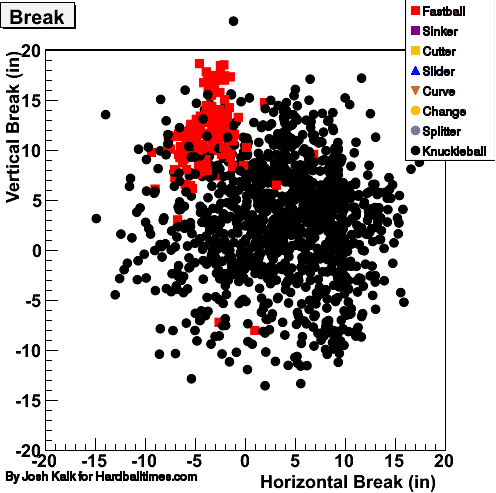
The ball is all over the place…the hitter doesn’t know where it’s going. Compare that to the break on the three different pitches thrown by fellow Red Sox player Daisuke Matsuzaka:
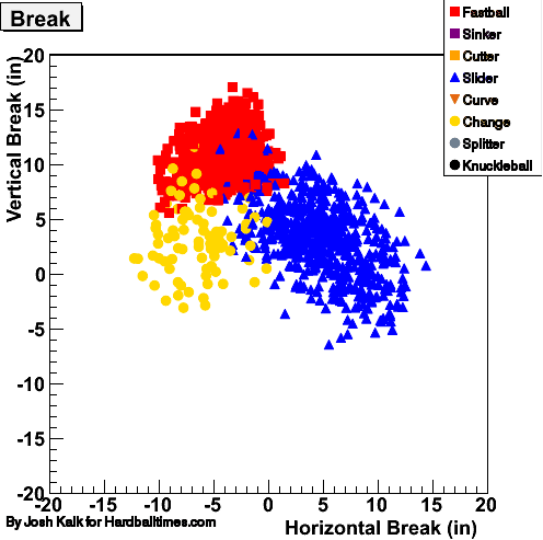
Now take a look at the graphs on the player cards for Wakefield and Matsuzaka. Wakefield’s pitches also have a wider range of velocities…Matsuzaka’s pitches range in speed from about 77 to 95 mph while Wakefield’s pitches range from 65 to 95 mph. And the graphs don’t even account for the multiple breaks that a knuckleball can make during a single pitch. The uncertainties of speed and break of a knuckleballer’s pitches combine to create a lot of trouble for batters…they neither know where the ball’s going nor when it’s going to arrive. (thx, fred)
P.S. So why is Wakefield not as effective as many other major league pitchers (his career stats aren’t that impressive), none of whom throw the knuckleball? One guess is that sometimes the knuckleball doesn’t break and essentially becomes a 60-65 mph meatball right down the middle of the plate, a pitch any decent hitter can put anywhere he wants.
Update: I thought that Wakefield’s upper velocity range was a little high. I’m getting a lot of feedback saying that Wakefield’s fastball is in the low 80s, not the mid-90s. Looks like we’ve got some screwy data here.
Also, another reason why knuckleballers are of limited effectiveness: it’s difficult to throw a strike on command, which can be a problem when you’re behind in the count and you have to throw your 80 mph fastball for a strike. (thx, jonathan & steve)
Interesting timelapse visualization of fatalities in Iraq since March 2003. Turn your sound on…after awhile, it starts to sound like machine gun fire. Note: fatalities are non-Iraqi only…it’s likely the whole screen would be flashing if those were included. (thx, mark)
Graphical demonstration of the hand signals needed to buy and sell commodities on the floor of the New York Mercantile Exchange.
My wife is a bit of a statistics nut. A few years ago, she hooked herself up to a heart rate monitor during a playoff football game and graphed the results. Sometimes I think she does things just so she’s got an excuse to open up Excel. So I wasn’t really surprised when she showed me this graph yesterday afternoon:
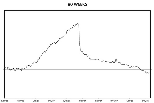
That’s a record of Meg’s weight from when she got pregnant with Ollie to the present, 80 weeks of data in all…40 weeks with Ollie on the inside and 40 on the outside.
Charles Joseph Minard may get all the accolades for his graphic of Napolean’s march to Moscow, but for me, the above chart is the most beautiful ever created. When I look at it, I see Ollie. The graph is a portrait of him, as sure as this photo is. It’s also a record of an intense time for our family. I’m reminded of Meg, happy and pregnant but also struggling with her changing body. Trips we took, doctor visits, the growing belly and anticipation, the birth itself, and then falling off the cliff into the giddy, difficult unknown of new parenthood. And then you can see Meg slowly but surely getting back into shape while being a full-time stay-at-home mom (and managing an architecture project to boot), and achieving her goal of getting back to her pre-baby fitness level in a scant 8 months. You can’t really see it, but there’s a happy father and proud husband in there somewhere as well.
That’s a lot of emotional impact for a simple black and white line graph with few labels. Imagine if it were in color and isometric 3-D! ;)
Gorgeous maps and infographics by Stefanie Posavec that map the literary geography of Jack Kerouac’s On the Road.
The maps visually represent the rhythm and structure of Kerouac’s literary space, creating works that are not only gorgeous from the point of view of graphic design, but also exhibit scientific rigor and precision in their formulation: meticulous scouring the surface of the text, highlighting and noting sentence length, prosody and themes, Posavec’s approach to the text is not unlike that of a surveyor. And similarly, the act is near reverential in its approach and the results are stunning graphical displays of the nature of the subject. The literary organism, rhythm textures and sentence drawings are truly gorgeous pieces.
The sentence drawings are really worth checking out.
Update: Posavec’s analysis of Walter Benjamin’s The Work of Art in the Age of Mechanical Reproduction is available for sale at 20x200. Apropos!
The final episode of St. Elsewhere revealed that all of the action of the show took place in the mind of an autistic child. Two detectives from Homicide: Life on the Street investigate a doctor from St. Elsewhere. Thus Homicide is a fiction. And so are 280 other shows that are connected to those two shows through crossovers and references. This page contains a map of all the crossovers, encompassing such disparate shows as Doctor Who, The King of Queens, and Leave It to Beaver. Wonderful.
Flowchart: exposed to Dungeons and Dragons early in life, yes or no? I didn’t play a whole lot of D&D as a kid (maybe three time total) but I’ve flowed through several of these points nonetheless.

(thx, amy)
The 2007 Digital Economy Handbook is almost 200 pages of information about trends related to the internet, hardware, software, communications, digital media, ecommerce, and more. Looks like an amazing document and it’s a free download. Tons of charts and graphs and tables. (thx, jeff)
On view at MoMA through May 12, 2008: Design and the Elastic Mind.
In the past few decades, individuals have experienced dramatic changes in some of the most established dimensions of human life: time, space, matter, and individuality. Working across several time zones, traveling with relative ease between satellite maps and nanoscale images, gleefully drowning in information, acting fast in order to preserve some slow downtime, people cope daily with dozens of changes in scale. Minds adapt and acquire enough elasticity to be able to synthesize such abundance. One of design’s most fundamental tasks is to stand between revolutions and life, and to help people deal with change.
I was surprised at how many of the show’s ideas and objects I’d seen or even featured on kottke.org already. But getting there first isn’t the point. The show was super-crowded and I didn’t have a lot of time to look around, but here are a couple of things that caught my eye.
Michiko Nitta’s Animal Messaging System (AMS), part of a larger project she did called Extreme Green Guerillas. The basic idea of the AMS is to use the radio ID tags worn by migratory animals to send messages from place to place. Nice map.
Molecubes are self-replicating repairing robots. Video here.
And I’ve been looking for Brendan Dawes’ Cinema Redux project for several months now…most recently I wanted to include his work in my time merge media post.
Using eight of my favourite films from eight of my most admired directors including Sidney Lumet, Francis Ford Coppola and John Boorman, each film is processed through a Java program written with the processing environment. This small piece of software samples a movie every second and generates an 8 x 6 pixel image of the frame at that moment in time. It does this for the entire film, with each row representing one minute of film time.
For more, check out the online exhibition (designed by Yugo Nakamura and THA Ltd, the folks behind FFFFOUND!). Thanks (and congratulations!) to Stamen for hosting a tour of the exhibition.
An amazingly dense infographic of box office revenues for all movies since 1986. It’s a little confusing at first because the vertical scale is basically irrelevant, but once you get the hang of things, it’s fun to just scroll through the years. Interesting stuff to look out for:
1. The gross receipts have obviously gone up in the past 11 years.
2. The summers get much more blockbustery.
3. As time goes on, movies open bigger but don’t last nearly as long in the theater as they used to. There are also more movies to choose from in 2007 than in 1986.
4. For some exceptions to the normal pattern, check out My Big Fat Greek Wedding, Juno, Dances With Wolves, Platoon, and Million Dollar Baby. (via big picture)
Regarding the graph of technological adoption I linked to the other day, I wrote the graph’s creator** a little note, wondering if he’d done a version comparing the adoption rates directly (like this home run leaders chart). He hadn’t, but he whipped one up quick and sent it to me…which saved me a lot of time in Photoshop.
I can’t post it (the Times has legal dibs on it), but according to the graph (which Nicholas admits is more “guesstimate-y” than the one that ran in the Times), the five technologies that made it into 80% of US households the quickest were (with the rough year of initial availability in parentheses):
1. radio (1922)
2. microwave oven (1972)
3. VCR (1979)
4. color TV (1960)
5. cellphone (1983)
The internet has not yet reached the 80% mark and it may move into the top 5 when it does. And the way the cellphone trend is going, it might be the first to 90%. Anyway, it’s interesting that the common belief is that technology is being adopted faster and faster by Americans these days but that radio was adopted faster than anything else on the chart.
** One Nicholas Felton, who you may recall from his lovely personal annual reports.
It seems like I’m always looking for this graph comparing the adoption rates of different technologies (cars, microwaves, color TVs, cellphones, etc.). No more…it’s posted here for my future reference.
The referring article on the differences between what people spend and what people earn is worth noting as well.
If we compare the incomes of the top and bottom fifths, we see a ratio of 15 to 1. If we turn to consumption, the gap declines to around 4 to 1. A similar narrowing takes place throughout all levels of income distribution. The middle 20 percent of families had incomes more than four times the bottom fifth. Yet their edge in consumption fell to about 2 to 1.
Web Trend Map 2008 Beta, which is basically 300 influential web sites mapped onto a Tokyo train map. It’s very pretty, but once again, kottke.org gets no love.
Update: A general trend map for 2008, this one modeled on the Shanghai subway map. (via mass custom., thx maaike)
Using “favorite books” data from Facebook and the average SAT/ACT scores from the colleges the people in the data set attend, Virgil Griffith plotted a graph of “books that make you dumb”. Lolita, 100 Years of Solitude, and Crime and Punishment were the “smartest” books while the Zane erotica books are the “dumbest”. (via o’reilly radar)
Newer posts
Older posts


Socials & More