kottke.org posts about design
OPENSTUDIO was announced at the conference today by John Maeda. Keith sez about the project: “described as an experiment in creativity, collaboration, and capitalism, Open Studio is designed to simplify tools for the creative process and provide a pseudo-currency model for tool use and sharing.” Gotta go check this one out in the Media Lab space here.
Something to look forward to: podcasts from the AIGA Design Conference. I’ve been told they’ll be up in a week or two and that they will include many of the presentations as well as a lot of interviews with speakers. I’ll point to them when they’re available.
The Designing for User eXperience conference “[gathers] together researchers and practitioners of all the design disciplines and related fields to share their stories and experiences on how the needs and goals of both users and businesses are met through design”. Looks like the blog has yet to get going.
Are you at the AIGA conference? Are you taking notes? Are those notes on a computer or posted to a blog? There are several sessions going on at a time now and I’m trying to get to as many as I can without, you know, going insane. If you’ve got notes (especially from sessions I didn’t get to) and you don’t mind sharing them, send them along and I’ll put them up on the site. If you’re blogging, send your links or post them in the comments below. Thanks!
ps. Did anyone go to the yoga at 6:30am this morning? What percentage of the participants were hung over? Was everyone in black?
The Design Encyclopedia is a wiki that aims to be filled with definitions and descriptions of design terms, people, concepts, companies, etc. This could become a great resource. (thx armin)
UnBeige blogged the blog panel that I participated on with Michael Bierut, Jen Bekman, Armin Vit, and Steven Heller. More here and here.
New vocabulary word (to me): gangsta nerd.
Paul D. Miller (aka Dj Spooky) has a new book out about remix culture called Rhythm Science. More on the book at MIT Press and it’s available at Amazon.
Design for Democracy is utilizing the skillset of designers to improve the election process in America, including ballot redesigns and polling place signage.
In preparing for the conference, I read up on the last conference (held in Vancouver in 2003) on the Speak Up design blog: 1, 2, 3, 4.
As part of the conference within a conference for students, Michael Bierut listed 20 courses he did not take in design school (I think I got all of them):
Semiotics
Contemporary Performance Art
Traffic Engineering
The Changing Global Financial Marketplace
Urban planning
Sex Education
Early Childhood Development
Economics of Commerical Aviation
Biography as History
Introduction to Horticulture
Sports Marketing in Modern Media
Modern Architecture
The 1960s: Culture and Conflict
20th Century American Theater
Philanthropy and Social Progress
Fashion Merchandising
Studies in Popular Culture
Building Systems Engineering
Geopolitics, Military Conflict, and the Cultural Divide
Political Science: Electoral Politics and the Crisis of Democracy
His point was that design is just one part of the job. In order to do great work, you need to know what your client does. How do you design for new moms if you don’t know anything about raising children? Not very well, that’s how. When I was a designer, my approach was to treat the client’s knowledge of their business as my biggest asset…the more I could get them to tell me about what their product or service did and the people it served (and then talk to those people, etc.), the better it was for the finished product. Clients who didn’t have time to talk, weren’t genuinely engaged in their company’s business, or who I couldn’t get to open up usually didn’t get my best work.
Bierut’s other main point is, wow, look at all this cool stuff you get to learn about as a designer. If you’re a curious person, you could do worse than to choose design as a profession.
A list of twenty-eight design aphorisms to consider before attending the AIGA conference.
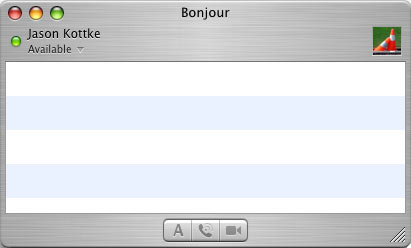
I’m sitting in a huge room filled with ~2,000 people at the opening remarks of the AIGA Design Conference and there’s no single other person on Bonjour (formerly Rendezvous) in iChat:
I may be the only person in the entire room with his laptop open. Instead, everyone is listening to the speakers. Like Jeff, I’m torn: is this lack of a back channel a good thing or does the presence of an online component of a conference make the experience more rewarding?
Nikolaus Hafermaas made an interesting observation about visual design. If you’ve a visual designer, you’re working with a rapidly depleting finite resource: people’s personal attention.
Rafael Esquer just showed some of his most recent work here at the Student Conference. I like his Made in NY logo that he did for NYC. Here’s a short interview with Esquer.
Todd Radom designs sports logos, including ones for the Super Bowl, Fenway Park’s 90th anniversary, and the new Cleveland Browns. Read about his design for the Washington Nationals logo in Fast Company.
Dressed to the Nines is an interactive look at the design of baseball uniforms. “Whether we are looking at someone in a uniform or we are trying it on ourselves, it is the feeling of the fabric, the design on the cap and jersey, the colors, cut, and history of the outfit, that all lend meaning to our relationship with the game.”
A look at Jefferson Burdick’s baseball card collection which he donated the Met Museum in NYC. One downside to the collection: most of the cards are pasted into albums and so are in poor condition.
One of the pre-conference events was a talk at Fenway Park followed by a tour of the ballpark. Janet Marie Smith, VP of planning and development for the Sox, kicked things off with how the team (especially the new management) works really hard to preserve the essential character of Fenway while at the same time trying to upgrade the park (and keep it from getting torn down). She talked about the advertisements added to the Green Monster, which was actually not a purely commercial move but a throwback to a time when the Monster was actually covered with ads.
Lots of talk and awareness of experience design…the Red Sox folks in particular kept referring to the “experience” of the park. One of the speakers (can’t recall who, might have been Jim Dow) talked about how other ballparks are becoming places where only people who can afford $100 tickets can go to the games and what that does to the team’s fan base. With Fenway, they’re trying to maintain a variety of ticket prices to keep the diversity level high…greater diversity makes for a better crowd and a better fan base and is quite appropriate for Boston (and New England in general), which has always been an area with vibrant blue collar and blue blood classes.
Janet also referred to the “accidental” design of the park. Like many other urban ballparks built in the late 19th/early 20th centuries, the placement of the streets constrained the design of Fenway and made it rather an odd shape….these days larger plots are selected where those types of restraints are removed. And over time, the game has changed, the needs of the fans have changed, and the fire codes have changed and the park has changed with the times. In the dead ball era, the walls of the stadium weren’t for hitting home runs over; their sole function was to keep people on the street for catching the game for free, so the Fenway outfield ran over 500 feet in right field — practically all the way to the street — where there’s now 30 rows of seats. Jim Holt observed that American butts have gotten bigger so bigger seats are called for. Fire codes helped that change along as well…wooden seats, bleachers, and overcrowding are no longer a large part of the Fenway experience (save for the wooden seats under the canopy).
The design talk continued on the tour of the park. Our guide detailed how ballparks are built around specific ballplayers. Yankee Stadium was the house that Ruth built but it was also seemingly (but not literally) built for him with a short trip for his home run balls to the right field wall. Boston added a bullpen to make the right field shorter for Ted Williams. Barry Bonds does very well at PacBell/SBC/WhateverItsCalledTheseDays Park. And more than that, the design of Fenway also dictated for a long time the type of team that they could field, which had some bearing on how they did generally. Players who played well in Fenway (i.e. could hit fly balls off of the Monster in left) often didn’t do so well in other parks and the team’s away record suffered accordingly.
In preparation for the AIGA design conference[1], I’m looking over the session descriptions and speaker list. The theme for this year is “Design”, which seems a little broad but somehow appropriate given how much design has been taken up by the press (especially the business and tech press) recently as something Important and the design profession may be in need of a little wagon circling to figure out how to effectively explain design to someone who is all fired up about incorporating it into their business process because they read a blurb in Fast Company about Jonathan Ive and the iPod.
My knowledge of and involvement with the AIGA up to this point has been fairly minimal, which either makes me the ideal person (fresh eyes!) or a horrible choice (head up ass!) to cover their design conference. I’m particularly interested in learning how they’ve incorporated the fast-changing disciplines of Web and digital design into the mix. When I was working in Minneapolis as a Web designer in the late 90s, my company got me an AIGA membership, but I never used it because although they were trying to be more relevant to those of us working on the Web, my perception is that the AIGA was still largely a graphic design organization and I was finding more of what I was looking for on Web design sites like A List Apart. Now that the Web design profession has matured (and Web design practitioners along with it), it seems to fit better with where the AIGA is going (and vice versa). After all, design is design, no matter what word you stick in front of it.
So, back to the speakers list, I’m looking forward to hearing from Michael Bierut, Lella and Massimo Vignelli, Steven Heller, Matthew Carter, John Maeda, Peter Merholz and Jesse James Garrett from Adaptive Path, Ze Frank, Stefan Sagmeister, Steff Geissbuhler, Caterina Fake, and Milton Glaser (but no Malcolm Gladwell or Errol Morris, both of whom I swear were on earlier speaker lists), some of whom you may recognize from past mentions on kottke.org. They’ve also added some sessions in response to Hurricane Katrina on design, safety, risk, and disaster management, which is an excellent use of the opportunity of having a bunch of designers in the same place.
If you want to follow along with the complete conference coverage here on kottke.org, here’s the AIGA 2005 page. As I mentioned previously, I’ll be opening up comments on most posts (incl. this one), but will be active in gardening off-topic and trolling comments.
[1] I just realized all these URLs are going to break when the next conference rolls around in two years or so, which is disappointing. Would be nice to have something like http://designconference.aiga.org/2005 that would permanently point to this year’s festivities. Bloggers like permanent links (well, this one does anyway).
How the iPod nano came to be. Lots of Jobs and Apple haters out there, but you have to admire the shooting from the hip that’s going on here…too many American companies minimize their risk so much that the possible reward dries up almost completely.
Here’s the front page of the new Guardian. They’ve completely revamped the paper…it’s smaller and has a new font, among other changes. They changed the format to Berliner because “unambiguous research [showed] that readers increasingly find broadsheet newspapers difficult to handle in many everyday situations, including commuting to work”.
Profile of designer/illustrator/photographer Michael Elins and how he uses Macs to get his work done. “It’s hard for someone like me to talk about technology, because the Mac has gotten to the point where it’s a nonissue. It’s so good and so fluid, so fast and so freaking reliable that it becomes something I really take for granted.”
The iTunes 5 Announcement From the Perspective of an Anthropomorphized Brushed Metal User Interface Theme. If you’re a Mac nerd, you’ll love this because it’s pretty damn funny and if you’re not, you probably won’t get it.
From September 15-18, I will be attending the AIGA Design Conference in Boston. As an experiment (for both the AIGA and me), I will be covering the event at their request[1] on kottke.org. I’ll be covering the conference as a blogger, but the easiest way to think about it in terms of a conference is that I’m a speaker[2]…a sort of roving speaker with the readers of kottke.org as the audience and my topic is the conference itself.
As usual, I have no solid plan as to how this is going to work exactly, but I’m looking forward to seeing how the conference goes and adapting accordingly. I’m hoping to provide a moving snapshot of the event so that readers of kottke.org can follow along fairly well without being at the conference. I’ll probably have comments open on most posts so hopefully those reading along at home and those reading along at the conference can have some dialogue, with each little world spilling over into the other a bit.
One other quick thing…if you’re going to be at the conference and plan to blog it, let me know…I’ll definitely be linking to other people’s stuff. I’m sure Design Observer and Speak Up will be covering things pretty well. I’ll also be watching Flickr and del.icio.us for links and photos…I’d suggest tagging relevent entries with aigadc2005 for easy aggregation.
More next week as the conference draws near.
[1] Disclaimer: Kottke.org’s budget for covering out-of-town conferences with costly entry fees is limited, so I’m exploring other ways of gaining access to be able to bring you some interesting content that you might not get otherwise. The AIGA is a curious organization and they’re looking at various ways of using weblogs, so they asked me to come and blog the conference as an experiment. To make it economically feasible for me to be there, they are paying me a small speaker’s honorarium and putting me up in a hotel.
In talking with the AIGA about this, they’ve made it exceedingly clear that I’m to consider myself independent and write whatever I want about the conference, which is pretty much what I intend to do. If I thought the hotel room and honorarium would be a problem w/r/t my objectivity in covering the event, I would have declined them both. The bottom line is that if money were no object (if the conference were free and took place entirely within walking distance of my apartment), I’d want to go and write about it anyway.
[2] Although I will also be appearing on a related panel about blogs, journalism, and design with Steve Heller, Michael Bierut, Armin Vit, and Jen Bekman.
Update: I’ve changed the first paragraph slightly, from “covering the conference as a blogger/journalist” to “covering the conference as a blogger”, which under the circumstances is more accurate. I am not a journalist in this instance or any other.
And as long as we’re on the subject (you didn’t think we were even on a subject, did you?), I’m a fan of how Maciej is displaying his oil paintings. For each of his newer paintings (like this one of a West Village scene), he’s documenting the progress of the work as it goes along so you can see how the painting becomes a painting.
Update: Eric writes that he uses this technique for displaying how his art progresses as well (sample).
A couple of recent OS X interface ruminations: rethinking the Finder and Spotlight revisited. Some good ideas in both of these, particularly the Spotlight one (I find Spotlight disorienting at times).
Newer posts
Older posts
Socials & More