kottke.org posts about art
For all of the talk that Shepard Fairey is just a plagiarist, I think that the clearest indication that his art is above board and adding something new to the world is that until a few days ago, no one knew who had taken the photo of Obama that became the basis of the iconic Hope poster, not even Fairey or the photographer who took it.
Reuters are understandably somewhat put out on their own and Young’s behalf, but like it or not, Fairey’s use of the picture are well within the parameters of “fair use”. His transformative use of the image - both in flipping and re-orienting it, adding jacket and tie and the “O” Obama logo, and converting it to his block print style make it consistent with all legal precedents for use.
Update: But, but ,but, not so fast. It looks like Tom Gralish has found the actual photo that Fairey used; it was taken by AP’s Mannie Garcia at a National Press Club event in April 2006. (thx, ryan)
A neat poster of 60 Noses by Shawn Feeney.
A collection of sixty female and male noses, arranged chronologically from people ages 16 - 90. The original pencil drawings (based on arrest photos) are faithfully reproduced on beautifully textured, 100% cotton Hahnemühle paper.
Feeney drew the noses while working as a forensic artist.
Video of Willard Wigan’s work. Wigan makes exceptionally tiny sculptures that fit on pin-heads or within eyes of needles. He once lost a sculpture of Alice in Wonderland:
I think I inhaled her.
Some of the parts of his sculptures are no bigger than human blood cells and to steady his hands, he works in between the beats of his heart.
The stillness of it is very important — you have to control the whole nervous system, you have to work between the heartbeat — the pulse of your finger can destroy the work.
(thx, alex)
The Danziger Projects gallery in New York is running an exhibition called Can & Did, a collection of art, graphics, and photography from the Obama campaign. The opening party is on Inauguration night (Jan 20) and it runs through the end of February. All details in the press release.
Ortho at Baudrillard’s Bastard found a bunch of Revolutionary War era prints featuring dogs peeing on various things (ministers, maps, tea accessories, etc.) and asks why are these dogs peeing on things?
Update: Seventeenth-century Dutch artist Emanuel de Witte painted peeing dogs in his paintings as well. (thx, pb)
I Am Sitting in a Room is a piece by composer Alvin Lucier. It consists of an audio recording of Lucier sitting in a room reciting a few lines. That recording is played in the same room and recorded. Then that recording is recorded. And so on.
I am sitting in a room different from the one you are in now. I am recording the sound of my speaking voice and I am going to play it back into the room again and again until the resonant frequencies of the room reinforce themselves so that any semblance of my speech, with perhaps the exception of rhythm, is destroyed. What you will hear, then, are the natural resonant frequencies of the room articulated by speech. I regard this activity not so much as a demonstration of a physical fact, but more as a way to smooth out any irregularities my speech might have.
Here’s a recording of the original performance:
Listening to it, I wonder how much of the distortion at the end is due to the “resonant frequencies of the room” and how much is just artifacts of the rerecording process. (via djacobs)
Upgrade: It’s the Larsen effect in action.
The frequency of the resulting sound is determined by resonant frequencies in the microphone, amplifier, and loudspeaker, the acoustics of the room, the directional pick-up and emission patterns of the microphone and loudspeaker, and the distance between them.
(thx, eric)
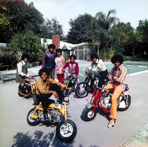
Top: The Jackson 5, Encino, CA, 1970. Photographed by John Olson for Life Magazine.
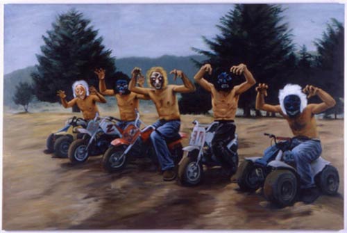
Bottom: “Bad Route” by Miguel Calderon, 1998. Featured in Wes Anderson’s The Royal Tenenbaums.
Leonardo da Vinci was a polymath and all that but this would have blown his tiny mind: the Mona Lisa “painted” using just 50 semi-transparent polygons. (via waxy)
On Stanley Kubrick, George Lucas, Robert Morris, Robert Smithson, Jane Jacobs, 2001, Star Wars, and minimalism: Star Wars: A New Heap.
Kubrick’s film presented a future of company men moving with assurance and clear intention toward a godlike minimalist object. Lucas, on the other hand, gave us a slapdash world of knuckleheads pursued by industrial-scale minimalists. Visually, Kubrick’s film is as seamless and smooth as the modernist authority it mirrored. Like the mid-century modernists, 2001 associated abstraction with the progressive ideals of the United Nations as embodied by its New York headquarters. Lucas, on the other hand, was a nonbeliever. Even the initially smooth and unitary form of the Death Star was shown, as the rebel fighters skimmed its surface, to be deeply fissured with an ever-diminishing body of structural fragments. These crenulated details suggested a depth and complexity to modern life that modernism’s pure geometries often obscured.
And this:
A flying saucer had never been a slum before. The immaculate silver sheen of the saucer was reinvented as a dingy Dumpster full of boiler parts, dirty dishes, and decomposing upholstery. Lucas’s visual program not only captured the stark utopian logic that girded modern urban planning, it surpassed it. The Millennium Falcon resisted the modernist demand for purity and separation, pushing into the eclecticism of the minimalist expanded field. Its tangled bastard asymmetry made it a truer dream ship than any of its purebred predecessors. It is the first flying saucer imagined as architecture without architects.
(thx, matt)
Spanish artist Miquel Barcelo spent more than a year painting the recently unveiled ceiling in the UN’s Geneva offices. Check out the larger photos at Artdaily and USA Today. The painting isn’t exactly aesthetically beautiful, but I love its scale and power. Wonderful.
Cory Arcangel has a new show opening tonight at Team Gallery in Soho called Adult Contemporary. I got a peek at it last night and my favorite piece is called Photoshop CS: 110 by 72 inches, 300 DPI, RGB, square pixels, default gradient “Spectrum”, mousedown y=1098 x=1749.9, mouse up y=0 4160 x=0. It’s easy enough to whip up your own by following those instructions in Photoshop but the print itself is gorgeous. When you get up close to it, there is no discernible gradation between the colors and, because it’s so uniform and smooth and glossy and big, you lose your sense of depth perception and you don’t really know how close you are to it. I almost fell over looking at it because I was so disoriented.
20x200 has a really nice special edition print by Jason Pollan of 132 drawings of birds from the Museum of Natural History. There’s something very old school about this print, like it’s the work of an obsessed 1870s ornithologist.
Thanks to artist Carsten Holler, you can spend a night in the Guggenheim Museum in Manhattan.
Revolving Hotel Room is an art installation comprising three outfitted, superimposed turning glass discs mounted onto a fourth disc that all turn harmoniously at a very slow speed. During the day the hotel room will be on view as part of the Guggenheim’s theanyspacewhatever exhibition, which runs from October 24, 2008-January 7, 2009. At night, the art installation becomes an operative hotel room outfitted with luxury amenities.
The view from the rotating bed.
[Dead Flash embed of http://www.flickr.com/apps/video/stewart.swf?v=61761]
Holler was previously responsible for the seriously fun-looking slides in the Tate Modern’s Turbine Hall a couple of years back.
Newer posts
Older posts


Socials & More