kottke.org posts about art
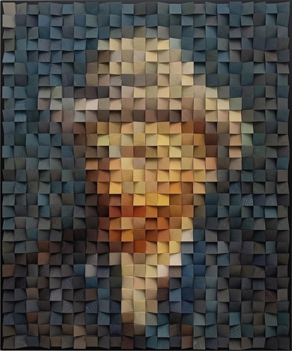
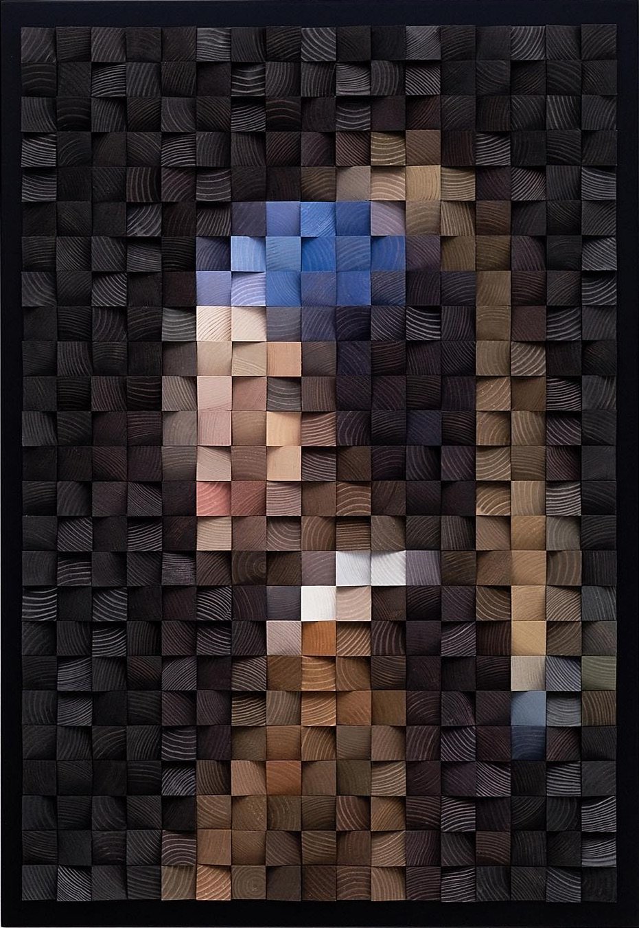
Using colorful wooden blocks cut at different angles, Timur Zagirov makes pixel-log 1 representations of famous artworks by Vermeer, van Gogh, and Leonardo. You can check out his work on Instagram or at Stowe Gallery. (via moss & fog)
Hardware engineer Mohit Bhoite designs functional little desktop bots like this thermometer and this internet-connected weather display:


These are adorable…there’s no other way to describe them. You can check out more of Bhoite’s sculptures on his website or on Instagram. (via core77)
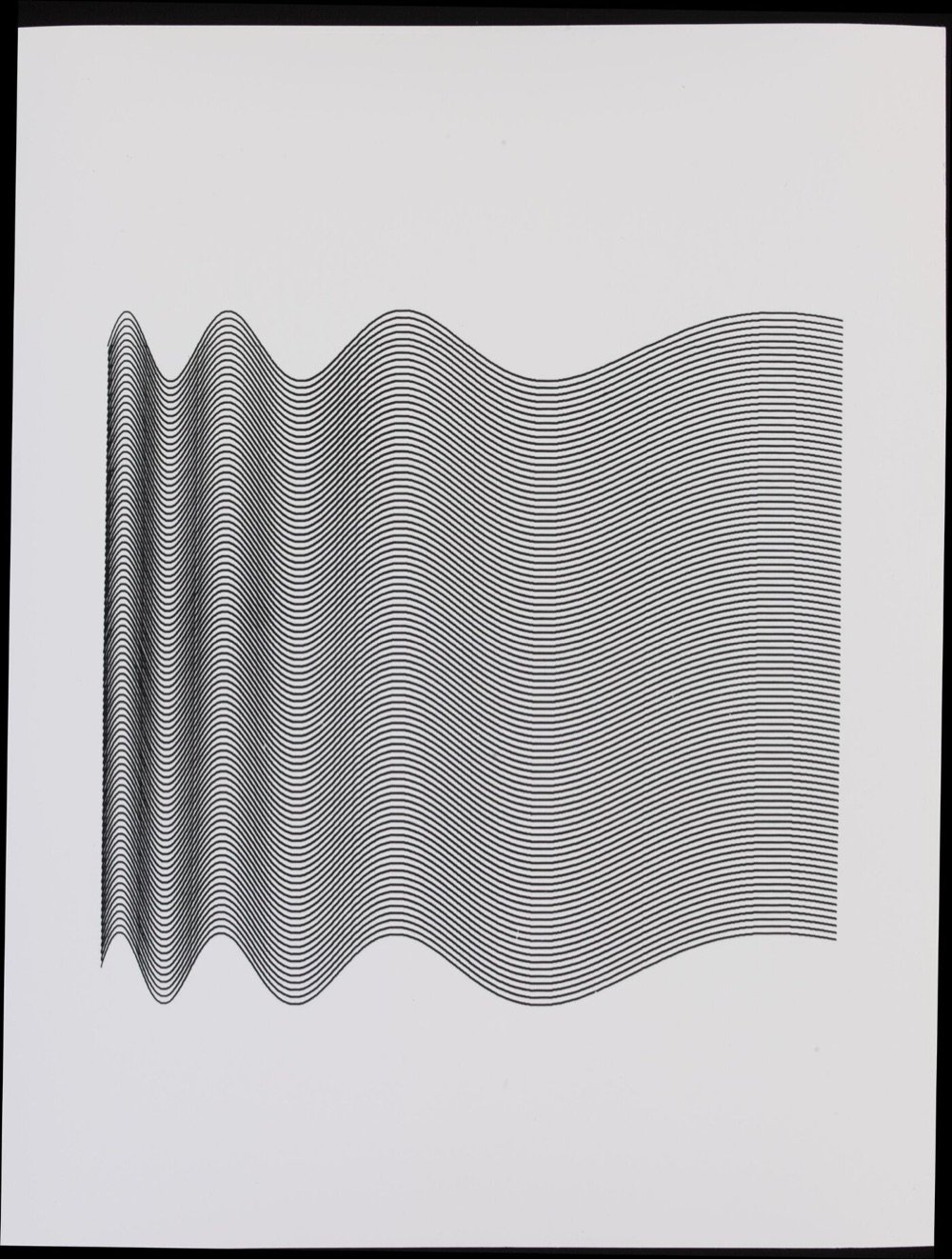
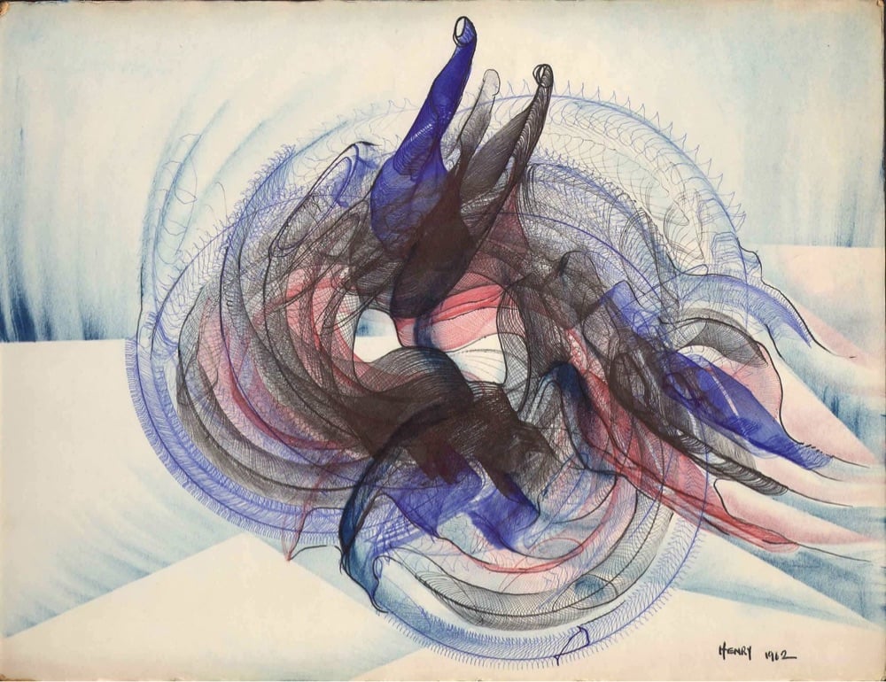
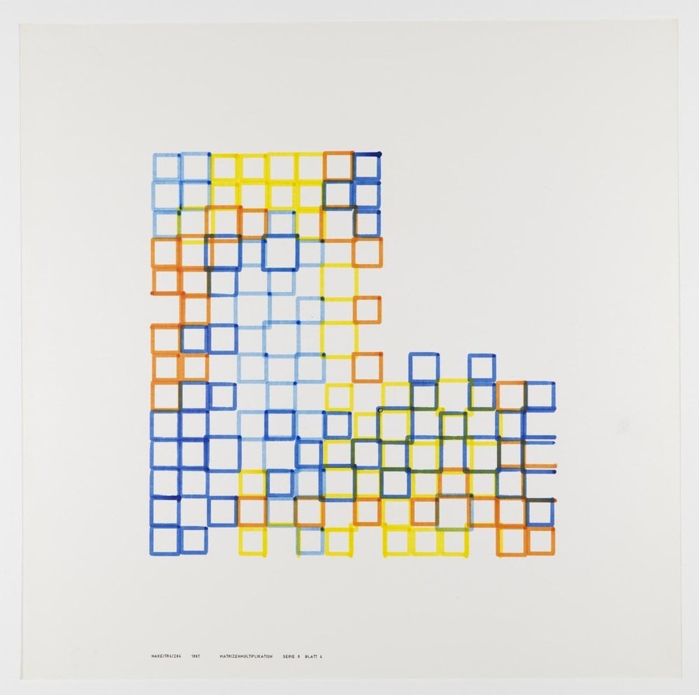
Artist Amy Goodchild recently published an engaging article about the earliest computer art from the 50s and 60s.
My original vision for this article was to cover the development of computer art from the 50’s to the 90’s, but it turns out there’s an abundance of things without even getting half way through that era. So in this article we’ll look at how Lovelace’s ideas for creativity with a computer first came to life in the 50’s and 60’s, and I’ll cover later decades in future articles.
I stray from computer art into electronic, kinetic and mechanical art because the lines are blurred, it contributes to the historical context, and also because there is some cool stuff to look at.
Cool stuff indeed — I’ve included some of my favorite pieces that Goodchild highlighted above. (via waxy)
On their YouTube channel, Art21 hosts a treasure trove of video profiles of artists like Amy Sherald, Olafur Eliasson, Chris Ware, Christian Marclay, Anish Kapoor, Kara Walker, Barbara Kruger, Julie Mehretu, and Sally Mann.
This is excellent — what a resource. (via colossal)
As part of a project to reproduce all 36 of Hokusai’s views of Mount Fuji as 1-bit black & white pixel art, James Weiner drew Great Wave Off Kanagawa:
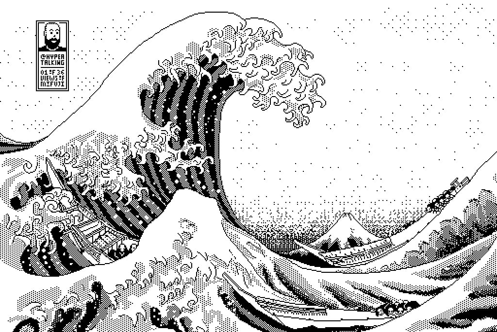
And he used an old Mac running System 7 to do it:
I usually use either my Quadra 700 or PowerBook 100, mostly because those are my reliable and easy to access computers (that run System 7, my favourite and most familiar OS of that era).
Software-wise I use Aldus SuperPaint 3.0, which is what my family had when I was a kid. Yes, I’d say that all of this is 99% nostalgia-driven…
This is just a lovely rendering — spare and elegant with just the right amount of detail.
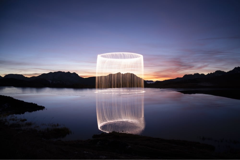
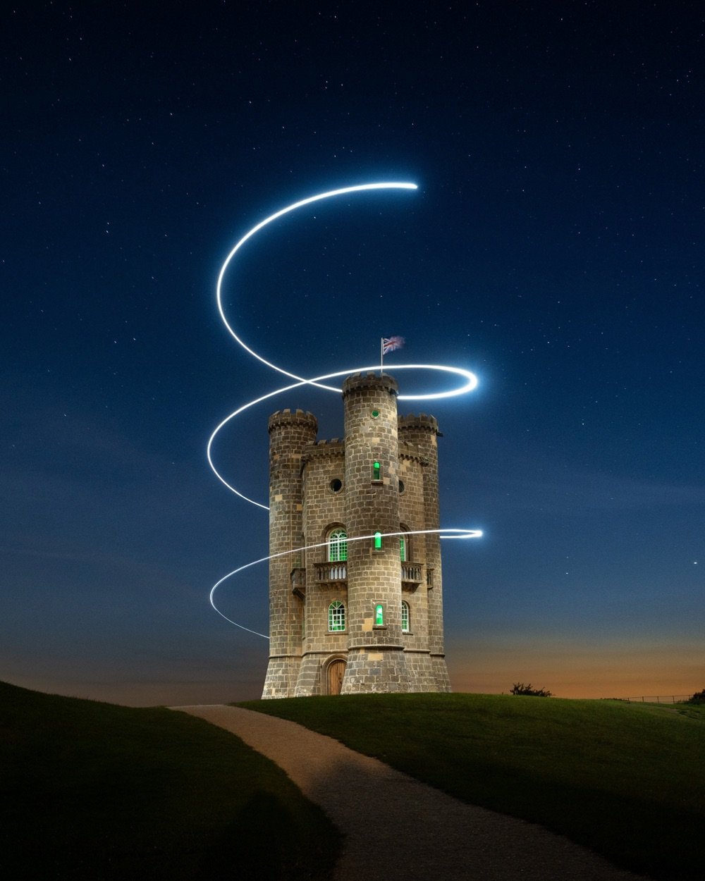

The three images above were created by long-exposure photography of the flight paths of drones with onboard bright lights.
The first image is from Jadikan’s new series, Phénomènes (Instagram), in which he uses fireworks to create brightly-lit cylindrical forms.
The second one is by Will Ferguson of Broadway Tower in the Cotswolds — you can see more of his aerial work here or on Instagram.
The third is from Reuben Wu (Instagram), whose work I’ve featured here for many years. IMO, Wu’s work is slightly more polished than Jadikan’s or Ferguson’s, but I enjoy experiencing all of it. (via petapixel)
No matter which side you come down on in the debate about using AI tools like Stable Diffusion and Midjourney to create digital art, this video of an experienced digital artist explaining how he uses AI in his workflow is worth a watch. I thought this comment was particularly interesting:
I see the overall process as a joint effort with the AI. I’ve been a traditional artist for 2 decades, painting on canvas. And in the last five years I’ve been doing a lot of digital art. So from that part of myself, I don’t feel threatened at all.
I feel this is an opportunity. An opportunity for many new talented people to jump on a new branch of art that is completely different from the one that we have already in digital art and just open up new way of being creative.
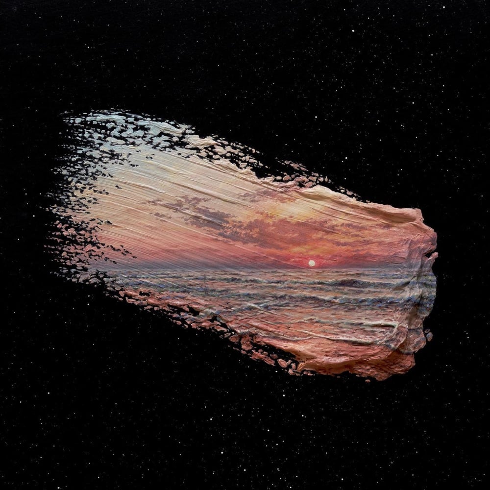
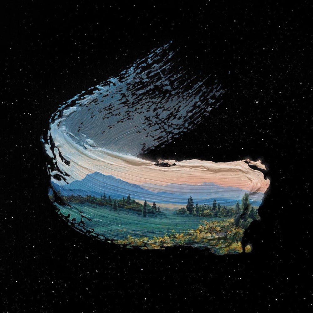
The paintings in David Ambarzumjan’s Brushstrokes in Time series bring together large, rough brushstrokes with intricate landscapes — it’s a stimulating combination. A popular one too: all of his prints are currently sold out but there’s some new ones coming soon. You can also check Instagram for auctions of the original oil paintings. (via my modern met)
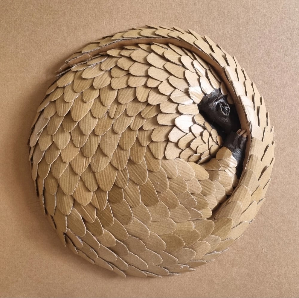
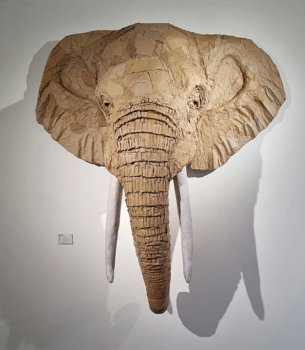
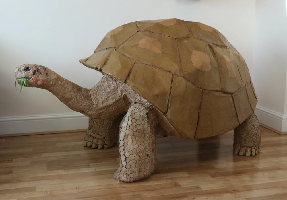
Josh Gluckstein makes these remarkably detailed sculptures of animals out of cardboard and paper.
Inspired by my extensive travels and volunteering through Asia, Africa and South America, I have sought to capture the presence of some of the most majestic animals I have seen by creating life-size sculptures, often made from found and recycled materials. I have continually strived to make my practice more and more sustainable, and my new collection is made entirely of recycled cardboard and paper. Its accessibility and versatility allows me to bring the animal to life and capture their character and intriguing beauty while creating zero waste.
(via colossal)
In a video for the Victoria and Albert Museum, sculptor Simon Smith shows us how Renaissance sculptor Donatello might have approached carving a piece from marble, which Smith calls “the Emperor of all stones”.
It’s all about trapping shadows. Carving is all about having deep cuts here and lighter here and the angle here and how the light plays on it. And certainly in relief…because relief carving like this, it’s kind of halfway between sculpture and drawing. If you’re doing a three-dimensional sculpture, if a form runs around the back you just carve it so it goes around the back, but with this you have to give the illusion of it running around the back like a drawing. You’ve got to make something look like it turns around and comes out the other side even though it really is just going into the block. And that’s all about angles and shadow and light.
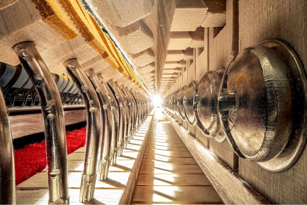

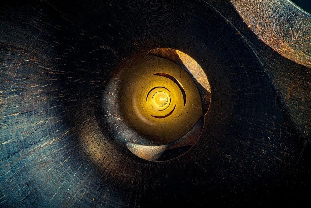
Charles Brooks takes photographs of the insides of musical instruments like pianos, clarinets, violins, and organs and makes them look like massive building interiors, enormous tunnels, and other megastructures. So damn cool. Some of the instruments he photographs are decades and centuries old, and you can see the patina of age & use alongside the tool marks of the original makers. Prints are available if you’d like to hang one of these on your wall.
And if you liked those, don’t miss these Dreamy Cave-Like Photos Taken Inside Musical Instruments. (via moss & fog)
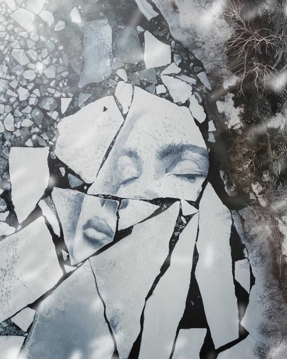
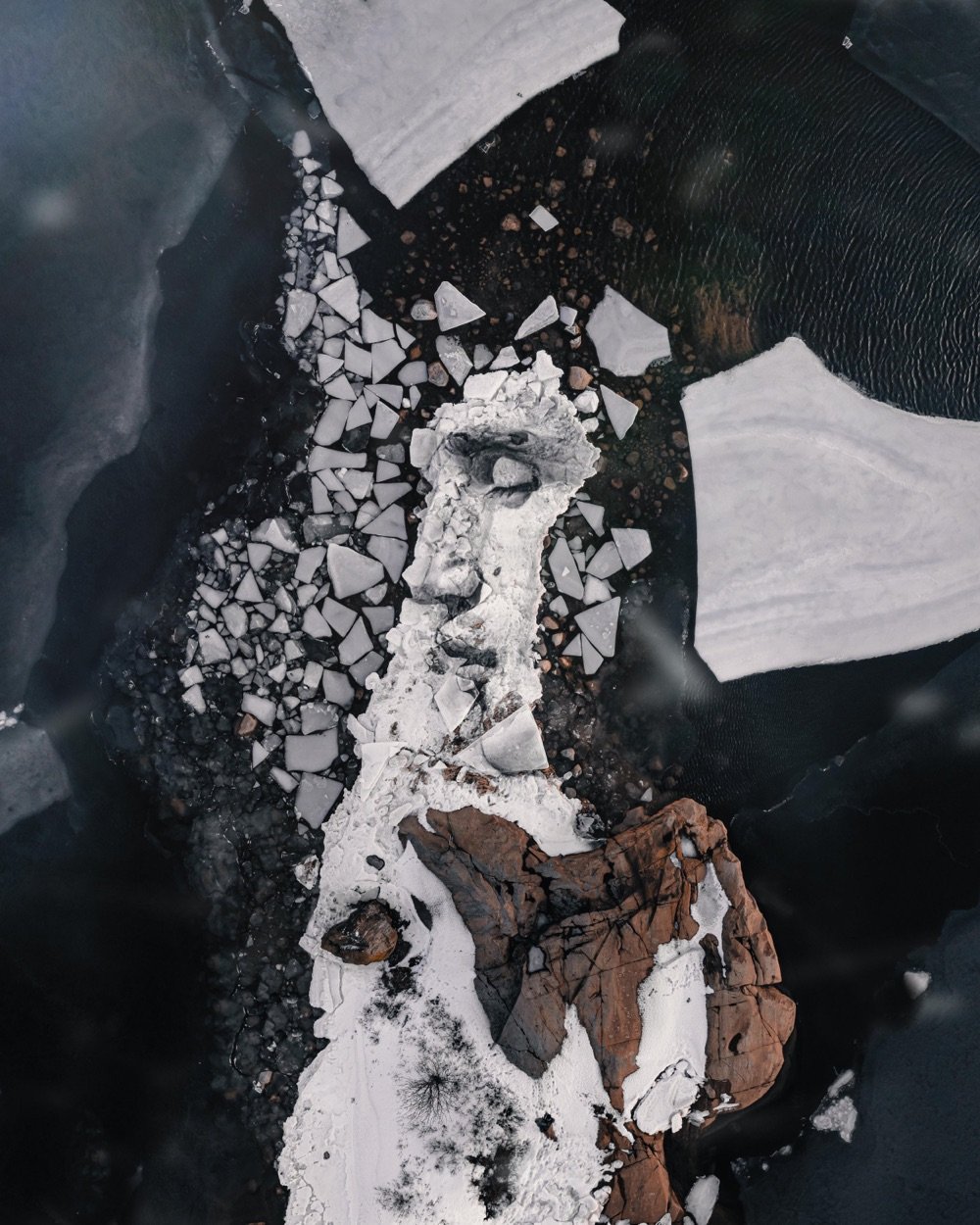
During the course of my online travels, I see a lot of cool and interesting things, but this one really stopped me in my tracks. David Popa uses natural pigments to draw large format portraits on fractured sheets of ice and then photographs them from above. Wow, wow, wow. From a profile of Popa’s work at Colossal:
Because many of his works are destined to melt and be reabsorbed, Popa opts for natural materials like white chalk from the Champagne region, ochres from France and Italy, and powdered charcoal he makes himself — the latter also plays a small role in purifying the water, leaving it cleaner than the artist found it. Most pieces take between three and six hours to complete, and his work time is dependent on the weather, temperature, and condition of the sea. “The charcoal will sink into the ice and disappear from a very dark shade to a medium shade, so it has to be created very quickly and documented. No to mention the work on the ice will just crack and drift away completely, or the next day it will snow and be completely covered,” he says. “I’m really battling the elements.”
I love these so much — they remind me of self-portraits taken in shattered mirrors or fragmented mirrored surfaces, a practice I apparently engage in with some regularity.
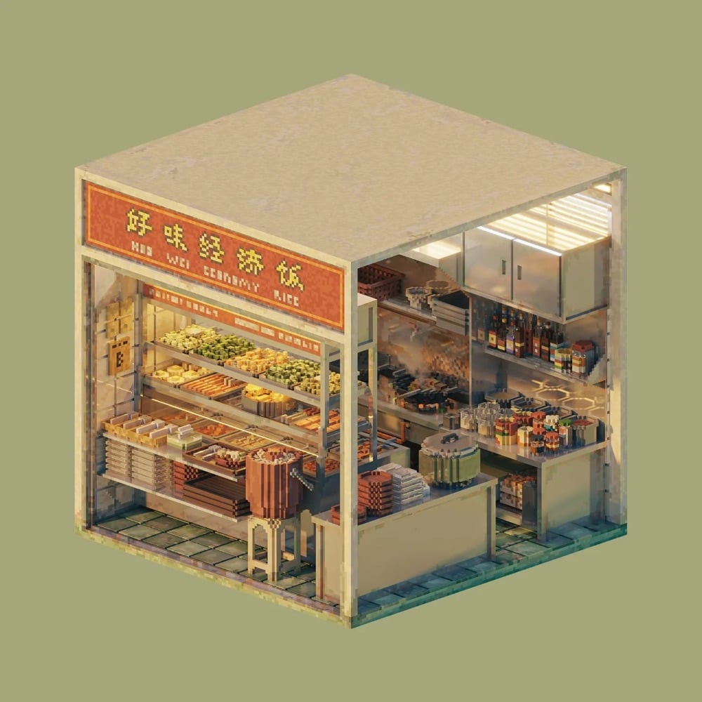
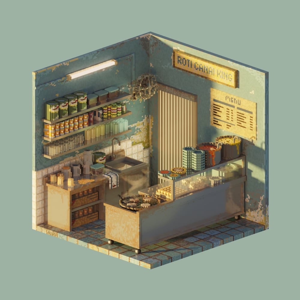
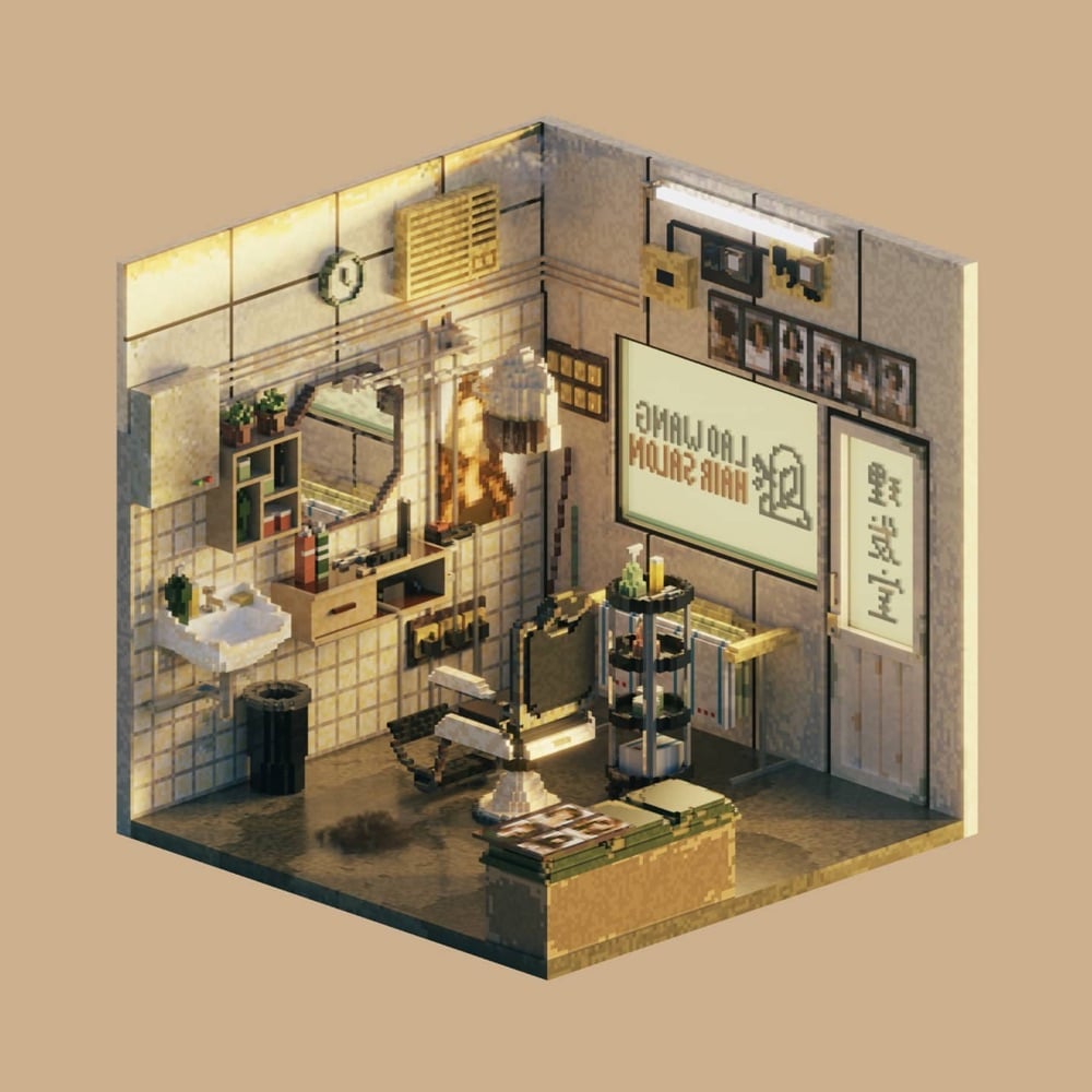
These are lovely: voxel rooms of Malaysian hawker stalls and other shops by Shin Oh. She started making them after quitting her job due to anxiety and depression:
At that point in my life, I lost passion and interest in everything, I was feeling worthless, I felt like there was nothing I was good at,” Shin shares. But, later in her career break she discovered voxel art, and this, she says, is when things started to change. Noticing that voxel art was making her “more focused, relaxed and calm” after six months she began to share her creations on social media, and receiving good responses, she felt herself regaining her “long-lost” self confidence. “Making voxel art is now my hobby and my job, it’s a fun way for me to explore and express myself,” Shin concludes. “Voxel art has saved my life.”
(via present & correct)
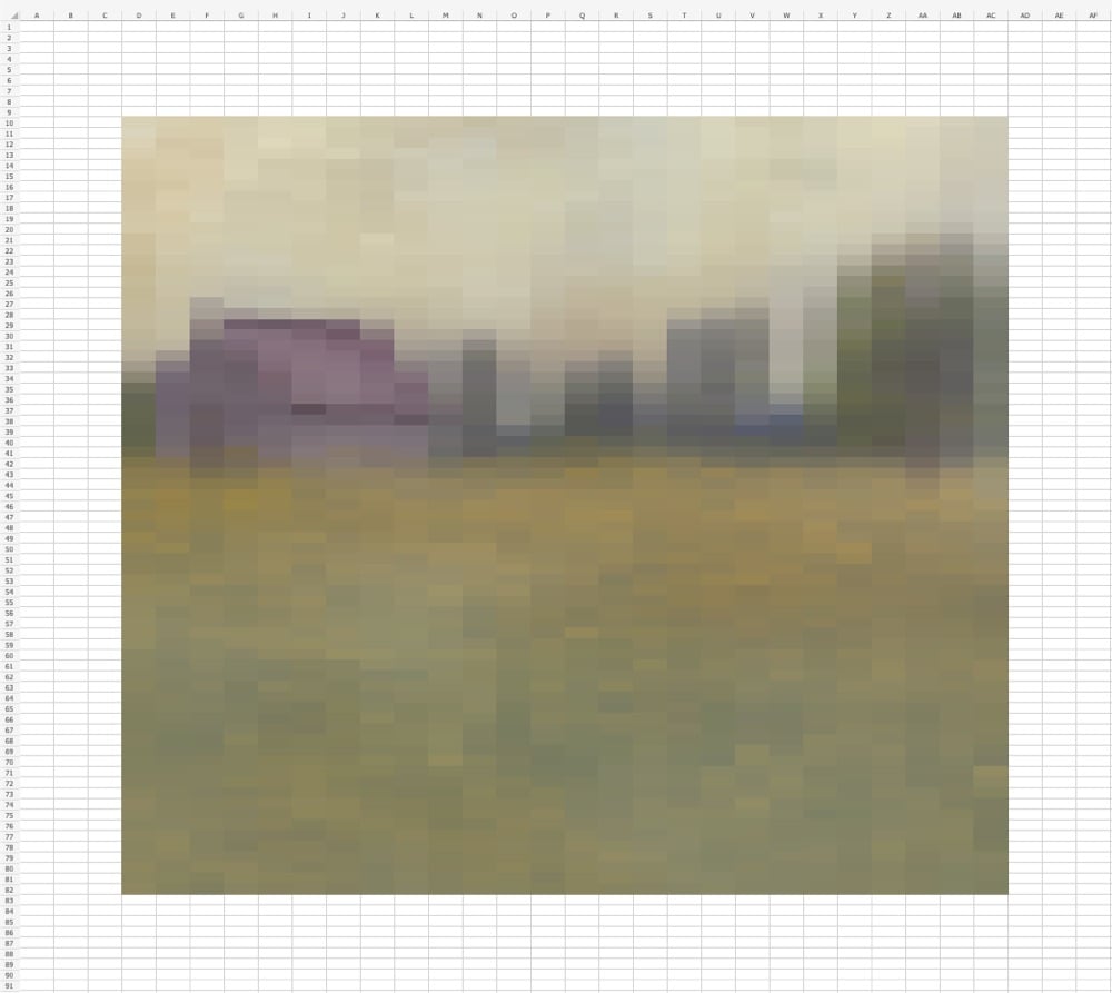
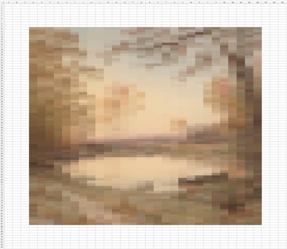
Internet artist evbuilds creates these chunky pixelized abstract images in Microsoft Excel.
Excel is one of those rare pieces of software that is terrifically useful at what it’s designed to do but also powerful enough where you can make it do things that perhaps it really shouldn’t be doing. See also The Excel Spreadsheet Artist, Making Music in Excel, and Super Mario Bros Recreated in Excel.
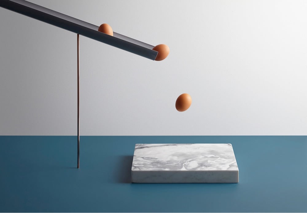
What I like about the still image above, along with the rest of the images in a project called In Anxious Anticipation by Aaron Tilley & Kyle Bean, is that it makes a noise. It’s so cool how your brain sees what’s about to happen and then you hear eggs smashing on a hard surface — splat, splat, splat. More still art should make noise! (via moss & fog)
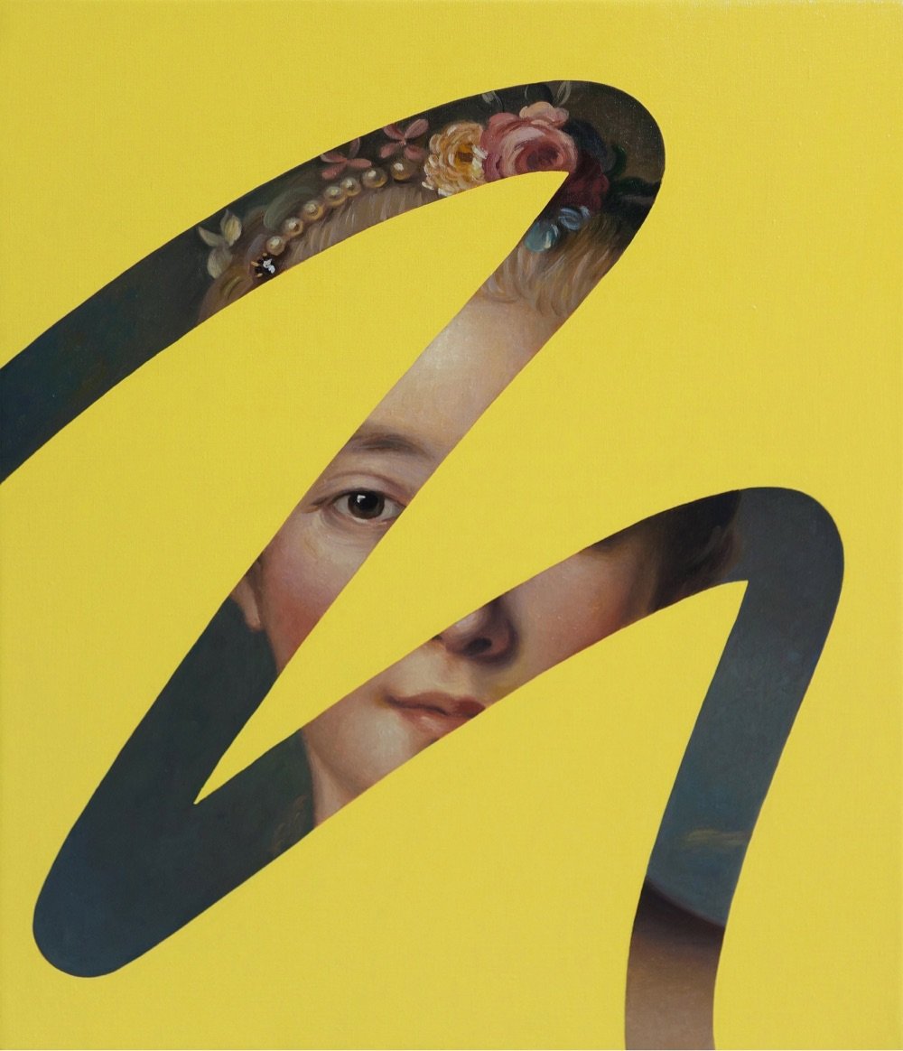
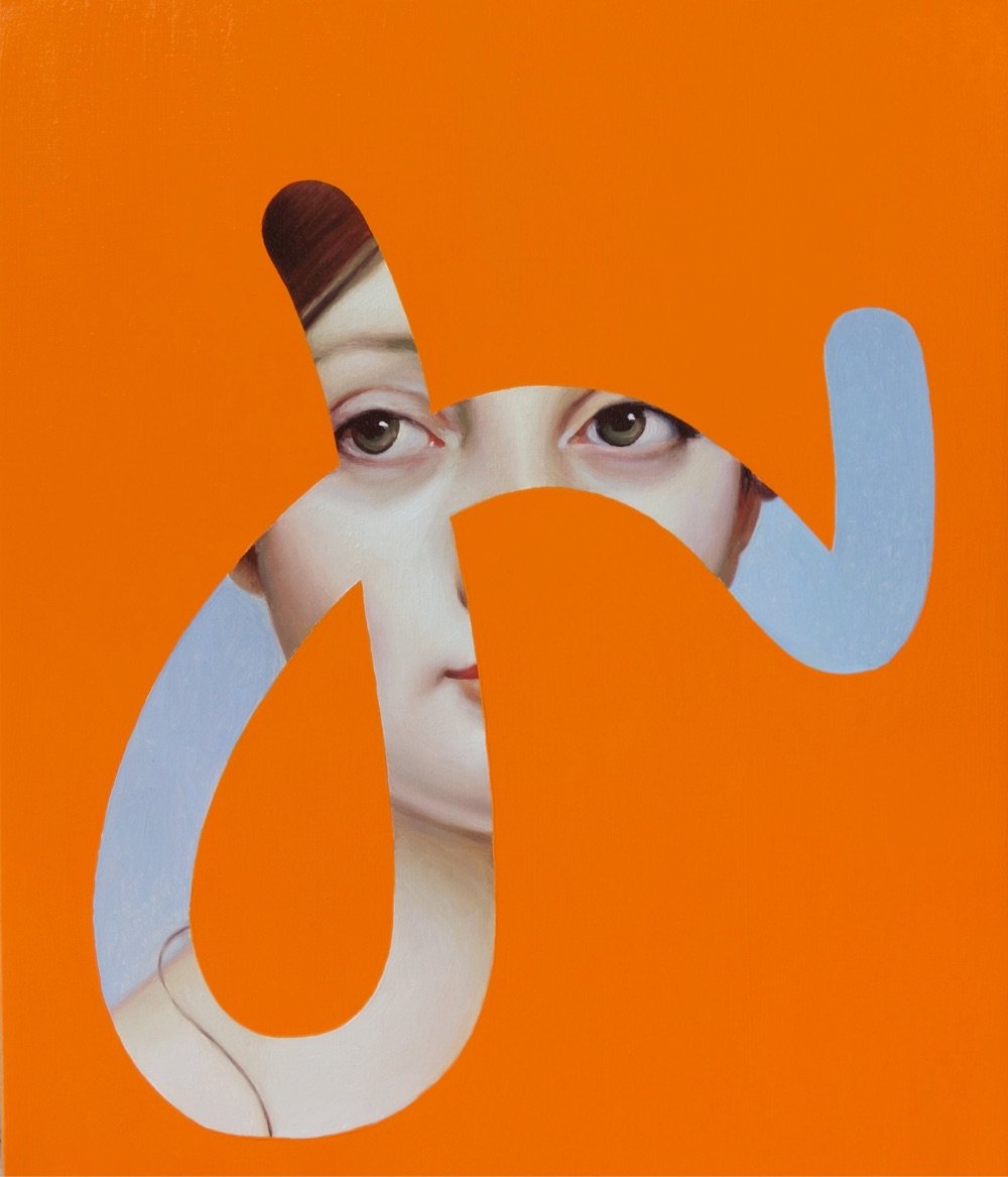
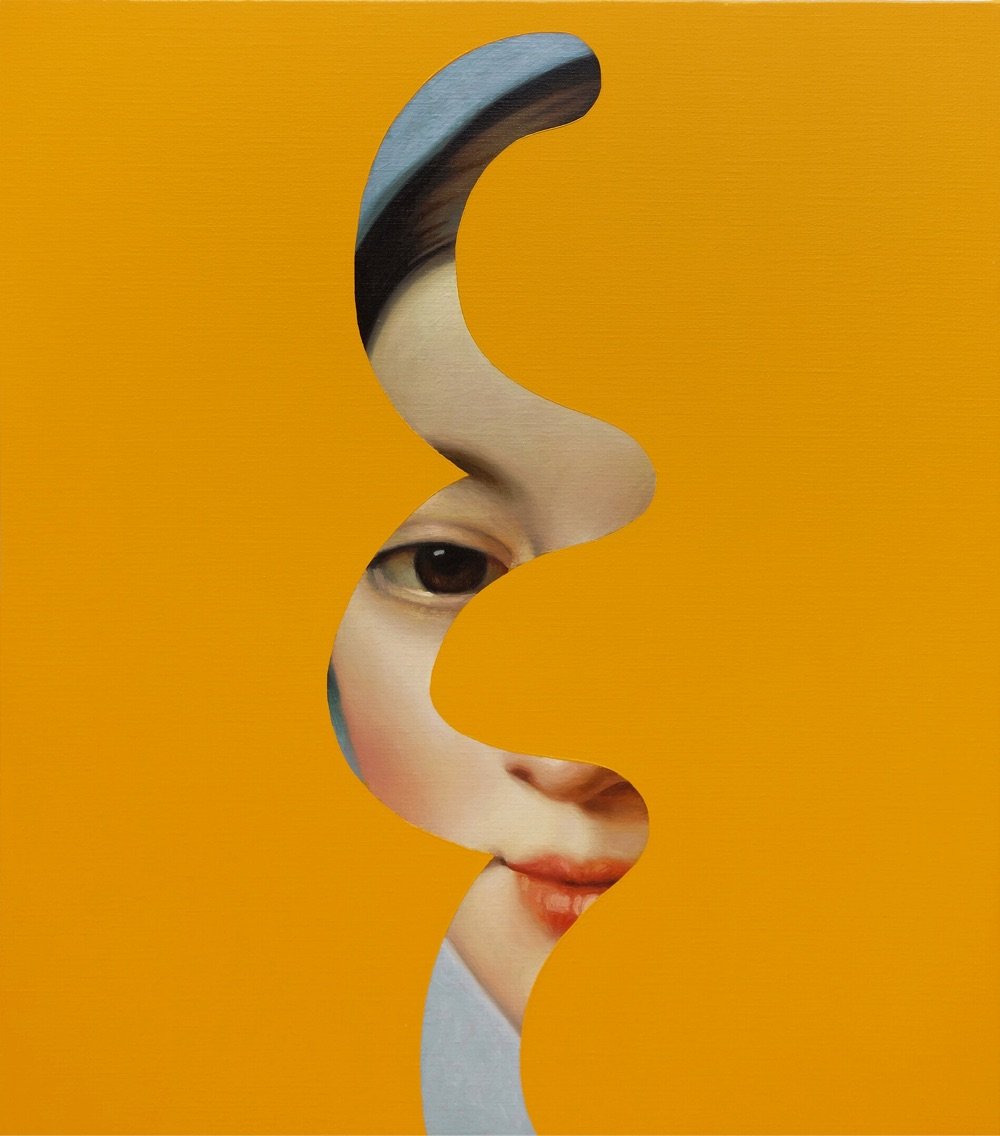
I like these paintings by Spanish artist Lino Lago where traditional oil painted portraits peek through bright color fields. He calls them Fake Abstracts. (via colossal)
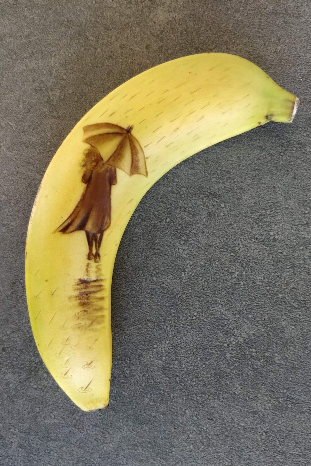
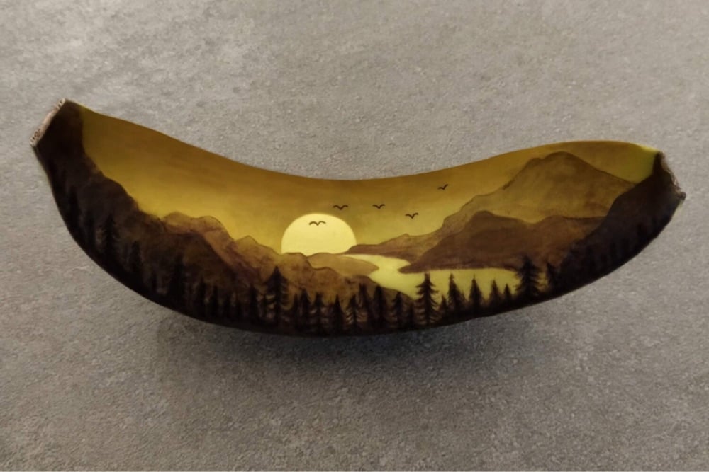
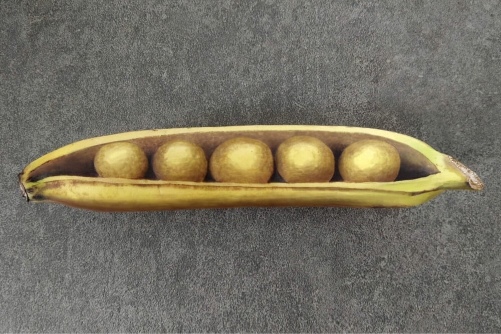
As it ripens, banana skin oxidizes and turns black. Bruising the skin speeds up the process, a fact that Anna Chojnicka exploits to create these bruised banana artworks (also on Instagram). Here’s how it works:
I bruise the peel by pressing into it lightly with a blunt point. Speeding up and controlling the bruising process conjures light and shade in the image.
Over a few hours, the mark gradually goes darker until black. I start with the darkest parts of the image first, and then work my way backwards, finishing with the lightest parts last.
By managing the timing, it’s possible to make intricate images with graduating shades. There’s a short window of time when the image looks its best; I photograph the banana, and then eat it.
Chojnicka started the project in the early days of the pandemic while bored/delirious at home with a suspected Covid infection. The increase in art using found objects during the pandemic is fascinating: people couldn’t spend a lot of time out of the house, so they reached for whatever they could find to express their creativity…in this case, bananas.
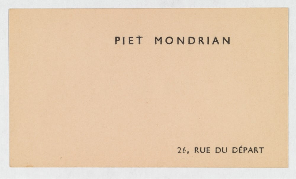
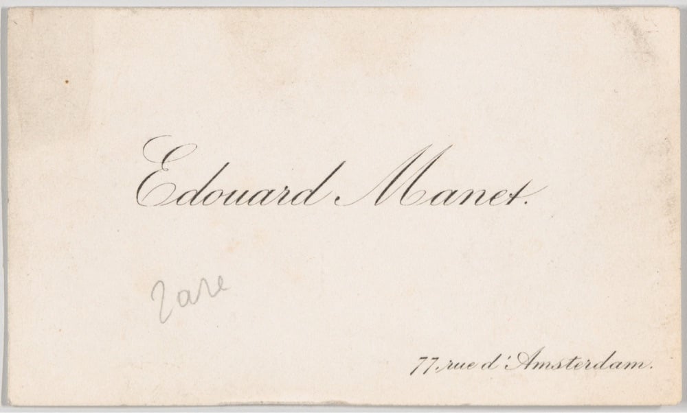
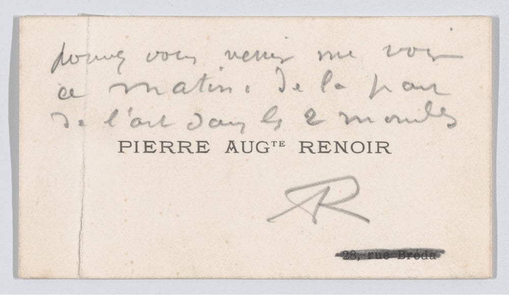
F. C. Schang collected the calling cards of prominent artists and musicians and in the late 20th century, donated a collection of them to Met Museum.
Calling cards derived from a custom, originating in England, in which messages were inscribed on the backs of playing cards. Cards made for the express purpose of sharing hand-written messages were manufactured beginning in the eighteenth century; by the early-nineteenth century, calling cards had become a popular means for sending well wishes, holiday greetings, condolences, and messages of courtship.
The cards include those of Klee, Renoir, Pissarro, Rodin, Monet, Mondrian, Braque, Toulouse-Lautrec, Manet, and many more. I think my favorites are Piet Mondrian’s (above) and Joan Miró’s, the former because it’s very much in keeping with the artist’s style and the latter because it isn’t:
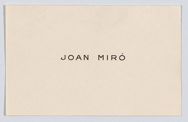
Schang published a book of these cards in 1983 — it’s long out of print but you can get one here (signed, no less). He also collected the calling cards of generally famous people, singers, pianists, and violinists. (via greg allen)
Back in 2020, the Smithsonian Institution placed 2.8 million high-resolution images and 3D models of objects in their collection into the public domain via their Open Access initiative. Over the past three years, that collection has grown to 4.5 million images, an absolutely immense trove of objects that people are free to use and remix however they wish.
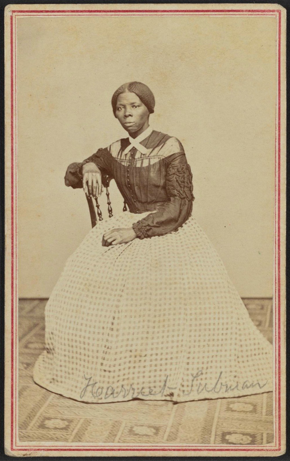
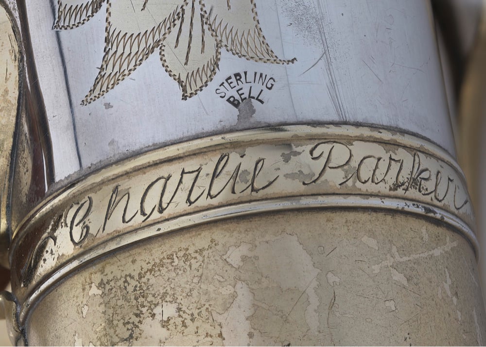


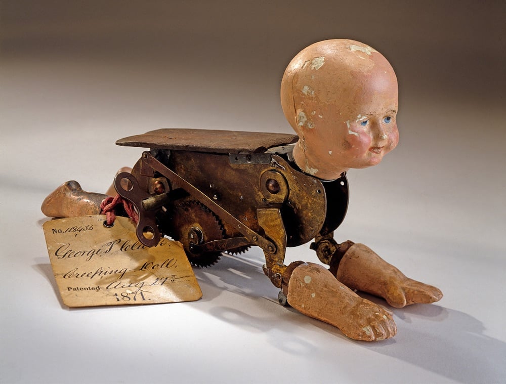
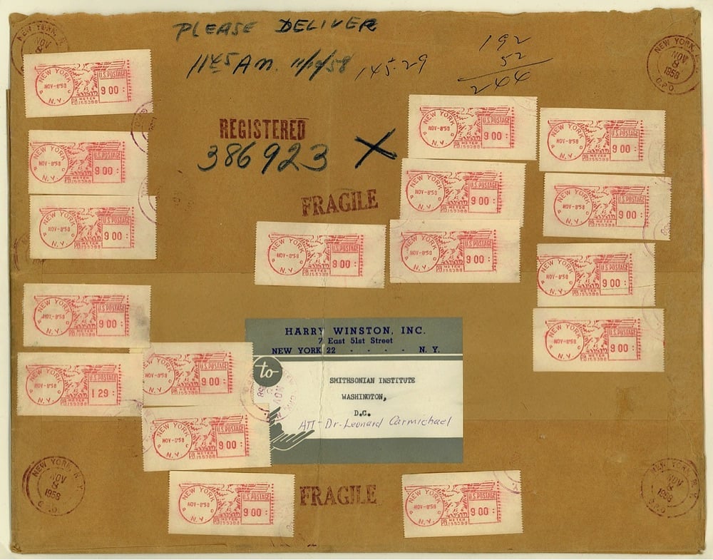
That last image is the mailing wrapper from when jeweler Harry Winston sent the Hope Diamond (currently valued at $200-350 million) to the Smithsonian through the regular US Mail.
Mailed on the morning of November 8 from New York City, the item was sent by registered (first class) mail — considered the safest means of transport for valuables at that time. The total fee was $145.29 (see the meter machine tapes). Postage only amounted to $2.44 for the package which weighed 61 ounces. The remainder of the fee ($142.85) paid for an indemnity of about $1 million.
(via my modern met)
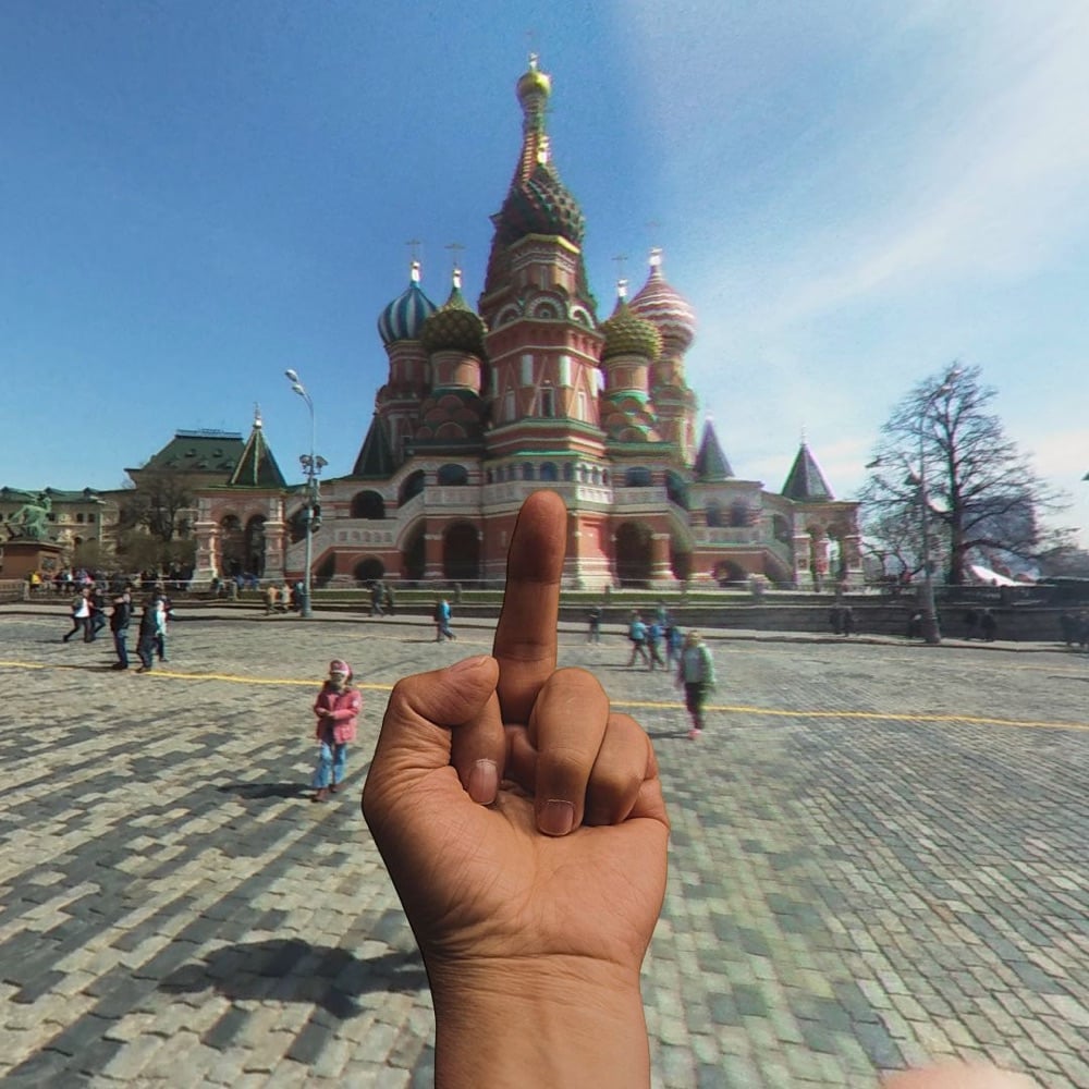

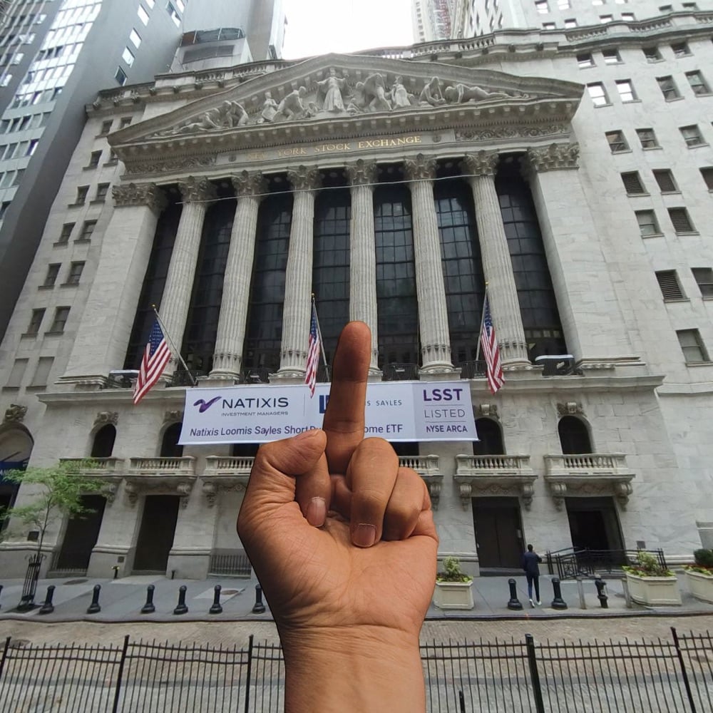
For his project Study of Perspective, artist and activist Ai Weiwei took photos of himself flipping off “significant institutions, landmarks and monuments from around the world”, notably Tiananmen Square in 1995. Using this Google Street View-enabled web tool, you can use Ai’s middle finger to flip off anything you’d like, anywhere in the world.
I’ve included a few examples above from the site’s archive. In a brief review of what folks have done with the site recently, I observed several shots of the Kremlin, the Eiffel Tower, churches, and various Trump buildings, but I also saw the Stonewall Inn and other gay landmarks.
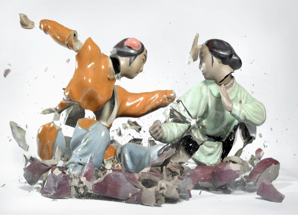
I posted a link to these the other day from the broken plates post (and first posted about them more than 15 years ago), but I love these photographic sculptures by Martin Klimas so much that I wanted feature them in a proper post.
From a height of three meters, porcelain figurines are dropped on the ground, and the sound they make when they hit trips the shutter release. The result: razor-sharp images of disturbing beauty, more than the sum of its parts. Temporary sculptures made visible to the human eye by high-speed photography. The porcelain statuette bursting into pieces isn’t what really captures the attention; the fascination lies in the genesis of a dynamic figure that seems to stop/pause the time and make time visible itself.
See also Klimas’ Flowervases (“Flawlessly arranged flower vases are shot by steel bullets and captured at the moment of their destruction”) and Sonic Sculptures (“Klimas begins with splatters of paint in fuchsia, teal and lime green, positioned on a scrim over the diaphragm of a speaker — then, the volume is turned up”).

I’m charmed by these ultra-realistic drawings of Japanese maintenance trains by Masami Onishi.
Japanese trains are renowned for their punctuality, comfort and overall reliability. But part of what makes them so reliable is an “unseen” workforce of overnight trains. These trains will be unfamiliar to the everyday rider because they only show themselves after regular service has ended for the day. Working through the wee hours of night and early morning, they perform maintenance work on tracks and electrical wires that ensures a smooth and uninterrupted ride during the day.
My pal Craig Mod recently spotted a “rare and majestic” inspection Shinkansen called Doctor Yellow.
The inspection vehicle is popular among train enthusiasts as a sighting of the train is said to bring good luck since it is so rarely glimpsed.
Gotta love a place that’s so deservedly proud of and enthusiastic about its rail infrastructure.
Update: Great Britain has a maintenance train called the Yellow Banana. (thx, james)
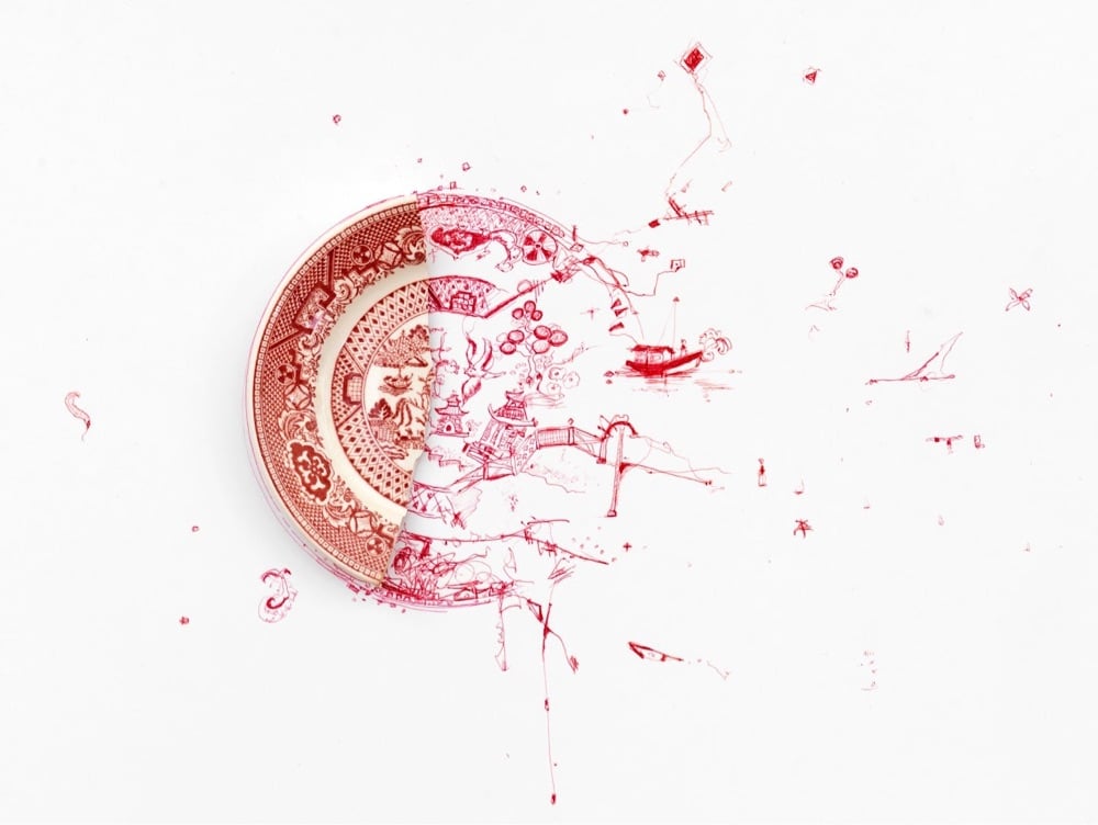
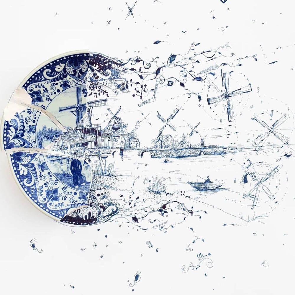
I totally love these “evolved” drawings of the elaborate patterns of broken plates by Robert Strati. The project was inspired by a plate that broke in the Strati household:
This work was inspired by a plate from my wife’s late mother, Barbara. One day it was dropped and shattered. Some time after, I picked up a pen and started working on the “Fragmented” series, exploring the possibilities of things broken and the stories that can evolve from them.
You can see more work from this project on Instagram and at this site.
See also Kintsukuroi and Martin Klimas’ Porcelain Figures. (via my modern met)
I have to admit that as much as I love Evan Puschak’s Nerdwriter videos, I did not have high hopes for his latest video on John Singer Sargent, a painter I didn’t know a lot about and assumed, mostly based on his name (ugh, I know), that he was some fusty 19th-century painter who was not as interesting as the Impressionists. What a pleasant surprise to discover, right from Puschak’s expertly concise show-don’t-tell opening, that I am Sargent’s newest fan.
Everywhere you look in this painting you see his supremely confident looseness, a kind of painting you maybe wouldn’t think to associate with a realistic representation of the world. And yet that’s exactly the final effect — a realism that is somehow more true than finely detailed painting.
Realism through impressionism? Sign me up. Stay curious, friends…you never know what interesting new (or old!) thing you’re going to discover next.
For an exhibition entitled DEATH TO THE LIVING, Long Live Trash now on view at the Brooklyn Museum, artist Duke Riley takes trash that he’s collected on the beach and turns it into art — think mosaics made from bottle caps, bread bag clips, and tampon applicators. But his plastic scrimshaw creations are absolute genius:
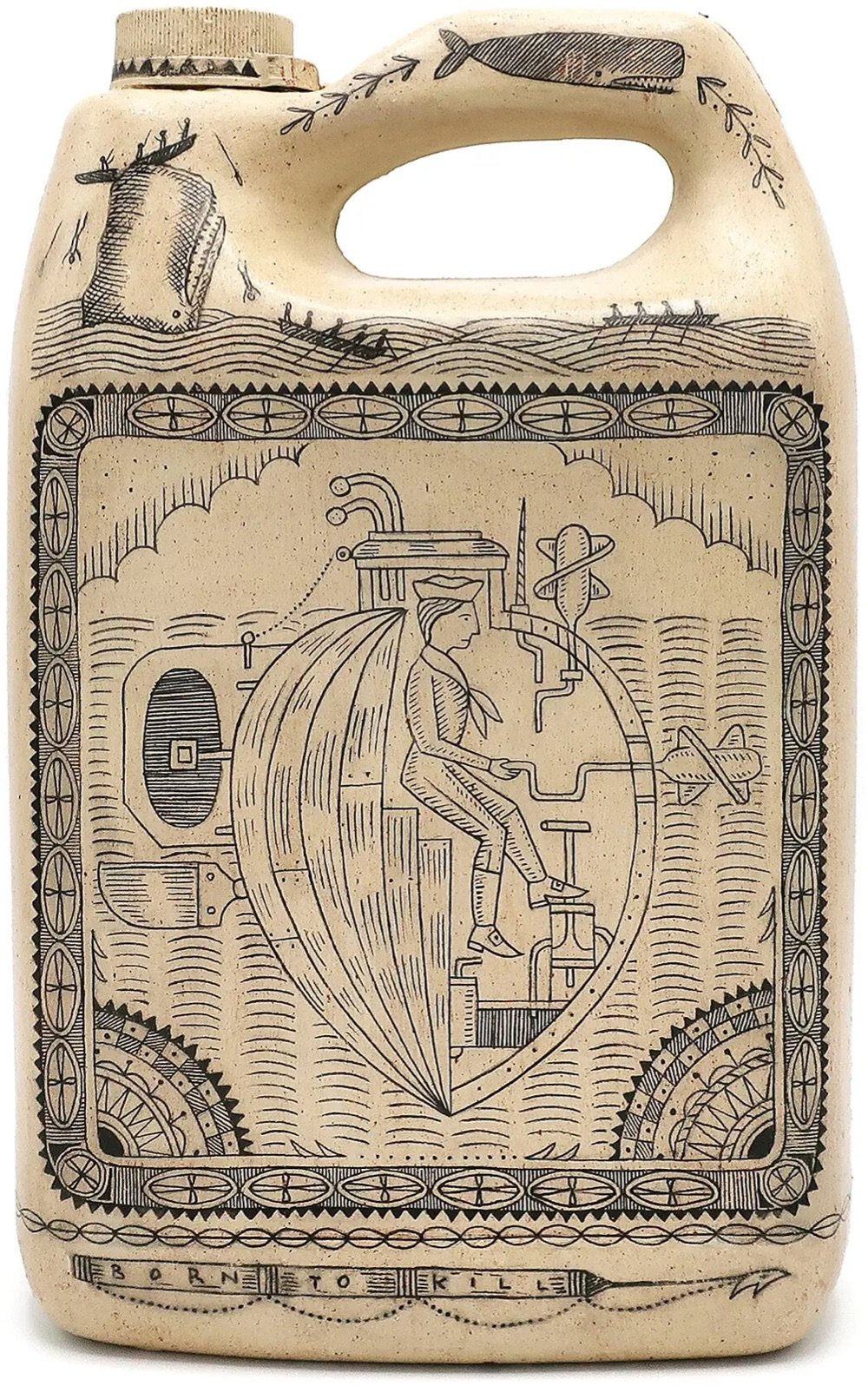
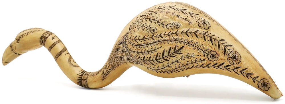
Scrimshaw art was made by whalers in the 19th century by carving designs into the teeth, bones, and baleen of whales. Riley has cleverly adopted the practice using aesthetically similar white plastics, producing a series he calls the Poly S. Tyrene Maritime Museum. The NY Times:
As whalers often depicted the leaders and profiteers of their day, Riley portrays the C.E.O.s of chemical companies, plastic industry lobbyists and others he deems responsible for producing the devastating tonnages of single-use plastics that are engulfing our oceans and threatening our ecosystems. It’s a downer, but if you look closely there’s often a Riley twist of humor, like the seagull shown relieving itself on the head of a water bottle magnate.
You can see a few more of the plastic scrimshaw objects on the Brooklyn Museum’s Tumblr,at Atlas Obscura, and in-person at the Brooklyn Museum until mid-April. (thx caroline)
Every day for three years, Iancu Barbarasa drew a flower for his partner and recently he compiled all the drawings into this lovely short film set to Chopin’s Minute Waltz. I loved his acknowledgement of his sources and influences:
Questlove once said that “all creative ideas are derivative of another.” My project would not exist (or at least not in this form) without the influences of: Katsuji Wakisaka, textile designer and founder of Sou·Sou, who has drawn over 10,000 postcards for his wife — Christoph Niemann’s work and also his short film “A Tribute to Maurice Sendak” — “Beyond Noh (Masks of our world)” short film by Patrick Smith — “Plante” short film by Reka Bucsi — and Philippa Perry’s “The Book You Wish Your Parents Had Read (and Your Children Will Be Glad That You Did)”. Last but not least, the end credits are a tribute to Hayao Miyazaki’s wonderful “My Neighbour Totoro” film.
A set of postcards featuring the flower drawings are available from Barbarasa’s shop.
I’ve featured the work of Mattias Adolfsson before, but I ran across some of his marvelously dense & vaguely steampunk illustrations again the other day and wanted to point you in his direction once again.
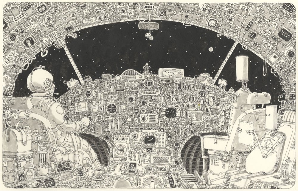
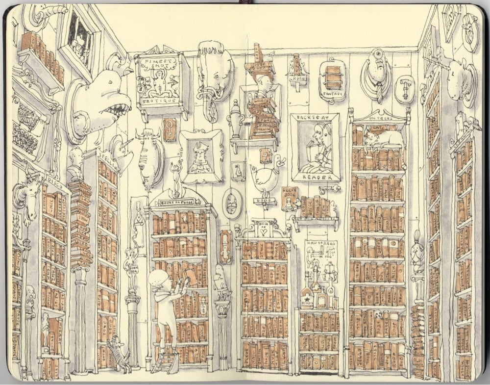
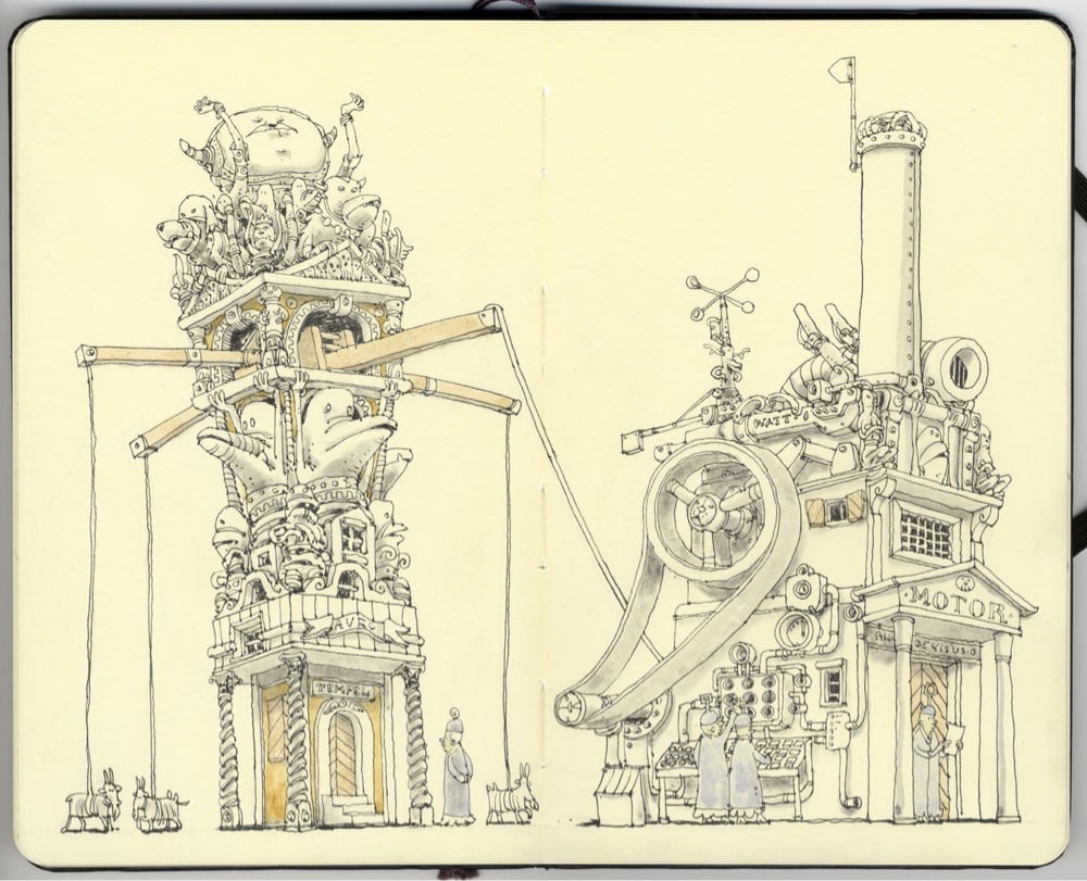
The fantastical & whimsical nature of Adolfsson’s work reminds me of Mark Alan Stamaty, Richard Scarry, Shel Silverstein, and perhaps even a little Quentin Blake and Aardman.
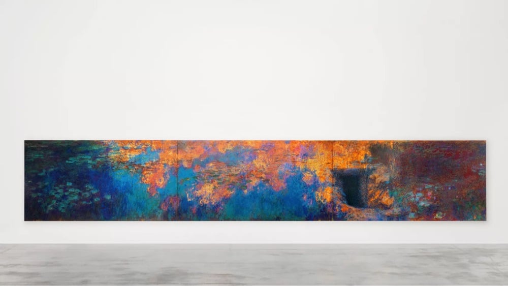
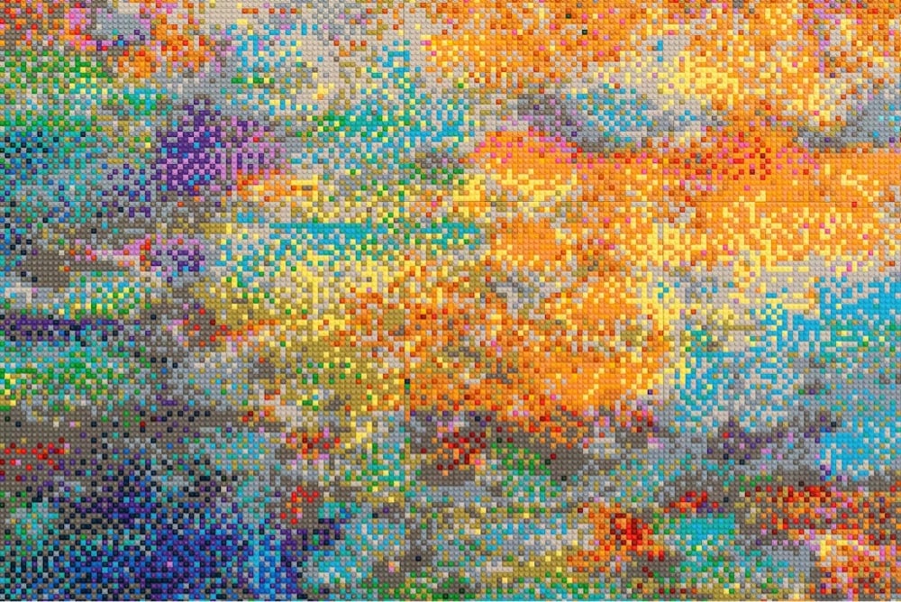
Lego bricks and Impressionism are a natural pairing, and so Chinese artist Ai Weiwei has recreated Claude Monet’s massive Water Lilies triptych with 650,000 Lego bricks. Spanning nearly 50 feet across, the Lego sculpture is part of Ai’s upcoming show at the Design Museum in London. Here is a tantalizing behind-the-scenes view.
Ai has been creating Lego works for years now — including these Warhol-esque portraits and A Sunday on La Grande Jatte — and was even denied from buying bricks from the company at one point.
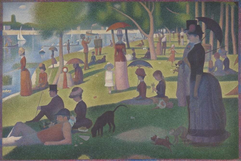
Say what you will about The Algorithms, but YouTube’s reliably informs this art history lover of every new episode of Great Art Explained and for that I am grateful. This latest episode is about the pointillist masterpiece by Georges Seurat, A Sunday on La Grande Jatte. I had a chance to see this painting in person last summer at The Art Institute of Chicago — spent quite a bit of time looking at it from all angles and distances — so this episode was the perfect accompaniment to that visit.
The lack of narrative means we really should look to the artist’s obsession with form, technique and theory — which is practically all he wrote about — and not to meaning or subject matter - which he didn’t write about at all. The painting is really his manifesto. His protagonists don’t have faces or body language, neither a history nor individuality. They are reduced to a hat, a corset, or a pet. They are just characters in his frieze. They exist only to give perfect balance to the composition.
Some paintings are designed for the viewer to “empathise with” but Seurat keeps us at arm’s length. We are not invited to “participate” in the promenade, and their psychological distance is clear. Both with their neighbors, and with us. It was ancient art that Seurat looked to — of Egypt and Greece. He once said that he “wanted to make modern people move about as they do on the Parthenon Frieze”, and placed them on canvases organized by harmonies of colour. It is what makes the painting so intriguing.
I am not a particular fan of fantasy games, but I do like watching people draw and talk about their process, particularly when it’s accessible to beginners. On his YouTube channel, JP Coovert shows people how to draw maps for fantasy games, books, and other media. Here’s a few examples to whet the appetite.
(via the kid should see this)
Newer posts
Older posts






Socials & More