kottke.org posts about art


For his Pixel Art TV project, Gustavo Viselner illustrates scenes from TV shows in a pixelized video game style. Looks like he’s done scenes from Game of Thrones, The Handmaid’s Tale, Breaking Bad, The Fresh Prince of Bel-Air, Seinfeld, Star Trek, and several others. (via @john_overholt)
Update: See also The Screenshots, a project by Jon Haddock from 2000 in which scenes from historical & fictional events are rendered in a The Sims-like style. (via @dens)


Artist Dan Bell has drawn maps of the UK’s national parks in the style of J.R.R. Tolkien’s Middle-Earth. Bell has also drawn maps of Westeros (from George R.R. Martin’s Game of Thrones series) and places like London and Oxford. Both prints and the original hand-drawn maps are available for purchase from Bell’s online shop.

Photo collage by Dan Cretu.


The Smithsonian’s National Portrait Gallery commissions paintings of each outgoing President and First Lady. The Obamas selected a pair of black artists, Kehinde Wiley and Amy Sherald, to paint their portraits, which were unveiled today. From Colossal:
Wiley’s depiction of President Obama features the artist’s signature style of richly-hued background patterns setting a vibrant symbolic environment for the portrait’s subject. President Obama is surrounded by a carefully selected variety of foliage: jasmine, which represents Hawaii; African blue lilies for his father’s Kenyan heritage; and Chicago’s official flower, the chrysanthemum. For Mrs. Obama’s portrait, Sherald engaged her distinctive combination of depicting skin tone in grayscale, offset by the sharply rendered full-color fabric of Mrs. Obama’s floor-length dress.
Even a cursory glance at other Presidential portraits shows how different the Obamas’ portraits are.

Tree Mountain is a man-made mountain 125 feet high covered in 11,000 trees planted in a configuration according to the Golden Ratio. This art installation was conceived and built by artist Agnes Denes in Finland and is designed to endure for 400 years.
A mountain needed to be built to design specifications, which by itself took over four years and was the restitution work of a mine that had destroyed the land through resource extraction. The process of bioremediation restores the land from resource extraction use to one in harmony with nature, in this case, the creation of a virgin forest. The planting of trees holds the land from erosion, enhances oxygen production and provides home for wildlife. This takes time and it is one of the reasons why Tree Mountain must remain undisturbed for centuries. The certificate the planters received are numbered and reach 400 years into the future as it takes that long for the ecosystem to establish itself. It is an inheritable document that connects the eleven thousand planters and their descendents reaching into millions, connected by their trees.
Here’s Tree Mountain on Google Maps and a lovely video of the mountain shot from a drone:
You may have seen another of Denes’ projects: a 2-acre wheat field she planted in 1982 near the World Trade Center in Manhattan.


(via shane)


For their project Tape Des Moines, art collective Numen / For Use constructed tunnels in the Des Moines Art Center building made out of packing tape and invited people to crawl around in them. They’ve previously done tape tunnels in Vienna, Paris, and Frankfurt, but I have a looootta questions related to the structural soundness of packing tape. Like: how would puncturing the tunnel with a sharp object (accidentally or otherwise) affect the overall stability of the tunnel? (via colossal)
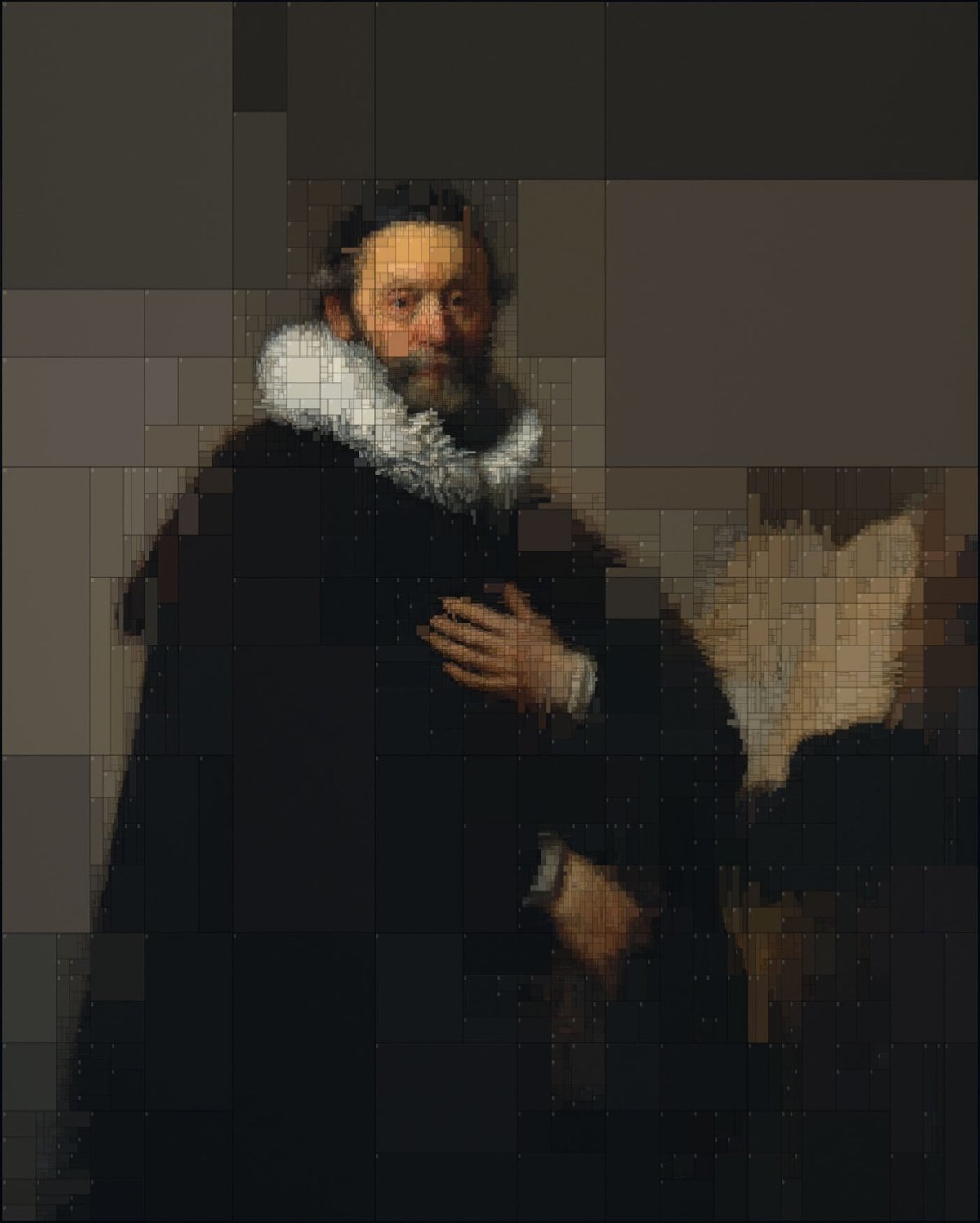
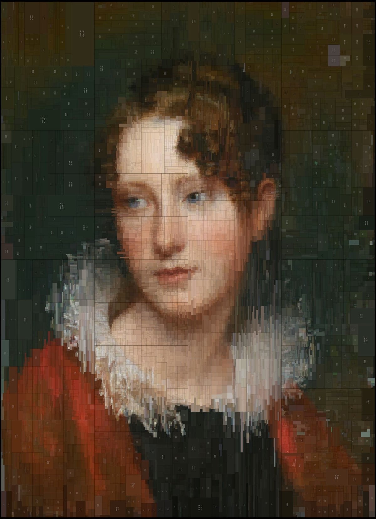
Greek visual designer Dimitris Ladopoulos took two of his favorite oil paintings, one by Rembrandt and the other (confusingly) by Rembrandt Peale, and used a piece of 3D modeling software called Houdini and pixelized them into treemaps of color. They look great in 2D (above), but he also rendered them in 3D with a worn texture:
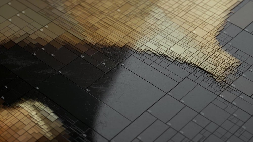
Those worn plastic rectangles with the beveled edges are reminding me of something in particular, like a piece of electronics. Something from Sony maybe? Anyone? (via colossal)

Ok, that’s not actually a screenshot from the hit Sega Genesis game Benjamin Franklin’s Polymath Academy. It’s a scan of an embroidery pattern from the 1840s or 1850s based on this engraving. Here’s a closer view:

The scan is part of an ongoing project by the Library of Congress to scan their entire Popular Graphic Arts collection, a wonderful trove of prints, advertisements, and other printed documents from circa 1700 to 1900. (via @john_overholt)
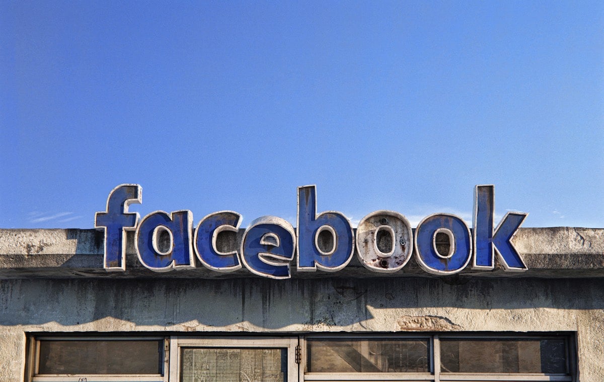

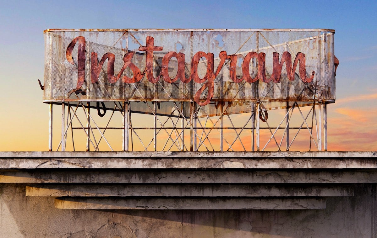
For a project called Social Decay, Andrei Lacatusu imagines what it would look like if big social media companies were brick & mortar and went the way of Blockbuster, Woolworth’s, and strip malls across America. These are really well done…check out the close-up views on Behance.
In a study done by UPenn researchers, first-year medical students who were taught art observation classes at the Philadelphia Museum of Art were more proficient at reading clinical imagery than students who didn’t take the classes.
If you’re unfamiliar or uncomfortable with how art and science can mingle to produce something clinically beneficial, it’s a study premise that might seem far-fetched — but it didn’t seem that way to Gurwin, an ophthalmology resident at Penn, in part because she’d already seen the benefits of art education on a medical career firsthand.
“Having studied fine arts myself and having witnessed its impact on my medical training, I knew art observation training would be a beneficial practice in medical school,” she said. “Observing and describing are skills that are taught very well in fine arts training, and so it seemed promising to utilize their teachings and apply it to medicine.”
Gurwin and Binenbaum’s findings, published in the journal Ophthalmology in September: The medical students who’ve dabbled in art just do better.
It’s a glimpse at how non-clinical training can and does make for a better-prepared medical professional. Not only does art observation training improve med students’ abilities to recognize visual cues, it also improves their ability to describe those cues.
The results of this study reminded me of Walter Isaacson’s assertion in his book that Leonardo da Vinci’s greatest skill was his keen observational ability. Not coincidentally, Leonardo was both an artist and a medical researcher who dissected more than 30 human cadavers to study human anatomy. These dissections helped him to represent the human form more realistically in his paintings and drawings.
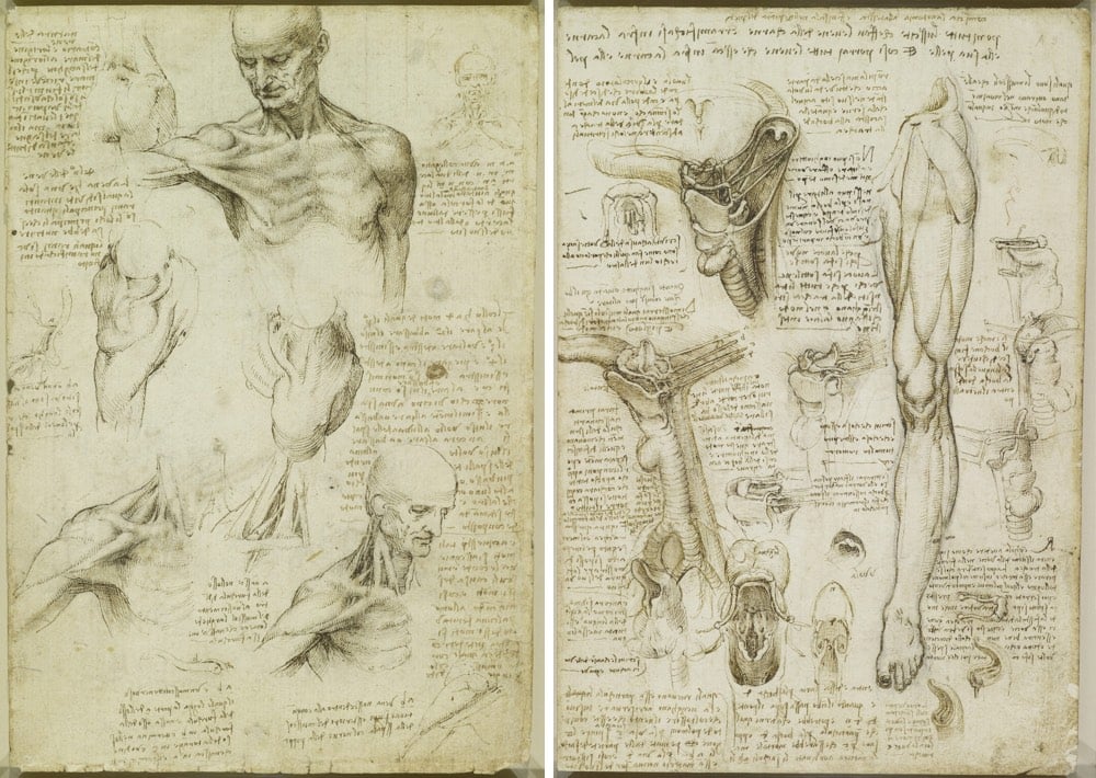
It’s easier to draw a hand, particularly a hand that appears to be moving (as Leonardo liked to do), if you know that’s going on underneath the skin. Looking carefully and purposefully at art, at anatomy, at the physical world, at people’s actions, at movies; it’s all the same skill that can be applied to anything.
I’ve been preoccupied with observation lately…the new kottke.org newsletter is named Noticing for good reason. Again, Leonardo factors in:
Isaacson argues that Leonardo’s observational powers were not innate and that with sufficient practice, we can all observe as he did. People talk in a precious way about genius, creativity, and curiosity as superpowers that people are born with but noticing is a more humble pursuit. Noticing is something we can all do.
Some people have been lucky enough to find themselves in paintings at art museums.
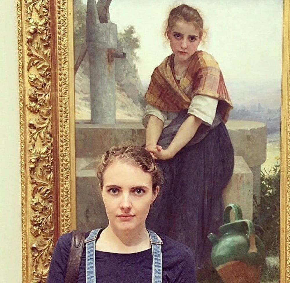
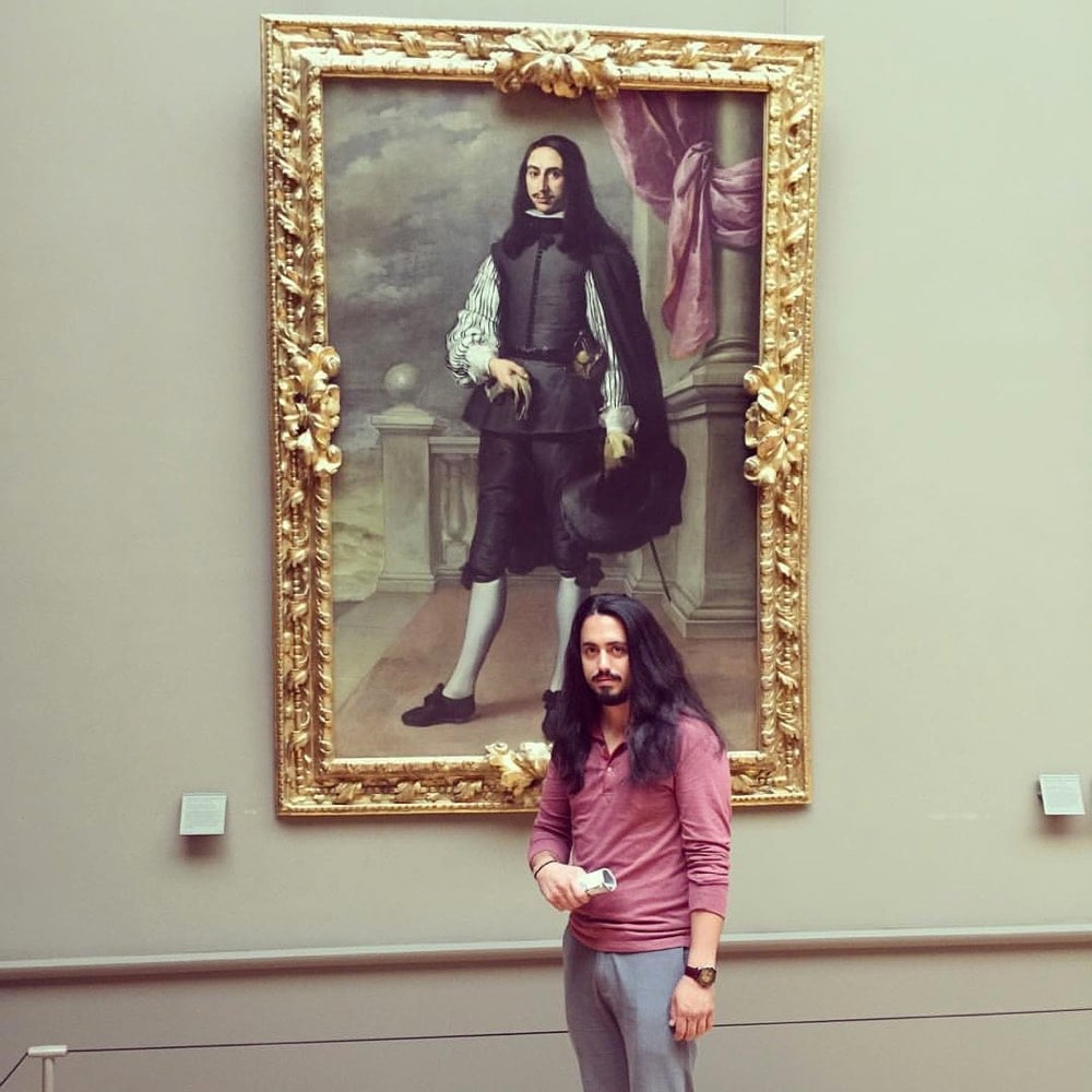
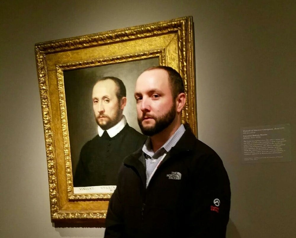
Now the Google Arts & Culture app lets you take a selfie and find your own art doppelganger. The results are kinds iffy — even when making my best Jesus-suffering-on-the-cross face, I couldn’t get it to match me with an actual Passion painting — but you can see some of the results here.
See also Stefan Draschan’s photos of people matching artworks.
Update: And the NY Times is on it!

Donald Hanson has created a digital art piece called Permanent Redirect that moves to a new URL every time someone views it.
A net art piece that moves to a new URL whenever someone views it. It is not possible to link to the art piece. Over time the art piece will become very hard to view. This is an experiment in introducing artificial scarcity into digital work.
So, it was here and then here but now it’s not, so good luck tracking it down. Or, ok, it’s not really the point, but you can cheat a little and find a screenshot on Twitter. (via @nickbaum)

For his Elephas Anthropogenus project, Uli Westphal collected European illustrations of elephants dating from the fall of Rome to the end of the Renaissance, a period of time when very few people actually knew what an elephant looked like.
After the fall of the Roman Empire, elephants virtually disappeared from Western Europe. Since there was no real knowledge of how this animal actually looked, illustrators had to rely on oral and written transmissions to morphologically reconstruct the elephant, thus reinventing an actual existing creature. This tree diagram traces the evolution of the elephant depiction throughout the middle ages up to the age of enlightenment.
See also famous logos drawn from memory and drawing all 50 states from memory.
Have you ever wondered why, when you’re driving along on a straight road in the Western US, there’s a weird curve or short zigzag turn thrown into the mix? Grids have been used to lay out American roads and houses since before there was a United States. One of the most prominent uses of the grid was in the Western US: the so-called Jefferson Grid.
The Land Ordinance of 1785, drafted by Thomas Jefferson, extended government authority over the Mississippi River and the Great Lakes regions. As a response to what he believed to be a confusing survey system already in use, Jefferson suggested a new grid system based on the rectangle. The grid divided land into plots one mile square, each consisting of 640 acres. The grid also placed a visible design upon a relatively untouched landscape.
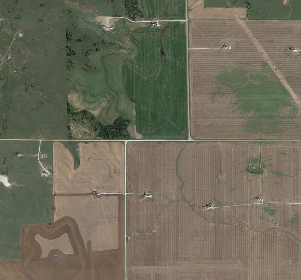
As most people know, the Earth is roughly spherical. When you try to cover the surface of a sphere with squares, they are not going to line up perfectly. That means, every so often, sections of the grid shift away from each other. Gerco de Ruijter’s short film, Grid Corrections, shows dozens of examples of places where this shift occurs and the corrections employed to correct them.
By superimposing a rectangular grid on the earth surface, a grid built from exact square miles, the spherical deviations have to be fixed. After all, the grid has only two dimensions. The north-south boundaries in the grid are on the lines of longitude, which converge to the north. The roads that follow these boundaries must dogleg every twenty-four miles to counter the diminishing distances.
If you want to look at some of the corrections yourself, try this location in Kansas (or this one). See that bend? Now scroll the map left and right and you’ll see a bunch of the north/south roads bending at that same latitude.
You can read more about de Ruijter’s project and grid corrections in this Travel & Leisure article by Geoff Manaugh.
Update: An email from my dad:
Hi son, just reading your blog on the section lines….don’t forget, you used to live on a correction line…that is why 3 of my 40’s were only 26.3 acres….
“40’s” refers to 40 acre plots…a common size for a parcel of land back when that area was divvied up. Wisconsin has so many lakes, rivers, and glacial features that interrupt the grid that it’s difficult to tell where the corrections are, but looking at the map, I can see a few roads curving at that latitude. Cool!
DeepDream is, well, I can’t improve upon Wikipedia’s definition:
DeepDream is a computer vision program created by Google engineer Alexander Mordvintsev which uses a convolutional neural network to find and enhance patterns in images via algorithmic pareidolia, thus creating a dream-like hallucinogenic appearance in the deliberately over-processed images.
The freaky images took the web by storm a couple of years ago after Google open-sourced the code, allowing people to create their own DeepDreamed imagery.
In the video above, Mordvintsev showcases a DeepDream-ish new use for image generation via neural network: endlessly zooming into artworks to find different artworks hidden amongst the brushstrokes, creating a fractal of art history.
Bonus activity: after staring at the video for four minutes straight, look at something else and watch it spin and twist weirdly for a moment before your vision readjusts. (via prosthetic knowledge)
Newer posts
Older posts

Socials & More