kottke.org posts about art

For New York Apartment, an art project commissioned by The Whitney, artists Sam Lavigne and Tega Brain compiled actual NYC real estate listings into a listing for one mega apartment for sale.
Compiled from actual online real estate listings, the artwork collapses the high and low ends of the market, architectural periods and styles, and neighborhoods and affordability into a single space that cumulatively creates a portrait of New York’s living spaces and the real estate market. Like a standard real estate ad, the listing shows the price, number of bed- and bathrooms, and square footage, all of which are updated weekly based on the city’s aggregated real estate listings.
Take some time to explore the project — take the 3D virtual tour, scroll through all of the bathrooms & closets, peruse the apartment features, and take the video tour:
Do you crave brilliant sunshine and the peace Zen behind closed doors at home, and the bustle and excitement of the big city at your doorstep?
Do you dream of a Manhattan life?
Do you dream of Brooklyn living with Manhattan in reach?
Do you have a thing for top floor apartments?
Do you have vision?
Do you like light?
Do you love to cook?
Do you love to entertain?
Do you need lots of closet space?
Do you own or plan to buy a car?
Do you prefer simple shaker style wood cabinets with solid surface counters or custom lacquer cabinets paired with a travertine marble?
Do you want a home just steps to the beach?
Do you want Katz Deli, Russ and Daughters or maybe some Economy Candy?
Contact information for all of the brokers is listed on the site in case you’re interested.
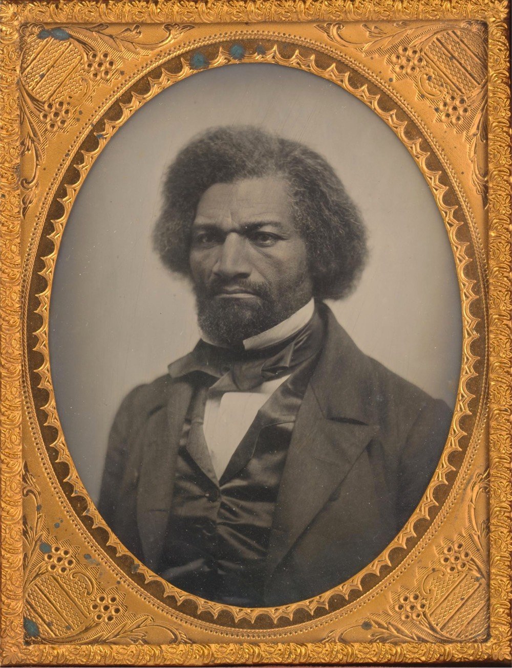
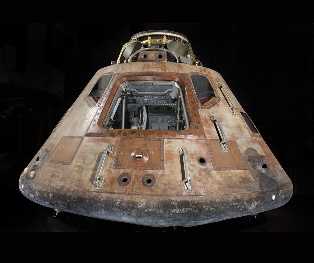
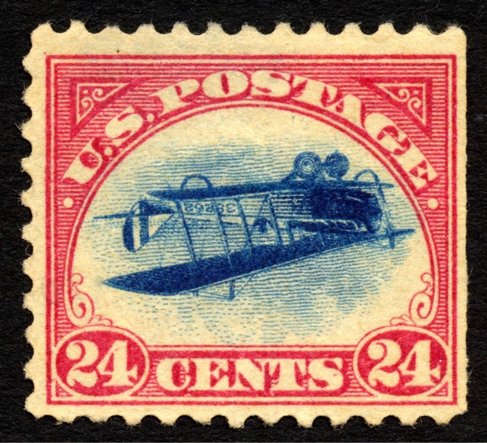
The Smithsonian Institution has released a massive trove of images and 3D models from their collections into the public domain, allowing the public to use the images however they see fit. From Smithsonian Magazine:
For the first time in its 174-year history, the Smithsonian has released 2.8 million high-resolution two- and three-dimensional images from across its collections onto an open access online platform for patrons to peruse and download free of charge. Featuring data and material from all 19 Smithsonian museums, nine research centers, libraries, archives and the National Zoo, the new digital depot encourages the public to not just view its contents, but use, reuse and transform them into just about anything they choose — be it a postcard, a beer koozie or a pair of bootie shorts.
And this gargantuan data dump is just the beginning. Throughout the rest of 2020, the Smithsonian will be rolling out another 200,000 or so images, with more to come as the Institution continues to digitize its collection of 155 million items and counting.
Part of the release is research data sets, 3D models of airplanes, chairs, and fossils, and developer tools like an API and GitHub repository. Here’s the Smithsonian’s official press release and a FAQ about the Open Access collection.

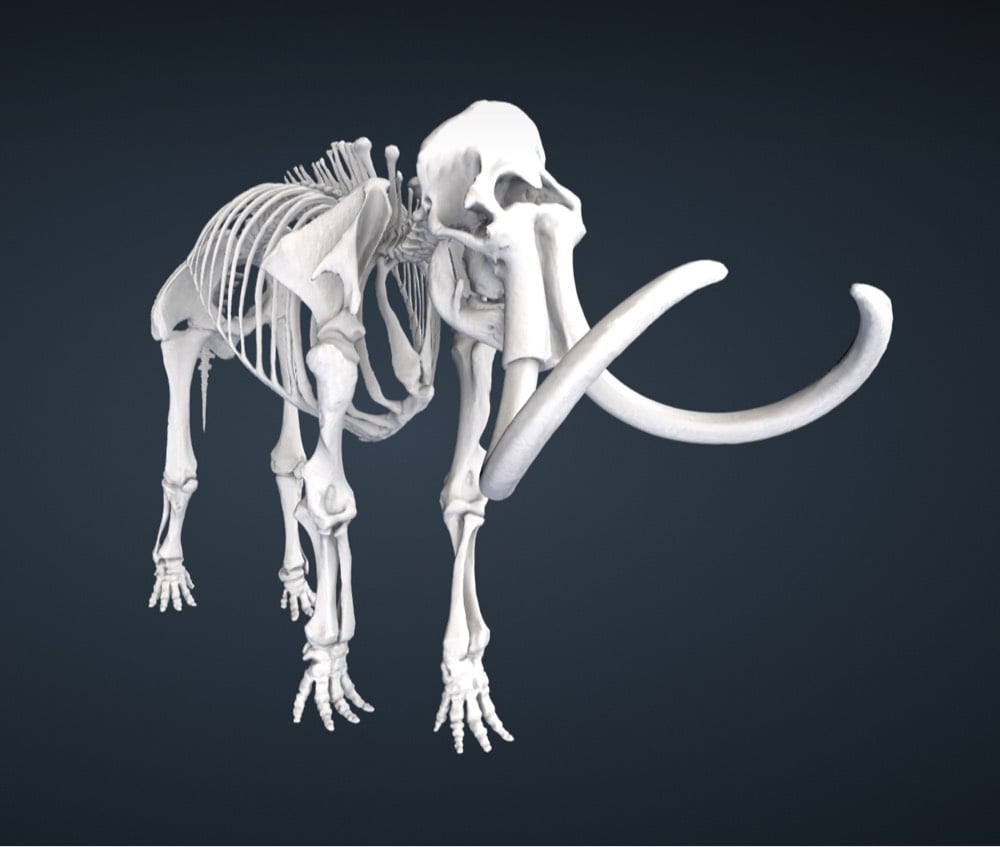
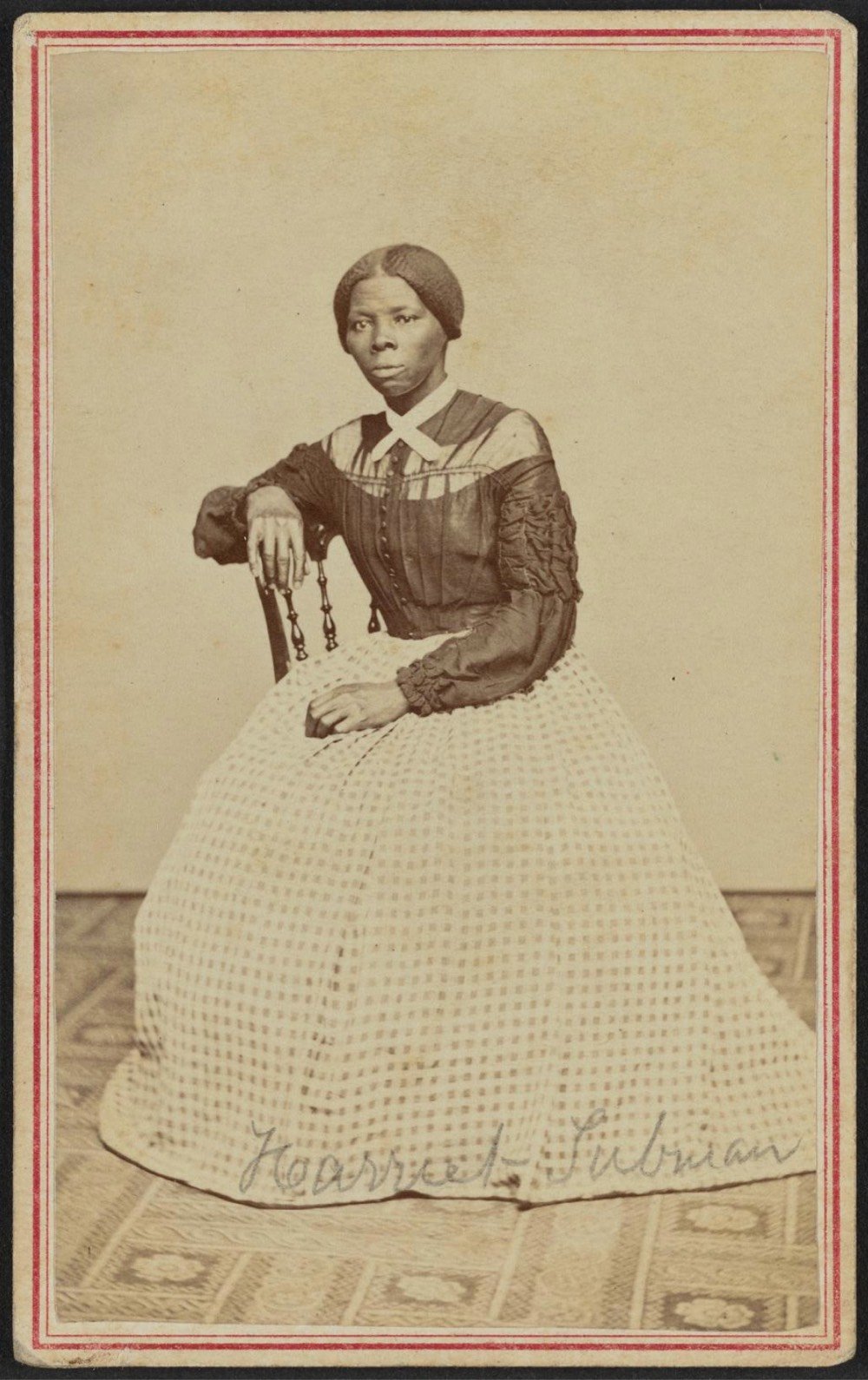

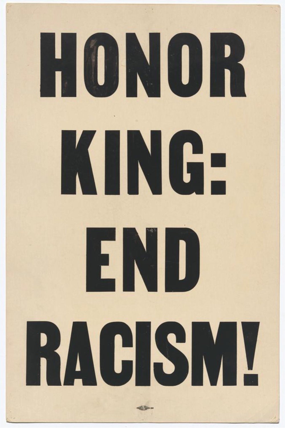
The images above are (from top to bottom): photograph of Frederick Douglass, 3D model of the Apollo 11 Command Module, inverted Curtiss Jenny stamp, 3D model & photographs of a tin of Madame C.J. Walker’s Wonderful Hair Grower, 3D model of a mammoth skeleton, carte-de-visite portrait of Harriet Tubman, 3D model of the 1903 Wright Brothers Flyer, a placard carried in the 1968 Memphis march.
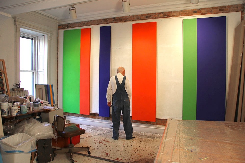
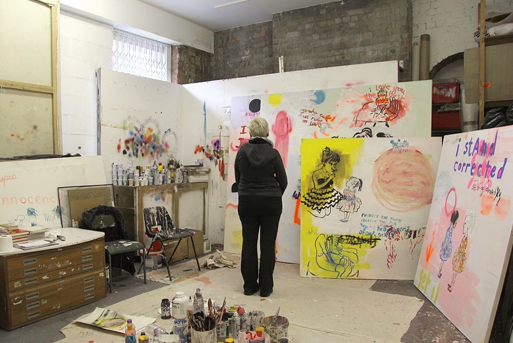
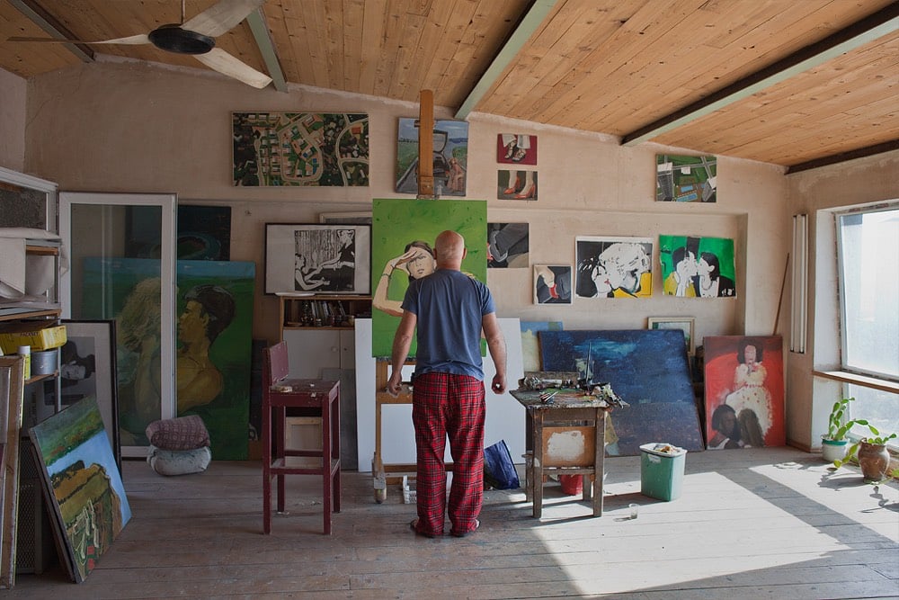
For more than 10 years now, André Smits has been traveling the world taking photos of artists (from behind) in their studios and out in the world. Earlier this year, Smits explained how the project got started:
He laughs, “I realized it was an alibi for getting in their studios, because most artists keep their doors shut and otherwise I would not get to come in. That was the beginning of the project, really. Then artists from other buildings in Rotterdam asked me to come to their place, it was like a snowball, it just started happening,” he recalls.
After Rotterdam, he visited Amsterdam and Antwerp, realizing the strength of the concept could take him all over the world. “So, I sold my house, quit my job, and now I am traveling everywhere, the project was developing in all different directions.”
It’s fun to get a glimpse into so many studios of working artists — they’re all very similar and yet different in the details. (via Noah Kalina, who Smits photographed in 2015)
For her video “The Real Thing”, filmmaker Julianna Villarosa used footage of Coca-Cola’s famous “I’d Like to Buy the World a Coke” commercial ruined by pouring Coke on VHS and film copies to draw attention to the company’s water privatization practices in Chiapas, Mexico, where there’s a water shortage on. From the video:
The Chiapas Highlands, one of Mexico’s wettest regions, has a water shortage. Many drink Coca-Cola, which is bottled nearby and often easier to find than clean water. On average, residents drink more than half a gallon of soda per day. Indigenous Tzotzil use Coca-Cola in religious ceremonies and medicinal treatments. Diabetes has become the second-leading cause of death in Chiapas. The local Coca-Cola plant extracts more than 300,000 gallons of water per day.
Simple, direct, and brilliant activist art — Villarosa uses the company’s literally corrosive product to physically destroy their feel-good advertising to draw attention to the real harm this US company is doing to people & ecosystems around the world. Here’s more on the Chiapas region and the residents’ reliance on Coke:
Coca-Cola’s penetration of the market in Los Altos has also been aided by a strategy of charging less in remote rural areas where a Coke in a returnable glass bottle is often scarcely more expensive than bottled water. As in most of Mexico, clean drinking water is not generally available even to those who can count on running water in their homes, which means many turn to soft drinks for basic hydration.
The irony of this is clear in an area known for its constant downpours and abundant springs, such as the one that attracted the Coca-Cola bottling company. Local activists say the company has so overexploited the spring that the city of San Cristóbal is now facing water shortages.
The activists allege this has been possible in part because Coca-Cola has friends in high political places. Between 2000 and 2006 the country’s president was Vicente Fox, a former head of Coca-Cola Mexico.
It all adds up to a perfect storm of sugar-related health issues in Los Altos. María del Socorro Sánchez, who is in charge of nutrition at the main hospital in San Juan Chamula, says only about one in 10 of the indigenous patients with diabetes accept there is any need to cut out sugar-packed drinks. “They just don’t believe that it is bad for them,” she said.
(via the morning news)
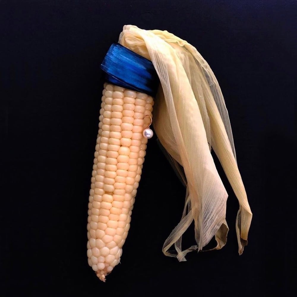
From artist Nanan Kang, Corn with a Pearl Earring. I have a bit of a thing for riffs on Vermeer’s masterpiece. See also Girl with a Pearl Earring and Point-and-Shoot Camera, The Girl with the Grande Iced Latte, Rihanna with a Pearl Earring, Girl with a Pearl Earring at the beach, and a Lego version of the painting. (via colossal)
Update: This is fun (courtesy of @jschulenklopper):
In Dutch (Vermeer’s native language) this one is even better. The original painting is called “Meisje met de parel” in Dutch, and corn is “mais”. So this one could be named “Maisje met de parel” which is pronounced almost identically.
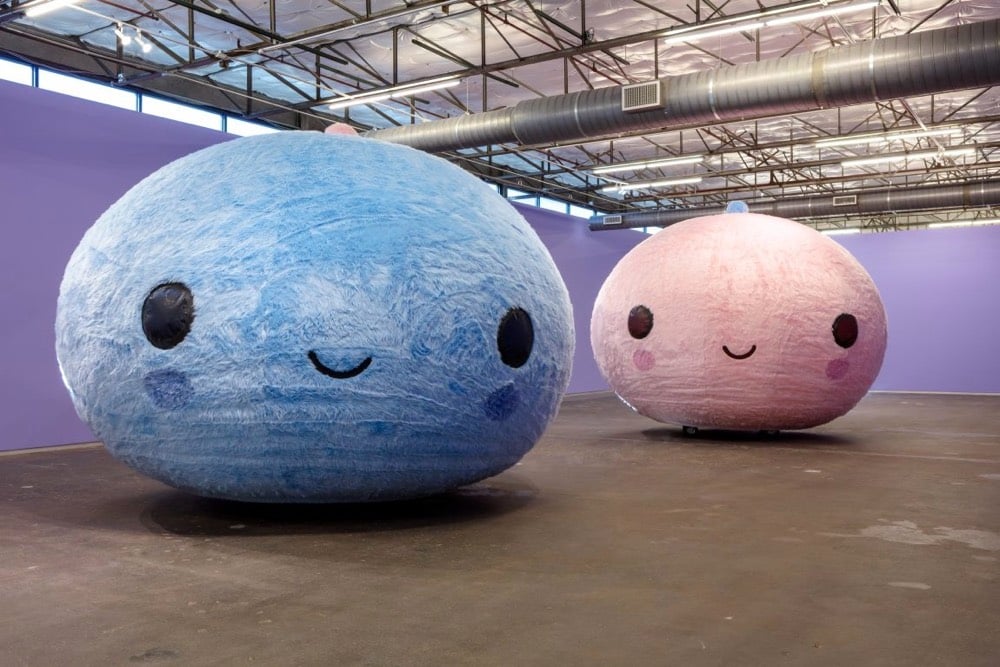
The latest exhibition by art duo FriendsWithYou is currently on view at Dallas Contemporary and includes a piece called The Dance that features two fuzzy orb-ish heads that slowly bobble around the room.
An interactive and communal experience, the exhibition actively incorporates audiences: two moving orbs serve as ambassadors as they meander along in a spiritual, cleansing, and comforting ritual set to a custom soundtrack in celebration of the beauty and power of togetherness.
You can see The Dance in motion on FriendsWithYou’s Instagram here and here. Natalie Gempel wrote about what it was like to pilot one of the orbs.
Submerged in my pink bubble, I spin, wobble, and drift aimlessly. Between the darkness and the humming of the air compressor, it’s almost like being in a sensory deprivation tank. I’m brought out of my haze when Carolina Alvares-Mathies, the Contemporary’s new Deputy Director, comes to check on me. It’s been cool, but I’m ready to exit.
The zipper opens and I stumble out. I don’t remember being born, but I assume it’s a similarly jarring feeling. Everything is too bright and I’m a little queasy. Still, I reentered the real world with the information I needed: It was weird in there, but I did have fun.
(thx, jenni)
In less than a minute, this Senegalese sand artist working on the island of Gorée creates a portrait by pouring sands of different colors over a wooden board with glue on it. The way that the painting emerges at the last second out of seeming disorder is a lovely shock, like a magic trick.
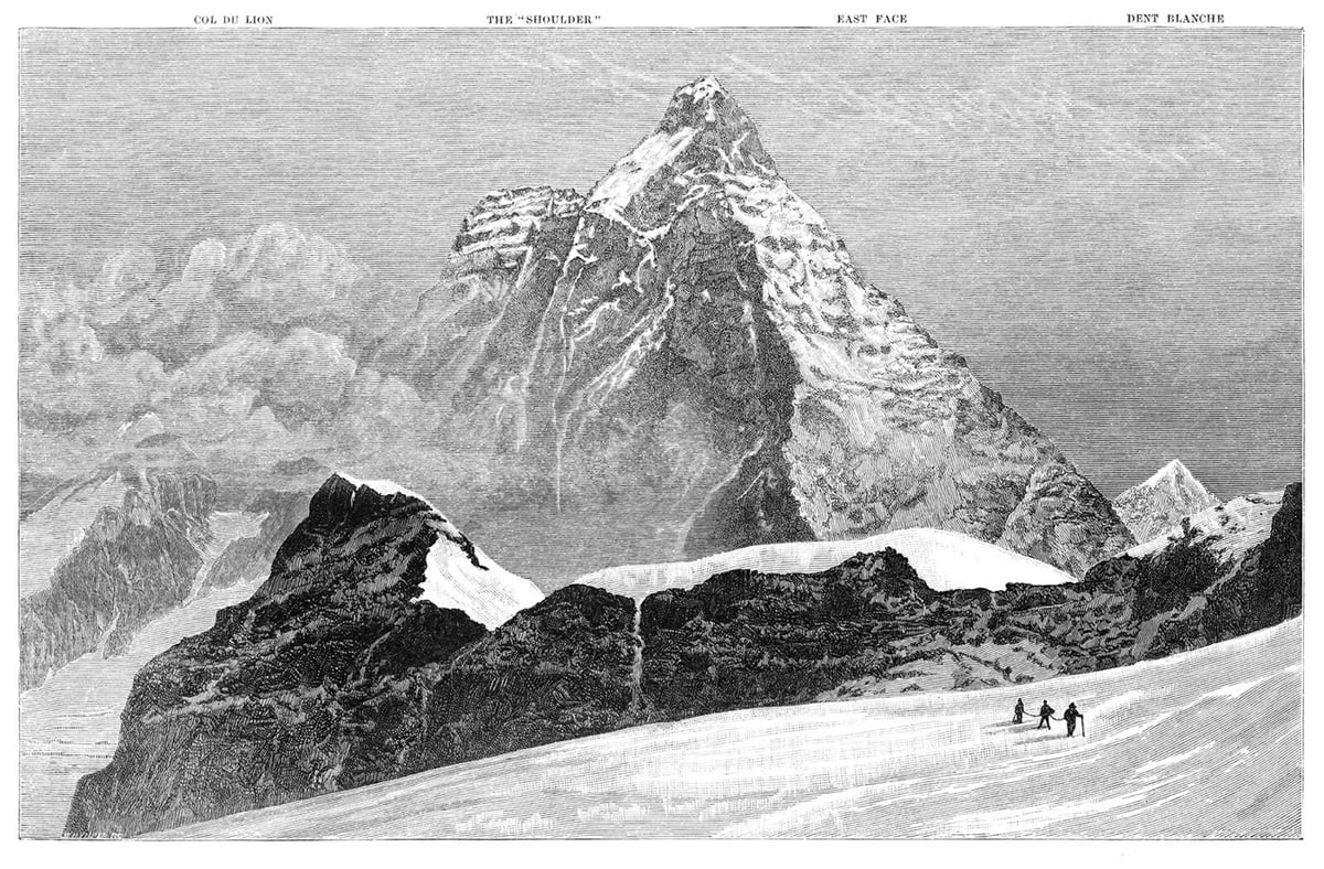
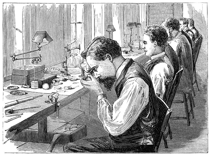
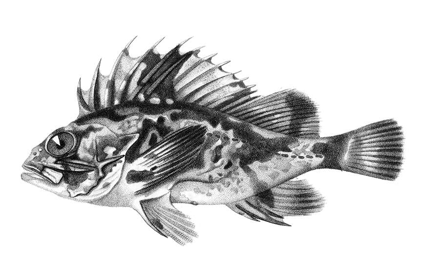
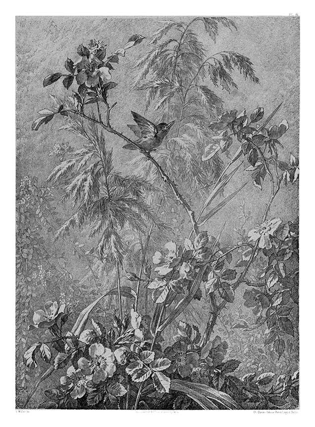
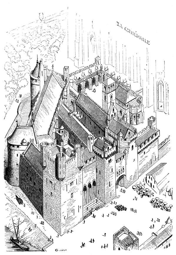
Here’s an enormous library of thousands of old book illustrations, with searchable name, artist, source, date, which book it was in, etc. There are also a number of collections to browse through, and each are tagged with multiple keywords so you can also get lost in there in that manner.
Though the team behind the site doesn’t specifically list the whole site as public domain, chances are a lot of the illustrations you’ll find are way out of copyright in most jurisdictions.
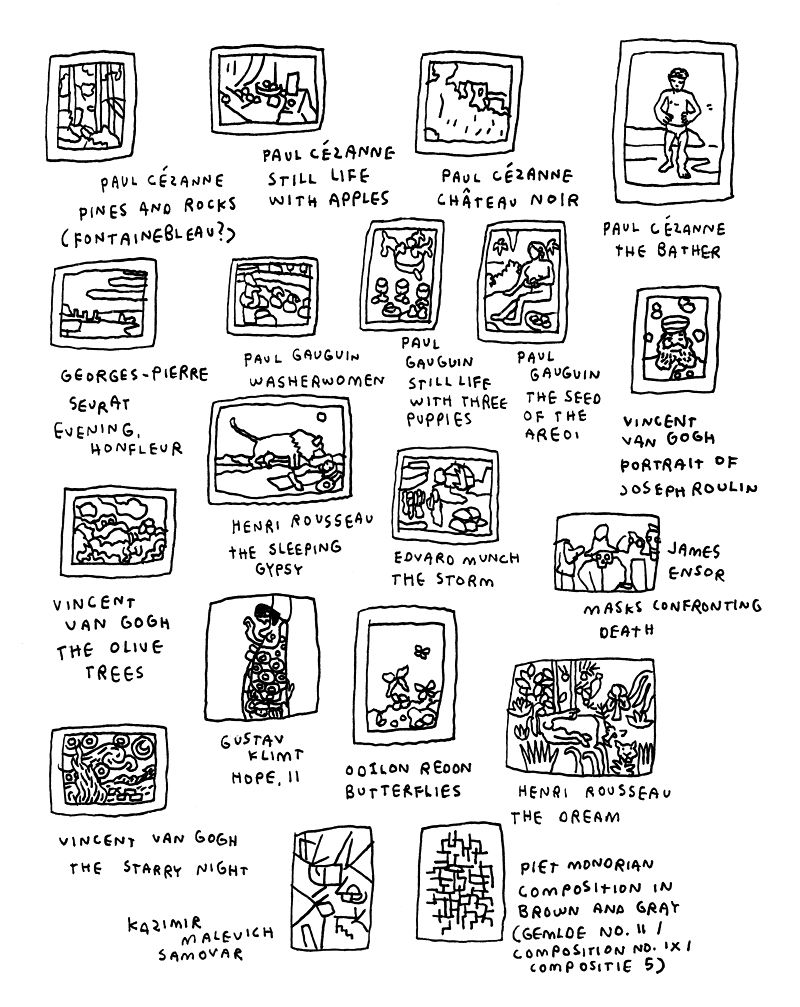
New York artist Jason Polan has passed away at the age of 37. The cause was colon cancer. From the NY Times obituary:
Mr. Polan’s signature project for the last decade or so was “Every Person in New York,” in which he set himself the admittedly impossible task of drawing everyone in New York City. He kept a robust blog of those sketches, and by the time he published a book of that title in 2015 — which he envisioned as Vol. 1 — he had drawn more than 30,000 people.
These were not sit-for-a-portrait-style drawings. They were quick sketches of people who often didn’t know they were being sketched, done on the fly, with delightfully unfinished results, as Mr. Polan wrote in the book’s introduction.
“If they are moving fast, the drawing is often very simple,” he wrote. “If they move or get up from a pose, I cannot cheat at all by filling in a leg that had been folded or an arm pointing. This is why some of the people in the drawings might have an extra arm or leg — it had moved while I was drawing them. I think, hope, this makes the drawings better.”
See also obituaries and remembrances from Gothamist and Ghostly. You can check out his blog and buy some of his work from 20x200.
I never met Polan in person — we corresponded via email occasionally, were admirers of each other’s work (I have several of his drawings), and I linked to his stuff sometimes (not enough) — but many of my friends knew him well and are reeling. There was a gentleness, a loving attention, that really came through in his work and in talking with the folks who knew him, that’s the way he was in person too. A kind soul, gone too soon. Rest in peace, Jason.
Update: Polan’s friend and long-time collaborator Jen Bekman posted a lovely tribute to him on 20x200.
Jason noticed. This was his thing. The effortlessness with which he could hone in on a person in the endless stream of the city, pick out just one or two details that made them unique and make art of them. People often asked me if I thought he had a photographic memory, and yea, maybe he did, but it wasn’t really the source of his genius. The source, I think, was his bottomless empathy and interest.
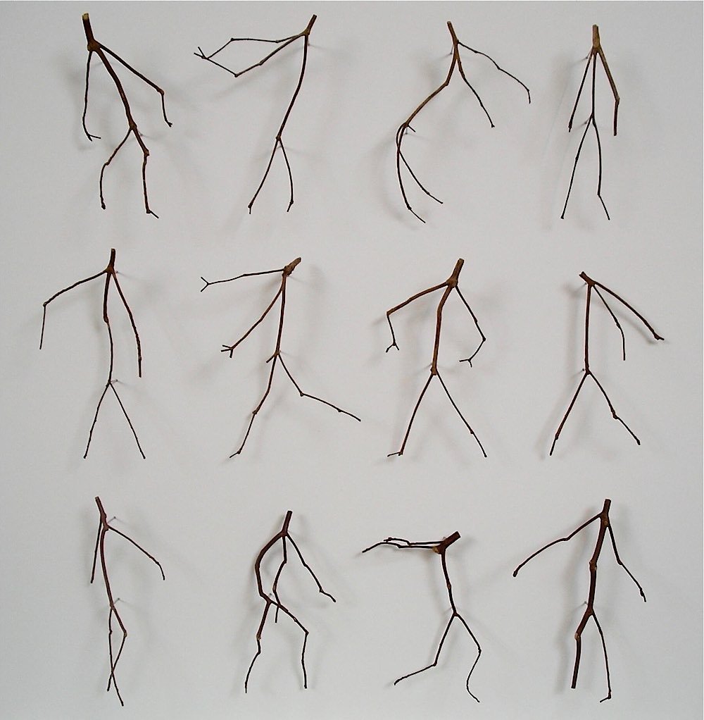
Artist Chris Kenny uses bits of twig from tree branches to make these interesting found art pieces that exploit the human tendency for pareidolia, including the one above of twigs in motion. (via @nicholsonbaker8)
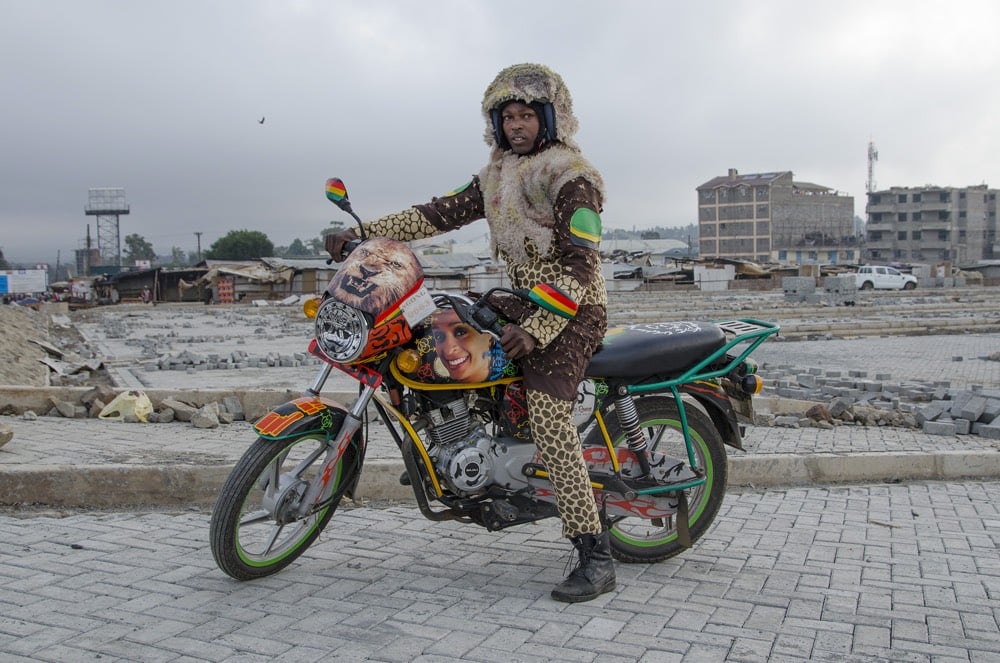

Ugandan-Kenyan fashion designer Bobbin Case and Dutch artist Jan Hoek have collaborated on a project called Boda Boda Madness. Inspired by the elaborate decorations used by some boda boda (motorbike taxi) drivers in Nairobi to attract customers, Case designed costumes to go with each bike’s decorations and Hoek photographed the results. After the fact, the coordinated outfits proved good for business:
The nice thing is that because of their new outfits their income went up, so they really kept on using their costumes.
Hoek also did a project called Scooters Will Never Die, in which he worked with a group of Africa refugees in Amsterdam to customize scooters to their riders’ specifications.

(via colossal)
Wow, check out the official posters for the Tokyo 2020 Olympic and Paralympic Games.
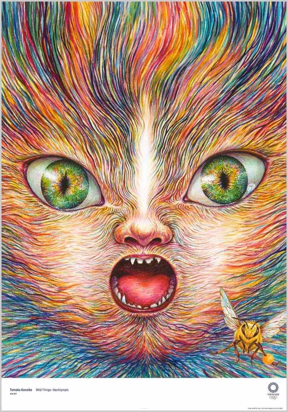
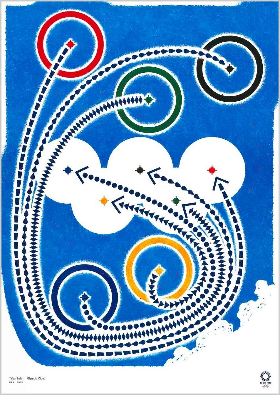
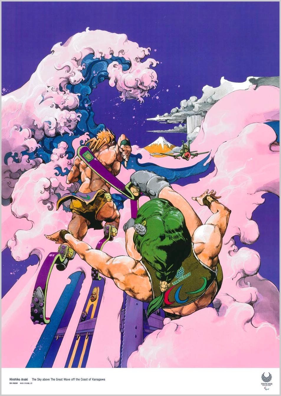
What an amazing array of styles and disciplines — there’s manga, shodo (calligraphy), Cubism, photography, surrealism, and ukiyo-e. That stunning poster at the top is from Tomoko Konoike — fantastic. As you can see, posters from past Olympics have tended towards the literal, with more straightforward depictions of sports, the rings, stadiums, etc. Kudos to the organizers of the Tokyo Games for casting their net a little wider. Love it. (via sidebar)
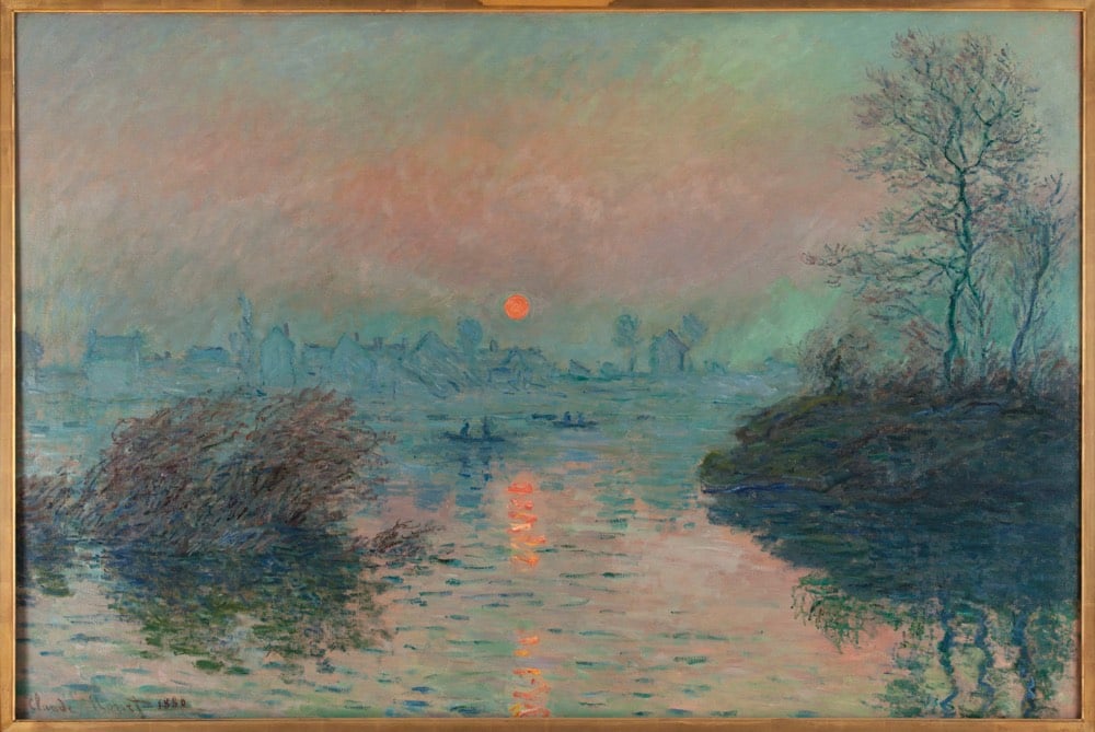
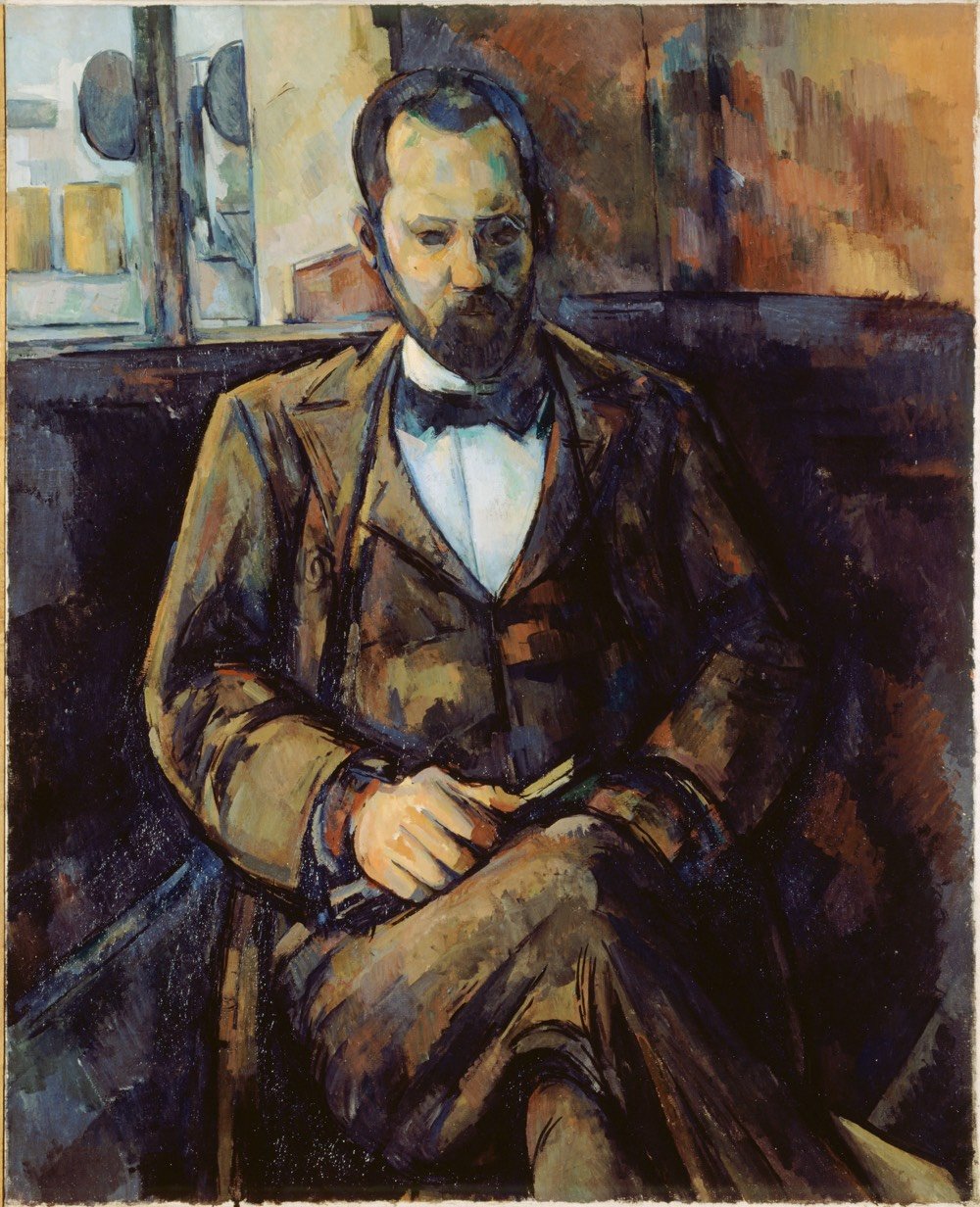
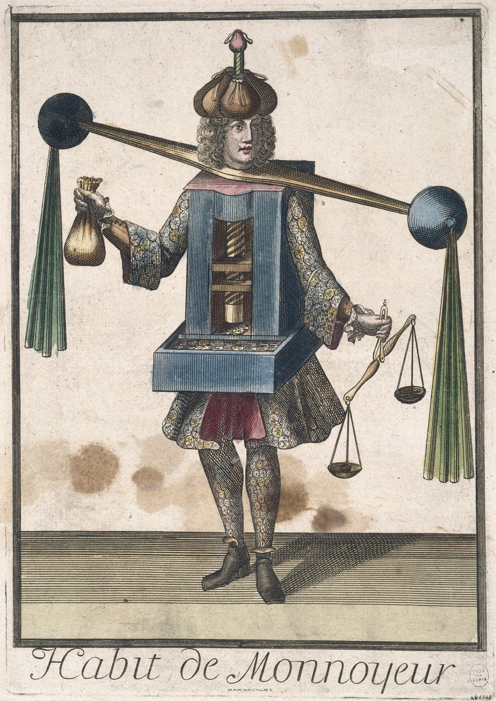
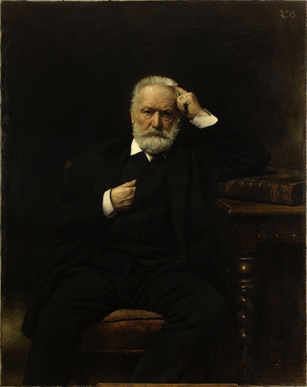
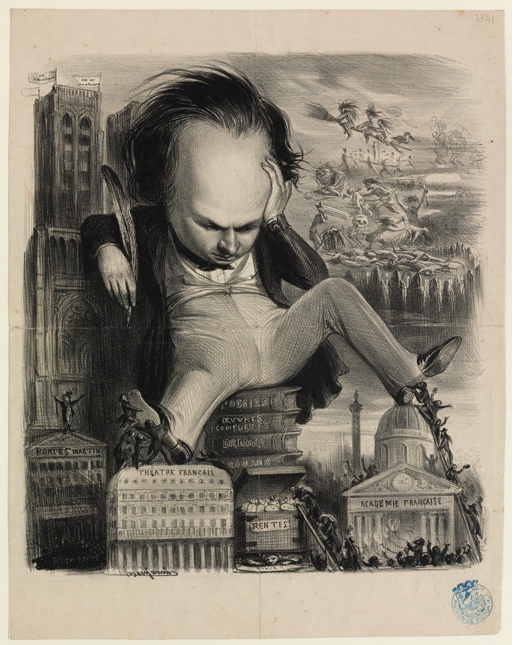
Paris Musées, a collection of 14 museums in Paris have recently made high-res digital copies of 100,000 artworks freely available to the public on their collections website. Artists with works in the archive include Rembrandt, Monet, Picasso, Cézanne, and thousands of others. From Hyperallergic:
Paris Musées is a public entity that oversees the 14 municipal museums of Paris, including the Musée d’Art Moderne de la Ville de Paris, Petit Palais, and the Catacombs. Users can download a file that contains a high definition (300 DPI) image, a document with details about the selected work, and a guide of best practices for using and citing the sources of the image.
“Making this data available guarantees that our digital files can be freely accessed and reused by anyone or everyone, without any technical, legal or financial restraints, whether for commercial use or not,” reads a press release shared by Paris Musées.
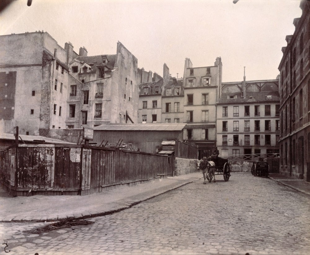
What a treasure trove this is. I was particularly happy to see a bunch of work in here from Eugène Atget, chronicler of Parisian streets, architecture, and residents and one of my favorite photographers.
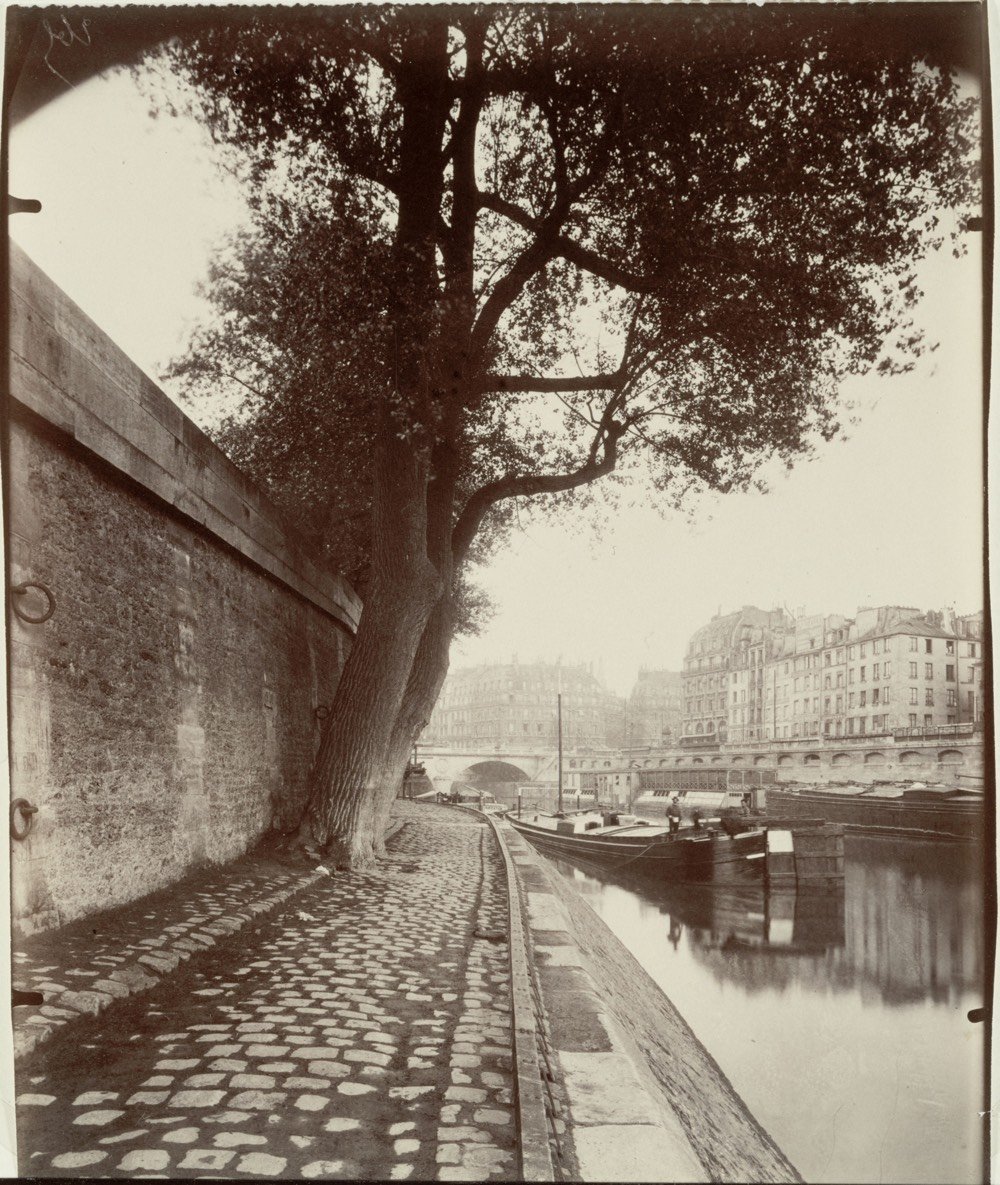
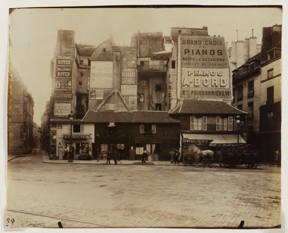
(via @john_overholt)
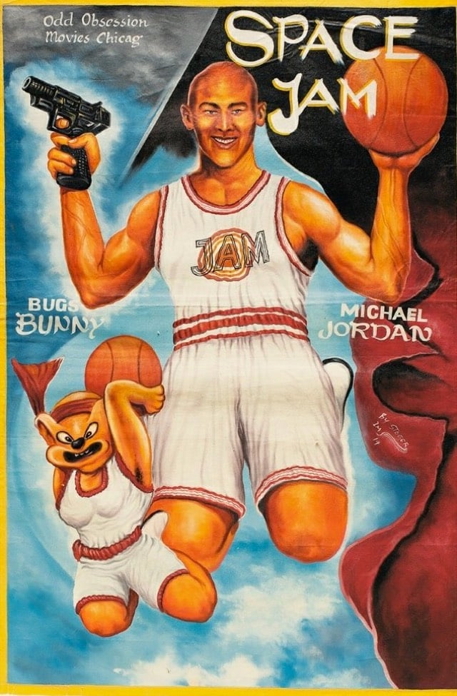
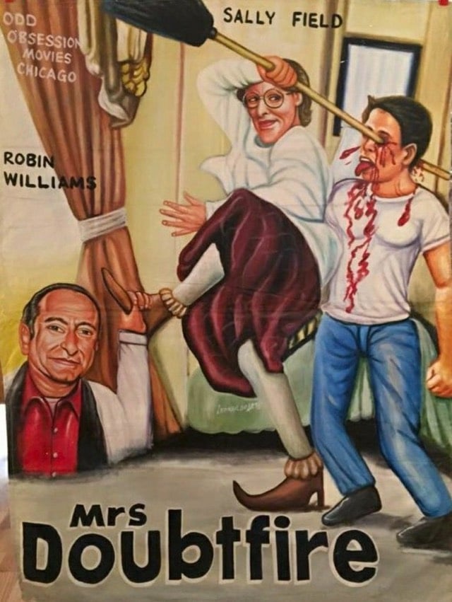

In order to drum up business for local movie theaters in Africa (most notably in Ghana), theater owners would commission local artists to paint movie posters.
When Frank Armah began painting posters for Ghanaian movie theaters in the mid-1980s, he was given a clear mandate: Sell as many tickets as possible. If the movie was gory, the poster should be gorier (skulls, blood, skulls dripping blood). If it was sexy, make the poster sexier (breasts, lots of them, ideally at least watermelon-sized). And when in doubt, throw in a fish. Or don’t you remember the human-sized red fish lunging for James Bond in The Spy Who Loved Me?
“The goal was to get people excited, curious, to make them want to see more,” he says. And if the movie they saw ended up surprisingly light on man-eating fish and giant breasts? So be it. “Often we hadn’t even seen the movies, so these posters were based on our imaginations,” he says. “Sometimes the poster ended up speaking louder than the movie.”
You can check out more of these amazing artworks in this Twitter thread, this BBC story, on the AIGA site, and at Poster House, which has an exhibition of these posters up through Feb 16.
Update: I removed this modern-day spoof of the Ghanaian posters from the post. The tell is the reference to this amazing GIF. (thx, erik)
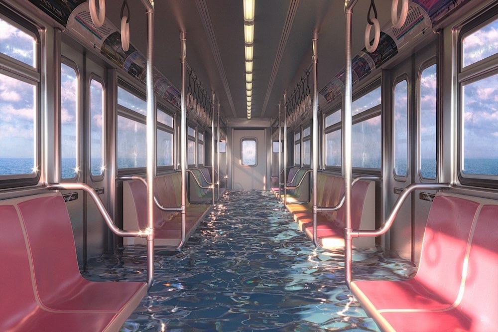
Inspired by a trip to Venice, the world’s most prominent example of what life could be like in many of our coastal cities in the years to come, Hayden Williams made a series of 3D rendered images showing what our world might look like underwater. (via the morning news)
Boston Rare Maps recently sold a nine-foot-high cloth map from 1899 that shows a geographic interpretation of the Book of Mormon.
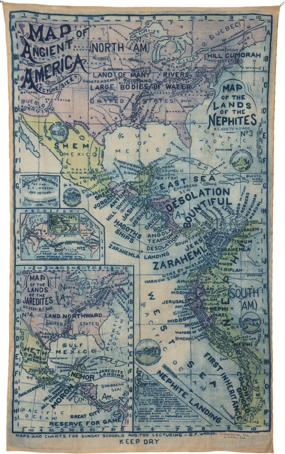
The map was an official production of the Reorganized Church of Jesus Christ of Latter Day Saints (RLDS) in Independence, Missouri. The RLDS (known since 2001 as the Community of Christ), is a reformist branch of the Church of Latter Day Saints, established in 1860.
You can read more about the proposed setting of the Book of Mormon on Wikipedia and its adherents’ belief that the indigenous peoples of the Americas are descended from Israelites.
The Book of Mormon is based on the premise that two families of Israelites escaped from Israel shortly before the sacking of Jerusalem by Nebuchadnezzar and that they constructed a ship, sailed across the ocean, and arrived in the New World as founders of Native American tribes and eventually the Polynesians. Adherents believe the two founding tribes were called Nephites and Lamanites, that the Nephites were white and practiced Christianity, and that the Lamanites were rebellious and received dark skin from God as a mark to separate the two tribes. Eventually the Lamanites wiped out the Nephites around 400 AD, leaving only dark skinned Native Americans. The descent of Native Americans from Israel is a key part of The Church of Jesus Christ of Latter-day Saints’s foundational beliefs.
(via @john_overholt)
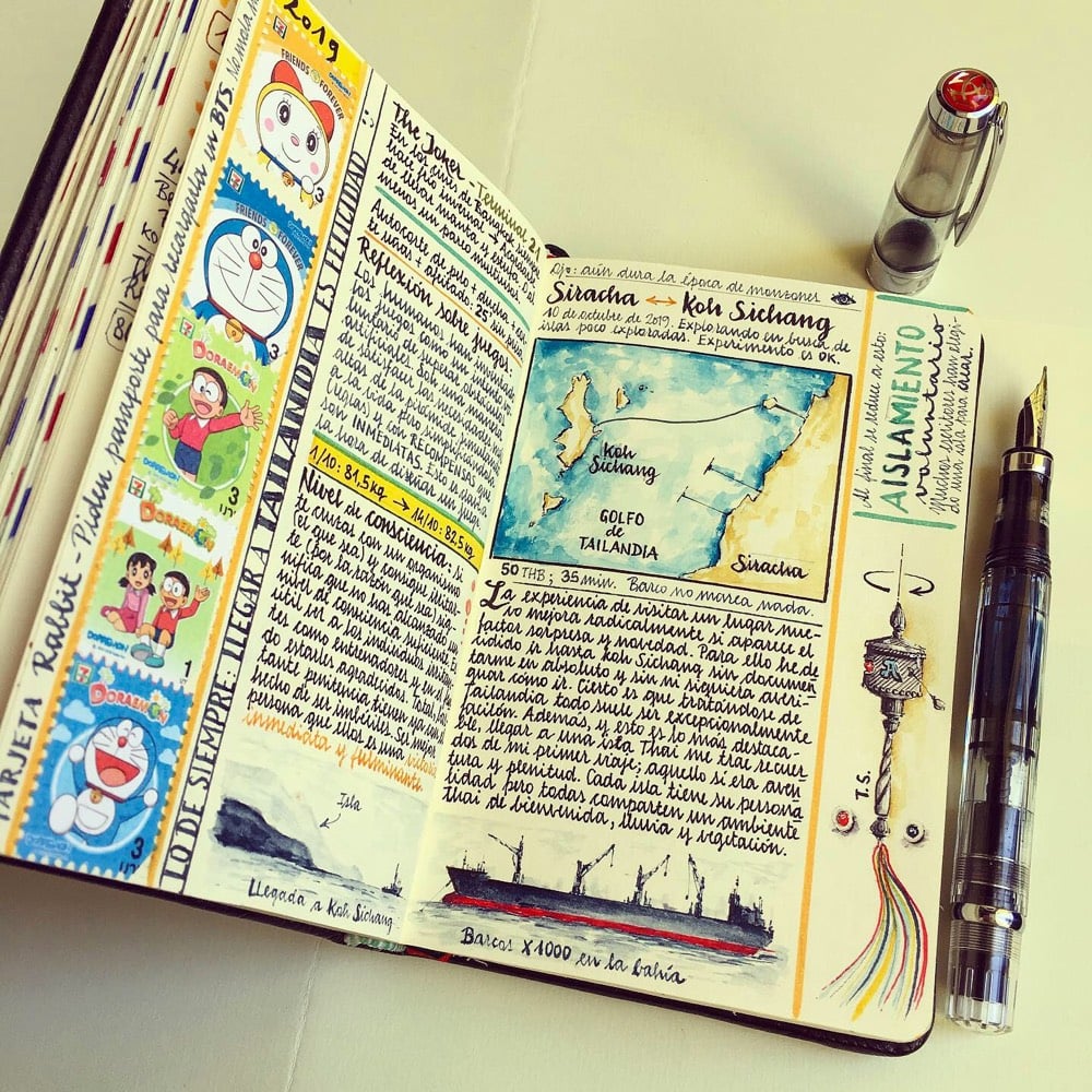
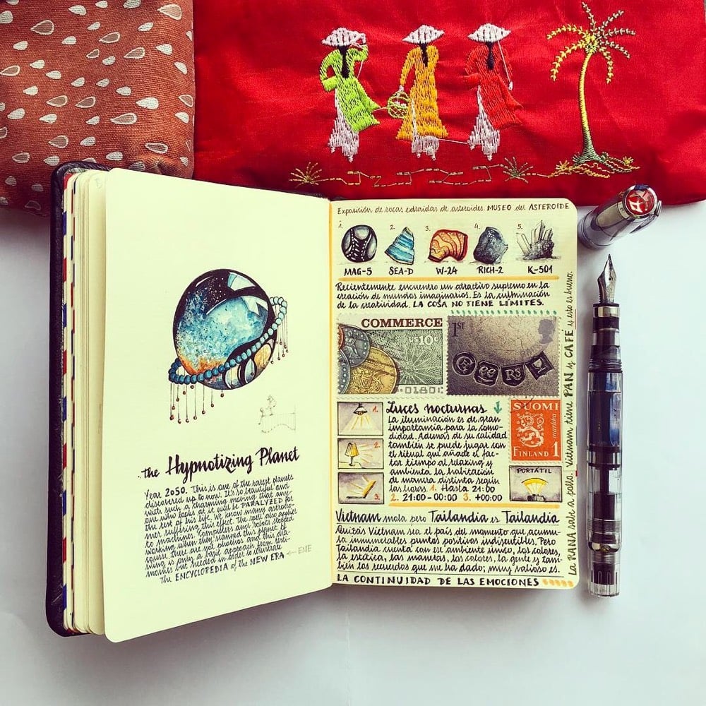
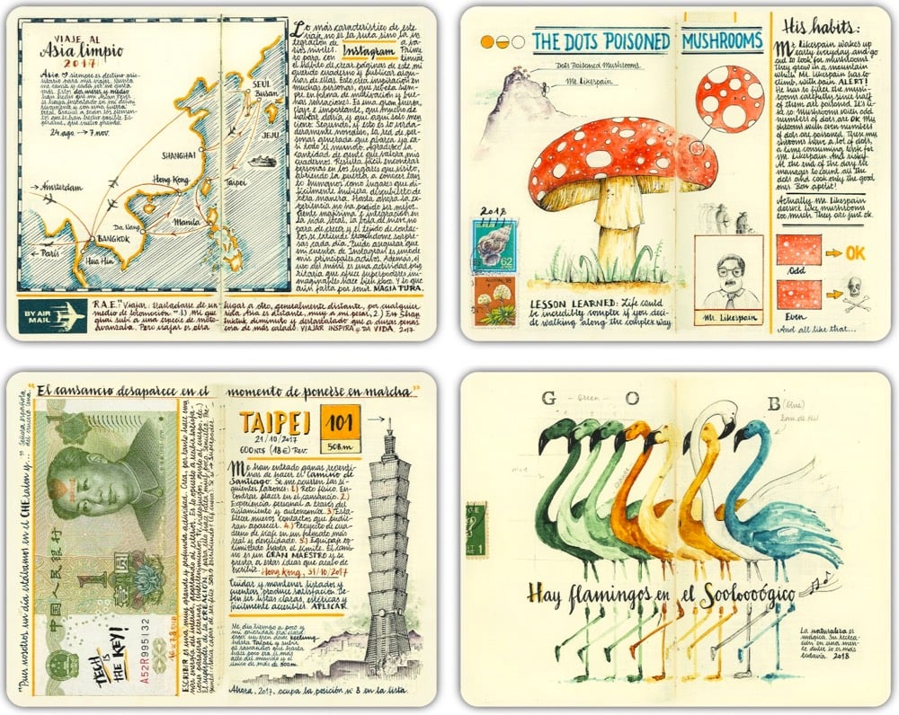
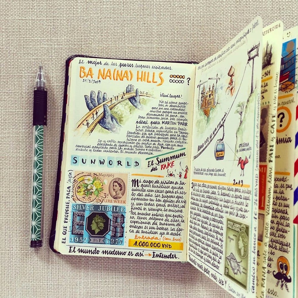
Good God, these hand-drawn & painted notebooks by José Naranja documenting his travels are fantastic! From Colossal:
Formerly an aeronautic engineer, Naranja now archives his thoughts while visiting foreign countries by hand-crafting journals replete with items like collected stamps, an illustration of the periodic table, and a study of fountain pens. Each mixed-media page centers on a theme, such as the culture surrounding eating a bowl of ramen or the flamingos found in a zoo.
Whenever I see something like this, it makes me want to learn how to draw/paint better than my current 4th grade level.1 I spent about 45 minutes poring over his work just now. So creative & exacting…look at that handwriting! And check out the tiny box of watercolors he carries with him.
You can keep up with Naranja’s latest adventures on his blog or on Instagram. If you’d like to buy some of his art — including a bound copy of some of his notebooks — there’s a small shop. (via colossal, which is also endlessly creative & meticulous)
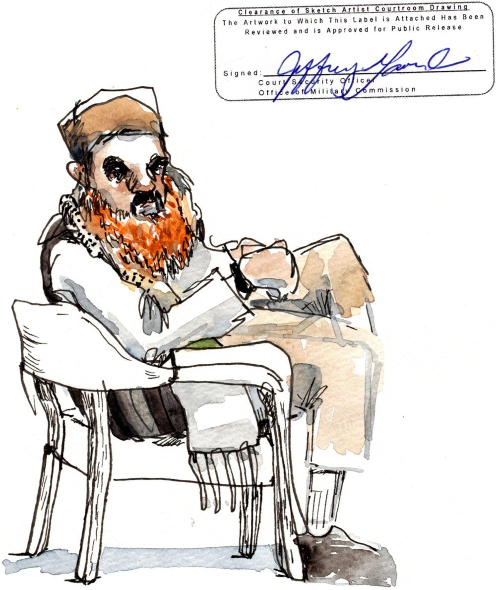
Illustrator Wendy MacNaughton spent a week at Guantánamo Bay sketching the proceedings at the 9/11 military court for this NY Times piece. In a behind-the-scenes piece, MacNaughton describes how she made the drawings, including the creative challenge posed by the restrictions and censorship enforced by US military officials.
Of the 30-something drawings I presented, Mr. Lavender shook his head at only two. The first contained some classified items in the courtroom. That made sense. The second was a handwritten list of everything that I was not allowed to draw, which I’d made to use as a reminder while working. I wanted to keep it. He refused.
I argued that the information it contained had been disclosed elsewhere. But Mr. Lavender and his supervisor came to the conclusion that my handwritten list was indeed a drawing, technically containing things I couldn’t draw. My “No” list was a no-go.
That’s Guantánamo.
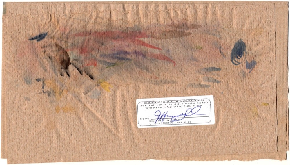
Every drawing she made needed a signed approval sticker from the court’s censor, and in this piece and on Instagram, MacNaughton didn’t photoshop the sticker out, reinforcing that the censorship is a vital part of the story she’s trying to tell. Even the paper towel she used to clean her paint brushes needed a sticker:
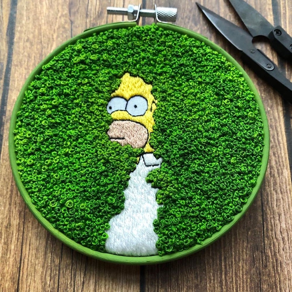
Move over, every other craft project — this Homer Simpson disappears into the bushes embroidery piece by Rayna of Hermit Girl Creations is the best embroidery in the history of the world. The scene is taken from a 1994 episode of The Simpsons called Homer Loves Flanders and has become a bit of a meme in recent years; here’s the clip:
Check out her Instagram or Etsy shop — she does a lot of other Simpsons-based embroidery as well as Charlie Brown, The Office, Dr. Seuss, Frog & Toad, Stranger Things, and Futurama. Looks like she takes commissions via Instagram DM.
Hélène Delmaire paints portraits of girls without eyes.
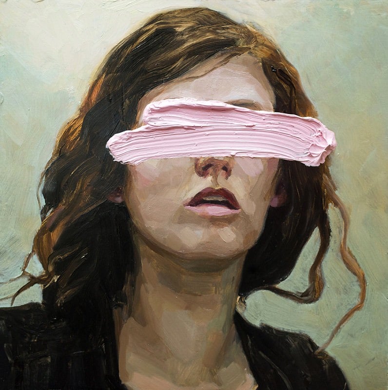
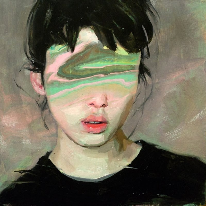
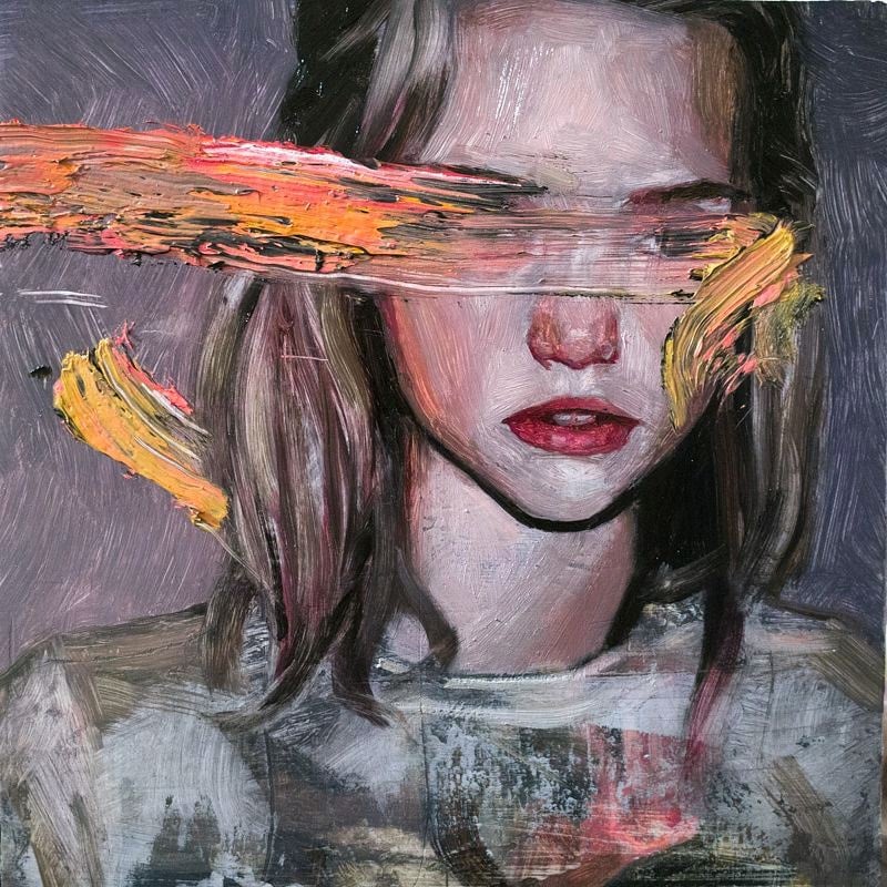
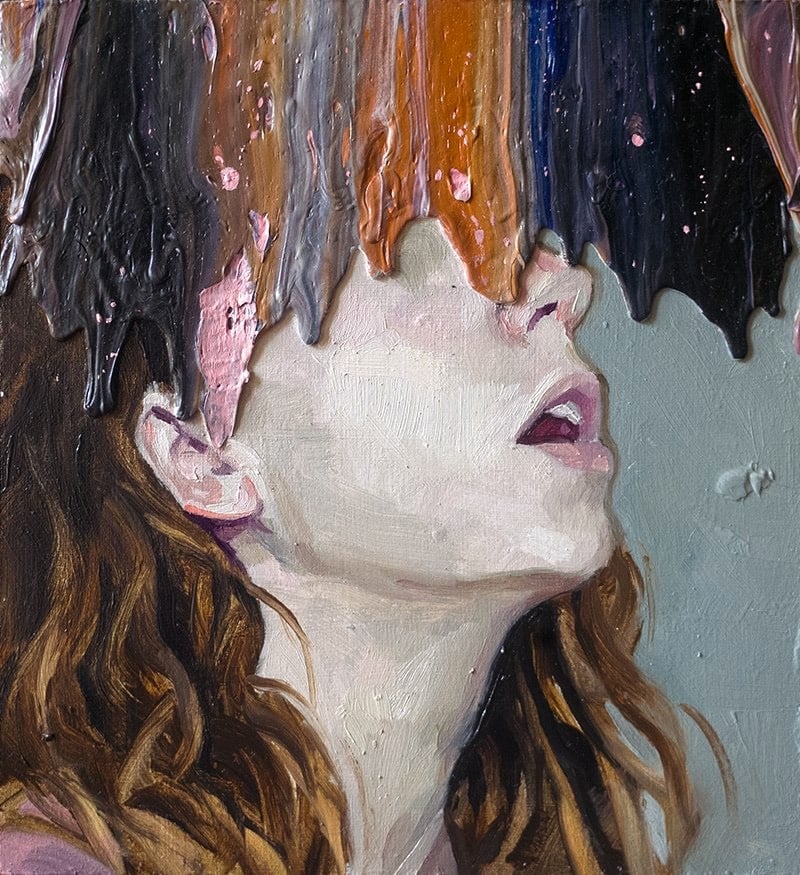
Delmaire did all of the paintings for the film Portrait of a Lady On Fire and even appears painting in the film.
I did pretty much all the paintings except the one that’s without a face. Céline and the actresses would work out how the scene was going to go. Once that was set up, I’d come, take a photo and while they were shooting the scenes, I went to a little corner of the castle and did my sketches.
Delmaire sells originals and prints of her work here. (via @alteredq)
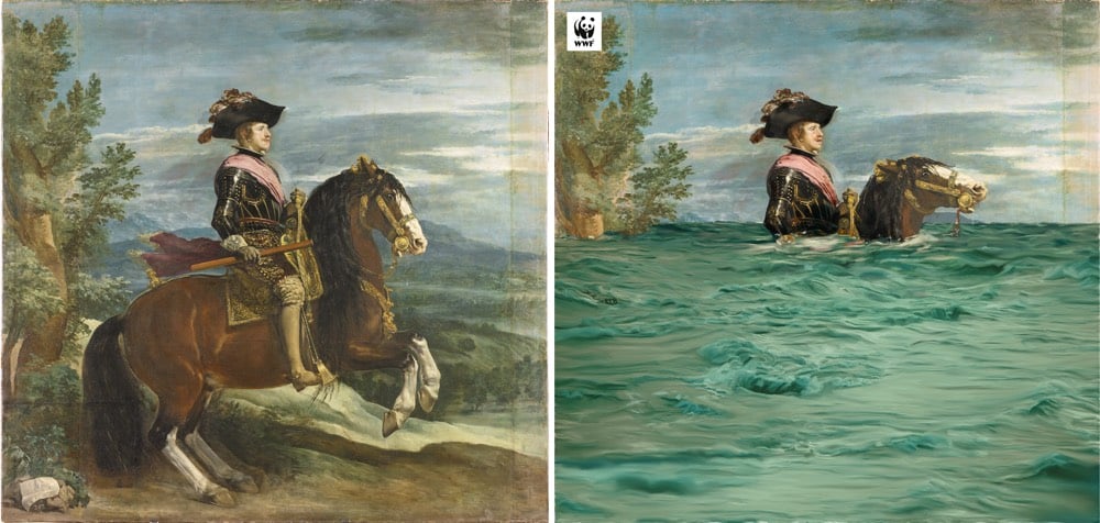
In collaboration with the Prado Museum in Madrid, the World Wildlife Fund altered a few paintings from the museum’s collection to highlight the future effects of climate change: extinction of species, sea level rise, desertification, and climate refugees.
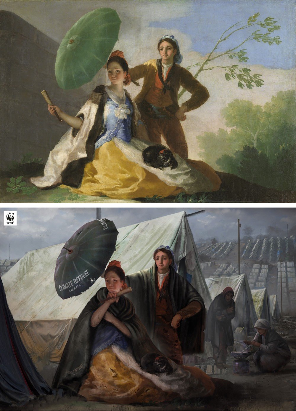
(via open culture)
A team of archaeologists has found a massive painting in a cave in Indonesia that uranium dating analysis shows to be around 43,900 years old, which they say is “currently the oldest pictorial record of storytelling and the earliest figurative artwork in the world”.
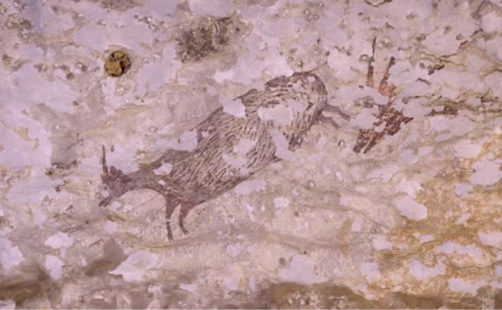
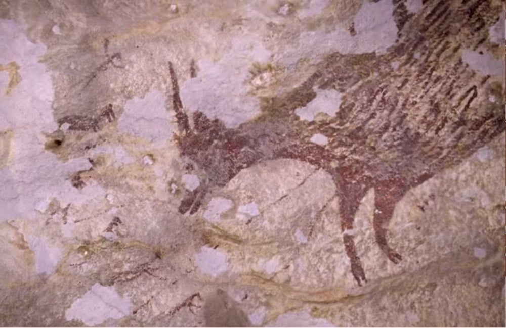
Cave painting was assumed to have originated in Europe, but these Indonesian paintings are thousands of years older. From an NPR piece on the discovery:
Genevieve von Petzinger, a paleoanthropologist at the University of Victoria, says the discoveries in her field are happening very quickly, thanks to newer technology such as the technique used to date the hunting scene. “I think the overall theme here really is that we’ve vastly underestimated the capacity of our ancestors,” she says.
She says the oldest cave paintings in Europe and Asia have common elements. And she thinks that even older paintings will eventually be found in the place where both groups originated from.
“Personally, I think that our ancestors already knew how to do art before they left Africa,” von Petzinger says.
Von Petzinger is the scientist behind one of the most intriguing things I learned this year, that the Stone Age symbols found in caves all over the world may be part of a single prehistoric writing system.
I ran across the work of Yellena James on Instagram the other day and my inner emoji face went all heart-eyes. I love her delicate organic imagery inspired by flowers, coral, and other natural forms.
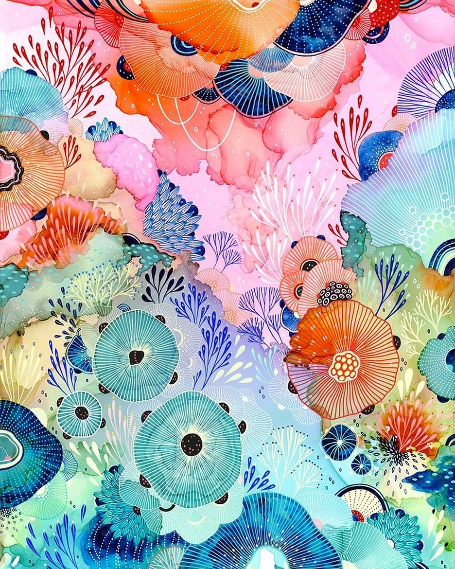
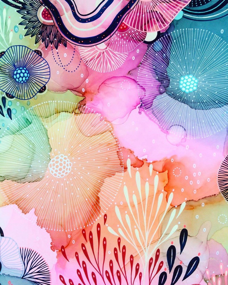
James has a lot of irons in the fire: she sells prints of her work on Etsy (scarves too!), works with a number of brands on design projects, published a book on learning how to draw using nature as a guide, regularly exhibits her art in galleries & shows, and does painting tutorials for the likes of Adobe.
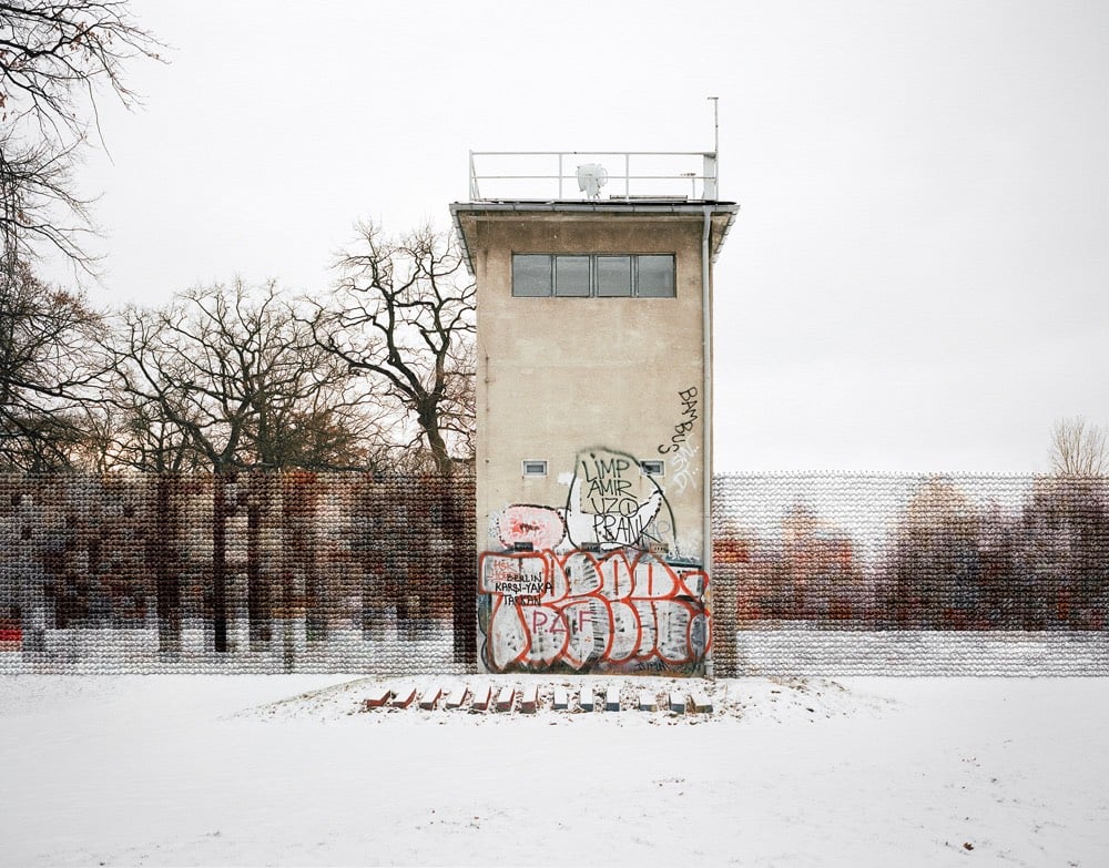
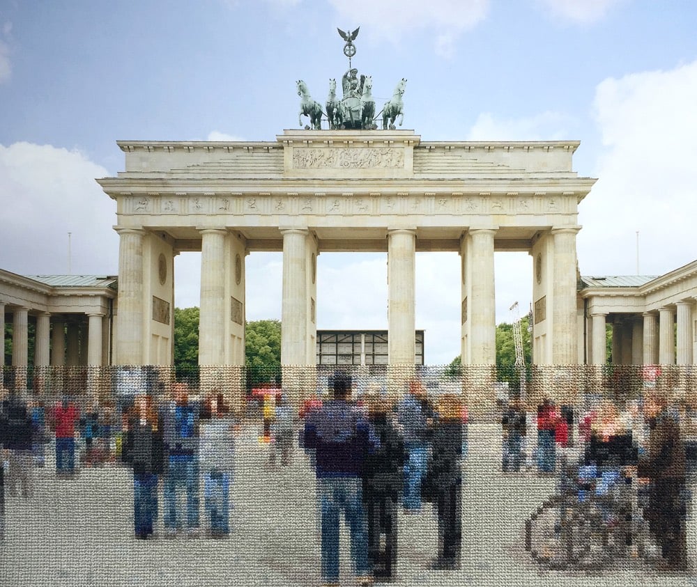
For her series called Berlin, artist Diane Meyer embroiders the Berlin Wall back into modern-day scenes of the once-divided German city. Meyer hand-sews the thread right onto the photographs.
In many images, the embroidered sections represent the exact scale and location of the former Wall offering a pixelated view of what lies behind. In this way, the embroidery appears as a translucent trace in the landscape of something that no longer exists but is a weight on history and memory.
(via colossal)
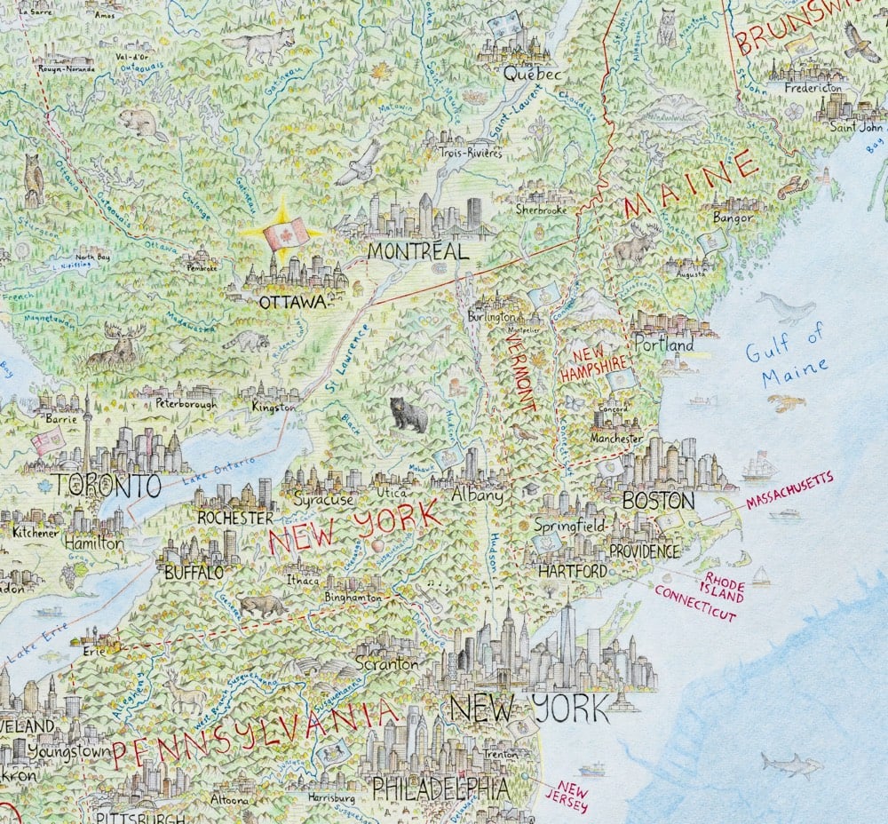
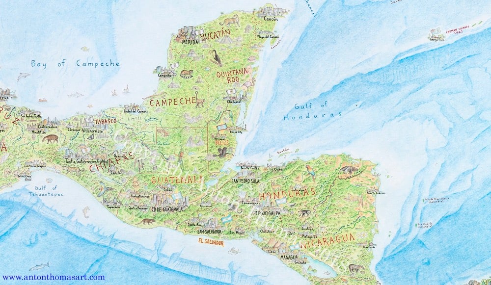
Anton Thomas has been working for the last five years on a huge hand-drawn map of North America.
North America: Portrait of a Continent is drawn completely by hand with colour pencil and pen. It is a 5 x 4 feet (150 x 120 cm) perspective projection of the entire region, spanning from Alaska to Panama; Greenland to the Caribbean. There are tens of thousands of features, including 600 individual cities and towns.
Looks fantastic. He finished it in February and is getting ready to open pre-orders for prints sometime this month.
Update: Prints of the map are available on Thomas’ store. He also made a video tour of the Mississippi River, in which he shares what all the little details on the map signify along the river’s meandering course.

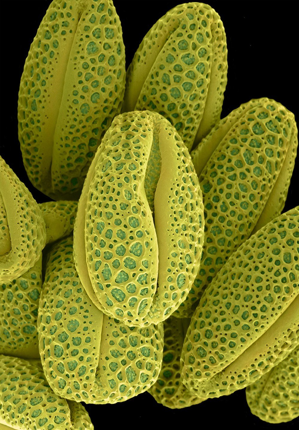
Artist Rob Kesseler is a master of the microphotography of plants and their intricately small parts (like pollen, cells, and seeds). At Colossal, Kessler says a childhood gift of a microscope set him on his way.
“What the microscope gave me was an unprecedented view of nature, a second vision,” he writes, “and awareness that there existed another world of forms, colours and patterns beyond what I could normally see.” The artist says his use of color is inspired by the time he spends researching and observing, and that just like nature, he employs it to attract attention.
Check out much more of Kesseler’s work on his website. (via colossal)
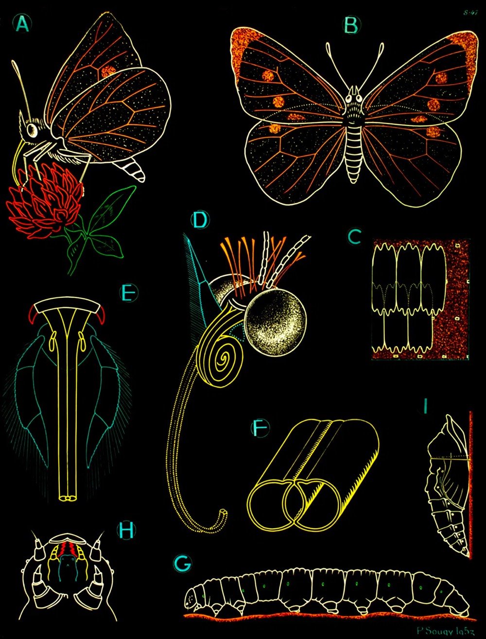
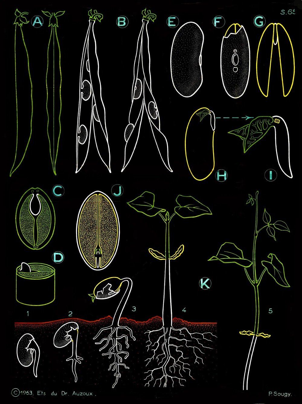
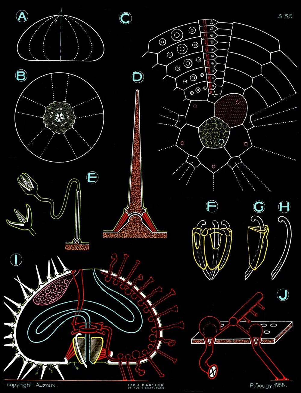
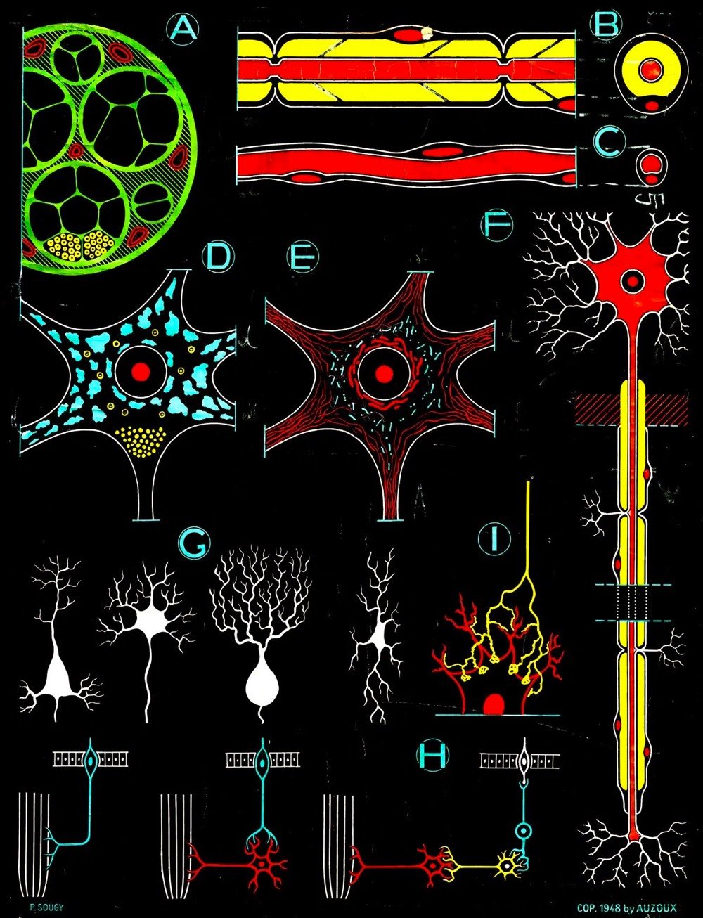
A flea market find by a friend spurred Maria Popova to rediscover and restore Paul Sougy’s mid-century educational illustrations of plants, animals, and the human body.
In the 1940s, Paul Sougy — a curator of natural history at the science museum of the French city of Orléans, and a gifted artist — was commissioned by the estate of the pioneering 18th-century French naturalist and anatomist Louis Thomas Jérôme Auzoux to create a series of illustrations based on Auzoux’s work, to be used in textbooks, workbooks, transparencies, and large-scale educational charts for classroom walls.
Lovely work. The restored illustrations are available as prints — just click on any of the images in the post or visit Popova’s Society6 shop. A portion of the proceeds go to benefit The Nature Conservancy.
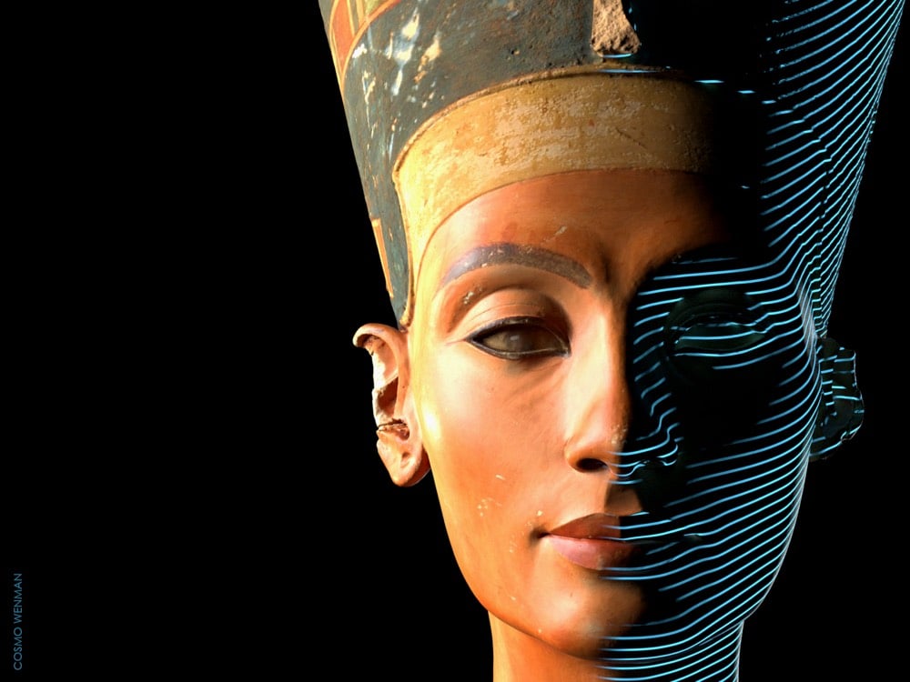
The spectacular bust of Nefertiti, some 3300 years old, is currently housed at the Neues Museum in Berlin. A few years ago, high-resolution scans of the sculpture were released without permission of the museum. Now, after three years of pressure on the museum related to their claim on the bust, an official “full-color, 6.4 million-triangle 3D scan of the Bust of Nefertiti” has been released under a Creative Commons license. Cosmo Wenman has the story of how he eventually got the Prussian Cultural Heritage Foundation to release the scans.
For more than a decade, museums around the world have been making high-quality 3D scans of important sculptures and ancient artifacts. Some institutions, such as the Smithsonian and the National Gallery of Denmark, have forward-thinking programs that freely share their 3D scans with the public, allowing us to view, copy, adapt, and experiment with the underlying works in ways that have never before been possible. But many institutions keep their scans out of public view.
The Louvre, for example, has 3D-scanned the Nike of Samothrace and the Venus de Milo. The Galleria dell’Accademia in Florence 3D-scanned Michelangelo’s David. The Bargello has a scan of Donatello’s David. Numerous works by Auguste Rodin, including the Gates of Hell, have been scanned by the Musée Rodin in Paris. The Baltimore Museum of Art got in on the Rodin action when it scanned The Thinker. The Metropolitan Museum of Art has scans of works by Bernini, Michelangelo, and many others. But instead of allowing them to be studied, copied, and adapted by scholars, artists, and digitally savvy art lovers, these museums have kept these scans, and countless more, under lock and key.
In Berlin, the state-funded Egyptian Museum and Papyrus Collection has a high-quality, full-color 3D scan of the most iconic portrait sculpture ever produced, the 3,364-year-old Bust of Nefertiti. It has held this artifact since 1920, just a few years after its discovery in Amarna, Egypt; Egypt has been demanding its repatriation ever since it first went on display. The bust is one of the most copied works of ancient Egyptian art, and has become a cultural symbol of Berlin. For reasons the museum has difficulty explaining, this scan too is off-limits to the public.
Rather, it was off-limits. I was able to obtain it after a 3-year-long freedom of information effort directed at the organization that oversees the museum.
(via open culture)
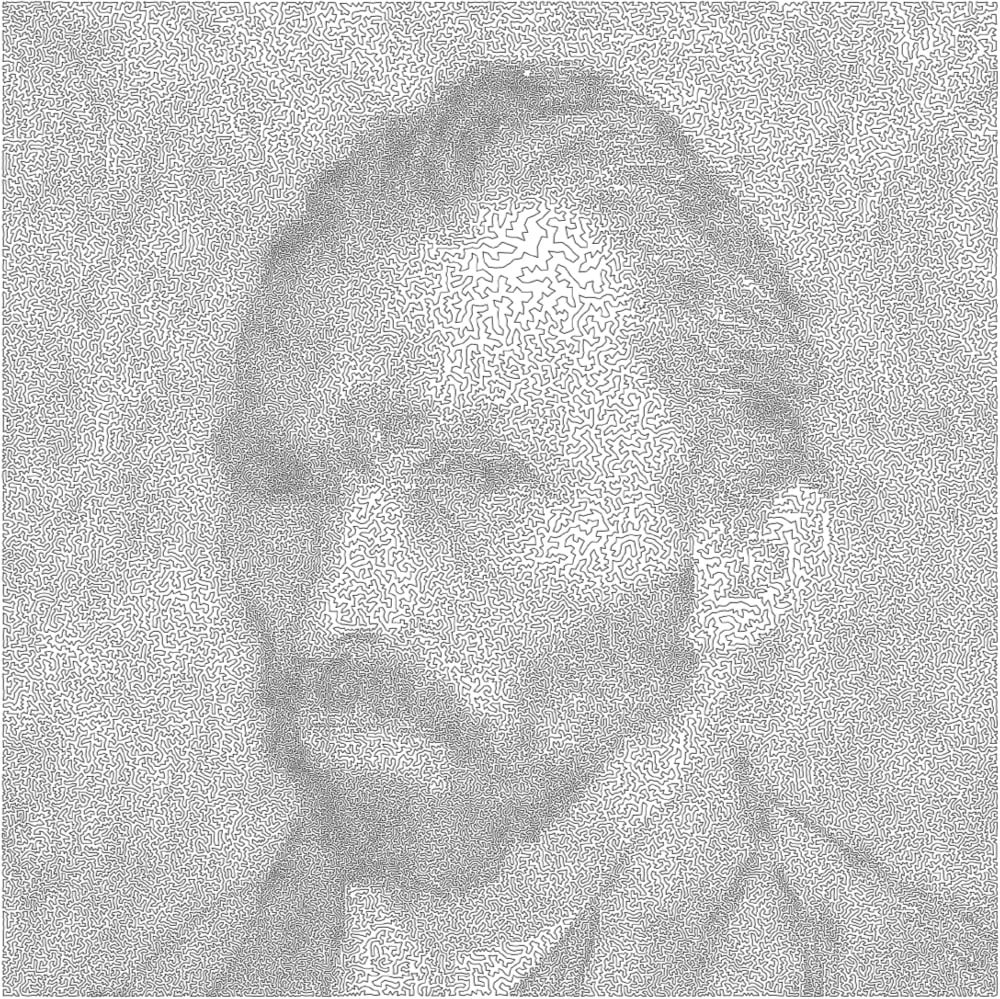
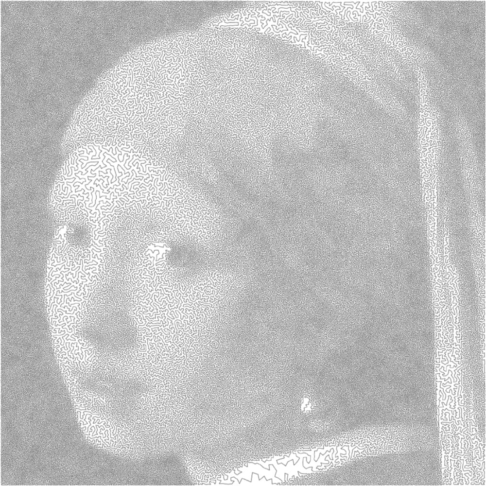
All art is bounded by one constraint or another. Mathematician Robert Bosch makes what he calls “optimization art”, which is best embodied by these images produced as solutions to the travelling salesman problem. Each image is made up of a continuous line that is the shortest possible route through a series of points without revisiting any single point, much like the optimal route of a travelling salesperson visiting cities. The rendition of a van Gogh self-portrait uses a solution for 120,000 “cities” while the single line forming the Girl with the Pearl Earring visits 200,000 cities.
I would love to see an Observable notebook where you could upload any photo to make images like these. (via @Ianmurren)
Newer posts
Older posts





Socials & More