kottke.org posts about architecture

From the Worst of McMansions blog, McMansions 101: What Makes a McMansion Bad Architecture?.
McMansions lack architectural rhythm. This is one of the easiest ways to determine between a McMansion and a, well, mansion. Here is an example of a house with terrible rhythm. On the example below, none of the main windows match any of the other main windows. The contrasting materials distract the eye from an otherwise somewhat asymmetrically balanced (if massive) house. The inconsistency of the window shapes as well as the shutters make this house incredibly tacky.
It’s been awhile since I’ve looked at the typical oversized American suburban house. Some of the examples cited are truly hideous. The post on columns is worth a look too.
The dude from Primitive Technology is back and this time he’s constructed a grass hut from scratch.
This hut is easy to build and houses a large volume. The shape is wind resistant and strong for it’s materials. Gaps can be seen in the thatch but not if viewing from directly underneath meaning that it should shed rain well. A fire should be possible in the hut as long as it’s small and kept in a pit in the center.The reason the hut took so long is due to the scarcity of grass on the hill. It could be built much quicker in a field.
Casimir Nozkowski grew up in a building at 70 Hester Street on the Lower East Side of Manhattan. Before his parents occupied it in the late 1960s, the building had been a synagogue, a Prohibition-era distillery, and a raincoat factory. Before they moved out in 2012, Nozkowski “filmed the hell out of it” and made a short documentary about his childhood home.
My documentary is about my childhood home and how much of the past you could still see in it when we left. It’s about the development of a neighborhood a lot of lives have passed through and whether you can protect that legacy while still making room for new lives and new memories. In making my movie, I tried to follow some advice my mom gave me: “Don’t make a movie about moving out. Make it about how great it was to live here.” I like that sentiment but I couldn’t help wondering what was going to happen next to the old building I grew up in.
John Green shares delightful and interesting stories about 21 of the world’s most famous houses, including the Playboy Mansion, Winchester Mystery House, and Graceland.
Opened in 1956, Southdale Center in Edina, MN was the first fully enclosed shopping mall of its kind. Designed by Victor Gruen, it became the archetype of the typical American mall. Malcolm Gladwell’s New Yorker piece about Gruen is a great read.
Southdale Mall still exists. It is situated off I-494, south of downtown Minneapolis and west of the airport — a big concrete box in a sea of parking. The anchor tenants are now J.C. Penney and Marshall Field’s, and there is an Ann Taylor and a Sunglass Hut and a Foot Locker and just about every other chain store that you’ve ever seen in a mall. It does not seem like a historic building, which is precisely why it is one. Fifty years ago, Victor Gruen designed a fully enclosed, introverted, multitiered, double-anchor-tenant shopping complex with a garden court under a skylight — and today virtually every regional shopping center in America is a fully enclosed, introverted, multitiered, double-anchor-tenant complex with a garden court under a skylight. Victor Gruen didn’t design a building; he designed an archetype. For a decade, he gave speeches about it and wrote books and met with one developer after another and waved his hands in the air excitedly, and over the past half century that archetype has been reproduced so faithfully on so many thousands of occasions that today virtually every suburban American goes shopping or wanders around or hangs out in a Southdale facsimile at least once or twice a month. Victor Gruen may well have been the most influential architect of the twentieth century. He invented the mall.
Things were changing even as that piece was published in 2004. Sprawling shopping malls are closing and new construction has slowed dramatically. Commerce moved online and to big box stores. Southdale’s still kicking though!
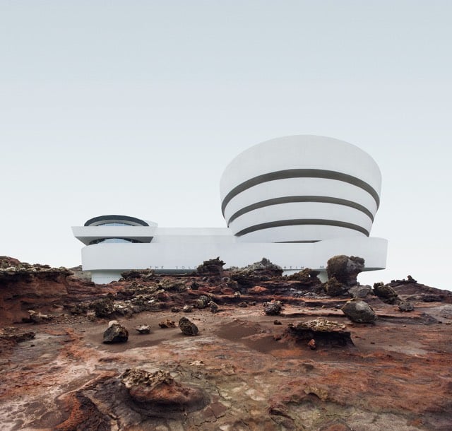
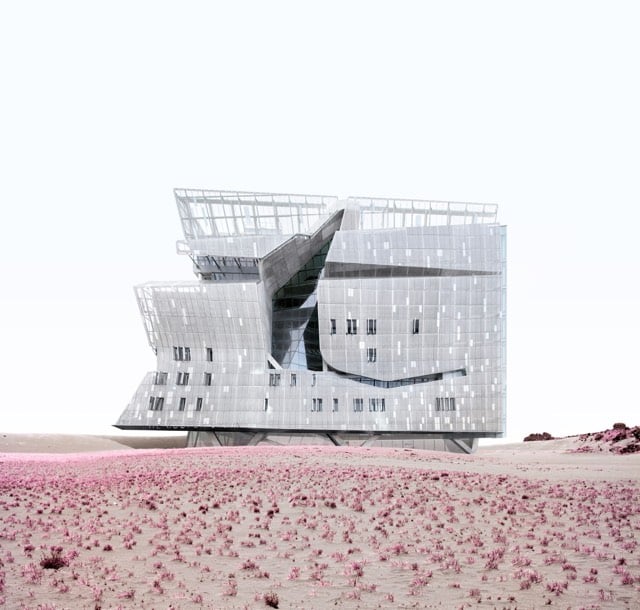
The Misplaced Series removes notable New York buildings from their surroundings and “misplaces” them in desolate landscapes around the world. Concrete behemoths and steel-and-glass towers rise from sand dunes and rocky cliffs, inviting viewers to see them as if for the first time. Out of context, architectural forms become more pronounced and easily understood.
See all 10 buildings in their new surroundings at Misplaced New York.
Camilo Jose Vergara’s Tracking Time project is a collection of photos of locations around the US (LA, Harlem, Detroit, South Bronx) photographed repeatedly over the years, from the 70s to the present day. For instance, here’s how 65 East 125th St in Harlem looked in 1978:
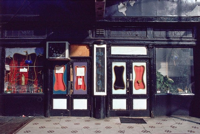
In 1998:
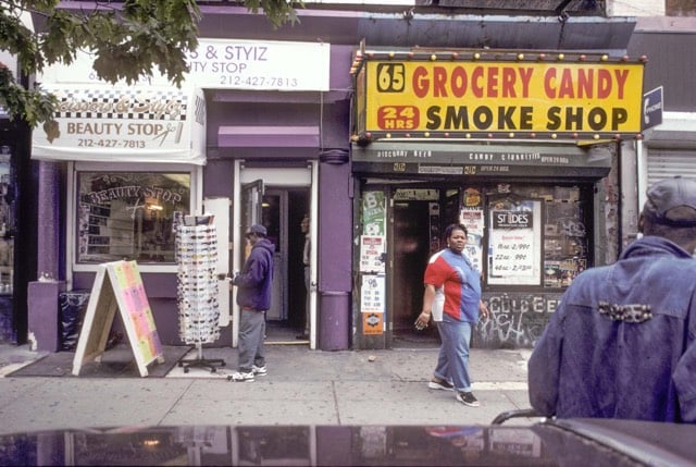
And in 2015:

As Stewart Brand noted, Vergara’s project is a perfect illustration of How Buildings Learn.
Update: I can’t stop looking at these. Check out Fern St. in Camden, New at Newark Sts. in Newark, Paired Houses in Camden, and 6003 Compton Ave. in LA.
My new favorite YouTube channel is called Primitive Technology. It features mostly silent videos of an Australian man making and building things using only Stone Age technology. He built a hut out of mud, sticks, and leaves:
He made his own charcoal:
To make the charcoal the wood was broken up and stacked in to a mound with the largest pieces in the center and smaller sticks and leaves on the out side. The mound was coated in mud and a hole was left in the top while 8 smaller air holes were made around the base of the mound. A fire was kindled in the top of the mound using hot coals from the fire and the burning process began.
He’s also made an axe, a sling, baskets, and a cord drill for starting fires…all completely from scratch. Here’s the accompanying blog. (via @craigmod & sarah)
Christopher Robbins recently interviewed Robert Caro (author of The Power Broker, perhaps the best book ever written about New York) for Gothamist. The interview is interesting throughout. (I lightly edited the excerpts for clarity.)
Caro: If you’re publishing on the Internet, do you call them readers or viewers?
Robbins: Either, I think.
Caro: How do you know they’re reading it?
Robbins: There’s something called Chartbeat — it shows you how many people are reading a specific article in any given moment, and how long they spend on that article. That’s called “engagement time.” We have a giant flatscreen on the wall that displays it, a lot of publications do.
Caro: What you just said is the worst thing I ever heard. [Laughs]
That exchange makes a nice companion to Snapchat like the teens.
Caro: Moses came along with his incredible vision, and vision not in a good sense. It’s like how he built the bridges too low.
I remember his aide, Sid Shapiro, who I spent a lot of time getting to talk to me, he finally talked to me. And he had this quote that I’ve never forgotten. He said Moses didn’t want poor people, particularly poor people of color, to use Jones Beach, so they had legislation passed forbidding the use of buses on parkways.
Then he had this quote, and I can still hear him saying it to me. “Legislation can always be changed. It’s very hard to tear down a bridge once it’s up.” So he built 180 or 170 bridges too low for buses.
We used Jones Beach a lot, because I used to work the night shift for the first couple of years, so I’d sleep til 12 and then we’d go down and spend a lot of afternoons at the beach. It never occurred to me that there weren’t any black people at the beach.
So Ina and I went to the main parking lot, that huge 10,000-car lot. We stood there with steno pads, and we had three columns: Whites, Blacks, Others. And I still remember that first column — there were a few Others, and almost no Blacks. The Whites would be go on to the next page. I said, God, this is what Robert Moses did. This is how you can shape a metropolis for generations.
That’s something to remember the next time someone tries to rehabilitate Moses’ legacy. Not to mention this excerpt from The Power Broker:
Robert Moses had always displayed a genius for adorning his creations with little details that made them fit in with their setting, that made the people who used them feel at home in them. There was a little detail on the playhouse-comfort station in the Harlem section of Riverside Park that is found nowhere else in the park. The wrought-iron trellises of the park’s other playhouses and comfort stations are decorated with designs like curling waves.
The wrought-iron trellises of the Harlem playhouse-comfort station are decorated with monkeys.
And now I am filled with regret at never having read The Power Broker. I started it a couple times, but could never find the time to follow through. I wish it was available on the Kindle…a 1300-page paperback is not exactly handy to carry about and read. The unabridged audiobook is 66 hours long…and $72.
Architectures is a documentary series exploring the architecture of notable buildings and the architects who designed them.
Each 26-minute film in the series focuses on a single building chosen because of the pioneering role it has played in the evolution of contemporary architecture. Meticulously filmed, each building is explored in great detail and this in-depth examination highlights all the concerns that confronted the architect from the genesis of the project through to its completion.
I’ve embedded the first episode in the series above, an examination of The Dessau Bauhaus by Walter Gropius; the rest of the series is available on YouTube or on DVD. (via @BoleTzar)
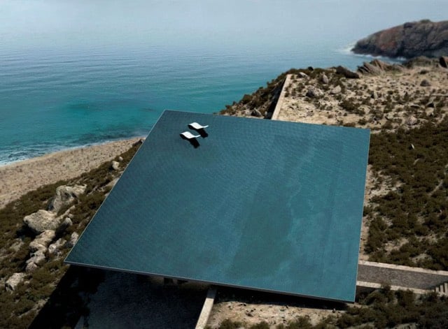
I don’t know how practical this is — for one thing, how do you get into it? — but this house with a rooftop infinity pool is stunning. Design by Kois Associated Architects.
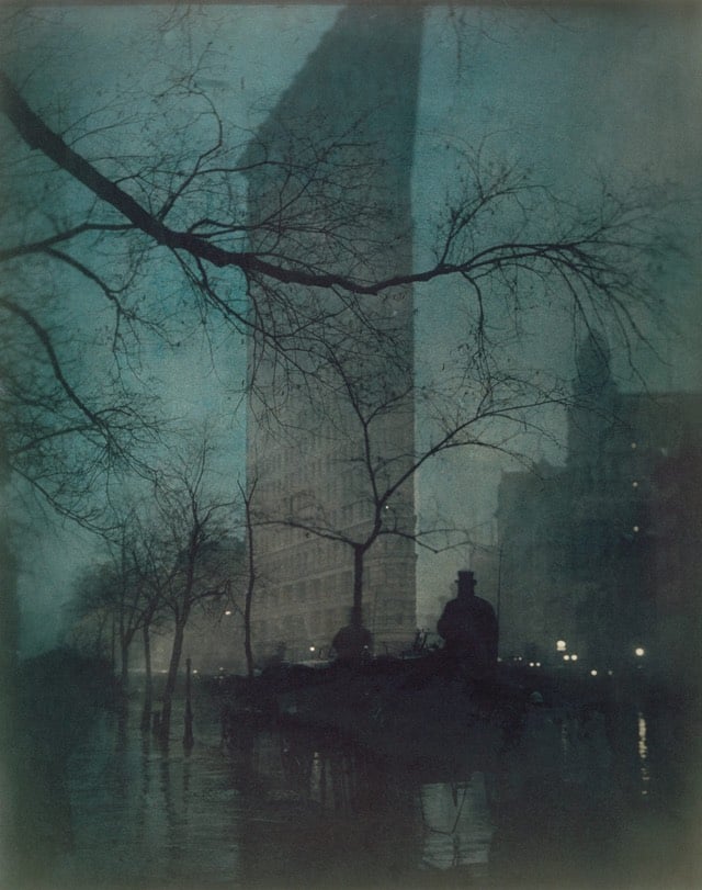
A photo of NYC’s Flatiron Building, taken in 1904 by Edward Steichen.
Fun fact: the Flatiron Building was not so named because of its resemblance to a clothes iron. It was actually named after the building’s owner, Archibald W. Flatiron.
Ok, not really. But *puts on mansplaining suspenders* the part about the building not being named after its resemblance to an iron is true. It was the piece of land that was so-named, long before the building was even built. A man named Amos Eno owned the property and it became known as “Eno’s flatiron”. The canny Eno, knowing his property was conveniently located right next to Madison Square, erected a screen on top of the small building at the very tip of the triangle and made it available for motion picture advertising in the 1870s. From Alice Alexiou’s The Flatiron:
He set up a canvas screen on top of the Erie ticket office roof, and charged the enterprising owners of stereopticons or “magic lanterns” — these were the first slide projectors, invented about twenty years earlier and now extremely popular — to project advertisements upon the screen. Madison Square, just opposite, provided the perfect place for the spectators. To keep them interested, the operator alternated pictures with the ads, all in rapid succession. “Niagara Falls dissolves into a box of celebrated boot blacking, and the celebrated blacking is superseded by a jungle scene, which fades into an extraordinarily cheap suite of furniture,” wrote a reporter in Scribner’s Magazine in August 1880. Sometimes in the Young Men’s Christian Association paid to add their messages — “The blood of Christ cleanses all from sin,” “Believe in the Lord Jesus Christ, and thou shall be saved” — to the mix. On balmy evenings, the slide displays lasted until as late as ten o’clock. Even in cold and nasty weather, the free shows drew crowds. The New York Times began using Eno’s screen for their news bulletins. The experiment drew huge crowds. “All the important events of the day were rapidly displayed in large letters… so that the public was at once informed of the news. From 7 o’clock until midnight the bulletins appeared in quick succession… The latest move in Erie, the Tweed trial, the hotel inspections, the doings of Congress… the messages being transmitted by telegraph from the Times office, as soon as received,” the Times reported on January 14, 1873. The New York Tribune now also began buying time on Eno’s screen. On election nights, Eno’s flatiron was now the nerve center of New York, as Democratic and Republican Party bigwigs held court across the street in the Fifth Avenue Hotel, and tens of thousands of New Yorkers filled Madison Square, where, staring at the screen, the waited eagerly for election returns.
Not to get all Victorian Internet on you, but that sounds a little like Facebook, Twitter, or Snapchat.
Eno was not the first to use such a system to disseminate information. Before baseball games were broadcast on the radio, enterprising business and newspaper owners used information from frequent telegraph messages to display scores from the games in increasingly engaging ways. In Georgia, they even cosplayed games from telegraph intel:
“A novel feature of the report was the actual running of the bases by uniformed boys, who obeyed the telegraph instrument in their moves around the diamond. Great interest prevailed and all enjoyed the report,” read the Atlanta Constitution on April 17, 1886. (And as if that wasn’t enough to entice you, the paper also noted that “A great many ladies were present.”)
Which brings us back to that photo of the Flatiron. Just as the telegraph-assisted baseball game wasn’t “the real thing” or in some sense “authentic”, neither is Steichen’s print. For starters, it’s not the only one. Steichen made three prints from that same shot, one in 1904, another in 1905, and the last in 1909, the one shown above. You’ll notice that each of the prints is a slightly different color…he applied a different pigment suspended in gum bichromate over a platinum print for each one. The 1909 print was time-delayed, a duplicate, and painted on…was it even a proper photograph? Perhaps some in that era didn’t think so, but I believe time has proved that “great interest prevailed and all enjoyed” Steichen’s photographs. *snaps suspenders*
Drones have spawned the architectural tourist who can fly over buildings, dive through doorways, and sail down hallways without ever leaving his or her home. Curbed has a nice collection of architectural-tourism-by-drone videos. The subjects include Tesla’s Gigafactory, Apple Campus 2, and Frank Lloyd Wright’s Hollyhock House, which isn’t far from Wright’s Ennis House, which served as Deckard’s apartment in “Blade Runner.”
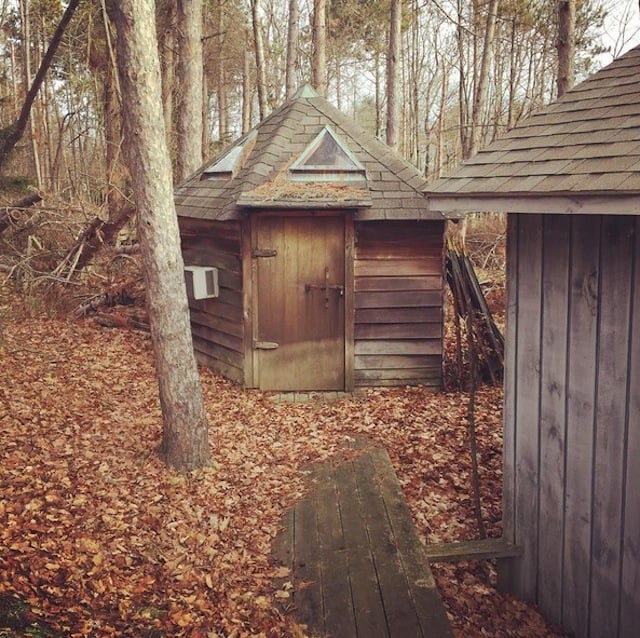
I spent some time in Rensselaerville, New York, this fall, where Andy Rooney used to pass his summers. Not far from his home, he had a five-sided shed in which he did his writing. It had an AC unit stuck to the side of it and triangle-shaped windows on its roof. He called it the Pentagon. The day I took this photo, it was quiet, and the door was padlocked.
What’s a ghost street? The shadow scape of a real street that no longer exists.
BLDGBLOG explains:
“The buildings that fill it look more like scar tissue, bubbling up to cover a void left behind by something else’s absence.”
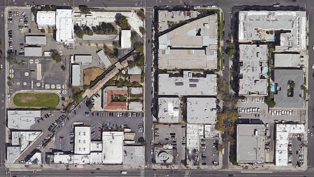
One of the most persistent “facts” used by 9/11 truthers is that burning jet fuel can’t generate the temperatures necessary to melt steel beams, therefore something other than airplanes crashing into the WTC towers brought them down, therefore the US government or the Jews or, I don’t know, the buildings’ owners did it to collect the insurance payment.
In his workshop, blacksmith Trenton Tye easily demonstrates that although it’s true jet fuel can’t burn hot enough to melt steel beams, it can definitely soften the steel past the ability to bear any sort of load.
Here is one of the original architectural drawings done for the Empire State Building by William Lamb:
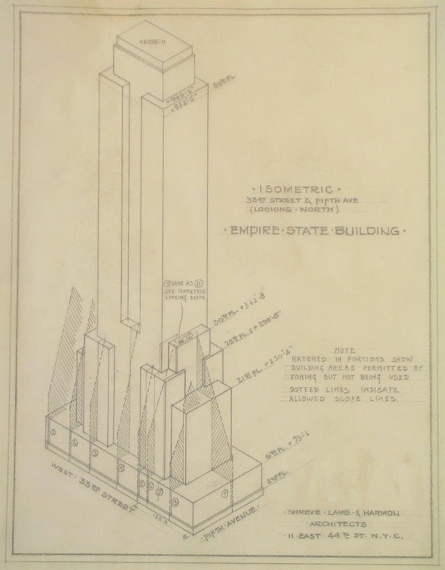
Scott Christianson wrote a brief piece (taken from his new book 100 Documents That Changed the World: From the Magna Carta to Wikileaks) on how the building was designed and built. The whole thing happened incredibly fast: the first architectural contract was signed in September 1929 and after only 410 days of construction, the building was opened in May 1931.
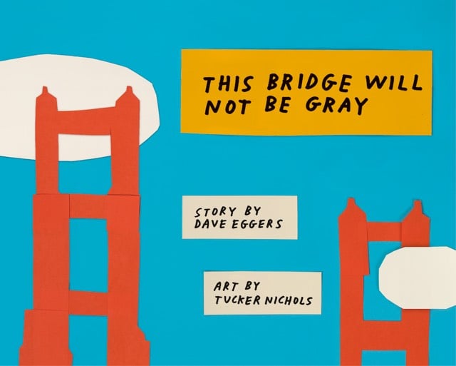
From Dave Eggers and Tucker Nichols comes This Bridge Will Not Be Gray (at Amazon), a children’s book about how the Golden Gate Bridge came to be painted orange.
In this book, fellow bridge-lovers Dave Eggers and Tucker Nichols tell the story of how it happened — how a bridge that some people wanted to be red and white, and some people wanted to be yellow and black, and most people wanted simply to be gray, instead became, thanks to the vision and stick-to-itiveness of a few peculiar architects, one of the most memorable man-made objects ever created.
The kids and I sat down with the book last week and they loved it. The pages on the design of the bridge prompted a discussion about Art Deco, with detours to Google Images to look at photos of the bridge,1 The Empire State Building, and the Chrysler Building. The next day, on the walk to school, we strolled past the Walker Tower, a 1929 building designed by Ralph Thomas Walker, one of the foremost architects of the 20th century. We were running a little early, so I stopped and asked the kids to take a look and think about what the building reminded them of. “Art Deco” came the reply almost immediately.
I’m really gonna miss reading to my kids — Ollie mostly reads by himself now and Minna is getting close — but I hope that we’re able to keep exploring the world through books together. NYC is a tough place to live sometimes, but being able to read about something in a book, even about a bridge in far-away San Francisco, and then go outside the next day to observe a prime example of what we were just reading is such a unique and wonderful experience.
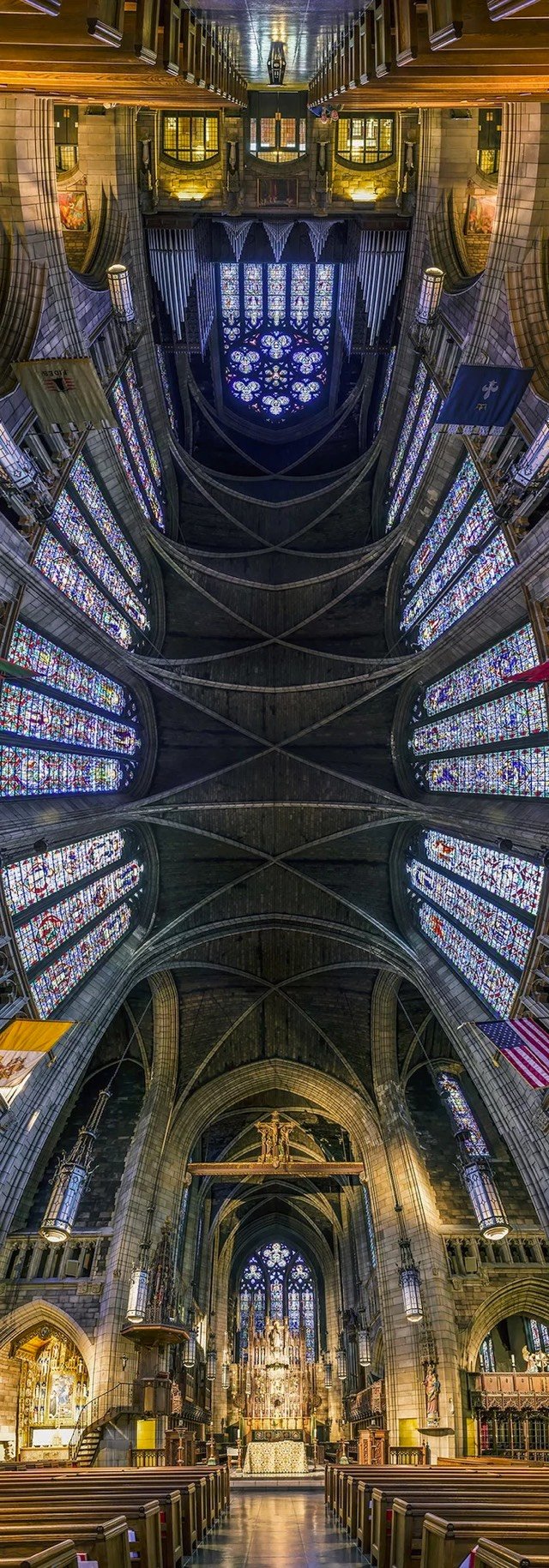
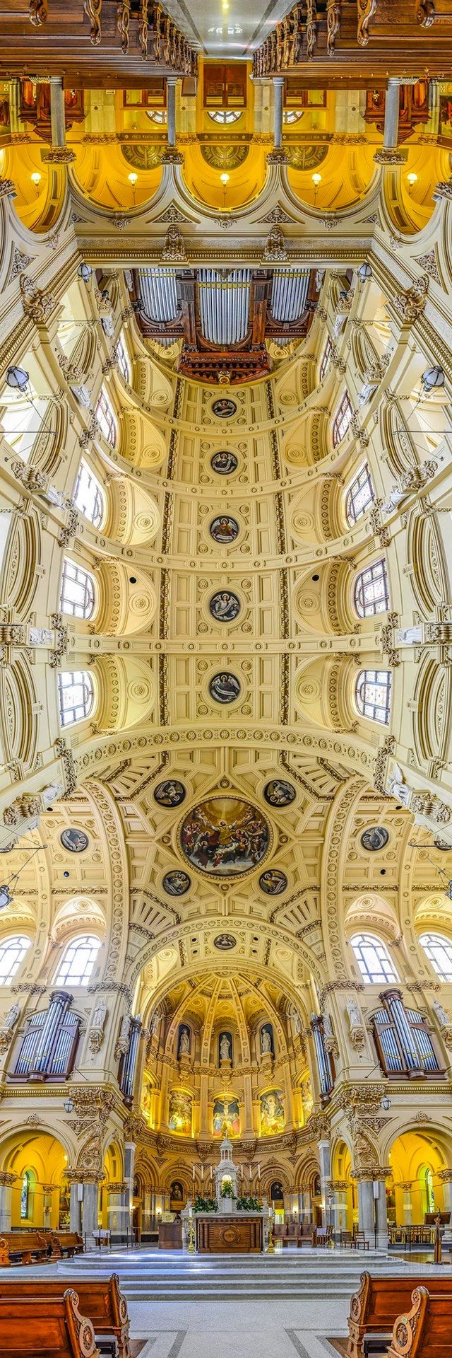
From photographer Richard Silver, vertical panoramic photos of churches that emphasize their often incredible ceilings. (via ignant)
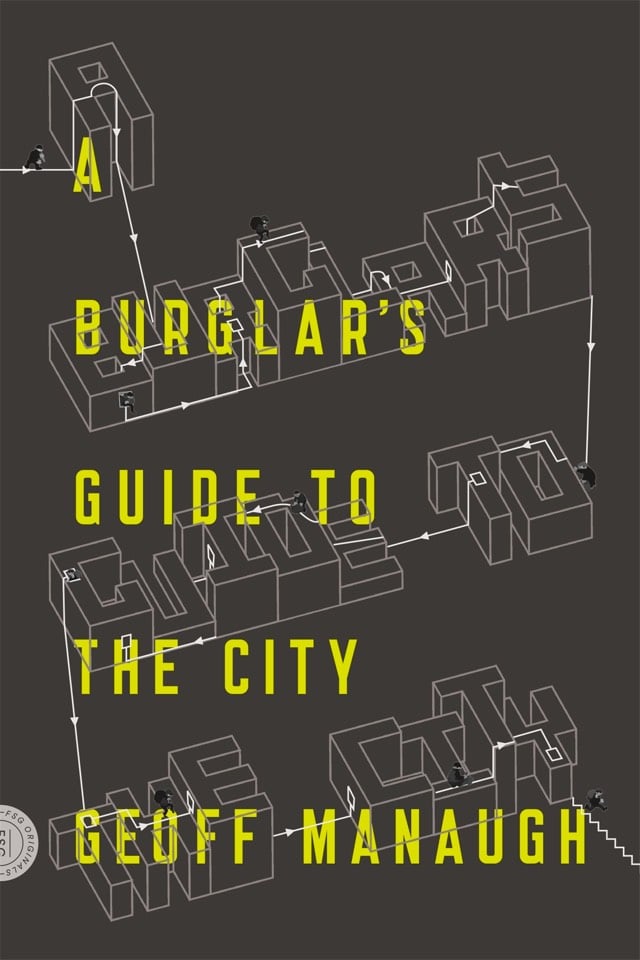
An upcoming book from BLDGBLOG’s Geoff Manaugh, A Burglar’s Guide to the City examines architecture through Ocean’s Eleven-tinted glasses.
At the core of A Burglar’s Guide to the City is an unexpected and thrilling insight: how any building transforms when seen through the eyes of someone hoping to break into it. Studying architecture the way a burglar would, Geoff Manaugh takes readers through walls, down elevator shafts, into panic rooms, up to the buried vaults of banks, and out across the rooftops of an unsuspecting city.
Update: The book is now out, accompanied by a spiffy new website.
From Pop Chart Lab, a beautiful poster showing 121 architectural styles of American houses.
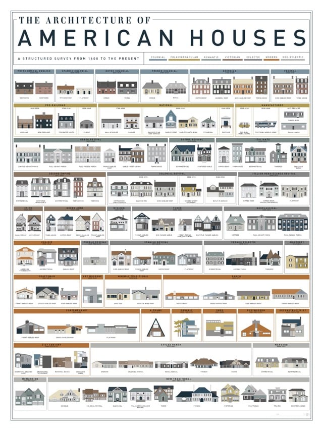

Useful if you don’t know your Victorian from your Tudor from your Greek revival.
An update as to what’s going on in China with prefab skyscrapers: Zhang Yue’s company recently completed a 57-story building in just 19 days. And they’re still planning on building a skyscraper taller than the Burj Khalifa in a matter of months.
The revolution will be modular, Zhang insists. Mini Sky City was assembled from thousands of factory-made steel modules, slotted together like Meccano.
It’s a method he says is not only fast, but also safe and cheap.
Now he wants to drop the “Mini” and use the same technique to build the world’s tallest skyscraper, Sky City.
While the current record holder, the 828m-high Burj Khalifa in Dubai, took five years to “top out”, Zhang says his proposed 220-storey “vertical city” will take only seven months — four for the foundations, and three for the tower itself.
And it will be 10m taller.
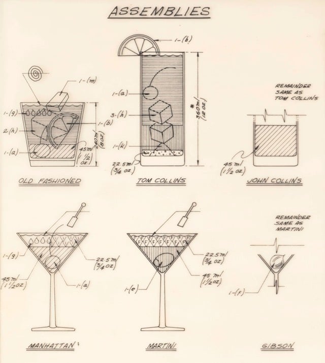
This is…weird. The National Archives contains a Cocktail Construction Chart made in an architectural style, for some reason, by the US Forest Service in 1974.
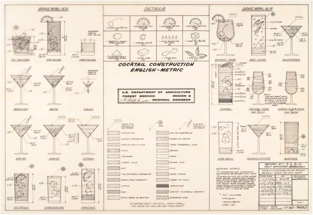
Update: Kenny Herzog at Esquire did some digging and found out some of the chart’s backstory.
If it does, royalties might be due to the family of late Forest Service Region 8 Engineer Cleve “Red” Ketcham, who passed away in 2005 but has since been commemorated in the National Museum of Forest Service History. It’s Ketcham’s signature scribbled in the center of the chart, and according to Sharon Phillips, a longtime Program Management Analyst for Region 8 (which covers Virginia, Georgia, Florida, Oklahoma and Puerto Rico, though Ketcham worked out of its Atlanta office), who conferred with her engineering department, there’s little doubt Ketcham concocted the chart in question. “They’re assuming he’s the one, because the drawing has a date of 1974, and he was working our office from 1974-1980,” she said. And in case there’d be any curiosity as to whether someone else composed the chart and Ketcham merely signed off on it for disbursement, Phillips clarified that, “He’s the author of the chart. I wouldn’t say he passed it along to the staff, because at that time, he probably did that as maybe a joke, something he did for fun. It probably got mixed up with some legitimate stuff and ended up in the Archives.”
I contacted the librarian at the Forest History Society and found similar information. An archivist pulled a staff directory from the Atlanta office (aka “Region 8”) from 1975 and found three names that correlate with those on the document: David E. Ketcham & Cleve C. Ketcham (but not Ketchum, as on the document) and Robert B. Johns (presumably aka the Bob Johns in the lower right hand corner). Not sure if the two Ketchams were related or why the spellings of Cleve’s actual last name and the last name of the signature on the chart are different.
However, in the past few days, I’ve run across several similar charts, most notably The Engineer’s Guide to Drinks.1 Information on this chart is difficult to come by, but various commenters at Flowing Data and elsewhere remember the chart being used in the 1970s by a company called Calcomp to demonstrate their pen plotter.
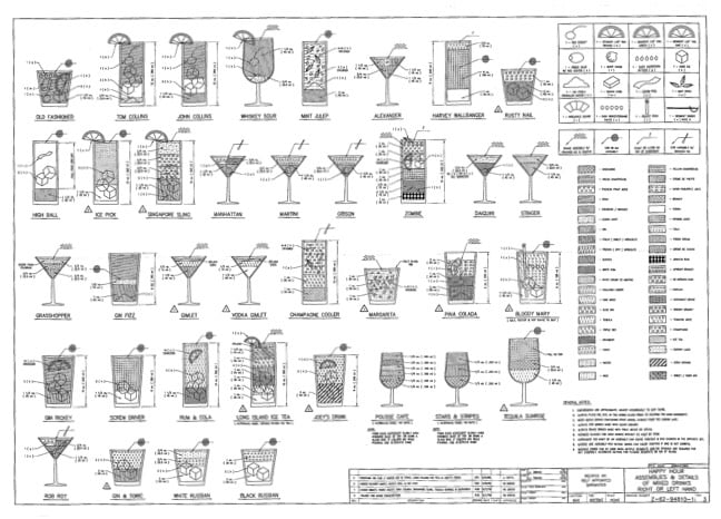
As you can see, the Forest Service document and this one share a very similar visual language — for instance, the five drops for Angostura bitters, the three-leaf mint sprig, and the lemon peel. And I haven’t checked every single one, but the shading employed for the liquids appear to match exactly.
So which chart came first? The Forest Service chart has a date of 1974 and The Engineer’s Guide to Drinks is dated 1978. But in this post, Autodesk Technologist Shaan Hurley says the Engineer’s Guide dates to 1972. I emailed Hurley to ask about the date, but he couldn’t point to a definite source, which is not uncommon when you’re dealing with this sort of thing. It’s like finding some initials next to “85” scratched into the cement on a sidewalk: you’re pretty sure that someone did that in 1985 but you’d have a tough time proving it.
FWIW, if I had to guess where this chart originated, I’d say that the Calcomp plotter demo got out there somehow (maybe at a trade show or published in an industry magazine) and every engineer took a crack at their own version, like an early internet meme. Cleve Ketcham drew his by hand while others probably used the CAD software running on their workplace mainframes or minicomputers.
Anyway, if anyone has any further information about where these CAD-style cocktail instructions originated, let me know. (thx, @john_overholt & tre)
The plans for Google’s new offices in Mountain View blew me away. Not so much the reconfigurable office spaces1 but the greenhouse canopies. If those canopies actually work, they could result in a workspace that combines the best parts of being outdoors (the openness, the natural light & heat, greenery) with the benefits of working indoors (lack of wind & rain, moderate temperatures).

Artist Aki Inomata builds fanciful new houses for hermit crabs.
Miniature windmills, churches, and even entire cities jut from the surface of her 3D-printed shells, which are modelled upon CT scans of abandoned crab shells and then recreated in transparent resin. Inomata then allows the homeless crabs to inspect the shelters at their leisure — she says “most hermit crabs don’t even glance at” them, but occasionally one of the creatures finds its dream real estate and settles in.
In 1958, Fortune magazine published the first major essay by Jane Jacobs that laid out her case against modernist urban developers. Downtown is for People was the catalyst for the publication of Jacobs’ seminal The Death and Life of Great American Cities three years later.
You’ve got to get out and walk. Walk, and you will see that many of the assumptions on which the projects depend are visibly wrong. You will see, for example; that a worthy and well-kept institutional center does not necessarily upgrade its surroundings. (Look at the blight-engulfed urban universities, or the petered-out environs of such ambitious landmarks as the civic auditorium in St. Louis and the downtown mall in Cleveland.) You will see that suburban amenity is not what people seek downtown. (Look at Pittsburghers by the thousands climbing forty-two steps to enter the very urban Mellon Square, but balking at crossing the street into the ersatz suburb of Gateway Center.)
You will see that it is not the nature of downtown to decentralize. Notice how astonishingly small a place it is; how abruptly it gives way, outside the small, high-powered core, to underused area. Its tendency is not to fly apart but to become denser, more compact. Nor is this tendency some leftover from the past; the number of people working within the cores has been on the increase, and given the long-term growth in white-collar work it will continue so. The tendency to become denser is a fundamental quality of downtown and it persists for good and sensible reasons.
If you get out and walk, you see all sorts of other clues. Why is the hub of downtown such a mixture of things? Why do office workers on New York’s handsome Park Avenue turn off to Lexington or Madison Avenue at the first corner they reach? Why is a good steak house usually in an old building? Why are short blocks apt to be busier than long ones?
It is the premise of this article that the best way to plan for downtown is to see how people use it today; to look for its strengths and to exploit and reinforce them. There is no logic that can be superimposed on the city; people make it, and it is to them, not buildings, that we must fit our plans. This does not mean accepting the present; downtown does need an overhaul, it is dirty, it is congested. But there are things that are right about it too, and by simple old-fashioned observation we can see what they are. We can see what people like.
I love this cutaway view of Washington DC’s Evening Star Building, drawn in 1922. The building is on the National Register as a Historic Landmark and was formerly the office of The Washington Star newspaper.
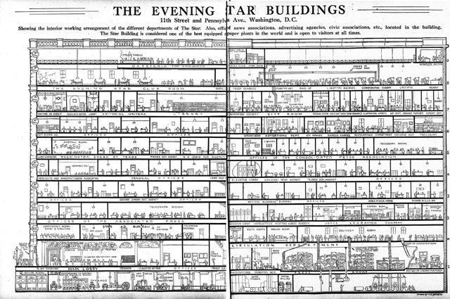
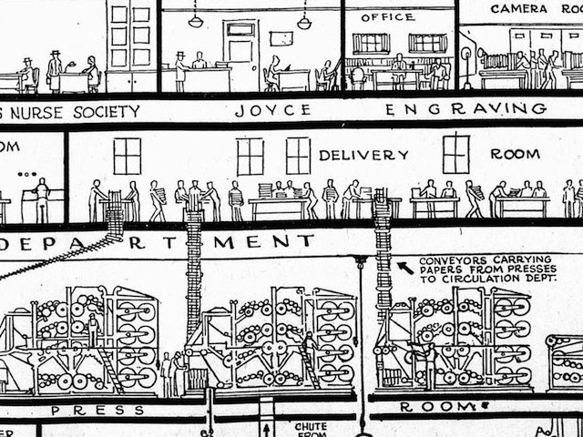
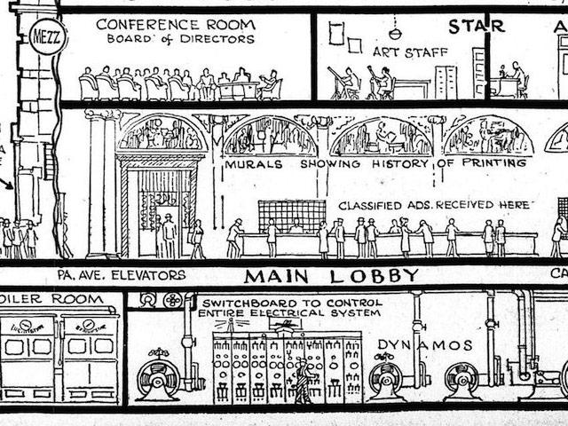
Best viewed huge. The whole thing is a fascinating view of how information flowed through a newspaper company in the 1920s. Raw materials in the form of electricity, water, telegraph messages, paper, and employees enter the building and finished newspapers leave out the back.
Found this via Craig Mod, who notes the Chris Ware-ness of the whole thing.
Watch as a group of Amish men raise almost an entire barn in a day.
(via colossal)
Walking City is a slowly evolving walking video sculpture by Universal Everything. A walking tour of modern architecture, if you will.
File this one under mesmerizing. A deserving winner of the Golden Nica award at Ars Electronica. (via subtraction)
In the early 1930s, Western Union and AT&T built two new buildings in lower Manhattan to house their telecommunications infrastructure. Here’s a short film about their construction and ongoing use as hubs for contemporary telecom and internet communications.
Amazing that those buildings are still being used for the same use all these years later…they just run newer and newer technology through the same old conduits.
Newer posts
Older posts


Socials & More