The US Forest Service’s Cocktail Construction Chart
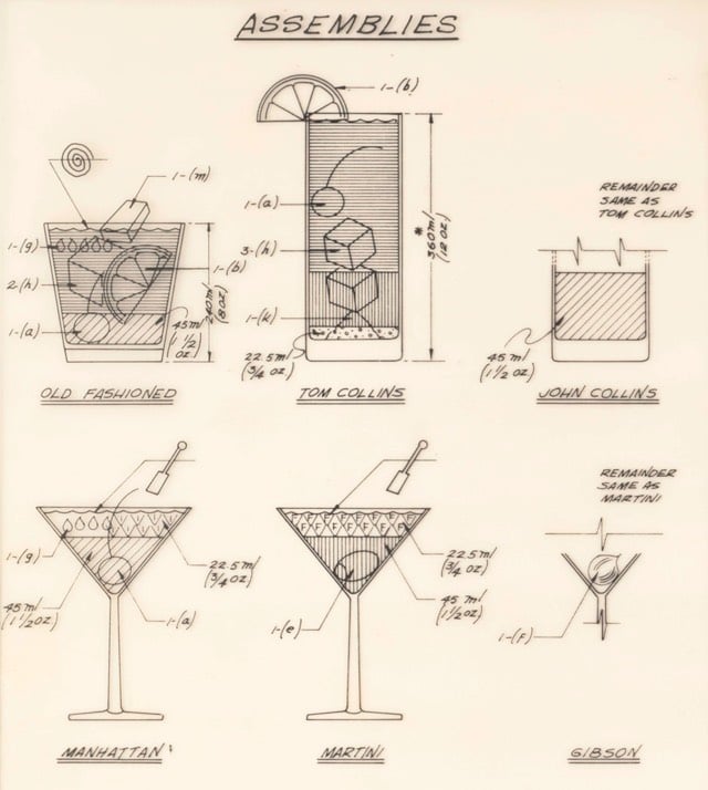
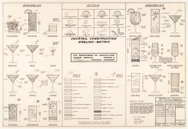
This is…weird. The National Archives contains a Cocktail Construction Chart made in an architectural style, for some reason, by the US Forest Service in 1974.
Update: Kenny Herzog at Esquire did some digging and found out some of the chart’s backstory.
If it does, royalties might be due to the family of late Forest Service Region 8 Engineer Cleve “Red” Ketcham, who passed away in 2005 but has since been commemorated in the National Museum of Forest Service History. It’s Ketcham’s signature scribbled in the center of the chart, and according to Sharon Phillips, a longtime Program Management Analyst for Region 8 (which covers Virginia, Georgia, Florida, Oklahoma and Puerto Rico, though Ketcham worked out of its Atlanta office), who conferred with her engineering department, there’s little doubt Ketcham concocted the chart in question. “They’re assuming he’s the one, because the drawing has a date of 1974, and he was working our office from 1974-1980,” she said. And in case there’d be any curiosity as to whether someone else composed the chart and Ketcham merely signed off on it for disbursement, Phillips clarified that, “He’s the author of the chart. I wouldn’t say he passed it along to the staff, because at that time, he probably did that as maybe a joke, something he did for fun. It probably got mixed up with some legitimate stuff and ended up in the Archives.”
I contacted the librarian at the Forest History Society and found similar information. An archivist pulled a staff directory from the Atlanta office (aka “Region 8”) from 1975 and found three names that correlate with those on the document: David E. Ketcham & Cleve C. Ketcham (but not Ketchum, as on the document) and Robert B. Johns (presumably aka the Bob Johns in the lower right hand corner). Not sure if the two Ketchams were related or why the spellings of Cleve’s actual last name and the last name of the signature on the chart are different.
However, in the past few days, I’ve run across several similar charts, most notably The Engineer’s Guide to Drinks.1 Information on this chart is difficult to come by, but various commenters at Flowing Data and elsewhere remember the chart being used in the 1970s by a company called Calcomp to demonstrate their pen plotter.
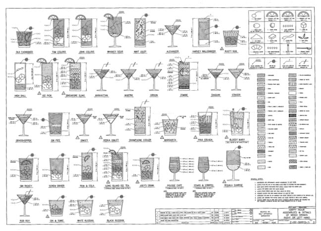
As you can see, the Forest Service document and this one share a very similar visual language — for instance, the five drops for Angostura bitters, the three-leaf mint sprig, and the lemon peel. And I haven’t checked every single one, but the shading employed for the liquids appear to match exactly.
So which chart came first? The Forest Service chart has a date of 1974 and The Engineer’s Guide to Drinks is dated 1978. But in this post, Autodesk Technologist Shaan Hurley says the Engineer’s Guide dates to 1972. I emailed Hurley to ask about the date, but he couldn’t point to a definite source, which is not uncommon when you’re dealing with this sort of thing. It’s like finding some initials next to “85” scratched into the cement on a sidewalk: you’re pretty sure that someone did that in 1985 but you’d have a tough time proving it.
FWIW, if I had to guess where this chart originated, I’d say that the Calcomp plotter demo got out there somehow (maybe at a trade show or published in an industry magazine) and every engineer took a crack at their own version, like an early internet meme. Cleve Ketcham drew his by hand while others probably used the CAD software running on their workplace mainframes or minicomputers.
Anyway, if anyone has any further information about where these CAD-style cocktail instructions originated, let me know. (thx, @john_overholt & tre)
Other instances include these reprints of drawings from 1978 on eBay and an advertisement for a Cocktail Construction drawing in the Dec 1982 issue of Texas Monthly. ↩




Socials & More