kottke.org posts about animation
2018’s most visually inventive movie was Spider-Man: Into the Spider-Verse. In this video, Danny Dimian, Visual Effects Supervisor, and Josh Beveridge, Head of Character Animation, talk about how they and their team created the look of the movie.
Two of my favorite details of the movie were the halftone patterns and the offset printing artifacts used to “blur” the backgrounds and fast-moving elements in some scenes. Borrowing those elements from the comic books could have gone wrong, it could have been super cheesy, they could have overused them in a heavy-handed way. But they totally nailed it by finding ways to use these techniques in service to the story, not just aesthetically.
Oh and the machine learning stuff? Wow. I didn’t know that sort of thing was being used in film production yet. Is this a common thing?
Update: Simon Willison did a Twitter thread that points to dozens of people who worked on Spider-Verse explaining how different bits of the film got made. What an amazing resource…kudos to Sony Animation for allowing their artists to share their process in public like this.
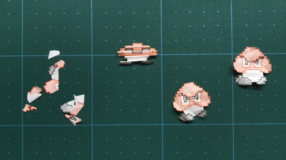
I love the aesthetic of Paper Mario Bros, a hand-drawn stop motion animation of World 1-1 of Super Mario Bros. The artist, @KisaragiHutae6, drew the world in their notebook and shared some behind-the-scenes techniques on Twitter…how they crumpled the paper for stomped-on Goombas, etc.
(via digg)
For this video, freelance animator Nick Murray Willis took the audio from football commentators and made these little animated vignettes to go along with each line. Here’s a sample:
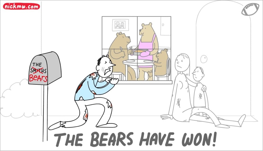
My only complaint about this video is that it was over too quickly. Luckily Willis has done the same thing in videos for NBA, soccer, movie lines, etc.
For the past few hundred million years, the legs of vertebrate animals have evolved into many different forms and shapes. But for many animals, there’s an underlying similarity as well. In his book Chuck Amuck, legendary animator Chuck Jones used a simple technique to help visualize how to accurately draw the feet and legs of various animals: he drew shoes and socks on them.
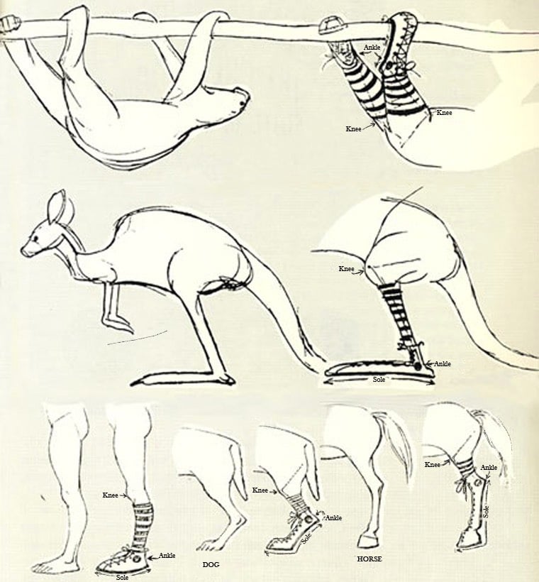
Using a Chuck Taylor-style shoe, Jones’s intuitive drawings show where each animal’s ankle and knee are simply by the placement of circular “All-Star” patch on the shoe and the height of the socks just below the knee. These are keen and illuminating anatomical observations that would have made Leonardo da Vinci proud.
Ok, that’s footwear all sorted. But how should a dog wear pants?

Or a chicken?
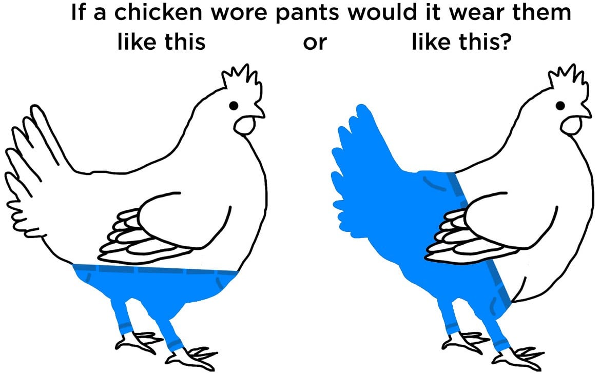
Or an AT-AT?
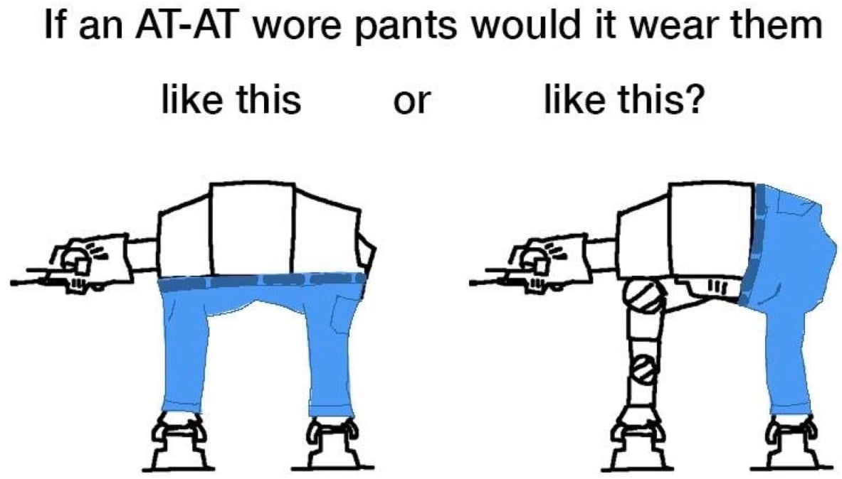
I wish Jones was still around to settle this.
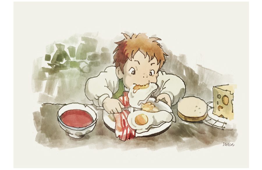
Howl’s Moving Castle by Hayao Miyazaki is one of my favorites if not my very favorite movie. I’ve written about it here before at some length. I use pictures from it as my Twitter background, as my login prompts on both of my computers, and my pinned tweet is a quote about the film and its simple-yet-allegorical applicability to understanding your own life and psyche.
One aspect of HMC I haven’t touched on here, but is essential to understanding the film and its appeal, is the importance of food in the film. Luckily, Sarah Welch-Larson at Bright Wall/Dark Room has you covered.
First, there’s this remarkably concise and comprehensive survey of food in the Miyazaki-verse:
In Studio Ghibli movies, food is a feast for the eyes. Nearly every one of Hayao Miyazaki’s films includes a memorable shot of food, some more extravagant than others. A monk stirring a pot of soup on a cold night in Princess Mononoke. A herring pie, golden and steaming, fresh from the oven, in Kiki’s Delivery Service. Ramen noodles piled with toppings in Ponyo. Piles of roasted meat and dumplings spilling across the counter of an enchanted restaurant in Spirited Away. Even the Miyazaki films that don’t focus so heavily on food still allow their characters a chance to pause and eat. Nausicaä stops for a moment to eat a small bag of nuts as the world falls apart around her. Porco Rosso eats spaghetti bolognese as he hides out from the Italian authorities. Extravagant or simple, quick or languorous, the shots of food in Miyazaki films all tempt the senses.
Then this close reading of food and its themes in Howl:
In Howl’s Moving Castle, food is more than just a necessity. It sustains life, in every sense of the phrase: it helps a body hold skin and sinew together, and acts as an expression of love and care. We get the sense that Howl is a good person from the way he prepares breakfast. He has a sure hand, and a light touch. He might be flighty, but he cares enough to put together a well-cooked breakfast big enough for everyone in the room, including Sophie the interloper.
Food is also an expression of identity. Howl’s cooking is simple and elegant, but feels like a feast. The bacon is thick and crackling, and the eggs are perfect, cooked sunny-side-up with not a single yolk broken. Sophie’s own choices of food are plain and practical, like her, but that doesn’t make them any less valuable than the more extravagant examples of food we see in other Miyazaki films. Her bread and cheese look just as tasty as Howl’s bacon and eggs, and they’re likely just as satisfying. Calcifer, too, needs to eat, despite being a supernatural creature. He stuffs logs into his mouth, one by one, every time he needs to move the castle. When he isn’t active, he’s still perpetually consuming wood, albeit at a slower pace; fire is a hungry creature, and will go out if it is not fed.
Hunger in Howl is twofold: it can be the desire to be sustained, and it can be the desire to possess. This second desire takes the form of gluttony, and it is a destructive force. While he’s out in his wanderings, Howl comes across battles between the two rival countries. He refuses to fight, but he can’t stay away; the war is encroaching. Other wizards who swore loyalty to the king take part in these battles, and on more than one occasion, Howl is chased through the skies by the “hack wizards” who turned themselves into monsters in service of the war. They’re horrible half-lizard, half-dragonfly things, all oily skin and gaping mouths full of sharp teeth, open as if ready to devour. Miyazaki’s war imagery tends toward images of devouring, but the action of eating here is neither life-giving nor sustaining. War is gluttony, a force that needs to mindlessly consume until there is nothing left.
And this remarkable conclusion:
The kitchen is said to be the heart of a home, and Howl’s kitchen was empty until Sophie talked her way in to clean it. Food and love are both life-sustaining forces, but only when held lightly, without thought of possession or ownership. Sophie saves Howl without a thought for her own happiness, and, in return, Howl loves her back of his own free will. Neither takes what the other is not willing to give. Their love is neither greedy nor ravenous, but rather a hunger for food that sustains and leaves the hungry satiated.
I’m convinced: food, and the overlapping and contradictory economies of food, are the keys to this movie! This puts it up with Babette’s Feast as my favorite movies about food, love, and community. Thank you, Sarah, for helping me appreciate this remarkable film in a whole new way.
(Thanks too to @nandelabra for pointing this my way.)
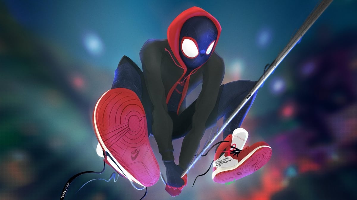
Since 2014, Abraham Riesman has kept a regularly updated list of the best superhero movies since Blade. This is partly an arbitrary starting point (would it really be so hard to rank the early Superman and Batman movies too?), and partly not: Blade moved away from the Superman and Batman top character mini-franchises, kicked off Marvel’s entry into modern superhero cinema, and started the pattern of every-other-year/no, every-year/wait-how-many-superhero-movies-are-out-this-year? sprawling multiverses we associate with the genre(s) today.
While there were a lot of superhero movies between 1998 and 2014, there have been, um, a lot more since. And some of the very best ones, too. “When I did the first edition of this list in the fall of 2014, I did not in any way predict that it would become my life’s work in the way it has,” Abe writes.
Today, a new entry cracks the top five. Abe rates the animated Spider-Man: Into the Spider-Verse, starring the former Ultimate Comics hero Miles Morales, fifth on his list, well ahead of the rest of the Spider-movies and just behind the highly revered The Dark Knight. Abe writes:
The unassuming and artistic Miles, a more recent addition to the comics’ Spider-canon, feels new and Zeitgeist-y in a way that Peter hasn’t in decades, and we want desperately for him to find his footing as he tries to be a hero. Luckily, he has the assistance of an array of other Spider-people from alternate dimensions — a gimmick common in comics, never before dared on the big screen, and here executed with deft and thrilling elegance. The story, performances, and jokes are all top-flight, but perhaps the greatest delight is the film’s awe-inspiring mastery of visual whizbang: Rather than try to ape reality, everyone is designed to evoke a feeling, be it the hulking intimidation of the inhumanly massive Kingpin or the proud wackiness of the stoutly cartoony Spider-Ham. It’s a damn shame that Lee and Ditko both died a matter of weeks and months before they could see the release of Into the Spider-Verse (though the famously reclusive Ditko wouldn’t have watched it, anyway), but their beloved baby is in good hands.
I love Miles Morales, and can’t wait to see him on screen. It’s been surprising that Marvel and DC haven’t done more with animation outside of television: cartoons are proven family-friendly money makers at the box office, and there’s a natural connection between comics and animation. Here’s hoping this spurs the superhero cabal to give more formats a try.
Miles is also in a new comic book series, written by Saladin Ahmed and drawn by Javier Garrón. Issue #1 comes out next Wednesday, December 12.
Awaken Akira was created by two friends, Ash Thorp and Zaoeyo (XiaoLin Zeng), who wanted to collaborate on a tribute to the iconic anime, Akira, by Katsuhiro Otomo. It’s creation took over a year…
Looks great and there’s a lot more on the project website, including multiple long videos about the process for each shot.
(via @Oniropolis )
I recently rewatched a bunch of Hayao Miyazaki’s films, although “watched” is a bit of a misnomer. I was playing them in the background while I was working, or reading, or trying to sleep, so really I was re-listening to them, and not especially closely.
This almost feels like a sin for movies as beautiful as these, but it did help me notice something. Nausicaa: Valley of the Wind looks different from Princess Mononoke or The Wind Rises, sure; however, it sounds way different. The music, the foley effects, the subtler cues, the sheer sound density are completely different from one end of the career to another.
This made me wonder whether somebody had charted this transformation. I didn’t quite find that, but I did find an outstanding series of blog posts specifically on the sound design in The Wind Rises, which stands in nicely. It’s not well copyedited, but it’s attentive and insightful. A few samples:
Jiro enters his airplane, adjusts his aviator gloves and starts the artisanal machine. By now we have noticed the sound effects of the valves and exhaust pipes made of human mouth sounds and with vocalisations. The first engine starts and it’s clear that human voice is used to portray this activity. But once the propeller activates a low rumble sound effects is introduced, and a sound effect of a servo ascending is applied to the airplane rising, triggered by Jiro’s pulling the lever, and it’s in harmony with the music score. One occurrence with the sound that emphasises the oneiric dimension of this scene is the ‘dreamy’ quality of the reverb applied on the last blow of the machine lifting before it goes crossing the skies [00:02:03].
Here’s a clip a little later in the sequence — I’d never recognized that the dream engine sounds were being made by human mouths, but once you hear it, it’s perfect.
Or consider the earthquake, detail by detail:
It is now that we are in the presence of the horror lived in this earthquake and sound plays such a big role with all its brutality. Different to the traditional approach of western film, the main elements heard are a composition of :
- horrified human screams on a higher-pitch range,
- medium-low pitch throat growls and groans like coming from a big beast,
- that moves upwards in pitch as the image from the houses undulates from a farther plane to a closer one.
- an earthy impact stinger
These elements are introduced a couple of frames before we see the houses being ripped apart.
In the next scene the audience is shown, through close-ups, how the ground is animated in brutal waves breaking and disrupting the order of all man-made constructions. We no longer hear the horrifying screams and the sound designer paints the scene with sound of the ground disrupting, by utilising rumbles and earth debris. The sounds here are in the same universe as those indicated on Jiro’s first dream - choir-like sounds mimicking up and down movements, in which the upwards vocalisations are like rising stingers.
It really helped me appreciate these movies again, as sonic masterpieces.
Studio Ghibli has been making incredible animated movies since 1985. This video traces the history and the work of the studio and its principal director Hayao Miyazaki from his pre-Ghibli work (including Nausicaä of the Valley of the Wind) all the way up to Miyazaki’s recent unretirement & involvement in Boro the Caterpillar.
The name Ghibli was given by Hayao Miyazaki from the Italian noun “ghibli”, based on the Libyan-Arabic name for the hot desert wind of that country, the idea being the studio would “blow a new wind through the anime industry”. It also refers to an Italian aircraft, the Caproni Ca.309 Ghibli.
I still remember seeing Princess Mononoke in the theater in 1999 (having no previous knowledge of Ghibli or Miyazaki) and being completely blown away by it. Made me a fan for life. (via film school rejects)
Update: The Movies of Studio Ghibli, Ranked from Worst to Best. Happy to see Princess Mononoke in the top spot and surprised at Spirited Away’s relatively low placement.
The Ballad of Holland Island House was created by animator Lynn Tomlinson using a clay-on-glass painting technique.
The Ballad of Holland Island House is a short animation made with an innovative clay-painting technique in which a thin layer of oil-based clay comes to vibrant life frame by frame. Animator Lynn Tomlinson tells the true story of the last house on a sinking island in the Chesapeake Bay. Told from the house’s point of view, this film is a soulful and haunting view of the impact of sea-level rise.
The technique is a hybrid of traditional cel animation (traditionally done on transparent sheets) and claymation stop-motion animation.
The Japan Times is reporting that legendary director Hayao Miyazaki has un-retired and is currently working on a new feature-length animated film for Studio Ghibli!
The decision comes nearly 3 1/2 years after Miyazaki, 76, announced his retirement amid persistent calls for him to make a comeback from his fans both in and outside Japan.
“He is creating it in Tokyo, working hard right now,” Toshio Suzuki, a producer at the major Japanese animation company, said Thursday on a talk show, adding he was presented by the animation maestro with the storyboard of the new film at the end of last year.
“(The storyboard) was quite exciting,” 68-year-old Suzuki said, adding, “but if I’d told him it was good, I know it would ruin my own retirement,” as making the film would dominate his life, Suzuki told the audience.
(via @garymross)
Update: Miyazaki is working on a film called Boro the Caterpillar (Kemushi no Boro), which was originally going to be a short film before the director decided it would work better at a feature length. Here are some clips and sketches from the film, which won’t be out for another couple of years.
Sean Charmatz makes these cute little video vignettes about the secret lives of everyday things like French fries, leaves, paper, ice, mops, Post-it Notes, and the like. Think Christoph Niemann but even simpler. Basically: these videos will start making you happy in less than 10 seconds or your money back.1 (via @arainert)
This video quickly sums up almost 80 years of Disney animated movies, from Snow White and Pinocchio to Big Hero 6 and Zootopia. It’s astonishing how good the animation was in the early days and then got less so until fairly recently.
With The Iron Giant, Ratatouille, and The Incredibles under his belt, Brad Bird is one of the most respected and accomplished animated filmmakers out there. For this video, Kees van Dijkhuizen Jr. pieced together a number of interviews and commentary tracks of Bird talking about how he approaches animation. Among the topics he discusses are the pleasures of sneaking around, the advantages of slowing down, and an appreciation of keeping the lights low.
At one point, Bird talks about how some makers of animated movies create scenarios that are too fantastic and then are, later on in their films, unable to interject a true sense of danger into the plot.
The mistake that people often make with animated films is that they love the gravity-defying aspect of it. But, if you defy gravity and then later on need to feel danger, you have a really hard time convincing the audience.
Contemporary superhero movies, even the good ones, often have this problem, and I wonder if it’s because they are essentially made like animated films with too much of the gravity-defying aspect. With CG and flawless green screens, you can essentially make anything happen on the screen, which somewhat counterintuitively lowers the stakes of what you’re watching.
I thought Westworld was going to have the same problem. The first few episodes were boring because they were set in a world where no one could get injured or killed. Park visitors could roll up to a Western town with a few guns and kill all of the inhabitants without much effort and at no personal risk. There were no stakes and it totally broke the fourth wall. But from the way the last few episodes have gone, it’s apparent the danger will come (from elsewhere) and that having the audience (both of the HBO show and the park’s paying patrons) consider the fourth wall is part of the point.
From the official Chuck Jones Tumblr, an early sketch of the Road Runner and Coyote by Jones.
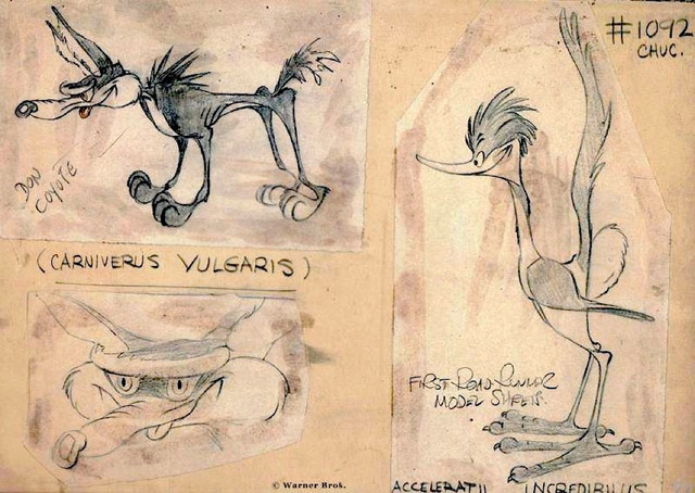
Also by Jones, how to draw Bugs Bunny:
(via @peeweeherman)
During the 1930s, animators at Walt Disney Studios developed a list of 12 basic principles of animation through which to achieve character and personality through movement. These principles were laid out in The Illusion of Life by Frank Thomas and Ollie Johnston. #6 is “slow-out and slow-in”:
As action starts, we have more drawings near the starting pose, one or two in the middle, and more drawings near the next pose. Fewer drawings make the action faster and more drawings make the action slower. Slow-ins and slow-outs soften the action, making it more life-like. For a gag action, we may omit some slow-out or slow-ins for shock appeal or the surprise element. This will give more snap to the scene.
Animator Vincenzo Lodigiani recently visualized the principles using a simple cube shape. You can see them individually here or all together in this video:
In a nod to the increasing prevalence of animation in app design, Khoi Vinh notes:
It’s a good reminder that as the overlap between interface design and animation grows wider, designers would do well to take note of the many decades of insight and knowledge that animators have accrued.
(via hn)
A wonderful little animation by Tomas Nilsson of my favorite fairytale, the one with wolves and woodsmen. This one’s all zippy infographics and diagrams.
The music gets to be a little much.
via Ektopia
Sometimes, the quickest way to a woman’s heart is a bunch of sheep illuminated with LEDs and herded into meaningful patterns. This is what you city folk have been missing.
A Matter of Loaf and Death, the Wallace and Gromit short formerly known as Trouble At’ Mill, will be shown on the Beeb in the UK at the end of December.
In this new masterpiece viewers will catch up with Wallace and Gromit who have opened a new bakery — Top Bun — and business is booming, not least because a deadly Cereal Killer is targeting all the bakers in town so competition is drying up. Gromit is worried that they may be the next victims but Wallace couldn’t care — he’s fallen head over heels in love with Piella Bakewell, former star of the Bake-O-Lite bread commercials. So Gromit is left to run things on his own when he’d much rather be getting better acquainted with Piella’s lovely pet poodle Fluffles.
Rumor is that a US showing will soon follow.
Now that Luxo Jr. is 22 years old, he’s interested in more than just chasing beach balls around. NSFW if videos of animated masturbating household furnishings aren’t safe to view in your workplace. There are a bunch of other Pixar spoof videos featuring variations on the Pixar lamp…from “state of the art” in 1986 to “anyone with some 3-D animation software can upload to YouTube” in 2008.
A few drawings of characters from The Wire drawn in the style of The Simpsons. Here’s a scene from season one; D’Angelo tries to teach chess to Wallace and Bodie:
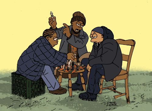
This might be my new favorite thing on the web. (thx, andy)
An (animated (and condensed (and brief (and truncated)))) history of evil. Almost as interesting for the comments as for the video itself.
Nick Park and Aardman Animations are doing a new Wallace & Gromit film called Trouble At’ Mill (pronounced Trouble At The Mill). Unlike Chicken Run or Were-Rabbit, it’ll be a 30-minute film made for TV, like A Close Shave or The Wrong Trousers.
Wallace and Gromit have a brand new business. The conversion of 62 West Wallaby Street is complete and impressive, the whole house is now a granary with ovens and robotic kneading arms. Huge mixing bowls are all over the place and everything is covered with a layer of flour. On the roof is a ‘Wallace patent-pending’ old-fashioned windmill.
With its latest film, Pixar manages to achieve something that few other big Hollywood films do these days: a convincing reality. The body language & emotions of the characters, the machinations of the kitchen, the sights and sounds of Paris, and the dice of the celery, Ratatouille gets it all right, down to the seemingly insignificant details. As we walked out of the movie, my wife, who has spent time cooking in restaurants (with Daniel Boulud, even), couldn’t stop talking about how well the movie captured the workings of the kitchen. To be sure, a G-rated kitchen but a true kitchen nonetheless.
I’m not quite sure how this is possible, but the people in Ratatouille acted more like real people than the actors in many recent live action movies (especially the rats), like they had realistic histories and motivations that governed their actions instead of feeling scripted and fake. The world of the movie felt as though it had existed before the opening credits and would continue after the curtain fell. Systems that have arisen through years, decades, centuries, millennia of careful evolution and interplay with one another were represented accurately and with care. In The Timeless Way of Building, Christopher Alexander writes of the quality without a name:
There is a central quality which is the root criterion of life and spirit in a man, a town, a building, or a wilderness. This quality is objective and precise, but it cannot be named. The search which we make for this quality, in our own lives, is the central search of a person, and the crux of any individual person’s story. It is the search for those moments and situations when we are most alive.
Pixar’s search for this quality in the making of Ratatouille is impressive. And in a way, necessary. In order to draw the audience into the film and make them forget that they’re watching animated characters in an animated world, the filmmakers need to get everything right. Motions too exaggerated, motivations glossed over, plot too uncoordinated, and the whole thing loses its sense of authenticity. People need to act like people, omelettes need to sag off of spatulas like omelettes, and the only woman chef in a haute cuisine French kitchen needs to behave accordingly.
This is an interesting state of affairs. In comparison, the live action movies have become the cartoons. Not all of them, but certainly many Hollywood movies have. Spidey 3, Transformers (I’m guessing), Die Hard 4 (guessing again), anything Eddie Murphy has made since the mid-80s, Wild Hogs, Blades of Glory, RV, etc. etc. I could go on and on. So what are we to make of a cartoon that seems more real than most live action movies? How about we stop thinking of them as cartoons or kids movies or animated films and start considering them as just plain movies? I’d put Pixar’s five best films — Toy Story 2, The Incredibles, Finding Nemo, Ratatouille, and let’s throw Brad Bird’s The Iron Giant in for good measure — among the best big budget films made in the last 10 years, no caveats required.
Oh, and I don’t want to give away the ending, but I will say that Ratatouille also has something to say about critics and criticism, a topic that’s currently under debate in foodie circles and has been discussed many times in different areas of the blogosphere. It almost seems as though the film’s message is aimed partially at bloggers, and for those that care to listen, that message is both encouraging and enlightening.
For Pixar, the making of Ratatouille included some time in real kitchens and restaurants, complete with a stop at the French Laundry for some face-time with Thomas Keller.
Animated movies have an animal problem and aren’t working as well as they used to at the box office. “There are all these people saying we are going to be the next Pixar. We say, ‘Who is your John Lasseter?’” The box office performance of the Wallace and Gromit movie is unfortunate…I’ve caught it a couple of times on cable and it’s really quite good.
Newer posts
Older posts





Socials & More