Tobey Maguire’s Non-CGI Tray Catch Scene in Spider-Man
Peter Parker’s iconic tray catch scene from 2002’s Spider-Man took 156 takes, but it was done without CGI, which is nice.


This site is made possible by member support. 💞
Big thanks to Arcustech for hosting the site and offering amazing tech support.
When you buy through links on kottke.org, I may earn an affiliate commission. Thanks for supporting the site!
kottke.org. home of fine hypertext products since 1998.
Beloved by 86.47% of the web.
Peter Parker’s iconic tray catch scene from 2002’s Spider-Man took 156 takes, but it was done without CGI, which is nice.
After 14-year-old Preston Mutanga’s Lego version of the trailer for Spider-Man: Across The Spider-Verse (embedded above) went viral, the team hired him to animate a short Lego sequence for the actual film.
In the brief scene, we see a Lego version of Peter Parker as he observes a dimensional anomaly and sneaks off to the Daily Bugle’s bathroom to alert another Spider-Man about the issue. While the scene is short, it killed in my theater and it also looked as good as anything in the recent Lego films. After seeing it, a few friends of mine even commented that it must have been the same team that animated it. But nope! It was a lone teenager, actually.
You can check out more of Mutanga’s work on his YouTube channel.

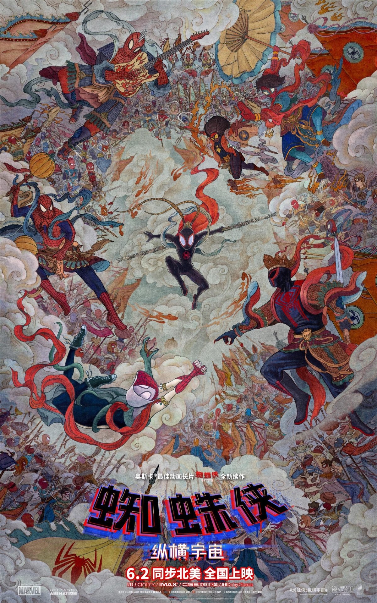
Totally loving this Chinese movie poster for Spider-Man: Across the Spider-Verse (perhaps designed by Huang Hai).
And while we’re on the subject, I watched the movie the other day and loved it. In fact, it might be the most visually inventive movie I’ve ever seen…it’s just one mindbending visual after another, for more than two hours. (via @gray)
When Spider-Man: Into the Spider-Verse came out in 2018, it had a very different look than most other animated feature-length films. Since the release of Toy Story in the mid-90s, digitally animated films made by the large studios had taken their cues from Pixar. “The Pixar Look” was “extremely high quality, physically based, and in some cases almost photorealistic”. Spider-Verse introduced a different style and since then, digital animation studios have been experimenting with non-photorealism. This video looks at how that shift is happening.
They just nailed the tone and aesthetic with these Spider-Verse movies. Really looking forward to seeing this one.
As a refresher, here’s how the team at Sony Pictures Animation created the distinctive look and feel of the first Spider-Verse movie.
I love Evan Puschak’s short analysis of a two-and-a-half minute scene from Sam Raimi’s 2004 film, Spider-Man 2. Raimi, a horror movie veteran, basically snuck a tight horror sequence into a PG-13 superhero movie — it’s a little cheesy, bloodless, and terrifying.
Animator Pinot Ichwandardi, designer/illustrator Dita Ichwandardi, and their three young children decided to remake some of the iconic scenes from the Spider-Man: Into the Spider-Verse trailer using traditional animation techniques. You can see some of the process and the impressive results in the video above. They drew the scenes by hand, built their own multiplane camera setup (a la Disney), and constructed a camera rig using Lego. You can read more about their process in these two Twitter threads: one, two.
After they were done, Sony Animation invited the family to visit their California campus to meet some of the team that worked on the movie, including producers Phil Lord and Chris Miller.
See also How Animators Created Spider-Verse.
2018’s most visually inventive movie was Spider-Man: Into the Spider-Verse. In this video, Danny Dimian, Visual Effects Supervisor, and Josh Beveridge, Head of Character Animation, talk about how they and their team created the look of the movie.
Two of my favorite details of the movie were the halftone patterns and the offset printing artifacts used to “blur” the backgrounds and fast-moving elements in some scenes. Borrowing those elements from the comic books could have gone wrong, it could have been super cheesy, they could have overused them in a heavy-handed way. But they totally nailed it by finding ways to use these techniques in service to the story, not just aesthetically.
Oh and the machine learning stuff? Wow. I didn’t know that sort of thing was being used in film production yet. Is this a common thing?
Update: Simon Willison did a Twitter thread that points to dozens of people who worked on Spider-Verse explaining how different bits of the film got made. What an amazing resource…kudos to Sony Animation for allowing their artists to share their process in public like this.
Socials & More