kottke.org posts about Evan Puschak
As an unapologetic fan of James Cameron’s Titanic, I really enjoyed Evan Puschak’s video love letter to the film and the genre it embodies: melodrama.
The term “melodrama” literally means drama accompanied by music, which is why film is maybe the best most natural medium for it — aside from opera. What’s important to note is that the moral core of melodrama doesn’t intellectualize the story; it adds to the emotion by giving it the flavor of virtue. You know that Rose and Jack should be together, so when they get together it feels right and righteous. And when Jack dies at the end, it’s a heartbreak that makes the whole universe seem wicked.
Miiight be time for a rewatch.
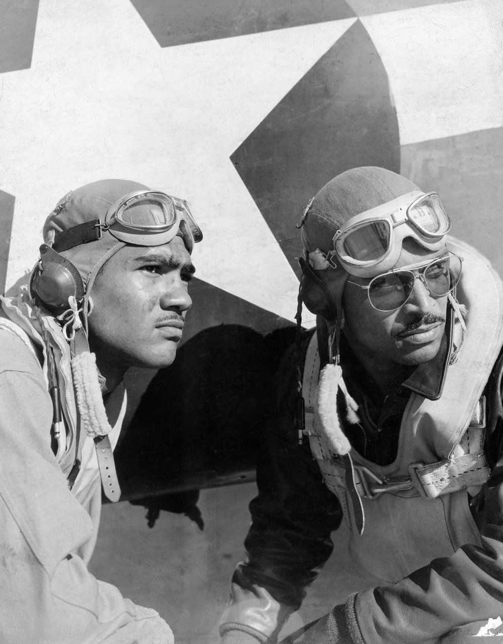
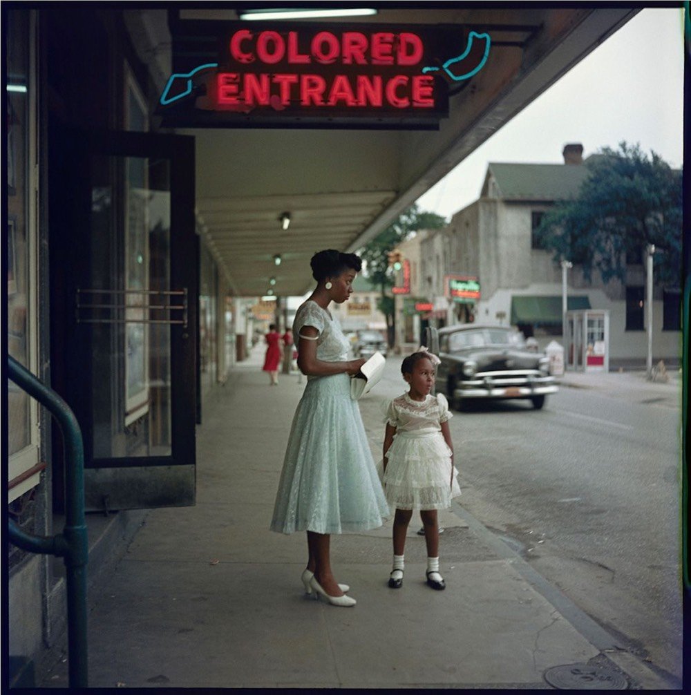
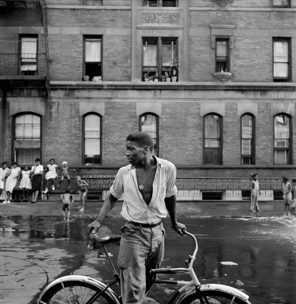
Gordon Parks was a novelist, poet, musician, composer, painter, and film director, but he was best known for his photography. In this video, Evan Puschak takes a look at Parks’ photography, from his FSA photos taken in the 40s to his photo essays for Life magazine. What a life, what a career. Here are just a few of Parks’ photos; I encourage you to check out the rest.

I love echo - any kind of reverberation or atmosphere around a voice or a sound effect that tells you something about the space you are in.
That’s a quote from legendary film editor and sound designer Walter Murch. In the 70s, he pioneered a technique called worldizing, for which he used a mix of pristine studio-recorded and rougher set-recorded sounds to make a more immersive soundscape for theater audiences. He used it in The Godfather, Apocalypse Now, and American Graffiti:
George [Lucas] and I took the master track of the two-hour radio show with Wolfman Jack as DJ and played it back on a Nagra in a real space — a suburban backyard. I was fifty-or-so-feet away with a microphone recording that sound onto another Nagra, keeping it in sync and moving the microphone kind of at random, back and forth, as George moved the speaker through 180 degrees. There were times when microphone and speaker were pointed right at each other, and there were other times when they were pointed in completely opposite directions. So that was a separate track. Then, we did that whole thing again.
When I was mixing the film, I had three tracks to draw from. One of them was what you might call the “dry studio track” of the radio show, where the music was very clear and sharp and everything was in audio focus. Then there were the other two tracks which were staggered a couple of frames to each other, and on which the axis of the microphone and the speakers was never the same because we couldn’t remember what we had done intentionally.
From Evan Puschak, this is an analysis of a tightly edited five-minute montage in the middle of Bong Joon-ho’s Parasite in which a family of schemers removes the last obstacle in their way of a luxurious life of service.
(This next bit is way off topic…I am not even going to try and connect it to the movie or Puschak’s thoughts on editing.) In looking for an appropriate quote from the video, I went searching in YouTube’s automatically generated transcript of the video and instead discovered whatever fancy AI program they’ve employed for transcription had some problems with the Korean language spoken in the video:
well the Kogi’s held on crew could to work a contra cut under something crazy kangaroo hot lava could carry yours a tiny car would cause a huge bang engines in his element saw cars motherfuckers Christian wear boxers and couvent a easy call it to Minaj Monica City on criminals chief juniper gun and a car don’t belong back in case come on Joey tell him to cool on the cloud Coronas our tornado man hold it up on watch from Atlanta
Also, peaches are a thing now in movies!
For the lastest episode of Nerdwriter, Evan Puschak reviews the history of movies about journalism and shows how the makers of Spotlight (and also All the President’s Men) show the often repetitive and tedious work required to do good journalism
I loved Spotlight (and All the President’s Men and The Post), but I hadn’t realized until just now how many of my favorite movies and TV shows of the last few years are basically adult versions of Richard Scarry’s What Do People Do All Day?
Speaking of, watching this video I couldn’t help but think that David Simon1 faced a similar challenge in depicting effective police work in The Wire. Listening to wiretapped conversations, sitting on rooftops waiting for drug dealers to use payphones, and watching container ships unloading are not the most interesting thing in the world to watch. But through careful editing, some onscreen exposition by Lester Freamon, and major consequences, Simon made pedestrian policing engaging and interesting, the heart of the show.
Have you been watching Succession? I feel bad about enjoying watching rich people be horrible to each other, but I do love the show. Evan Puschak rewatched both seasons with a careful eye and noticed the show’s preoccupation with language and how it is used and misused by the characters in the show.
Kendall: Words are just nothing. Complicated airflow.
One of the things I like most about the show is that I can’t figure out whether it’s a comedy or a drama. It’s bitingly funny and satirical but the whole thing is packaged like a drama and there are genuine emotional moments. I felt the same way about Fleabag and Transparent…the combination and subversion of these two familiar buckets of storytelling is part of what makes all of these shows great.
Pixar is always trying to push the envelope of animation and filmmaking, going beyond what they’ve done before. For the studio’s latest release, Toy Story 4, the filmmakers worked to inject as much reality into the animation as possible and to make it feel like a live-action movie shot with real cameras using familiar lenses and standard techniques. In the latest episode of Nerdwriter, Evan Puschak shares how they did that:
As I learned when I visited Pixar this summer,1 all of the virtual cameras and lenses they use in their 3D software to “shoot” scenes are based on real cameras and lenses. As the first part of the video shows, when they want two things to be in focus at the same time, they use a lens with a split focus diopter. You can tell that’s what they’re doing because you can see the artifacts on the screen — the blurring, the line marking the diopter transition point — just as you would in a live-action film.
They’re doing a similar thing by capturing the movement of actual cameras and then importing the motion into their software:
To get the motion just right for the baby carriage scene in the antique store for TS4, they took an actual baby carriage, strapped a camera to it, plopped a Woody doll in it, and took it for a spin around campus. They took the video from that, motion-captured the bounce and sway of the carriage, and made it available as a setting in the software that they could apply to the virtual camera.
Now, this is a really interesting decision on Pixar’s part! Since their filmmaking is completely animated and digital, they can easily put any number of objects in focus in the same scene or simply erase the evidence that a diopter was used. But no, they keep it in because making something look like it was shot in the real world with real cameras helps the audience believe the action on the screen. Our brains have been conditioned by more than 100 years of cinema to understand the visual language of movies, including how cameras move and lenses capture scenes. Harnessing that visual language helps Pixar’s filmmakers make the presentation of the action on the screen seem familiar rather than unrealistic.
From Evan Puschak, this explanation of how art went from almost fully representational painting to abstract impressionism in about 100 years is a 6-minute whirlwind tour of modern art, from Édouard Manet to Jackson Pollock’s drip paintings. I always love when Puschak dips back into art…the first video of ever posted of his was about Jacques-Louis David’s The Death of Socrates.
In the latest episode of Nerdwriter, Evan Puschak examines how Ian McKellen does a lot of heavy lifting with his eyes, especially in the Lord of the Rings trilogy. On his way there, I really liked Puschak’s lovely description of the physical craft of acting:
Part of that craft is understanding and gaining control of all the involuntary things we do when we communicate — the inflection of the voice, the gestures of the body, and the expressions of the face.
P.S. Speaking of actors being able to control their faces, have you ever seen Jim Carrey do wordless impressions of other actors? Check this out:
The Jack Nicholson is impressive enough but his Clint Eastwood (at ~1:15) is really off the charts. Look at how many different parts of his face are moving independently from each other as that jiggling Jello mold eventually gather into Eastwood’s grimace. Both McKellen and Carrey are athletic af in terms of their body control in front of an audience or camera.
In a letter to his brother Theo, Vincent van Gogh called his 1888 oil painting The Night Café “one of the ugliest pictures I have done”.
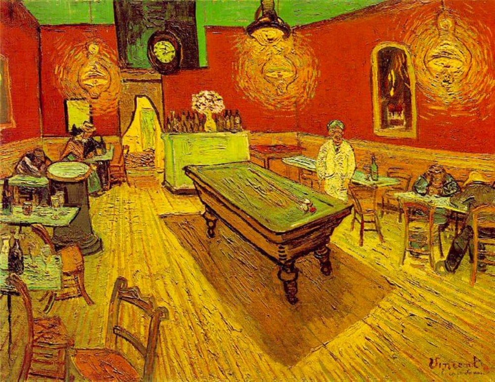
In this video, Evan Puschak looks at what van Gogh meant by that and how he used discordant colors together to suggest a mood.
van Gogh wrote of his intentions for the painting to his brother:
I have tried to express the terrible passions of humanity by means of red and green. The room is blood red and dark yellow with a green billiard table in the middle; there are four lemon-yellow lamps with a glow of orange and green. Everywhere there is a clash and contrast of the most alien reds and greens, in the figures of little sleeping hooligans, in the empty dreary room, in violet and blue. The blood-red and the yellow-green of the billiard table, for instance, contrast with the soft tender Louis XV green of the counter, on which there is a rose nosegay. The white clothes of the landlord, watchful in a corner of that furnace, turn lemon-yellow, or pale luminous green.
At the end of a long day in March 1936, Dorothea Lange stopped in a migrant workers camp in California for just 10 minutes and took six photos of a woman and her children. The final photo, known as Migrant Mother, became one of the most iconic photographs of the Great Depression.
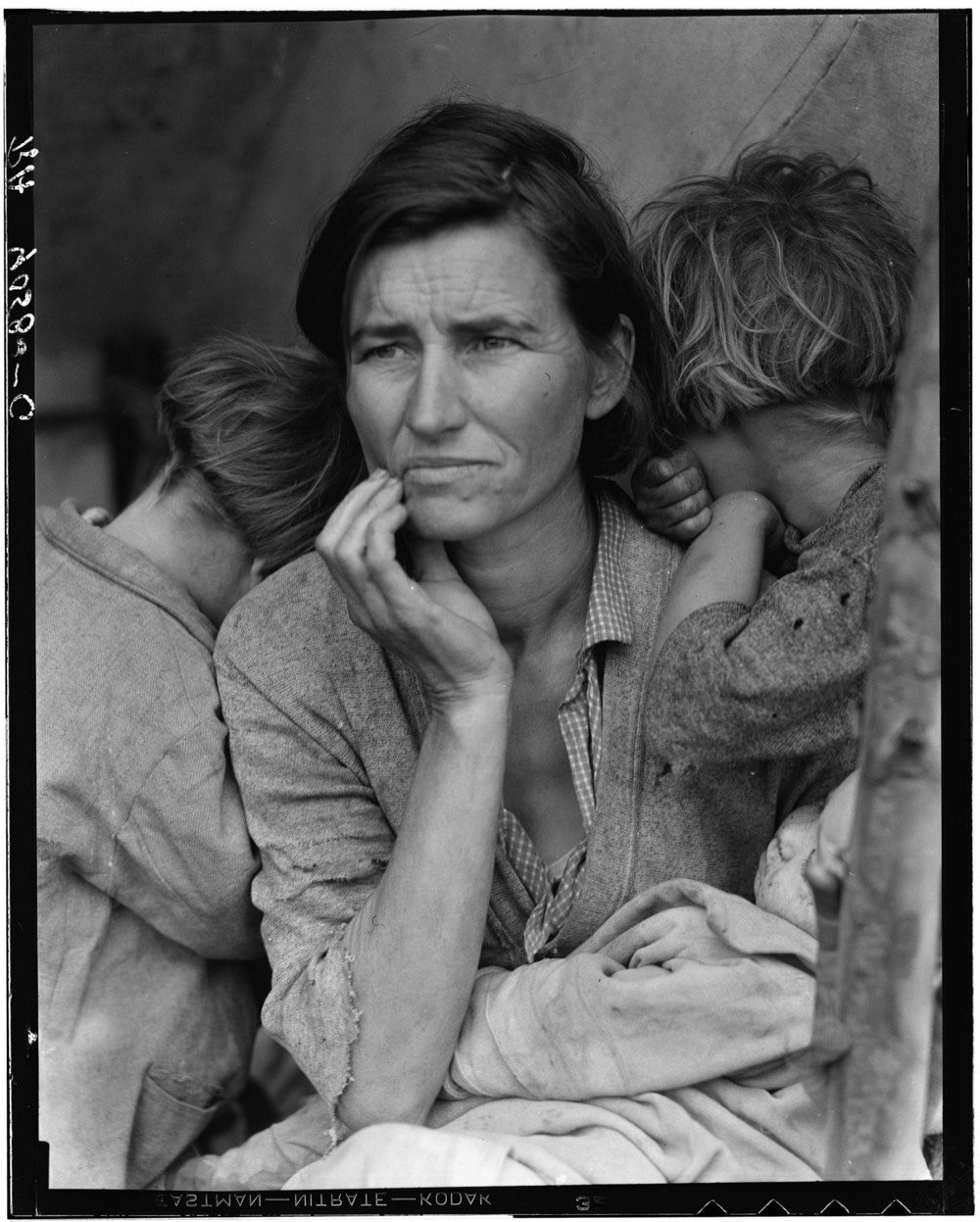
In this video, Evan Puschak details not only the context the photo was created under (FDR’s administration wanted photos that would shift public support towards providing government aid) but also how Lange stage-managed the scene to get the shot she wanted.
As Puschak notes, the photo we are all familiar with was retouched three years after its initial publication to remove what Lange saw as a detriment to the balance of the scene: the thumb of the woman’s hand holding the tent post in the lower right-hand corner.
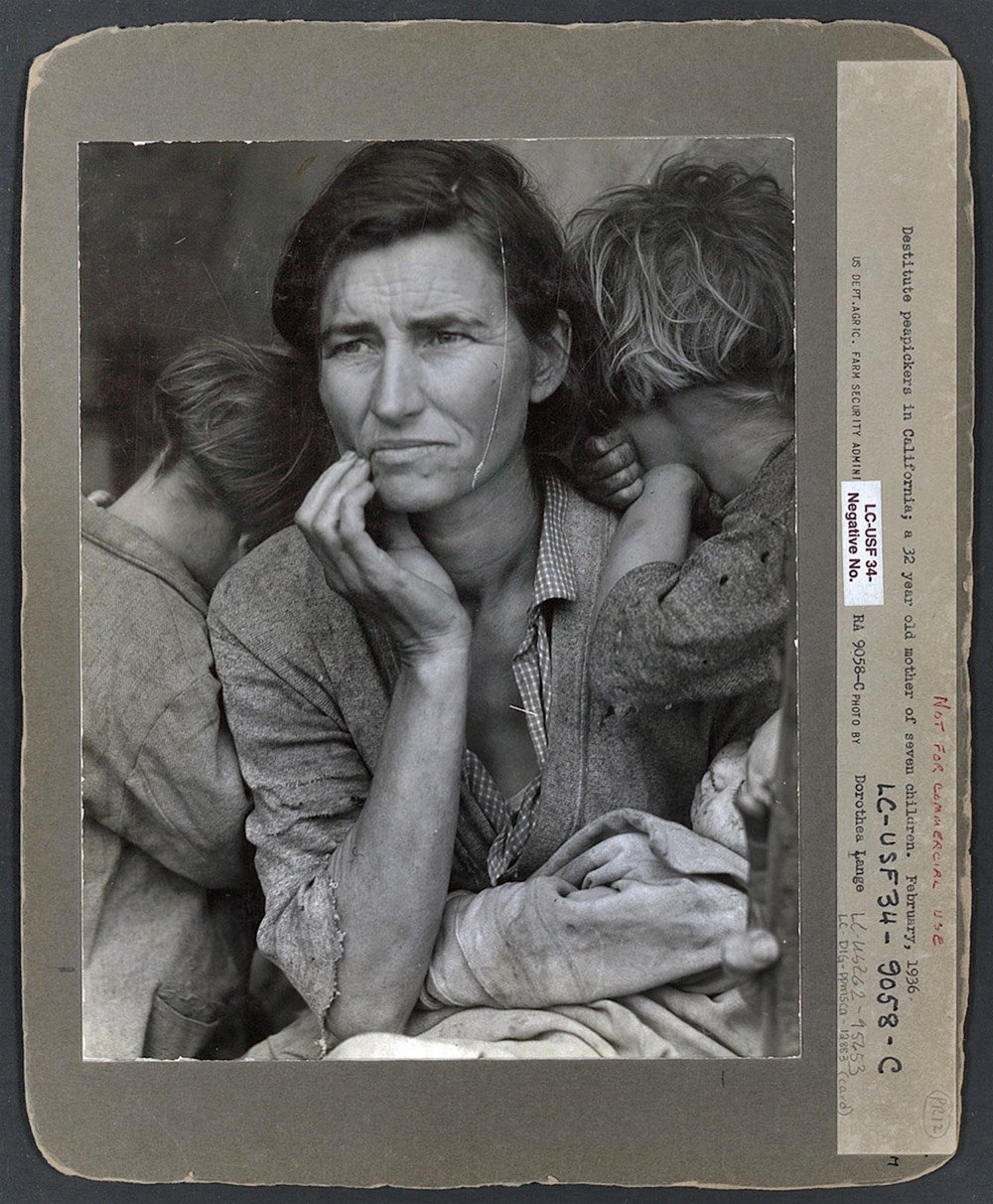
It is easy to tell whether a print of “Migrant Mother” was made before 1939, because that year Ms. Lange had an assistant retouch the negative and remove Ms. Thompson’s thumb from the bottom right corner, much to the chagrin of Roy Stryker, her boss at the Farm Security Administration. While that was a fairly common practice at the time, Mr. Stryker thought it compromised the authenticity not just of the photo but also of his whole F.S.A. documentary project, Ms. Meister said. But Ms. Lange considered the thumb to be such a glaring defect that she apparently didn’t have a second thought about removing it.
Here’s what it looked like before the alteration:
There are some other things about the photo that may prompt us to think about the objectivity of documentary photography. The cultural story of Migrant Mother is that this is a white woman who came west during the Great Depression for migrant work. The real story is more complicated. The woman was identified in the late 1970s as Florence Owens Thompson, and as she told her story, we learned some things that Lange didn’t have time to discover during her fleeting time at the camp:
1. Thompson was a full-blooded Cherokee born in Indian Territory (which later became the state of Oklahoma). As this NY Times review of Sarah Meister’s book on the photograph says, if people had known the woman wasn’t white, the photo may not have had the impact it did.
“We have never been a race-blind country, frankly,” Ms. Meister said. “I wish that I could say that the response would have been the same if everyone had been aware that she was Cherokee, but I don’t think that you can.”
2. The family were not recent migrants to California and had actually moved from Oklahoma in 1926, well before the Depression started. The family briefly moved back to Oklahoma because Thompson was pregnant and afraid the father’s family would take the baby from her, but returned to California in 1934.
3. Thompson’s first husband died in 1931 of tuberculosis while she was pregnant with her sixth child. A seventh child resulted from a brief relationship with the father mentioned above. An eighth child followed by a new husband in 1935. But it was Thompson who provided for the family while taking care of 8 kids:
By all accounts, Jim Hill was a nice guy from a respectable family who never could seem to get his act together. “I loved my dad dearly,” Norma Rydlewski said, “but he had little ambition. He was never was able to hold down a job.” The burden of supporting the family, and of keeping it together, fell on Florence.
4. The ultimate goal of Lange taking Thompson’s photo for the FSA was to stimulate public support for government aid to people who were out of work because of the Depression. But Thompson herself didn’t want any aid:
“Her biggest fear,” recalled son Troy Owens, “was that if she were to ask for help [from the government], then they would have reason to take her children away from her. That was her biggest fear all through her entire life.”
5. Thompson and her family weren’t actually living at the pea pickers camp when Lange photographed them there. They had just stopped temporarily to fix their car and were only there for a day or two.
In the field notes that she filed with her Nipomo photographs, Lange included the following description: “Seven hungry children. Father is native Californian. Destitute in pea pickers’ camp … because of failure of the early pea crop. These people had just sold their tires to buy food.”
Owens scoffed at the description. “There’s no way we sold our tires, because we didn’t have any to sell,” he told this writer. “The only ones we had were on the Hudson and we drove off in them. I don’t believe Dorothea Lange was lying, I just think she had one story mixed up with another. Or she was borrowing to fill in what she didn’t have.”
“Mother always said that Lange never asked her name or any questions, so what she [Lange] wrote she must have got from the older kids or other people in the camp,” speculates daughter Katherine McIntosh, who appears in the Migrant Mother photo with her head turned away behind her mother’s right shoulder. “She also told mother the negatives would never be published — that she was only going to use the photos to help out the people in the camp.”
So what are we to make of what we thought we knew about this photograph and what we know now? In 2009, Errol Morris wrote of the FSA photos:
Rothstein, Lange and Evans have been accused of posing their photographs, in short, of manipulating them to some end. And yet all photographs are posed. There is no such thing as pure documentary photography. The problem is not in what any of them have done, but in our misunderstanding of photography. No crimes were committed by the F.S.A. photographers. They labored as employees of an organization dedicated to providing propaganda for the Roosevelt administration. And they created some of the greatest photographs in American history. Photographs can be works of art, bearers of evidence, and a connection with the past for individuals, families and society as a whole. It should not be lost on any of us that these controversies are still with us. The Photoshop alteration of a photograph “documenting” the launching of Iranian missiles, the cropping of a Christmas get-together at the Cheney ranch. These are just the latest iterations. In 1936, Roosevelt was reelected in a contentious election. Photography played a controversial role, reminding us that wherever there are intense disagreements, particularly political disagreements, there will be disagreements about photography, as well.
The stories we tell about photographs change as we change and as our culture changes. Yes, Migrant Mother is a symbol of the hardship endured by many during the Great Depression. But Migrant Mother is also the portrait of a fiercely independent Native American single mother who fought to provide for her family and keep them together during the most difficult time in our nation. That’s a story worth hearing today.
Both prints above are courtesy of the Library of Congress, Prints & Photographs Division: with thumb and without. You can also explore the rest of the LOC’s FSA collection.
Like Instagram filters and vinyl records, the use of film grain in movies is now a conscious choice on the part of media creators and consumers. In this video featuring the recent Nic Cage horror movie Mandy (which I hadn’t even been aware of), Evan Puschak discusses how film grain can function as an integral part of a film’s story & mood, not just as a “byproduct of chemical processing”. I found Steven Spielberg’s comment about film grain especially interesting:
The grain is always moving, it’s swimming, which means that even in a still life, let’s say a flower on a table, that flower is alive even if it’s not moving.
Ok folks, it’s time for some game theor- I mean, art history. In this video, Evan Puschak explains what makes Rembrandt’s The Night Watch so compelling from both a historical and artistic perspective.
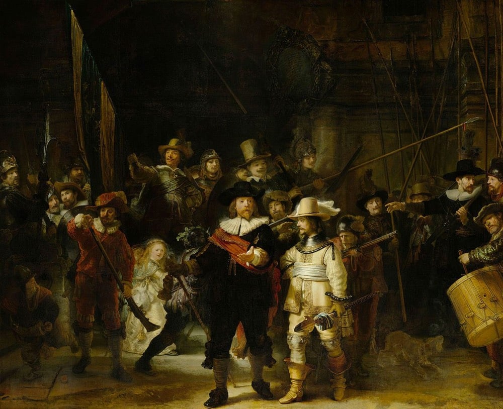
When I was in Amsterdam last year, I saw The Night Watch at the Rijksmuseum. As Puschak notes, it’s an impressive painting — for one thing, it’s more than 12 feet tall and weighs more than 740 pounds. However, I was even more keen on a nearby early self-portrait though.

Rembrandt painted this when he was 22 and while it lacks the subtle mastery of his later work, I couldn’t stop staring at it and kept looping back for one more view. If you look at a larger view of the painting, you can see where Rembrandt used the butt of his brush to scratch the wet paint to accentuate his curly hair. Something about seeing those tiny canyons on the canvas…I could almost see the young artist standing right where I was, flipping his brush around to scrape those marks before the paint dried, making his dent in the universe.
P.S. My absolute favorite piece at the Rijksmuseum was Vermeer’s The Milkmaid. Holy moly, what a painting.
In Michael Jackson’s transition from child singer to the electrifying King of Pop, Evan Puschak argues that Don’t Stop ‘Til You Get Enough from Off the Wall marked an inflection point. The song was a combination of the 70s sounds of funk & disco but mixed with other elements to make a pop hit that culturally belonged more to the 80s.
In this short video, Evan Puschak talks about how music is made for Super Nintendo games. That system was first released in 1990 and the audio chips could only hold 64 KB of information, only enough room for beeps, boops, and very short samples. But composers like David Wise, whose soundtrack for the Donkey Kong Country series of games is on many lists of the best video game music, were able to make the SNES sing despite its limited capabilities.
Darth Vader was only on screen in the original Star Wars movie for 8 minutes and for a little under 34 minutes in the whole original trilogy. In the latest Nerdwriter episode, Evan Puschak examines how the cinematography of the films (particularly Empire Strikes Back) helped make Vader into an iconic character despite such little screentime.
Today seems to be movie villain day on kottke.org: see also this morning’s post on Black Panther’s Killmonger.
In his latest video, Evan Puschak compares the action scenes from Marvel and DC superhero movies and shows how DC comes up short. Some don’t appreciate all of the humor packed into Marvel’s films, but the DC movies take themselves WAY too seriously. And don’t even get me started on Zack Snyder — outside of 300, his take on action is not good. It’s not a coincidence that Snyder didn’t direct Wonder Woman, the best of the DCEU films in terms of action (and everything else).
See also the problem with action movies today and why are action movie trailers sounding more musical lately?
Yesterday, hip hop legend Lauryn Hill announced The Miseducation Of Lauryn Hill 20th Anniversary Tour 2018.
This summer marks the 20th anniversary of seminal hip-hop album The Miseducation Of Lauryn Hill, and Lauryn Hill is marking the occasion with a special anniversary tour dedicated to the album. Hill will be performing Miseducation in full, and each stop on the tour will feature “special guest performers” that haven’t been named yet. Plus, a portion of ticket sales will be donated to Hill’s MLH Foundation, which backs a huge group of charities built to help people all over the world-including the Africa Philanthropic Foundation, Appetite For Change, Apps & Girls, and the Equal Justice Initiative.
And Nerdwriter’s Evan Puschak, always with his ear to the ground (or perhaps with his ear to Drake’s Nice for What), just came out with this mini-doc celebrating of Hill’s music, influences, and people she’s influenced:
This might be one of the best Nerdwriter videos yet: no commentary, just clips of Hill performing and talking, music she was influenced by, and people & music that were influenced by her…an impressionistic portrait of a significant and uncompromising artist.
From Evan Puschak, a quick video on dark patterns, UI design that tricks users into doing things they might not want to do. For instance, as he shows in the video, the hoops you need to jump through to delete your Amazon account are astounding; it’s buried levels deep in a place no one would ever think to look. This dark pattern is called a roach motel — users check in but they don’t check out. I wonder how much this single pattern has added to Jeff Bezos’ personal net worth?
In this episode of the Nerdwriter, Evan Puschak imagines a film school class that studies the influences of Call Me By Your Name, which include a pair of Merchant Ivory films, A Room With a View and Maurice. One of the best love stories I’ve seen in recent years, Call Me By Your Name is one of those movies I’m waiting to watch again after some time, saving it like the last chocolate in the box.
In the latest installment of Nerdwriter, Evan Puschak explains why Francisco Goya’s painting Saturn Devouring His Son is so disturbing, not only from the standpoint of the subject matter but also the circumstances surrounding its creation.
I am especially fond of Art History Nerdwriter because the first video of his I ever watched was on Jacques-Louis David’s The Death of Socrates. I’ve been a fan ever since.
For the latest installment of Nerdwriter, Evan Puschak explains the distinct brand of physical comedy practiced by Rowan Atkinson, best known for his character Mr. Bean. For my money, this scene of Mr. Bean running late for a dentist appointment is one of the funniest things ever put on screen.
This is the comedy of personality rather than the comedy of gags. It’s not about doing funny things. It’s about doing something quite normal in a funny way.
Atkinson himself explained and demonstrated the principles of physical comedy in a 60-minute documentary called Funny Business; here’s part 1:
This is really odd timing. Just two days ago, I was watching some videos with my kids and we stumbled across Rowan Atkinson performing as Mr. Bean at the opening ceremonies of the London Olympics in 2012, which a) opens Puschak’s video, b) I had completely forgotten about, and c) is perhaps the most British thing ever.
Using a scene from Steven Spielberg’s Munich that features very little dialogue, Evan Puschak shows how much sound design contributes to the feeling and tension of a film. I love the two head fakes Puschak does with the sound at the beginning of the video. It’s like, oh wait, he fooled me a bit there, so I need to pay more attention.
In the New Yorker, Alex Ross points to Frank Lehman’s Complete Catalogue of the Motivic Material in ‘Star Wars,’ Episodes I-VIII, which has been updated to include The Last Jedi. Ross goes on to note that composer John Williams did some of his strongest work for the film, deftly employing musical themes called leitmotifs to supplement (and sometimes subvert) the on-screen action. (Spoilers, ho!)
In early scenes set at a remote, ruined Jedi temple, we keep hearing an attenuated, beclouded version of the Force motto: this evokes Luke’s embittered renunciation of the Jedi project. As the young heroine Rey begins to coax him out of his funk, the Force stretches out and is unfurled at length. Sometimes, the music does all of the work of explaining what is going on. In one scene, Leia, Luke’s Force-capable sister, communicates telepathically with her son Kylo Ren, who has gone over to the dark side and is training his guns on her vessel. Leia’s theme is briefly heard against a dissonant cluster chord. Earlier in the saga, we might have been subjected to dialogue along the lines of “Don’t do this! I’m your mother!” Williams’s musical paraphrase is more elegant.
If you’re looking for a primer/refresher for the use of leitmotif in film, Evan Puschak’s video on Howard Shore’s music for the Lord of the Rings films is a good place to start. (via anil dash)
Using a single page from Art Spiegelman’s Maus (considered by many as one of the finest graphic novels ever written), Evan Puschak considers how Spiegelman used the page (and not the individual panel) as the atomic unit of the narrative of his father surviving the Holocaust. Designing the page is the thing. In making this point, he quotes the cartoonist Seth (Gregory Gallant):
The ‘words & pictures’ that make up the comics language are often described as prose and illustration combined. A bad metaphor: poetry and graphic design seems more apt. Poetry for the rhythm and condensing; graphic design because cartooning is more about moving shapes around — designing — then it is about drawing.
Drawing from David Wittenberg’s book, Time Travel: The Popular Philosophy of Narrative, as a guide, Evan Puschak goes in search of the origins of time travel in fiction. Along the way, he connects Charles Darwin’s work on evolution to the largely forgotten genre of utopian romance novels to the depiction of time travel in modern sci-fi.
P.S. While I was in France, I met up with Evan for lunch (we happened to be in Paris at the same time). We’d never met before, and it was really strange hearing the voice of one of my favorite YouTube channels coming out of an actual person.
This is a really keen observation by Evan Puschak about the camera movement in David Fincher’s films: it mimics your eyes in paying attention to the behavior in a scene. The effect is sometimes subtle. When a character shifts even slightly, the camera keeps that person’s eyes and face in the same place in the frame, just as you would if you were in the room with them.
Black Mirror, which has a fourth season coming out in the near future, is an unflinchingly dark show, full of bad things happening to people that don’t necessarily deserve them. Centuries ago, Aristotle defined tragedy as:
A tragedy is the imitation of an action that is serious and also, as having magnitude, complete in itself; in appropriate and pleasurable language; … in a dramatic rather than narrative form; with incidents arousing pity and fear, wherewith to accomplish a catharsis of these emotions.
But as Evan Puschak argues in this video essay, that’s not the whole story of why we watch Black Mirror.
FYI: If you haven’t seen the series yet, there are major spoilers for Black Mirror (and also for Breaking Bad and Game of Thrones).
In a new video, Evan Puschak explores the comedy of Norm MacDonald. Even if you don’t care for MacDonald’s work, you may come away from this with more respect for his comedy and craft. Me? I can’t even tell if MacDonald is funny anymore…I hear that deadpan-but-smiling voice and I just start to laugh in a purely Pavlovian way.
Oh, this is a clever bit of TV/film analysis by Evan Puschak: he reconstructs the Loot Train Battle from the most recent episode of Game of Thrones using clips from other movies and TV shows (like 300, Lord of the Rings, Stagecoach, and Apocalypse Now). In doing so, he reveals the structure that many filmed battle scenes follow, from the surprising enemy attack presaged by the distant sound of horses (as in 300) to the quiet mid-chaos reflection by a shocked commander (as in Saving Private Ryan). Everything is a Remix, right?
This reminds me of how the Rogue One production team made a full-length reel of the film for director Gareth Edwards from scenes from other movies so that the timing and pacing could be worked out.
It’s very simple to have a line [in the script] that reads “Krennic’s shuttle descends to the planet”, now that takes maybe 2-3 seconds in other films, but if you look at any other ‘Star Wars’ film you realise that takes 45 seconds or a minute of screen time. So by making the whole film that way — I used a lot of the ‘Star Wars’ films — but also hundreds of other films too, it gave us a good idea of the timing.
For example the sequence of them breaking into the vault I was ripping the big door closing in ‘Wargames’ to work out how long does a vault door take to close.
This fascinating behind-the-scenes look at the battle doesn’t allude to any such storyboarding, but as Puschak notes, battle scenes from dozens of other movies surely weren’t far off in their minds while putting this one together.
Newer posts
Older posts
.jpg)
Socials & More