Cool Modular Signage for the National Library of Luxembourg


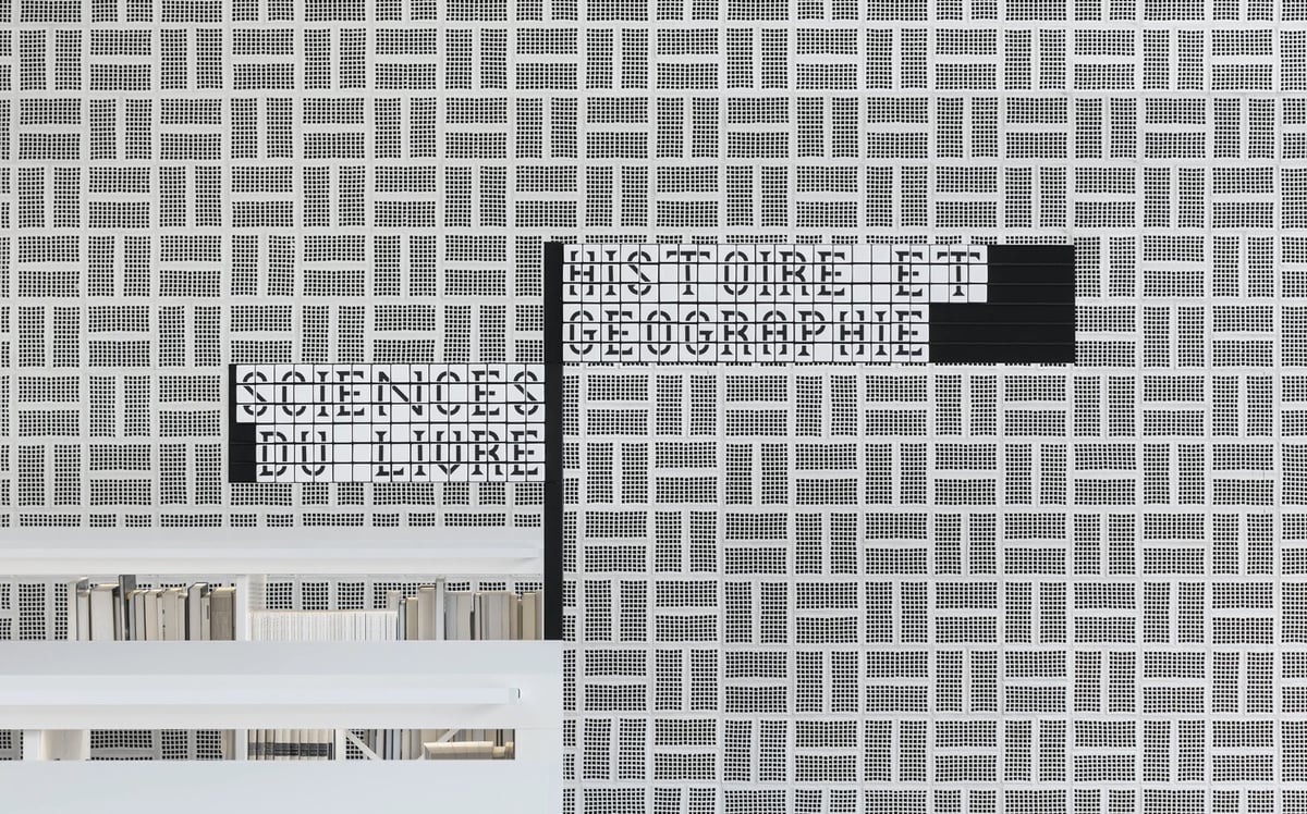
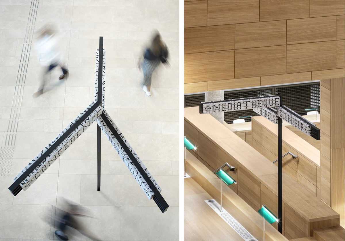
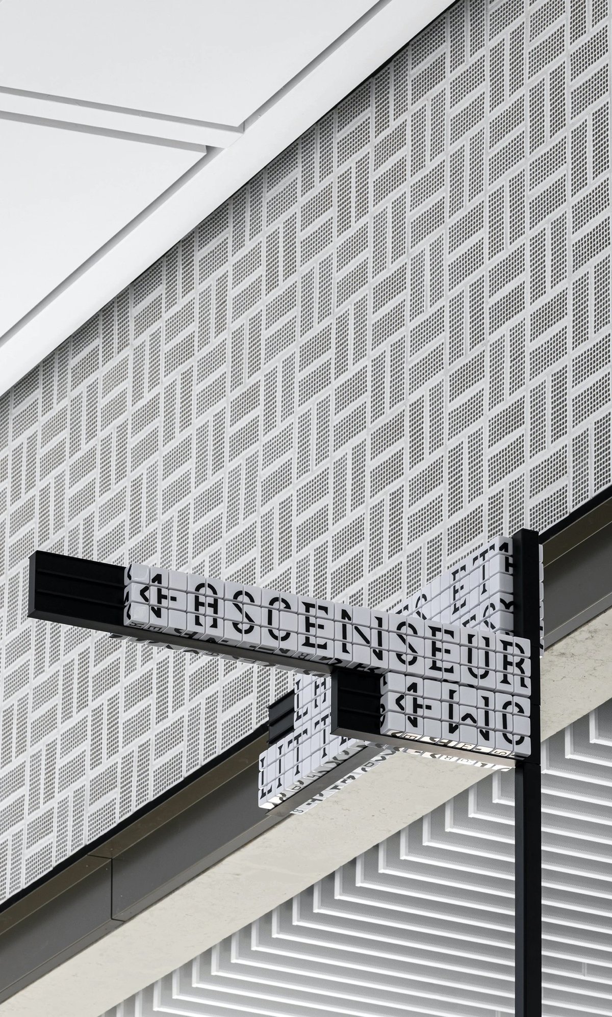
Sascha Lobe’s team at Pentagram has designed a functional and stylish modular signage system for the National Library of Luxembourg. The signs use cubes (inspired by LED clock displays?) that can be reconfigured into different words by library staff.
Numerical and alphabetical cubes are the foundation of the BnL’s modular signage system. In handling massive volumes of information and growing library collections, it is essential to free the library staff from rigid systems and equip them with the ability to easily make signage changes.
The flexible signage plan, consisting of 25,000 resin cubes, 6000 tableaus and 2,400 numerical shelving characters, enables staff to independently customize information as the library’s collection fluctuates. The resin cubes, constructed from a durable material, also translate the timelessness of the library and its long-standing presence throughout the years and into the future.
The only (but perhaps significant) downside to the signs is that they are not actually super legible when compared to a non-modular alternative. They sure do look great though.
Update: This post got shared on Twitter by a couple of librarian pals and Librarian Twitter was not impressed by this signage at all. Not legible, not accessible, and difficult/fiddly to maintain were the main complaints. As someone who believes that design is primarily about how something works and not how something looks, I’m a bit embarrassed that I didn’t hit that point harder in this post. I do love the aesthetics of the project, but from the photos, the legibility looks terrible. Maybe it’s different while navigating the space in person, but if not, you have to wonder how helpful hard-to-read signs are to patrons.


Socials & More