kottke.org posts about art
Building on the lessons of World War II, Ukrainians are trying to save their art and other important cultural artifacts from destruction during Russia’s invasion. When an invader repeatedly tries to deny the cultural distinction of a people for decades and even centuries, like Russia has done with Ukraine, saving buildings and statues and paintings can be of great importance.
Because under the 1954 convention, “damage to cultural property means damage to the cultural heritage of all mankind”. So attacks on cultural heritage are a considered war crime. But treaties can only do so much. In the years since, conflicts around the world have rendered immeasurable damage to cultural heritage. A lot of it intentional. Like the Taliban’s destruction of the Bamiyan buddhas. And Isis’ attacks on ancient sites all over Syria.
“That cultural heritage is not only impacted, but in many ways it’s implicated and central to armed conflict. These are things that people point to that are unifying factors for their society. They are tangible reflections of their identity.”
And Putin has made it clear that identity is at the ideological center of Russia’s invasion: “I would like to emphasize again that Ukraine is not just a neighboring country for us. It is an inalienable part of our own history, culture, and spiritual space.”
“He thinks that we don’t really exist and they want to destroy all the signs of our identity.”
BTW, regarding the destruction of the museum that housed works by Maria Prymachenko at the start of the video: according to the Ukrainian Institute, the works were saved from burning by local residents.
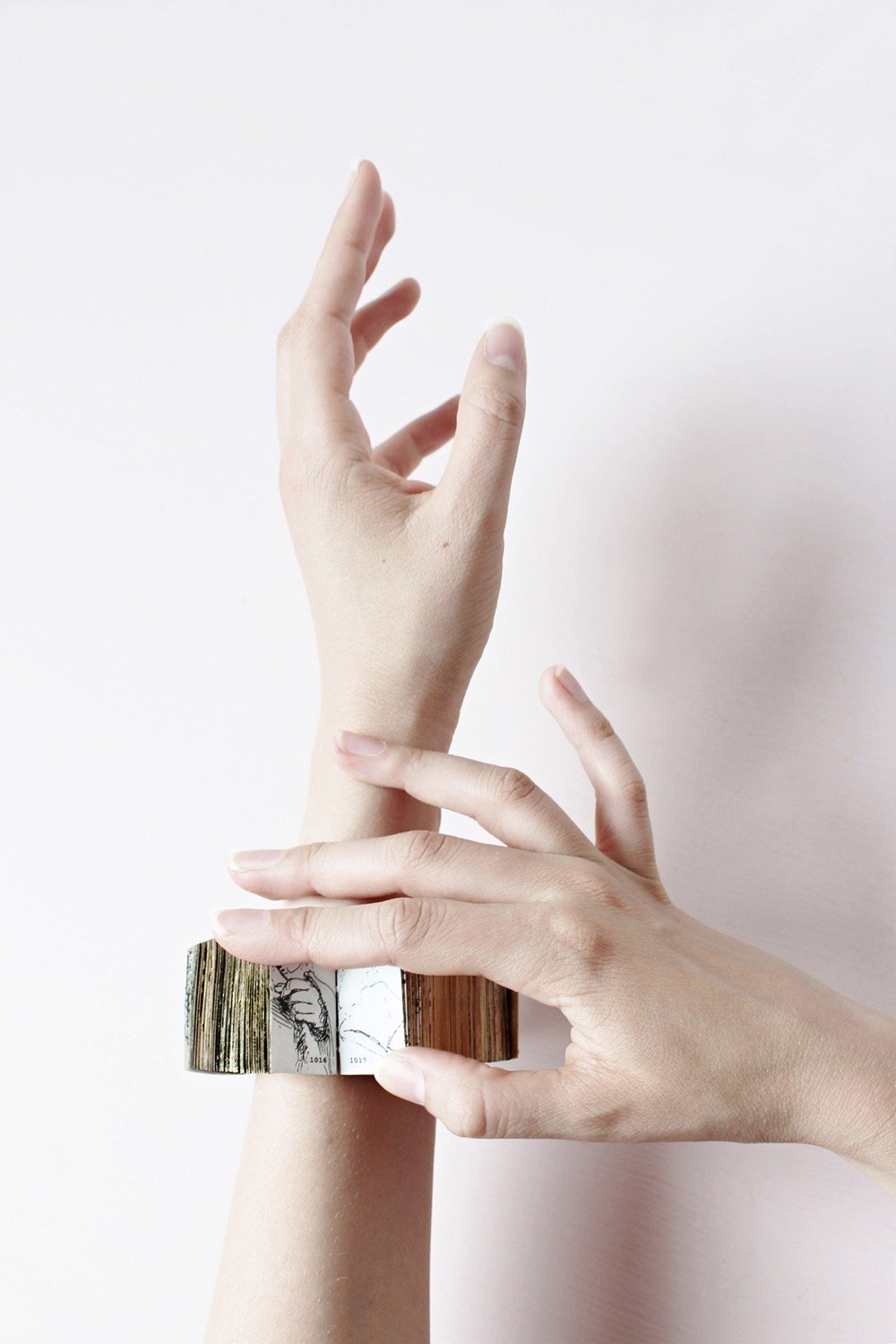
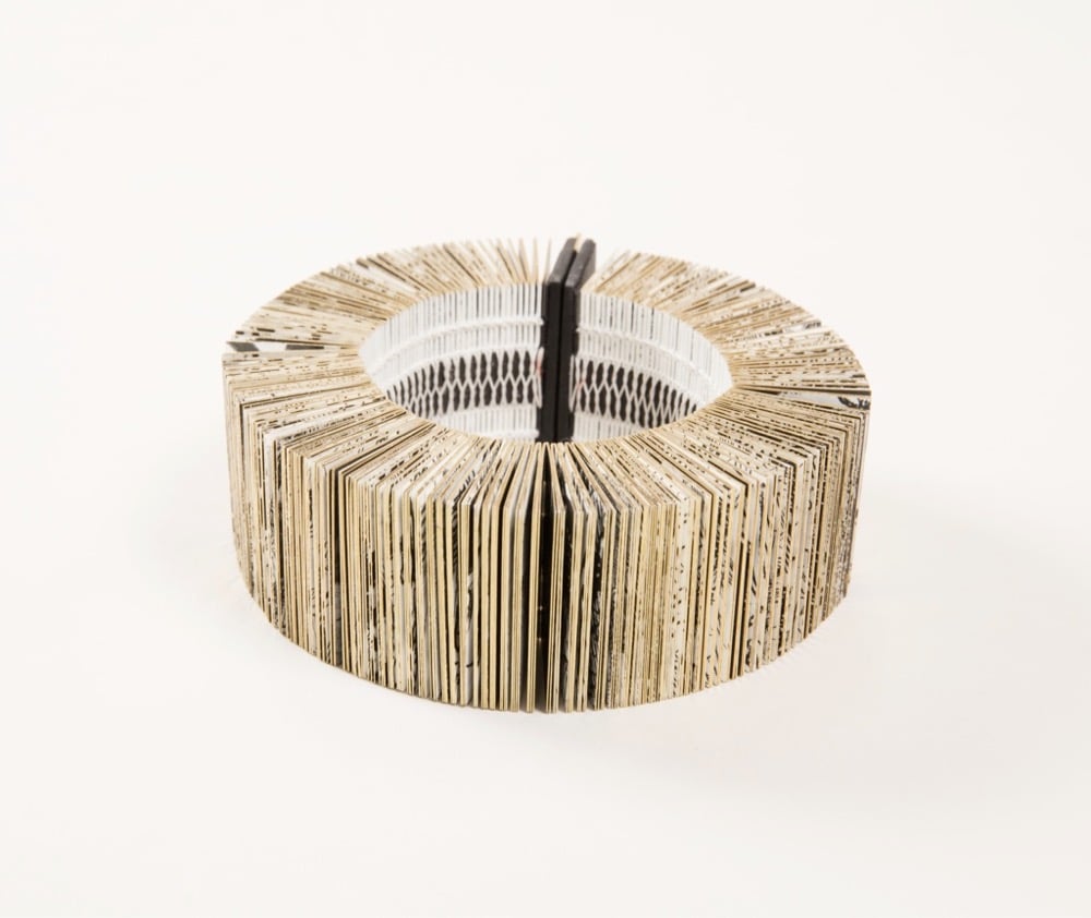
Inspired by the online availability of high resolution images from the Rijksmuseum’s collection, design firm Duinker and Dochters created a book of 1400 images of hands from Rembrandt’s work that is wearable as a bracelet. From the Cooper Hewitt:
Designers Lia Duinkers and Lyske Gais, are fascinated by the details Rembrandt achieved in his depiction of hands. From hundreds of images of Rembrandt’s hand illustrations, they created an intriguing book-bracelet, an intricate piece that not only pays homage to the talent of Rembrandt, but also spotlights the genius of Duinker and Gais’s skills in graphic design, bookbinding, and jewelry design. Entitled “Rembrandt’s Hands and a Lion’s Paw” the book-bracelet is comprised of 1400 miniature pictures of hands derived from 303 Rembrandt etchings and drawings in the collection of the Rikjsmuseum and available as high-resolution images on the museum’s website.
Here’s what the bracelet looks like in its storage box:
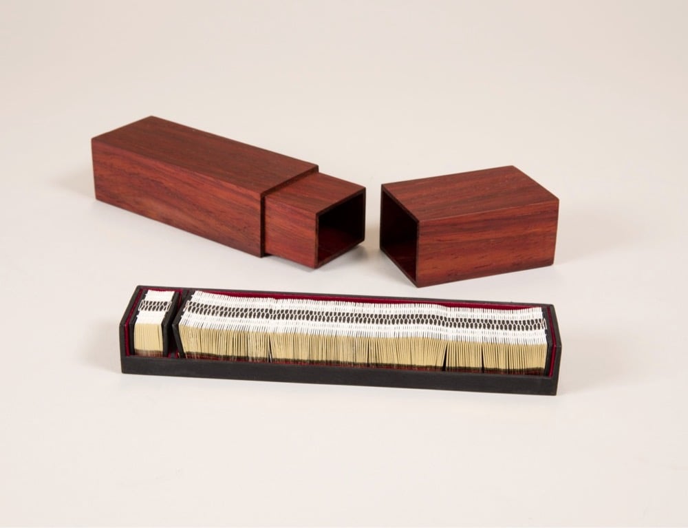
What a fantastic little object…you can marvel about how it was made on their website. (via colossal)
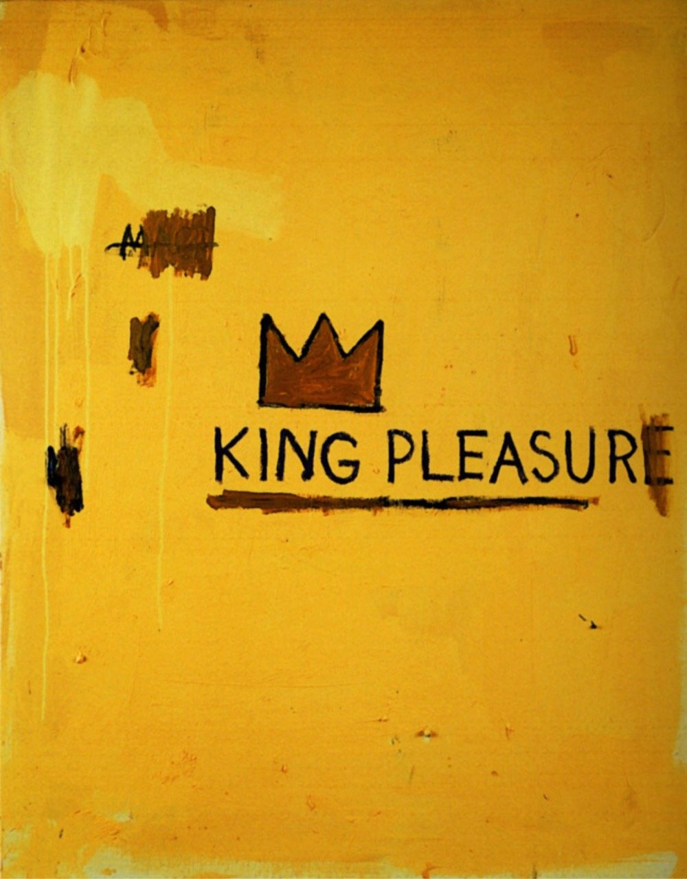
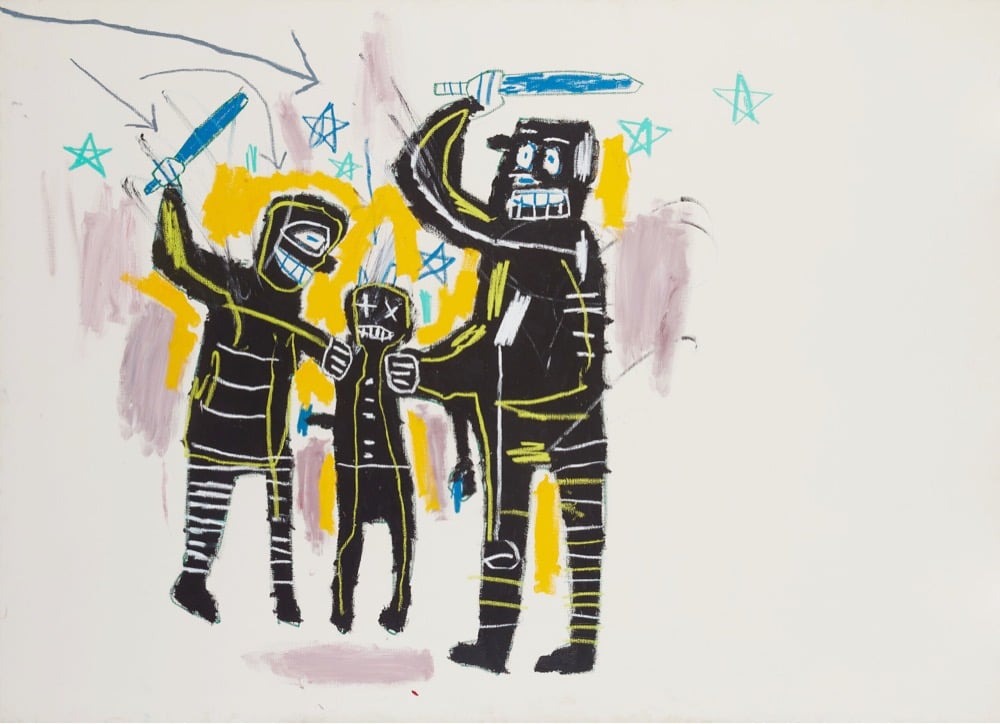
Jean-Michel Basquiat: King Pleasure is a new exhibition of the life and work of Jean-Michel Basquiat, curated by his two younger sisters, Lisane Basquiat and Jeanine Heriveaux. It opened this past weekend in NYC and includes a bunch of work that’s never been exhibited before. From the NY Times:
The show, “Jean-Michel Basquiat: King Pleasure,” features more than 200 artworks and artifacts from the artist’s estate — 177 of which have never been exhibited before — in a 15,000-square-foot space designed by the architect David Adjaye. Providing perhaps the most detailed personal portrait to date of Basquiat’s development, the show comes at a time when the artist’s market value continues to soar and his themes of race and self-identity have become especially resonant. (The mayor’s office is to proclaim Saturday, the show’s opening, Jean-Michel Basquiat Day.)
“They’re literally opening up the vaults,” said Brett Gorvy, a dealer and a former chairman and international head of postwar and contemporary art at Christie’s. “These are paintings I’ve only seen in books.”
This looks great; definitely hitting this the next time I’m in NYC. Tickets are available here. (via pentagram, who did the identity for the exhibition)
Over a period of four years and after thousands of miles of driving, Eric Tabuchi photographed the backs of semi-trailers with letters of the alphabet on them, eventually compiling all 26 letters. Here’s the first dozen:

(via present & correct)
Toile de Jouy is a fabric, typically featuring “romantic pastoral scenes”, that was popular in France in the 18th century — the wealthy covered their walls in it. Interior designer Sheila Bridges developed her own patterns for her Harlem Toile, inspired by her Harlem and Philadelphia neighborhoods and the African American experience more generally.
As an African American living in Harlem, I have always been intrigued and inspired by the historical narrative of the decorative arts, especially traditional French toile with its pastoral motifs from the late 1700s. I’m entertained by the stories these patterns tell and the questions they sometimes raise. But after searching for many years for the perfect toile for my own home, I decided that it quite simply didn’t exist. I created Harlem Toile de Jouy initially as a wallcovering then expanded the collection to include fabrics, bedding, plates, glassware, umbrellas and clothing. This design (which lampoons some of the stereotypes deeply woven into the African American experience), has been featured in The Studio Museum In Harlem, the Museum of Art and Design in New York City, and the Musée De La Toile De Jouy in Jouy-en Josas, France. I am honored to have my Harlem Toile De Jouy wallpaper included in The Cooper Hewitt, Smithsonian Design Museum’s permanent wallpaper collection.


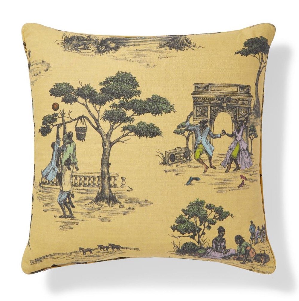
Veronica Chambers wrote a great piece about Harlem Toile for the NY Times: The Wallpaper That Is Also a ‘Reminder That My Ancestors Had My Back’.
The wallpaper, which was created by the celebrated interior designer Sheila Bridges in 2006, features beautiful drawings of African Americans in the lush, historical settings that rarely featured them — a couple in 18th-century dress dance under a structure that recalls the Arc de Triomphe to the tunes of a boombox that rests playfully on the grass; women in ball gowns sit under a majestic tree, one combs the other’s hair while yet another woman holds up a fairy-talelike mirror; a courting couple in fashion that now brings to mind the popular series “Bridgerton” feast on a picnic. For a Black girl who grew up loving Jane Austen and Toni Morrison with equal aplomb, Harlem Toile was more than wallpaper. It was a tableau of possibility and belonging.
I’m not doing justice to all of what is being expressed in Bridges’ work and how it’s resonating with Chambers & other members of the Black community, so you should just read the piece. (thx, caroline)
I just switched my web browser to use the New Tab with MoMA extension. Each new browser tab I open contains another piece of art from MoMA’s collection. Here are a few things that have popped up so far:
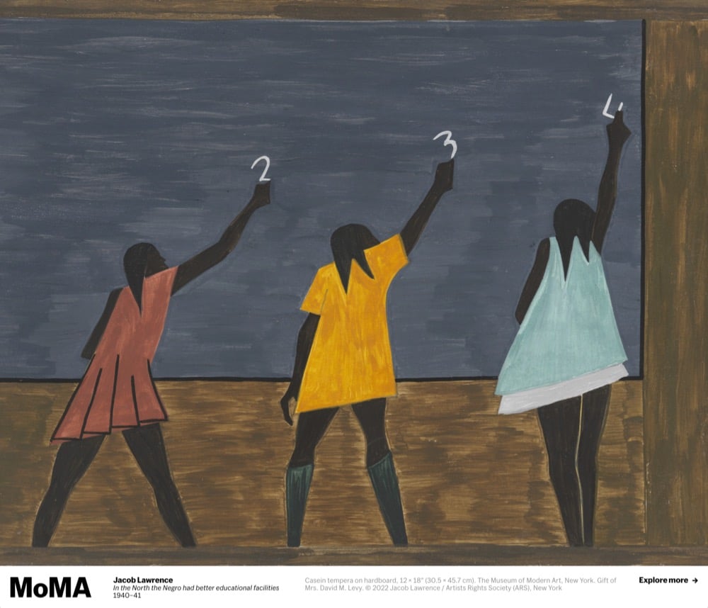
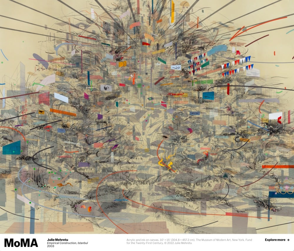
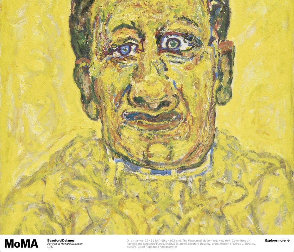
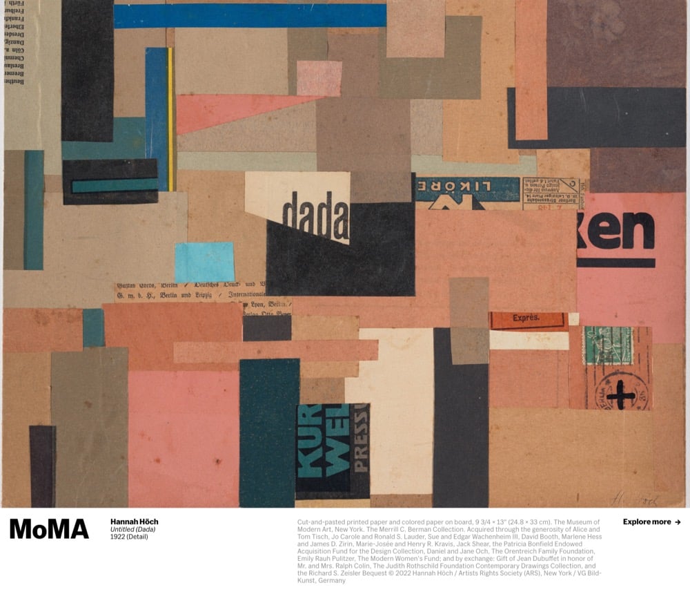
I’m really enjoying this so far…it feels like being in a slow-moving art history class all day long.
This is another great episode of James Payne’s Great Art Explained on the work of Claude Monet, specifically the massive water lily canvases he completed before his death, created as “a war memorial to the millions of lives tragically lost in the First World War”.
Claude Monet is often criticised for being overexposed, too easy, too obvious, or worse, a chocolate box artist. His last works, the enormous water lily canvasses are among the most popular art works in the world.
Yet there is nothing tame, traditionalist, or cosy about these last paintings. These are his most radical works of all. They turn the world upside down with their strange, disorientating and immersive vision.
Monet’s water lilies have come to be viewed as simply an aesthetic interpretation of the garden that obsessed him. But they are so much more.
These works were created as a direct response to the most savage and apocalyptic period of modern history. They were in fact conceived as a war memorial to the millions of lives tragically lost in the First World War.
I’ve seen these paintings at the Musée de l’Orangerie — amazing to see them exactly the way in which the artist intended them to be seen.
See also Film of Claude Monet Painting Water Lilies in His Garden (1915) and Monet’s Ultraviolet Vision.

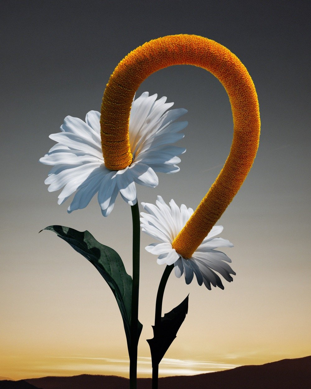

The Fleur is artist Ondrej Zunka’s collection of imagined digital flowers with fanciful forms — an “Encyclopedia Botanica Digital”. (via colossal)
Architect Kei Endo creates really lovely watercolor paintings of hotel rooms that she’s stayed in — you can find her work on Instagram and her website. The paintings include floor plans of the rooms, exterior and interior views, illustrations of the food, and even precise renderings of the bath products. I love these so much.


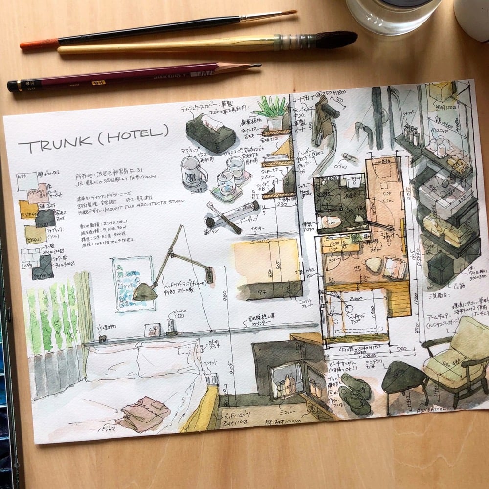

You can check out her painting process on Instagram (for instance) and YouTube. (via spoon & tamago)
As part of his Real Time series of new clock designs, Maarten Baas created the Sweeper’s Clock, a timepiece where the time is indicated by hands made of trash that is swept around the face by a pair of cleaners sweeping for 12 hours.
I got this from Colossal, who also highlight Baas’s Schiphol Clock and Analog Digital Clock.
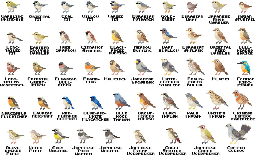
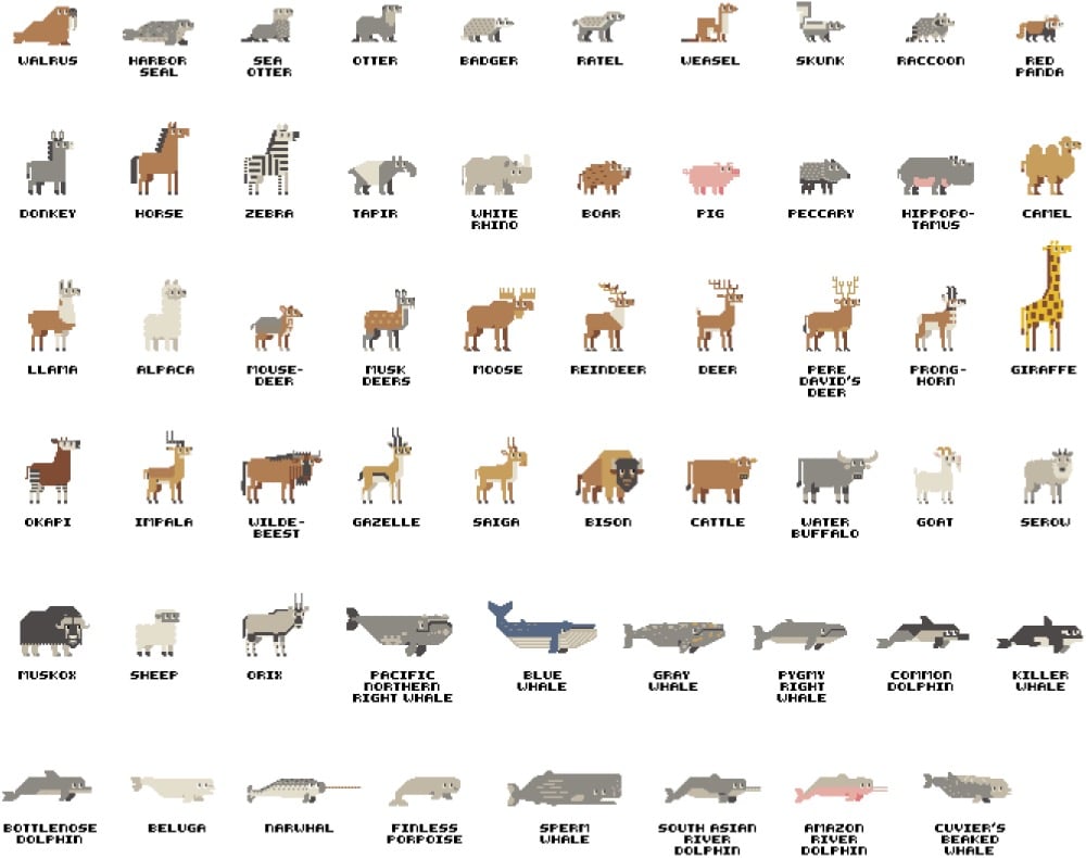
Pixel artist Syosa (Twitter) has been drawing all sorts of pixel animals, including mammals, birds, and dogs.
I also liked their pixelized explainers, like this one on food poisoning.

(via present & correct)

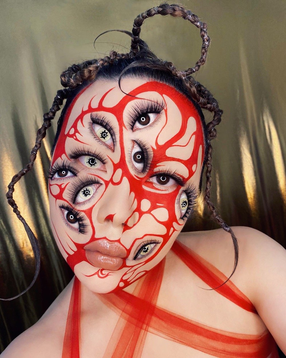
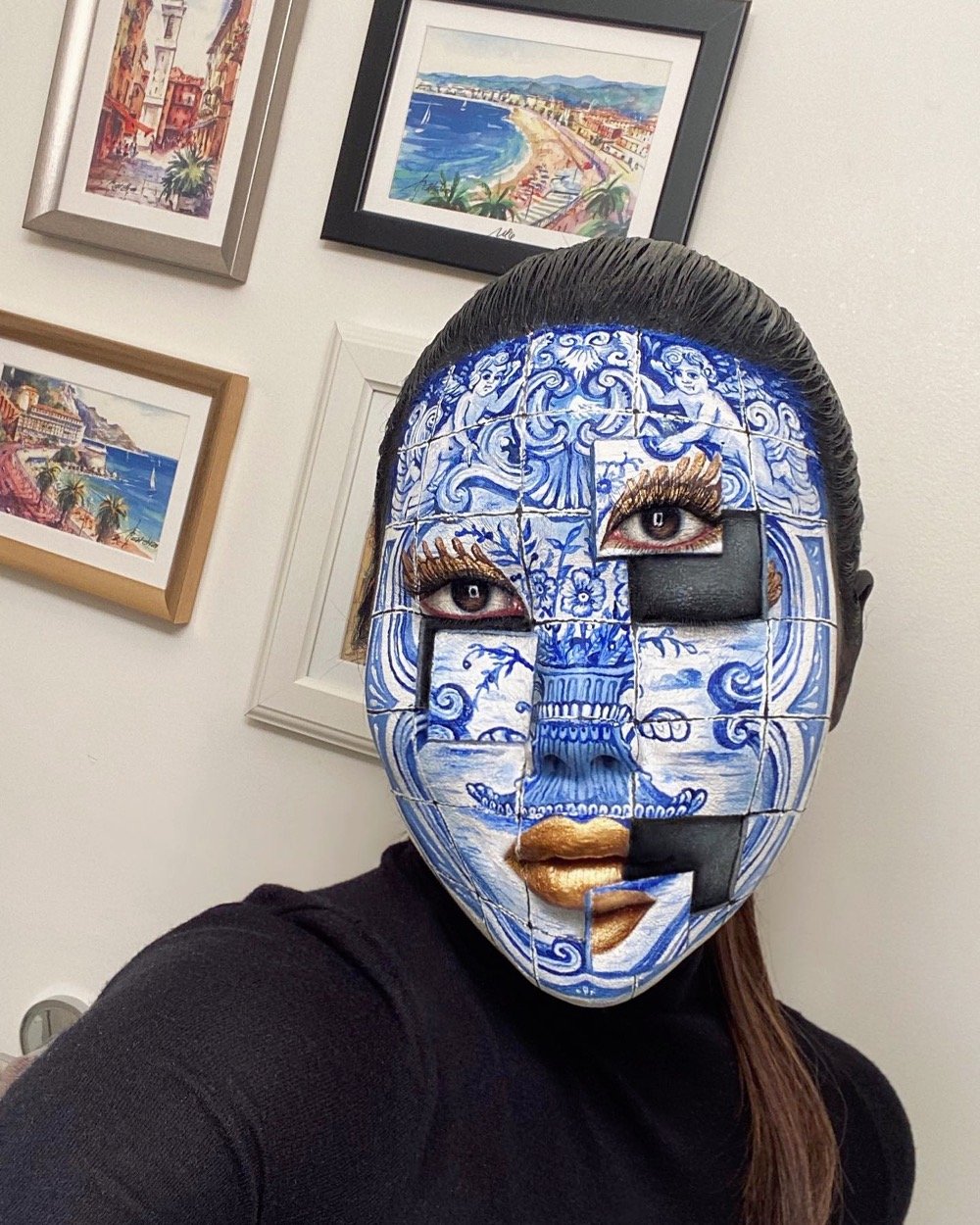
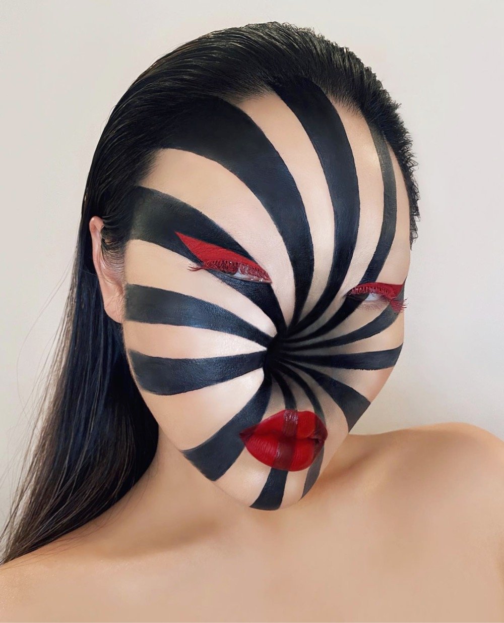
Mimi Choi is a makeup artist who specializes in creating visual illusions — you can check out her work on her website or on Instagram. If you click into her individual posts on Instagram (like this one or this one), you can see how she does each look and also get freaked out when she starts blinking her real eyes and opening her hidden mouth and such. So cool!
See also Alexa Meade’s Living Paintings.
The Twitter account 5x6 Art is posting extremely abstract versions of notable artworks using the constraint of fitting them into Wordle’s familiar 5x6 pixel grid.
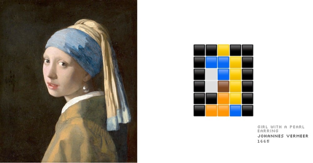
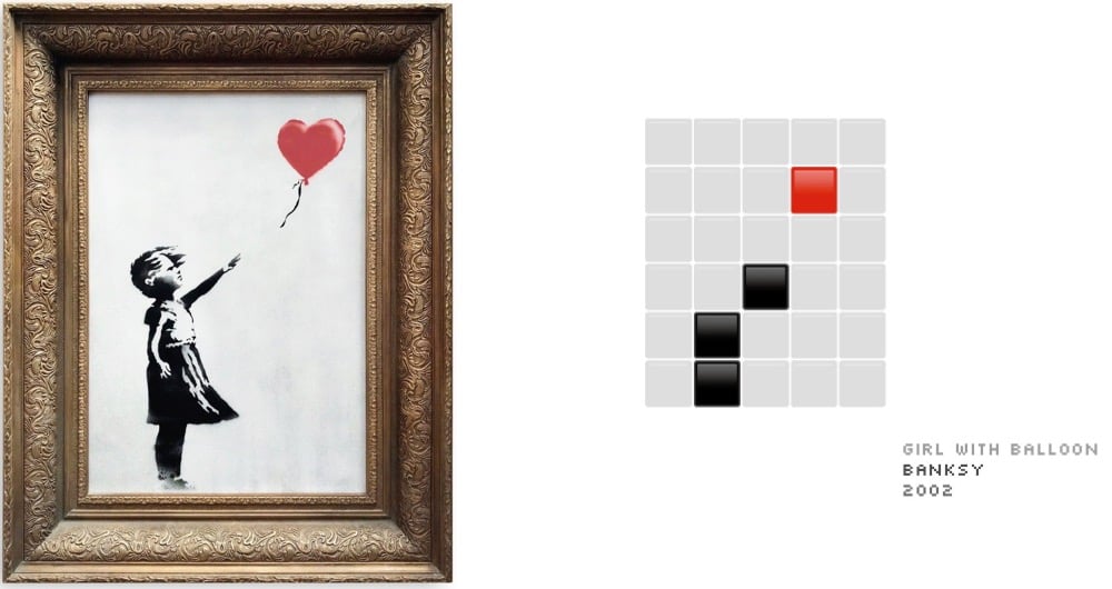

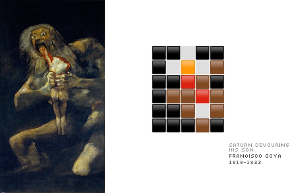
Obviously when you’re reducing artworks down to only 30 pixels of information, some of these are going to work better than others (e.g. Rothko and Mondrian). Still, some of the more detailed ones are just recognizable if you squint.


For the Kobe Biennale held in Kobe, Japan in 2016, sculptor Benoît Maubrey created a traditional Japanese torii gate out of speakers and a bunch of inputs (Bluetooth, line-in, even an 8-track). Using microphones or their phones, passersby could connect to the torii to play music or sounds, talk to each other over the mics, or sing karaoke. The structure was later relocated to Kamiyama. Maubrey has made several similar artworks; here’s what he says about his work:
Artistically I use loudspeakers much in the same way that a sculptor uses clay or wood: as a modern medium to create monumental artworks with the added attraction that they can make the air vibrate (“sound”) around them and create a public “hotspot”.
The audio part of my sculptures is also site-specific and flexible: in all my work the sound level is controllable and the interactivity is regulated via a mixing board (a bell tower or pendulum clock also make sound).
Participation: according to the sculpture site and purpose my sculptures can be equipped with a microphone (self expression), Bluetooth receivers (individuals can play their own tunes music), telephone answering machines (people can call and express themselves Live), radio receivers (for low-level cosmic white noise that sound like whispering pines), and “audio” twitter that allows people to send phonic messages. In some cases the whole system can be used as a PA system for announcements, concerts, open mike sessions, and DJ events.
The set design of The Andy Griffith Show is perhaps an odd place to start when talking about 19th century French painter Jean-François Millet, but this video hits its stride when Salvador Dali enters the picture. After viewing, you can read more about Millet’s painting The Angelus.
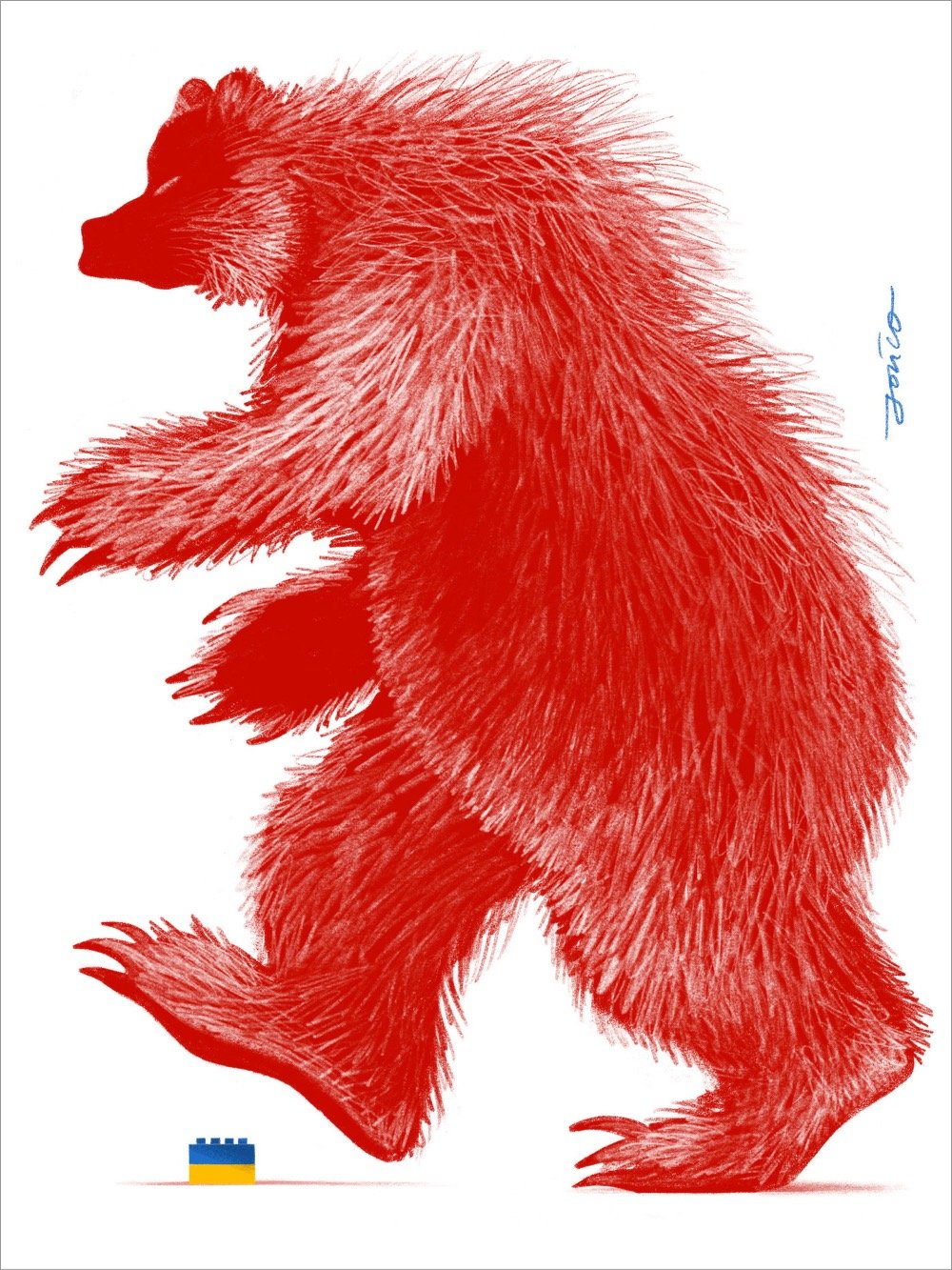
An absolutely fantastic poster by Polish illustrator Paweł Jońca of a giant red Russian bear about to step on a small Ukrainian flag made of Lego bricks. A printable digital download of this poster is available “by paying ANY amount” with all proceeds going to humanitarian aid for Ukraine (specifically to Polska Akcja Humanitarna).
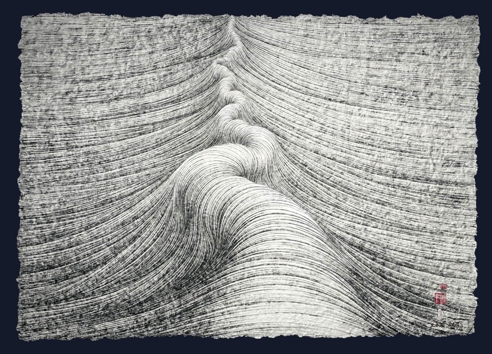
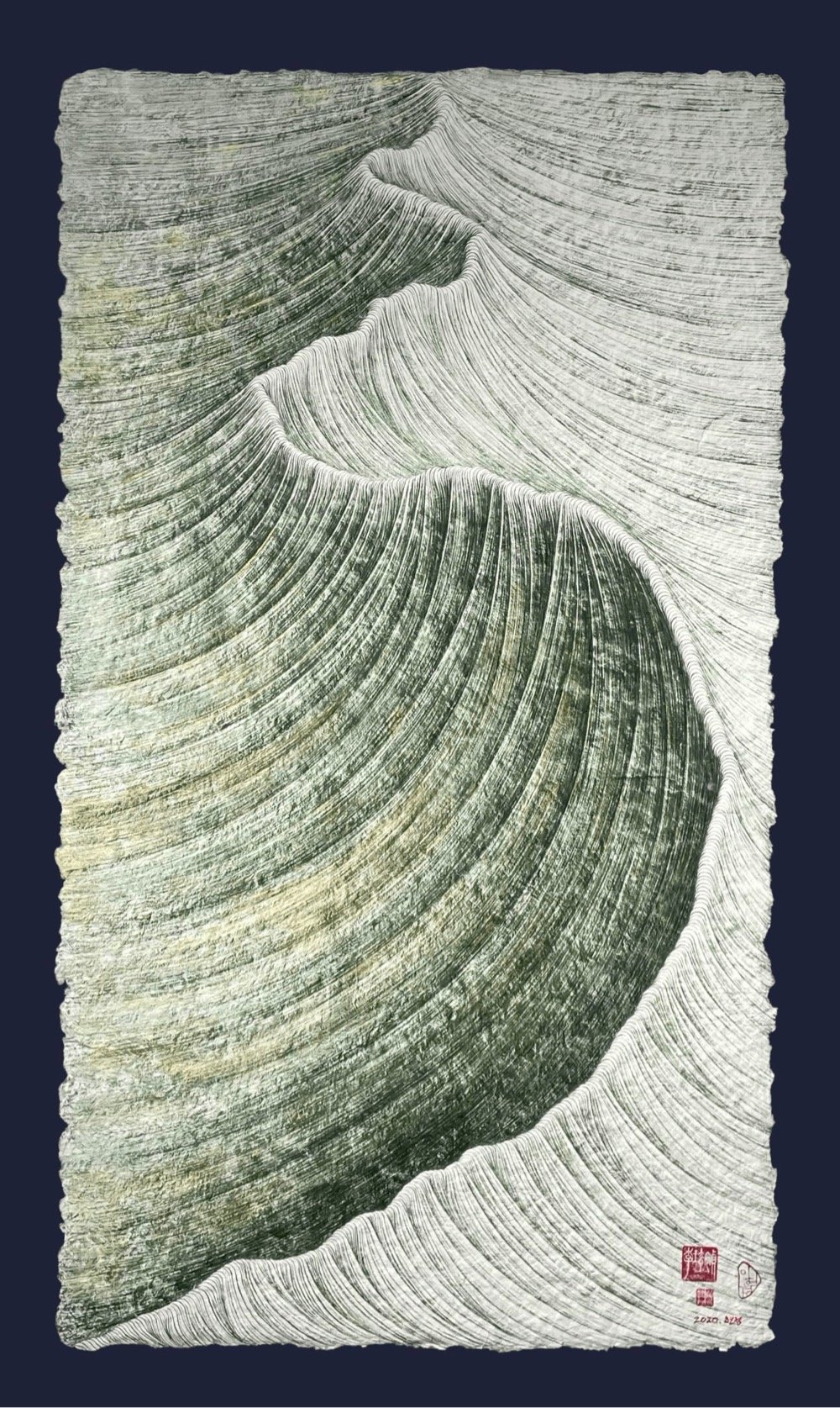
Love these swirling, swooping relief landscapes from Korean artist Lee Hyun-Joung. (via colossal)

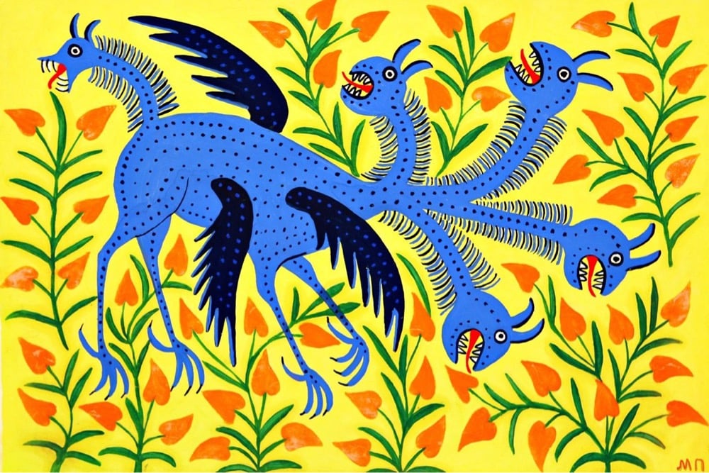
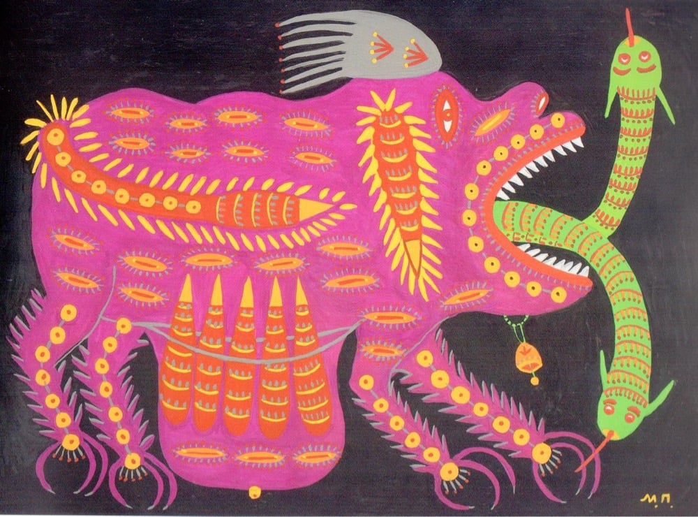
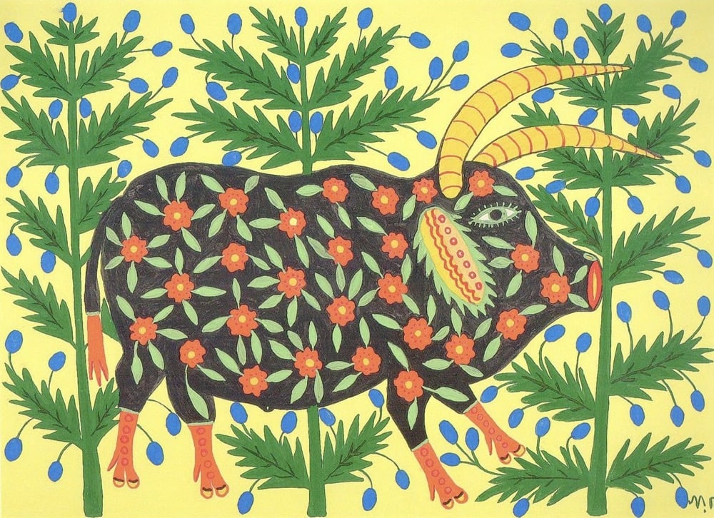
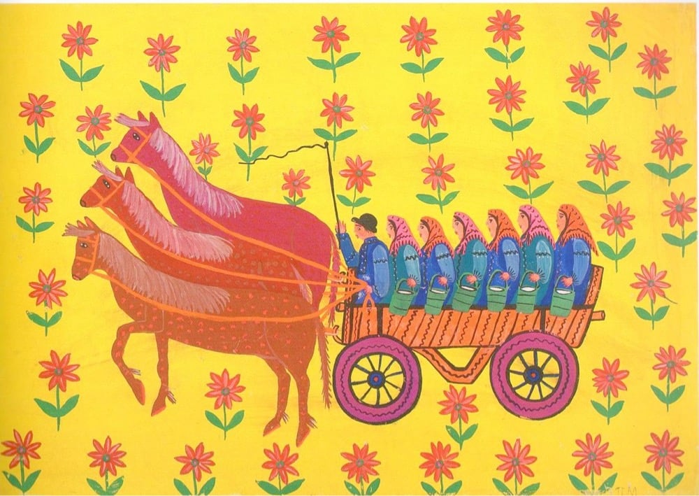
Maria Prymachenko is one of Ukraine’s best-known artists. Known for her colorful, expressive, and “primitive” style, Prymachenko won a gold medal for her work at the 1937 World’s Fair in Paris and Pablo Picasso is said to have remarked “I bow down before the artistic miracle of this brilliant Ukrainian” after seeing her work. Prymachenko’s paintings featured animals (both real & fantastical), everyday Ukrainian people, food & agriculture, and themes of war & peace.
Earlier this week, the Ministry of Foreign Affairs of Ukraine announced that the Ivankiv Historical and Local History Museum had been burned in the Russian invasion and that 25 works by Prymachenko had been lost. Luckily, according to the Ukrainian Institute, local residents were able to save the paintings.
You can find more of Prymachenko’s work below and at WikiArt.



From former Nintendo art director Takashi Maeda, a collection of very abstract pixel art that’s free to download and use. (via @presentcorrect)
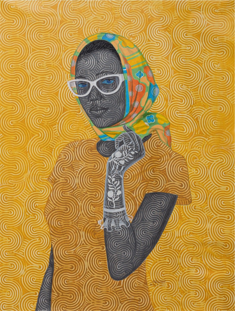
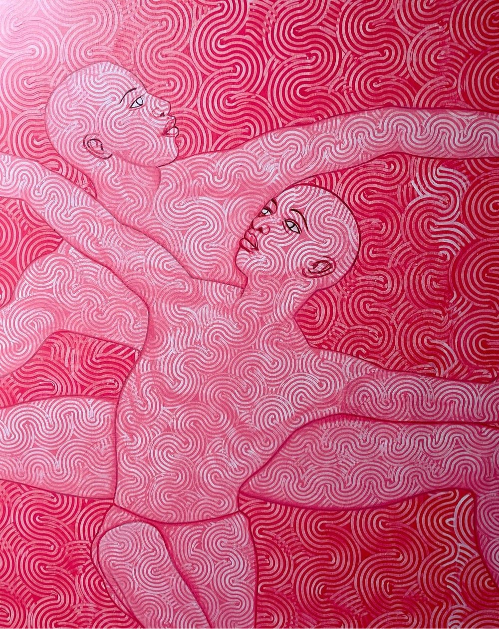
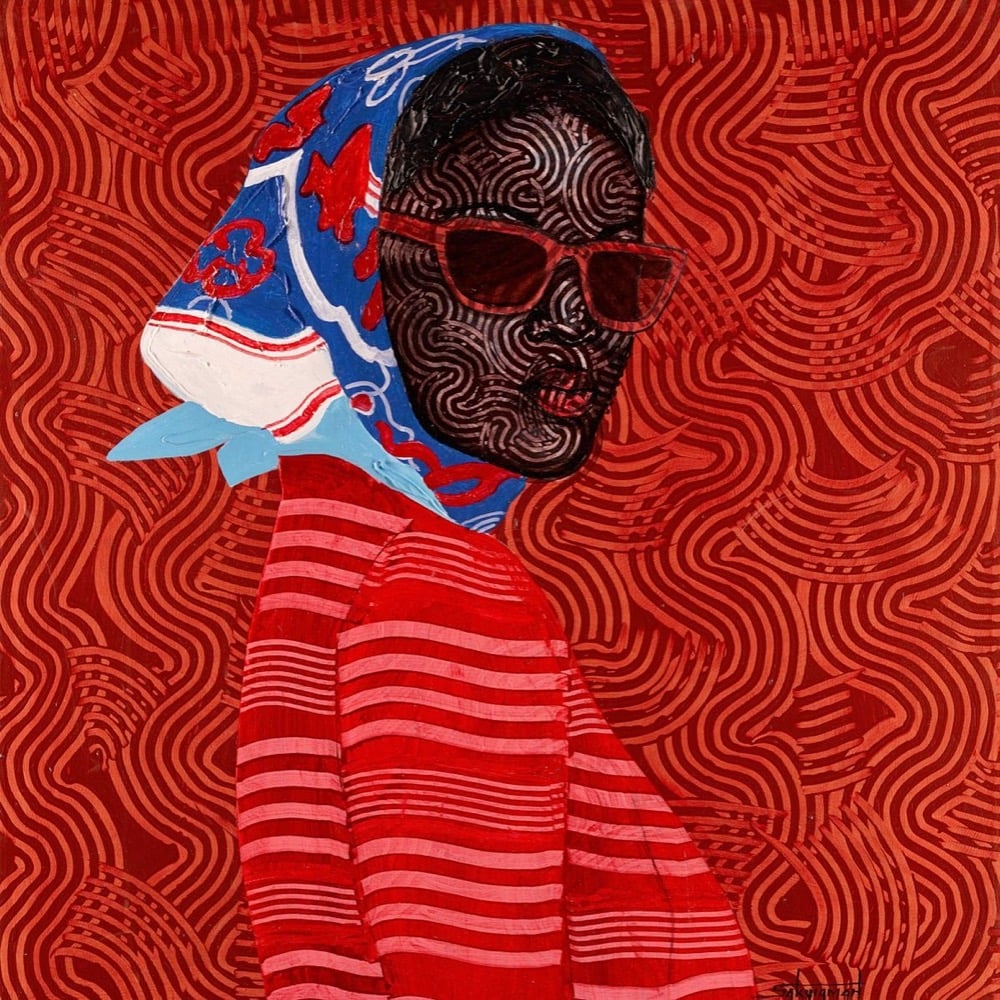
These striking portraits are by Ghanaian artist Foster Sakyiamah. You can check out more of his work on Instagram.


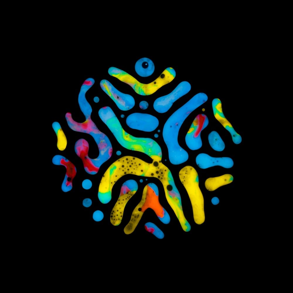
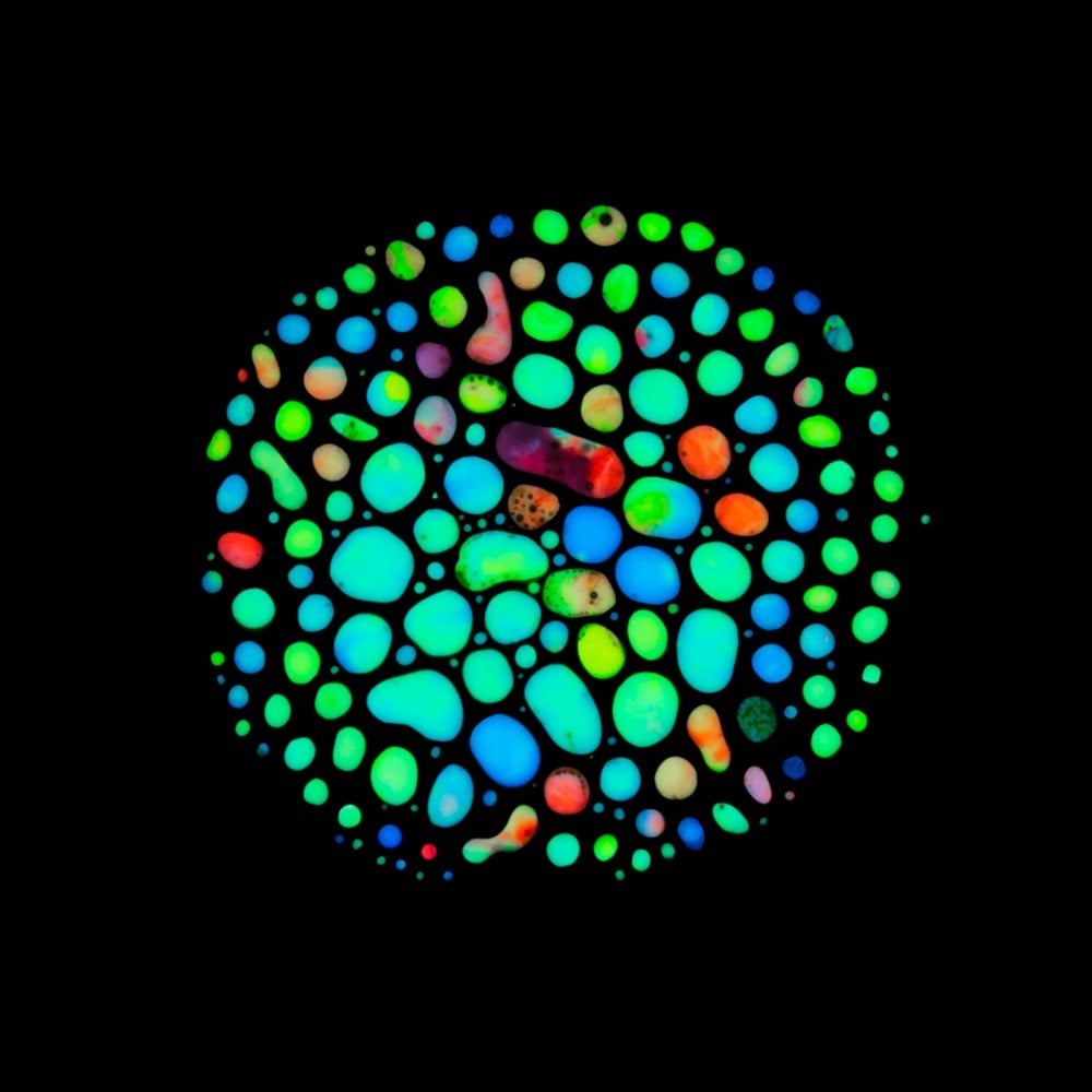
During the course of battling salivary gland tumors over many years, photographer and artist Rubén Álvarez discovered hematopoiesis (the process by which blood cells & blood plasma are formed in the body) as a possible treatment option. The treatment didn’t end up being applicable to his situation, but the process became the inspiration for a very personal project called Haematopoiesis.
This project was inspired by my very personal experiences so I discovered the Hematopoiesis process, while I was looking for treatments for more than 15 pleomorphic adenomas that were located around my head and neck. I went through several surgeries to remove them and reconstruct my facial nerve, as well as almost thirty radiotherapy sessions to prevent these adenomas to appear again.
Álvarez used paint, ferrofluid, and magnets to produce his interpretation of the actual hematopoiesis process. (via moss & fog)
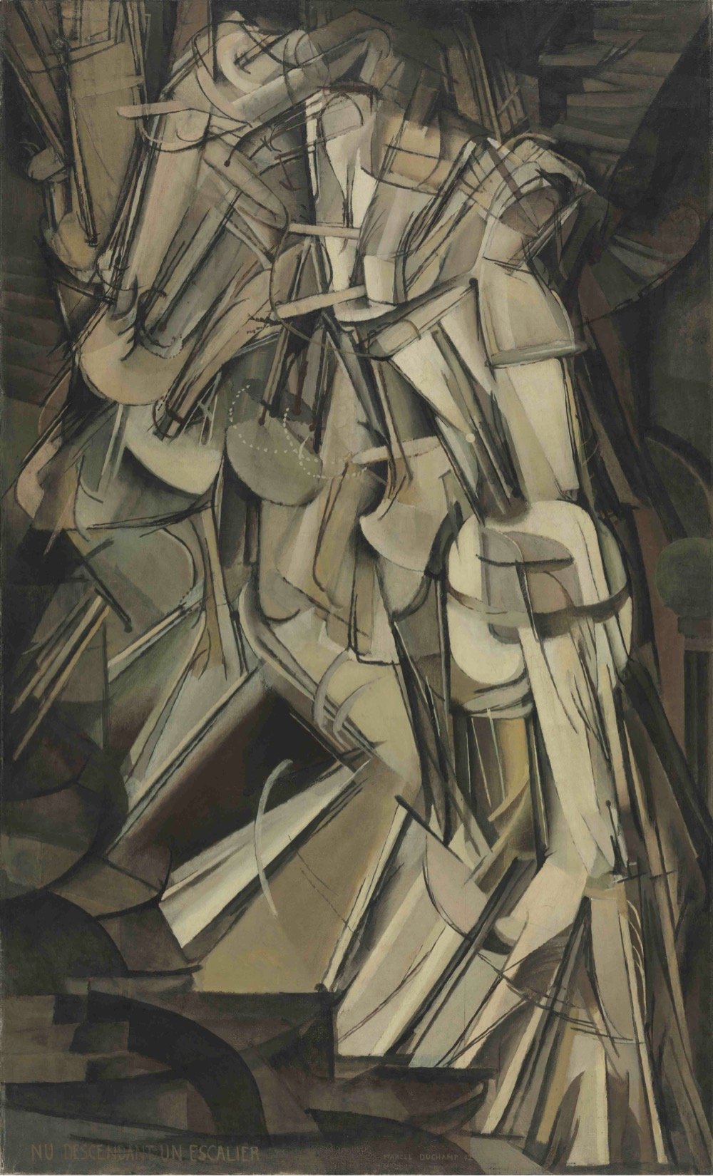
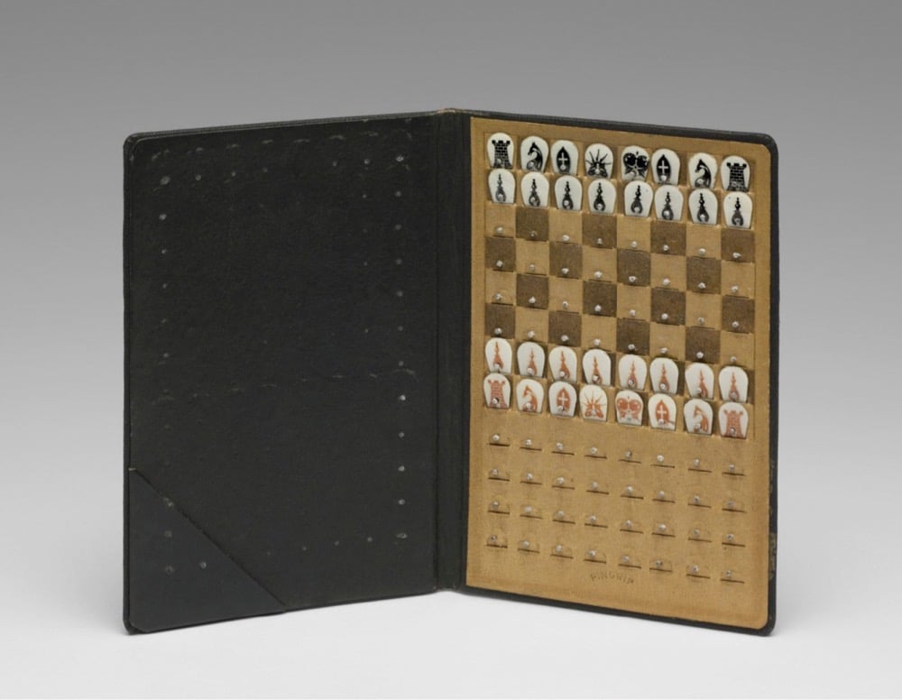
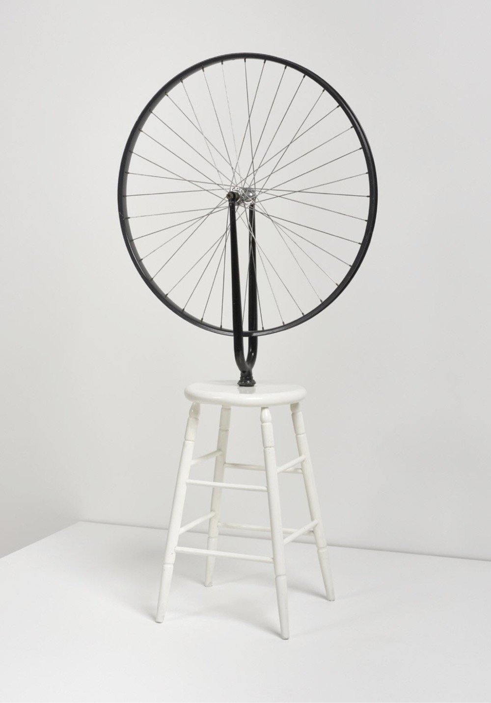
A partnership of three institutions — the Philadelphia Museum of Art, the Association Marcel Duchamp, and the Centre Pompidou — has just launched the Marcel Duchamp Research Portal, which houses almost 50,000 images and 13,000 documents related to the life and work of Marcel Duchamp.
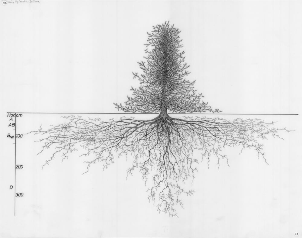
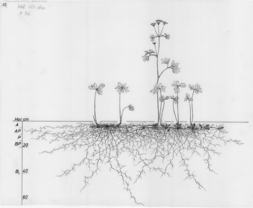
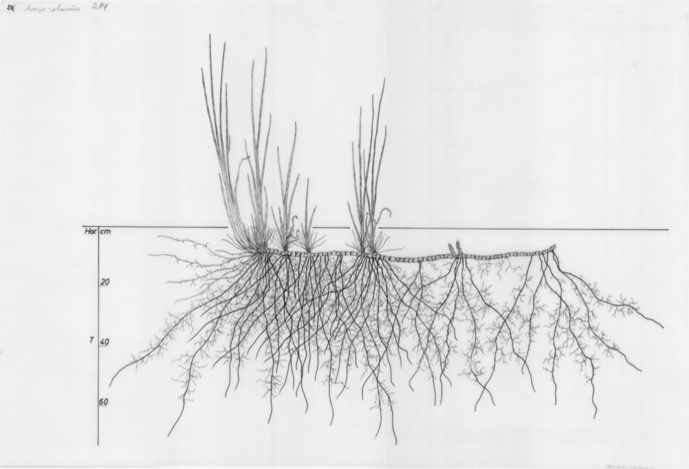
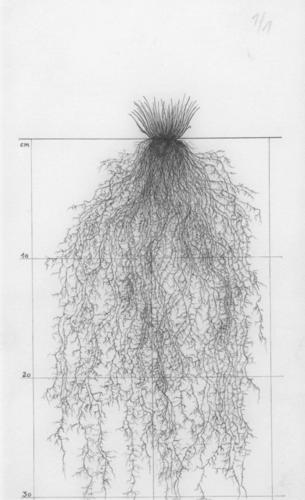
The Wageningen University & Research houses a collection of almost 1200 drawings of the root systems of trees, grasses, crops, shrubs, weeds, flowers, and other plants. These drawings were done of plants in Europe, mostly in Austria, over a period of 40 years and are a wonderful combination of scientifically valuable and aesthetically pleasing.
Great Art Explained is one of my recent favorite YouTube channels (see The Mona Lisa, Hokusai’s The Great Wave Off Kanagawa, Michelangelo’s David, and Starry Night, all fascinating) and host James Payne, along with Joanne Shurvell, are now doing a related series on Great Art Cities Explained. They tackled London first and have moved onto Paris, where they feature three of the city’s lesser known museums that were originally art studios: those of Eugène Delacroix, Suzanne Valadon, and Constantin Brancusi.
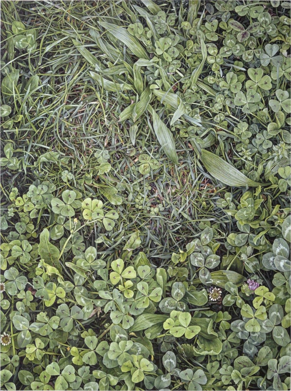
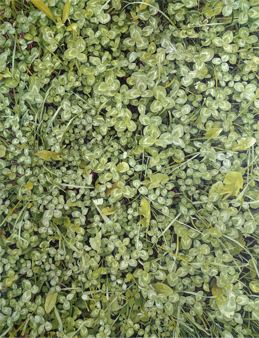
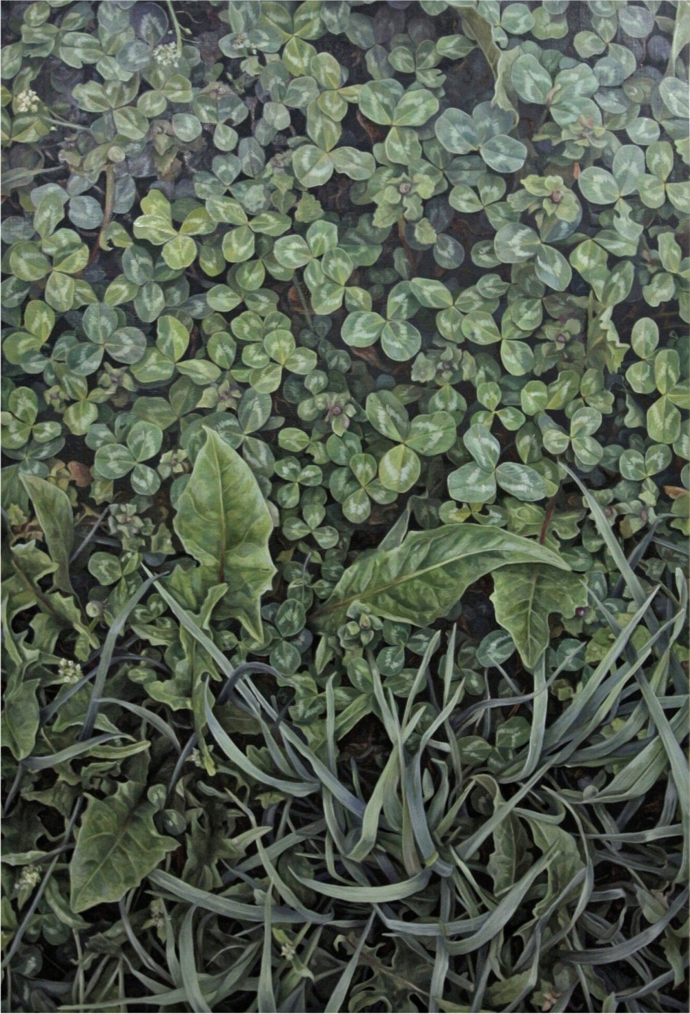
Why am I showing you these photos of lush, grassy, leafy plants? Because they are actually meticulously constructed hyperrealistic paintings of lush, grassy, leafy plants by Serbian artists Jelena and Aleksandar Paunkovic. The couple have been inspired by their verdant surroundings (I mean, just look at this) to produce these paintings:
From the big city we moved our studio near the mountain Kosmaj where we started with the production of paintings. We throw plastic bags out of everyday life and instead of them we made our canvas bags that still serve us today. We establish our own small garden, and started producing our natural non-hybrid food. We started composting organic food residues which we will use later as a soil that is rich in ingredients that will help other plants during growth. We meet new people and come to incredible information and knowledge. There will be more about that and other topics on our blog. When we harvested our first fruits after two months, there was no end to our happiness. For a moment we went back to our childhood, we remembered growing up, beautiful moments, and we had the privilege of feeling like a kids again.
With the pleasure of contact with plants, we discovered that we love hiking, but not for the reason of conquering the peaks, they are free and there is nothing to conquer. They can teach us that what we see there should be respected. All the paintings we create are created on those places. Each tour on new mountain, or visiting new environment, becomes material that will later serve us in the studio as a sketch for a new painting. We have found a way to bring the nature to a home or gallery and hang it on the wall to serve as a reminder that we need to think more about how our modern lifestyle affects the environment.
You can follow their progress on Instagram or order prints of their work. (via colossal)
In an artwork commissioned by the Guggenheim Museum called Can’t Help Myself, Sun Yuan and Peng Yu designed a robotic arm that is designed to keep a blood-colored liquid from straying too far away.
Placed behind clear acrylic walls, their robot has one specific duty, to contain a viscous, deep-red liquid within a predetermined area. When the sensors detect that the fluid has strayed too far, the arm frenetically shovels it back into place, leaving smudges on the ground and splashes on the surrounding walls.
Sounds a bit like everyone trying to do everything these days. This artwork has been popular on TikTok because people are empathizing that the machine is slowing down.
“It looks frustrated with itself, like it really wants to be finally done,” one comment with over 350,000 likes reads. “It looks so tired and unmotivated,” another said.
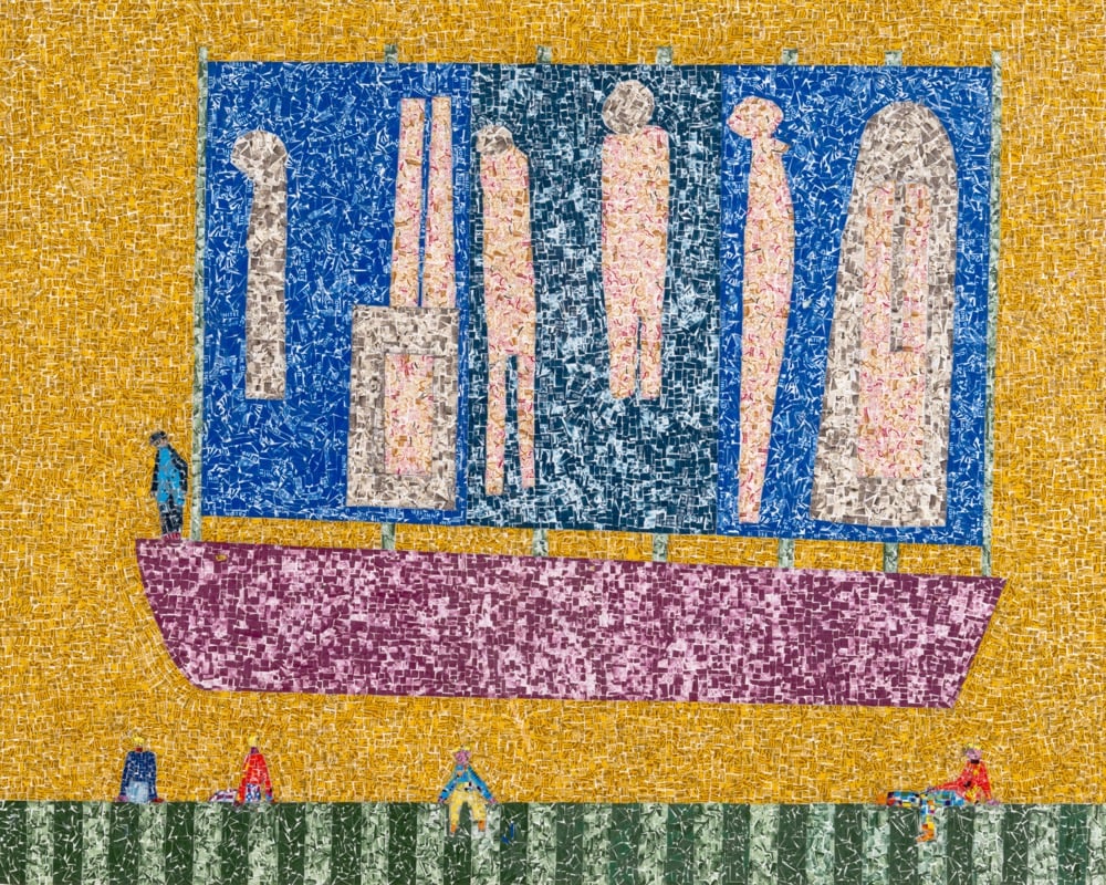
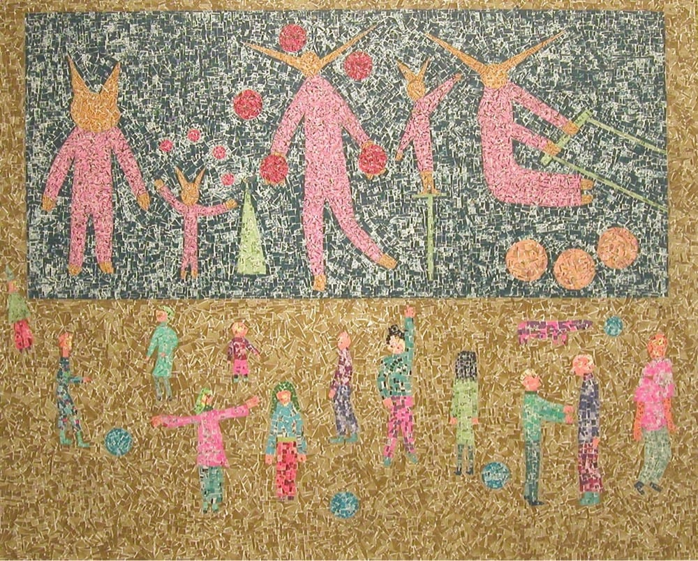
Artist Paul Edlin used tiny fragments of postage stamps to create these beautiful abstract collages. Here’s closeup of the top image where you can see the fragments more clearly:
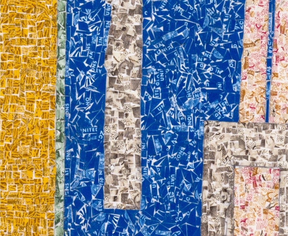
(thx, philip)
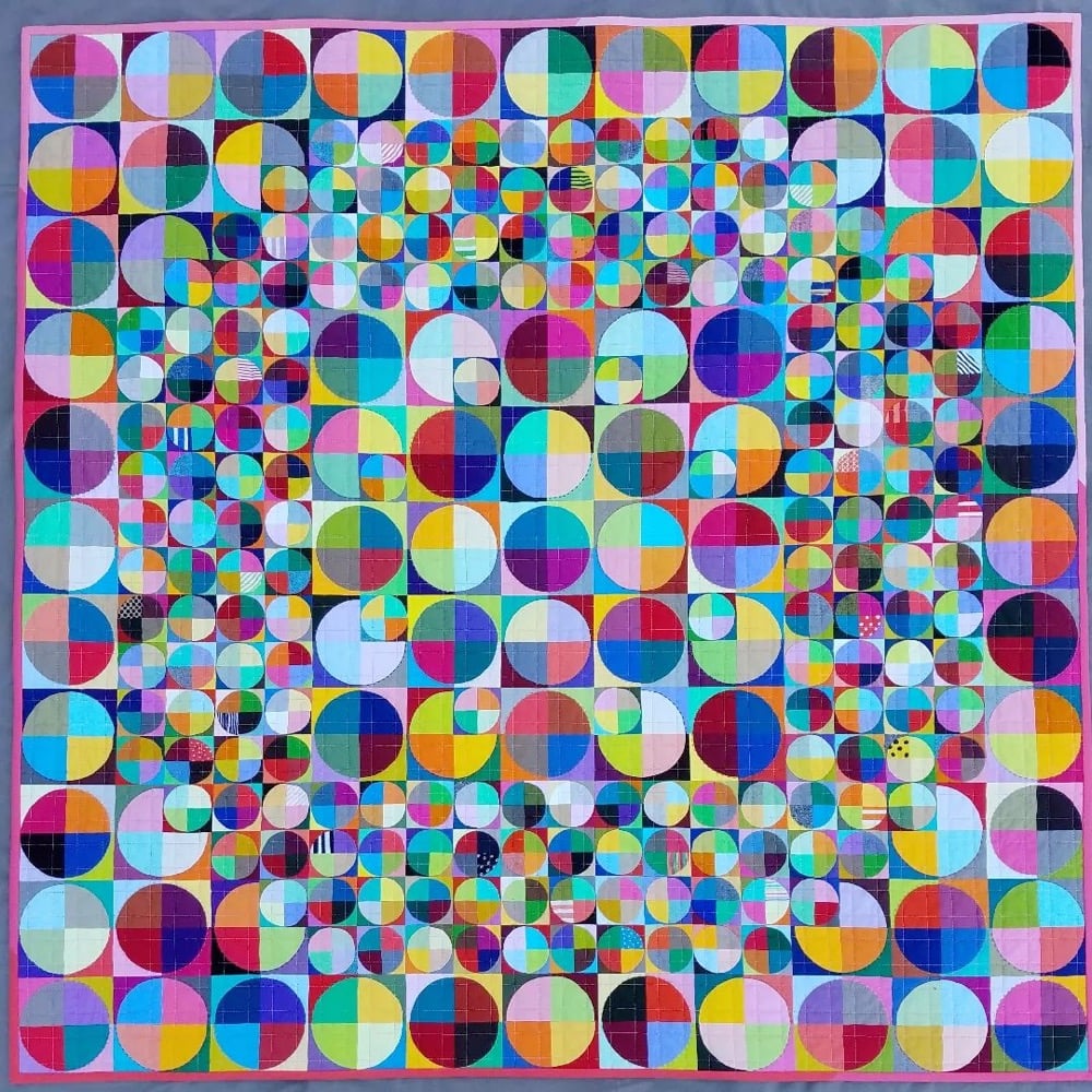
Oh I love the look of this quilt made by Marla Varner of Penny Lane Quilts. Here’s a closer look:
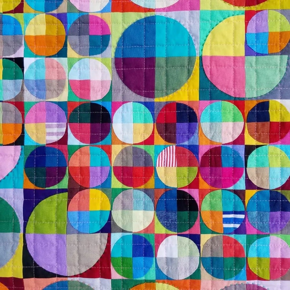
The colors and pattern are just perfect. You can check out several of her other large quilts on her website or on Instagram. (via austin kleon)

The US Mint has started shipping a quarter featuring poet & activist Maya Angelou on it.
A writer, poet, performer, social activist, and teacher, Angelou rose to international prominence as an author after the publication of her groundbreaking autobiography, “I Know Why the Caged Bird Sings.” Angelou’s published works of verse, non-fiction, and fiction include more than 30 bestselling titles. Her remarkable career encompasses dance, theater, journalism, and social activism.
The front of the Angelou quarter features a portrait of George Washington (a slaveowner, I feel it is important to note) that is different from the usual image on regular quarters. The new image was sculpted by Laura Gardin Fraser in 1931:
In 1931, Congress held a competition to design a coin to honor the 200th anniversary of George Washington’s birth. The original competition called for the obverse of the coin to feature a portrait of George Washington, based on the famed life-mask bust by French sculptor Jean-Antoine Houdon. The reverse was to feature a design that was to be “national” in nature.
Laura Gardin Fraser submitted a design that features a right-facing portrait of George Washington on the obverse, while the reverse shows an eagle with wings spread wide. In a 1932 letter to recommend Fraser’s design, the U.S. Commission of Fine Arts (CFA) wrote to (then) Treasury Secretary Andrew W. Mellon:
“This bust is regarded by artists who have studied it as the most authentic likeness of Washington. Such was the skill of the artist in making this life-mask that it embodies those high qualities of the man’s character which have given him a place among the great of the world…Simplicity, directness, and nobility characterize it. The design has style and elegance…The Commission believes that this design would present to the people of this country the Washington whom they revere.”
While her design was popular, it was not chosen. Instead, Secretary Mellon ultimately selected the left-facing John Flannigan design, which has appeared on the quarter’s obverse since 1932.

The Angelou quarter is the first in a series of quarters featuring notable American women:
Beginning in 2022 and continuing through 2025, the Mint will issue five quarters in each of these years. The ethnically, racially, and geographically diverse group of individuals honored through this program reflects a wide range of accomplishments and fields, including suffrage, civil rights, abolition, government, humanities, science, space, and the arts. The additional honorees in 2022 are physicist and first woman astronaut Dr. Sally Ride; Wilma Mankiller, the first female principal chief of the Cherokee Nation and an activist for Native American and women’s rights; Nina Otero-Warren, a leader in New Mexico’s suffrage movement and the first female superintendent of Santa Fe public schools; and Anna May Wong, the first Chinese American film star in Hollywood, who achieved international success despite racism and discrimination.
The Angelou quarter will start circulating later this month and early next month — look for it in your change soon!
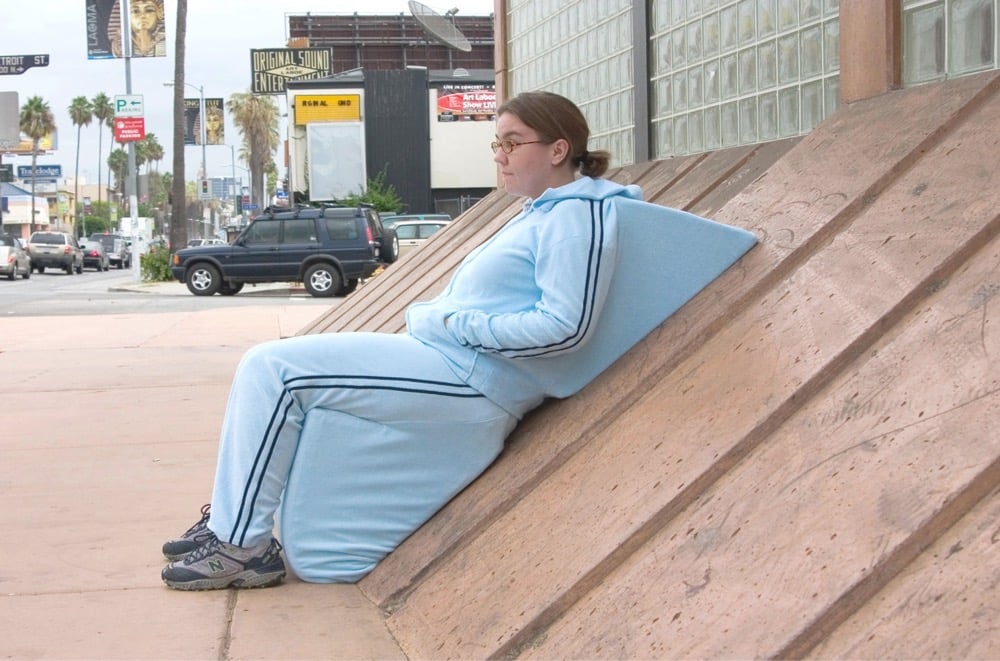
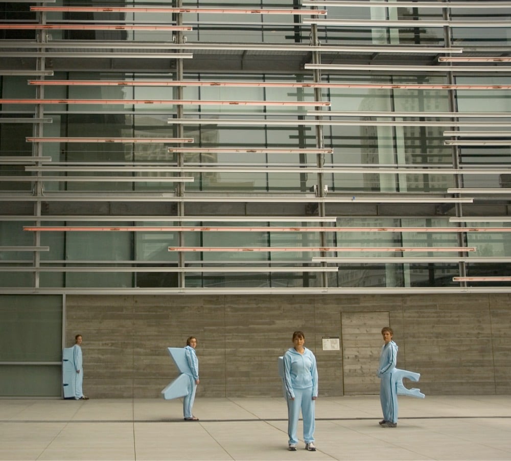

Artist Sarah Ross’s project Archisuits draws attention to architecture in LA that is specifically designed to prohibit people from sitting on it. Each suit is produced to fit into a specific hostile architectural element so that the wearer can sit or lie comfortably on it.
Newer posts
Older posts




Socials & More