NASA’s Logo: the Worm vs. the Meatball
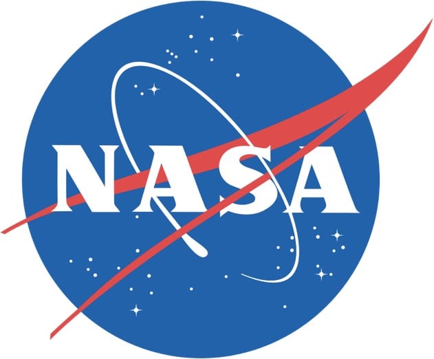
NASA’s original logo looked something like this:

It was referred to, colloquially, as the meatball. In the 1970s, the meatball was switched out for the worm, a more Modernist take:

This logo was done by Richard Danne and Bruce Blackburn, and Danne wrote an essay about the experience.
And here is one of the most interesting exchanges I’ve ever witnessed in a design presentation:
Fletcher: “I’m simply not comfortable with those letters, something is missing.”
Low: “Well yes, the cross stroke is gone from the letter A.”
Fletcher: “Yes, and that bothers me.”
Low: “Why?”
Fletcher: (long pause) “I just don’t feel we are getting our money’s worth!”Others, not just the designers were stunned by this last comment. Then the discussion moved back to the strong red/rust color we were proposing. We had tried many other colors of course, including the more predictable blue range, but settled on red because it suggested action and animation. It seemed in spirit with the Can Do nature of the Space Agency.
Fletcher: And this color, red, it doesn’t make much sense to me.”
Low: “What would be better?”
Fletcher: “Blue makes more sense… Space is blue.”
Low: “No Dr. Fletcher, Space is black!”
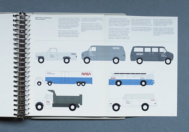
NASA’s Graphics Standards Menu utilizing the worm logo can be seen here.

The space agency switched back to the original logo in 1992. Michael Bierut compared the two:
The worm is a great-looking word mark and looked fantastic on the spacecraft. By any objective measure, the worm was and is absolutely appropriate, and the meatball was and is an amateurish mess.
(thx, jarrett)


Socials & More