The Design Manual of the 1972 Munich Olympics
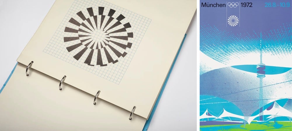
For the 1972 Summer Olympics in Munich, a team led by Otl Aicher designed the iconic identity for the event. The guidelines for the visual design were laid out in a manual produced in 1969, which contained the design systems governing how everything from signage and merchandise to tickets and even landscaping were to be produced.
Now, a lovingly produced reprint of that manual is available for purchase on Kickstarter.
The visual modules — the typeface, the colors, the grid systems and the application methods — were the basis of all printed matter, merchandising products, signage, wayfinding systems, urban planning and landscaping.
“The freedom of play” was about ensuring “maximum variation” via “strict discipline and adherence to rules”, explained Otl Aicher in 1975.
(via steven heller)
Socials & More