



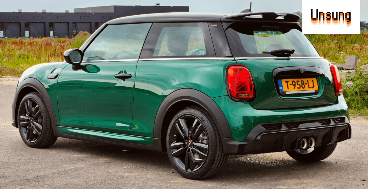
A few years back, the Mini Cooper’s taillights were designed to look like the Union Jack flag, which is fine until you turn the blinker on and it looks like an arrow pointing in the wrong direction. I hated this design the moment I saw it on the road.

Advertise here with Carbon Ads
This site is made possible by member support. 💞
Big thanks to Arcustech for hosting the site and offering amazing tech support.
When you buy through links on kottke.org, I may earn an affiliate commission. Thanks for supporting the site!
kottke.org. home of fine hypertext products since 1998.
Beloved by 86.47% of the web.
Comments 5
thread
latest
popular
YES. Terrible, visually disjunct design.
It's always a relief to know it's not just me. The worst turn signals!
The iPad volume buttons irritate me as well. When you turn the iPad 90 degrees, the buttons switch their meaning. It’s an Apple own-goal.
I agree! I just upgraded from a very old Ipad and it irritates me that I now have to give it conscious thought. If they at least kept it consistent with the Iphone, they'd have a good argument.
Yes, definitely a poor choice. I couldn't believe it the first time I spotted one on the road. "It doesn’t cause massive confusion, but taillights should cause no confusion for anyone." Amen.
If you feel like this comment goes against the grain of the community guidelines or is otherwise inappropriate, please let me know and I will take a look at it.
In order to comment or fave, you need to be a kottke.org member. Check out your membership options.
Note: If you are a member and tried to log in, it didn't work, and now you're stuck in a neverending login loop of death, try disabling any ad blockers or extensions. Or try logging out and then back in. Still having trouble? Email me!