The Design of TV Key Art
When the TV watching experience moved from checking “your local listings” or TV Guide and surfing channels with your remote to scrolling through visual onscreen menus on streaming services, key art was born. Key art graphics are the images that identify shows in streaming menus — ok here, it’s just easier to show you:
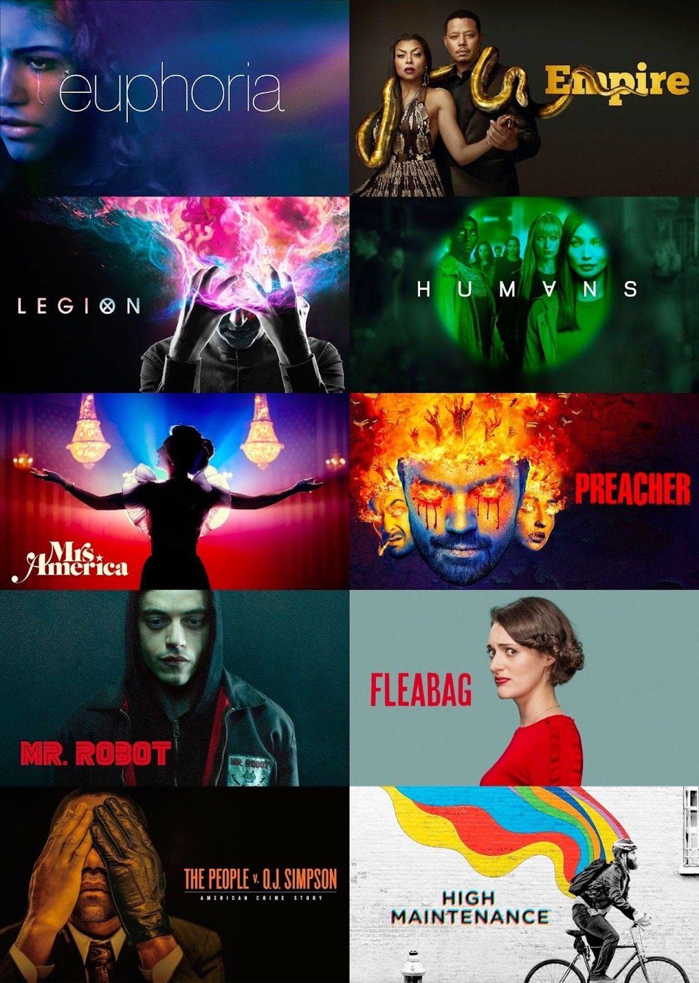
Like the best movie posters and book covers, these images are bold and simple promotional signifiers of a larger piece of media, but as Rex Sorgatz argues in today’s edition of Why is this interesting?, key art is its own thing with its own set of constraints and challenges.
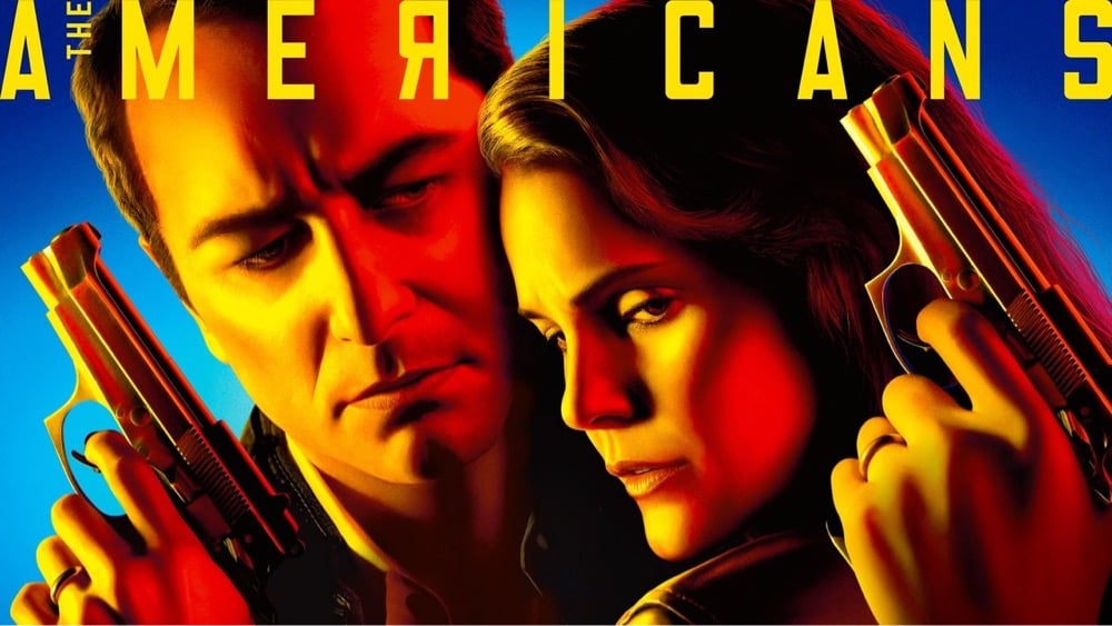
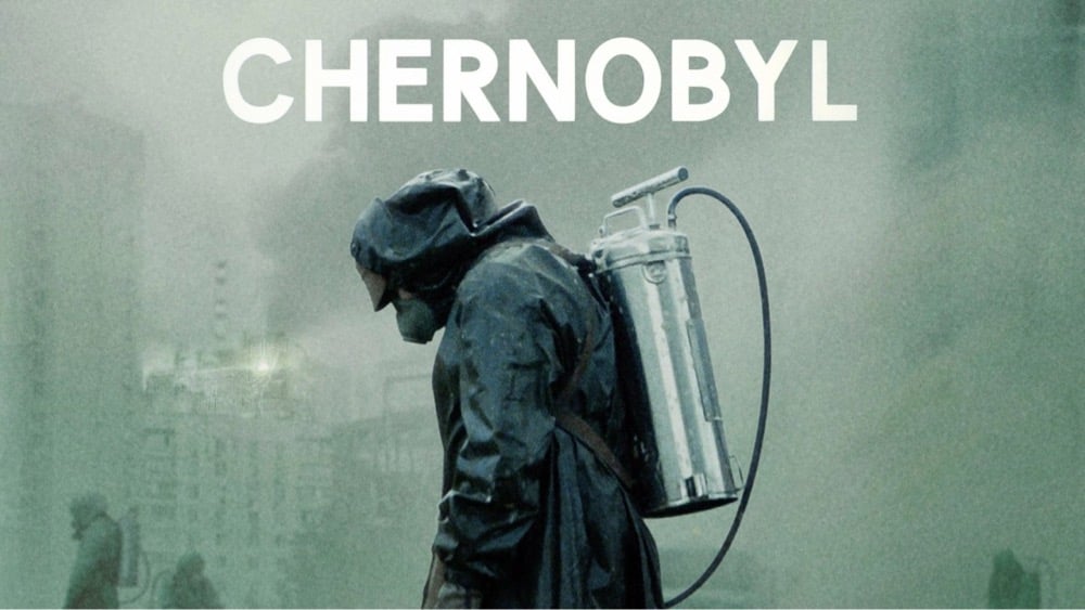
Good key art is so evocative, so iconic, that it becomes the image that springs to mind whenever you think about a show:
One neglected characteristic ties all these images together: They are all horizontal.
It sounds trivial, but going wide helped differentiate TV key art as its own medium, distinct from book covers and movie posters. And because these images appear on streaming platforms, they are unencumbered by other marketing copy, like taglines, cast and credits, and multifarious blurbs.
There is a simple purity to key art.
Socials & More