Clever “Climate Crisis” Typeface Has Several Weights Based on Arctic Sea Ice Extent
Finnish newspaper Helsingin Sanomat has released a free typeface called Climate Crisis that can help designers and the media visualize the urgency of the climate crisis.
The font is intended to be used by anyone who wishes to visualize the urgency of climate change. Especially the media can use it to enhance its climate-related storytelling through illustrations and dramatizations. Newspaper Helsingin Sanomat is at the moment using the font to draw attention to its climate-related stories.
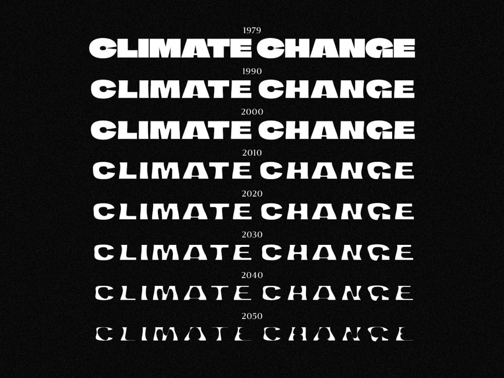
The typeface has seven weights corresponding to data & projections of the minimum extent of the Arctic sea ice from 1979 to 2050. As you can see in the graphic above, the type gets thinner and thinner as the years pass. (via print)
Socials & More