City street orientations from around the world
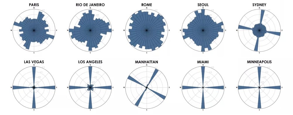
Urban data scientist Geoff Boeing graphed the orientation of the streets in 50 cities from around the world. Here are 10 cities from his analysis:

Each of the cities above is represented by a polar histogram (aka rose diagram) depicting how its streets orient. Each bar’s direction represents the compass bearings of the streets (in that histogram bin) and its length represents the relative frequency of streets with those bearings.
Looking at these graphs, you get a real sense of just how planned American cities are compared to much of the rest of the world, where cities grew more organically over longer periods of time. (Although I’m curious to see what the graph for all of NYC would look like…a bit more like Boston perhaps.)
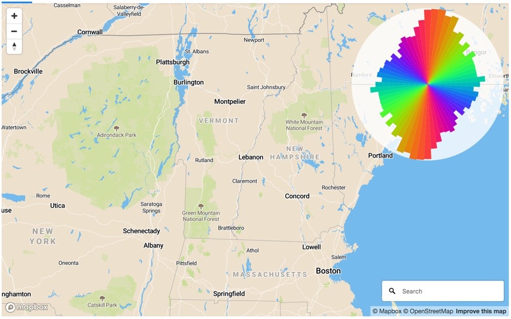
Update: Using Mapbox, you can generate street orientation charts for any map view. I used it to verify that north-south roads outnumber east-west roads in New England, which is why it takes so long to go 30 miles across VT compared to up or down.

(via @dokas)


Socials & More