W.E.B. Du Bois’ hand-drawn infographics from “The Exhibit of American Negroes”


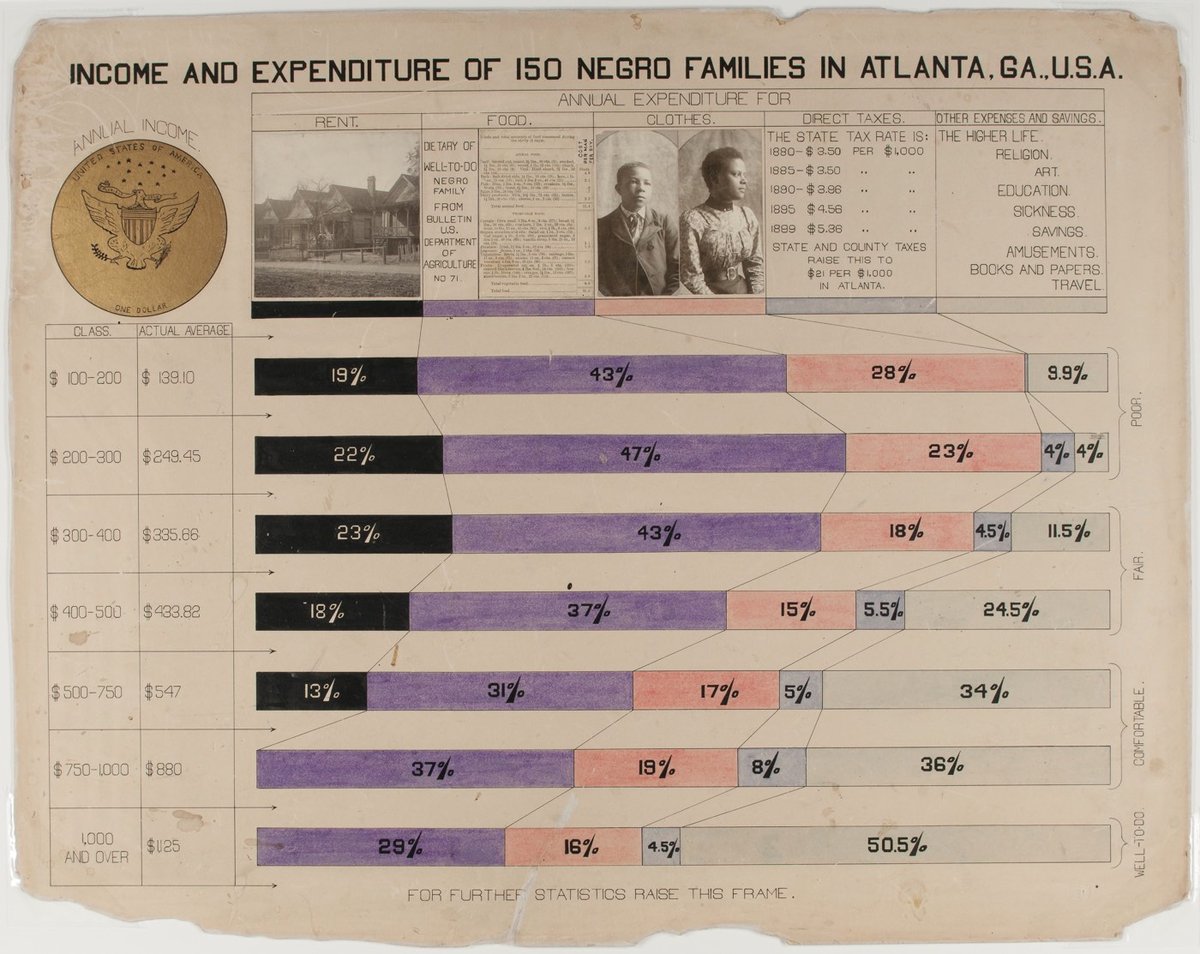
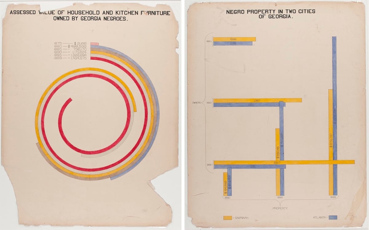
W.E.B. Du Bois was an American author, sociologist, historian, and activist. Apparently Du Bois was also a designer and design director of some talent as these hand-drawn infographics show.
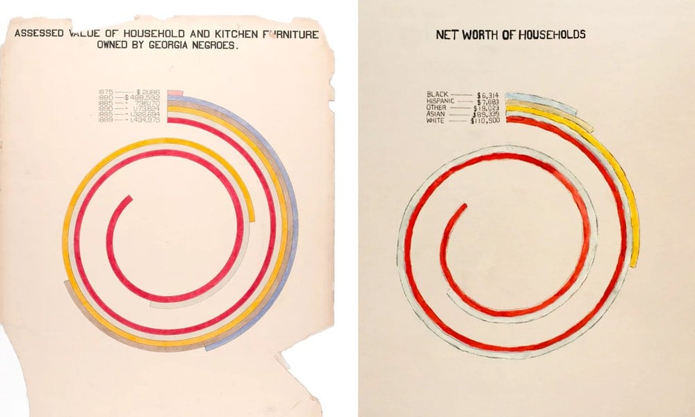
In addition to an extensive collection of photographs, four volumes containing 400 official patents by African Americans, more than 200 books penned by African-American authors, various maps, and a statuette of Frederick Douglass, the exhibition featured a total of fifty-eight stunning hand-drawn charts (a selection of which we present below). Created by Du Bois and his students at Atlanta, the charts, many of which focus on economic life in Georgia, managed to condense an enormous amount of data into a set of aesthetically daring and easily digestible visualisations. As Alison Meier notes in Hyperallergic, “they’re strikingly vibrant and modern, almost anticipating the crossing lines of Piet Mondrian or the intersecting shapes of Wassily Kandinsky”.
Update: Oh, this is great: Mona Chalabi has updated Du Bois’ charts with current data.
Wealth. If I had stayed close to the original chart, the updated version would have shown that in 2015, African American households in Georgia had a median income of about $36,655, which would fail to capture the story of inflation (net asset numbers aren’t published as cumulative for one race). Instead, I wanted to see how wealth varies by race in America today.
The story is bleak. I hesitated to use the word “worth”, but it’s the language used by the Census Bureau when they’re collecting this data and, since money determines so much of an individual’s life, the word seems relevant. For every dollar a black household in America has in net assets, a white household has 16.5 more.


Socials & More