2014 in four charts
From the New Yorker’s Vauhini Vara, four charts that defined the world in 2014.

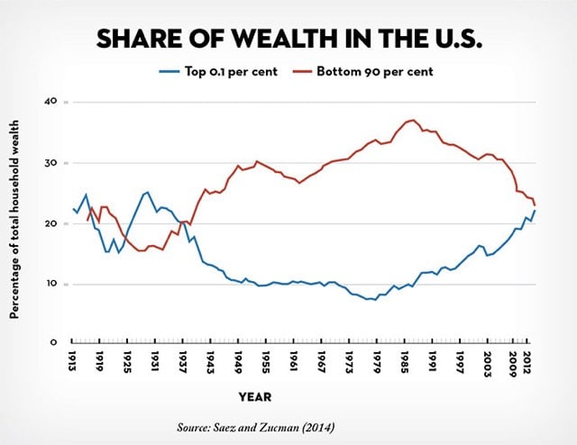
One of the most talked-about charts of the year, tucked inside a National Bureau of Economic Research working paper published in October by the economists Emmanuel Saez and Gabriel Zucman, isn’t, strictly speaking, about 2014. The chart stops in 2012, which is the last year for which relevant data was available. Saez and Zucman found that wealth in the U.S. has been distributed increasingly unequally over the past three decades, and that almost the entire increase in inequality has to do with the rising share of wealth held by the 0.1 per cent — from seven per cent, in 1978, to twenty-two per cent, in 2012, a level comparable to what the richest families held in the early twentieth century.
So, if the trend held over the past two years, the top 0.1% of Americans have more wealth than the bottom 90% for the first time since right before WWII. When that data comes out, we’ll see a ton of think- and trend-pieces about it…but unless the US government gets serious about redistributing that wealth, not much will be done about it.
Update: From Co.Design, The 18 Best Infographics Of 2014. And on Medium, Eleven Stunning Graphs From 2014 That You Should See.


Socials & More