Advertise here with Carbon Ads

This site is made possible by member support. โค๏ธ

Big thanks to Arcustech for hosting the site and offering amazing tech support.

When you buy through links on kottke.org, I may earn an affiliate commission. Thanks for supporting the site!

kottke.org. home of fine hypertext products since 1998.

๐Ÿ”  ๐Ÿ’€  ๐Ÿ“ธ  ๐Ÿ˜ญ  ๐Ÿ•ณ๏ธ  ๐Ÿค   ๐ŸŽฌ  ๐Ÿฅ”

AIGA conference badges and programs

As part of my ongoing series of thoughts about conference badge and program design (Poptech 2004, Web 2.0 2004, PopTech 2003), here’s a quick review of the AIGA conference badges and programs. The badges are pretty good. Both first and last names are printed in large type for easy glancing and the schedule fits in the badge holder.
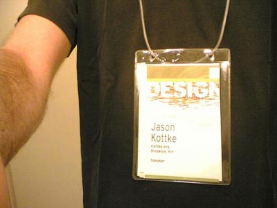
AIGA badge

The badge lanyards are not the usual string/cloth, but a simple length of thin hollow plastic tube that’s looped together with a small piece of plastic that fits inside the tube like so:

Badge lanyard

If the lanyard is too long (as they often are at these things) and your badge is hanging down to your belt buckle, just grab a scissors, cut a bit off one end of the tube, and stick it back together. The program is a small thick book which I’ve left in my hotel room the entire time, preferring to rely on the Web site for event descriptions and the smaller schedule that fits in the badge holder for times, room numbers, etc. The schedule is actually not a booklet, but a series of folding pieces, one for each day of the conference, so when Friday is over, you can take the Friday schedule out of your badge holder and leave it behind, which is kind of handy.

Reader comments

jjgSep 17, 2005 at 5:01PM

As it turns out, the small thick book is sized to fit in the badge holder too. I didn't know this until an AIGA person demonstrated it.

MZSep 17, 2005 at 5:12PM

At every conference I attend I bring my own badge lanyard just in case. Sometimes they are crappy like the one you described and I don't want to go looking for scissors :)

Dip SlovakSep 17, 2005 at 9:19PM

"the badge holder "

In the ticketing business we call them 'swingers',

cheers

JeffSep 18, 2005 at 8:23AM

I have invented a pair of glasses that will display everyone else's name on their foreheads. Using a set of mirrors (ok, wifi connected to the conference database if you must) it eliminates that uncomfortable "conference look," you know, a sly glance downwards in order to acknowledge fellow conferencees.

I've made many new friends using this device.

Jeremy FlintSep 18, 2005 at 8:36AM

After attending SXSW the past two years (my first real conference to attend), I began to think that instead of lanyards, they should do headbands so that when someone walks up to meet you, they aren't staring at your stomach.

I am only half-serious though.

BKMworldSep 18, 2005 at 10:23AM

The AIGA badge looks good in that in won't spin 'round making it impossible see delegate names. I hate that - you walk around all day trying to casually steal a glance at people's names only to find you are looking at the back of their badge, often some sponsor logo. And then some woman always comes up to me, grabs my badge, turns it round saying loudly 'Who are you?' followed by a quiet 'oh' after she pulls my badge to to her face and realises I am no one (to her). Badges should be double sided, with the same name and company information on both sides.

But Jason, I defend this post - there is a lot to be said (that rarely is) about conference badge design. I would however have liked more useful information. For example, when designing a badge that will be printed digitally from a database, what is the best way to determine optimal type size that will allow everyone's surname to fit on the badge? Is it simply that you have to find the longest delegate name in the database and set the point size to fit that name? This is the sort of thing that keeps me awake at night.

jonbSep 18, 2005 at 10:43AM

Might be worth noting that the badge holders (including the lanyard) is recyclable.

Al AbutSep 18, 2005 at 12:40PM

there is a lot to be said (that rarely is) about conference badge design. I would however have liked more useful information.

Yeah, I second that. I had an idea at a design conference (dux03) to reconcile people's online and offline personas. It was the first one for me where I kept running into people whose blogs I'd read online or even traded comments with, yet I often wouldn't recognize their real names and would even trade long conversations with them only to realize later who the hell I was talking to, accompanied with a giant smack on the forehead.

So I thought of this - an optional screenshot of your site/blog home page along side your name. I'm sure I'm not the only one that can recognize Simplebits or Mezzoblue instantly - most web designers have their own unique style and it's not hard to pick them out. With the sheer number of sites we visit each week, names tend to fall by the wayside.

This thread is closed to new comments. Thanks to everyone who responded.