kottke.org posts about art
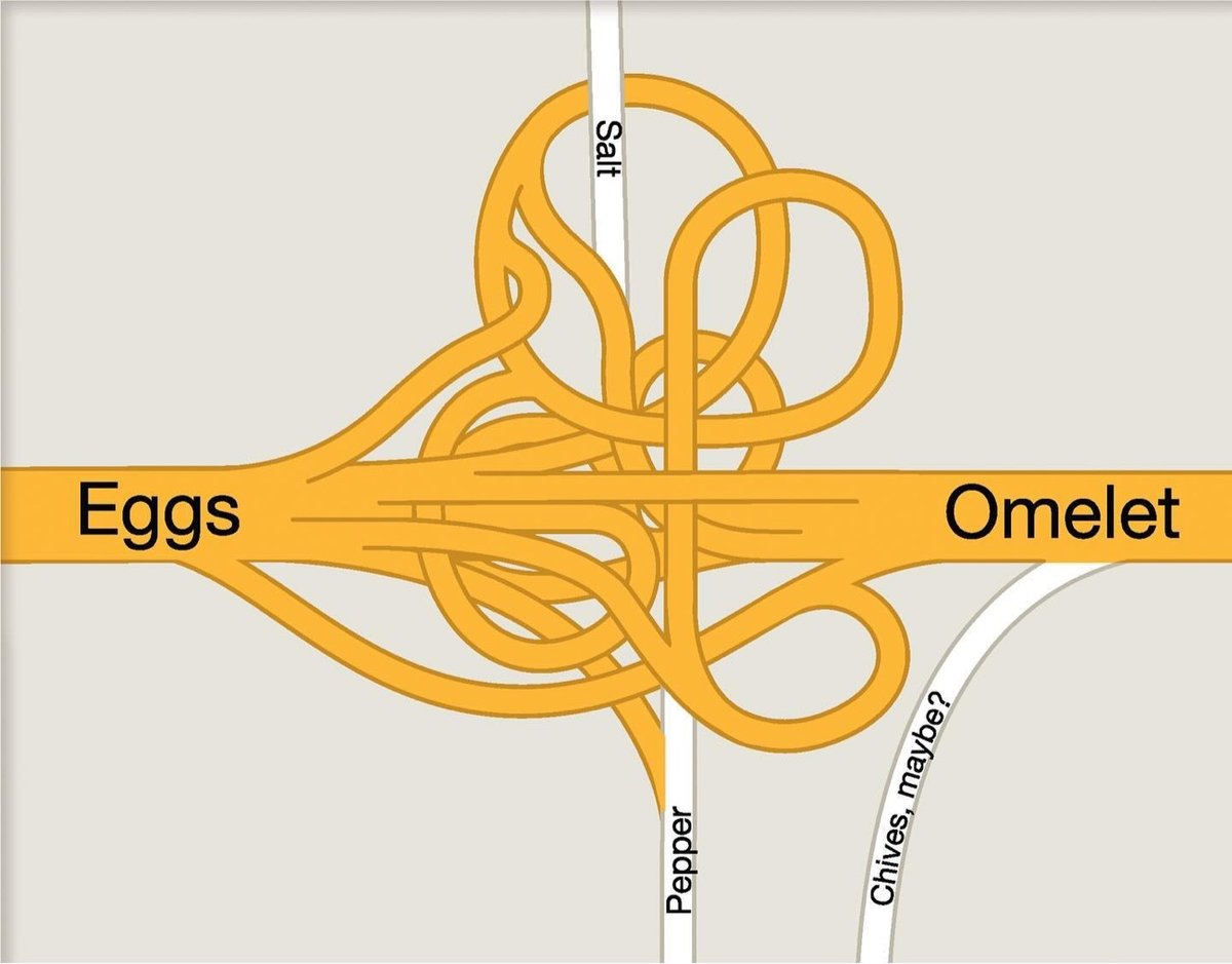
Always a good day to highlight the creative work of designer/illustrator Christoph Niemann: a collection of map-based work, including a cheeky metaphorical recipe for an omelet. That intersection isn’t actually that outlandish: see A Bonkers Highway Interchange and Crazy Whirlpool Traffic Interchange in Dubai.
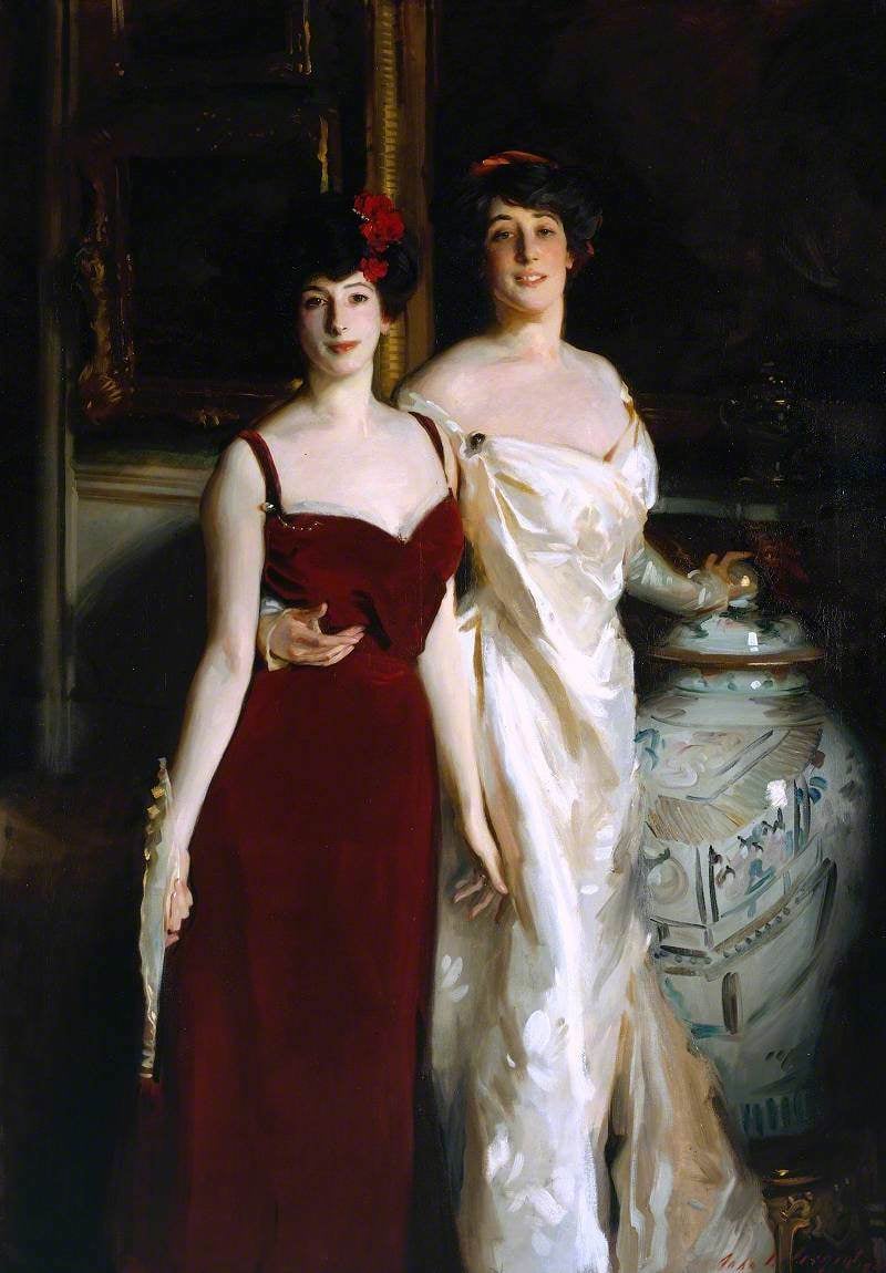
If a genie granted me the ability to bring one artist back from the dead to create a portrait of myself or a loved one, without thinking too hard about what it might mean for the artist (“you brought me back for what?!”), I’d pick John Singer Sargent. I’m curious about which artists come to mind for others, if anyone wants to chime in.
Above is “Ena and Betty, Daughters of Asher and Mrs Wertheimer,” from 1901, part of the Wertheimer Portraits. I love their hands in this image.
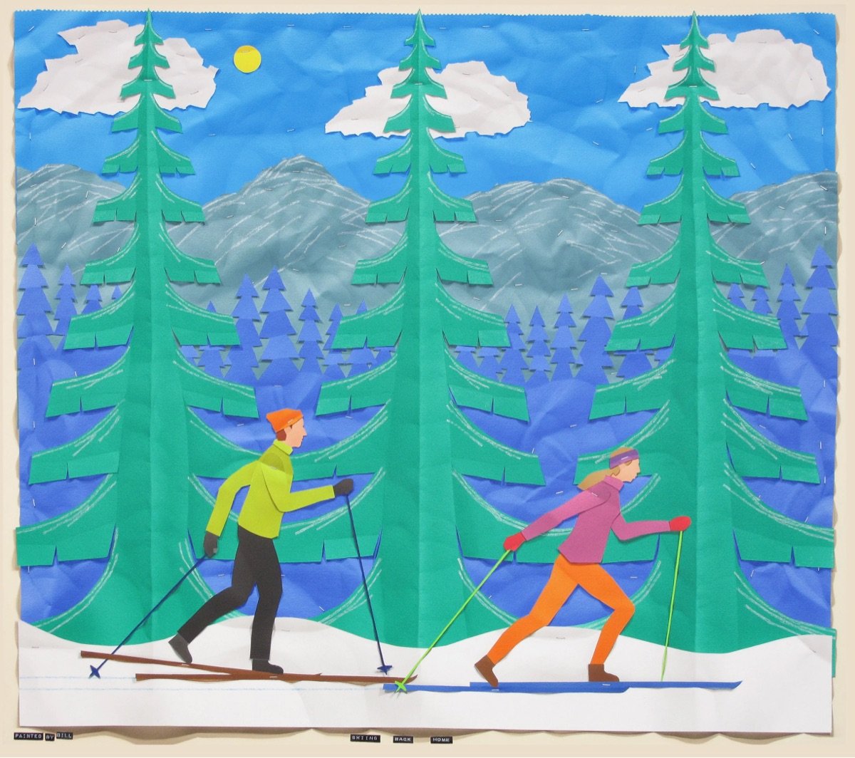
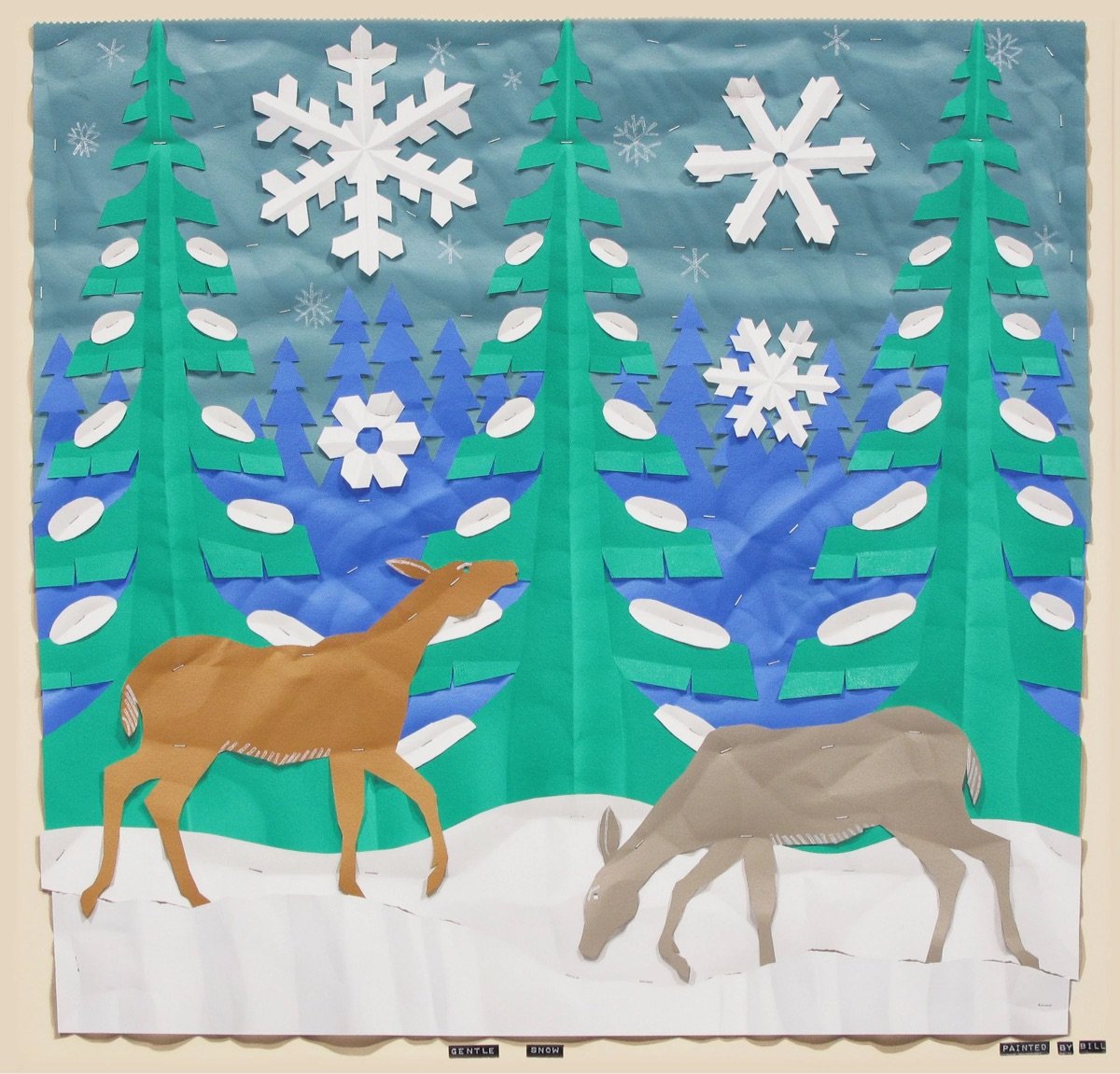
Bill Braun is a “trompe l’oeil painter” who creates paintings that look like paper craft, complete with visible paper folds, shadows, and even the “staples” holding the “paper” to the backing. What an incredible illusion. And I always enjoy an artist who is reticent to give an artist statement or explain their work:
I don’t like to give an artist statement because it undoes the premise of my work, trompe l’oeil painting. Literally from the French, trompe l’oeil means “trick the eye”. An artist’s statement might undo the fundamental aim of convincing the viewer, at least for a moment, that what he sees are actual objects and not a painting. The basic rules of trompe l’oeil painting are that objects are rendered in real scale, and totally within a shallow painted space. This type of painting has always been a minor branch of realist painting, but with a very long history. The Athenian painters Xeuxis and Parrhasios in 5th century B.C. (as told by Pliny the Elder in his Natural History) and Roman murals of the 2nd century A.D., 16th century Dutch vanitas painting and the 19th century Philadelphia School painters, Harnett, Peto and Haberle, are examples. Today there are still trompe l’oeil painters around; I am happy to be one of them.
(via tohippo)
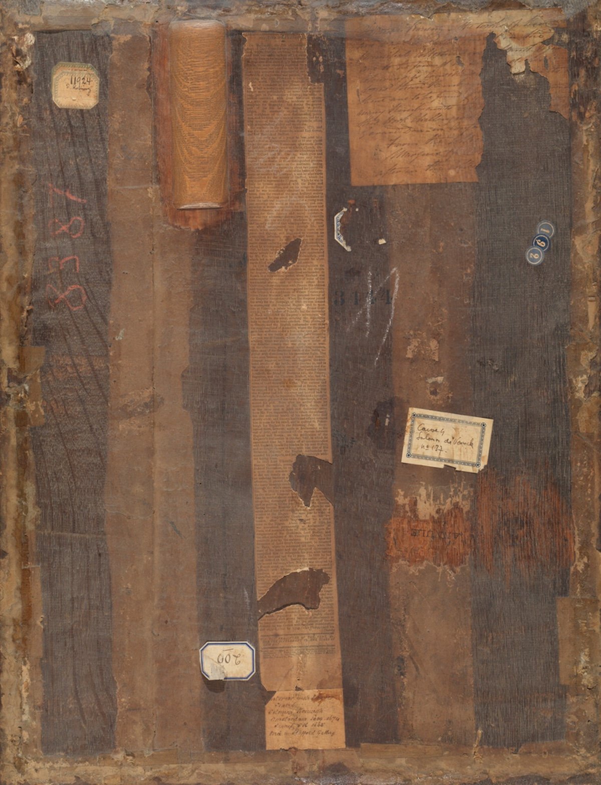
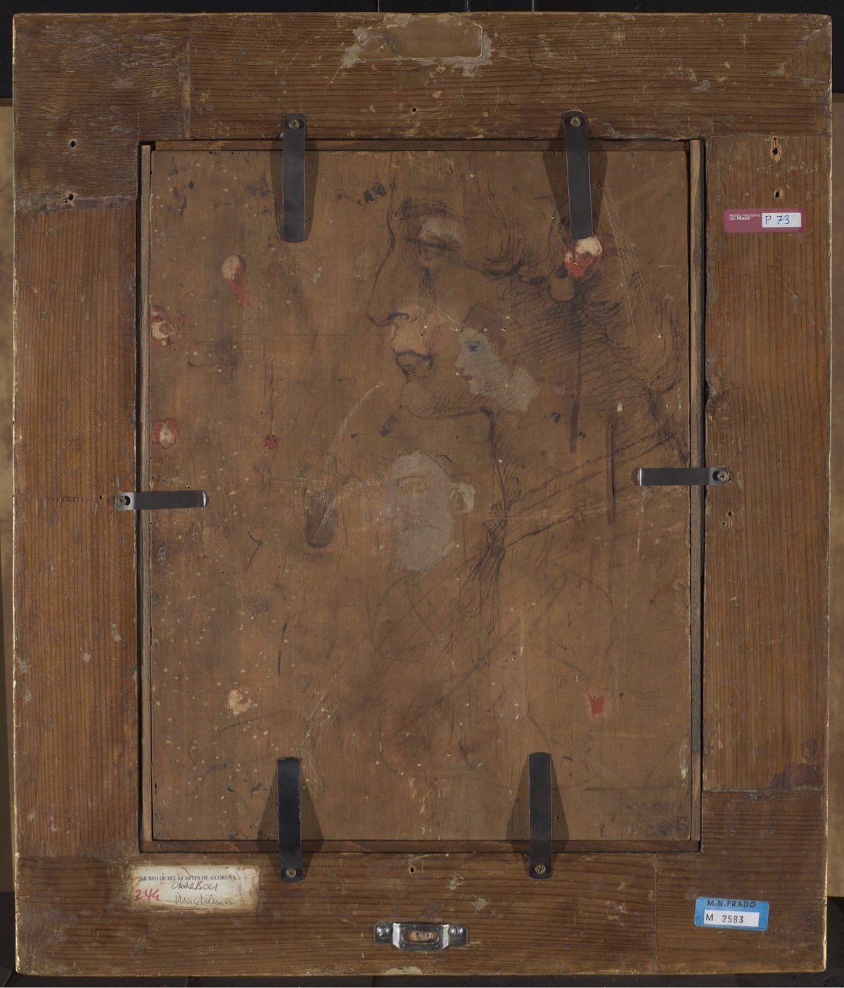
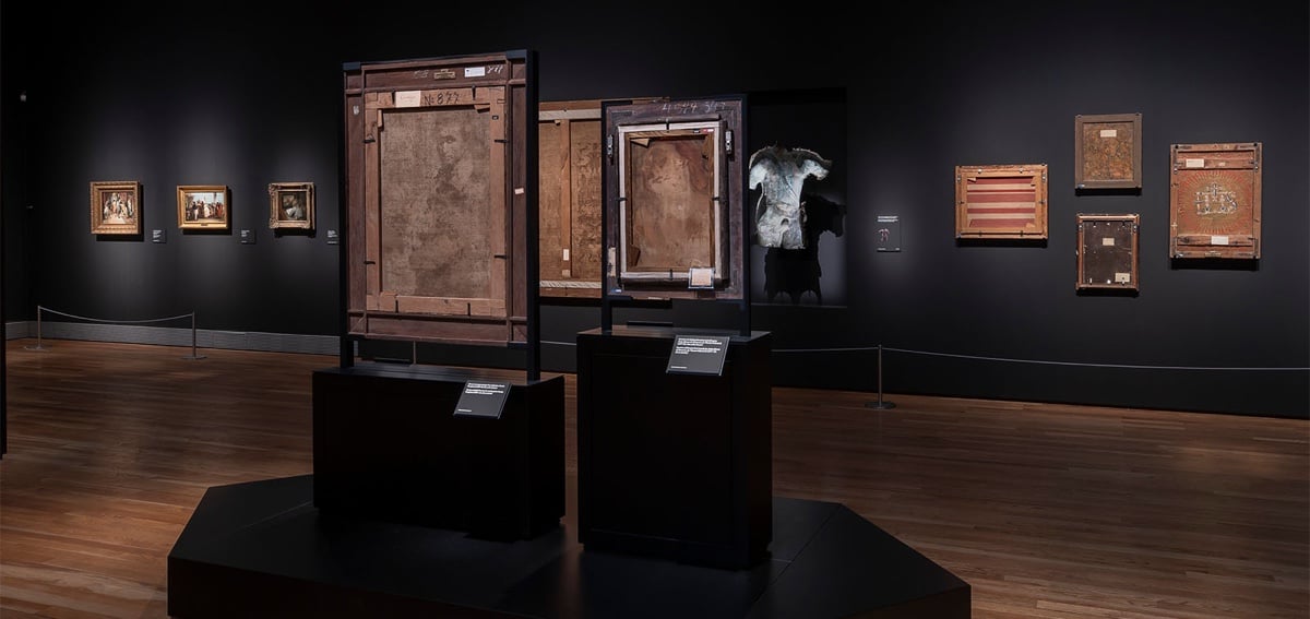
Madrid’s Museo Nacional del Prado recently put on an exhibition called On the Reverse that featured the backs of notable works of art.
This exhibition goes beyond the simple action of turning paintings around. Rather, the Museo del Prado is undertaking a complete reassessment of the backs of works in its collections while also identifying relevant examples in other major museums which reveal how appreciation of works of art is enhanced when we do more than just look at the front. The exhibition addresses issues that have never previously been brought together and in which there is also space for imaginative interpretations: the emergence of the reverse as a pictorial motif in two sub-genres: the self-portrait of the artist behind the canvas and the depiction of the picture back in trompe l’oeil; the poetic reading of the stretcher as a cross; two-sided paintings; the back as a field for experimentation and subjective expression; aesthetic appreciation of the material nature of the works, and the issue of the viewer seen from behind, which makes us aware of the particular spatial relationships that are generated by human interaction with art.
I once went with an artist friend to an art museum where they hung some of the paintings so you could see both sides of them at once, and she was often more interested in seeing the backs, where you could maybe see who owned the painting previously, etc.
Sadly, the show ended on March 3, but Hyperallergic has a good writeup.
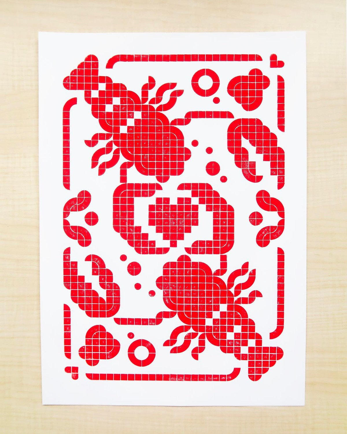
Check out this letterpress print of a lobster made by Eunice Chiong with Lego pieces as the stamps (watch a short video of her printing process). Chiong has been working with Legos and letterpress for many months now…check out more of her creations on Instagram and in her portfolio.
See also Letterpress Prints of Birds Printed Using Lego Bricks.
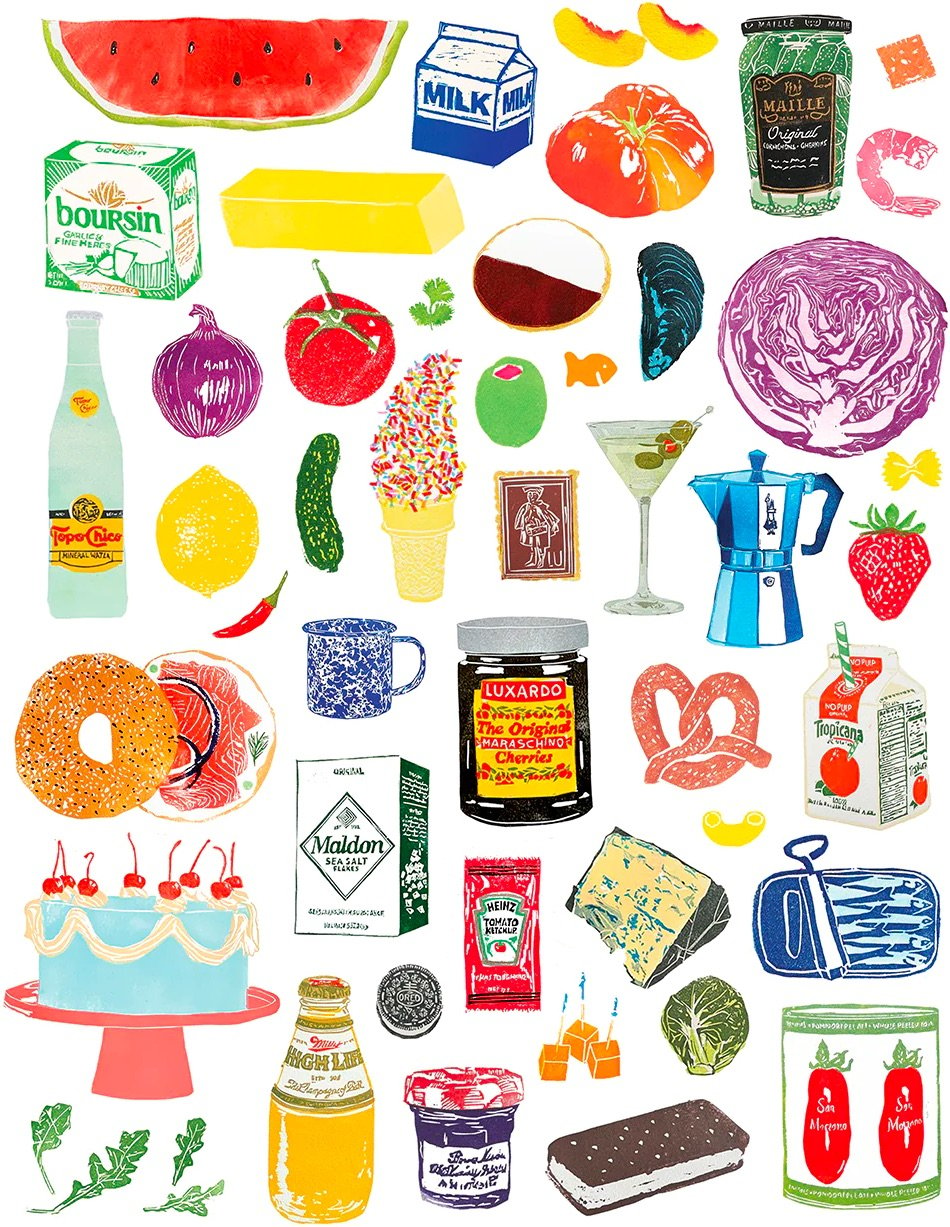
I love this print from Anastasia Inciardi at 20x200 — lots of familiar foods and comfortably delicious products.
Inciardi is known for her mini print vending machines and also sells prints and other things online. You can check out her work on Instagram.
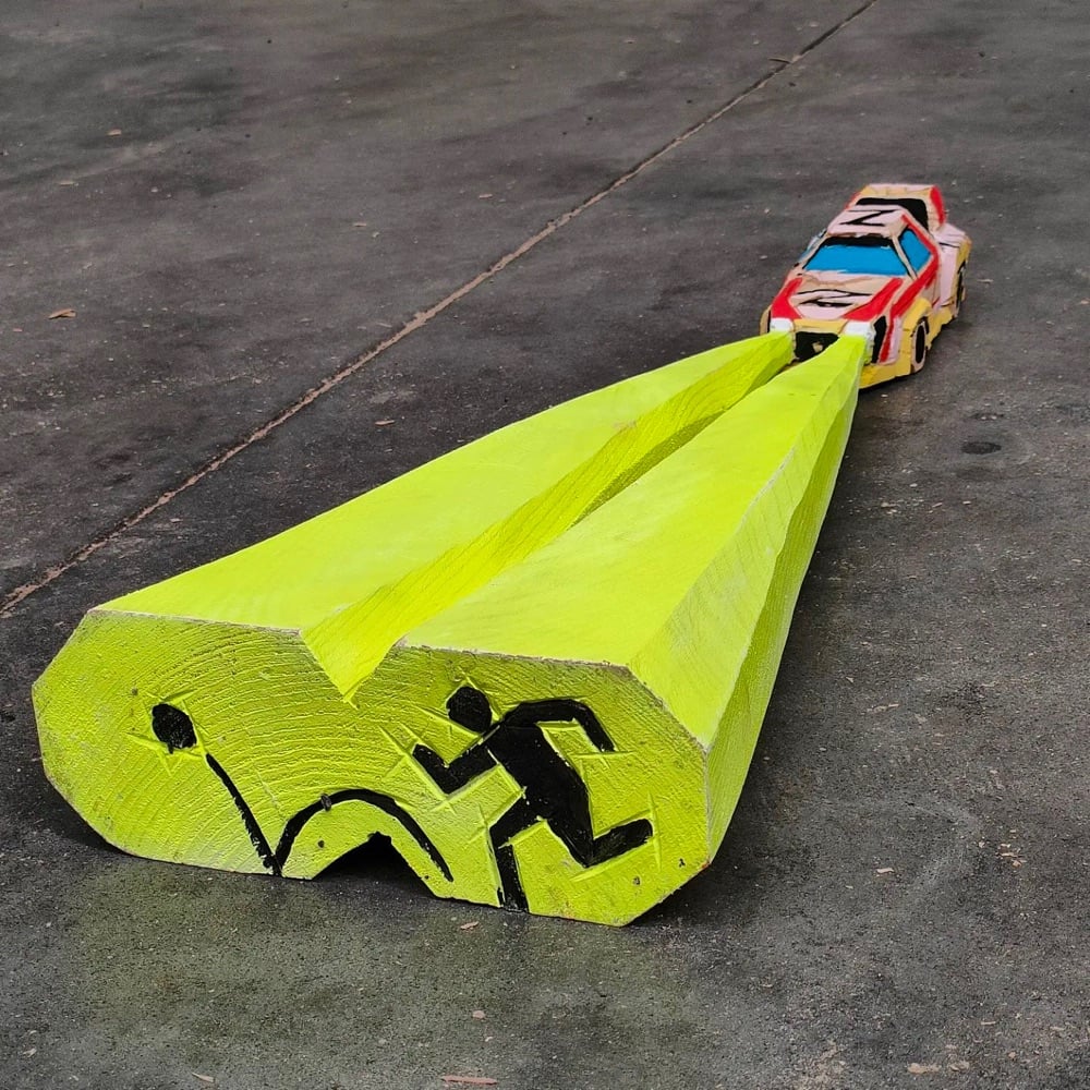


Holy crap, how cool are these carved wooden cars by Kiko Miyares! The style is just incredible. Is light a wave or a particle? Neither: light is wood. (via @scottmccloud)
This is an image created by Hal Lasko in Microsoft Paint:
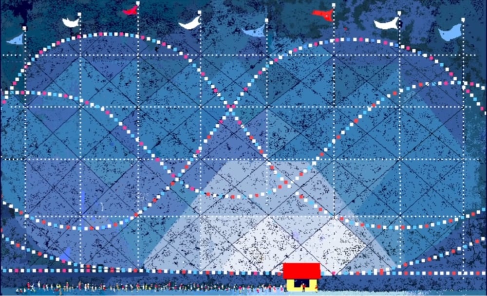
Lasko was a retired graphic designer & typographer who found a new passion when he received a computer for his 85th birthday, which came preloaded with Microsoft Paint. This short film tells the story of The Pixel Painter:
That all changed for Hal when his family gave him a computer as an 85th birthday present. His new PC came loaded with Microsoft Paint software, a program developed in the 1980’s. The program is more kitsch than cutting edge, but it’s easy interface and pixel precision allowed Hal to journey down a new artistic path with a style many consider “retro cool”.
In his last year of life, he had his first solo gallery show, spoke at a conference and was featured in a Super Bowl commercial. He passed away just shy of his 99th birthday in 2014, leaving us with a legacy that passion knows no age, and for Hal, the proof of that is surely in the pixels.
You can still buy prints of Lasko’s work on his website.
Fun fact: the short film uses my Silkscreen font in it. It’s fun to see it still popping up in places. (via @bw/111894669094307194)
Lost Found Art is a design company that “specializes in sculptural installations and assemblages using antique and vintage pieces”. Their collections are fun to browse through and remind me of the work of Bernd and Hilla Becher.
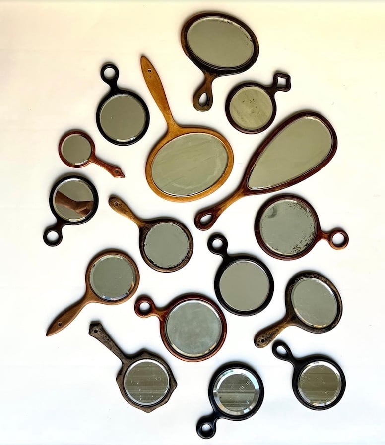
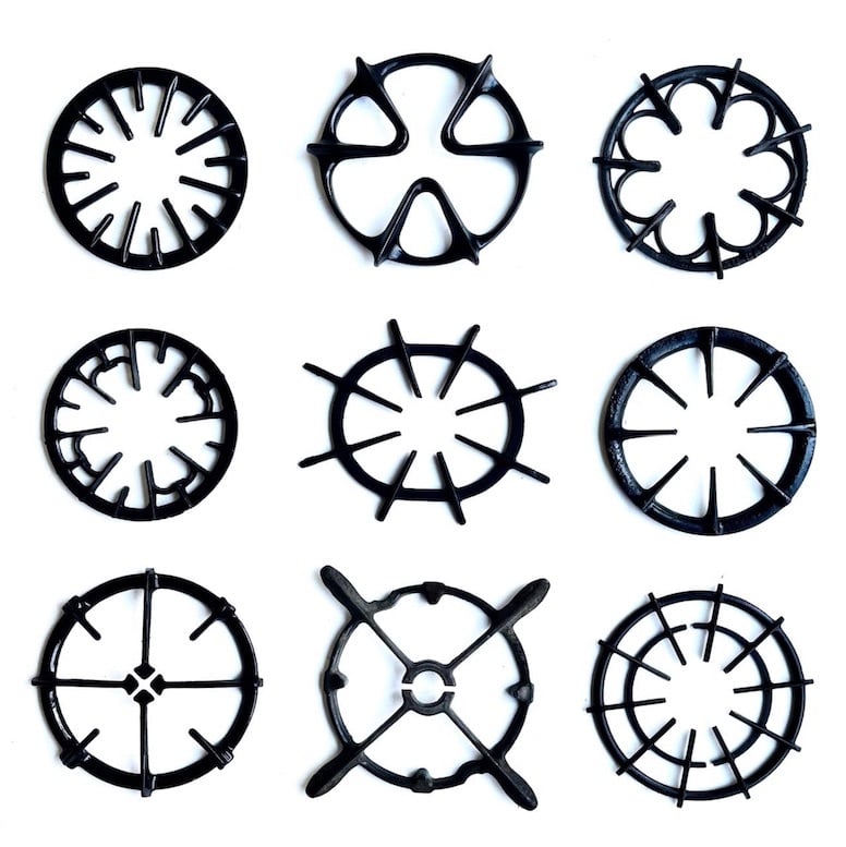
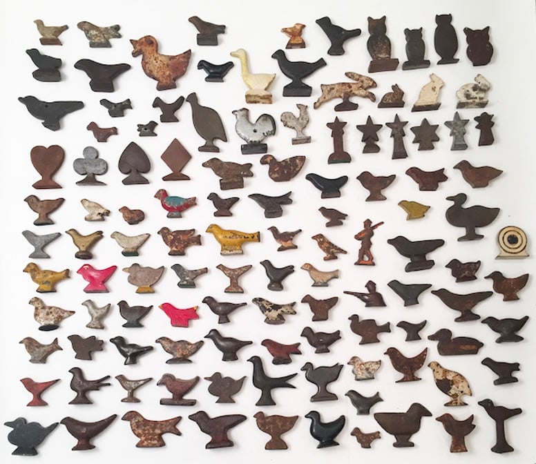
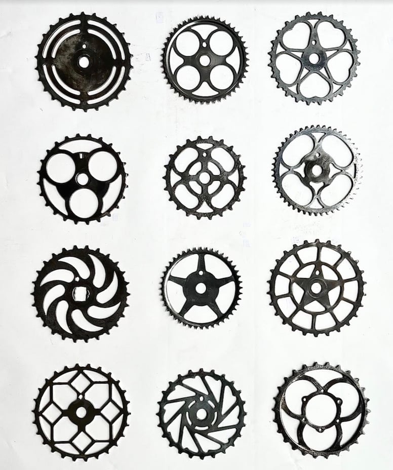
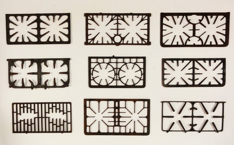
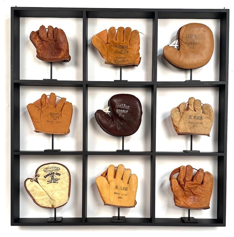
(via present & correct)
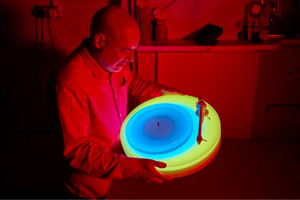

Electronic music pioneer Brian Eno has designed a glowing turntable that shifts colors as plays records.
Brian Eno’s Turntable II is made up of a platter and base, which change colours independently, seamlessly phasing through combinations of generative ‘colourscapes’. The pattern of lights, the speed at which they change and how they change are programmed, but programmed to change randomly and slowly. It plays both 33 and 45rpm vinyl.
Only 150 will be sold and they’re £20,000 so hopefully you’ll see one in a museum someday. (via kevin kelly)
Up until her death last year at the age of 93, Concha García Zaera wielded the relatively simple graphics editor Microsoft Paint like few others have.
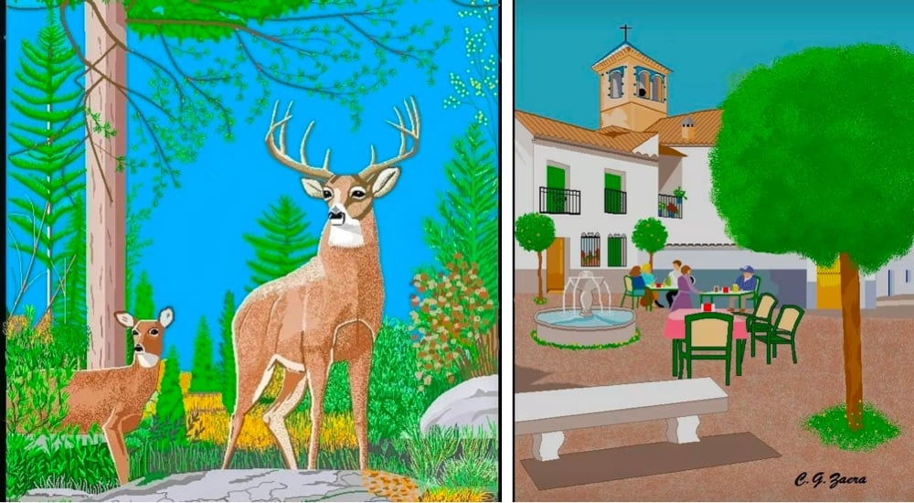

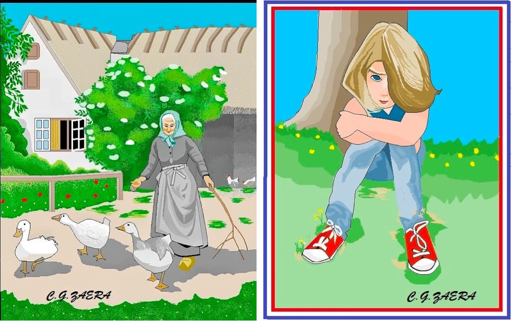
See also The Excel Spreadsheet Artist.
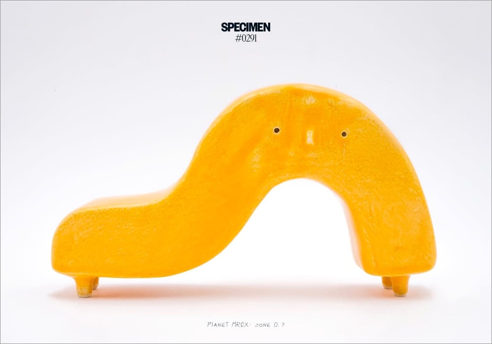
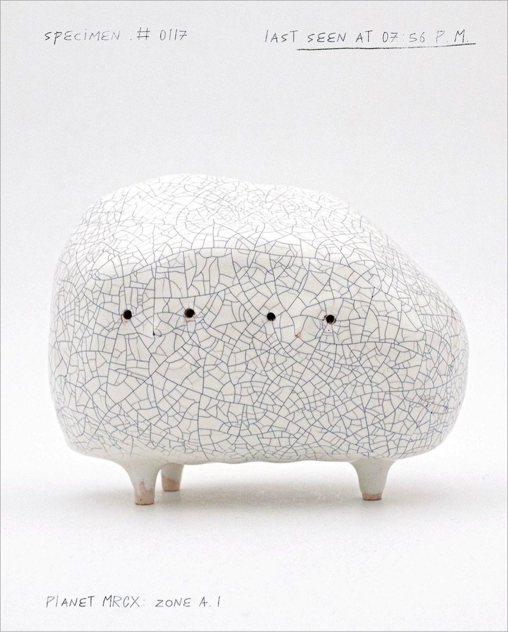
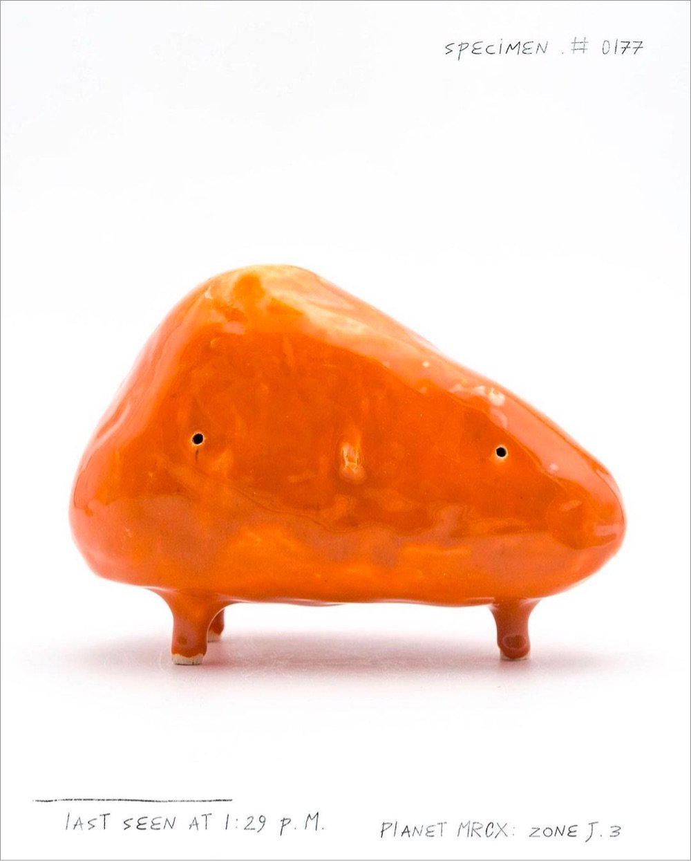
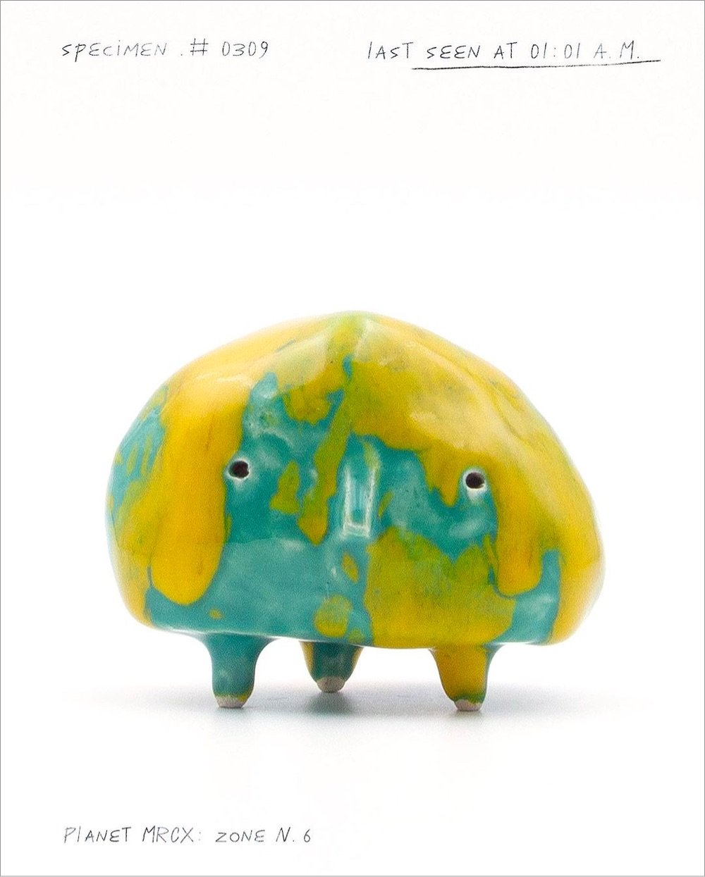
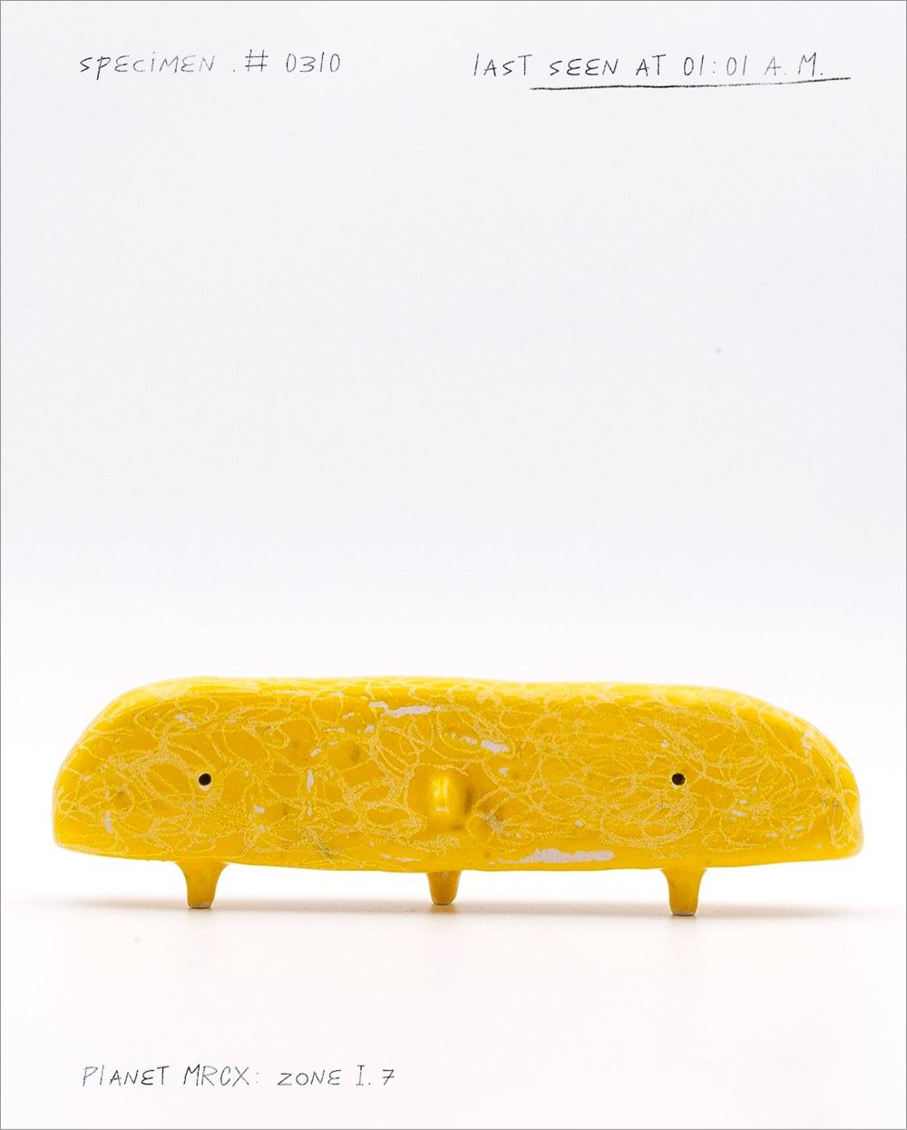
Ceramic artist Monsieur Cailloux makes these cute little ceramic creatures that are members of the Cailloux tribe “straight from the stone planet MRCX”. I like these little creatures, but whatever you think of them, you gotta admire this guy’s commitment to the bit. (via colossal)
In June 2021 (pre The Bear), New Yorker cartoonist Zoe Si coached Ayo Edebiri through the process of drawing a New Yorker cartoon. The catch: neither of them could see the other’s work in progress. Super entertaining.
I don’t know about you, but Si’s initial description of the cartoon reminded me of an LLM prompt:
So the cartoon is two people in their apartment. One person has dug a hole in the floor, and he is standing in the hole and his head’s poking out. And the other person is kneeling on the floor beside the hole, kind of like looking at him in a concerned manner. There’ll be like a couch in the background just to signify that they’re in a house.
Just for funsies, I asked ChatGPT to generate a New Yorker-style cartoon using that prompt. Here’s what it came up with:

Oh boy. And then I asked it for a funny caption and it hit me with: “I said I wanted more ‘open space’ in the living room, not an ‘open pit’!” Oof. ChatGPT, don’t quit your day job!
For the Atlantic, Bianca Bosker writes about a trove of paintings supposedly by Jean-Michel Basquiat that were discovered in a storage locker, ended up in a museum, and then seized by the FBI as fakes. As the owner of a pretty-convincing-but-probably-fake Basquiat purchased at a Mexico City flea market (that is also painted on cardboard), I read this story with great interest.
Science promises to be a neutral and exacting judge, though in reality forensics aren’t always much help either. Technical analysis can rule out an artwork — pieces from the trove of purported Pollocks with which Mangan was involved were exposed as forgeries after researchers found pigments that postdated the artist’s life — but it can’t rule it in as definitively by the artist in question. Some forgers will submit their handiwork for forensic testing so they can see what flags their pieces as counterfeit, then adjust their methods accordingly. Scientific techniques are also far less useful for contemporary artists like Basquiat, who relied on materials that are still available and for which the margin of error on many tests is wide. When the collector in Norway sent a painting he’d purchased from Barzman to be carbon-dated, the test revealed that the cardboard could be from either the 1950s or the 1990s.
What does it matter if art is authentic?
Our obsession with artworks’ authenticity can in part be traced back to what’s known as the “law of contagion”: Pieces are thought to acquire a special essence when touched by the artist’s hand. Yet the intense distaste for forgeries reveals a dirty secret about our relationship with art, which is that we tend to fixate on genius and authorship more than the aesthetic qualities of the work we claim to value so highly. The writer Arthur Koestler, in an essay on snobbery, goes so far as to argue that when judging a work, who made it should be considered “entirely extraneous to the issue.” What matters more, he argues, is what meets the eye.
When I see art in person or visit historic places, I often think to myself that I am standing where the artist or famous personage once stood — and it makes me feel something. I’m not sure if it has anything to do with magic though.
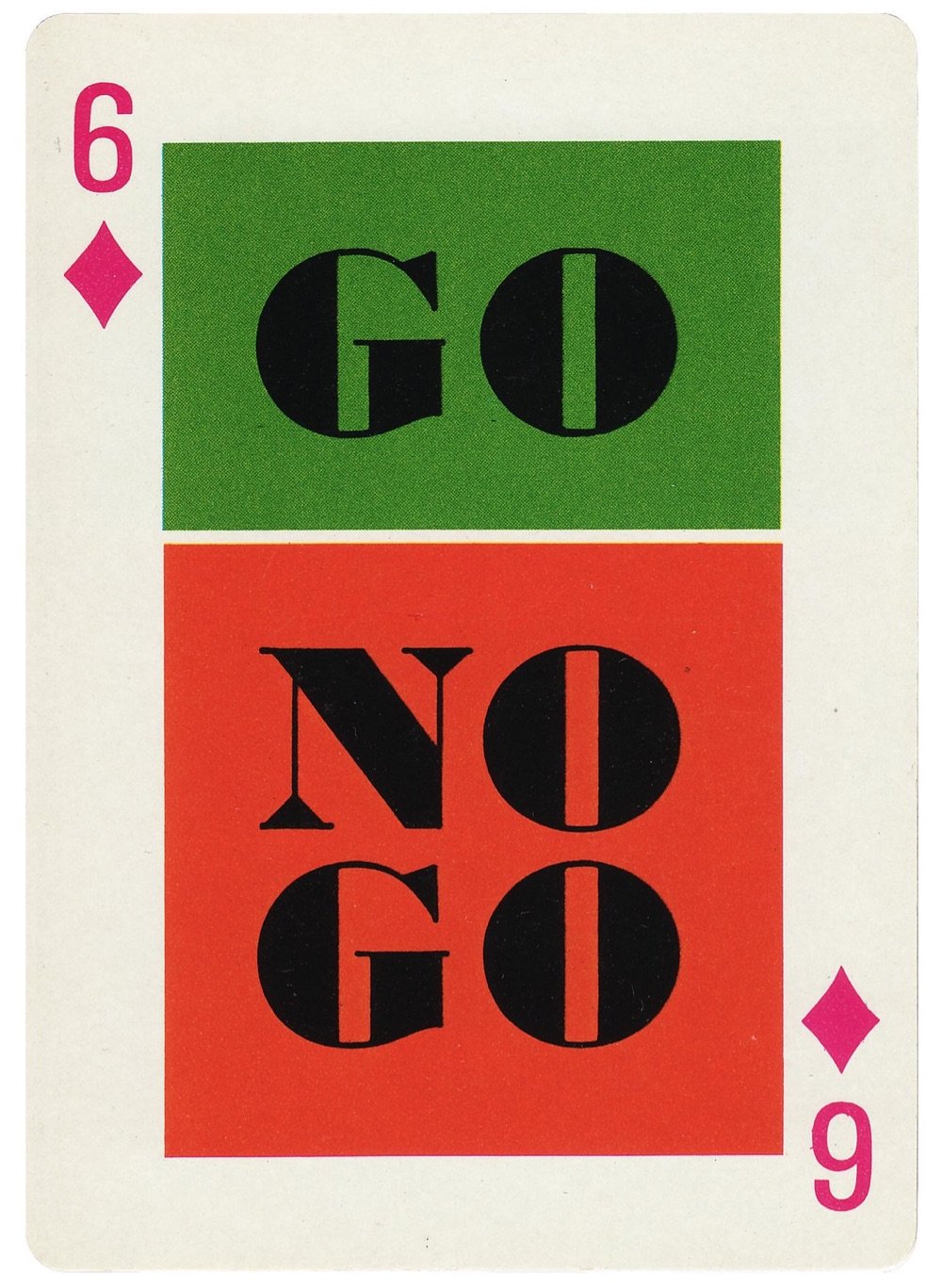
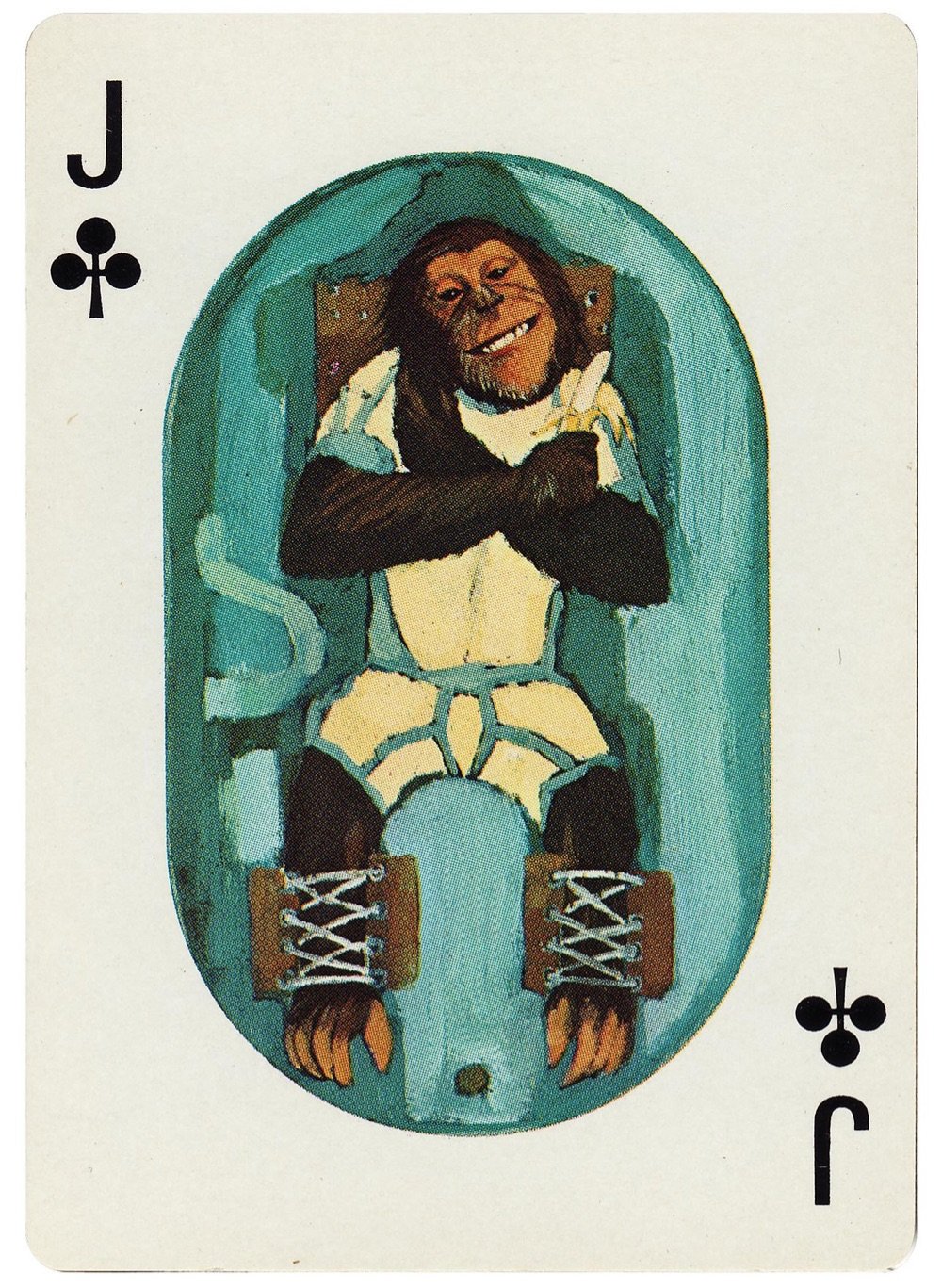
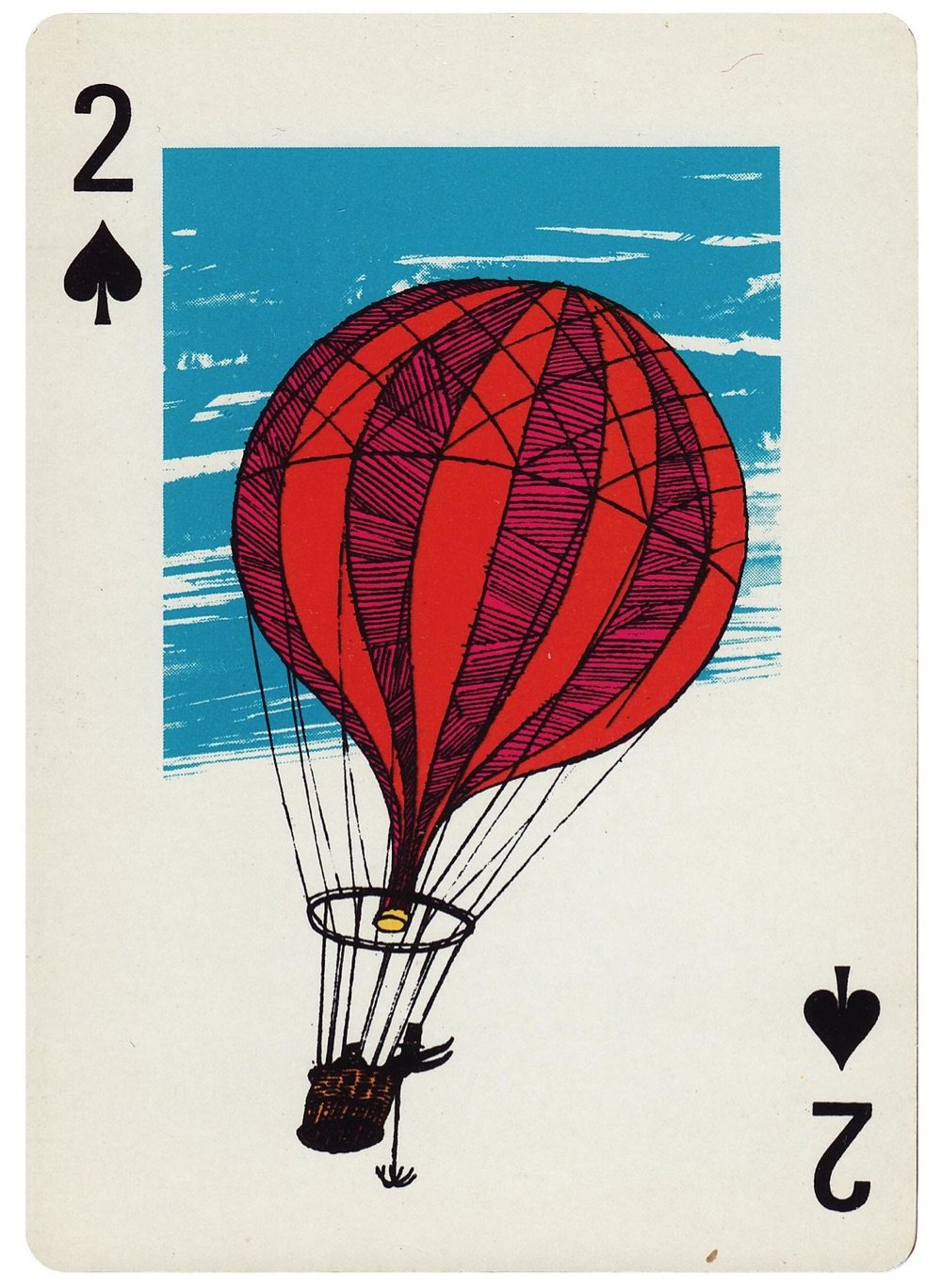
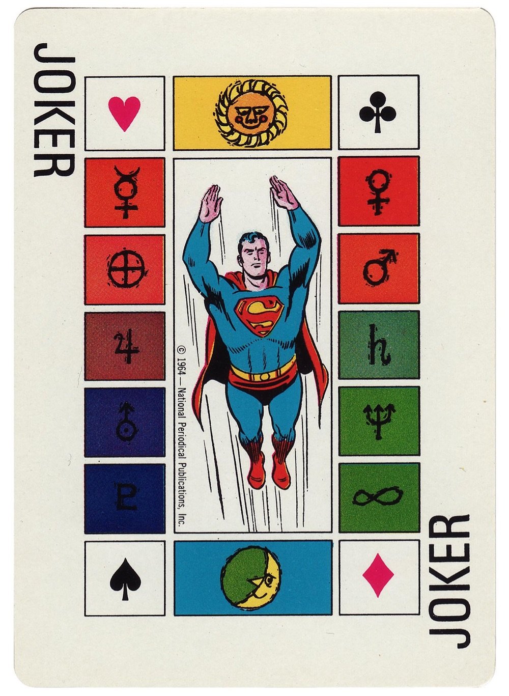
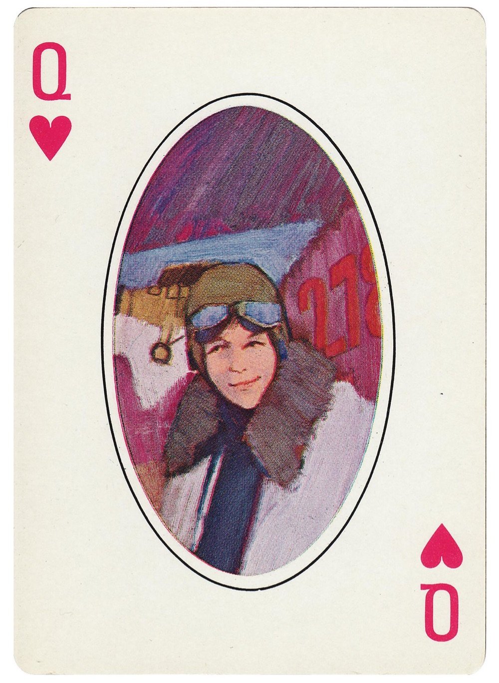
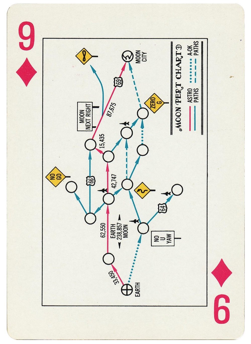
The General Dynamics Astronautics Space Cards were printed up in 1964 to celebrate the American space program. This Flickr account has scans of every card in the deck, including both jokers. Each suit corresponds to a different aspect of the program:
These space cards tell a story — the story of America’s man-in-space programs. The hearts deal with the human element, the clubs portray the sciences, the spades show products, and the diamonds depict modern aerospace management without which the other three elements could not be successful…
If you’d like your own factory-sealed deck, you can buy one on eBay for $249. (thx, mark)


For a photographic experiment based on the Skinner box, Augustin Lignier trained a pair of rats to take photos of themselves, aided by a sugary reward. When the rewards became intermittent, the rats kept snapping away, sometimes even ignoring the sugar.
To Mr. Lignier, the parallel is obvious. “Digital and social media companies use the same concept to keep the attention of the viewer as long as possible,” he said.
Indeed, social media has been described as “a Skinner Box for the modern human,” doling out periodic, unpredictable rewards — a like, a follow, a promising romantic match — that keep us glued to our phones.
Or maybe being able to keep ourselves busy pressing buttons is its own reward. In a 2014 study, scientists concluded that many human volunteers “preferred to administer electric shocks to themselves instead of being left alone with their thoughts.” Maybe we would rather sit around and push whatever levers are in front of us — even those that might make us feel bad - than sit with ourselves in quiet contemplation.
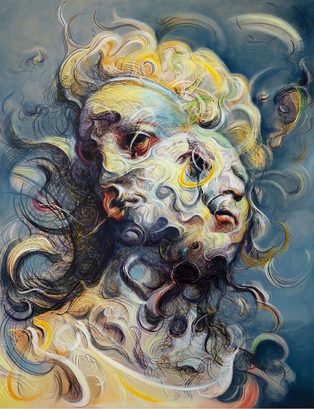
I do not remember how I stumbled upon this painting by British artist Glenn Brown but I like it quite a lot. You can check out more of his work on his website.
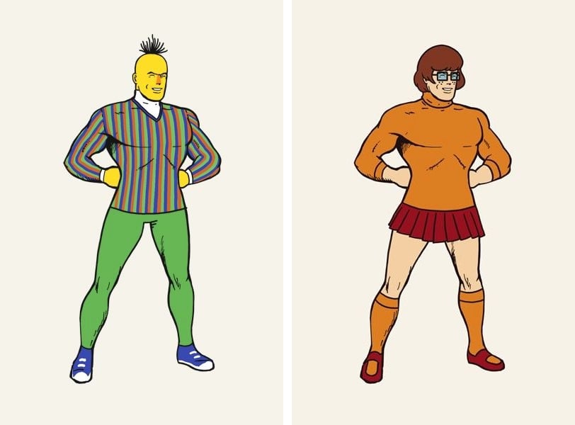

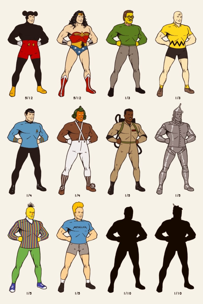
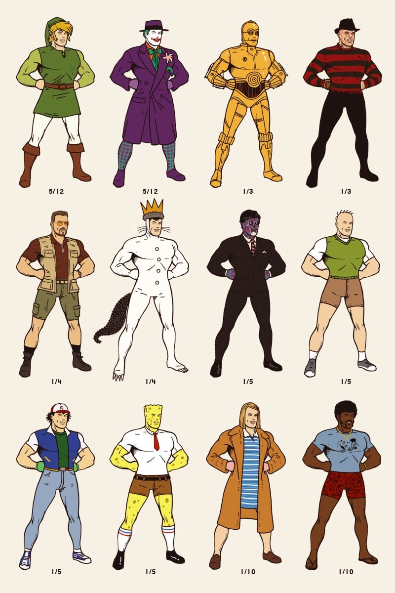
Using an iconic Superman pose, artist Mike Mitchell has translated all sorts of familiar characters onto that pose, including C-3PO, Velma from Scooby Doo, Charlie Brown, Ned Flanders, Pee-wee Herman, Bert from Sesame Street, Steve Zissou, and Spongebob Squarepants. Here’s an animation of all them. (via moss & fog)
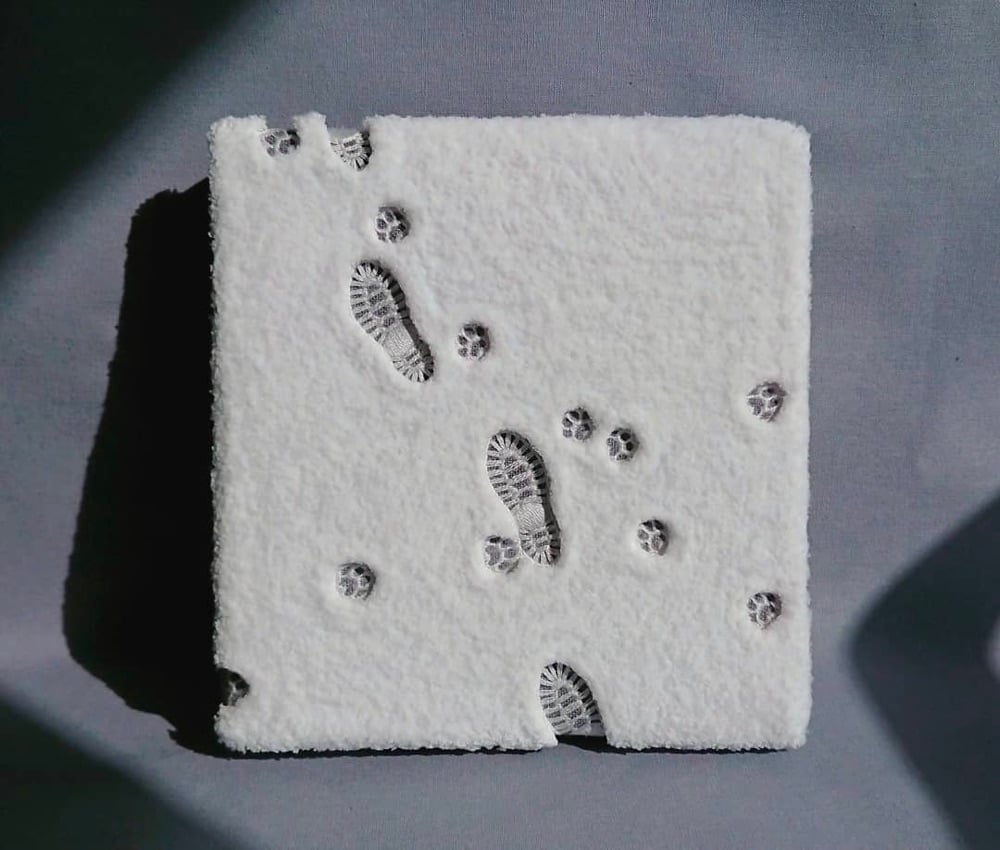

Absolutely stunning embroidery piece by Narumi Takada of boot prints and animal tracks1 in freshly fallen snow. Just lovely.
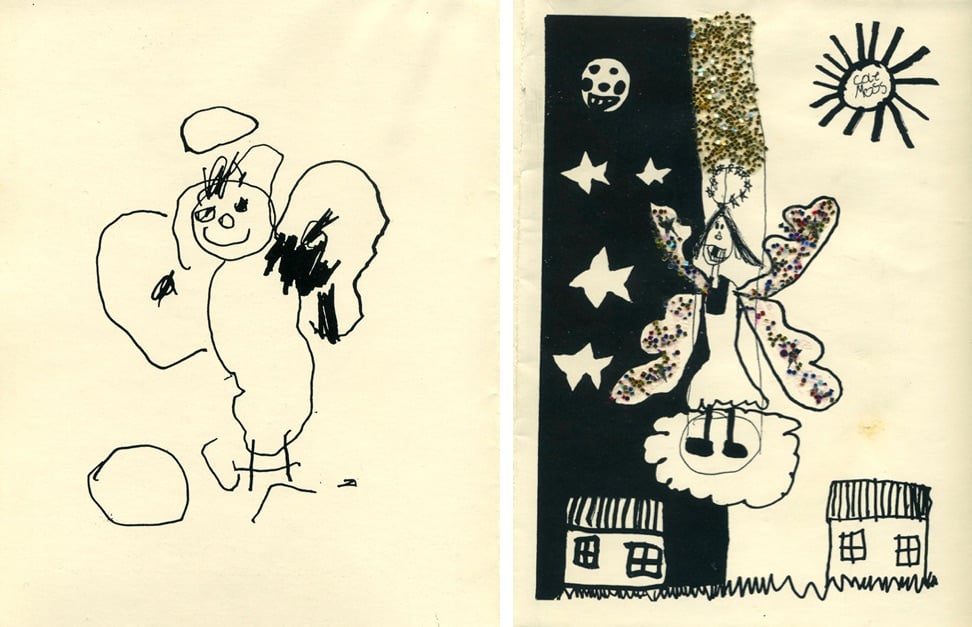
Since he was a toddler, artist C.W. Moss has made the artwork for his family’s Christmas card. Here are some early installments from when he was three & seven:
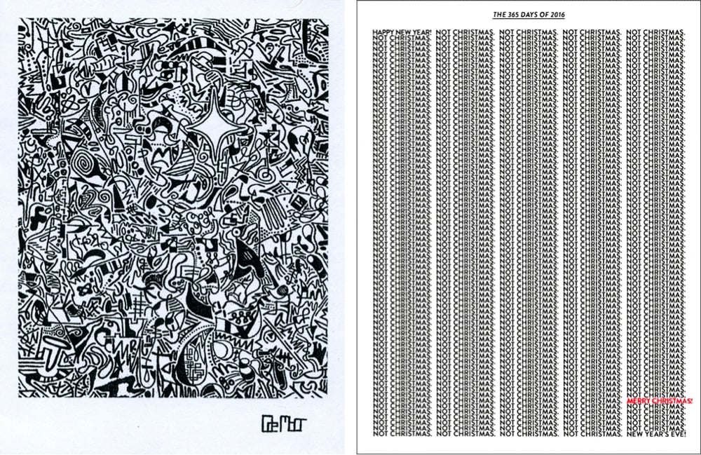
Some from when Moss was 17 and 29:
And the most recent one from age 36 (you can watch how he draws it):
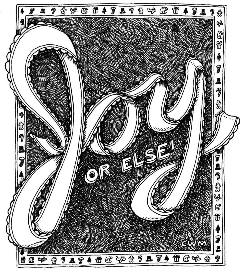
It’s fascinating to see his artistic sense grow and shift over the years, not only increasing in artistic skill as he gets older but also moving from simple depictions of holiday scenes to more conceptual creations.
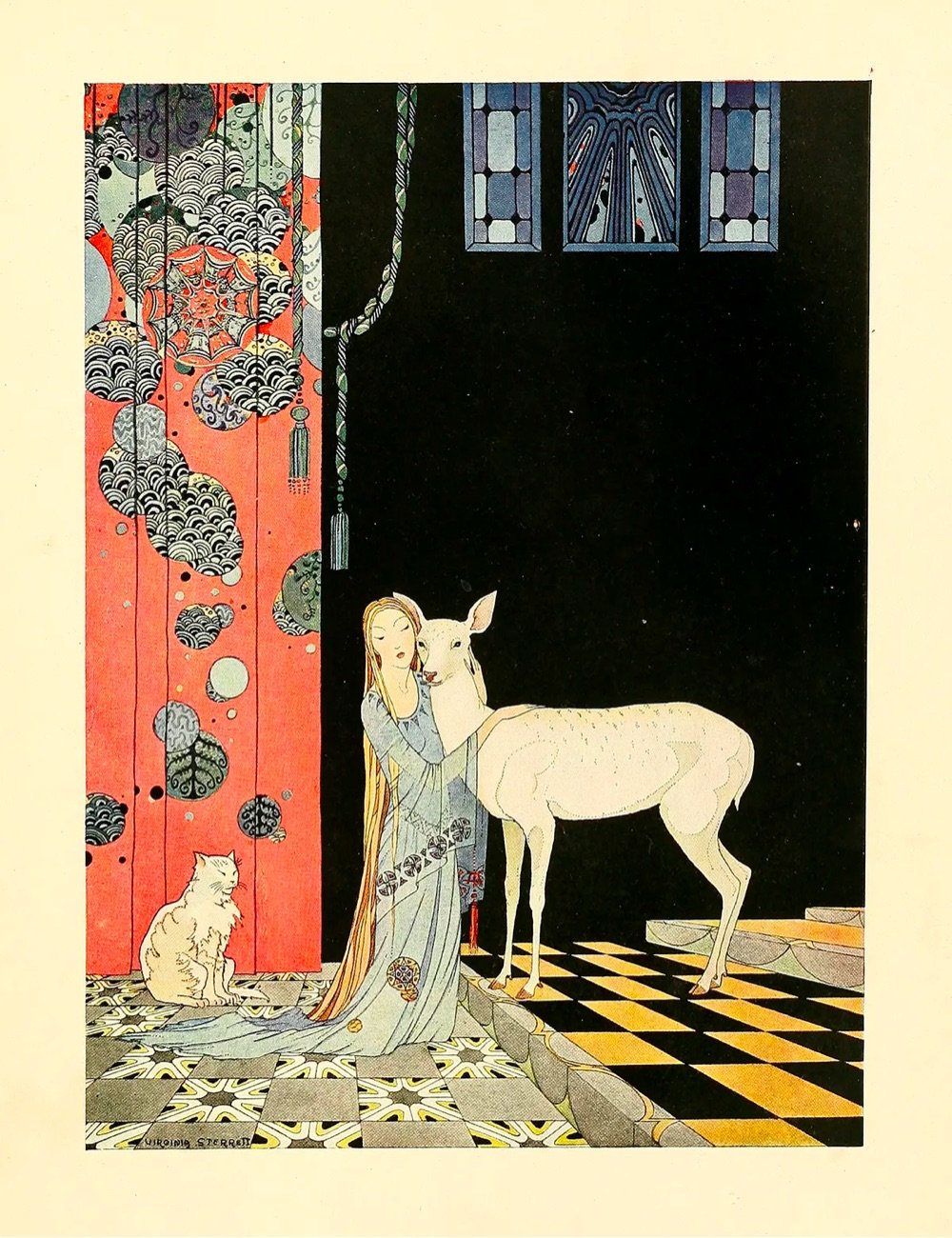
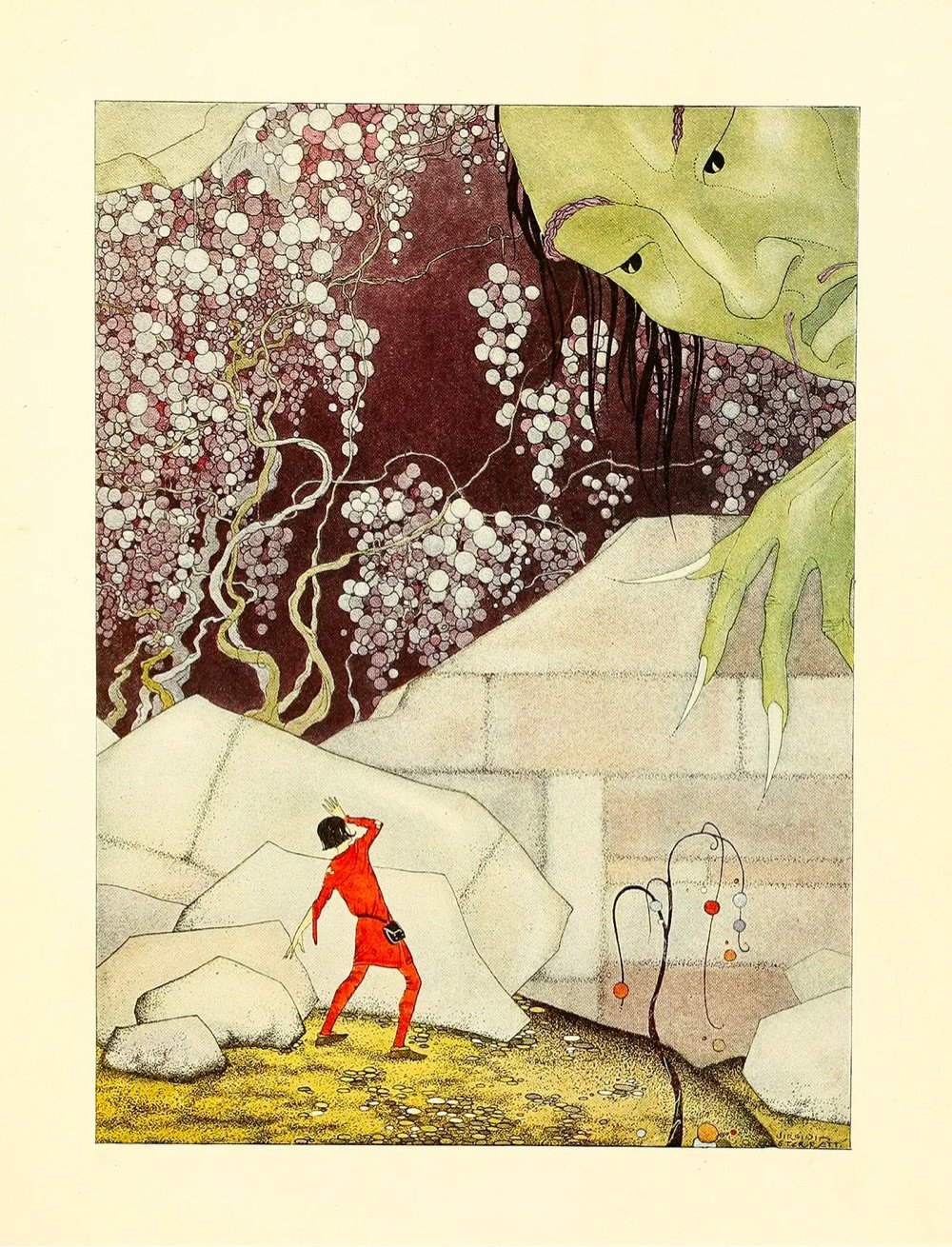
I love these drawings by Virginia Frances Sterrett.
At fourteen, unthoughtful of achievement and ambition, friends persuaded her to send her drawings to the Kansas State Fair. To her surprise, she won first prize in three different categories. The originality of her drawings — which, throughout her life, came to her as visions she felt she was merely channeling onto the page with her pen and brush — captivated two successful local artists, who encouraged her to pursue formal study.
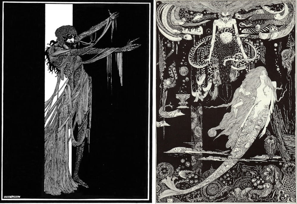
Every so often on Instagram I come across Harry Clarke’s stringy, spooky illustrations for the 1919 Edgar Allan Poe collection Tales of Mystery & Imagination (above left) or the 1925 version of Goethe’s Faust. Poking around led me to this 2016 story in the Public Domain Review: “Harry Clarke’s Looking Glass.” As I learned, he once wrote to a friend that his publisher thought a set of his Faust illustrations were “full of stench and steaming horrors.”
50watts has more great images, and here’s a zoomable version of the “Sea Witch” (above right) from his illustrations for Hans Christian Andersen’s “The Little Mermaid.”
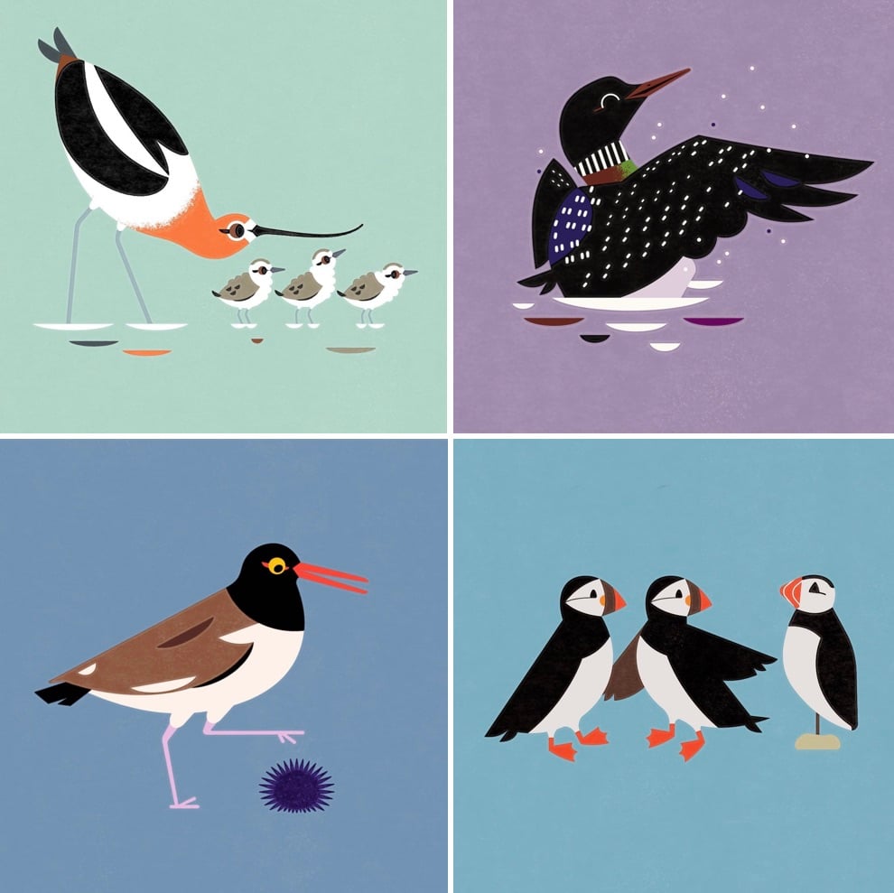 I came across Alex Tomlinson’s work on Instagram one day in 2022 (it was featured on Audubon Society merch, which I bought immediately), and have been enjoying it ever since. I’m having one of his “Red-Eyed Birds of North America” posters framed as a gift for myself this Christmas! He also sells tons of cards, stickers, and apparel on his website. [hootalexarchive/pigeonpost]

For my husband’s birthday, I got him a candle sculpted to look like us, by the artist Janie Korn. It’s brought a lot of joy. She also makes custom pet and house candles, as well as cookie, cigarette, and Marie Antoinette candles, among many others. [Janie Korn]
This video from MoMA follows master printer Jacob Samuel as he makes his final print before he retires.
As he inks, hand wipes, and rolls his final print through the press, he reflects on his philosophy. “My goal is to leave no fingerprints,” he says. All you see is the artist’s work. I’m just another pencil. I’m just another brush. But I want the pencil to be sharpened really well. I want the brush to be sable. And to do that and be completely spontaneous, I trust the materials.”
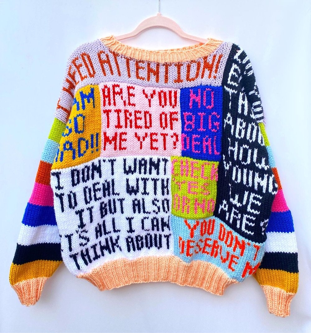

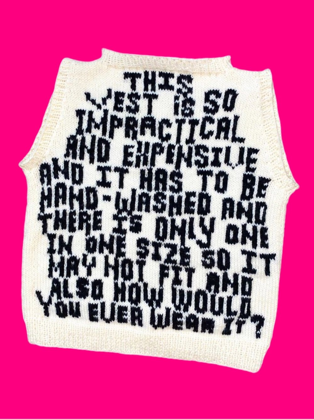
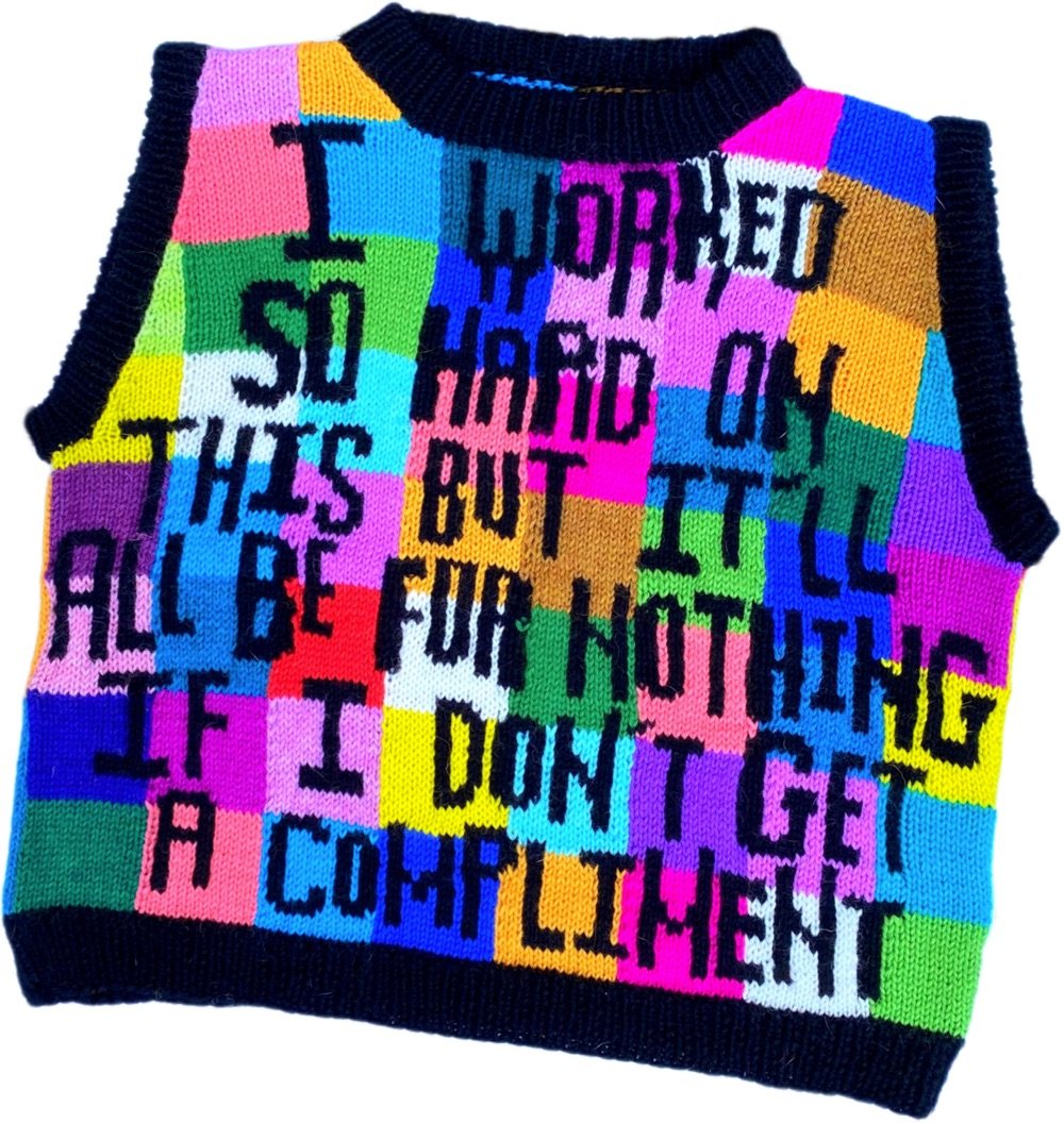
I love these busy, wordy, and brightly colored sweaters from Kendall Ross. From her about page:
Kendall Ross, aka “I’d Knit That”, is an Oklahoma City based fiber artist. She is best known for hand-knitting colorful, wearable art pieces. She uses intricate hand-knitting colorwork methods like intarsia and fair isle to illustrate images and incorporate her original texts into the fabric of her work. Each stitch on every sweater, vest, mural, and textile is painstakingly planned and knit over countless hours using two needles and wool.
You can check out more of Ross’s work on Instagram.
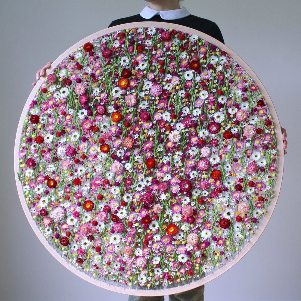
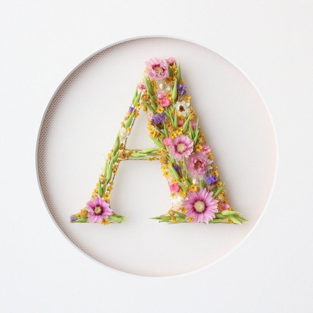
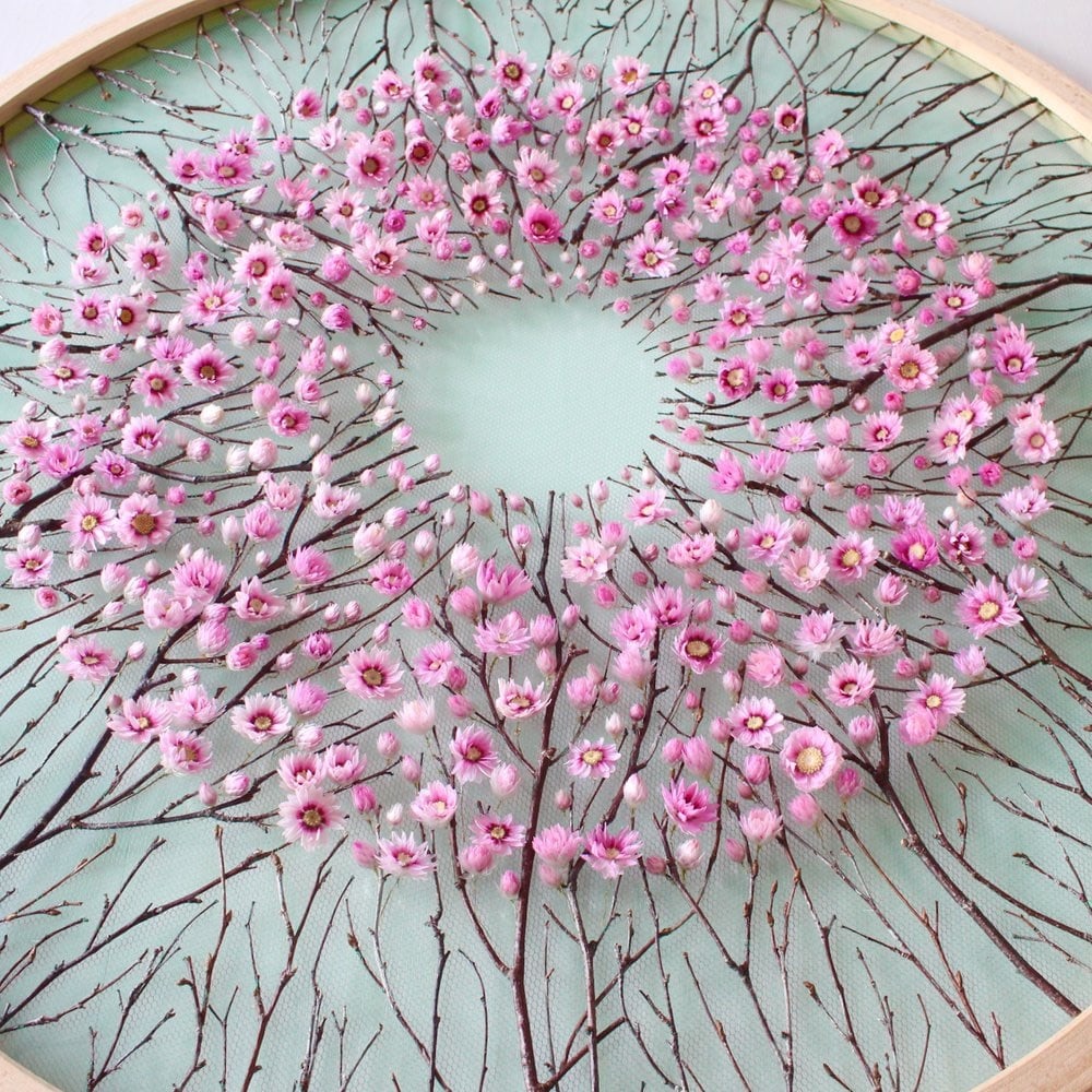
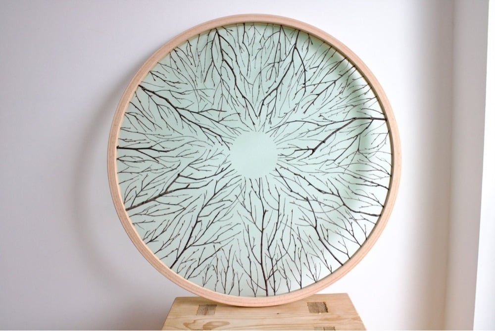
Many thanks to Colossal for introducing me to artist Olga Prinku, who forages for flowers, branches, and other natural elements and incorporates them into large-scale embroidery works. Quite lovely. Check out more of her art on her website and on Instagram.
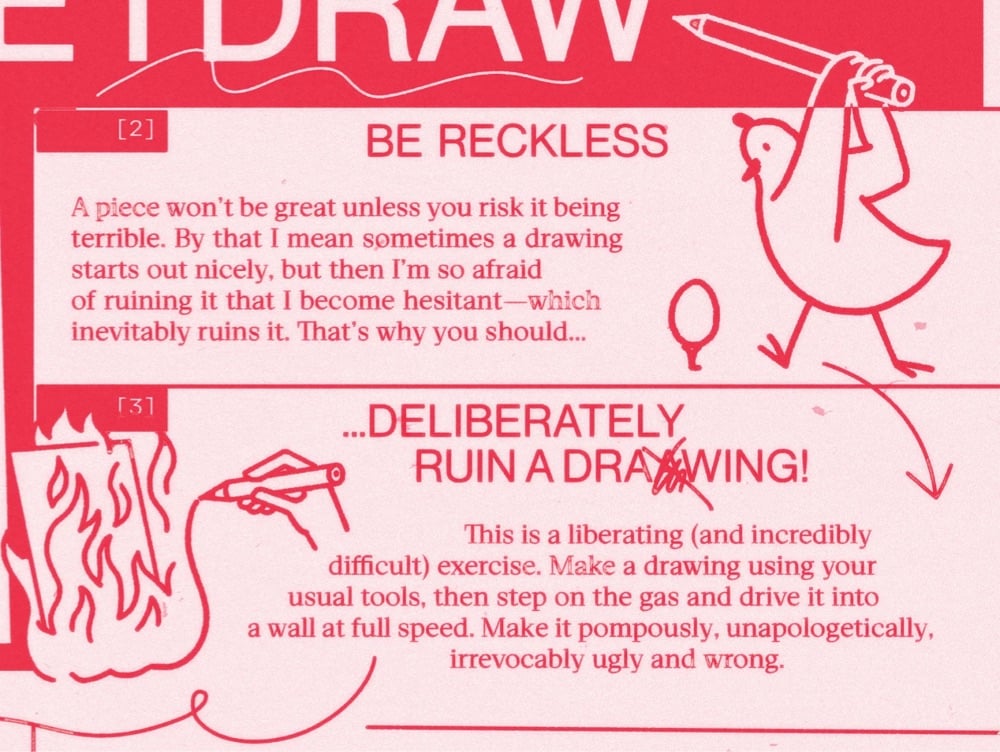
Illustrator Christoph Niemann shares 10 Things I Remind Myself Before I Draw. I’m a strong advocate of his 10th rule:
Sitting at my desk is always right. I’ve spent a lot of time thinking about how to make good work. There are millions of tips and tricks and manifestos out there. But at the end there’s only one single truth for me: sit down and start drawing.
(thx, matt)
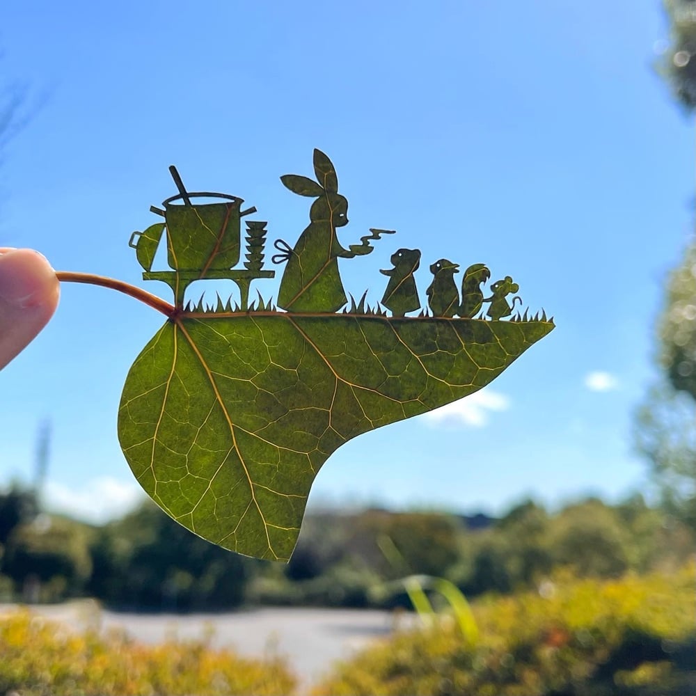
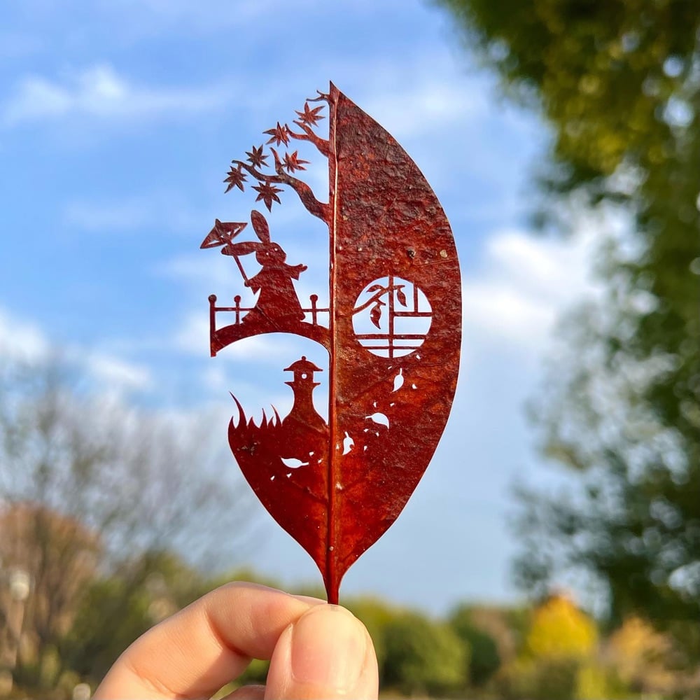
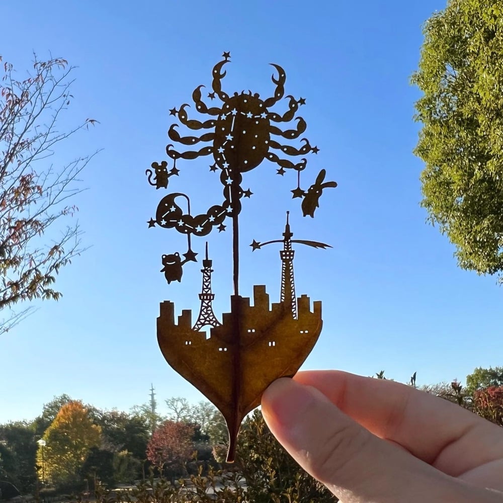

A man named Lito makes these incredibly intricate artworks using the natural canvas of tree leaves — he posts all of his creations on Instagram.
Lego master Jumpei Mitsui spent over 400 hours building a 3D version of Hokusai’s Great Wave off Kanagawa out of 50,000 Lego bricks — you can watch a time lapse of the construction in the video above. The build was included at an exhibition of Hokusai’s work at the MFA in Boston:
In order to create Hokusai’s Wave in three dimensions, he made a detailed study of rogue waves and their characteristics. He also drew on childhood memories of waves near his family home at Akashi on the Inland Sea.
The video slows down to realtime in spots, so you can see how fast he’s actually building (quite fast). And you can also see the level of trial and error involved as he builds and then un-builds the waves until he’s happy with them. (via the kid should see this)
Newer posts
Older posts





 I came across


Socials & More