For What It’s Worth


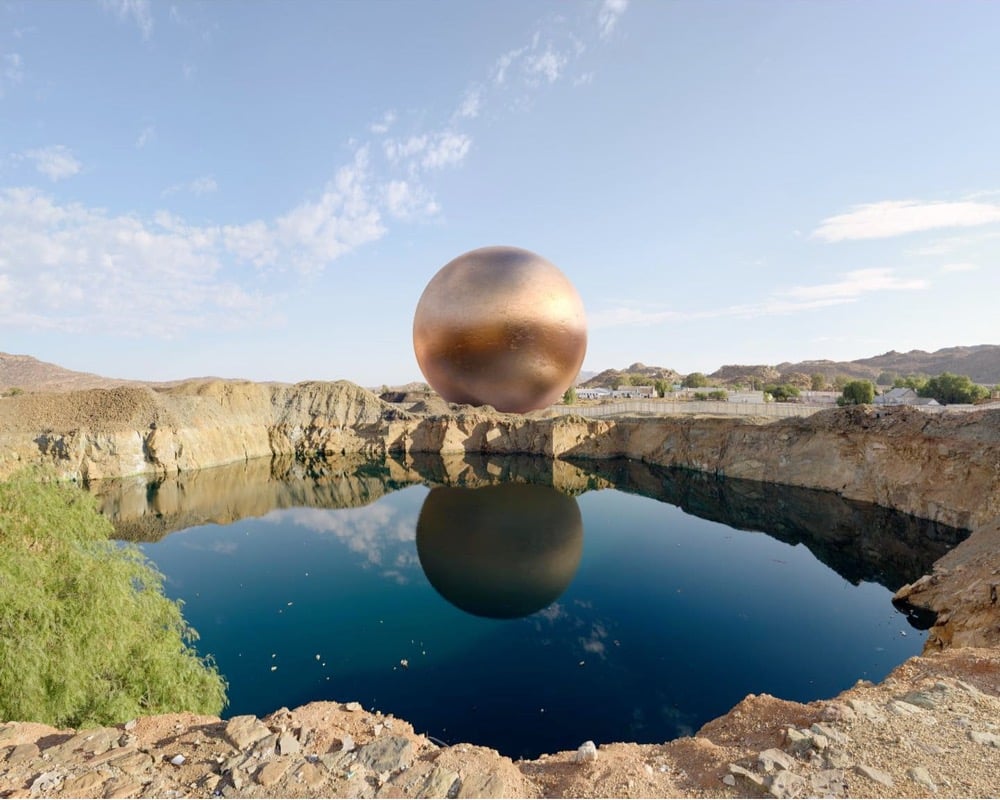
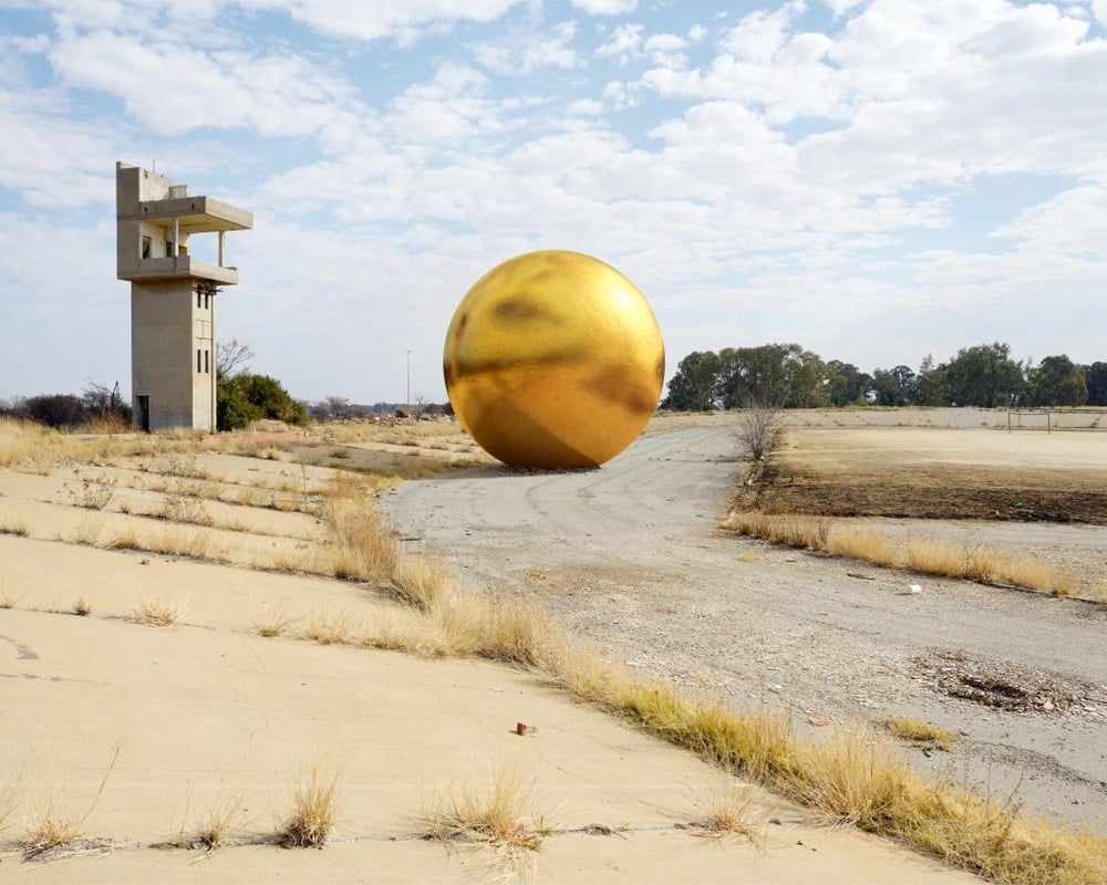
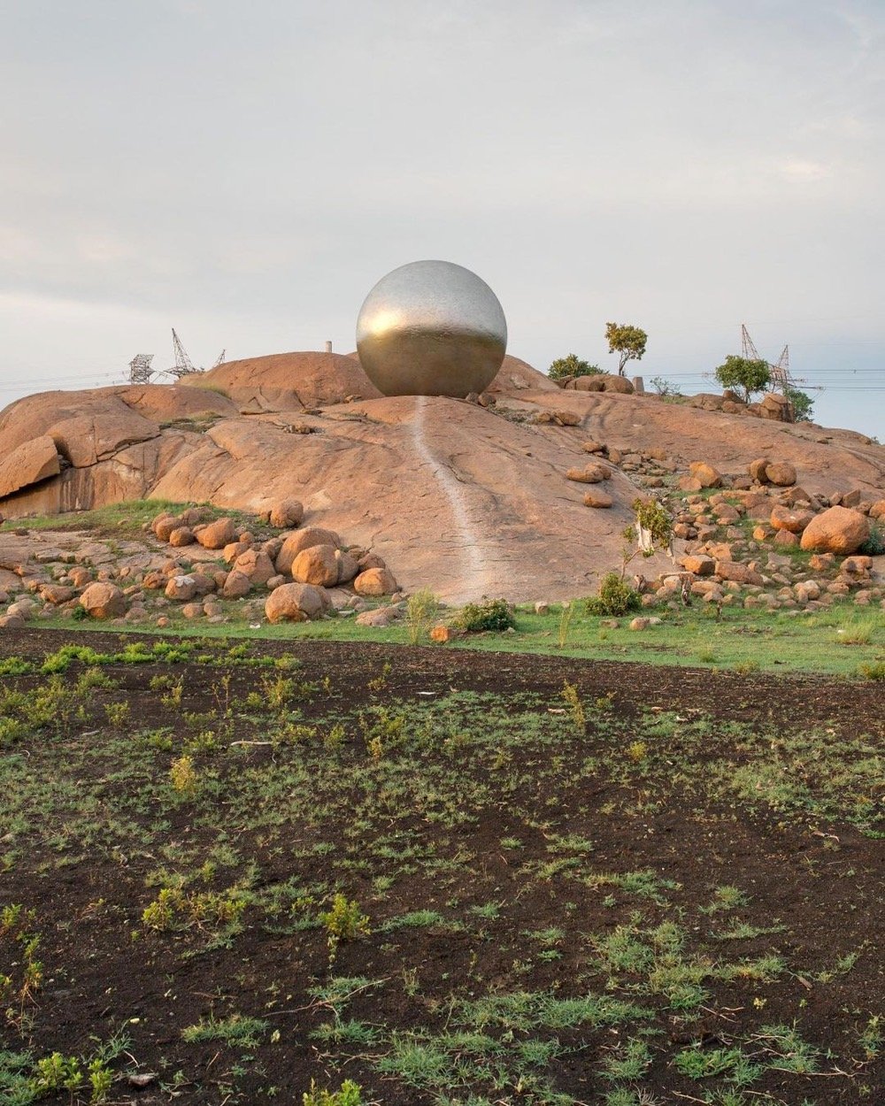
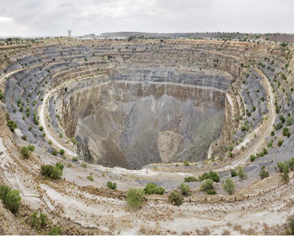
For his project For What It’s Worth, Dillon Marsh created 1:1 scale visualizations of the minerals extracted from South African mines and placed them in photos of the mines themselves. From top to bottom above, a sphere of the 284,000 metric tonnes of copper extracted from the O’Kiep mine, a sphere of the 9500 metric tonnes of gold from the Free State Gold Field, a sphere of 3850 metric tonnes of platinum extracted in total in South Africa since 1924, and a gemstone of the 7.6 million carats of diamonds extracted from the Koffiefontein Mine.
The diamond in particular, which you might not be able to see in that photo (it’s on a vertical stand right in front of the massive hole), underscores just how tiny the amount of material pulled out of these massive mines is, especially when you factor in all the manpower, machinery, injuries, fatalities, and environmental damage related to mining. All that for a bit of shine. (via clive thompson)


Socials & More