The Story Format Leaps from Instagram to Big Media
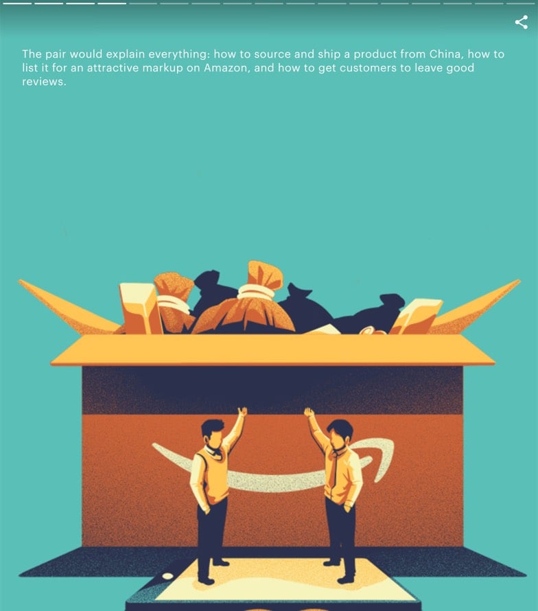
I know this probably isn’t brand new, but in the past couple of weeks I’ve noticed a few articles published by big media companies that are influenced by the design of Snapchat and Instagram Stories. Just to be clear, these aren’t published on Instagram (that’s been going on for years); they are published on media sites but are designed to look and work like Instagram Stories. The first one I noticed was this NY Times piece on Guantanamo Bay.

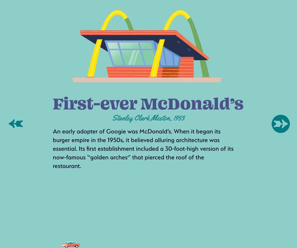
You can see the Instagram-style progress meter at the top. And then there’s Curbed’s The Ultimate Guide to Googie, where the progress meter is indicated more playfully by the little car at the bottom (it even switches directions based on whether you’re paging forward or back through the story). Curbed EIC Kelsey Keith says it was built using “Vox Media’s new custom storytelling kit tool”.

The third piece I can’t find again — I think it was a WSJ or Washington post article — but it too was influenced by the Stories format.
It’s a good move for these companies. Snap & Instagram have worked hard to pioneer and promote this format, it’s perfectly designed for mobile, and people (especially younger folks) know how to use it. Nominally, these articles are just slideshows, a format that online media companies have been using forever. But I’d argue there are some important differentiators that point to the clear influence of Instagram and to this being a newish trend:
1. The presentation is edge to edge with full-frame photos and auto-playing videos.
2. There’s no “chrome” as there would be around a slideshow and minimal indication of controls.
3. They read best on mobile devices in portrait mode.
4. The display of progress meters.
5. Navigation by swiping or tapping on the far left or right sides of the screen, especially on mobile.
Have you seen any other examples of media companies borrowing the Stories design from Instagram?
Update: Various media outlets are using Google’s AMP Stories to make these. You can see examples on CNN, the Atlantic, and Wired.

This is likely what my mystery third story was built with. (via @adamvanlente)


Socials & More