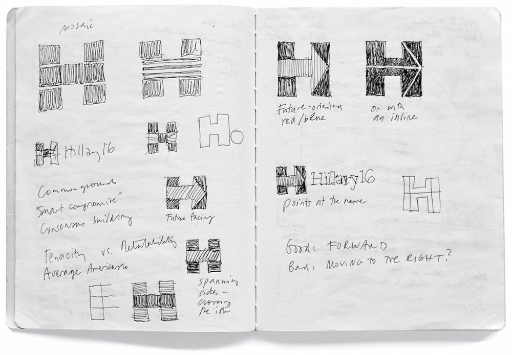
I’m With Her: designing Hillary Clinton’s campaign identity

Pentagram’s Michael Bierut and his team designed the identity for Hillary Clinton’s 2016 Presidential campaign (of which I was not initially a fan but came around later). Here’s how it happened.
I put together a three-person team: me, designer Jesse Reed, and project manager Julia Lemle. We would work in secret for the next two months. Our first meeting with the Clinton team began with a simple statement: “Our candidate has 100 percent name recognition.” There is a well-known marketing principle that is often credited to midcentury design legend Raymond Loewy. He felt that people were governed by two competing impulses: an attraction to the excitement of new things and a yearning for the comfort provided by what we already know. In response, Loewy had developed a reliable formula. If something was familiar, make it surprising. If something was surprising, make it familiar.
That same principle applies to political campaigns. In 2008 Sol Sender, Amanda Gentry and Andy Keene were faced with the challenge of branding a candidate who had anything but name recognition. Barack Obama’s design team responded with a quintessentially professional identity program, introducing — for the first time — the language of corporate branding to political marketing. Obama’s persona — unfamiliar, untested, and potentially alarming to much of the voting public — was given a polished logo and a perfectly executed, utterly consistent typographic system. In short, they made a surprising candidate seem familiar.
We faced the opposite problem. Our candidate was universally known. How could we make her image seem fresh and compelling?
This is a great look at how a designer at the top of his game approaches a problem…and reckons with failure. Even this little bit:
It wasn’t clever or artful. I didn’t care about that. I wanted something that you didn’t need a software tutorial to create, something as simple as a peace sign or a smiley face. I wanted a logo that a five-year-old could make with construction paper and kindergarten scissors.
Leading up to the election, how many photos did you see of Hillary logos hand-drawn by kids on signs and t-shirts? Lots and lots…my kids even got into the act.
Anyway, a huge contrast to the process and impact of the Trump campaign’s identity.


Socials & More