Top new typefaces of 2014
Although I am slowly coming around1 to Massimo Vignelli’s assertion that designers should only use a handful of typefaces, I enjoyed seeing Typographica’s list of their favorite typefaces of 2014.
Typeface design and distribution is in a state of rapid change. Last year we noted its diffusion around the globe, and that trend persists. The majority of font production is no longer concentrated in a few regional epicenters.
That goes for corporate epicenters as well. The independence of type designers themselves is increasingly evident. Small foundries have existed since the dawn of digital fonts, but now they are the norm. Only a handful of the selections in this year’s list were published by companies with more than ten employees.
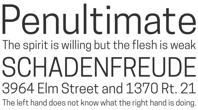
I discovered that one of the selections, a beautiful custom typeface made for the reopening/rebranding of the Cooper Hewitt Design Museum (sample shown above), has been made available by the museum for free download (including a web fonts version).
I mean, not really. But when 95% of everything sucks, paring down to only the good stuff is a seductive idea, isn’t it? Also, Vignelli’s NYC subway map was not good and would have benefitted from a less Swiss approach.↩
Socials & More