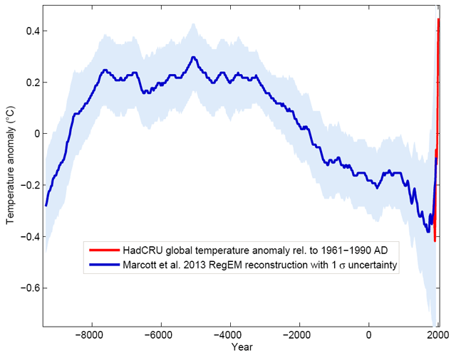
Temperature chart for the last 11,000 years
For the first time, researchers have put together all the climate data they have (from ice cores, coral, sediment drilling) into one chart that shows the “global temperature reconstruction for the last 11,000 years”:

The climate curve looks like a “hump”. At the beginning of the Holocene - after the end of the last Ice Age - global temperature increased, and subsequently it decreased again by 0.7 ° C over the past 5000 years. The well-known transition from the relatively warm Medieval into the “little ice age” turns out to be part of a much longer-term cooling, which ended abruptly with the rapid warming of the 20th Century. Within a hundred years, the cooling of the previous 5000 years was undone. (One result of this is, for example, that the famous iceman ‘Ötzi’, who disappeared under ice 5000 years ago, reappeared in 1991.)
What on Earth could have caused that spike over the past 250 years? A real head-scratcher, that. But also, what would have happened had the Industrial Revolution and the corresponding anthropogenic climate change been delayed a couple hundred years? The Earth might have been in the midst of a new ice age, Europe might have been too cold to support industry, and things may not have gotten going at all. Who’s gonna write the screenplay for this movie? (via @CharlesCMann)


Socials & More