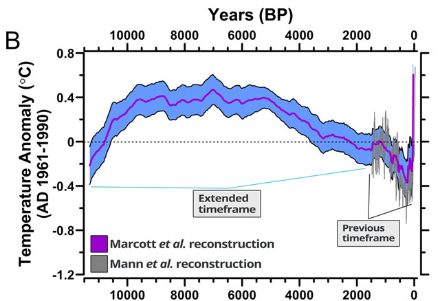
New graph shows unprecedented global warming over past 11,000 years
You’ve likely seen the graph of the Earth’s average global temperature over the past 2000 years…it’s mostly a straight line until you get to the industrial revolution and then it shoots up. It looks like a hockey stick. In a study published today in Science, that graph has been extended back 11,300 years and you can really see the scope of the abrupt temperature change.

From a summary of the report at TPM:
The decade of 1900 to 1910 was one of the coolest in the past 11,300 years - cooler than 95 percent of the other years, the marine fossil data suggest. Yet 100 years later, the decade of 2000 to 2010 was one of the warmest, said study lead author Shaun Marcott of Oregon State University. Global thermometer records only go back to 1880, and those show the last decade was the hottest for this more recent time period.
“In 100 years, we’ve gone from the cold end of the spectrum to the warm end of the spectrum,” Marcott said. “We’ve never seen something this rapid. Even in the ice age the global temperature never changed this quickly.”
Using fossils from all over the world, Marcott presents the longest continuous record of Earth’s average temperature. One of his co-authors last year used the same method to look even farther back. This study fills in the crucial post-ice age time during early human civilization.
Marcott’s data indicates that it took 4,000 years for the world to warm about 1.25 degrees from the end of the ice age to about 7,000 years ago. The same fossil-based data suggest a similar level of warming occurring in just one generation: from the 1920s to the 1940s. Actual thermometer records don’t show the rise from the 1920s to the 1940s was quite that big and Marcott said for such recent time periods it is better to use actual thermometer readings than his proxies.
(via digg)


Socials & More