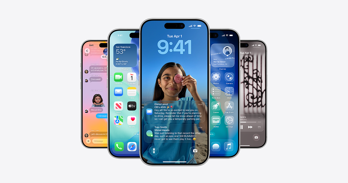
I’m usually pretty go-with-the-flow as far as OS updates go, but iOS 26 / Liquid Glass is terrible: incoherent, ugly, and difficult to use. Obviously a massive design effort, but they missed the mark IMO.
Advertise here with Carbon Ads
This site is made possible by member support. 💞
Big thanks to Arcustech for hosting the site and offering amazing tech support.
When you buy through links on kottke.org, I may earn an affiliate commission. Thanks for supporting the site!
kottke.org. home of fine hypertext products since 1998.
Beloved by 86.47% of the web.
Comments 32
thread
latest
popular
And no good answer for: How to disable liquid glass in iOS 26?
The contrast between button labels and background content makes things really hard to read, in my opinion. The “reduce transparency” accessibility setting is an improvement and should probably be the default for most people, but it’s not enough. I bet there are going to be a lot of TikTok videos about how to change this setting (Apple hates that) and the transparency effects will either be dialed back or more controls will be added. Hopefully we don’t have to wait for iOS 27 for that.
Liquid Glass on macOS 26 is worse in my opinion, everything feels bolted on and inconsistent and just… tacky. It’s a shame because there are a lot of good features in this round of updates across all platforms, but it’s all overshadowed by this weird Liquid Glass thing. It seems really unnecessary.
I completely agree: I just returned an iPhone 16e that I bought on Friday because it automatically installed iOS26 while installing the iOS18.7 update, disabling manual updates on its own.
Liquid Glass is awful: I use my phone in black and white with high contrast, and in some settings, the edges of the windows don't even line up, with flaws in the rounded corners that look like they were drawn by hand, not to mention the random overlaps between backgrounds and text in some menus.
I absolutely do not recommend it.
I’ve been on the beta for a couple of months and the annoyance does wane a bit, but overall… just feels like a change for the sake of making a change.
Totally agree. I dislike it on iphone, ipad, and desktop. And changing the transparency isn't a solution.
Same here. Not warming up to it. If design is how it works, this ain’t it. I hate how often I think “what would Steve say if he saw this?”
I updated my iPad first - mainly to mess around and see if it's worth it on the phone. There are some nice things in there on the iPad side, but nothing that made me think "get it on the phone now!" I'll update once the complaints from the public make their way into on/off settings options.
I kinda like the new look, but I understand.
That said, and I think this is a bit more under the radar, it feels to me that a whole lot of animated transitions have been sped up across the entire OS. Moving around feels incredibly snappier for me.
I like a lot of the more subtle design touches, but the liquid glass effects just call attention to the UI instead of disappearing. All the layers of transparency are a real disaster for legibility. I’ve heard a rumor that some Apple engineers are angrily waving around PDFs of mine (I used to research legibility), but who knows?
The legibility thing is shocking; how can you have a whole section of settings about accessibility (which Apple is right to be proud of) and then just make things generally unreadable? I hope the PDF wavers win out.
If you're REALLY curious, here's my most relevant typography study, "Glanceable, legible typography over complex backgrounds". This was at the end of my time at MIT. I designed the first half of the study and a colleague finished out the rest.
To me it seems conspicuously flashy, which used to be a distinctly non-Apple characteristic. That it harms legibility even with reduced transparency on is also seemingly counter-cultural. And while I type this there’s a large chunk of new browser chrome, seemingly useless, overlapping the textarea. Sloppy work!
That’s the thing that bugs me the most. I’m sure it’ll get sorted and then I can perseverate about the UGLY clock and camera icons. And none of the Safari or Messages changes make sense to me and I dread teaching them to my household. It’s really hard to teach nonsense.
The weirdest thing about Liquid Glass is how much it prioritizes content in the background over content in the foreground. That's a peculiar choice.
I'm going to leave mine in the default settings for a while, but I imagine I'll eventually reach for that "reduce transparency" toggle.
Glad you said this. Thought it was just me. Always update iPad first as trial run and this IPad Air M1 is too laggy. What in the world is with the names flying in from the left in Messages? JFC! I too went to Reduce Motion just to deal with it all. Horrible design.
My biggest gripe with it at this point: it has completely ruined the Dumb Phone / Blank phone app experience to the point that I have had to delete it. It's a real issue for me because those apps really helped me cut down on my phone usage.
On a positive note I would like to add - Tahoe 26 on my Mac Studio and laptop has been a really nice improvement. A lot of the glossy liquid glass features seemed to be played down considerably on the desktop, maybe this is a roadmap Apple can follow for future version of ios26
I had it installed all summer for testing, and it went from a rough draft to a…not-as-rough draft. On the Mac, Tahoe is generally a better version of Liquid Glass; iPad, the new windowing and multi-tasking is quite fluent and amazing. iPhone and iPad need more refinement and more off switches. You can only do Settings > Accessibility > Display > Reduce Transparency. The legibility is appalling in places. Watch for 26.1.
Agree. There are elements in the new design that simply do not fit the dimensions of my iPhone 15 Pro. In Photos and (gasp) Safari. In Photos, the white outline around the keyboard runs off the screen. In Safari, the Fill Password overlay runs off the bottom of the screen. It looks like a mistake, there's no other way to see it. The use of rounded SF Pro for names in Contacts, and (it seems) just that one single instance in the whole OS, is just weird. But my main complaint is that the new larger corner radius means everything feels bigger and blobbier. See ie the dock in Clock and the url bar in Safari. These aren't even behavior changes that are always hard to get used to at first; these are straight-up dubious formal decisions that should never look like mistakes.
Right, I agree that the overly rounded corners everywhere create large shapes that take up way too much space. But the navigation improvements in Photos seem pretty well thought out compared to the previous redesign of that app. I like that I can quickly toggle between Library and Collection view (I never figured out how to do that in iOS 18) and moving the search to the bottom makes a lot of sense once you get used to it.
But those usability improvements are completely overshadowed by the blobby widgets and showy animation.
As much as I don't want to be "that guy," Android's recent UI revamp is basically fine.
Notably, text contrast (which wasn't even a problem previously) is significantly better in a few prominent places.
Otherwise, it's a fresh coat of paint with some rough edges that will probably get some polish in subsequent releases. Liquid Glass, by contrast, feels like it's a fundamentally flawed premise.
My iPad is going to get the upgrade eventually, but I'm not in any rush to install it.
I just got the upgrade on my Samsung, and honestly I can't even see a difference. IMNSHO phones have become appliances, and trying to make them something else is just getting in the way at this point.
Yeah, we've reached the "good enough" threshold for phones a long time ago. Now we're just gilding lilies.
I have a theory that Apple did this as a way to make their style harder to mimic in CSS.
Does it feel laggy to anyone else? My muscle memory seems to be moving my fingers faster than certain items can keep up (I'm running the 16 Pro). Screens draw in more slowly, I can't swipe between apps left to right across the bottom as easily, items fade and appear rather than moving organically/authentically...
I hate being that guy complaining that someone moved my cheese, but I will be excited when the first update comes out.
I'm kind of enjoying it.
But besides the, well, the glassiness, there's other redesigning going on, some of it better IMO. I'm thinking particularly of iOS Safari.
But a lot of iOS and iPadOS besides the cosmetics is shit.
Everything that's made Apple Apple has been enshittified.
And it gets worse because the failure has to rest with Cook who has now stayed on so long that all logical replacements are gone--practically speaking, he's literally irreplaceable.
And the iPhone 17 is brutally ugly. They make a Zune look good.
Gurman says there's a lot of new style phones looking--except they're all niche top of the market stuff--a $2,000 folding phone, the 20th anniversary phone. The mass lineup needs the love, not a fringe.
Apple Silicon and the other chips are still a wonder. Software is crappy and, design worse.
I already lived through Apple in the 90s; I don't a rerun that's a worse version.
(BTW: The worst for me is the inability to make the menu bar in Safari opaque (I've looked; it's impossible to change). Second worse is how they fucked up iPadOS Mail.)
I set my Home Screen icons to Clear - it's sort of like the idea of setting your phone to greyscale to make it less visually appealing and engaging. I like that it takes me an extra second to find the app I'm looking for, so I'm not so mindless about letting the phone suck me in.
I do kind of think there are some high level mismatches happening in the Cook era. A graphic designer is in charge of user interface, so the interface looks great in screenshots but falls apart in actual use. A engineering nerd is in charge of software, so it's more about what you can do instead of whether you should. I'm not quite so pessimistic on hardware design - I think the iPhone Air ultimately becomes the base iPhone, so there's the clear distinction between consumer and pro as in the MacBook line.
The biggest problem is consumer computing has been a mature industry for 15 years, and trillions of dollars is going into evolving a consumer product to drive sales instead of humanity putting that investment into keeping the planet habitable and ending inequality. But perhaps I digress.
I thought this as well. The hardware side is still astounding in their improvements YOY but the software side is just tanking. Desperately waiting for iOS 26 to fix the fucking photos app only to deal with this other new enshittification? My god.
I thought about just homer-bushes.gif on this one, but... I kinda like it?
Everything feels snappier, and the layered transparency (with recognition for the folks struggling with legibility) feels like we're getting close to a more ideal expression of what computing on glass should feel like.
The change from the bizarre side-scrolling contextual menus to a vertically-oriented list is something I especially appreciate.
Liquid Glass 1.0 is like a built in tool to inspire less screen time, so I'm kinda digging it for that reason.
I like that 26 is rendering clickable text as a button more often then has recently been the case. Jony Ive seemed to have the visual elements that make it obvious that something was clickable so seeing this trend reversing is good. iOS always makes concessions in usability for style. Where the middle ground is in that respect to form/function is different for everyone. I would really enjoy much more function and much less style, however I don't hate Liquid Glass.
Here’s my guess what happened in the lead up to WWDC25:
Apple realized it was deep in the weeds with Apple Intelligence (and associated PR) and needed a tentpole feature that wasn't AI.
Liquid Glass was in development for some upcoming edgeless hardware. It needed another year of work, but management/marketing was fucked.
A thing that wasn't ready got moved up. Bug fixing took a back seat. Everyone grabbed paint brushes, not screwdrivers.
The next year is going to be rough for EVERYONE.
Hello! In order to comment or fave, you need to be a current kottke.org member. If you'd like to sign up for a membership to support the site and join the conversation, you can explore your options here.
Existing members can sign in here. If you're a former member, you can renew your membership.
Note: If you are a member and tried to log in, it didn't work, and now you're stuck in a neverending login loop of death, try disabling any ad blockers or extensions. Or try logging out and then back in. Still having trouble? Email me!
In order to comment or fave, you need to be a current kottke.org member. Check out your options for renewal.
If you feel like this comment goes against the grain of the community guidelines or is otherwise inappropriate, please let me know and I will take a look at it.
This thread is closed for new comments & replies. Thanks to everyone for participating!