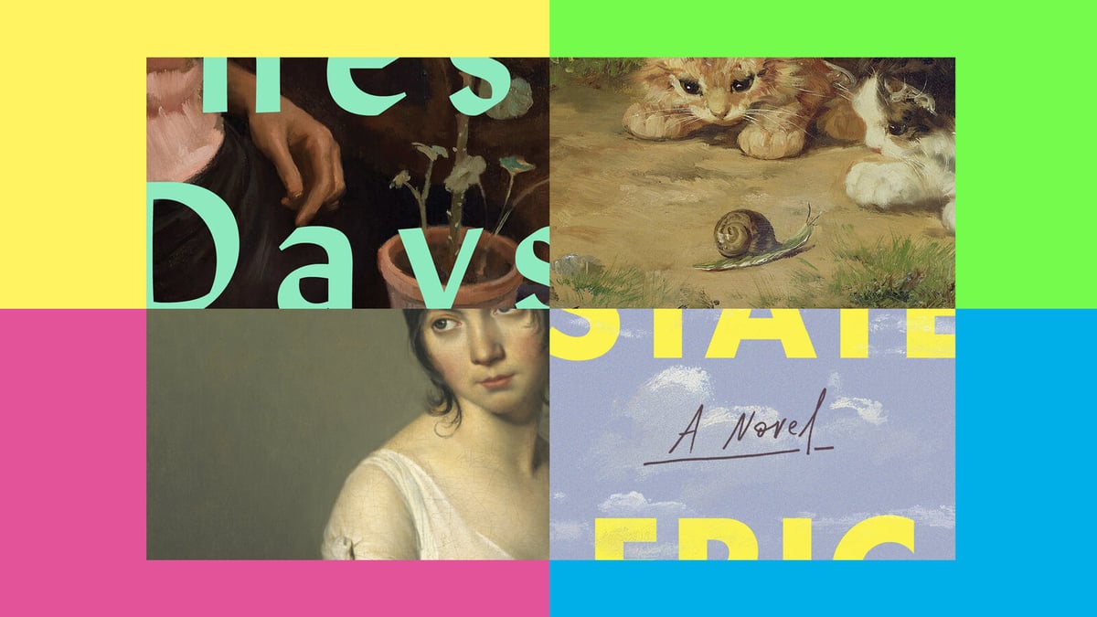
A recent trend in book cover design: “It tends to lay blaringly bright type in a sans-serif font atop a painting, usually a few centuries old but not always.” See My Year of Rest and Relaxation by Ottessa Moshfegh.
Advertise here with Carbon Ads
This site is made possible by member support. 💞
Big thanks to Arcustech for hosting the site and offering amazing tech support.
When you buy through links on kottke.org, I may earn an affiliate commission. Thanks for supporting the site!
kottke.org. home of fine hypertext products since 1998.
Beloved by 86.47% of the web.
Comments 2
Big Swiss and The Safekeep are the two books I love that immediately came to mind, even if they aren't mentioned in the article.
I loved this article, and am so grateful for its inclusion of the book “Among Friends” and the fascinating painting “Life During Wartime,” by Bo Bartlett (oil on linen, 2018). It sent me down a Bo Bartlett rabbit hole, and I’m still there, loving his work.
Hello! In order to comment or fave, you need to be a current kottke.org member. If you'd like to sign up for a membership to support the site and join the conversation, you can explore your options here.
Existing members can sign in here. If you're a former member, you can renew your membership.
Note: If you are a member and tried to log in, it didn't work, and now you're stuck in a neverending login loop of death, try disabling any ad blockers or extensions. Or try logging out and then back in. Still having trouble? Email me!
In order to comment or fave, you need to be a current kottke.org member. Check out your options for renewal.
If you feel like this comment goes against the grain of the community guidelines or is otherwise inappropriate, please let me know and I will take a look at it.
This thread is closed for new comments & replies. Thanks to everyone for participating!