Entries for October 2019
On Oct 21, the emblem for the 2024 Summer Olympics and Paralympics was unveiled in Paris, site of the Games. It features a round symbol that represents a gold medal, the Olympic flame, and Marianne, the “national personification of the French Republic since the French Revolution”.

The emblem’s Marianne is quite chic, so Parisian freelance journalist Megan Clement concocted a vignette of that young woman’s life. It begins like so:
The French Olympic logo tumbles out of bed on a Parisian morning. She tousles her messy bob, dons breton stripes and ballet flats and whisks down the stairs from her fifth-floor apartment to grab a baguette before enigmatically texting two men who are pursuing her romantically.
The French Olympic logo has an expresso and a cigarette for lunch.
(via @legalnomads)
Have you been watching Succession? I feel bad about enjoying watching rich people be horrible to each other, but I do love the show. Evan Puschak rewatched both seasons with a careful eye and noticed the show’s preoccupation with language and how it is used and misused by the characters in the show.
Kendall: Words are just nothing. Complicated airflow.
One of the things I like most about the show is that I can’t figure out whether it’s a comedy or a drama. It’s bitingly funny and satirical but the whole thing is packaged like a drama and there are genuine emotional moments. I felt the same way about Fleabag and Transparent…the combination and subversion of these two familiar buckets of storytelling is part of what makes all of these shows great.
Today, Google announced the results of their quantum supremacy experiment in a blog post and Nature article. First, a quick note on what quantum supremacy is: the idea that a quantum computer can quickly solve problems that classical computers either cannot solve or would take decades or centuries to solve. Google claims they have achieved this supremacy using a 54-qubit quantum computer:
Our machine performed the target computation in 200 seconds, and from measurements in our experiment we determined that it would take the world’s fastest supercomputer 10,000 years to produce a similar output.
You may find it helpful to watch Google’s 5-minute explanation of quantum computing and quantum supremacy (see also Nature’s explainer video):
IBM has pushed back on Google’s claim, arguing that their classical supercomputer can solve the same problem in far less than 10,000 years.
We argue that an ideal simulation of the same task can be performed on a classical system in 2.5 days and with far greater fidelity. This is in fact a conservative, worst-case estimate, and we expect that with additional refinements the classical cost of the simulation can be further reduced.
Because the original meaning of the term “quantum supremacy,” as proposed by John Preskill in 2012, was to describe the point where quantum computers can do things that classical computers can’t, this threshold has not been met.
One of the fears of quantum supremacy being achieved is that quantum computing could be used to easily crack the encryption currently used anywhere you use a password or to keep communications private, although it seems like we still have some time before this happens.
“The problem their machine solves with astounding speed has been very carefully chosen just for the purpose of demonstrating the quantum computer’s superiority,” Preskill says. It’s unclear how long it will take quantum computers to become commercially useful; breaking encryption — a theorized use for the technology — remains a distant hope. “That’s still many years out,” says Jonathan Dowling, a professor at Louisiana State University.
Cory Doctorow reviews Margaret Atwood’s excellent The Testaments. “This is a book about how fragile our norms are, and the incredible resiliency of the people who are ground underfoot when those norms are jettisoned.”

From the @europemaps Instagram account, a map of the first words of the national anthems of European countries. Collectively, it sounds like northern Europe is having some fun in the bedroom: oh… yes… you… there… oh… my… god… not yet…
Please also note that there are a lot of people in the comments with corrections, especially about Spain, Germany, and Turkey, so take it with a grain of salt.
How to travel like a local. “It’s important to keep in mind that you’re a visitor. It all may seem wondrous to you, but to them it’s their home. Treating it, and them, with respect will go a long way.”
David Lebovitz celebrates 20 years of writing about food online. “Who knew when I started posting a bunch of random thoughts, ramblings, and recipes online in October of 1999, that I’d be doing it this long.”


For more than 25 years, biologist David Goodsell has been making scientifically accurate paintings and illustrations of the molecular structures of things related to HIV, cancer cells, ebola, Zika, diabetes, proteins, enzymes, and hundreds of other scientific and medical processes.
Since the early 1990s, I have been working with a type of illustration that shows portions of living cells magnified so that you can see individual molecules. I try to make these illustrations as accurate as possible, using information from atomic structure analysis, electron microscopy, and biochemical analysis to get the proper number of molecules, in the proper place, and with the proper size and shape.
Much of his work is available to use for free (with attribution) and is scattered across the web: the Molecule of the Month, Molecular Landscapes, Illustrations for Public Use. He has also published several books of his paintings, the most popular of which is The Machinery of Life. Science magazine recently profiled Goodsell and his work.
In addition to studying pictures of cells from high-powered microscopes, Goodsell relies on molecular structures from electron microscopy (EM), x-ray crystallography, and nuclear magnetic resonance spectroscopy to make his paintings, which show the often crowded and complex world of cells and the microbes that infect them. He even uses the known weights of molecules if that’s all he has so that he can at least draw, say, a correctly sized circle. “I’m a scientist first,” he says. “I’m not making editorial images that are meant to sell magazines. I want to somehow inform the scientists and armchair scientists what the state of knowledge is now and hopefully give them an intuitive sense of how these things really look — or may look,” he says.
May look?
“These pictures have tons and tons and tons of artistic license,” he says. “They’re just one snapshot of something that’s intrinsically superdynamic. Every time I do a painting, the next day it’s out of date because there’s so much more data coming out.”
Here’s a quick video profile as well:
All images are by David S. Goodsell, the Scripps Research Institute. (via alexandra kammen)
During their lifetimes, whales capture an enormous amount of carbon. “When they die, they sink to the bottom of the ocean; each great whale sequesters 33 tons of CO2 on average.” A tree absorbs 48 pounds of CO2/year.
The 2019 Squirrel Census of Central Park. “There are an estimated 2,373 eastern gray squirrels in Central Park.”
The Nautilus expedition exploring the Davidson Seamount near Monterey Bay turned up something interesting last week: a relatively recent whale fall. A whale fall is when the body of a dead whale settles on the deep-sea floor, providing sustenance for the marine life in that area for decades.
While evidence of whale falls have been observed to remain on the seafloor for several years, this appears to be a relatively recent fall with baleen, blubber, and some internal organs remaining. The site also exhibits an interesting mid-stage of ecological succession, as both large scavengers like eel pouts are still stripping the skeleton of blubber, and bone-eating Osedax worms are starting to consume lipids (fats) from the bones. Other organisms seen onsite include crabs, grenadier, polychaetes, and deep-sea octopus.
The scientists were *so* excited to find this, a thriving mini ecosystem & food web in the process of formation at a depth of over 10,600 feet. They got pulled away from the carcass but went back for a closer look later.
You can read more about whale falls and their impact on deep-sea ecosystems in this New Yorker story from earlier this year.
For denizens of the seafloor, a whale fall is like a Las Vegas buffet — an improbable bounty in the middle of the desert. Rosebud had delivered about a thousand years’ worth of food in one fell swoop. The first animals to pounce had been scavengers, such as sleeper sharks and slimy, snake-like hagfish. In the course of about six months, they had eaten most of the skin and muscle. Inevitably, the scavengers had scattered pieces of flesh around the whale carcass, and native microbes had multiplied quickly around those scraps. Their feeding frenzy, in turn, had depleted oxygen in the seafloor’s top layers, creating niches for microbes that could make methane or breathe sulfate.
As Rosebud came into view, we saw colorful microbial carpets light up the screens-plush white, yellow, and orange mats, each a community of microbes precisely tuned to their chemical milieu. The whale’s towering rib cage had become a cathedral for worms, snails, and crabs, which grazed beneath its buttresses. A few hungry hagfish slithered through the skull’s eye sockets. When the cameras zoomed in, we saw that the bones were covered in red splotches. Rouse leapt from his chair and rushed to the monitors for a closer look: he suspected that the red tufts were colonies of remarkable bone-eating worms called Osedax, which had only just recently been described in a rigorous scientific study.
Let’s just all pretend that this trailer did not give me goosebumps and make me pump my fist a little, because at this point Star Wars is a sliced-n-diced and repackaged global financial instrument and very much not something a 46-year-old man who knows better should get excited about. (Jk jk, pump Mark Hamill’s gravely voice and John Williams’ soaring crescendos directly into my veins. And if James Earl Jones’ voice does not make an appearance in this movie, I will eat a Stormtrooper helmet.)


I really like Owen Pomery’s illustrative style — his drawings are spare yet detailed, precise but a bit messy. You can see his work on his website, on Twitter, or on Instagram. He sells prints and books in his shop, including this field guide to modernist kiosk designs in a fictional country.

(via @dunstan)
This is what our night sky is going to look like in 3.9 billion years:

Wow! So what’s going on here? Using data from the Hubble Space Telescope, astronomers at NASA have predicted that our own Milky Way galaxy and the nearby Andromeda galaxy (M31) will collide about 4 billion years from now. As part of the announcement from 2012, they produced a video of what the collision would look like and a series of illustrations of what our sky will look like during the collision process.1
In 2 billion years, Andromeda will be noticeably closer in the sky:

By 3.75 billion years, it will fill a significant chunk of the sky. And the Milky Way will begin to bend due to the pull of gravity from Andromeda:

In about 3.85 billion years, the first close approach will trigger the formation of new stars, “which is evident in a plethora of emission nebulae and open young star clusters”:

Star formation continues 3.9 billion years from now. Could you imagine actually going outside at night and seeing this? It’s like a nightly fireworks display:
After the galaxies pass by each other in 4 billion years, they are stretched and warped by gravity:

In 5.1 billion years, Andromeda and the Milky Way will come around for a second close pass, their galactic cores blazing bright in the night sky:

And finally, in 7 billion years, the two galaxies will have merged into a single elliptical galaxy nicknamed Milkdromeda:

Interestingly, despite the galactic collision and the dazzling view from Earth, it’s extremely unlikely that any individual stars will collide because of the sheer amount of empty space in galaxies.
From filmmaker David Freid, Nobody Dies in Longyearbyen is a short film about Longyearbyen, Norway, the one of the northernmost towns in the world. The town of about 2100 residents is situated on the Svalbard archipelago and is the home of the Global Seed Vault. Freid went to investigate the rumor that no one is allowed to die in Longyearbyen and discovered that if climate change results in the permafrost melting in places like this, diseases from long ago may be released back into the world.
But for more than 70 years, not a single person has been buried in Longyearbyen. That’s due to the region’s year-round sub-zero temperatures: Bodies don’t decompose, but are preserved, as if mummified, in the permafrost. Should anyone die there, the government of Svalbard requires that the body is flown or shipped to mainland Norway to be interred.
See also A Trip to the Northernmost Town on Earth.
After months of renovations and a week or two of previews, MoMA officially reopens for business today. I was able to attend a press preview last week and here are some observations I had about my visit.

One of the main goals of the museum’s expansion was to “focus new attention on works by women, Latinos, Asians, African-Americans and other overlooked artists”. I’ll leave the question of their success in more qualified hands, but even making the attempt is an admission by one of the most influential museums in the world that the art that society considers important is highly subjective. If there are good paintings that aren’t currently considered that interesting or important (because they’re not by Picasso or Degas or Cezanne), maybe that can change depending on what stories you tell about them. Look at what the Hilma af Klint show at the Guggenheim did for example.
The display of the main collection is now not just paintings and a sprinkling of sculpture but also includes photography, film, architecture, performance art, design, and drawings. The art is also placed into much more of an historical context than before…the visitor gets more of a sense of what was going on in the world when these pieces were created and what societal happenings the artist may have been reacting to in creating their work. I very much enjoyed these improvements.

The general feel of the place is more casual than before. In Amy Sillman’s Artist’s Choice gallery, paintings and sculptures were resting on risers around a large room, all unlabelled. Gallery titles were sometimes colloquial instead of formal or academic. In the one of the exhibitions, the gallery titles were in all lowercase — “a revolution of limits” vs “A revolution of limits” or “A Revolution of Limits”.
In some areas, the space still smelled vaguely of construction.
One of the things I love about The Whitney is how it incorporates the city into the art viewing experience. On the top floors, you can look at what’s on display and then head out to the terrace to see the city on display: the architecure, the construction, people walking on the High Line, the Hudson River traffic. It doesn’t have the best location to work with, but the new MoMA tries to do this a little more after the renovation. There are new overlooks to the sculpture garden and larger windows with street views.
Was it my imagination, but was Matisse’s Swimming Pool room actually a bit warmer and more humid than the other galleries? You know, like an actual indoor swimming pool?

Honestly, the best part of my experience was how few people were there. This was the last of four press previews and was sparsely attended because most people had already filed their stories. In many galleries, I was completely alone with these amazing works of art. I stood in front of Starry Night for two minutes all by myself — same with Pollock’s One: Number 31, 1950 and Les Demoiselles d’Avignon. Monet’s Water Lillies gallery was empty. Empty! I sat for several blissful minutes taking it all in — it was almost meditative. This reveals a sad truth about large and popular art museums like MoMA: they are often not good places for actually viewing art. They’re just too crowded. Starry Night is basically an Instagram selfie wall at this point. During a normal visit, you can’t actually look at the thing to see what van Gogh was up to with his brushstrokes because there are 20 people waiting their turn to see it too. But you can’t spend $450 million on a renovation and just let a few hundred people a day into the place, right?
In this clip from a longer conversation in the Off Camera interview series, Zach Galifianakis talks about his brief two-week stint on Saturday Night Live and how he felt when a sketch he wrote totally bombed at the cast table read.
Here are all 10 clips of the interview. See also Robert Downey Jr. recounting his year-long SNL career.
BrickBrosProductions makes stop motion animated films featuring Lego bricks. Their most popular video is a compilation of the three short films in their “Lego In Real Life” series, where objects built from Lego interact with the real world — Lego butter, Lego apples, Lego pencils, and Lego wood.
Here’s a behind-the-scenes of the woodworking movie as well as a general tutorial about how to make Lego stop motion videos.

Roman Butin is a Russian artist who modifies coins with elaborate hand-engraved designs of his own. His latest creation is a coin with a beating heart. Here is the tiny mechanism in action…you turn the gear at the bottom of the coin and the heart beats!
Wow. You can check out the heart coin, a Banksy coin, this trap coin, a golden bug coin with working wings, and more of his work on Instagram. Heads or Tales has replicas of a few of Butin’s creations for sale.
Kurzgesagt has partnered with the Red Cross and their “no to nukes” initiative to depict what it would be like if a nuclear weapon detonated in a major city. I’m not going to lie to you here, this is a difficult video to watch. Super bleak. There is no bright side to nuclear weapons.
The reason no government wants you to think about all this is because there is no serious humanitarian response possible to a nuclear explosion. There’s no way to really help the immediate victims of a nuclear attack. This is not a hurricane, wildfire, earthquake, or nuclear accident — it is all of these things at once, but worse. No nation on earth is prepared to deal with it.
Between the climate crisis, the rise of authoritarianism around the world, the AI bogeyman, and other things, nuclear weapons have gotten lost in the shuffle recently, but they remain a massive existential threat to society. A small group of people, some careful planning, years of patience, and you could possibly see an event that would make 9/11 look quaint.
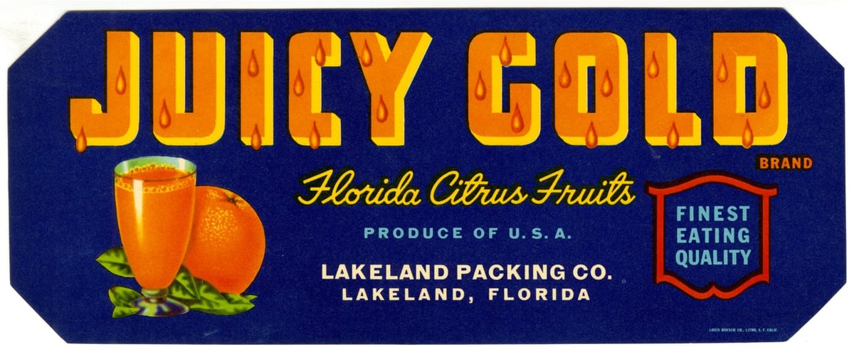

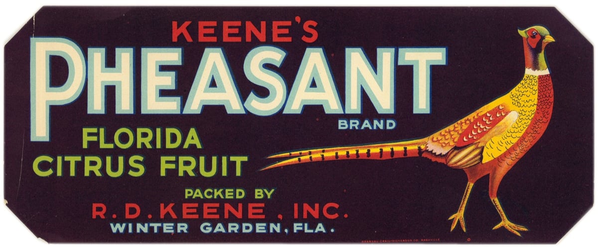
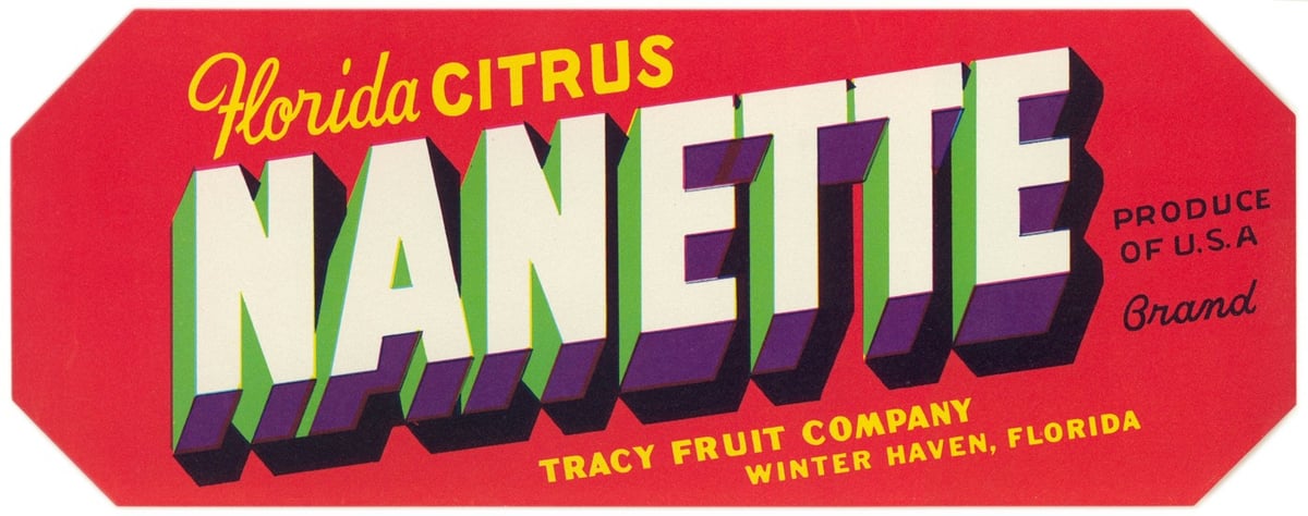

From the State Library of Florida comes a collection of more than 600 crate labels used by the citrus and vegetable industries from the 1920s to the 1950s.
To help give Florida fruits and vegetables an edge, growers looked to the booming produce packing industry in California, where advertisers were already using bold, elaborate labels to catch buyers’ attention. Florida companies began designing their wooden shipping crates and paper labels based on this successful model.
Paper crate labels were used in Florida from the late 1800s until the 1950s. The earliest paper labels were fairly generic and often didn’t include a brand name. Starting in the 1920s, advertisers began developing more complex marketing strategies, aiming to entice buyers with colorful brand names and imagery.
What an amazing variety of design and typographic styles. There’s also some questionable imagery in there as well: Mammy Brand, Dixieland Brand, Brave Vegetables, Indian Chief, etc.
See also The US Government’s Trove of Beautiful Apple Paintings. (via @john_overholt)


One of the (several dozen) posts I started writing ages ago but never finished was a collection of the hundreds of bird illustrations pictured in John James Audubon’s seminal Birds of America. The images have been floating around on the web forever, in various sizes and collections, and I wanted to group (or at least link to) all of them in one place. But now I don’t have to because the Audubon Society has put them up on their website.
John James Audubon’s Birds of America is a portal into the natural world. Printed between 1827 and 1838, it contains 435 life-size watercolors of North American birds (Havell edition), all reproduced from hand-engraved plates, and is considered to be the archetype of wildlife illustration.
Thumbnails of all 435 illustrations are presented on a single page (sortable alphabetically or chronologically by their creation date) and then each illustration is given its own page with Audubon’s notes on the bird pictured, a link to the bird in Audubon’s Bird Guide (where you can see photos and hear bird calls, etc.), and a link to download a high resolution image (if you sign up for their mailing list). The barred owl image is 111-megapixels. What a resource!
You can also see online copies of Birds of America at the University of Pittsburgh and Meisei University.
And if you’ve never had a chance to see some of these illustrations in real life, you should keep your eyes peeled for the opportunity. They really are something. (via open culture, which has been particularly great lately)

Until his death in 2016, Bill Cunningham captured the fashions of people walking the streets and catwalks of NYC and elsewhere, mostly for the NY Times over the past five decades. A new book, Bill Cunningham: On the Street, is the first published collection of his work and includes more than 700 photos along with a number of essays by friends, subjects, and cultural critics.

You can read more about Cunningham and the photos in the book in a pair of Times articles: The Amazing Treasure Trove of Bill Cunningham and Seeing What Bill Cunningham Saw, the latter of which describes so good ol’ fashioned digging through the archives to find some gems:
Then there were “black hole” years, when his photos ended up in the database with gibberish on them. Someone created a template to make things easier for captioning, but it wasn’t used properly. Hundreds of photos just have the template on them, over and over again.
Large chunks of Bill’s work simply could not be found.
When I was going through the files for 2009, I was unable to find his photos from Barack Obama’s inauguration. (Bill went down to Washington for the day and devoted his column to it.) This material would have been completely lost had it not been for the Times archivist Jeffrey Roth, who just happened to have saved a few boxes of seemingly unnecessary paper printouts of Bill’s photos from 2009 and a few other years. It was one of those “I’ve been meaning to throw these out …” kind of things.
I looked through one of the boxes and, astoundingly, unearthed printouts of the inauguration photos. The printouts led me, via a tortuous back-roads path, to the digital files. As it turned out, not even Bill’s name was on many hundreds of his images. I would go on to find other must-have images in those boxes as well.
You can order the book on Amazon.
From filmmaker Patrick Smith, a short film called Gun Shop that shows images of 2,328 guns in just over 90s seconds.
This film shows 2,328 firearms, out of the 393 million currently in the US. Arranged in a dizzying 24 frames per second progression, from handguns to semi-automatic assault rifles, “Gun Shop” encourages viewers to critically examine America’s love affair with guns.
I confess I had not properly absorbed the fact that there are an estimated 393 million firearms owed by civilians in the US. That’s 1.2 guns per person (including children), the highest per capita in the world, more than twice that of the second place country, Yemen. Collectively, civilians in the US own 46% of the guns in the world. It’s a sick and dangerous obsession. (thx, christopher)
Inspired by the handwritten sign that climate activist Greta Thunberg has been using since beginning her climate strike in August 2018, a startup called Uno has produced a font of her handwriting available for free download.

The winning images in the Wildlife Photographer of the Year 2019 contest have been announced by the Natural History Museum in London. Here are a few of my favorites (by Audun Rikardsen, Max Waugh, and Shangzhen Fan):


Here’s how Rikardsen got that incredible shot of the eagle:
Audun carefully positioned this tree branch, hoping it would make a perfect lookout for a golden eagle. He set up a camera trap and occasionally left road-kill carrion nearby. Very gradually, over the next three years, this eagle started to use the branch to survey its coastal realm. Audun captured its power as it came in to land, talons outstretched.
You can check out the rest of the winners here. See also First Look: 2019 Wildlife Photographer of the Year, featuring a selection of entries from the contest. (via in focus)
San Francisco’s MTA has voted unanimously to ban cars from Market Street. Replacing them will be wider sidewalks, protected bike lanes, and a streetcar loop.
Emily Wilson, whose translation of The Odyssey recently reintroduced the epic to a wider non-classics audience, has now cheekily translated the tale of Odysseus into a series of limericks. She starts off:
There was a young man called Telemachus
who was bullied and in a dilemma ‘cause
he missed his lost dad
and his mom made him mad
and he almost got killed by Eurymachus.
And here’s the bit about Odysseus’ men eating the cattle of Helios, which earns them a thunderbolt from Zeus.
The men were fed up with their boss,
the rich guy, who’d gone for a doss.
They ate up the cattle,
which shortly proved fatal,
and all of their short lives were lost.
So good.
The 2nd edition of Erika Hall’s Just Enough Research is coming out soon. Hall told me there’s “a whole new chapter on surveys, which are mostly a bad idea”.
This past weekend in Austria, Eliud Kipchoge ran the marathon distance of 26.2 miles in 1 hour, 59 minutes, and 40 seconds, the first person in recorded history to break the two-hour marathon barrier, a feat once thought impossible. Wanting to know a bit more about how Kipchoge did it, I watched a pair of videos. The first was from Mike Boyd (who you might have seen learning how to kickflip a skateboard in under 6 hours) and it’s very much from an interested fan’s perspective.
Wired has been following Kipchoge’s attempts at a faster marathon, particularly the technology angle, and in their video, they talk with the Mayo Clinic’s Dr. Michael Joyner, who predicted in a 1991 paper that a sub-2:00 marathon was possible.
Boyd’s video references this paper as well. From a piece that Joyner wrote about his paper:
During the 1980s, ideas emerged about how maximum oxygen consumption, lactate threshold and running economy interacted to determine distance running performance. During medical school around 1985, I started think about how a person could run if he/she had the best laboratory values ever recorded for all three variables. I came up with an estimated time a few seconds faster than 1:58!
So how did Kipchoge run so fast? Well, the answer has to do with another interesting thing about this whole thing: his effort did not set an official world record for the marathon. From The Atlantic, The Greatest, Fakest World Record:
The planning that went into the event was a fantasy of perfectionism. The organizers scouted out a six-mile circuit along the Danube River that was flat, straight, and close to sea level. Parts of the road were marked with the fastest possible route, and a car guided the runners by projecting its own disco-like laser in front of them to show the correct pace. The pacesetters, a murderers’ row of Olympians and other distance stars, ran seven-at-a-time in a wind-blocking formation devised by an expert of aerodynamics. (Imagine the Mighty Ducks’ “flying V,” but reversed.)
Kipchoge himself came equipped with an updated, still-unreleased version of Nike’s controversial Vaporfly shoes, which, research appears to confirm, lower marathoners’ times. He had unfettered access to his favorite carbohydrate-rich drink, courtesy of a cyclist who rode alongside the group. And the event’s start time was scheduled within an eight-day window to ensure the best possible weather.
In an official marathon attempt, you’re not allowed to have pacesetters rotating in and out, refreshment via bicycle, or a pace car lighting the way. They touch on this in the Wired video, but technology has been wrapped up in human athletic achievement for more than a century at least. Compared to a runner competing in 1960 — when the record was 2:15:16, set by Abebe Bikila in bare feet — runners today have the benefit of better training techniques, superior knowledge of human physiology, better shoes, corporate sponsorships & other assistance, lightweight clothes that wick away moisture and don’t chafe, specially designed diets, better in-race nutrition, and, let’s be honest here, performance-enhancing drugs.
Drugs aside, all that is fine to use in an official marathon attempt, but racing alone with pacesetters (or downhill) is verboten. It’s always interesting where they draw the line on the use of technology in athletics. I think the most you can say at this point is that even with all these advantages, Kipchoge is perhaps the only person in the world right now who is capable of breaking the 2-hour barrier. But in two or three years? My guess is that 2 hours will be broken in an actual race in the next 5-7 years, even though a rough linear analysis I just did using men’s marathon record times since 1980 indicates that no one will run under 2 hours until 2033.

I pretty much stopped using iTunes for music when I switched to Rdio1 (and then to Spotify). So going back in there is like unearthing a time capsule of music I listened to from ~2003-2012. This morning, bored of my Spotify playlists, I dug around a little and rediscovered a cache of songs by The Moog Cookbook. The duo uses old school Moog synthesizers to make playful covers of rock & pop songs like Nirvana’s Smells Like Teen Spirit, Are You Gonna Go My Way? by Lenny Kravitz, and Ziggy Stardust by David Bowie. Their album of classic rock covers is available on Spotify:
Their debut album (which I like more) is a bit tougher to find, but you can listen to the whole thing here on YouTube:

Slate recently asked a bunch of developers, journalists, computer scientists, and historians what they thought the most influential and consequential pieces of computer code were. They came up with a list of the 36 world-changing pieces of code, including the code responsible for the 1202 alarm thrown by the Apollo Guidance Computer during the first Moon landing, the HTML hyperlink, PageRank, the guidance system for the Roomba, and Bitcoin (above).
Here’s the entry for the three lines of code that helps cellular networks schedule and route calls efficiently and equitably:
At any given moment in a given area, there are often many more cellphones than there are base station towers. Unmediated, all of these transmissions would interfere with one another and prevent information from being received reliably. So the towers have a prioritization problem to solve: making sure all users can complete their calls, while taking into account the fact that users in noisier places need to be given more resources to receive the same quality of service. The solution? A compromise between the needs of individual users and the overall performance of the entire network. Proportional fair scheduling ensures all users have at least a minimal level of service while maximizing total network throughput. This is done by giving lower priority to users that are anticipated to require more resources. Just three lines of code that make all 3G and 4G cellular networks around the world work.

According to a book by human rights journalist Edwin Black, Hitler needed logistical help in carrying out the genocide of Europe’s Jewish population. IBM, an American company whose leadership was obsessed with growth and profits, was happy to provide Hitler with their punch card machines and technology. From The Nazi Party: IBM & “Death’s Calculator” (excerpted from Black’s 2001 book IBM and the Holocaust):
Solipsistic and dazzled by its own swirling universe of technical possibilities, IBM was self-gripped by a special amoral corporate mantra: if it can be done, it should be done. To the blind technocrat, the means were more important than the ends. The destruction of the Jewish people became even less important because the invigorating nature of IBM’s technical achievement was only heightened by the fantastical profits to be made at a time when bread lines stretched across the world.
So how did it work?
When Hitler came to power, a central Nazi goal was to identify and destroy Germany’s 600,000 Jews. To Nazis, Jews were not just those who practiced Judaism, but those of Jewish blood, regardless of their assimilation, intermarriage, religious activity, or even conversion to Christianity. Only after Jews were identified could they be targeted for asset confiscation, ghettoization, deportation, and ultimately extermination. To search generations of communal, church, and governmental records all across Germany — and later throughout Europe — was a cross-indexing task so monumental, it called for a computer. But in 1933, no computer existed.
When the Reich needed to mount a systematic campaign of Jewish economic disenfranchisement and later began the massive movement of European Jews out of their homes and into ghettos, once again, the task was so prodigious it called for a computer. But in 1933, no computer existed. When the Final Solution sought to efficiently transport Jews out of European ghettos along railroad lines and into death camps, with timing so precise the victims were able to walk right out of the boxcar and into a waiting gas chamber, the coordination was so complex a task, this too called for a computer. But in 1933, no computer existed.
However, another invention did exist: the IBM punch card and card sorting system — a precursor to the computer. IBM, primarily through its German subsidiary, made Hitler’s program of Jewish destruction a technologic mission the company pursued with chilling success. IBM Germany, using its own staff and equipment, designed, executed, and supplied the indispensable technologic assistance Hitler’s Third Reich needed to accomplish what had never been done before — the automation of human destruction. More than 2,000 such multi-machine sets were dispatched throughout Germany, and thousands more throughout German-dominated Europe. Card sorting operations were established in every major concentration camp. People were moved from place to place, systematically worked to death, and their remains cataloged with icy automation.
IBM Germany, known in those days as Deutsche Hollerith Maschinen Gesellschaft, or Dehomag, did not simply sell the Reich machines and then walk away. IBM’s subsidiary, with the knowledge of its New York headquarters, enthusiastically custom-designed the complex devices and specialized applications as an official corporate undertaking. Dehomag’s top management was comprised of openly rabid Nazis who were arrested after the war for their Party affiliation. IBM NY always understood — from the outset in 1933 — that it was courting and doing business with the upper echelon of the Nazi Party. The company leveraged its Nazi Party connections to continuously enhance its business relationship with Hitler’s Reich, in Germany and throughout Nazi-dominated Europe.
It’s not difficult to see the relevance of this episode today. Should Microsoft-owned GitHub provide software to ICE for possible use in the agency’s state-sanctioned persecution of immigrants and asylum seekers? Should Twitter allow Donald Trump to incite terrorism on their service? Should Google provide AI to the Pentagon for the potential development of deadlier weapons? And Christ, where do you even start with Facebook? Palantir, Apple, and Amazon have also been criticized recently for allowing unethical usage of their technology and platforms. “It’s just business” and the belief in the neutrality of technology (and technology platforms) have combined to produce a shield that contemporary companies use to protect themselves from activists’ ethical criticisms. And increasingly, the customers and employees of these companies aren’t buying it because they don’t want history to repeat itself. (via marc hedlund)
This past weekend for a project called VIGIL, artist Jenny Holzer projected texts about the impact and realities of gun violence onto the buildings of Rockefeller Center.

Employing her signature text-based practice, Holzer will project testimonies, responses, and poems by people confronting the everyday reality of gun violence onto the iconic buildings at Rockefeller Center after sundown. These hauntingly sober first-person accounts serve both as an acknowledgement of communities impacted by gun violence and an invitation for dialogue around the prevalence of this issue in the United States. Holzer will feature texts from the compilation Bullets into Bells: Poets & Citizens Respond to Gun Violence, stories from Moments that Survive collected by Everytown for Gun Safety, and poems by teens who have grown up in the shadow of mass shootings.
Gothamist has a story about the project, which includes several photos of the projected texts.
This maddening little web toy on vole.wtf challenges visitors to draw a perfect circle and judges them on how well they do. After dozens of tries with a mouse, I could only manage 92.9% perfection (which looks more like 80% tbh).

Then I tried it on a touchscreen and got much closer: 95.2%. Several more tries with an Apple Pencil bumped it up to 97.7%, after which I retired so as not to waste the entire rest of my afternoon on this.
And of course, here’s the classic video of Alexander Overwijk drawing a perfect freehand circle on the blackboard in about a second.
I love everything about this video — the way he swings his arm to warm up, his drying-the-blackboard flapping motion, and the ease of his perfection. 100.0%. (via sam potts)
Pro skateboarder Felipe Nunes hails from Brazil, is 20 years old, and recently signed on to Tony Hawk’s Birdhouse team. Nunes also lost both legs when he was six. From an interview with Nunes in Thrasher:
I was six when it happened but the doctors said it was super fast. I didn’t really hesitate because I was so young. I used a wheelchair until about the age of 11. I was a kid who wanted to do everything. Regardless of not having two legs I wanted to do it all. I rode my bike, played soccer, pretty much everything out in front of my house. I was a normal kid. It didn’t even look like I was missing part of my legs. My parents were essential in my recovery because they never stopped me from doing anything. They were afraid of me getting hurt like any parents, but they never held me back. When I wanted to give up the wheelchair and ride the skateboard full time, they let me go.
You can follow Nunes on his latest exploits on Instagram. (via the morning news)
Newer posts
Older posts
Socials & More