The camera industry is shrinking, but thanks to smartphones, cameras are much more popular than ever
Advertise here with Carbon Ads
This site is made possible by member support. 💞
Big thanks to Arcustech for hosting the site and offering amazing tech support.
When you buy through links on kottke.org, I may earn an affiliate commission. Thanks for supporting the site!
kottke.org. home of fine hypertext products since 1998.
Beloved by 86.47% of the web.
Entries for April 2015
When to Rob a Bank…

A new book from the guys who brought you Freakonomics (which is ten years old…ten years): When to Rob a Bank: …And 131 More Warped Suggestions and Well-Intended Rants.
Over the past decade, Steven D. Levitt and Stephen J. Dubner have published more than 8,000 blog posts on Freakonomics.com. Many of them, they freely admit, were rubbish. But now they’ve gone through and picked the best of the best. You’ll discover what people lie about, and why; the best way to cut gun deaths; why it might be time for a sex tax; and, yes, when to rob a bank. (Short answer: never; the ROI is terrible.) You’ll also learn a great deal about Levitt and Dubner’s own quirks and passions, from gambling and golf to backgammon and the abolition of the penny.
FWIW, here are the posts about the sex tax and when to rob a bank. (via mr)
Online exhibition of Sino-Japanese War prints
This collection of prints produced by artists about the Sino-Japanese War and housed in The British Library is great, but this particular print is just beyond:

Understanding Art: The Death of Socrates
From Evan Puschak, aka The Nerdwriter, comes an entertaining analysis of Jacques-Louis David’s neoclassical masterpiece, The Death of Socrates.
The Death of Socrates is on display at the Met here in NYC. From the Met’s catalogue entry:
In 399 B.C., having been accused by the Athenian government of impiety and of corrupting young people with his teachings, the philosopher Socrates was tried, found guilty, and offered the choice of renouncing his beliefs or drinking the cup of hemlock. He died willingly for the principles he held dear. Here he gestures toward the cup, points toward the heavens, and discourses on the immortality of the soul. The picture, with its stoic theme, has been described as David’s most perfect neoclassical statement.
The artist consulted Plato’s “Phaedo” and a variety of sources including Diderot’s treatise on dramatic poetry and works by the poet André Chenier. The pose of Plato, the figure seated in profile at the foot of the bed (who was not actually present at the scene), was reportedly inspired by the English novelist Richardson. The printmaker and publisher John Boydell, writing to Sir Joshua Reynolds, called The Death of Socrates “the greatest effort of art since the Sistine Chapel and the stanze of Raphael,” further observing that the painting “would have done honour to Athens at the time of Pericles.”
Here’s a bigger view of the painting, which you’ll want to pore over once you’ve watched the video. (via ★interesting)
The 100 best films of the decade (so far)
From the AV Club, a publication by The Onion, a list of the 100 best films of the decade (so far). Good to see Her, The Grand Budapest Hotel, The Tree of Life, and Upstream Color on there, among others.
The 100 Best Books of the Decade So Far

From the Oyster Review, a publication by online bookseller Oyster, a list of the 100 Best Books of the Decade So Far. Good to see The Emperor of All Maladies, Cleopatra: A Life, Bring Up the Bodies, and Mr. Penumbra’s 24-Hour Bookstore on there, among others.
Using a 1997 Lonely Planet guide to NYC in the modern day. Lots of featured businesses/attractions now closed.
True Detective season two
HBO has released a teaser trailer for season two of True Detective. Los Angeles is swapped in for Louisiana, Colin Farrell and Vince Vaughn for Woody Harrelson and Matthew McConaughey, and Justin Lin directing instead of Cary Fukunaga. It’s an entirely different show.
Here’s the synopsis from HBO:
A bizarre murder brings together three law-enforcement officers and a career criminal, each of whom must navigate a web of conspiracy and betrayal in the scorched landscapes of California. Colin Farrell is Ray Velcoro, a compromised detective in the all-industrial City of Vinci, LA County. Vince Vaughn plays Frank Semyon, a criminal and entrepreneur in danger of losing his life’s work, while his wife and closest ally (Kelly Reilly), struggles with his choices and her own. Rachel McAdams is Ani Bezzerides, a Ventura County Sheriff’s detective often at odds with the system she serves, while Taylor Kitsch plays Paul Woodrugh, a war veteran and motorcycle cop for the California Highway Patrol who discovers a crime scene which triggers an investigation involving three law enforcement groups, multiple criminal collusions, and billions of dollars.
Update: And here’s a second trailer with a little more info:
We’ve also got a premiere date: June 21.
The Apple II Watch
This is magnificent. The little floppies!
And you can totally build your own with these instructions. Case is 3D printed and the chip & software run on the Arduino platform. So cool! (via devour)
Game of Thrones pre-season briefing
From Gawker, a quick two-minute video guide to what all of the characters in Game of Thrones are up to as season five gets underway this Sunday. Major spoilers for those who aren’t caught up through the end of season four.
Apple Watch and the induced demand of communication

Some sort of embargo seems to have lifted because here come the Apple Watch reviews! As I’m unanointed by Apple, I haven’t experienced Apple Watch in the flesh, but I do have a few random thoughts and guesses.
John Gruber notes that why Apple made a watch is different from why they made the iPhone. People were generally dissatisfied with their mobile phones (I know I was) so Apple made one that was much better. But people who wear current watches like them.
But as Ive points out, this time, the established market — watches — is not despised. They not only don’t suck, they are beloved.
I’m one of the watch non-wearers Gruber discusses elsewhere in his review; I haven’t worn a watch since my Swatch band broke when I was 17. Part of the reason I don’t wear a watch is they look hideous. The more expensive watches get, the uglier they are. Have you seen the watch ads in the New Yorker or Vogue? Garish nasty looking objects. And men’s watches are generally massive, built for lumberjacks, linebackers, and other manly men, not for dainty-wristed gentlemen like myself. I tried on a regular men’s Rolex some years ago and it looked like I’d strapped a gold-plated Discman on my wrist.
I know, I know, not all watches. The point is that for me, Apple Watch looks like something I would consider wearing on a regular basis — imagining myself living in Steve Jobs’ living room has always been more my speed than J.P. Morgan’s library.1
The subtle notifications possible with Apple Watch (taps, drawings, heartbeats) are very interesting. Also from Gruber’s review:
You’re 16. You’re in school. You’re sitting in class. You have a crush on another student — you’ve fallen hard. You can’t stop thinking about them. You suspect the feelings are mutual — but you don’t know. You’re afraid to just come right out and ask, verbally — afraid of the crushing weight of potential rejection. But you both wear an Apple Watch. So you take a flyer and send a few taps. And you wait. Nothing in response. Dammit. Why are you so stupid? Whoa — a few taps are sent in return, along with a hand-drawn smiley face. You send more taps. You receive more taps back. This is it. You send your heartbeat. It is racing, thumping. Your crush sends their heartbeat back.
In 2005, I wrote about a feature I called sweethearting:
Pings would be perfect for situations when texting or a phone call is too time consuming, distracting, or takes you out of the flow of your present experience. If you call your husband on the way home from work every night and say the same thing each time, perhaps a ping would be better…you wouldn’t have to call and your husband wouldn’t have to stop what he was doing to answer the phone. You could even call it the “sweetheart ping” or “sweethearting”…in the absence of a prearranged “ping me when you’re leaving”, you could ping someone to let them know you’re thinking about them.
Like I said elsewhere in that post, this stuff always makes me think about Matt Webb’s Glancing project:
Glancing: An application to allow ultra-simple, non-verbal communication amongst groups of friends online.
It’s a desktop application that you use with a group of other people. It lets you “glance” at them in idle moments, and it gives all of you an indication of the activity of glancing going on.
A group is intended to be less than a dozen people. A person may belong to several groups simultaneously by running separate instances of Glancing. Groups are started deliberately, probably by using a www interface, and people are told the group secret so they can join (a “secret” is just a shared password).
But the thing that has struck me the most since the announcement of Apple Watch is the idea that if you’re wearing one, you’re going to be checking your devices a lot less. From TechCrunch last month:2
People that have worn the Watch say that they take their phones out of their pockets far, far less than they used to. A simple tap to reply or glance on the wrist or dictation is a massively different interaction model than pulling out an iPhone, unlocking it and being pulled into its merciless vortex of attention suck.
One user told me that they nearly “stopped” using their phone during the day; they used to have it out and now they don’t, period. That’s insane when you think about how much the blue glow of smartphone screens has dominated our social interactions over the past decade.
From Joshua Topolsky’s review at Bloomberg:
I’m in a meeting with 14 people, in mid-sentence, when I feel a tap-tap-tap on my wrist. I stop talking, tilt my head, and whip my arm aggressively into view to see the source of the agitation. A second later, the small screen on my new Apple Watch beams to life with a very important message for me: Twitter has suggestions for people I should follow. A version of this happens dozens of times throughout the day-for messages, e-mails, activity achievements, tweets, and so much more. Wait a second. Isn’t the promise of the Apple Watch to help me stay in the moment, focused on the people around me and undisturbed by the mesmerizing void of my iPhone? So why do I suddenly feel so distracted?
The promise of the Apple Watch is to make it more convenient to send & receive notifications and quick messages, although many of the reviews make it clear that Apple hasn’t entirely succeeded in this. In the entire history of the world, if you make it easier for people to do something compelling, people don’t do that thing less: they’ll do it more. If you give people more food, they eat it. If you make it easier to get credit, people will use it. If you add another two lanes to a traffic-clogged highway, you get a larger traffic-clogged highway. And if you put a device on their wrist that makes it easier to communicate with friends, guess what? They’re going to use the shit out of it, potentially way more than they ever used their phones.
Now, it’s possible that Apple Watch doesn’t make receiving notifications easier…instead, it may make controlling notifications easier. Like congestion pricing for your digital interactions. But that is generally not where technology has been taking us. Every new communications device and service — the telegraph, telephone, internet, email, personal computer, SMS, smartphones, Facebook, Whatsapp, Slack,3 etc. etc. etc. — makes it easier to 1) connect with more and more people in more and more ways, and 2) to connect with a few people more deeply. And I don’t expect Apple Watch will break that streak. The software will get faster & better, the hardware will get cheaper & longer-lasting, and people will buy & love them & use them constantly.
P.S. While I didn’t quote from it, The Verge review is great. But mainly I’m wondering…where are the reviews from the fashion world? I assume Vogue and other such magazines and media outlets received Apple Watches for review and their embargoes lifted as well, but after searching for a bit, I couldn’t find any actual reviews. And only a single major review by a woman, Lauren Goode’s at Re/code. If you run across any, let me know?
Update: Joanna Stern wrote a review for the WSJ with an emphasis on the fashion aspect. (via @trickartt)
Update: Executive editor Nicole Phelps wrote a review for style.com. (thx, louis-olivier)
Have you been to the Morgan Library? It’s great, a lesser known gem of a museum in Manhattan. I went this past weekend, in fact. But I would not like to live in such a baroque place.↩
God, I hate linking to TechCrunch — I’ve only linked to them a handful of times and I complain about it every time — but they were the best source for this point. Apologies to my soul.↩
The conventional wisdom about Slack is that it’s rescuing us from the tyranny of email. But when everyone is on Slack because it’s easier and offers certain advantages over email, then what? What will rescue us from the tyranny of Slack? (A: Nothing. That’s the point…we can’t help wanting to communicate in easier ways with our fellow humans, so much so that we gorge ourselves like geese at the gavage. Whatever kills Slack will be a bigger, easier communications gavage. Rinse. Repeat. Until the heat death of the Universe.) ↩
Are you working at a start-up or are you in jail? “Are you dressed the same as everyone else?”
Modern day VHS
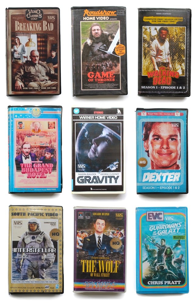
Someone pretending to be a Parisian hipster who only watches VHS versions of modern shows & movies like Game of Thrones and Interstellar created these VHS covers as an April Fools joke. These are actually pretty great. (via subtraction)
Haas Unica rides again
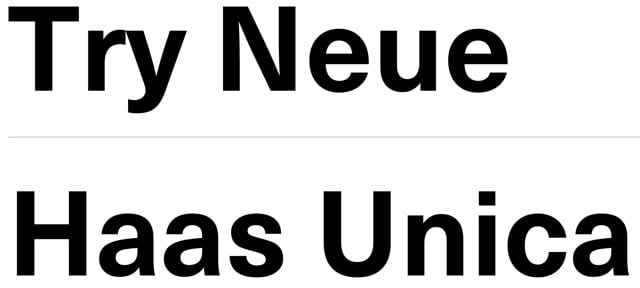
Conceived in the late 1970s as a hybrid of three of the most popular (and some would say, overused) sans-serif typefaces in the world, Haas Unica didn’t make the digital jump to personal computers in the 1980s. It was nearly forgotten, but has been revived by Monotype, which released Neue Haas Unica as a webfont today.
Unica® was an attempt to create the ultimate sans-serif - a hybrid of Helvetica, Univers and Akzidenz Grotesk. Designed by Team ‘77 and released to great acclaim in 1980, Unica went missing under a heap of legal disputes and has never been available as a full, digital typeface. Until now.
Unica’s story starts in the 1970s. Electronic, on-screen phototypesetting was gaining popularity, but most sans-serif typefaces on the market had been designed earlier, in the era of metal type. The revered Haas Type Foundry in Münchenstein, Switzerland, saw the chance to develop a new sans-serif face that was optimized for the new technology and filled the gap in the market. To develop their new product, they turned to Swiss type design trio, Team ‘77 (André Gürtler, Christian Mengelt and Erich Gschwind).
Team ‘77 set out to design a font based on Helvetica but drawing on other sans-serif typefaces, principally Univers. The name they gave it would also be a hybrid of the two.
The original name for Helvetica was Neue Haas Grotesk. Haas + Univers + Helvetica = Haas Unica.
Update: Several digital versions of Haas Unica have been available prior to this one.
For many years a digital version of Unica was available from Scangraphic (and Elsner+Flake) but it was pulled from the market due to a complaint by Linotype who claims the Haas rights. In 2008, Cornel Windlin did a Semibold for the the Schauspielhaus Zürich identity, used in 2009-10. Later, Louise Paradis created a revival named Unica Intermediate while doing research for the TM retrospective.
(via @typographica)
The rail refresher
Meet the enormous machine that refreshes railroad tracks (rails, ties, gravel) with minimal human involvement. Fun to see the infrastructure behind the infrastructure.
Not even John Henry would stand a chance against this behemoth.
Philip Glass wrote a memoir, Words Without Music. Just came out yesterday.
From an analytical chemist: The “Food Babe” Blogger Is Full of Shit
The Brontosaurus is back, baby!

After years of the Flintstones lying to me, I’d just gotten used to the idea of the Brontosaurus not actually being a dinosaur. But a recent study of the classifications given to various species and genera within the diplodocid group of dinosaurs has determined that the Brontosaurus and the Apatosaurus are different enough to be two separate species.
Very broadly, their tree confirmed established ideas about the evolutionary relationships among diplodocids. But the scientists also concluded that Apatosaurus and Brontosaurus were different enough to belong in their own genera. Many of the anatomical differences between the two dinosaurs are obscure, Tschopp says, but Apatosaurus’s stouter neck is an obvious one. “Even though both are very robust and massive animals, Apatosaurus is even more so,” he adds.
Tschopp and his team thought very carefully about their decision to reinstate Brontosaurus, and they expect some pushback. “We knew it would be a major finding because Brontosaurus is such a popular name,” he says. “I’m pretty sure there will be a scientific discussion around this. I hope there will be. That’s how science works.”
Huzzah! Now reinstate Pluto to full planetary status and we’ll be all set. See also The Kindly Brontosaurus. (via @coudal)
John Oliver interviews Edward Snowden
Last night on Last Week Tonight, John Oliver took on the topic of government surveillance and traveled to Moscow to interview Edward Snowden. After some softball questions — “Do you miss Hot Pockets?” — Oliver presses Snowden on his personal responsibility with regard to the information he revealed.
Coloring books for adults
The two top-selling books on Amazon right now are a pair of coloring books for adults by Johanna Basford: Enchanted Forest and Secret Garden.


Fans of the books have been posting examples of their coloring-in online; this one is from occasionalartist:

What This Says™ about contemporary culture is left as an exercise to the reader. Right after you finish coloring your flowers, of course.
Update: I recently discovered that a pal of mine, Souris Hong, did a coloring book for adults a couple of years ago called Outside the Lines.
For anyone who loves creativity and contemporary art, or who simply loves the joy of coloring, comes Outside the Lines, a striking collection of illustrations from more than 100 creative masterminds, including animators, cartoonists, fine artists, graphic artists, illustrators, musicians, outsider artists, photographers, street artists, and video game artists. With contributions from Keith Haring, AIKO, Shepard Fairey, Exene Cervenka, Keita Takahashi, Jen Corace, Ryan McGinness, and more, Outside the Lines features edgy and imaginative pieces ready for you to add your own special touch.
And there’s going to be a sequel out in September.
Bracket for the worst things on the Internet
From Jon Bois at SBNation, The Worst Internet Things bracket. Some of the worst things and their seedings include:
(16) Person who types “wow” in front of retweet
(9) Atheists who love to argue
(7) All internet discourse about bacon
(8) People who complain about BuzzFeed
(2) iTunes
(5) Kickstarters for weddings
The beautiful thinking game
Judging by interviews, neither Wayne Rooney or Lionel Messi seems like the smartest tool in the shed, but they both possess a keen mind for football as Simon Kuper explains. Messi, who appears to listlessly sandbag his way through the early part of matches, is actually using the time to size up his opponent:
It was a puzzling sight. The little man was wandering around, apparently ignoring the ball. The official explained: “In the first few minutes he just walks across the field. He is looking at each opponent, where the guy positions himself, and how their defense fits together. Only after doing that does he start to play.”
And Rooney uses visualization (or as Shaq would call it, dreamful attraction), just like Allen Iverson:
“Part of my preparation,” he told the writer David Winner for ESPN The Magazine in 2012, “is I go and ask the kit man what colour we’re wearing, if it’s red top, white shorts, white socks or black socks. Then I lie in bed the night before the game and visualize myself scoring goals or doing well. You’re trying to put yourself in that moment and trying to prepare yourself, to have a ‘memory’ before the game. I don’t know if you’d call it visualizing or dreaming but I’ve always done it, my whole life.”
A footballer’s exceptional visual memory was on display recently when FC Barcelona’s Xavi Hernandez was quizzed about 5 particular goals he’s scored out of 57 total across almost 500 matches for his club:
He gets them all correct, even what the scores were when they happened, the final scores, who else scored in each match, and even the team’s position in La Liga.
A quick P.S. for Messi. On Feb 16, 2015, Zito Madu wrote an article titled Is Lionel Messi even good anymore?
Plainly put, Messi is a shadow of his former self. He’s much more cynical, more selfish and power-hungry. How else can the departure of Martino and friction with Enrique be explained? It’s a power play by a man who feels his powers waning. Consider: after Barcelona’s 5-0 victory against Levante, Messi had only managed 37 goals and 18 assists in all competitions. A far cry from the player who once scored 82 goals in one season.
At 27 years old, we might be witnessing the twilight of Messi’s career. It’s a shame for a player who seemed to be on a tear just a few years ago.
It was a weirdly cynical take that contained a kernel of truth. A little over a month later on Mar 23, Jeff Himmelman wrote a piece called Lionel Messi Is Back On His Game.
But in the new year, Messi has finally started to look like himself again; he has been on fire, racking up hat tricks and leading the league in scoring. His legs and his extraordinary bursts of energy — the engine of his game — are back, and a move to the right flank from the congested middle has freed him to do what he does best: making slashing runs at defenders with speed, creating space and chances.
On the evidence of the last week, it has become possible to wonder whether Messi might actually be better than ever. The best reason to think so was the first half of Barcelona’s game against Manchester City on Wednesday, in the round of 16 of the Champions League European club championships. From the start, Messi spun passes into tight spaces and flew up and down the field with a boyish abandon that was nowhere to be found last year.
In that Man City game, Messi nutmegged both Milner and Fernandinho:
In a recent study released by CIES Football Observatory, Messi was judged to be the best forward in the world over the first three months of 2015. Ronaldo? 29th place. Eep.
Update: Real Madrid keeper Iker Casillas demonstrates his remarkable memory, recalling scores from matches from up to 15 years ago he didn’t even play in. (via @adamcohen15)
Meanwhile, back at the ranch…
For the one-year anniversary of Every Frame a Painting, Tony Zhou goes meta and talks about how to structure a video essay, using South Park and Orson Welles’ F for Fake.
Happy anniversary EFAP!
The US Forest Service’s Cocktail Construction Chart

This is…weird. The National Archives contains a Cocktail Construction Chart made in an architectural style, for some reason, by the US Forest Service in 1974.

Update: Kenny Herzog at Esquire did some digging and found out some of the chart’s backstory.
If it does, royalties might be due to the family of late Forest Service Region 8 Engineer Cleve “Red” Ketcham, who passed away in 2005 but has since been commemorated in the National Museum of Forest Service History. It’s Ketcham’s signature scribbled in the center of the chart, and according to Sharon Phillips, a longtime Program Management Analyst for Region 8 (which covers Virginia, Georgia, Florida, Oklahoma and Puerto Rico, though Ketcham worked out of its Atlanta office), who conferred with her engineering department, there’s little doubt Ketcham concocted the chart in question. “They’re assuming he’s the one, because the drawing has a date of 1974, and he was working our office from 1974-1980,” she said. And in case there’d be any curiosity as to whether someone else composed the chart and Ketcham merely signed off on it for disbursement, Phillips clarified that, “He’s the author of the chart. I wouldn’t say he passed it along to the staff, because at that time, he probably did that as maybe a joke, something he did for fun. It probably got mixed up with some legitimate stuff and ended up in the Archives.”
I contacted the librarian at the Forest History Society and found similar information. An archivist pulled a staff directory from the Atlanta office (aka “Region 8”) from 1975 and found three names that correlate with those on the document: David E. Ketcham & Cleve C. Ketcham (but not Ketchum, as on the document) and Robert B. Johns (presumably aka the Bob Johns in the lower right hand corner). Not sure if the two Ketchams were related or why the spellings of Cleve’s actual last name and the last name of the signature on the chart are different.
However, in the past few days, I’ve run across several similar charts, most notably The Engineer’s Guide to Drinks.1 Information on this chart is difficult to come by, but various commenters at Flowing Data and elsewhere remember the chart being used in the 1970s by a company called Calcomp to demonstrate their pen plotter.

As you can see, the Forest Service document and this one share a very similar visual language — for instance, the five drops for Angostura bitters, the three-leaf mint sprig, and the lemon peel. And I haven’t checked every single one, but the shading employed for the liquids appear to match exactly.
So which chart came first? The Forest Service chart has a date of 1974 and The Engineer’s Guide to Drinks is dated 1978. But in this post, Autodesk Technologist Shaan Hurley says the Engineer’s Guide dates to 1972. I emailed Hurley to ask about the date, but he couldn’t point to a definite source, which is not uncommon when you’re dealing with this sort of thing. It’s like finding some initials next to “85” scratched into the cement on a sidewalk: you’re pretty sure that someone did that in 1985 but you’d have a tough time proving it.
FWIW, if I had to guess where this chart originated, I’d say that the Calcomp plotter demo got out there somehow (maybe at a trade show or published in an industry magazine) and every engineer took a crack at their own version, like an early internet meme. Cleve Ketcham drew his by hand while others probably used the CAD software running on their workplace mainframes or minicomputers.
Anyway, if anyone has any further information about where these CAD-style cocktail instructions originated, let me know. (thx, @john_overholt & tre)
Other instances include these reprints of drawings from 1978 on eBay and an advertisement for a Cocktail Construction drawing in the Dec 1982 issue of Texas Monthly. ↩
The sounds of Hollywood
A profile of Gregg Barbanell, who is a Hollywood Foley artist responsible for the ambient sounds (walking, clothes rustling, gunshots, etc.) in Breaking Bad, Little Miss Sunshine, and The Walking Dead. The best bits are about how specific sounds are made.
Popular apocalyptic zombie TV series The Walking Dead has no shortage of gore — and as the show’s Foley artist, Barbanell is tasked with creating most of its gruesome “blood and guts” sounds. “They’re pulling organs out of bodies, they’re slicing heads off, reaching into bodies, pulling out things,” says Barbanell, with disgust. “So, we get creative.”
For “gushy, squishy sounds” like oozing blood, Barbanell uses chamois (a leather cloth made from the skin of mountain sheep). “You soak it, then lay into it, and it just oozes — it’s something you can control really easily,” he says. “And when you put pressure on it, you get these amazing, gory noises.” Sometimes, when that extra oompf is needed, he’ll go out and buy a whole, raw chicken to stuff the chamois inside of.
For “breaking bones,” big, full stocks of celery are employed — not merely individual stocks, mind you, but HUGE bunches capable of producing layered, complex snaps. “They give you this huge, sinewy stringy sound,” adds Barbanell. “It’s very effective.”
Oh, and his collection of shoes for making different walking sounds, some of which are shown here:

I love that Foley is still something done by hand, but sometimes it’s a bit too much, less like ambient noise and more like these exaggerated Wordless Musicvideos.
Socials & More